
Back in 2012, an event ripped through the Marvel Universe. It tore apart the space-time continuum, relaunching the line with all new #1s and a streamlined universe. It was called Marvel NOW and it mirrored the Direct Competition’s then-year old relaunch in size, scale and br — What’s that? It was just a re-branding and a bunch of new titles and new #1s? “AvX” didn’t even change up the universe itself, unlike “Secret Wars” in 2015? Well, now I feel silly.
Regardless, we’re here to cover the first third of the initiative that’s had, perhaps, the most outsized impact on the company, spawning multiple waves, a 2.0 version, and the start to a few fan-favorite, and fan-reviled, runs. In case you missed yesterday, here’s A-F. Today, we’ve got the second of three with Marvel NOW G-Se titles. Let’s see what Marvel thought was important enough to be their flagship titles in 2012.

Guardians of the Galaxy #1
Written by Brian Michael Bendis
Illustrated by Steve McNiven
Inked by John Dell
Colored by Justin Ponsor
Lettered by Cory Petit
Reviewed by Kevin Gregory
Feels like a heresy to be reviewing a Bendis book even though he’s been over at DC now for two years, but that won’t stop us getting you this end of the decade content. Will it? I don’t know, it might. But could it? Why would it? Who are you? (OK, I’ll stop with the Bendis speak).
So, welcome to the biggest “Guardians” launch from right before the movie comes out. This book comes out at the beginning of 2013 with Marvel’s two big guns – Bendis and Steve McNiven – to give you all the best krutacking content you could want. And with added Iron Man.
First off, this book is very pretty looking. McNiven is nothing if not a master of the craft at this point, and Marvel only breaks him out for the big ones. Him and Dell and the late Justin Ponsor make this book look great from space battles and pin-up spreads covered with inner monologue to the quieter, subtler moments. There is such detail in the facial expressions of all the characters from the royal assholery of King Jason to the aloofness of Peter Quill. Which is good, because those are the two characters we spend the most time with in this issue.
Now onto everything else. It is so odd to read this book back to back with reading “Avengers” #1 mainly because of the inclusion of Iron Man. Tony is written as relieved to get the hell off Earth here, and building a better Avengers there. But I digress. The tone of this book is somewhere between serious and what will come when the Guardians film hits theaters a from this debut. The funny is Bendis and the serious is McNiven and the art team. It’s hard to imagine McNiven on a funny book, but Bendis tries his darndest to get him there. It’s dissonant and doesn’t really work.
This whole comic hinges on another intergalactic call of Earth being off limits, and while that’s cool, there’s not a clear vision beyond that. Peter’s mad at his dad and Iron Man’s in space for some reason with the rest of the Guardians not getting a whole lot else. I don’t even remember Drax or Groot getting a word in. Not a whole lot happens other than one conversation and a prolonged fight scene. But hey it looks real good.
Final Verdict: 5.0 – A pretty book is held back by a lack of vision and words words words.

Indestructible Hulk #1
Written by Mark Waid
Penciled by Leinil Francis Yu
Inked by Gerry Alanguilan
Colored by Sunny Gho
Lettered by Chris Eliopoulous
Reviewed by Kate Kosturski
Bruce Banner, Agent of S.H.I.E.L.D.? It’s a head scratching concept, but one that Mark Waid sells pretty well in “Indestructible Hulk” #1. Recognizing that his angry alter ego cannot be defeated, only controlled, Bruce Banner offers his intelligence to Maria Hill as a way to help make his past destructions right, with proof to come from the results of a trial run of sorts against the Mad Thinker. Talk about your unorthodox job interviews.
Continued belowEarlier this week in one of our “Not So New 52” recaps, I complained about “Justice League International” #1 spending too much time in the waters of world building. This series does not have that problem. And to its credit (something that JLI did not do), it also uses the idea of “show not tell” to set up our universe. There are dialogue-heavy moments here, but balanced evenly with artwork, and those wordy occasions themselves balanced evenly throughout the issue. While we have a beginning, middle, and end to the action, all three of these work to set up the series rather effectively, even though we have no idea what to expect. Is this going to be a story-of-the-week type series? Will there be larger arcs? Perhaps both? (Spoiler alert: it’s both.) Whatever it is, you have enough here to keep you entertained for one issue, and intrigued enough to come back for the second.
Yu and Alanguilan have a lot of fun with their artwork. The Hulk’s destructive debut into the Mad Thinker’s lair uses a worm’s eye view to show off his power beautifully. Light, feather-like hatching showcases power and speed in movement in moments that work both for and against Hulk. And while we’re still in the era of Extreme Contouring(TM), it’s not over-used here. One touch from Sunny Gho’s colors I loved was the vivid emerald green of Banner’s eyes (later revealed to be contact lenses he designed to help track his Hulk vitals). It’s a small but vibrant touch, reminding him – – and us – – of Banner’s dual nature, how one is always with the other.
With rumors of Agents of S.W.O.R.D coming to Disney+, and possibly incorporating elements of Agents of S.H.I.E.L.D., perhaps it’s time for this series to come to the small screen.
Final Verdict: 7.3 – A pretty smashing (see what I did there) debut.

Iron Man #1
Written by Kieron Gillen
Illustrated by Greg Land
Inked by Jay Leistein
Colored by Guru-eFX
Lettered by Joe Caramagna
Reviewed by Kevin Gregory
I’m a few issues into this project, but I’ve already encountered three different Iron Men. Gillen’s, Hickman’s, and Bendis’s. Two of them I’m really into and this one is absolutely one of them. Gillen gets Tony Stark.
There’s so much about this book that I want to like. Tony’s inner monologue is perfect. It’s that grey area between a genius and realist who wants to believe in people, but also knows the limits. It’s that little bit of sarcastic that comes with riding the line between where nihilism and fatalism meet. It’s the thoughts of a man convinced that the future and perfection are humanity’s for the taking and he really doesn’t need any help. Tony is appealing, and also very dangerous.
Again there’s so much I want to like. This book begins a follow-up to the ‘Extremis,’ arc that Warren Ellis and Adi Granov did and there are few people that I’d want to try to play Ellis but Gillen is one of them. There’s heroics, there’s bar talk, there’s Tony and Pepper playing nice. Again so much you want to like.
But…dang is this a really unappealing looking book. Now don’t get my wrong, does Land’s sort of plastic, fake style work really well in a scene of Tony and unnamed woman in a bar that has a foregone conclusion? Sure if you’re into all of Land’s women always looking the same. But everywhere else much less so. The backgrounds are very static. On the first page of this comic you might be mistaken thinking that someone cut out a picture of the Empire State Building and glued it onto the bottom panel of the page at a slight angle. It’s very bad. There’s a way to do sexy, there’s a way to do cocky, there’s a way to sell the arrogance of Tony Stark, but Land and co. aren’t doing it. And that’s a shame, because there’s nothing worse in a comic than having great words and bad art. Usually it’s the other way around.
Ultimately, this book offers a fun look at Tony Stark that offers to give you a little of Robert Downey Jr. mixed with current continuity whose eye color changes from black to brown page to page. It’s a fun confident read trying to build on everything that’s come before.
Continued belowFinal Verdict: 5.5 – A fun ride betrayed by the pictures.

Journey Into Mystery #646
Written by Kathryn Immonen
Illustrated by Valerio Schiti
Colored by Jordie Bellaire
Lettered by Clayton Cowles
Reviewed by Kevin Gregory
Having not read any “Journey Into Mystery” before this issue (shame on me yes, yes I know) this issue was a little hard to find. I get now why people are frustrated with renumbering and not. But, does the only Marvel NOW book to not get renumbered get good numbers itself? The answer is a resounding yes.
I really enjoyed this issue, and in doing a project that has required many of us to read a lot of issues and being in the profession of writing and talking about comics (thus again requiring one to read a lot of issues) that’s no small praise. This book was a lot of fun and had a very simple premise. Sif wants to get stronger. I can get behind that and it’s relayed very succinctly. There may be a specific reason for that, I have very little knowledge of the Asgardian books prior to this era, but nonetheless that’s what’s on offer here. Sif wants to get stronger and she’s going on a journey to make it happen.
My knowledge of Sif pretty much just comes from the MCU, but this issue makes a case for her as a strong compassionate warrior. Almost Marvel’s Wonder Woman, which Schiti’s art tries to make a play for. This is the early Valerio Schiti – who is now a big name artist at the company – but man you could almost mistake this for Cliff Chiang. I mean that in the best way, I love this look. Schiti and Bellaire craft a flatter starker more mythic looking Sif here that is more stylized and much less digitalized than Schiti’s current output. This comic is expressive and bright and cartoonish in an imaginative, fun, childlike way. While I am absolutely a modern day Schiti fan, I wouldn’t ever mind a retread of this look.
Immonen fills this book with Asgardian terms and facts and all of it is stupid fun. From Nidhogg to the needed reminder that Heimdell and Sif are siblings, Immonen just embeds the reader into this complicated word with much humor and tact. While we as readers are thrust into a realm possibly unfamiliar (or not maybe you read the first 645 issues) it’s all paralleled by Sif trying to find herself in an unfamiliar and new Asgard. Hence the hero’s journey. The narration here works really well, and pulls the reader further and further into what’s happening.
While nothing here is revelatory, everything here is competent and precise. This issue makes a case for more Asgardian stories, more Sif, and more wondering about what all corners of Asgard might be up to. It’s dumb and fun, like comics should be.
Final Verdict: 8.0 – This issue makes me want to keep reading, and in an age when I so badly want to stop reading so many books that’s a great feat.

Morbius: The Living Vampire #1
Written by Joe Keatinge
Illustrated by Richard Elson
Colored by Antonio Fabela
Lettered by Clayton Cowles
Reviewed by Brian Salvatore
With the Spider-man status quo fundamentally different in the Marvel NOW! era, it made sense that certain characters would be thrust in the spotlight, with Otto Octavius in the Spidey role. Morbius was one of those characters given a bit more of a push than normal, and this series by Joe Keatinge and Richard Elson attempted to bring Morbius to a more distinguished place in the 616.
This first issue does an excellent job of establishing who Morbius is, where he came from, and what the overall deal with the character is. Keatinge does this without excessive, clunky exposition. Instead, the first 1/3 of the book is full of near infographics, where Morbius is explaining his situation to the reader. Third person narration can often times be obnoxious, but Keatinge uses it well here, allowing it to take the place of stilted conversation to reveal the same information.
Continued belowThe cover of the book is so striking that it is a bit unfair to expect the interiors to pull off a similar tone. Elson’s work is solid, and his character design, especially on Noah St. Germain, is very reflective of 2000 AD, where Elson cut his teeth. The work isn’t quite as horror-influenced as you may think from a vampire comic, but Elson manages to make the book feel both unexpected and vampiric enough to satisfy those who came looking for a more traditional story.
Final Verdict: 7.5 – A strong start and a great introduction to the character and the status quo.
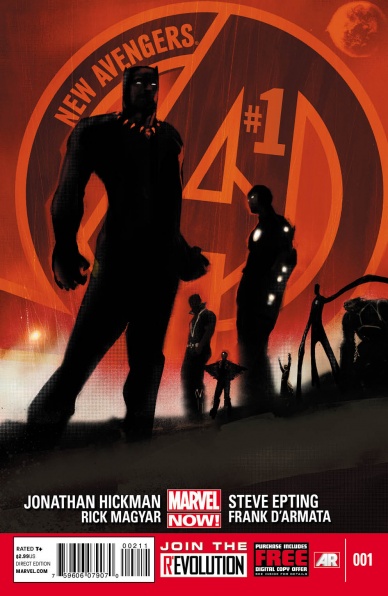
New Avengers #1
Written by Jonathan Hickman
Penciled by Steve Epting
Inked by Rich Magyar with Steve Epting
Colored by Frank D’Armata
Lettered by VC’s Joe Caramagna
Reviewed by James Dowling
“New Avengers” #1 is the beginning of something profound. Johnathan Hickman’s time writing Earth’s Mightiest Heroes, is regarded as some of the best work in Marvel history and this issue gives the series a running start. One of the main selling points of Hickman’s writing is just how well he conveys scale. In comics the end of the world is pretty much the world’s default state, yet Hickman still manages to illustrate the overwhelming threat the first incursion represents. At times though, the dialogue toes the line between stiff and profound, especially when very little emotional weight is given to the issue’s point-of-view characters.
Steve Epting’s art is full of unapologetic realism and heavy shadows. His characters carry a weight with them that’s perfectly portrayed through heavy contours; the cover by Jock is wonderfully supplementary to this. Ultimately, Epting’s ever-present realism helps exemplify the surrealism of Wakanda’s cosmic invasion and the disturbance to the natural order that it represents. He even manages to fit Lockjaw and the Fantasticar into the book’s noir aesthetic, the ability to draw a somber space dog is always a great skill for an artist.
Hickman brings an unmatched level of vision and scale to every title he writes and that is clear from the start in “New Avengers.”
Final Verdict: 8.0. “New Avengers” #1 is refreshing, monolithic and still holds up as one of the best series debuts in modern comics.

Nova #1
Written by Jeph Loeb
Penciled by Ed McGuinness
Inked by Dexter Vines
Colored by Marte Gracia
Lettered by Comicraft’s Albert Deschesne
Reviewed by James Dowling
Sam Alexander as Nova was one of the first in the latest wave of Marvel’s legacy heroes; arriving shortly after Miles Morales’s debut as Spider-Man and a while ahead of Riri Williams’s Ironheart and Amadeus Cho’s Hulk. This debut issue establishes Nova fairly well but it does little to build interest in Sam Alexander, the man behind the mask.
Ed McGuiness proves his competency, as he skillfully pencils energetic action, gorgeous vistas and creative creature designs. While his art never demands close inspection, some of the quieter scenes are charmingly intricate. These character-building details help account for the occasional sense of emotionlessness that appears in his art. With the help of Marte Garcia’s saturated sci-fi color palette and the bold inks of Dexter Vines, McGuinness’s illustrations feel especially deft and confident.
Loeb’s script has an air-tight opening, quickly introducing a new form of Nova that feels like a natural evolution on the character without being overtly derivative of the original. However, the book stumbles once it gets through this beginning. The story feels as if it’s going through the motions; setting up a cliche bully, a cliche teacher and a cliche love interest who speak entirely in quotes ripped straight from The Breakfast Club. McGuinness’s art sags in this midpoint as well as he begins relying on awkwardly proportioned cliches who forgettably fill panel space in between action scenes.
The story feels frustrating, Loeb continually proves that he’s capable of writing a good “Nova” story and that he can provide an interesting enough father/son story as a backdrop, but his insistence on including schlock high school tropes drags down the otherwise original story.
Final Verdict: 7.0 – “Nova” #1 is a book with two conflicting identities. One half is an engaging story of a father coming home from war to a resentful world; a story that’s aided by high-action and a dynamic parental relationship. While the other half is a frustratingly cliche high school narrative about an inexplicably universally despised skater-boy stuck in a stereotypical small town. Wrenching the reader between these two halves leaves them counting pages until the next flashback and means the book can never feel wholly satisfying, despite it’s generally good art and writing.
Continued below
Red She-Hulk #58
Written by Jeff Parker
Penciled by Carlo Pagulayan and Wellinton Alves
Inked by Wellinton Alves
Colored by Val Staples
Letted by Clayton Cowles
Reviewed by Brian Salvatore
The Red Hulk/She-Hulk era of Marvel was silly at the outset, but both characters were created in ways that, from a comics logic standpoint, made sense. When Betty Ross took over the “Hulk” series and was rebranded “Red She-Hulk,” she had a few things going for her. First of all, the series was written by Jeff Parker, one of the more clever and inventive writers in Marvel’s stable at the time. Parker is one of the best at making seemingly bad ideas work. The second is that Carlo Pagulayan is another Marvel heavyweight, whose work here is dynamic and fun, giving the book a visual tone to match Parker’s script.
But more than anything else, this is a relatively new approach to a Hulk character. We’ve seen both the brainy, ‘intelligent’ Hulk and the all-rage, no thought Hulk, but this is the first time that we’ve seen a Hulk as strategic, covert ops agent. The idea of her systematically taking down Echelon by infiltrating under her ‘real’ identity and then Hulking out is a fun concept that allows for the book to bridge the gap between superhero and espionage.
While we don’t get a lot inside the mind of Betty in this issue, her motivations are easy enough to understand, based on her actions. There is also a nice interaction with Captain America and Machine Man, where Machine Man says what we all are thinking reading the book: why are you hating on Echelon, when that is basically the Super Soldier program? It is easy enough to figure out the answer, but it’s important that it was asked in the first place.
Final Verdict: 7.3 – A strong start to a new, redder chapter of Betty’s story.
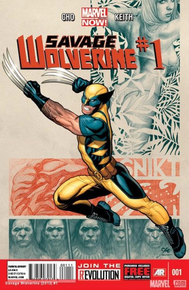
Savage Wolverine #1
Written and Illustrated by Frank Cho
Colored by Jason Keith
Lettered by VC’s Cory Petit
Reviewed by Kate Kosturski
There’s nothing like opening a comic from 2013 and immediately being greeted by a buxom woman in a bikini piloting a hovercar.
After I sighed and had my Men Is Too Headache moment, and then reminded myself that this is from 2013, I dug in to find two pages later, Logan gutting what appears to be one of the Jurassic Park velociraptors.
Gratuitous sex and violence? Check.
But once you get past that (and trust me, there’s a lot of it), there’s something of an interesting story of survival here. Wolvie and Shanna the She-Devil (that is the hovercar pilot from the first page) are stuck in the Savage Land and have to find a way out. Shanna and her researchers ended up stranded there after their hovercar crash landed, and efforts to leave the island prove fatal for all but Shanna. Logan decides to help finish the job. But can two tough-as-Adamantium types like these survive?
Comic book tropes aside, Frank Cho does know how to pace an opener of an issue well, almost in a cinematic way with high action stakes to start, and then a flash forward later to the aftermath. There’s a lot of world-building in these 24 pages, but never does it feel overstuffed or exposition for the sake of it. The cliffhanger that this leaves off of is predictable, but still hooks you in to want to find out what happens next.
In terms of artwork, I’ll say this: Frank Cho knows how to contour. Shading and cross-hatching make every muscle and facial expression pop. In spite of wearing very little, Cho draws Shanna with a reasonably proportional and muscular body, showing off her strength as her greatest asset over those other ones. That level of detail extends to setting. From the tentacle-like mountain at the heart of the Savage Land to a random tree in the forest, the Savage Land itself becomes a third character in this story.
Once you get past the objectification of Shanna in these pages, but there’s a pretty decent high-stakes survival plot within. Think popcorn summer flick instead of highbrow entertainment. And sometimes, the popcorn flick is just what you need.
Continued belowFinal Verdict: 5.6 – Decently structured with highly detailed art, the sex object Shanna the She-Devil makes this just a little awkward to take in our #MeToo era.

Secret Avengers #1
Written by Nick Spencer
Illustrated by Luke Ross
Colored by Matthew Wilson
Lettered by VC’s Clayton Cowles
Reviewed by Erik Hyska
If you stay in comics long enough, expand your reach, and try some new books, occasionally a comic book will come along that feels like it was made for you and is your book. Yours in the sense that it fits your tastes and sensibilities. Yours in a way that you cannot wait for the next episode of the story to arrive because you keep thinking about the plot and the stakes of the characters. Yours because you are wholly committed to seeing the journey of this creation from beginning to end. When I started reading comic books regularly in 2013, “Secret Avengers” was that series for me, so I jumped at the chance to review the first issue of this comic and experience the same excitement and intrigue I felt when I first picked this up.
“Secret Avengers” #1 is a spy book through and through and follows the best spy stories by parsing out bits of knowledge to its main cast, its supporting cast, and even the audience itself to keep everyone hooked. In the first issue, readers are introduced to the core members of the SHIELD team operating in the shadows: Clint Barton (Hawkeye), Natasha Romanoff (Black Widow), Nick Fury Jr., Maria Hill, and fan favorite Phil Coulson. Phil extends an offer to Clint and Natasha to work as operatives for SHIELD. Both initially decline, but Phil tries again saying that “You would assist us on any number of missions… but there is one in particular that in the course of reading your files very closely – it was apparent to us you would have a vested interest in dealing with yourselves.” Clint and Natasha shrug and in the final panel of the page there is a large white text on a red background with the word “REDACTED.” Turn the page, and Clint answers, “We’re in.”
Writer Nick Spencer fills the issue with great moments like this demonstrating a rich understanding of spy stories and the mechanics of comic books. Paired with artist Luke Ross, the tandem work effortlessly to ensure story beats land as they’re intended to and to avoid overplaying their hand to the audience. For example, there’s an interrogation sequence early in the issue between illegal arms dealer, Andras Bertesy, who is attempting to extract information from a captured Clint Barton. The way the pacing and the dialogue in this scene builds up to its revelation is so perfect. I enjoyed how Ross sequences his characters and the way Bertesy moves around Barton in a way that readers can see when Bertesy is speaking slowly and intensely and later depicting his annoyance and urgency.
Spencer and Ross also nail the small moments between characters. After Black Widow saves Clint, Natasha holds up the wounded Hawkeye and they exit the scene with their backs towards the audience. Clint says, “The hell am I doing out here? This isn’t my game. Not even allowed to know why I agreed to it in the first damn place…” Natasha replies, “But you know that you did. Which tells you all you need doesn’t it?” Spencer’s writing is adept and can weave in the poignancy between characters so Ross can cleanly punctuate it.
Final Verdict: 9.5 – “Secret Avengers” #1 is a formative book early in my comic book reading life. The issue has strong pacing, good use of genre conventions, and utilizes the comic book format better than most of its peers. Nick Spencer’s dialogue offers a range of poignant, humorous, and intense lines from a compelling cast of characters and Luke Ross delivers consistent and understated portrayals.


