
Do you guys like the nineties? On top of that, do you guys also like nostalgia? Were you also a big fan of smashing your tough-as-nails Raphael figure with your slightly-more-fragile Red Ranger figure? Then strap in, my friends, because boy do I have a comic for you.
Written by Ryan Parrott
Illustrated by Simone di Meo
Colored by Walter Baiamonte and Igor Monti
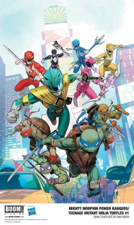
Lettering by Ed DukeshireThe Power Rangers arrive in New York City to find Tommy Oliver – AKA The Mighty Morphin Green Ranger – but soon discover he’s joined forces with the villainous Shredder and the Foot Clan! As the Rangers are sent reeling by this betrayal, they’re confronted by another (fr)enemy – the Teenage Mutant Ninja Turtles! Can these heroes find a way to work together to defeat the bad guys and save the world from total destruction?! Written by Ryan Parrott (Power Rangers: Necessary Evil) and illustrated by Simone di Meo (Mighty Morphin Power Rangers, Venom Annual), the Mighty Morphin Power Rangers fight – and maybe team up with – the Teenage Mutant Ninja Turtles for the first time in this oversized issue includes 30 pages of story content!
As far as crossovers go, the debut we’ve got here is pretty by the book, but it does certainly use the more enjoyable tropes rather than some heavy-handed ones. One thing I love that this book does is that it doesn’t go to great lengths to explain complicated interdimensional crossovers or anything like that: Parrott has just established that TMNT’s New York and MMPR’s Angel Grove are in the same world, and on the same beat, everyone knows who the Power Rangers are. This pre-established familiarity allows for some great story beats to form naturally. Tommy, the resident bad boy of the Rangers, is the centerpiece of this crossover as he’s lured over to train with the Foot Clan to attain more power. On the flip side, our favorite Turtle bad guy Shredder has allowed for Tommy to train with the clan to get him to attain an artifact that will allow him to also harness Tommy and furthermore, the Morphin powers of the Rangers. Ryan Parrott isn’t trying to complicate you with new lore or narrative, he’s simply seeing narrative jigsaw pieces on both sides of the coin and fitting them together perfectly to create an enjoyable new story.
That said, there are some stock standard trappings that do come across as a little annoying. The most obvious here is the classic hero vs. hero trope that happens with almost any crossover story. In this case, it is brought about in the most typical way as well: everyone’s base instinct in this story is to shoot first and talk later. While I would probably buy this the most from the Turtles, they are interestingly the ones that call for a ceasefire the most throughout the fight, which did pleasantly surprise me. However, it happens at a point where it seems like the fighting is winding down, before it quickly starts up again a few pages later, begging the question of what the point of all this action was for. We do get some neat character comparisons and development in this fight scene, at least. Having Donatello out-nerd the Blue Ranger was a cute little character beat and having the Yellow Ranger call out Raphael as he makes an unfortunately somewhat sexist comment was super satisfying to see.
Simone di Meo does some great, hyperkinetic action art in this series that gives breezy pacing to the series and makes it as loud and passionate as the nineties often feel in retrospect. The opening splash is a super-well composed shot that brings our eyes towards the Power Rangers in a focal point with some negative space for visual attraction. The way that di Meo moves the action of our protagonists moves the story flow and points our eyes in a spiral down to the antagonist(named Apocalyptopus if you were wondering) skulking away in the corner. The same kind of structure is replicated in the splash that introduces the Turtles a few pages later, with the Foot Clan being positioned around the frame of the splash and moving our eyes naturally from page to page. There are a few little jarring action moments that lead readers to question the physicality of what’s happening, however. When Leo and the Red Ranger meet up in a sword clash, the blades don’t meet up in a way that would signify this kind of tense clash is happening. The moment just preceding that also has Leo catching the Red Ranger’s sword with his own blades like a pincer, which in theory seems like a neat move but doesn’t flow as nicely or seem as efficient as the rest of the action on the page.
Continued belowThere are some neat little visual consistencies that make each character pop and feel unique and individual that di Meo adds to the comic. The way we see the Power Rangers jump and move through space makes them feel reminiscent of high-acrobatics, Japanese Super Sentai style shows. Not only that, but having each character’s eyes reflected through their visors every now and then adds a lot of individual personalities. In contrast, the Turtles jump and move with a lot more visual precision and determination, evoking the… well, ninja action that they obviously represent. They’re also rendered individually in ways that seem to emulate their personalities. Mikey has a more pear-shaped head that channels his goofy attitude well, while interestingly enough, Leo’s is much more horizontal and precise-seeming. The latter also moves through space with much more concealment than the more extroverted, show-off display that Mikey uses. Each of the characters not only has a distinct narrative personality but has a lot of visual idiosyncrasies that make them just as unique.
Colors are handled by Walter Baiamonte with assistance from Igor Monti, and the pair have a shiny, slick style that evokes the pop vibrancy both of these series have been associated with. One of the best visual distinctions that we get between the two teams is through color, but surprisingly not just of the individual characters! Baiamonte and Monti paint Angel Grove a pretty city-at-dusk gradient of orange and light blue, whilst the Turtles’ New York is a sparkling yet mysterious perpetual night. On the characters specifically, there’s not a lot of thematic difference coloring wise, but the two make the Turtles’ individual color motifs pop, and the Rangers look beautiful and perfect in their shiny, almost hard-plastic looking suits, to which the colorists use white highlights to great effect. There’s a nice visual clash when the two teams meet, however, as in the splash we see a smear of brightness permeate the night sky, and the neon vibrancies of New York become much more accentuated.
“Mighty Morphin Power Rangers/Teenage Mutant Ninja Turtles” #1 can land in the category of a stock standard company crossover at times, but the creative team does some great work in ensuring that this still feels fresh, fun, and evocative of the time these two properties were hot topics. The characters are all interesting and well handled, the art is action-packed and exciting, and the colors are as candy-colored and vibrant as you would expect. Check this out if you’re a fan of either property and you need a nostalgia hit right into your veins.
Final Score: 7.0 – A crossover that does a good job at handling both properties well but can be a little by the book at times.


