![]()
“Hellboy and the B.P.R.D.” brings us its first five-issue arc since the series’ debut, ‘1952.’ Even still, ‘1956’ is doing something very different, with three different artists on the title.
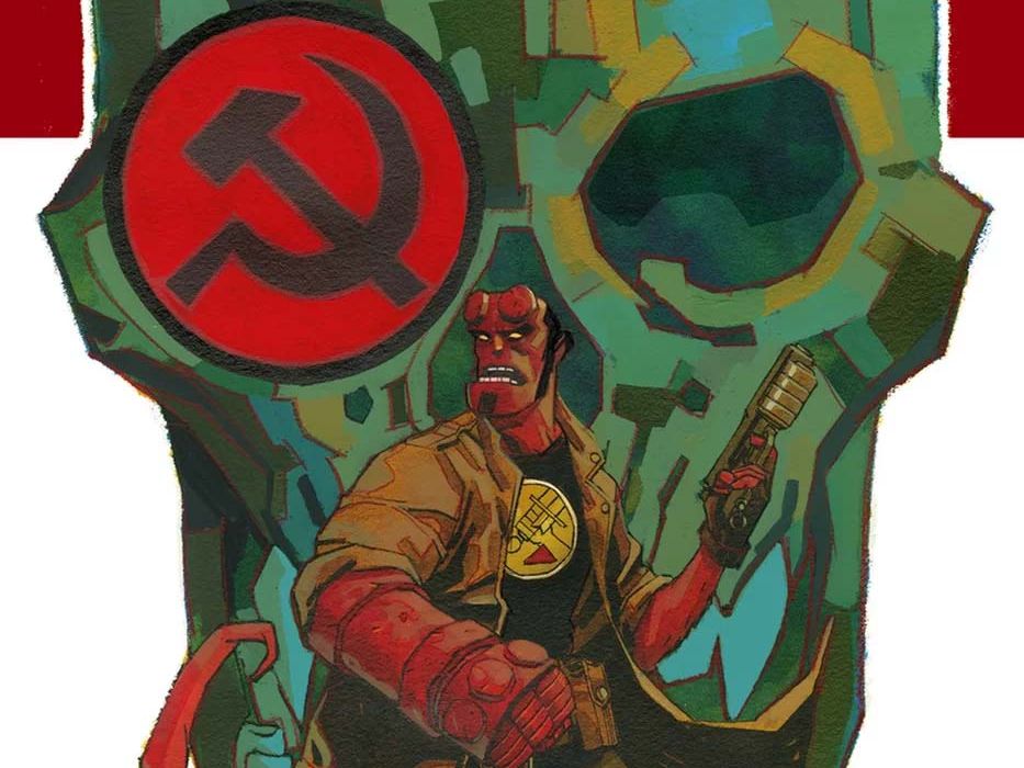
Written by Mike Mignola and Chris RobersonCover by Dave Johnson
Illustrated by Yishan Li, Mike Norton, and Michael Avon Oeming
Colored by Dave Stewart
Lettered by Clem RobinsPressure is mounting within the bureau to uncover the Soviets’ secret plans, but a suspicious cover-up leads one agent off the radar in search of answers. Meanwhile, demonic Soviet occult leader Varvara pushes her team to follow her own whims, and Hellboy is sent on the mission that led to his infamous misadventures in Mexico. But even more clandestine plots are at work—both inside the B.P.R.D. and out.
• Three Hellboy and the B.P.R.D. storylines interwoven into an espionage saga!

Mark Tweedale: ‘1956’ isn’t quite your usual five-issue arc; as the solicitation blurb above promises, this is three stories from three different artists—one focused on Hellboy and Professor Bruttenholm (drawn by Mike Norton), another on Susan Xiang (Yishan Li), and another on the S.S.S. (Michael Avon Oeming).
Christopher Lewis: Interestingly enough the timeline of the issue also jumps forward with each scene. The Hellboy piece being in May, the Bruttenholm story in July, and the Susan and S.S.S. stories taking taking place in August. I think this is the first time we are seeing this type of jump around within one issue of the series.
Mark: Yeah, it’s definitely good to see Chris Roberson embracing the year format and using it to tell a story on a larger canvas.
I’m going to skip over the Hellboy/Bruttenholm scenes and come back to it last. Those pages contain a plot development I want to discuss in detail, so it’ll be packed full of spoilers. However, our discussion on Li and Oeming’s pages will be spoiler free.
So, Chris, what’d you think of the Susan Xiang pages?
Chris: Without going into to many details, I enjoyed that the scene directly foreshadowed plot points discussed in the S.S.S. story that followed.
One thing that really surprised me was that Susan still had Dr. Sandhu’s trident from ‘1955: Occult Intelligence.’ I wouldn’t have thought Dr. Sandhu to give up a such a powerful psychic relic. Additionally, I was shocked that Susan was walking around holding it with her bare hands since it is a catalyst to her having premonitions.
Mark: Dr. Sandhu said herself, as long as she’s had the Trishul, she’s never seen evidence of its third-eye-opening qualities until Susan came along. And as we saw in ‘1955: Burning Season,’ Susan’s already been using it in the field. She’s had more than a year with the trident now; I expect she’s a great deal more experienced with it.
Yishan Li’s work on these pages certainly feels as home in the Mignolaverse. Her take on Susan feels very inline with Paolo Rivera’s. I like the way she shifts the sequence too, starting with rectangular panels with evenly spaced gutters, transitioning to trapezoid panels with gutters of varying widths. Li’s panel layouts alone get us into Susan’s head. The layouts are unsettled and we project that onto Susan.
Chris: Those are some good observations. I actually didn’t pick up on the shifting panels and had to go back and look at them again. The shifting happened very subtly and was not as drastic as we have seen in prior years, which is why I didn’t notice it. This slow change in the panels gives credence to your statement that Susan is more experienced with the trident and I would also say not as emotionally or physically affected by the vision.
Moving to the S.S.S. storyline, I thought Michael Avon Oeming did a great job of making the exterior of the soviet government facility and medical ward look unwelcoming by giving it an industrial look and also using significant black shadows throughout the story. This look was exacerbated even more by Dave Stewart’s use of dark greys and sickly greens to take that unwelcoming look and move it to a prison feel.
Continued belowOn top of that I was very impressed with Stewart’s use of red and orange as a key contrasting color to the scenery and give an ominous feeling throughout this story. From the red S.S.S. symbol, to the orange-ish red carpet, and finally to the last page where the where the two Russians were left standing horrified in front of a red silhouetted painting of the “Four Horsemen of the Apocalypse,” there was a constant ominous, demonic tone to the story.
Mark: Going from Norton to Li, it was readily apparent that the artists on ‘1956’ are all using different visual languages. And the leap from Li to Oeming though is enormous.
‘1956’ is unlike anything else I’ve seen in the Hellboy Universe before. Sure, we’ve seen multiple artists on a single title, but not like this. “B.P.R.D.: 1947” and ‘Vampire’ featured both Fábio Moon and Gabriel Bá on art duties, but they worked closely together, and the transition between artists was always carefully orchestrated, and they used the same visual language. “Abe Sapien: The Shadow Over Suwanee” had Sebastián Fiumara drawing in numerous styles to quote previous stories, Max Fiumara on a surreal sequence inside an Ogdru Hem, and Tyler Crook on a flashback, but again, the transitions were carefully orchestrated so as not to draw attention to the switch. ‘1956’ features no such transitions or any adherence to a particular visual language. Even something as simple as panel gutters is markedly different in each story.
It’s an interesting choice, and I’m curious what this will bring out of the narrative. Oeming’s pages are certainly the most overt. Oeming leaves behind white pages and soaks his in black (which makes Varvara and her white dress pop off the page wonderfully). Where Norton and Li went for naturalistic angles, Oeming’s pages push the angles to unnatural extremes, at times mimicking a fisheye lens effect. This is perfect for Varvara, whose very existence is unnatural. She’s a big, theatrical character, and Oeming certainly leans into that aspect hard. He’s not going for subtlety here and it absolutely works in favor of Varvara’s larger than life character.
Meanwhile, Mike Norton’s doing something very different.
Chris: Agreed. I felt that Norton’s art kept emphasis on the characters. Each character is very defined while the the backgrounds have some detail that seems to fade making the reader’s eye focus more on each character.
Mark: Norton puts so much into his pages. The Bruttenholm stuff, which is largely just a meeting, is full of visuals that showcase shifting power dynamics—look at the way he chooses to position the camera (apologies for the film terminology) above, below, or level with a character’s eyeline; or at the way he puts a character in shadow or frames them with shadows; or even when he chooses to show or conceal Mr. Dulles’s eyes behind his glasses. Each of these choices heightens the dialogue or punctuates a shift. The scene feels so alive, even though it’s just two guys sitting opposite each other talking.
Norton seems to love playing with spatial relationships. Virtually every panel on his pages have a strong foreground and background element, often using the contrast created between the two to comment on the story in some way. I suppose I should drop a big spoiler warning here, because there’s a major plot development in here that I simply have to talk about.
Hellboy’s feeling pretty isolated at the beginning of this story, and Norton sells this beautifully. When Hellboy tries to talk to Margaret, but gets dismissed, Norton delivered a fantastic panel, creating maximum contrast between Margaret and Hellboy, and then threw a barrier right down the middle of the panel. The visual storytelling is so finely tuned, you can read this scene without even looking at the dialogue.

This leads into the moment when we learn Mac has died. The way Chris Roberson wrote this reveal and the way Norton brought it to the page was perfect and utterly heartbreaking. If this is the bar they’re setting in the opening issue, then ‘1956’ could be the best “Hellboy and the B.P.R.D.” arc to date.
Chris: Another thing I noticed about the Hellboy scene were Hellboy’s eyes. It is obvious that he is acting distant here, but it was the eyes that showed that something more was going on with him—he constantly looked distressed. Considering that Hellboy has no pupils, just solid orange-colored eyes, Norton needed to focus on the eye shape to articulate this feeling.
Continued belowMark: Yeah, he really used Hellboy’s brow to sell the expressions too, but even that is something you can’t push too far, otherwise Hellboy stops looking like Hellboy. He struck the right balance.
Chris:Well, let’s grade this one. I am going to give it an 8. Fantastic art from all parties involved. The story itself is still being shaped and it feels like it is going to be a good read.
Mark: I’m going for a 9. I thoroughly enjoyed this issue and I got a real kick out of seeing the three vastly different artists tackle ‘1956’ in three very distinctly different ways. Most importantly, this isn’t just great art here, it’s great storytelling from everyone involved.
Final verdict: 8.5 – ‘1956’ kicks off in style with an impressive first issue.


