
![]()
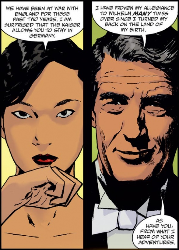
“The Sword of Hyperborea” #2 introduces readers to aristocrat Graf Ling de Gotha as she seeks out the Heliopic Brotherhood of Ra in the throes of World War I, all while intersecting with the fated blade at the heart of this series. The densely packed story highlights its whole creative team throughout, promising a mercurial journey to come, albeit with some reservations on whether the page count can meet the promise.
Written by Mike Mignola and Rob WilliamsCover by Laurence Campbell
with Dave Stewart
Illustrated by Laurence Campbell
Colored by Quinton Winter
Lettered by Clem RobinsThe Sword of Hyperborea continues its trek through history, blessing the chosen ones who wield it with incredible power. When it appears at a pivotal moment during WWI, will the blade be used for good or for evil? Spies, supernatural creatures, and secret societies collide in this fast-paced continuation of the sword’s saga!

Mark Tweedale: One of the interesting things about this series right away, was that each issue was going to focus on a different main character in a different era, and that the leads for #2–4 would be previously unknown. Still, when a see a cover as evocative as Laurence Campbell’s here, I start putting together clues and cobbling together a plot whether I mean to or not. In this particular case, given that we have a strange creature wearing a suit, my immediate assumption was that perhaps the men in suits were the Heliopic Brotherhood of Ra or one of its offshoots. The creature I thought was probably one of the members, though I thought perhaps spliced through some magical means with the subterranean creature Sir Edward Grey encountered in “Witchfinder: In the Service of Angels.”
Only fragments of that are correct, but it’s my long way of saying that I love a cover like this that goes out of its way to tease readers.
James Dowling: Yeah, if this issue did anything, it was to subvert expectations.
Mark: What were yours before you picked it up?
James: I was expecting some pretty direct “Witchfinder” crossover, actually. I had picked that the woman on the cover would probably be the next one to wield the sword, but was expecting her to take up the mantle under the eye of Edward Grey. Seems I was off by a couple of decades.
I think tonally on its own this is a really strong issue. It has a very clear voice to it that ripples through into page layouts, mood, and lighting spectacularly. But after the great, resonant layers of history and metaphor in issue #1, this story felt a lot more flat. Not only that, but there’s so much time spent setting up the theatre of play here, that I felt by the time the narrative had really gained enough momentum, the page count had run out. “The Sword of Hyperborea” #2 is, for me, a very tough nut to crack.
Mark: I can see what you mean. Before the story can properly start, it needs to reintroduce readers to the events of ‘In the Service of Angels,’ which prevents it from really hitting the ground running. We knew Howards and Gall, so in issue #1 we could get dropped right into the thick of it. Here, we need to recap another story, then introduce the era and its lead first. There’s a solid six pages of set-up before things can really begin.
That said, Graf Ling de Gotha proved to be an interesting hook for me, though perhaps part of that was informed by an interview I did with writer Rob Williams recently in which he strongly hinted we’d be seeing de Gotha again, so I was very eager to learn about this new figure in the Hellboy Universe. Plus, she’s such a curious character. On the surface of things, her life is very much the product of colonialism, but it seems her adoptive father did really care for her—she was more than just an exotic curiosity to him.
Part of that comes from contrast though, as Mr. Moore is clearly coded as someone that looks at her through more of a colonial lens. There’s a creepy panel early on emphasizing his mouth—it expresses how he sees her as something to be used or consumed for his benefit.
Continued below
James: I also really enjoyed her as a protagonist, but was sort of frustrated by the wavering commitment to actually planting her in the time period of the story. Williams does such an amazing job at capturing that Turn of the Century gentleman/aristocrat voice Mignola does so well across his stories, but when it comes to the ideology of it, the comic wavers. There are sections where de Gotha bluntly states a complete disinterest in the actual ideologies of the First World War; it feels like a missed opportunity.
Obviously the period has to be kept to the periphery in such a short story but it’s not being given any real consequence as the issue progresses. Which is frustrating seeing as it was the main point of introduction to the character. I just wish this comic could do one or two things with its full attention, rather than spreading itself thin and consistently lacking authority because of that.
Mark: I could’ve easily spent two issues with de Gotha. This was over all too soon. I can see why you’d want to explore her disinterest in the politics of her age, especially since it forms the foundation of her story arc. I feel like I got enough there from implication, but I would certainly have enjoyed more time exploring that. Given the way Moore talks to her, it was clear she’d absorbed a lot of her adoptive father’s attitudes and privilege. But she’s still an outsider too, so her mere presence in certain spaces is automatically political. She would’ve learned to be apolitical as a survival mechanism. It’s a shame we don’t get to explore that much here. With more time spent developing these aspects, I think it would’ve made her arc more resonant.
James: I think that’s a great read of the character that addresses some of the issues I had. It would be nice to have a version of this text where that could be more central though, and not something you have to speculate to get to. All those issues aside however, I loved seeing how the Heliopic Brotherhood was handled as an actor during the period. It was really interesting to see how they’re a sort of universal threat, but still tied into all the higher echelons as the bureaucrats seeking to destroy them. It’s a really quintessential interpretation of them, a society with very long-term destructive goals who achieve it through manipulating short-term vices and greed.
Mark: Just like in the first issue, we’ve got some strong visual storytelling here, with the painting of Larzod connecting this branch of the Heliopic Brotherhood of Ra with the one that goes on to become the Knights of the Silver Star that we see in “B.P.R.D.: Hell on Earth—The Abyssal Plain.” (Also, I love that once again Zara-Hem makes a cameo appearance.)

As it is, this issue is way more dialogue-heavy than the first, but there’s still a massive portion of information just coming through the visuals, so it doesn’t feel dialogue-heavy in a bad way, but rather appropriately dialogue-heavy. It especially serves a character like Moore well, when his dialogue full of niceties is played against visuals that tell us something otherwise.
James: The biggest strength of this issue was taking the same very deliberate style of imagery from last issue and applying it to a different tone and genre. It achieves the same heavy feeling for each panel and really challenges the reader to try and read every emotion on display.
I also thought Campbell did a great job of rendering his pages in a very angular and matter-of-fact layout that matched the voice Williams established so well. It really feels like “Witchfinder” by way of Laurence Campbell.
Mark: Of course, it helps that Campbell is such an attentive artist when it comes to capturing moments previously portrayed by other artists. It’s not just rigidly copying a panel or posing of a character—he’s very attentive to the mood, and breathing that life into the moment. You can really see this in the Sir Edward flashbacks, but where I felt it the most was when the Hyperborean warrior appeared.
Continued below
Right: “The Sword of Hyperborea” #2
James: It’s such a powerful moment with such a stark visual contrast. They’re all throughout this book and it shows just how good it can be. If there was a way to cut out the chaff here, you’d be left with an incredibly straight-forward, intentional and memorable narrative. . . which is exactly what issue #1 managed to be!

The conclusion was definitely the best part of this issue, allowing the color to move more dynamically, surrealism to take hold, and for the issue to utilise all the different motifs and images it had cultivated in more and more surprising ways.
I also think it was de Gotha’s Volskak transformation that proved to me why this issue proved itself to be part of the wider “Sword of Hyperborea” story. It’s a story about isolated people who are changed irrevocably in ways that leave them strung between two, irreconcilable worlds. It’s great because it puts isolation at the forefront of monster horror, like the best classics do. I just wish we could start at that point and see where it goes next.
Mark: I think this is a point where we disagree. For me, what gave power to this sequence wasn’t just the things that you mentioned, but also the way it served as a metaphor for de Gotha’s situation as established in the first half of the issue. She is an outsider that has to disguise herself and attempt to assimilate into a privileged class. . . only for them to reveal they have no intention of respecting her humanity, seeing her only as something to exploit through her suffering. Those thematic echoes were a really nice touch, and I don’t think they would’ve hit as hard if we had got to them sooner. I feel like we needed as much time as we did establishing this stuff in the first half for it to resonate in the second half.
But I do agree with you in that I want to see where de Gotha goes next. We get this point of change where she decides to take action and then the issue is over. I wanted to see more time spent with her in the aftermath of that choice.
James: You’re right that we definitely get to see a satisfying formation and then deconstruction across both halves of this issue. I think I just wanted this whole story’s space to match its scope.
Mark: Yeah, it’s very ambitious in what it attempts to achieve in so few pages.
James: Williams and Campbell have proved they’re a formidable enough creative team to manage a far bigger version of this story. If we could have had a 2–3 issue arc for each protagonist here, so much more could have been handled in a satisfying manner. Which is a compliment in itself, so many ongoing comics don’t achieve nearly enough for the time they take to achieve it; it’s rare to find a miniseries that actively asks for more space than it gets.
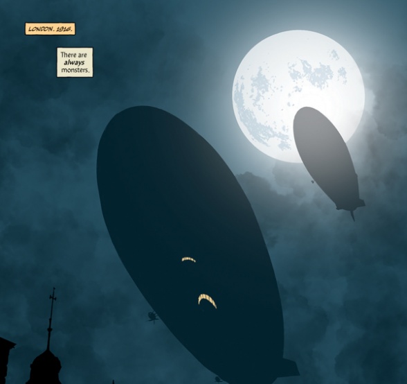
Mark: It translates to the issue having a grand scale though. There’s a visual I really loved, with the looming zeppelins. They are a product of the war and they hang over everything. . . and de Gotha ignores them until the moment of change. It’s repeated imagery throughout the issue, and it was a nice visual to have her bring down a zeppelin as a way to express her change. Plus, I loved Quinton Winter’s colors on the zeppelins in the night. The atmosphere is palpable.
James: Winters really killed it this issue. I loved the heavy amber coloring he uses for de Gotha’s transformation.
Mark: Before we wrap up, I wanted to address a something about “The Sword of Hyperborea” #1. When the wolf mentioned Chicago, I had assumed that Gall Dennar had travelled to Chicago for the final scene and that when the sword fell into the Hollow Earth, it would’ve been found by some other figure so that it would eventually end up in the Sahara. That turns out not to have been the case. Instead, Gall himself travelled from the continent of North America to what would one day be the Sahara. So the line from the wolf about Chicago wasn’t so much about him travelling to Chicago, but rather taking the sword to the location it needs to be so that one day it will end up in Chicago.
Continued belowIn this issue, when we have that image of the wolf once again saying “Chicago,” there’s that sense that the wolf’s spirit is guiding the sword’s journey. Or at least that’s my read on it. Does that seem right to you, James?
James: Yeah, I think that the surrealism hammered in throughout this book would be a waste if the spirit here was entirely directing the people who wield it. It’s pretty clearly established that this is working on a long timescale, and it’s going to wind in unexpected directions before we get the sword to Chicago. I’m just excited to see some of the repetitions between these two issues come into focus as we continue. It’s still not clear where this is winding up, and I’m excited for the surprise.
Mark: I discarded a bunch of theories as soon as I got that extra information. And I think that shows just how engaging this title is.
I think we should probably get to grading. For me, this was an 8. It doesn’t soar as high as the first issue, in part because it has so much to establish before it can get to its central character. Writing and art are all top notch (Campbell never disappoints), but twenty-four pages wasn’t quite enough time to spend with Graf Ling de Gotha for her arc to hit as hard as it could. I don’t consider that a mark against the issue though, as it leaves me eager to see her again.
James: I’d say this was a 7 for me, I had a lot of issues with how the story unfolded here, but it’s still an incredible visual arc with a great atmosphere throughout. The fact that there was too much crammed into this issue was frustrating, but it does nothing to disincentivize me from reading any more, in fact I’m more excited to see what gets paid off in the future.
Final Verdict: 7.5 – Our biggest criticism is that we wanted to spend more time with the central character introduced in “The Sword of Hyperborea” #2. Graf Ling de Gotha has a complex relationship with the culture she’s embedded in, but the issue only has time to gesture at this aspect. Ultimately though, this is about the sword.


