
![]()
D’Israeli and Michelle Madsen close out ‘The Gates of Heaven’ with the most visually stunning issue yet.
Written by Mike Mignola and Chris RobersonCover by D’Israeli
Illustrated by D’Israeli
Colored by Michelle Madsen
Lettered by Clem RobinsMagic and science collide above London! The Witchfinder and his allies make a final stand when terror descends from the skies, and their nightmarish foe is finally revealed!

Mark Tweedale: Forewarning: there are some spoilers in this review. We’re getting a bit of an outsider point of view on the series this time. I’ve asked Greg Matiasevich to join me because he’s a big fan of D’Israeli’s work, but isn’t really familiar with “Witchfinder.” Before we get to the review, Greg, can you give us a bit of a background on your “Witchfinder” knowledge?
Greg Matiasevich: Thanks for letting me join the festivities! ‘The Gates of Heaven’ is my first encounter with Edward Grey and his setting. I kept getting him confused with Baltimore, to the point where hearing you mention Grey conjured up a mental Mignola image of a dude with a harpoon! But even though ‘Gates’ is the fifth “Witchfinder” miniseries, I found it a surprisingly effective jumping-on point. Bringing the Foundry and the British Paranormal Society into Grey’s world lets the reader learn about them as he learns about them (and vice versa). So while I didn’t get the thrill of seeing the series’ normal purview expand, which seemed to be a takeaway for longtime readers, I also didn’t feel I was always a step behind. And, honestly, that was a bit of a concern when I agreed to this review. Does that make sense?
Mark: Yeah. And on the flipside, ‘Gates’ is my first exposure to D’Israeli’s work. Listening to you and Mike Romeo talk about him on Robots From Tomorrow, there’s clearly a lot of reverence there. I thought you might have some insights about how he crafts a story, and what he’s doing new in “Witchfinder” that he may not have done before.
For me, the element that jumps out when looking at this miniseries as a whole is the way his art develops greater complexity alongside the plot. Just looking at the covers this miniseries, there’s a clear evolution.
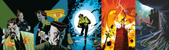
Issue #1 looks rather plain when compared to #5. Early on, his panels are full of expanses of black or solid colors, but by the end we’re seeing more gradients, more contrast between foreground and background elements, and hatching appears in place of solid colors. As the story gets bigger, so does the range of techniques D’Israeli employs.
Greg: That range is something you’ll find throughout his career, and one of the reasons I keep coming back to his work again and again. And just to come at his work here from a different angle—one of the reasons D’Israeli is such a good fit for this story in particular is his world-building. Look no further than his work on “Scarlet Traces” to see his ability to not only create new designs from whole cloth (in that case, the invading Martians and their society), but merge disparate themes seamlessly and then extrapolate how that union would change in appearance over time. There are few cartoonists who can sell a story setting and environment like D’Israeli. And when you give him a property like “Sir Edward Grey,” whose setting seems particularly tailor-made for him, then you really get something special.
And I can’t imagine Chris Roberson not jumping for joy landing D’Israeli on ‘The Gates of Heaven.’ Introducing the Foundry could have been jarring to the established look and feel of the series (I’m assuming), but what comics writer WOULDN’T want their steampunk helicarrier handled like this:

Mark: He certainly took what was already there and took it to a whole other level. I mean, one of the Foundry’s airships was introduced all the way back in “Abe Sapien: The Drowning” (2008), but D’Israeli’s taken that design and run with it.

Greg: And just to get back to the colors briefly, D’Israeli is usually a one-stop shop when it comes to his art output, but ‘The Gates of Heaven’ sees him working with established Mignolaverse colorist Michelle Madsen, and I gotta say I really like their work here. I’d be curious to find out how they handled the collaboration. On the one hand, D’Israeli seems to build his lineart as much as a scaffolding for his color choices in color holds than anything else, so handing that much of the art equation over to another person would seem less than ideal. But on the other hand, Madsen is a great colorist in general and has home-field advantage for this work in particular, so I wouldn’t be surprised if he in some ways welcomed her input more than usual.
Mark: Color continuity is a big deal in the Hellboy Universe. Dave Stewart’s been building the universe’s color language for over two decades now and it shows. So when Michelle Madsen comes onto a book, she has to borrow Stewart’s color language, which I imagine is quite a difficult task. It’d be so easy to start second guessing yourself.
But in this issue, Madsen goes to a whole other place. This doesn’t look like any other Mignola book, which would normally be a problem, but it totally works here. D’Israeli’s style gives her the creative license to go in a wildly different direction and make this miniseries something special. Again, I wonder what came first, because the line between D’Israeli’s art and Madsen’s colors is so hard to pinpoint. I can’t help but think that she became involved very early on, perhaps even discussing the colors for this issue back at the thumbnail stage.
Greg: I’d venture to guess it came up even before working on this actual issue. Sinclair’s device gives off a bright blue/white tone when in use, and we see it briefly a few times leading up to issue #5. That kind of color signature not only makes this otherworldly element pop that much more, but also means the other colors should stay as far away from that end of the spectrum as possible to avoid lessening the impact. Madsen uses very few blues before issue 4 that aren’t tied to the machine. But once the switch flips, everything shifts from some shade of brown/red/yellow/earth tone over to the blue/green end of things.
And it not only looks awesome because she avoids a one-size-fits-all application for a much more nuanced approach, but it does two other things to ultimately help the book. First, it avoids the easy, or maybe just expected, choice of red for danger. Second, and more importantly, it helps sell the apocalyptic feel Roberson’s script depends on by denying the reader any connection to the ‘normal’ world. This coloring says that world is gone and not coming back, unless Grey and company succeed. Good stuff!
Mark: Indeed. The ending of ‘The Gates of Heaven’ reminds me a little of “B.P.R.D.: The Dead.” Sinclair seems to have tapped into a power similar to the one Dr. Eiss used.
I enjoyed seeing the characters all working together at the end here. Honora especially seems to revel in the opportunity. But Sir Edward is certainly hard to impress. At the end of the story, after everything they’ve been through, he only reluctantly admits Honora and Bruttenholm were useful.
‘The Gates of Heaven’ is clearly a series building arc—Roberson’s introduced so much that he intends to play with in the future. On other titles the series building has occasionally been to the detriment of the story he’s telling, derailing the focus or losing the characters, but here he gets the balance right. The series building works with the story to elevate it overall. I finished this arc eager for the next.
Greg: I’m a little out of practice in giving these things numerical scores, but I think I’ll go with an 8 on this one. Like I said before, ‘The Gates of Heaven’ is a surprisingly good jump-on arc for readers new to Edward Grey and company, and D’Israeli and Madsen really make it stand out from everything else on the shelves.
Mark: I’m giving this an 8 too. I had a blast with ‘The Gates of Heaven.’ I think this is Madsen’s best work in the Hellboy Universe to date, and especially in this last issue she seems to be having so much fun.
Final verdict: 8 – A visually impressive issue that sets up a lot to play with for future “Witchfinder” stories.


