8, going on 9, years ago, DC did something radical. No, not in the slang 90s way but in the major, seismic shift sort of way. They took their entire line of comics, cancelled every single one of them, and rebooted their entire universe. Not only did they reboot it, they reset it, making a pseudo-Ultimate Universe where heroes were near the start of their careers, without decades of story baggage. The Wildstorm and Vertigo universes were folded back into the main DCU and an overarching threat was teased during the final pages of “Flashpoint,” the event that birthed the New 52. It was a promise of more interconnected titles, a greater coherence within the universe and 52(!) titles to start, with more on the way in subsequent waves.
Gone were the JSA. Gone were all but one of the Robins (not really). Teams that once had hundreds of members and rotating casts were reduced to their core membership. The Teen Titans existed, but didn’t. It was a weird time.
It was a bold move and while, in theory, it could have worked, the practicalities and execution fell flat on its face and gave us nearly a decade of material to shake our collective heads at and ask: what the hell happened?
Well, that’s not what we’re here for! To celebrate the end of the decade, we here at Multiversity thought it’d be a neat idea to go back to the start of the New 52 with fresh eyes to see if things were better, if things were worse, and how well these books have stood the test of time. Over the next two weeks, we’ll be covering every single title of Wave 1 of the New 52, divided up by the “imprints” they spearheaded, an idea I, Elias, genuinely wish they had kept.
These titles were meant to be an entry into a simplified universe — let’s see if these #1s accomplished that goal.
Last week, we covered ‘The Edge,’ ‘Young Justice,’ the ‘Green Lantern’ quartet, ‘The Dark’ and the ‘Superman’ quartet. Today, for the penultimate imprint, we bring you the syndicate that fights crime, or as it’s known here on our Earth, the ‘Justice League.’

Aquaman #1
Written by Geoff Johns
Penciled by Ivan Reis
Inked by Joe Prado
Colored by Rod Reis
Lettered by Nick J. Napolitano
Reviewed by Jake Hill
“You can’t get the fish and chips,” a diner patron with a patchy beard whines, “because you talk to fish.” He’s addressing a fully costumed Arthur Curry, King of the Seven Seas, the Dweller in the Depths, and Protector of the Deep. In other words: Aquaman. “I don’t talk to fish,” Aquaman replies. His frown is sharp enough to cut seaglass and his eyes glower suspiciously at this know-it-all in the diner. He’s pissed. But here’s the thing- everyone knows Aquaman can talk to fish. That’s literally one of his main powers.
I know, I know. In the proceeding pages of Geoff Johns and Ivan Reis’ “Aquaman” #1, Arthur goes on to explain. He can send a psychic signal out that can be understood by sea life, but he doesn’t talk to them. He’s not an idiot. This confrontation in not the only thing that happens in “Aquaman” #1, but it is the most important scene. It’s the mission statement of the book, in the form of a question. What kind of embarrassing idiot loser child wants to read about the fish-whisperer?
The thing is, we now have an answer to that question. On the other end of the decade, we got an Aquaman movie from James Wan. It made a billion dollars at the box office. It had Willem Dafoe and Nicole Kidman in it. The movie was absolutely wild, and is destined to be a classic among stoners everywhere. And that’s radical. Because Aquaman doesn’t have to be this humorless, put-upon narc. He can be a chill dude with a big heart. People love him.
But in “Aquaman” #1, people do not love him. Cops and criminals laugh at him alike. Civilians heckle him, and won’t even let him finish a meal in peace. “How’s it feel to be a laughingstock?” The diner patron asks him. “How’s it feel to be nobody’s favorite super-hero?” Aquaman grabs his (five-pronged) trident and storms off with an intense frown. It’s not a cool look. Arthur looks petulant, childish, and weak. He’s not an aspirational figure, he’s “relatable” and flawed. He’s no fun at all.
Continued belowThat isn’t to say “Aquaman” #1 is a disaster of a first issue. It sort of explains Aquaman’s superpowers (he’s strong and bullet resistant) and his backstory (the whole tale of his lighthouse keep dad and his mermaid mom). Mera gets introduced, though she’s mostly just a girlfriend prop. The monsters of the Trench make their first appearance, and they are pretty cool. But Aquaman himself is a try-hard loser, so determined to make you like him, he forgets to do anything likable. Within the next ten years writers would figure out what to do with Aquaman but until that time, “Aquaman” #1 of the New 52 is not the debut issue fans were looking for.
Final Verdict: 5.0 – Instead of talking to fish, Arthur Curry fails to have a normal interaction with anyone.

Captain Atom #1
Written by J.T. Krul
Illustrated by Freddie E. Williams II
Colored by Jose Villarubbia
Lettered by Rob Leigh
Reviewed by Brian Salvatore
It’s hard to remember, but in 2011, DC was still reluctant to touch “Watchmen.” So, for the New 52, they did the next best thing: they took the Charlton character that was a partial inspiration for Dr. Manhattan, and made him even more Dr. Manhattan-ish. J.T. Krul doesn’t completely zap the humanity out of Captain Atom, but he renders him far closer to Jon Osterman, both in tone and literal colorization, than we ever saw Nathaniel Adam in the past. The effect is more obvious and obnoxious looking back at it from a distance, even though it was relatively crass in its intellectual theft when it first came out.
Freddie E. Williams II does a really admirable job balancing two contrasting tones here: the smooth sci-fi of Captain Atom and the sketchy ugliness of Dr. Megala. The two characters don’t look drawn by the same artist, and yet, Williams is able to pass between the two with relatively little cognitive dissonance. Steve Buccellato’s colors really help this issue, visually, as well, as Dr. Manhattan Captain Atom’s pastel coloring really pops off the page, especially when paired with the deep red of magma or the electricity that is bursting forth from his chest.
But ultimately, this book feels like such a craven attempt to cash in on a Dr. Manhattan clone that by the time Atom is dispatched to – you guessed it! – New York City, you can collectively hear the groaning from around the world when folks first read that piece of dialogue. For a character with lots of both DC and Charlton roots, including supporting characters and team affiliations, Atom is treated very much like an leper, placed in a corner of the DCU where he doesn’t both any other books, even though he’s one of the most powerful heroes on the planet.
Final Verdict: 5.3 – A total dud of a nuclear warhead.

DC Universe Presents #1
Written by Paul Jenkins
Illustrated by Bernard Chang
Colored by Blond
Lettered by Dave Sharpe
Reviewed by Elias Rosner
I knew what I was getting into when I picked up most of these New 52 comics. I knew they’d range from hidden gems to the bottom of the barrel. “DC Universe Presents” #1 surprised me because I assumed it’d be one of the former from the cover and idea and, in a way, it is. Deadman being a flagship character to head up a new character focused anthology is great! His is a story with endless possibilities, thanks to Boston Brand’s biblical quest for redemption and ghost powers, and Jenkins capitalizes on that. . .it’s just that it’s handled in such a ham fisted way.
Boston Brand will not shut up. Every page is littered with his thoughts, his dialog, his narrations, it’s endless and offers little in the way of substance. He’s brooding and dour and serious, which feels antithetical to Boston’s brand of gallows humor and pomposity. And I know what you’ll say, “This is a reboot, they can change Boston’s personality.” Yes but if they do, they gotta do it in a comic that makes you want to come back, or at least has a greater point than, he’s dead, he’s got a job to do, he’s living pennacne by helping the people he’s possessing, and he’s kind of a dick about it all.
Continued belowIt’s not enjoyable and it doesn’t really make you think, so all that’s left are a few good ideas executed in a OK manner. Chang’s art and Blond’s colors are fine, supporting the darker story without sacrificing clarity. In fact, other than every character having a face like they just heard some mildly displeasing music, the art is where the comic shines and gets at the existential crisis that Boston must be going on. It’s reserved, which is a detriment to action but a boon to the more thoughtful atmosphere it’s trying to craft, but not afraid to present the harshness of reality.
While I appreciate the attempt to make Deadman a cerebral character, this was not the story or the way to do it. There is both too much and too little and by the end, I’m left wondering why I should care if in a few issues he’ll be gone. O’Neil and Cowyn’s “The Question” did this kind of tone far better and I think a few notes could have been pulled from there.
Final Verdict: 5.5 – An interesting reintroduction squandered by a lackluster execution.

The Flash #1
Written by Francis Manapul and Brian Buccellato
Illustrated by Francis Manapul
Colored by Brian Buccellato
Lettered by Sal Cipriano
Reviewed by Joe Skonce
DC comics has always been something of a blind spot in my comic book knowledge. In fact, my entry point to DC (outside of the Batman films) was the “Arrowverse” on the CW. Those shows were able to strike the right balance and giving heroes fun supporting casts. For whatever reason, though, it didn’t translate to me reading any of the books. Of all the shows, The Flash made me want to learn more about the character. Flash was kind and earnest, had an interesting set of friends, and a good cast of villains. In 2011, DC relaunched Flash in the New 52 with “The Flash” #1. The issue functions in a similar way to the CW pilot but is also improved in some ways.
One of the major differences in “The Flash” #1 is that Barry Allen is already established as The Flash. There is something cool about seeing an already established Flash, one where he’s confident in the suit. Where the issue works well, however, is in the villain. Barry stops an attack on a science lab and in the process, one of the attackers dies. The reveal is that it is one of Barry’s childhood friends and that he potentially died by the Flash’s hand. The eventual twist is that Barry’s friend has multiple versions of himself all trying to kill him. But where the issue works the best is in the characterization of Barry. His dialogue is just, fun.
The art of “The Flash” #1 is fine, although the character designs are a little reliant on chiseled jawlines for men and round faces for women. But where Francis Manapul works well is in drawing the action of the Flash. While the rest of the panels aren’t exactly black and white, the colors are certainly muted. This allows the Flash to really stand out in his red and yellow suit. One page in particular really stands out and forces your eye to follow the color (and the action) of the Flash. The art really helped to showcase the power of the Flash by showing how the world looks to a person moving that fast. Overall it was a fine first issue, one that I intend to continue reading.
Final Verdict: 7.4 “The Flash” #1 does a good job of establishing the ton of Barry’s character, kind, earnest, and a little dorky. While the art outside of the suit is a bit generic, when Flash is in action, it gets quite impressive.

The Fury of Firestorm: The Nuclear Men #1
Plotted by Gail Simone and Ethan Van Sciver
Scripted by Gail Simone
Illustrated by Yildiray Cinar
Colored by Steve Buccellato
Lettered by Travis Lanham
Reviewed by Brian Salvatore
There is no more comic that screams 2011 than “The Fury of Firestorm: The Nuclear Men” #1: the Higgs Boson, Large Hadron Collider, the novel idea of a staunch liberal and an extreme conservative co-plotting a comic about a black teenager and a white teenager literally coming together to make a monster. This is the type of book is already as dated as parachute pants, only it was never as fun.
Continued belowSo many of the New 52 first issues wait until the final five or so pages to really get to the point, and this issue is certainly guilty of that. The first 15 pages are about lunkhead Ronnie and in-his-head Jason, and how they are comically positioned as opposites. Jason lives with his dad, Ronnie his mom. Ronnie looks like an idiot jock, but is more perceptive than he looks; Jason is a ‘nerd’ newspaper writer who has the athletic attributes to play if he so desired. I’m sure some found this clever, but it reads cloying and simplistic.
Yildiray Conan falls into all the New 52 traps: everyone is either grimacing or screaming, hyperviolence reigns supreme, and muscles are bulging like Wrestlemania VI. This is, perhaps, the darkest book in the whole line, with multiple teens getting shot in the head, one after watching his dad get his throat slit because people think, incorrectly they admit, that the kid was a terrorist.
There are some good kernels of ideas found here, but every single one is handled in the worst conceivable way. Gail Simone’s script is so far from the excellent work she would do both before and after this run. There is moralizing, horseshit both-sides rhetoric, and some really dreadful ‘conversations’ about tough issues. This book reeks of an attempt to find common ground on politics, which seemed possible, if not a little contrived in 2011, but to find common ground by killing innocent Muslims and having white kids blame their parents for not having black friends isn’t effective in any sense.
Final Verdict: 3.0 – A giant cringe that lasts 20 pages.
Green Arrow #1
Written by J.T. Krul
Penciled by Dan Jurgens
Inked by George Pérez
Colored by Dave Baron
Lettered by Rob Leigh
Reviewed by Brian Salvatore
There is something so weird about an all-star pairing like Dan Jurgens on pencils and George Pérez on inks handling a Green Arrow title written by J.T. Krul. Though Oliver Queen has had important/interesting runs before and after this, this period of “Green Arrow” is marketed by a blandness that is offensive in its absolute refusal to be anything at all. Krul took his prior run, which directly preceded this one, where Oliver lived in the actual forest like Robin Hood, and somehow made that look like the most creative writing of the decade compared to what happens here.
This issue reinforces all the stereotypes about Green Arrow all at once, and makes him look ineffectual and obnoxious at every turn. He’s not Batman, but he’s a billionaire who neglects his company and has people at an undisclosed location feeding him information. He’s a ‘genius’ with tech, but has to hire someone else to make his arrows for him. Here, even this classically left-leaning politics are dulled down to him simply not being a total monster capitalist.
Jurgens and Pérez are given very little to do here that is fun or worthwhile for their resumes, and so the work looks a lot like the New 52 house style: leaning into Jurgens’s 90s-wheelhouse, but with derpier haircuts and even less functional costumes. It is hard to see what Krul was trying to set up here, because just about everything that he attempts can be shrugged off, due to it being literally nothing. There is nothing to see here whatsoever.
Final Verdict: 4.8 – The issue practically disintegrates in your hands.

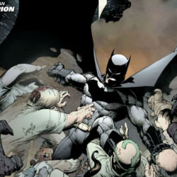
Justice League #1
Written by Geoff Johns
Pencilled by Jim Lee
Inked by Scott Williams
Colored by Alex Sinclair
Lettered by Patrick Brosseau
Reviewed by Kevin Gregory
In this issue Batman gets the shit kicked out of him, Green Lantern gets the shit kicked out of him, Superman’s a cocky little shit, and Vic Stone plays football. Welcome to the issue that started it all. Welcome to The New 52.
Ooof. Folks, I gotta say, this issue is bad. If much of The New 52 was new style and old substance then this issue takes the cake. Not a whole lot happens in the book that was the first launch title and one of two books released the week it came out (this and the end of “Flashpoint.”) This issue acts as the beginning of the extended flashback that is this first arc. Wanna know how the League got together in this iteration? You’ll know after six issues.
Continued below“Justice League” kicks off with Batman trying to take down a single Parademon in Gotham in a much too long sequence before cutting to Vic’s game in an odd and seemingly unrelated move. The only hint we’re given about Cyborg is on the now iconic cover of this first issue. Otherwise you wouldn’t know that was the future Leaguer. And, speaking of that cover, only Batman, Green Lantern, and Superman appear in costume this issue. None of the rest of the seven. I love that cover, but I forgot how little happens in the issue it wears.
Batman and Green Lantern go back and forth a little, there’s fighting and posturing before heading to see Superman in Metropolis who takes them both out very quickly in the most arrogant, young fashion. While we get more Superman as this arc goes on, what he does here is played for shock value. How Green Lantern and Batman act is played as ignorance, but they just all come across as frat boy equivalents of themselves. The rest of the League is really missing in this issue. While Johns clearly really wanted to tell this origin story, there is no clear plan delineated from this issue for what will come after.
Lee, Williams, and Sinclair do their thing, and if you’re a Jim Lee fan, seeing his costume redesigns for the first time in the wild is probably really stunning. But we’re in an era 8 years later where those designs have been rejected, and seeing the extra lines, shapes, and rigidity does much less than it did in September 2011. Beyond that, this issue contains some of the best Jim Lee art of the modern era, with dynamic expressions (some nut faces), and fun action. While you may be turned off by this new Supes, Lee sells his confidence.
Final Verdict: 4.0 – Johns and Lee kick off the new era with a testosterone-filled whimper.

Justice League International #1
Written by Dan Jurgens
Pencilled by Aaron Lopresti
Inked by Matt Ryan
Colored by Hi-Fi
Lettered by Travis Lanham
Reviewed by Kate Kosturski
If the intent of ‘New 52’ is to reboot DC continuity from scratch to get everyone in at the same ground level, this title is an example of taking that concept to the extreme.
Never have I seen a first issue spend so much time on building the team, that the first mission said team is sent out on – – a search and rescue/recovery for some UN researchers lost in the jungle – – gets lost in the script. Exposition and world-building in a first issue is necessary, and so is characterization, both of which are on full view here. But, one has to find a balance between building that world and providing something in that world that gets readers back for more. And the limp jokes (Booster Gold wrings a gag about adult diapers drier than the Arizona desert) and in-team fighting that characterizes this opening issue doesn’t provide any of that hook. This is also a very large team; many of their introductions are blink and you’ll miss it moments, which does not give me confidence that future issues give equal character development.
The existence of both “Justice League” and “Justice League International” begs the question: why both? We get this answer right on the first page: the main team does not answer to any governing body, and the world’s leaders want superheroes they can control. Here is a tension that would have made for an intriguing side story, but one I don’t feel would have been done properly, given the weaknesses in script.
One hopes (or perhaps expects) that when script fails to deliver, artwork can pick up the slack to provide some value. That art provides some redeeming moments, but nothing to praise. Credit to Aaron Lopresti for drawing the women of JLI fully clothed and reasonably proportioned. And that early 2000s trend of hyper-detail and contouring is on full display in our muscular men. But outside of one large panel and a splash page near the end that are rich in that hyper-detail (perhaps even too rich) there isn’t much else to distinguish this art as groundbreaking, revolutionary, or unique – – nothing that has you wanting more from this world.
Continued belowA first issue of this magnitude should not be this average. And this is about as average as you can get.
Final Verdict: 4.4 – There’s too much of the good things that a series debut needs here, and that holds it back.

Mister Terrific #1
Written by Eric Wallace
Penciled by Gianluca Gugliotta
Inked by Wayne Faucher
Colored by Mike Atiyeh
Lettered by Dave Sharpe
Reviewed by Nicholas Palmieri
Before reading this issue, I knew exactly two things about it: one, it was an attempt to add some diversity to the New 52 lineup, and two, it was very bad. After reading it, I understand exactly two things: one, that it doesn’t know what to do with its own diversity, and two, why it is very, very bad.
There was no Mister Terrific series before this, so there was no precedent for what this series could do, and I think that very much comes through in the issue. With nothing to either replicate or consciously try and reinvent, Wallace was forced to create his own world and tone from scratch. It’s too bad, then, that Wallace had no idea how to do that. He throws so many ideas out that none of them mean anything, his characters all speak in the same vaguely quippy voice, and the story relies on a series of outdated cliches. The cliches include, but are not limited to, a love interest who dies in her first panel while announcing that she was pregnant.
Also, as mentioned above, Wallace largely fails to make use of the fact that this was a black hero headlining his own book. Race is brought up a few times, but Wallace never makes a point with it, even though it seems like he wants to.
As with so many New 52 books, Gugliotta’s art is low-grade DC house style, doing exactly what the script asks for and little else. It has very little personality of its own, and that’s really all I can say about it.
Mister Terrific is a cool character, and I see why he was chosen for a solo book. This is just… Not the way to do it.
Final Verdict: 2.8 – It’s as bad as you’ve heard.

The Savage Hawkman #1
Written by Tony S. Daniel
Illustrated by Philip Tan
Colored by Sunny Gho
Lettered by Travis Lanham
Reviewed by Brian Salvatore
One of the hardest parts of looking back on the New 52 is the realization of just how fucking dark everything was, and for no real reason. “The Savage Hawkman” does one thing, really, from a plot perspective, and that is letting the Nth Metal fuse with Carter’s physiology. It’s maybe a small change, but it’s a significant one, both in terms of how it can color future stories, and also how it diversifies Hawkman from other heroes. It’s a cool idea, and is handled reasonably well.
The problem is that everything surrounding that idea is cast as bleakly as possible. Carter isn’t just a good archaeologist, he’s being evicted, is on the verge of being fired, and is haunted by his past. They can’t just find an alien vessel, it has to kill two scientists in the blink of an eye. It is wild that noted artist Tony Daniel was scripting two New 52 series, and this very much reads like a script from an artist turned writer. There’s very little subtlety or nuance here, and ‘what would make good visuals?’ seems to drive every plot decision. [Note: that’s not to say that writers shouldn’t be writing with visuals in mind; of course they should. But there’s a difference between trying to write good scenes that look cool versus trying to write scenes that look cool but have no real substance.]
This is, to steal from the DC3cast, the ‘good’ Philip Tap, whose work is distinct and unique. He manages to do some truly interesting things on the page, and balances the sequential storytelling with a distinctive and stylized approach. There is nothing in this issue that doesn’t look gorgeous, and Tan manages to paste over a lot of the problems in the script. But ultiamtely, this is another slight issue in a line that attempted to re-brand, or at least fortify the brands of their biggest heroes. Instead of digging for what makes Carter tick, Daniel instead decides to just write him growing armor.
Continued belowFinal Verdict: 5.8 – Looks great, but not very substantial.

Wonder Woman #1
Written by Brian Azzarello
Illustrated by Cliff Chiang
Colored by Matthew Wilson
Lettered by Jared K. Fletcher
Reviewed by James Dowling
“Wonder Woman” #1 was an interesting addition to the New 52 line-up, it pushed new boundaries for the character while confining itself self-destructively behind others.
One of my favorite parts of Azzarello and Chiang’s story is how it pulls in a whole new tone for Wonder Woman. It expands from simple hero vs villain storytelling into layered familial politics as Wonder Woman goes up against a pantheon of independently motivated and flawed figures. Apollo and Hera’s gradual and unclear involvement in the first issue makes the book feel especially cryptic and meticulously planned.
Cliff Chiang’s art carries emotion and shines when paired with colorist Matthew Wilson. He manages to make each hero feel charming and each villain feel vicious before they even speak a word. Diana Prince is written as a stoically gruff character in the issue; making it one of the few times she feels closer in tone to Batman than Superman. Zola is an especially fun point of view character and it’s nice to see a pregnant woman who isn’t treated as a faultless symbol of motherhood.
However, the main criticism of the series is one that’s plagued Wonder Woman for the years she’s been rendered by male-dominated creative teams, she has been constantly treated as a sex symbol. In her very first scene for the series, she’s lying naked in bed and has to be dressed before the book even labels her as a hero. This stretches to the other female characters in the story. Apollo’s three prophets are treated as shallow women who fawn over him and Zola spends the entire issue in her underwear. All the male gods are given fascinating and abstract character designs while Hera’s two main physical traits are her toplessness and convenient shadowing.
You could argue that Wonder Woman was originally intended to carry sexual undertones, but so much of Azzarello and Chiang’s run has centered around Wonder Woman as a figure of emancipation and self sufficiency, yet she’s still rendered in this leering eye. It’s frustrating because it makes the comic feel shallow when every other element is deep and thought provoking. I mean, it’s a Wonder Woman comic that doesn’t even pass the Bechdel test.
Final Verdict: 7.5. Criticisms aside, the issue is still worth the cover price. After all, you get two centaurs in the very first issue and that’s a guarantee that no other New 52 book can give you.