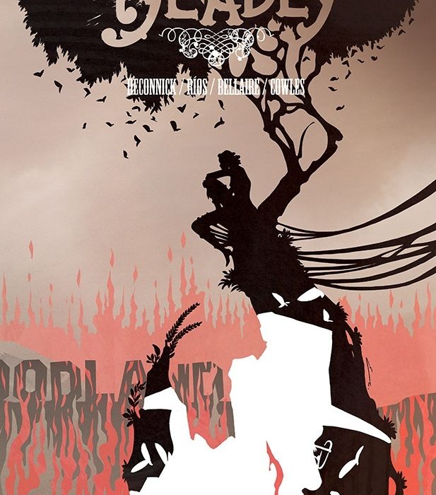
“Pretty Deadly” has always been one of those superstar Image comics of the last decade that can turn heads upon release, up there with the likes of “Saga” and “The Wicked + The Divine”. Kelly Sue DeConnick, Emma Rios, Jordie Bellaire, and Clayton Cowles have been an infrequent yet undisputable powerhouse with this book, and with the latest release, “The Rat”, it’s easy to remember why this book left such an impression.

Written by Kelly Sue DeConnick
Illustrated by Emma Rios
Colored by Jordie Bellaire
Lettered by Clayton CowlesKELLY SUE DeCONNICK (BITCH PLANET, Captain Marvel) and EMMA RÍOS (MIRROR, I.D.) begin a new chapter in the dark and deadly golden era of Hollywood.
The narrative of “Pretty Deadly” over the years has always dealt with different eras of history, with the Reapers of the Immortal Garden interacting with key figures within them. This time around, we have a 1930’s era of Los Angeles, which infuses the tone of the book with significant noir stylings. The opening sequence told by the Bunny and the Butterfly is a great metaphor of what’s to come, signified in animal form as a Bluejay mourns a fallen friend and we’re told about the unique cry of grief. After the opening sequence ends, we move from flourishing fantasy narration to the cold, stripped-back dialogue of Frank, a local ‘conjure-man’ who conducts seances to talk to the dead. DeConnick is careful not to go heavy on the dialogue, only delivering a couple of lines a page to make it punchy, but making sure the tone of it is dripping with cynicism to feel like noir.
Our protagonist Frank is an interesting case himself. His most prominent dilemma is a unique one, being someone who engages in a performative act of talking to the dead, yet can’t talk to them when it matters to him the most. We see this reflected through his narration, as he constantly talks about conversations he had with Clara before her death, like visiting her in her boarding house and talking about the nature of the town. DeConnick hits us hard with the tragedy of his situation most after looking at Clara’s film reel when he takes out his conjurer’s bell. The narrative takes a sudden and sharp crescendo at this point, as Frank remarks in his narration and outward dialogue, that he’s listening for the truth, as he rings his bell, giving us a moment of highly palpable emotion as we feel for Frank in his mourning for Clara. The issue cuts off well as we see Frank talking to the Reaper of Vengeance in a direct sharp manner establishing the purpose of the story as a whole and giving us an example of Frank’s now-hardy resolve. Interestingly, I’m reminded a lot of “Sandman” at this moment, with an otherworldly deity that represents an aspect of humanity getting involved in the affairs of human life, which makes me even more invested in the story.
Emma Rios is one of the big stars of the show here, bringing a style that invokes both the swirling fantasy of the first two volumes and infusing it with the twisted shadows of noir-era Hollywood. The best example of this stylistic fusion is in the opening pages when we see the usual autumn-western style melt away into smog and darkness with despairing imagery, preparing readers for what is to come. The succeeding double-page spread gives us a more concrete example of what this story is about. Rios structures the page well, with the iconic HOLLYWOOD sign serving as a sort of header to place readers in a scene, with the addition of a few old-timey cars traveling down a winding, mountain road, signifying the journey that the readers will be taking. On the opposite side, we see investigators clad heavily in top hats, coats, and suspenders, taking photos with press cameras armed with giant flash-lightbulbs and smoking thin cigarettes. Rios is giving you all the noir iconography you could ask for in this opening pages, yet it doesn’t feel oversaturated, more as a statement for what the book looks to cover.
One of the most striking sequences of the book is when Frank finds the strips for Clara’s film, La Noire. Rios uses silhouette and shadow masterfully here, as we’re shown the dying Clara being visited by different Reapers. The arrival of each Reaper is punctuated by a dramatic opening splash. Each one is framed by different aspects that the Reapers represent, like the snakes in the Reaper of Hunger’s appearance, and it gives a very ornate but very classical, ’30s era feel. Clayton Cowles’ lettering also does a lot for tone in these splashes, giving us a little box of narration that looks straight out of a silent movie or the title card of a ’30s era movie. Once we move to the successive pages of each Reaper’s appearance, Rios structures the panels like a cascading sequence of film reels, with larger boxes on the left side of the page that almost appear to be highlighted moments from the reel. It does a great job at adapting a film reel style to the comics page without taking away too much of its inherent nature. Within the panels themselves, Rios uses shadows decadently to show the true nature of the Reapers, like Hunger’s swirling mass of snake shadows and Thirst’s cloying, desperate hands grabbing for Clara. The sequence is packed with incredible techniques, showing that Rios is undoubtedly on top of her game here.
Continued belowBellaire continues to be one of the best in the coloring biz with her work in “The Rat”. She works well with Rios in the first sequence, as we slowly melt from candy-pastel oranges to the darker blues and greys of Hollywood. Most of the book from the Hollywood title card is based in colder greys, but Bellaire uses this to contrast highlighted colors when they are important. Bellaire cleverly highlights the Bluejay that flies through the book carrying it’s grief, highlighting it with a melancholic blue to have it stand out from the crowd. Bellaire also uses hazy oranges mixed with these blues to give a dusk-like feel, as if Frank’s world is all turning into night. Some of the best work is the block colors Bellaire uses in the film strip sequence. Each Reaper’s appearance has a different solid color that contrasts well against the stark blacks and represents the themes well, like the sickly green of Hunger, and the lustful red of Thirst.
“Pretty Deadly: The Rat” #1 shows that this series is still one of the best in the Image Comics lineup. DeConnick, Rios, Bellaire, and Cowles all synchronize superbly to create a piece that explores different genres and ideas seamlessly, with complex characters, clever visual iconography and powerful use of colors. Even if you’re new to the series, you need to jump on this one.
Final Score: 9.3 – A great representation of how the comics medium can be used to explore different genres both visually and narratively.


