I originally discovered Jason Brubaker by accident. I was poking around Kickstarter and saw the name Brubaker and thought, “The guy who writes all the crime comics? I love that guy!” and immediately backed his project. I was thinking of Ed Brubaker. But it was the happiest accident in my life of comics, because Jason Brubaker is an absolute treasure to comic books.
Plotted and illustrated by Jason Brubaker
Scripted by Jeremy Barlow and Jason Brubaker
Lettered by Nick Welch“Sithrah Volume 5: City of Light”is the penultimate comic in the epic “Sithrah” series. Dino and Vonna start on oversized tanker, and end at the long awaited Light City.
“Sithrah” is set in a fantasy-inspired variation of our modern world, with protective yōkai and android nurses. The story over the books has followed fantasy journey, where our heroes start in mountain scapes and bucolic villages, and steadily find themselves moving towards dense, industrial life.

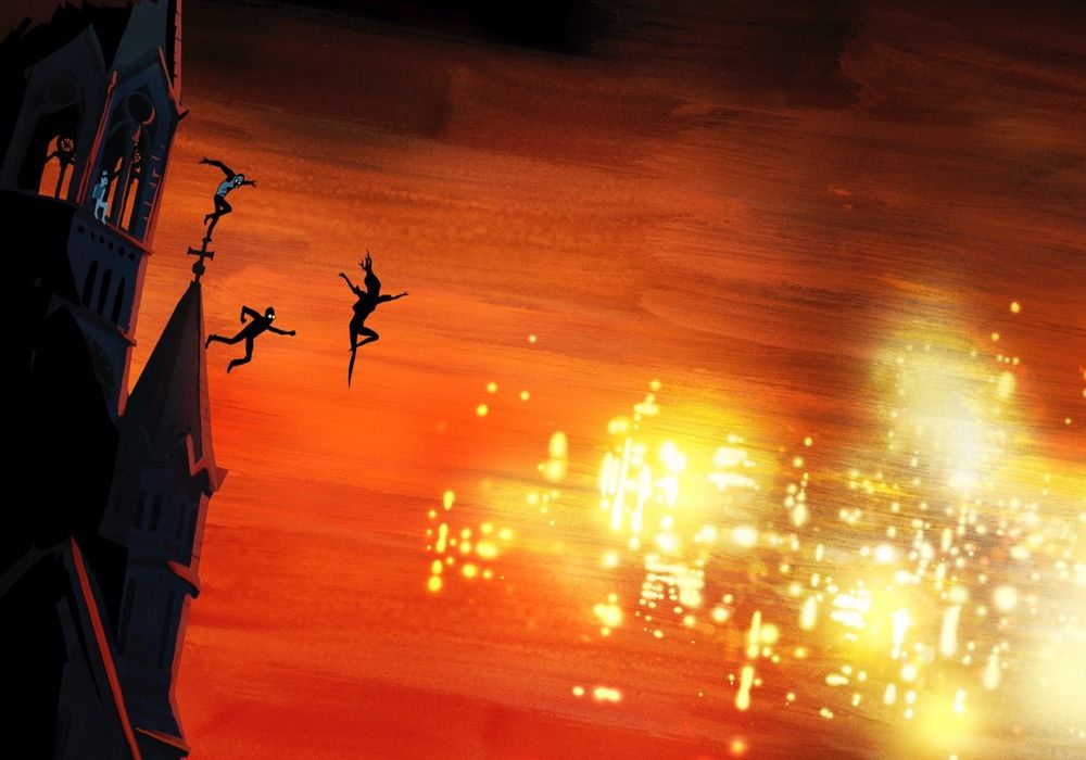
Jason Brubaker lives and breaths in two-page spreads and book-length graphic novels. He doesn’t draw in panels, and he doesn’t plot in issues. The book length format is standard for indie fare, which discards that weird, single-issue format at least half the time, but the way Brubaker lets loose on two-page spread after two-page spread is downright breathtaking. In earlier books Brubaker showed off this world with huge, picturesque backgrounds, but in this later book his spreads are used to show cramped rooms and omnipresent industry.
Before he was a comic book artist, Jason Brubaker worked at Dreamworks, and he brings with him the hallmarks of traditional animation. Every character has the clear silhouette and clothing choices of a well done children’s book. The reader can identify their personality, wants, life story, and even their age at a glance: Vonna is a child with crooked hair and offset socks, the captain has gruff beard and kind eyes and worn, practical clothing.
(Sidetrack: The credit pages for “Sithrah” are always enlightening. Brubaker has that movie industry dual habit of hiring help where he needs it, and recognizing everyone he hired in the credits. There’s not just the usual comic book credits of “scripting, letters,” but also, “flatting, 3D vehicle modeling, additional background painting.”)
Brubaker says this story in particular is inspired by Miyazaki, but Miazaki and the modern American animation styles are so intertwined, it’s hard for me to tell where his different influences are coming from. The template of a special child on a journey, being guided by a wayward adult, is infused in our world. It’s definitely a pleasant way to build a story for all ages, that kids can enjoy but adults will really appreciate. “Sithrah” reminds me of Bone in that.
The one piece of “Sithrah” that worries me is where it falls into the trope of using Capitalized Big Concepts as proper names. One character is struggling with, “The Author,” and, “The End,” and the protagonist is named, “Nirvana Page”. Normally I hate this. Normally it’s lazy storytelling that implies depth rather than writing it. But with the Big Concept Names we’ve seen I’m betting that Brubaker is using these to tell a meta-story about creation, and I’m hopeful that it’s going to weave together at the end.
“Sithrah” seems to take inspiration from the design of children’s picture books. Children’s books often don’t have backgrounds, they’re abandoned for clarity. Manga does this too, selectively. Brubaker does this frequently, and on huge pages. Brubaker will drop the background whenever it suits him to focus on two people having a conversation. But at the same time, he’ll later have pages with nothing but abstract background imagery.
Another aspect that reminds me of children’s picture books is the lettering, and credit for that goes to Nick Welch, who joined “Sithrah” for volumes 5 and 6. He’s following the example Jason set for lettering in the earlier books, and Nick is just having fun with it. The size varies hugely for the mood and page, he uses bolds and italics at will, and switches fonts for emphasis.
If the whole business wasn’t so adeptly handled it would be distracting and unnecessarily quirky. Instead it adds to the bright playfulness of the “Sithrah.” It’s a small feature I look forward to in every book.
Continued belowThis is all to say, the lettering doesn’t disappear into the background. Lettering is sometimes thought of as the invisible art in comics: if it’s done well, you don’t even notice it. “Sithrah” throws that out, and Brubaker reminds me of Will Eisner and Dave Sim. Different pages will have dense dialog bubbles, or a narrative running down the side of the page, or will toss out words and let the art speak for itself. Brubaker has an easy fluency with this fundamental art of comics.
It’s just fun to read.
One of the reasons I wanted to become a comic book reviewer was to talk about all the independent comic creators I love. Jason Brubaker’s comics are gorgeous, genre-defying gifts, and I look forward to every one. “Sithrah” is easily his defining jewel, but I don’t expect it to be his last.


