
It is 901 AD. The Dark Ages. The darkest of times. Centuries after the Romans retreated and faded, yet many centuries before reason and order would take hold. The Dark Ages were times marked by sweat and blood and lives cut short by famine and disease. Desperate days. These were the times the lands known today as Great Britain were fought over like raw meat in a dog’s teeth. The world was up for grabs. New religions were sweeping the continent like a plague of hope in a hopeless time. These are the days that a Hellspawn named Covenant walked the earth in search of the truth, understanding and solution to the curse that bound him. These are his Dark Ages. These are his adventures…
Written by Brian Holguin
Illustrated by Liam Sharp and
Penciled by Angel Medina(#12)
Inked by Jonathan Glapion(#12)
Colored by Brian Haberlin(#9), Arisa Rozegar(9), Haberline Studios(10), Mark Nicholas (11-14)
Lettered by Richard Starkings
This entry puts us to the halfway point in “The Dark Ages” covering #9-14 the ‘A Child’s Crusade’ arc. It also marks the end of Brian Holguin and Liam Sharp’s run on the book. They will be succeeded by Steve Niles and Nat Jones for the remaining issues. The ‘Crusade’ feels like the culmination of what Holguin and Sharp had been doing in those earlier issues by going in an even more experimental route in terms of presentation as well as falling into the same sexist traps that laid throughout. These formal choices push the book into a space where it does not operate as a traditional comic sharing more formal connections to the work of Paul Dini and Alex Ross in what would eventually be collected as “World’s Greatest Superheroes” series of books or to a degree the work of Ashley Wood in “Hellspawn.” While the figure work firmly places it in the, to be charitable, 90s excess associated with the property and publisher.
I have made light of this series title in the past, despite proclaiming it to be the “Dark Ages” it’s really the Medieval period. Writer Brian Holguin leans into fungible idea of epochs and the timescale afforded to Hellspawn, as long as they don’t use up all of their energy they can keep walking this mortal plane, in this arc. That is why there can be a century or more gap between issue #8 of “Dark Ages” and #9 and a similar gap between #14 and #9. The use of time skips in this way, and using it to build a flashback narrative like ‘Child’s Crusade’ is a bit disorienting compared to previous narratives where the year long skips are subtler.
The disorientation is fostered by sepia tone coloring provided by the art team in the main ‘Crusade.’ This along with the copious borders and filigree make the panel content appear more like a work of art done decades later than from the perspective of Covenant. Holguin’s use of third omniscient narration helps to further displace Covenant’s perspective, and to a degree sense of agency. ‘Crusade’ is the height of this creative teams use of our Hellspawn as nominal lead. He is the lead in that he is around the most, but he isn’t pushing the story forward. History, the passage of time, is happening to him as he passively experiences (un)existence.
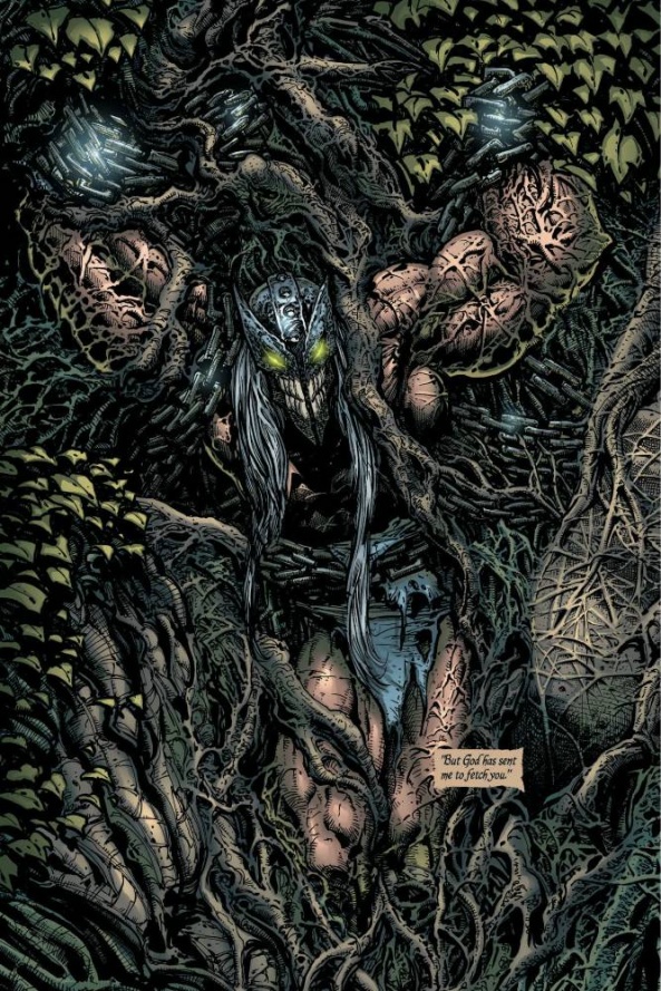
In a run littered with big center fold images, Sharps’s depiction of Lord Covenant mysteriously strapped to the wall of a cave for decades stands out. It is the kind of striking image that would normally be the sort of tease another story would be based around. It offers an immediate question: why and how is he there? He is there by choice, the mystery solved via narration on the very next page. He is bored with un-living. Sharp’s initial image of Covenant strapped to the wall is a mixture of myths, echoing both the Allegory of the Cave to the fate of Prometheus. Covenant like the escaped Prisoner knows what the outside world really has and cannot go back to either environment. His existence, like Prometheus’ actions, is in defiance of God or the Devil and so punished by removing him from the world. And so he waits until Maeve Fletcher appears offering him a chance at redemption. Maeve wishes Lord Covenant to train and lead her rag tag child army for the glory of the Christian God. If he does this, he will be welcomed back to Heaven.
Continued belowThe core drama of ‘Child’s Crusade’ is a somewhat interesting departure from previous ones. Issue #9 serves as a prequel giving the reader flashes of what happened both through the titular crusades dramatization in a local pub, much to Covenant’s displeasure, and his own flashbacks. We know from the start that this crusade doesn’t end well, the historical equivalent certainly did not end well. This turns the arc into a slow motion car crash for the reader, one that emphasizes the fleeting appearance of joy on Covenant’s mask at times.
Setting the readers expectations in this way also allows the book to appropriately function with the formal decisions the creative team make. Liam Sharp fully leans into the iconic image making that has been running through the book and drops most of the typical qualities one would consider to be associated to the comic book. In previous issues pages had frames overlaid and had multiple panels. Pages with multiple panels are rare and a majority of pages are framed creating pages built around an often singular centralized image. Building the book in this way pushes it away from the hyper stylized excess of McFarlane “Spawn” and closer to the contemporaneous work of Paul Dini and Alex Ross in their “World’s Greatest Superheroes” series of oversized books. Both of these books function more like picture books than sequential art. This lack of sequence, beyond the page turn, works in “Dark Ages” favor as Holguin consistently wrote in a third person narration. Putting the book together this way also foreshadows what artist Ashely Wood along with writers Brian Bendis and Steve Niles would be doing in “Hellspawn,” which was in production by this point. Wood’s art is similarly iconic, if more surreal, but he also tended to still make sequential panels occur. There are other connections you could make with “Dark Ages” but this chunk of issues feels most connected to the work of Kieron Gillen and Aud Koch in “The Wicked + The Divine: 1923” which was created as a comics-prose hybrid.

Composing the book in this way did lead to a couple of off moments in the lettering. The book is primarily composed of black ink and sepia after the ninth issue. Letter Richard Starkings has a habit of giving the first letter of a balloon extra flourish and emphasis in near black ink. These flourishes in a few spots fail to stand out as the near black ink is overtaken by the pure black of Sharp’s line work. For his part Starkings’ tries to make the page lively to read with balloon placement. It would’ve been easier to just throw everything in the wide margins. This would have been more readable but less interesting too read.
In every entry thus far I have dedicated some amount of space to consider the often poor to problematic depiction of women in this series. The depiction of Maeve Fletcher makes for an interesting trio on the limits and shortcomings of the choices the creative team have made. The depiction of the Morrígan Sisters was awkward, but you could make the case that showing them as hyper sexual and well muscled was a way to reinforce their supernatural status. Sister Immaculata was treated with similar excess as she transformed into her angelic form, which you could argue made for an interesting push and pull between her new found humanity and the uncaring nature of her Angelic self. These depictions all relied on sexualizing these women in ridiculous ways. Sharp’s depiction of Maeve is, to twist a turn of phrase, sexualized but not sexy.

Maeve is a lowly peasant girl who after the death of her Father begins to here the voice of God and goes off leading the titular ‘Child’s Crusade.’ There is some potentially interesting commentary, or at least text to work with, in the prequel to ‘Crusade’ in issue #9 due to initially showing it as a play. With the emphasis on the crowd caring only for the actresses body and the drama linking her fall to her sexuality. The depiction of Maeve in #9 sets up a an expectation for how it will be subverted in the following issues. She is given enough page space to be shown to be a kind, driven character, Holguin’s writing is pretty good. Sharp’s depiction of her, however, subverts no expectation except the idea that maybe the dramatists missed some key costuming choices. ‘Crusade’ takes place in the dead of winter, so, why is she wearing a leather(?) thong and for lack of a better term chain mail micro bikini top? Not even Red Sonja at her worst was in that. Everyone else is bundled up, because it is winter, except for Maeve whose top doesn’t seem to slip only because it is frozen to her person. Her costuming just boggles the mind as to the why and sad obviousness of it all.
Her costuming by itself would be poor, but like Red Sonja in the right hands you can make a chain mail bikini work. Sharp does not make it work. When people complain about people complaining about the depiction of women in comics there is always that canard about male character being drawn in excessive sexualized manners too. Which is partly right, but misses the part about how they are depicted. Covenant runs around shirtless in the dead of winter quite often, he is also undead and likely doesn’t feel anything. But more importantly Sharp is constantly drawing him in poses that emphasize his physical power. He is also clearly being drawn for the heterosexual male reader to look up to. Maeve isn’t drawn in this way. She is given one image that emphasizes her own power, at least the Morrígan and Immaculata were consistently drawn in that nebulous strong way. Maeve is instead drawn constantly for no dramatic reason swooning or otherwise overwhelmed by it all. She isn’t a bad ass sword and sorcery character like Aydis in “Heathen,” she’s the damsel. The depiction of Maeve in this way is irksome on many levels and it feels overwrought because of the formal choices the art team made by building the book around large single images. When you only have a limited number of images the limited type that are produced begins to stand out.
The ‘Child’s Crusade’ arc is the culmination of this creative team and the first half of “The Dark Ages.” On one level Holguin and Sharp go into some interesting experimental directions that feel about as far away from “Spawn” as you can get and foreshadow what would come for other spinoff titles. On the other level it could be seen as the epitome of a series of sexist portrayals of women that forgot the “strong” part of female character and only emphasized the “female” of it all. I am curious to see how and where the second creative team take the book. “Dark Ages” has established a large sandbox it could play in and the seemingly limitless directions therein.


