
The Starcraft video games have always been a source of great intrigue to me. While they looked to have an interesting lore and story like their siblings Warcraft and Diablo, the gameplay always seemed too complicated and impenetrable for me to get into. Now, Dark Horse has partnered up with Blizzard to remedy this, releasing a comic tie-in by the fantastic Jody Houser, sci-fi veteran Gabriel Guzman, Mike Atiyeh and Steve Dutro. Can this finally be my link into the Starcraft-verse?
Written by Jody Houser
Illustrated by Gabriel Guzman
Colored by Mike Atiyeh
Lettered by Steve DutroOfficial StarCraft comics!
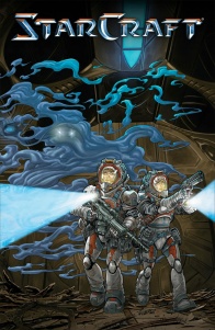
Writer Jody Houser (Mother Panic, Faith) and artist Gabriel Guzmán (Mass Effect: Discovery, Star Wars) join forces for StarCraft, a new series further exploring the expansive universe of Blizzard’s hit game. A group of Terran space scavengers hope to pull off the job of their lifetimes, pillaging a derelict Protoss ship.
One thought resounded the whole time as I read this comic. This is Starcraft via Alien. There’s a large group of varied people, albeit mostly good-natured folks, aboard a derelict alien spacecraft, who stumble upon something beyond their knowledge before encountering a hostile lifeform. It’s not necessarily a bad thing, for the most part. It’s a great method of establishing atmosphere and tone, with a constant sense of unease throughout the comic. One of the best sequences that do this when Houser relies on the Starcraft lore to convey terror. When Kyra and Caleb talk about Zerg infestations on the ship, Houser uses hearsay in the dialogue, with Kyra saying how she’s heard they can ‘consume whole planets’ and ‘turn people into one of them’. There’s nothing like a vague, campfire tale to get the blood boiling, and Houser plays this strategy well. However, there’s still this underlying sense that we’ve all seen this before when sticking to the framework as something as titanic as Alien. When we see one of the crew members covered in black blood fleeing the scene screaming ‘NO! PLEASE!’, it feels overly familiar and unoriginal. And when we don’t even see the alien hostile? It’s a lot to trust that readers will come back for the next issue just to see this appearance.
The cast of characters here is something of a mixed bag, with some feeling inspiring and original and some falling into cookie cutter roles. Kyra feels like one of the best interpretations of the Ripley-type protagonist. She’s a tough, badass role-model, and what’s even better is that she works as a mentor of sorts for the somewhat pathetic and annoyingly naive Caleb. She’s great when she’s schooling Caleb and reassuring him on the mission, as it works as a kind of genre reversal role with the female acting as the wiser character. But then we get characters like Caleb, who Houser tells us are interesting and have a fantastic role to play but have very few compelling traits. He’s like the know-it-all new kid clinging to anyone in power who will comfort or support him in any way. He has some merit when we get a brief, dialogue-free flashback of his farming past, but it’s the only thing that keeps him endearing. Other characters aren’t developed enough to leave an impression. Captain Theban seems like he could be an inspiring and interesting leader, but he seems more like a poster or advertisement, spouting inspirational speeches and cliche one-liners.
Gabriel Guzman handles art duties and it’s a very serviceable spread of work. What he does best is draw large groups of people that all look individual and unique, and manages to handle having several bodies on screen without it looking inappropriately overcrowded. From the third page, we see a spread of eleven or so of the ship’s crew, all huddled into the first panel with enough detail to distinguish fashion and light facial expression, and also outline the intricate environment of the ship’s walls. It’s impressive to do something like this on a full page spread, but to do it on one panel of five on a page is a great showing of the composition. What is something of a mixed bag is how Guzman handles expressive and genuine emotions. The people here feel real and well constructed, with sequences like the volunteering page brimming with a wholesome genuineness. However, sometimes emotions visually don’t match up with the tone in the dialogue or on the page. When Kyra approaches Caleb about his nerves, Caleb doesn’t look nervous but looks more like he was thinking about how ugly and boring his new situation is. Another is when Theban tells Caleb about how Zerg can’t infest Protoss, Caleb’s subsequent expression is one of focus mixed with a struggle for some strange reason.
Continued belowWhat Guzman executes well, and I’m sure he’s had a lot of experience with it, is constructing complex sci-fi backdrops. The environments here feel legitimate and interesting. The interior of the ship The Magpie is lined with scuffed and rusted metal, and complex patterns zigzag throughout the architecture. When we also get a brief flashback of Caleb’s Terran past, it’s vast green farmland contrasted with rusty machinery and sleek looking public transport. What Guzman works best at is within the confines of the Protoss ship. Here, Guzman channels his full Alien aesthetic with style, making sure panels are a little awkward to convey claustrophobia and fear. But the inner architecture of this ship is just as lovingly rendered as The Magpie. The walls are elegant and filled with elliptical shapes embedded with sapphire-like cores. They look mysterious and alien in the best possible way and fill the reader with intrigue at the architecture and dread at its ruin.
Starcraft has always had a rich, vibrant and almost neon color palette in the games and packaging, and this is well represented and handled by Mike Atiyeh. Each scene set has a distinct feel, and it’s mostly thanks to the textures and painterly shading that Atiyeh utilizes. The Magpie’s interiors are a dull, dusty but luminous blue that conveys a warmth signifying this is a safe place. The farmland of Caleb’s past is a mix of similar vibrant blues and greens, looking beautifully natural. I love how he handles the Protoss Ship’s interiors. The walls are a stained, dusty gold, but when we get up close, Atiyeh smears the walls with water and grease stains and heavy wearing to the metal. It’s a great way to convey the idea that this is a derelict and abandoned ship and helps a lot with total reader immersion.
For me, “Starcraft: Scavengers” #1 plays it a little too safe with structuring and narrative conventions. There’s some merit in characters like Kyra, and Houser handles tension really well, but the way that the plot is executed feels too similar to past texts like Alien to be totally enjoyable. Guzman renders some dreamy, complex sci-fi backdrops, however, and Atiyeh brings them to life with a warm yet worn palette. It’s a solid start, let’s hope it gets better from here.
Final Score: 6.7 – “Starcraft: Scavengers” #1 is a visually beautiful debut that narratively feels a little too familiar.


