Welcome back to The Webcomics Weekly!
Yes, you read that right, we’re about to hit 100! Triple digits baybeeeeeeeee. This week is the penultimate issue on the Road to 100. The Omega prelude final countdown of it all. What have we planned?!
. . .Well, we got a regular column for you but DON’T YOU WORRY NONE. Next week, we’ve got something special planned. I see it clear, the stairway reaching up to the sky. It seems so far away now. I wonder if I’ll ever get all the way to the end. But it’s a risk I gotta take.
This week, “A Better Place” and “Trekker” are joined by “Freaking Romance” and “When It’s Dark and Cold.” See you next week for 100.
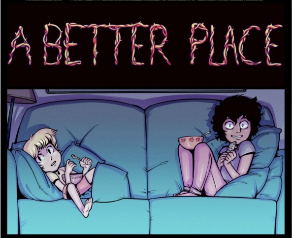
A Better Place
‘Are You Okay?’ – ‘Amazing Planner’
Updates: Thursdays
By Harry Bogosian
Reviewed by Elias Rosner
Two scenes of struggle. One internal, the product of loneliness and regret and the realization that the entire world is too much to put onto the shoulders of one child. One external, fought with beams and fists and weapons, the tension between opposing groups lighting the fire of war and conflict. The first is short, the other long, although that is because Hannah being trapped in the Black Tower is only beginning while the fight at the City of Cups is in its ending.
As I said a couple weeks ago, the complexity of the greater story is increasing and that’s certainly the case here. Irtes/Mr. Bun’s greater plans, the relation between him and The First, Frida’s own motivations and actions, E.C.’s goals and machinations, Hannah being trapped, the status of the Anti-Theists, as well as Nina and Theo’s current state mentally and emotionally and logically, it’s all playing out on the page and it’s a lot to keep in one’s head at a time, especially week to week, one page at a time. This is specifically with regards to the City of Cups pages rather than Hannah’s fantasy realm in The Black Tower, which is very focused on her own issues and the looming question of will she realize it’s all B.S. or not.
I have the benefit of reading these as a chunk. Bogosian does not outright say much on the page, though he does often give more details in the descriptions, and having it all at once is a boon to constructing the larger plot and character motivations in my head. Some of the above are still in the question phase while others are developing answers while others still are brand new, slotting into resolved ideas and plots. It’s all there but it’s not always clear and for some, that can be frustrating and disorienting. The tags, however, remain fantastic.
#as_an_older_sibling #you_always_know #you_will_never_get #to_eat_your_cake #without_sharing_it #and_after_awhile #you_wouldnt_want_it #any_other_way

Freaking Romance
Pages: Episodes 1-3
Schedule: Sundays
By Snailords
Reviewed by Michael Mazzacane
We’re looking at “Freaking Romance” for a few very simple reasons. For starters I am a sucker for romance stories. Also advertising works, a pre-roll YouTube add suggested this comic to me and the brief motion-comic trailer looked lively and fun. The advertising wasn’t a complete lie; “Freaking Romance” is a charming strip. Some of the comedy may grate on other readers.
For example, in reaction to how much rent would potentially be, Zylith remarks that the rent must be on “weed” because it’s “so high.” Word play aside, Snailords lands the moment of comedy by drawing the character in a chibi-esque state of shock that sells the moment. Snailord — I cannot discern if it is the name of a collective or singular person — shows off a variety of art styles in this apartment hunting journey that are to this strip’s favor. The multiple styles employed as we go through various potential apartments gives every sequence a unique quality and appropriate tone. The chibi-esque style of Apartment #1 would not sell the creep factor of a pervy old landlord telling her that the rent is free “if you know what I mean.”
I’m fairly certain there is a syndicated newspaper strip that is just someone looking through apartments every strip. “Freaking Romance” is not that strip and so Zylith eventually finds a place to call her own, without actually owning it. This mysteriously cheap and Friends sized apartment is also the space that gives the strip its name. It is a freaky space and there is romance as the magic bathroom mirror reveals a very pretty man on the other side. He can’t see her and she can’t touch him, but when has that stopped anyone? It’s interesting how Snailords plays this moment of near contact, exploding the strip out into a long spread that visually unites them even as it emphasizes the small God to Adam in the Sistine Chapel distance between them.
Continued below“Freaking Romance” has a lot of promise, the setup is not uncommon but the way Snailords is willing to switch up the art style to emphasize moments gives the strip a liveliness. Even if my normal Webtoon complaints of overly large gutter space are present.

Trekker
Pages: Book 9 “Thicker Than Blood” Part 3 Pages 17-24
Schedule: Mondays
Written and Illustrated by Ron Randall
Lettered by David Jackson
Reviewed by Michael Mazzacane
‘Thicker Than Blood’ comes to a satisfying conclusion, surprisingly tying in character threads from the larger series and this stories specific arc. Randall’s conclusion is this interesting mix of noir ambivalence and the growing sense of heroism within Mercy. She’s able to collar Strauss and save the day, unlike what we saw her do at the beginning of the three-strip story. Maybe it’s like Molly said, she needs something more to enact violence after all of her experiences. Randall also pulls a nice reveal in the final half of the page that contextualizes why there is narration in this story when it had largely dropped, due to the extra page space of the single-issue format. ‘Thicker Than Blood’ was a nice example of how these sorts of strips and storytelling can work to reinforce and meaningfully change the narrative pace and presentation of a story.
Randall doesn’t change up how they were doing grey tones in this final 8 pages, continuing with duo-shade. There aren’t any meaningful changes to how the shading is applied, but Randall mixes it with heavier moments of spot black littered throughout the page. The use of stark black adds a nice bit of texture the previous batch of pages lacked. The previous strip had this soft watercolor like application and now you have that softness contrasted with sharp angular black ink. Randall went through a variety of techniques for this three-part strip. Which is something I wouldn’t have expected by this point in the series run.

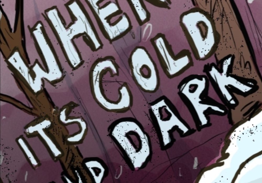
When it’s Cold and Dark
Page 30-35
Updates: Tuesdays and Fridays
By Conner MacDonald
Reviewed by Jason Jeffords Jr
Damn, we’re already on episode #99 of Webcomic Weekly; honestly, that’s crazy! My webcomic this week is a little different than my previous ones: a straight-up horror comic set in the wintry woods of Canada.
From the starting point, MacDonald’s horror story is my jam. This is due to me living in Alaska and living near some deep woods during parts of my life. Not only that but also my countless years of camping, so I can totally see where the horror aspect comes from. Nonetheless, “When it’s Cold and Dark” is a slow burn, MacDonald even says this in the synopsis. Hell, it isn’t until page 35 that we actually see there is a monster. A slow build towards a reveal of “is the monster is real or isn’t it” is tricky. By not showing your monster for so long, you can easily annoy people and make then stop reading. Yet, MacDonald’s build-up towards the fateful page is amazing.
Throughout the thirty pages, he builds tension with characters talking about the monster rumors and the characters himself but it’s not all tense, as he adds in some great humor. Like the slow build, humor in horror is hard to pull off, but MacDonald does an amazing running joke with one of the characters reading a gun manual, mixing the genres quite well.
Now, I’m not saying I know everything about art, but it seems that MacDonald uses watercolor or something akin to it, instead of pen/pencils. Hell, if you’re reading this let me know! I say that because when there are lines, they don’t look like thin pencil lines, instead they are a little thicker. That said, this style works fantastic for the story being told. This especially holding true when we see the monster attack which is visually violent and gory.
Sadly, not everything works in “When it’s Cold and Dark.” In this case it’s MacDonald’s use of the usual white word bubble. With the word bubbles being bright white, the panels start to lose some of their beauty. Instead of looking at the fantastic art, you have bright word bubbles popping off the page. Nonetheless, I look forward to what transpires next, especially since it seems like he is trying to show how we Humans are just as bad as monsters.


