The Webcomics Weekly returns! And we continue the march toward the centennial anniversary. Which poses many interesting questions like do we go with a lithographic cover or a foil print? Do those things even matter in the digital medium? This week we have continuing coverage of “Agents of the Realm,” “Chickenface,” “The Otherknown,” and “Trekker.” We also have a new comic called “Parallax” that our own Elias declares immediately you should read now (by now they mean after you finish reading their insightful criticism.)

Pages 336-346(Ch7)
Schedule: Tuesdays and Thursdays
By Mildred Louis
Reviewed by Michael Mazzacane
Stuck inside the Agents do the only logical move: sleepover! That is the kind of slice of life setup that Louis could’ve easily gotten a few extra pages on just that and dealing with them interacting in such close proximity. The comic doesn’t go in that direction, instead we get a horror-comic surreal dream sequence. Which works as well.
The pages leading up to Norah’s trip to Slumberland set the sequence up without over doing it. The previous couple of pages had emphasized group shots and dynamic. But everyone’s got to go to bed eventually and so Louis works through a series of solo shots of everyone slowly falling asleep. A minor note as someone who has spent a lot of time in student apartments, Norah and Adele’s truly reaches Friends level of big if they can comfortably 5 people laying down, only 4 are shown. Doctor Who like spatial relations aside it does a good job of isolating and setting Norah up to be alone even as she is surrounded by all her friends before the spooky energy comes and pulls her to the other side. Structurally that page makes great use of angular panels which give off a sense of urgency and run counter to the overall rectangular design of previous pages. It looks different so it reads different.
The surreal world of the dream state is this interesting play on spatial relations. Panels overlap one another, Norah and Ruby seem to be existing both next to one another and an ocean apart. Strong lettering as a guide with good gutter size keep everything legible. There is understandably a heavy use of black throughout but it’s the use of as Norah puts it “mood lighting” that gives the impression of the infinite. And than Lindi shows up, looking more evil than ever to have a villain-ish monologue. Once again the use of surreal spatial relations helps to emphasize both distance and a sort of mirrored relationship between Norah and Lindi. Everything about this sequence is surreal and trippy without being excessive and unreadable.
There is a bit of comedy to this sequence as Lindi tries to overtake Norah, her powers react and create a barrier around her. This also occurs in the material world as Lindi’s bolts of energy try to infect her. Louis makes good use of onomatopoeia for this section, they aren’t overly large but present to tell the reader some amount of sound-disturbance is occurring. Meanwhile the other Agents just sleep away. It creates this humorous tangent that helps to reinforce and undercut the tension of Norah’s time in slumberland.

Chapter 2 pg 11-15
Updates: Sundays
By KJ Murr
Reviewed by Dexter Buschetelli
Mystery is afoot in “Chickenface” as the titular fowl boy visits his Abeulito and is nearly killed by his robot arm. This is a slow beat as these five pages allow the story to breathe and build up some suspicions about granddad’s living situation. There is an amount of suspense to this despite the usual humor of this series–which is still very present. Murr blends the awkwardly funny moments into a genuine sense of dread that only lasts for a blink, but leaves your eye twitching a bit.
This sounds all doom and gloom but most of it plays like an episode of Seinfeld visiting the retirement community. Page 15 almost comes across like a sitcom moment as it opens with a panel of Midge bringing it in while CF’s Abuelo exclaims “Midge! Ven, come sit down and say hello to my grandson!” These are rarely wholesome bits in this series that breathe life into it and make these characters real.
Continued belowWhatever has happened to Amelia though sounds ominous and I’ve been promised by KJ that there’s monsters coming. I keep telling you people there’s monsters coming. There better be some monsters coming, KJ. Or I’m going to send a strongly worded tweet.

Chapter 2, Pages 58-69
Updates: Wednesday/Saturday
By Lora Merriman
Reviewed by, Jason Jeffords Jr
It’s insane how close we are to the end of chapter 2, with one more update after this to finish the chapter, and we’ll be in chapter 3 of “The Otherknown.” Time sure does fly by. Nonetheless, the plots ramping up to the climax of the chapter, so let’s go!
Chapter 2, Pages 58-69 focuses primarily on Ajupris confronting Demeck, yet my favorite part doesn’t revolve around those moments, even though they are great. No, the best part comes within the first few pages. Demeck threatens an employee of Ajupris’ that she doesn’t know, but asks him to let go, once he does the employee gets back up and punches him. However, Ajupris isn’t happy with this and nonchalantly askes his name. When he answers (his name’s Gavin) she replies, “Gavin? You no longer work for me.” The demeanor she does this in is smooth, yet shows her leadership skills. In the past, I’ve been iffy on her character, – I still am – but this moment was beautiful in its execution and I instantly loved it.
Nevertheless, we learn more about Demeck’s past, one main factor that he is from earth, which may be uncommon. But that isn’t the biggest deal, as Ajupris seems to know a few things about Demeck and promises to get him away from A.I.D.E. and them killing him. But this just pisses him off more while bringing up more questions to us readers, especially since he says no and that he has a “Friend.” With everything building to the end of the chapter, Merriman is hinting at a lot, while keeping everything exciting.
Throughout these 12 pages, Merriman has solid background colors to gorgeous effect. By dropping the detailed background and putting a solid color helps showcase the emotion the scene is going for. This transpires in one of the best panels, the punch. When Gavin punches Demeck, Merriman gives it a solid yellow background, yellow impact lines, and a yellow “PUNCH” sound effect. Not only that, but she draws extra lines around the fist to further show the impact, not only do the colors and sound effects help the impact but so does the extra lines. All together Merriman makes you feel the punch as much as Demeck.
I know I already said it, but damn, it’s crazy we are this close to the end of the chapter. Hopefully, we learn even more of the world, while the chapter wraps up.

Chapter 1: ‘The Chronicle of the Whispering Star’ & ‘Olivia’s Clever Plan Could Surely Never Fail’
Updates: On sorta hiatus since Jan, though page WIPS are happening on Patreon
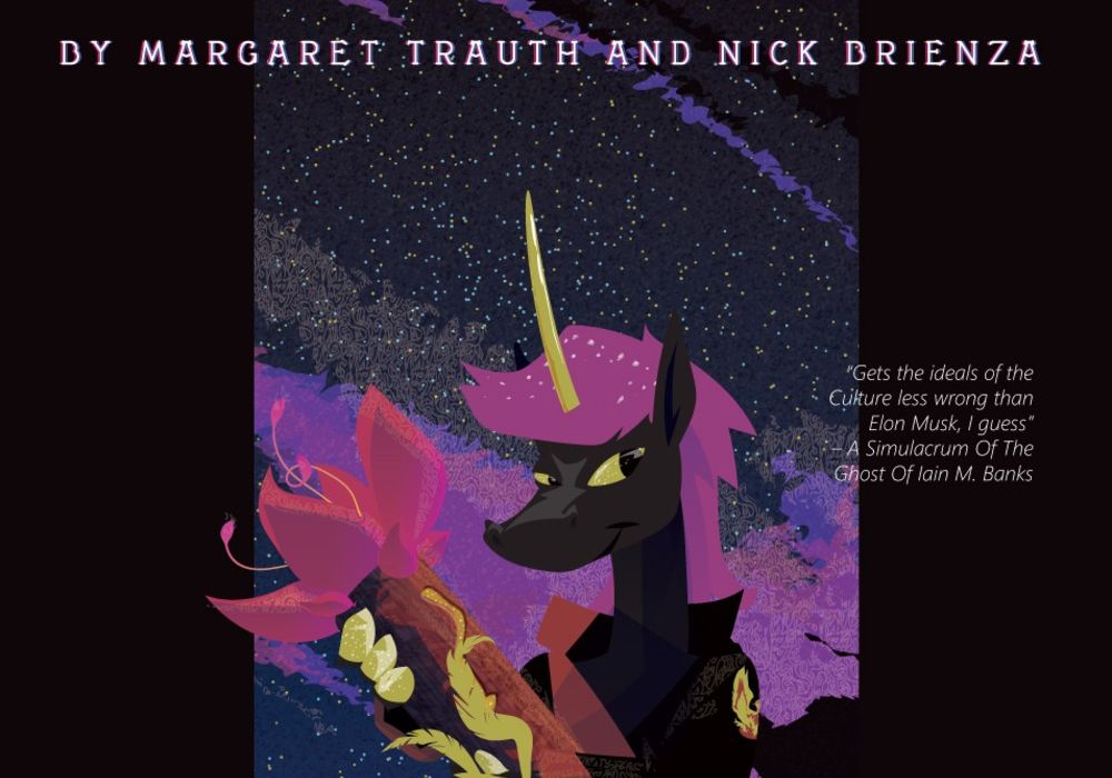
Written by Margaraet Trauth & Nick Brienza
Illustrated, Colored and Lettered by Margaret Trauth
Reviewed by Elias Rosner
READ THIS COMIC RIGHT NOW.
Normally I bury the lede or something but I have fallen in love with this comic and I want more eyes on it. It’s not perfect, which I’ll touch on in a sec, but it’s experimental and digitally rendered and I need more pages of it released publicly asap and if more readers helps achieve that goal, good. If you’re more comfortable reading on Webtoons or Tapas, there are links to that version on the top of the webcomic’s home page.
“Parallax” is composed of two different stories: that of Olivia and Baron, and that of Noa and Kirt. Both are going about their lives, doing their jobs, when they run into each other in the biospheres of the station. Oh, did I mention the whole thing is set in a strange, chromatic space station/garden and that Olivia & Baron are a Cat & Mouse and Noa & Kirt are a Unicorn and, presumably, a Bird of Paradise? Oh, and Noa and Kirt are potentially not real, instead clones/programs that are a part of the station since they have respawn counts and associated fragrances like “anisic aldehyde; gamma-Decalactone?”
Continued belowWhile the story isn’t inscrutable, there aren’t enough pages to really get a firm grasp on the larger narrative or the world, thanks to the in media res nature of the two parts. I find Olivia and Baron’s half of the story easier to follow, there’s a greater clarity to their actions, perhaps because I recognize the framework without understanding the specifics. Noa & Kirt’s sections are far more lush with colors and textures but their pages feel like they’re from earlier, when the comic was trying to figure out exactly how transparent the text-boxes should be or how much brown should (or shouldn’t) be on Noa & Kirt’s pseudo-dragon, organic dragon transport vehicles. The abundance of textures in this section can also make it difficult to find the borders between objects, background and foreground, which often works to the comic’s benefit but just as often makes panels difficult to parse and look at.
However, there are just as many wonderful details that are alien yet familiar, futuristic yet easily understood in context. Olivia’s magic is speaking in Math and Patterns which is AMAZING and the visual rendering of it instantly conveys the technicalities and fundamental oddness within the world without breaking it. The lettering may be my second favorite part of the comic, especially when Olivia is trying to converse with Noa and Kirt on their side and it’s rendered in an intelligible to us but also clearly wrong font. This perspective shift even translates to how Olivia and Baron look, being more inscrutable and strange to Noa and Kirt whereas in their own chapter, they’re pretty clearly rendered.
It’s early days for the comic but there’s enough there to make me excited for where it is going. There’s an early webcomic ethos to the whole project, being open and on a bespoke site with a rad playing with the page vibe, and it’s always good to support trans creators. Plus, just look at those colors! So pretty.

Pages: Book 9 “Sins of the Fathers” Pages 11-20
Schedule: Mondays
By Ron Randall(story and breakdowns), Jeremy Colwell (coloring), Ken Bruzenak(lettering)
Reviewed by Michael Mazzacane
‘Sins of the Fathers’ continue we go into the second chapter dealing with Mercy’s time at the academy. Randall covers a lot of ground in this batch of pages as we see Mercy go from her “You’re Not my Dad” phase with Uncle Alex, to you’re the Dad I always wanted with Angus, and a school romance. Randall does a fantastic job of visually defining these three sections of time with little shifts in body language for Mercy. While she is still angry at Uncle Alex for the failure he represents, Randall draws Mercy coiled up and angular. It’s a defensive posture and one that clearly shows her anger. Which is completely different when she is with Karch, a truly great odd Sci-Fi name, where she actually looks happy for what feels like the first time in the series. Randall draws her in more round shapes, the paneling with her and Karch emphasize a yin-yang like connection as they form complementary geometry. Randall uses a lot of the same narrative techniques, primarily (retrospective) narration, but the visual storytelling in this batch of pages is strong enough that the narration does not feel like it gets in the way.
Mercy is now at school which means it is time to do a training montage, of sorts. Her training and years at the school aren’t so much a montage as a series of page length vignettes that slowly track her development. Randall shows some plainly good panel compositions in this section. How he composes Mercy with Karch is good but it’s also the sense of energy and degree of playfulness as they workout that make these sequences work. It isn’t enough that Mercy is said to be happy and looks happy, the images feel happy.
There is one bit that didn’t quite work for me and it’s the Good Girl Art tendencies in Randall’s depiction of Mercy. Good Girl Art is defined by a female characters unknowing sexuality, but not unknown to those around her or the reader. Early on Randall makes a point of writing a sequence about how Mercy is making the students hot and it dosen’t read right, same goes for some unnecessary sexy posing of Mercy in her underwear. Mercy has been presented as a character who understands and knows her self so these little moments just didn’t quite fit.
The blog post commentary keeps coming, this time Randall talks about an influence of his the work of Russ Manning and “Magnus Robot Fighter” in particular. It is worth a read and a good example of how he has modified that sort of mid-twentieth century science fiction look for a retrofuture late eighties book.


