

1000
Chapters 1-3
Schedule: Returns October 4, 2018. Updates Thursdays.
Written by Chuck Brown
Illustrated by Sanford Greene
Colored by Mike Chung
Lettered by Rus Wooton
Music by Dose
Reviewed by Michael Mazzacane
The first three chapters of “1000” do a fine job setting up its premise – an action adventure series centered around a band of misfit mercenaries who find themselves pulled into a large global conspiracy set in a contemporary urban fantasy world with maybe a dash of Journey to the West thrown in for good measure. The action heavy trio of chapters smoothly introduces this merry band of misfits and their various power-sets as best as one can in the space allotted. If the strip had started out in something like “Shonen Jump,” it wouldn’t feel out of place.
“1000” didn’t start out in “Jump,” it’s published on Line Webtoons, and the features specific to this digital medium are what put it over the top with its tried and true genre beats. For starters, each chapter features music by Dose and select sound effects accompanying it. So far, the music hasn’t over extended and become too memorable so as to distract from the reading and provides a good back beat. The music is a nice subtle leash to stop people from scrolling through too fast and really looking at Greene’s excellent compositions. Scrolling too fast can trigger effects early and makes a bit of an audio mess.
Creator and artist Sanford Green is the first illustrator I’ve seen use the infinite scroll to really play with perspective in a meaningful way. He uses the infinite scroll to construct long sweeping vertical images that create a sense of scale vertically the way Bryan Hitch would explode with fold out pages. The opening tour through Neo New York is a beautiful introduction to the macro space as we slowly drift down to the alleyway that the fight takes place in. His smart use of perspective gives the action a real sense of energy as the gang tries to stop a rampaging dragon from destroying everything. The change in perspective is the difference between showing the gun slinging Tommy as a quintessential Western badass and a joke. The shift from one to the other is near frictionless and the key to landing that comedic beat.
When he isn’t using the infinite space to draw huge images, the paneling itself has an excellent flow as they are normally overlaid larger images. There is never a meaningful sense of disconnect one art piece from the other, which creates this easy readability that other Line strips haven’t quite mastered yet.

Bybloemen
Chapter 1: Pages 1-4
Schedule: Fridays
Written and Illustrated by C.B. McPherson
Reviewed by Bodhi
Mad about flowers? Can’t resist black comedies? Then C.B. McPherson’s “Bybloemen” might just be the right webcomic for you. The story of this new comic is set in the Dutch town of Stenen Brug at the height of tulip mania. Yes, not only this seaside town but the entire country was in the grip of a mass fascination of tulips and this ‘mania’ almost succeeded in scuttling the economy.
Except “Bybloemen” suggests the ridiculous flower mania might have its roots in infernal machinations.
“Bybloemen” opens in a dripping forest in Holland and introduces us to the cast: Basil, a grumpy old demon, and his just-arrived, just-graduated apprentice Ludwig. The demonic duo are making their way through the forest while Basil dispenses some advice to Ludwig on how to blend among humans.
The art of “Bybloemen” reminds me of the Marvel 1602 covers by Scott McKowen and Richard Isanove and of woodcuts. It’s an almost black and white comic but don’t let that deter you. The abundantly-applied black is very effective in suggesting depth and McPherson’s lineart is more than able to convey the grumpiness of Basil, the enthusiasm and inexperience of Ludwig, and the drippiness of wet hat rims.
“Bybloemen” has just started and this is the perfect jumping-on point to see just what our demonic friends are up to.
Oh and, in case you are wondering, Bybloemen means broken tulips.
Continued below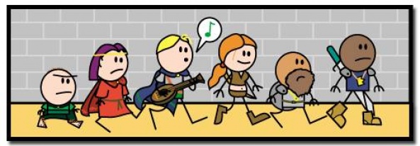
Order of the Stick
Pages 1-5
Schedule: Varies between issues
Written and Illustrated by Rich Burlew
Reviewed by Robbie Pleasant
So here we begin, with one of the longest-running D&D-inspired webcomics. A lengthy epic, spanning through multiple fantasy story arcs and character turning points. And it all begins… with the update from Dungeons & Dragons 3rd Edition to 3.5.
This is a clever way to begin the comic, as we immediately learn what kind of world it’s set in. Not only is it a D&D comic, it’s self-aware, and mechanics such as Skill Points, or even the editions of the game, are in-character knowledge. There is no fourth wall, no division between what gamers would call “player knowledge” and “character knowledge,” just the characters and the game world they live in.
The following pages continue the dungeon crawl, and we learn about how the game mechanics work in this world. While the readers may see a group of ninja goblins standing around, the characters will not, while still acknowledging that they failed a Spot Check. It’s a clever blend of game mechanics and meta-humor, which also serves to set the tone for the comic going forward.
While we don’t learn too much about the characters yet, we still get the basics for their personalities. Belkar is angry, Elan is a goof, Roy’s the serious one who has to deal with Elan’s shenanigans, and the rest of the cast get clear voices from their dialogue at the very least. (Of course, they’ll eventually go on to become some of the most well-developed characters in any webcomic I’ve ever read, but that comes later.)
Artistically, “Order of the Stick” is exactly as promised. The characters have minimalistic designs, with sticks for arms and legs. It’s bright, flat, and generally utilizes simple shapes for all the designs. There’s beauty in the simplicity, as we’re not overwhelmed by fancy armor or intense detailing that would clash with the light, humorous tone of the comic.
In fact, the simplicity is a stylistic choice from creator Rich Burlew, who is more than capable of more complex and detailed art. As the story progresses down the line, the designs gain more detail, but only as the characters and story have grown to match it. Even the panels are intentionally drawn as uneven lines, subtly adding to the goofy atmosphere.
Just five pages isn’t enough to really kickstart the plot, but it’s enough to serve as an introduction. In fact, it’s even enough to set up some recurring jokes or references that will come back into play later down the line; the sense of continuity within the comic is amazing, as events or jokes from hundreds of pages ago can be brought back up seamlessly. For those reading it for the first time, though, it provides plenty of laughs and a good introduction to the world and characters.

Sam and Fuzzy: NMS
Volume 1: Pages 1-5
Schedule: Mondays, Wednesdays, and Fridays
Written and Illustrated by Sam Logan
Reviewed by Dexter Buschetelli
“Sam and Fuzzy” is a charming comic from the very start. Introducing us to the character of Fuzzy who is…some kind of stuffed bear, maybe; the art is endearing and the humor is already evident in the opening pages of the book’s first volume. We find Fuzzy awaking in a dumpster, unsure of who he is and being interrupted by a thief on the run from police officers who gives us the half-title character’s name.
The art style is the right kind of “cartoon-y,” characters are emotive and distinct. It has a unique but familiar flair that is pleasing to the eye while fitting with the tone of the dialogue and the type of story it seeks to tell.
Fuzzy’s narration is chuckle-worthy, with moments like him trying to “remember something. Anything at all” and only mustering “Coroner Candy’s Chocolate Corpsies: Dig Up the Deliciousness!” This sort of absurdity is reminiscent of Jhonen Vasquez’ “Johnny the Homicidal Maniac” but…y’know, without the homicide. If this style of comedic story-telling is anything to go by, the series will be a hysterical ride worth continuing after reading Sam Logan’s opening segments.
Continued below
SpacePunk
Pages 46-50
Schedule: Saturdays and Sundays
Written and Illustrated by Cover Hyphen
Reviewed by Elias Rosner
And thus the first obstacle to our young Calvin’s journey appears in the form of Robocop with a laser arm. Previously on “SpacePunk,” we learned the meaning behind the title as well as being presented with the conceit of the comic; namely, magical space powers that give the ability to rock and form disruptive rock bands. It’s a fun concept and when paired with Cover’s simple but charming artwork, it makes for an even more fun read. During these most recent pages, there’s a sense that the story is beginning to pick up. Now that Calvin, one of the aforementioned Space Punks, is aware of his powers, even if he doesn’t quite know how to use them, events can begin to more at a brisker pace, as action replaces exposition.
A few minor notes on these pages, though. The lack of backgrounds is noticeable, especially on page 46, but the choice to leave them out doesn’t harm the scene’s readability in any way. Additionally, there isn’t much energy to the fight, which can make it feel drawn out despite only being a couple pages long, due to the artstyle; it’s not built for high-intensity action. The characters look like paper cutouts or stickers, and thus the world is flattened, but that’s what I love about the comic. The aesthetic informs the narrative and sets the tone. This is a world of bright colors, crazy hair and cute bumbling robocops with laser arms. It’s an interesting take on superpowers without any of the cynicism of many print comics with that bent.
We’re still in the early days of the comic, so where “SpacePunk” will develop is uncertain. Heck, we end page 50 still in the midst of the fight. Regardless, for those who are new to the comic, I advise reading it through the archive. You won’t want to miss a beat.

Wonderlust
Pages 1-10
Schedule: On Hiatus. Updates Mondays
Written and Illustrated by Diana Nock
Reviewed by Gustavo S. Lodi
“Wonderlust” introduces readers to Sally Kalloway, a young girl who is clearly smarter than her years, and who holds a couple of secrets from her school mates and teacher. The first original pages of this webcomic manage that introduction really well, focusing on character and reaction rather than on actual plot evolution.
Series creator Diana Nock strongly delivers in the art department: her line work is thin and elegant, but she also knows when to make it thicker and bolder for moments where the tension heats up. On most of the background and depiction of more mundane situations, there is a hazy perception of the surroundings, which adds to the false sense of normalcy the story is going for. Character design is also on point, with every child in the school looking distinct, rather than the “cloned-look” readers sometimes get when artists fail to depict kids like kids, and not short adults.
Special note should also go to Nock’s lettering: she utilizes different fonts and balloon backgrounds to different characters and situations, and it really works to add to their personality and to reflect the mood as the story progresses.
In terms of plot, there was still little to be extracted from these first 11 pages, other than the fact that protagonist Sally sounds like a complex child going through a lot, with a special stowaway supernatural pal for the ride. It is a very strong beginning, just one that chooses not to dwell in too much exposition. This series surely looks like it will pace itself as it peels the layers of the magical environment around it, its connection with Halloween and creatures of the night.
Based on these updates, “Wonderlust” shows tremendous promise. It feels unique, with beautiful line work and imaginative use of a muted color palette, with a story that pulls the audience in for more reveals. Will definitely return to discover what happens next.


