Welcome Back to The Webcomics Weekly!
My typing fingers are slowly seizing up from all this work from home but I push on, for you all, and for the good of the column. I find myself wondering what “A Better Place” might be like. Would I find it in “Realm Nine” or while “Trekker”-ing to the “Order of the Stick” to cure my “Bloodclot?” Would I find out that “My Black’s Don’t Match?” I certainly hope not. I take pride in my ability to match black with black.
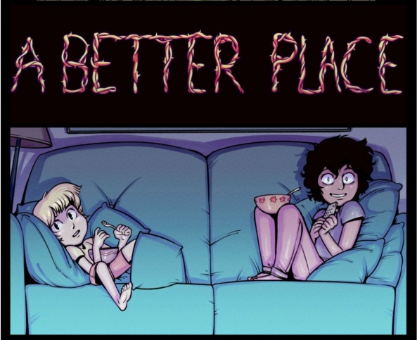
A Better Place
‘Keys’ – ‘Fix This World’
Updates: Thursdays
By Harry Bogosian
Reviewed by Elias Rosner
“Brothers. Sisters. Let us fix this world. . . or break it trying.”
‘Fix this World’ ends with these eleven words, an elucidation of the unspoken mission statement for the Anti-Theists. As I read the pages that make up the “The First” scene, I was struck by two revelations, plus the usual awe at the power and craftsmanship of Bogosian’s pages and the tags, preserved sporadically as comments, growing more ominous. One was the creeping fear that, perhaps, the Anti-Theists were correctly identified by Empress Computer as those who will do more harm than good. The other was that we actually know woefully little about the Anti-Theists. Because of this, the moment’s importance is undercut by ambiguity in a way that harms the narrative.
Bogosian’s exposition light and implication heavy approach to storytelling has often been a boon to the mood of “A Better Place,” trusting his audience to piece together the larger story, allowing him to focus on the characters and to keep the lens narrowly pointed at this cross-section of the world. Unfortunately, that came at the expenses of really digging into the politics that’s brewed beneath the surface of Hannah’s world. Specifics are left to the wind and there’s only so much that can be gleaned from the extant information available, though the broad strokes are there and, most of that time, that’s enough.
Moreover, it’s hard to get emotionally invested in the same way as we are in Nina or Theo’s journeys. Sure, Theo is attached to the Anti-Theists but his drama, his tension, comes from his direct relation to Hannah as the younger sibling and being unsure of the right way to fix the situation they’re in. The Anti-Theists are a vehicle for that, it seems, and so when they break into the armory with The First and its kin, prepared to unleash them against Hannah, the questions it is asking, i.e. how far is too far, becomes difficult to consider as we have not seen the fall and the escalation. It simply is, changing the question from “How far is too far?” to “How does one reconcile throwing in with the lesser of two evils?”
Or, perhaps, “If the world will break from your actions to combat your enemies, is that even a path worth pursuing?”
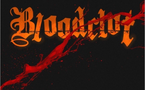
Bloodclot – Tapas
Pages: 1-4
Schedule: Weekly
By Gleb Melnikov
Reviewed by Michael Mazzacane
While “Bloodclot” the new webcomic by Gleb Melinkov is just getting off the ground, it is their choice to serialize it on Webtoon and Tapas, and how that mixes with the presentation of its format that has me interested.
Line and Tapas both employ infinite scroll style comics, this is good for phones and tablet interfaces. This format also creates certain changes to presentation with pages being spread out vertically and a greater emphasis on isolate panels, to a certain degree. Webtoons like “1000” and “BloodStain” or “Punderworld” show how tighter paneling can work in the vertical environment. Melinkov is not using these platforms to produce a vertical scoll, he is using their feed technology to post one page at a time; a classic technique that comics like “Trekker” and “Agents of the Realm” use. It is interesting to note how this classic formatting/distribution, when mixed with a contemporary models, highlights differences between the two.
For the most part, putting up a page at a time hasn’t led to any readability issues, having looked at the strip on both my phone and desktop web browser. The biggest source of tension is created in the sense of fulfillment I get from reading an “episode” as Webtoon puts it. Now, most of the time a Webtoon first episode isn’t all that fulfilling, narratively speaking; these are not strips in a “2000 A.D.” Prog. However, being forced to scroll all the time extends things out and creates the appearance of fulfillment. These single pages offer some tantalizing possibilities and teases but lack the density of a standard Prog strip, much like native webtoons, where a lot is happening but not enough really is.
Continued belowFormatting each episode as a standard comic page does allow Melinkov to do something that would be much harder in a vertical comic. The second page and late title card show a conversation but only one person in a nine panel grid. These two voices are represented through markedly different lettering. The ability to grid out this page and conversation allows for an easy way to track the action and highlight how isolated everything is. We never get to see a full body shot of the man, Isiah, only bits and pieces of him. This is the kind of structure I don’t think would occur in a native vertical comic, or at least a grid would not be used. I could see a sort of stairway, scalloped approach being used to create the back and forth rhythm, but that would lack the effect of being able to see everything at once as a macro image and series of micro images.
“Bloodclot” is still early going but the novelty of its presentation might be worth checking out down the line when more pages are banked.
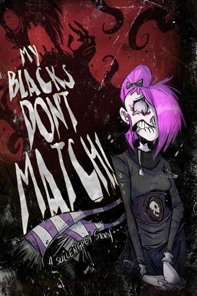
My Blacks Don’t Match!
Chapter 2, pgs 51-65
Updates: “Weekly-Ish”
By Drew Rausch
Reviewed by Dexter Buschetelli
Greetings weekly webheads! Something that our dear readers may or may not realize when perusing this column is that it is really tough finding good webcomics to review. There is no shortage of them out there, and that is why we feature them here every ding-dong week. But there are also quite literally thousands of other series out there which are…shall we say less deserving? So I’ve begun reaching out to some of the creators whose work I have reviewed here to find out what strips they like.
This week’s suggestion comes courtesy of one KJ Murr, creator of “Chickenface,” which will be my new regular series moving forward. KJ was gracious enough to point me in the direction of two particular creators he enjoys, the first of which being Drew Rausch and his ongoing “My Blacks Don’t Match!”
It is unsurprising KJ would recommend “My Blacks Don’t Match!” as he and Rausch clearly share a lot of the same influences. Rausch’s panels are that sort of cartoony macabre that gives you the impression his earliest memories are of enjoying Rat Fink illustrations and the poetry of Edgar Allen Poe, which I can also relate to. The characters have an animated feel, in the same sense that someone re-animated the corpse of Walt Disney and stuck a quill pen in his decaying fingers. It’s goofy meets spooky, fun as it is frightening, and cutesy while being creepy.
I can’t say I would recommend the fourteen pages I chose for this review on the basis that you may feel like you are missing out on a broader overall story, but that is not to say I don’t feel you should visit Rausch’s site nor that I did not enjoy reading them. The most recent installments still do a good job of introducing the reader to Salemandrina and her girlfriend, and Grey and Mr. Grime.
The characters all have distinct personalities that are conveyed well and come across through simple and quick interactions with each other and Grey’s house is a treasure trove of delightful sight gags and literary references. It’s the type of haunted mansion that a young me would have been eager to traverse, and there’s a killing moon! Like, seriously, there’s a man with a moon head that looks eager to slice you up should you come near him.
This is a series I’m going to be keeping an eye out for when I do some of my revisits on those weeks it is difficult to find these diamonds in the rough waters of shit that can sometimes be the world of webcomics, as I feel the current story I began on will journey down some interesting roads. So, give “My Blacks Don’t Match!” a shot if you’re in the mood for something spoopy.
And during these intensely difficult times we find ourselves in, make sure to treat yourself well, and those you care about. And when you find creators whose work you enjoy such as this, go out and find them and tell them. Maybe just on social media, though. If you show up at a cartoonist’s door I am not legally responsible for the results of any misunderstandings. And Rausch doesn’t seem like the type of folk you’d want to pop in on unannounced.
Continued below
Order of the Stick
Pages 226 – 230
Updates: Varies
By Rich Burlew
Reviewed by Gustavo S. Lodi
“Order of the Stick” has been a blast to follow and review over the last months. And the key reason for that is, despite such a straight-forward plot (stick figurines on a fantasy adventure) is so well-crafted and expanded by the most absurd of situations, sharply written dialogue, and, for it simplicity, an amazingly effective art style.
This time around, series creator Rich Burlew flex his muscles on one of Monty Python’s (a clear inspiration for this series) mainstay: that of the use of generic names (“somewhere”) as a proper pronoun (“Somewhere”). Hilarity ensues when that is framed in the context of kingdoms and royalty. It is so silly, so nonsensical, and yet it works like a charm.
Next, “Order of the Stick” does another routine it has a knack for, that of mixing the trapping on the RPG tropes, with some more realistic (and sometimes, just as insane) laws and regulations. On these chapters, the legal background of restraining orders is played for laughs in very good measure, especially when it highlights that the sets of rules and limitations a legislation can impose it not THAT distant from the byzantine bylaws on tabletop RPGs.
Every chapter of “Order of the Stick” is sharp, smart, and inventive. Here’s to many more.

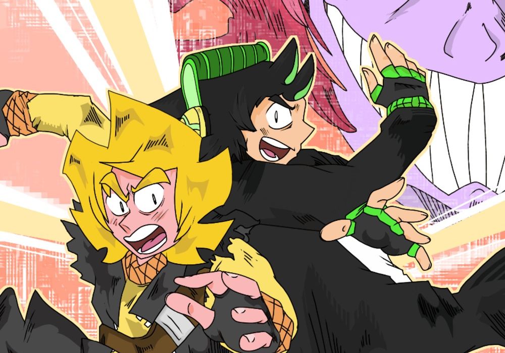
Realm Nine
Act 1, Page 26-30
Updates: Every other Wednesday
By Drememoto
Reviewed by Jason Jeffords Jr
“Realm Nine” hits a lot of checkmarks for me, but what initially drew me in was that it feels like a video game and a manga combined. Not only that, but the lettering is quite fun. Yet, even if those aren’t your cups of tea, “Realm Nine” has other aspects that’ll make you enjoy it. Mainly its two main characters. Not much is said about the world as of yet but during the pages preceding pages 26-30, we are told Lunic and Kurt are the “Chosen Ones,” and that they will save the planet. That and they aren’t on Earth anymore.
Nevertheless, we are talking about pages 26-30, not the ones beforehand. During Chapter two we’re introduced to the big bad villain, Golzer. Honestly, Golzer looks like a “Power Rangers” villain, and the name even resembles that. Is that bad? No. But, our main characters are in for a bad time. With Kurt being held by his hair in Golzer’s hand, Lunic lashes out. Yet, his punch does absolutely nothing. This moment shows the power difference between the “Chosen Ones” and the main villain. This moment is fun because Golzer is so awestruck at how weak these two are that he feels offended.
That’s the fun part of “Realm Nine,” Lunic and Kurt are so unusual compared to other “Chosen Ones” that it’s a breath of fresh air. The two are immensely dumb, scared, and out of their league, and it’s amazing seeing those around them react to this.
“Realm Nine’s” art is chaotic. Not in the sense that you’ll have no idea what is happening, but each page is bustling with energy. Since Pages 26-30 focuses on the introduction of Golzer, this high energy works well and makes the stakes feel much higher. Yet, one of my favorite aspects of “Realm Nine” is the lettering. Lettering can make or break a comic, and barely gets the recognition it deserves. Plus, much like art, it is based on opinion. Nonetheless, “Realm Nine’s” lettering feels just as chaotic as its art at points and makes the story a blast to read.

Trekker
Pages: 11-20 Book 06 ‘The Babel Cannon’ Part 1
Schedule: Mondays
Written and Illustrated Ron Randall
Lettered by Ken Bruzenak
Reviewed by Michael Mazzacane
The second half of this first part of ‘Babel Cannon’ is a bit of a bottle episode as Mercy, Paul, and Bolt are all stuck on the ship as they travel to the Trillu-Crystal Mountains. Randall gets a lot out of this limited space, using it to reinforce the tension between Mercy and Paul while developing Bolt into potentially something a bit more than he appears. This sort of episode is the kind of stuff you would normally cut from a comic, we find out they need to go to the mountains on page 13 and while they get there within the next page they are forced to wait around for a clear shot. That act of waiting isn’t how comics normally operate, page budgets dictate you get into the action. Here all that waiting allows Randall to end this first of a two part story on an action cliffhanger.
Continued belowKeeping everyone bundled together helps to exasperate Paul and Mercy’s tense relationship. How they are acting makes sense for their character but it also feels like what would happen between Han and Leia if they never made it to Bespin in Empire, their differing wants and needs would rear its head eventually and they’d be stuck with one another.
Waiting around on the ship for 9 pages does highlight some of the excellent design work Randall has put in on the ship and the surrounding technology. Aesthetically it is in line with Star Wars and Trek what gives this a twist is all the screentone that is applied to it. This creates a texture to everything as well as clearly demarcate fore to background with varying shades of grey. It manages to provide a lot of energy, without the use of color, into a panel that is talking heads. Another interesting design element, that is very of its time when the book was originally being published, is how the second part of the message implanted in Mercy’s head is realized. It is a crude wireframe, which would seem anachronistic in our present and the future of the story world, but fits for the moment it was published. Randall also lays in a series of nice action lines that unite the image of Mercy and the image, so that we understand this is in her head, that create a sensation of movement.
Randall continues to slowly build out the world of “Trekker” on a socio-political. It isn’t much, more of an aside, but with so many issues still to come and with how this book is largely been one and done adventures it creates for good texture.


