
There’s a lot to cover on Wednesdays. We should know, as collectively, we read an insane amount of comics. Even with a large review staff, it’s hard to get to everything. With that in mind, we’re back with Wrapping Wednesday, where we look at some of the books we missed in what was another great week of comics.
Let’s get this party started.
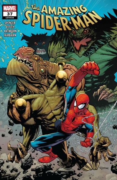
Written by Nick Spencer
Illustrated by Ryan Ottley
Lettered by VC’s Joe Caramagna
Colored by Nathan Fairbairn
Reviewed by Michael Govan
I think that “Amazing Spider-Man” #37 can basically be divided into three parts.There are the bookends at the start and end of the story and then there’s the main part. On the positive side, the entire book looks great. Ryan Ottley drew the lion’s share, if not all, of the superhero title “Invincible” over several years. The artist is a great fit for superhero action and Spider-Man is similar enough to Invincible that he fits in perfectly on this title. It really was a great call, whoever put him on this book.
On the other hand, I didn’t much care for either of the bookends, short as they were. At the start of the issue, we get an update on where J. Jonah Jameson’s life is at. I didn’t find it that interesting and would have preferred if the creative team did something else with those pages. Jonah works best as comic relief and he wasn’t particularly funny here. Ah well, maybe his new job will take the story in an interesting direction.
Kindred’s stinger at the end didn’t leave much of an impression either. The villain’s monologue feels flat, nothing really new. Speaking of nothing new, the villain he resurrects here is a real throwback, way before my time. I can vaguely recognize a lot of characters but I had to google this guy. Why he would be a significant threat to Spider-Man is beyond me. Again, I don’t know him that well, maybe I would be more interested if not for the gap in my knowledge.
The meat of the story deals with Spider-Man initial tests of the Clairvoyant device that he used to fight off the big threat in the previous issue. Peter’s thought process here definitely makes sense. All superheroes have some trials to endure but Spidey’s struggling all the time. Literally all the time. If it isn’t the personal life, it’s the superhero life and often it’s both at once. You can appreciate that he wants to find a more effective way to fight crime and that he feels he has a responsibility to go above and beyond when he can. At the same time though…common sense says leave time travel and seeing the future alone alone. Just don’t do it, Pete. It’s going to blow up in your face, it always goes wrong. The Clairvoyant immediately reminded me of “Civil War II” and Spider-Man even acknowledges that this has gone wrong in the past…but he keeps going. Such a bad idea.
Final Verdict: 6.0 – Time travel…if you can see the future, how can you not see this is going to blow up in your face?!
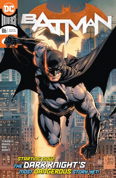
Written by James Tynion IV
Illustrated by Tony S. Daniel
Inks by Danny Miki
Colored by Tomeu Morey
Lettered by Clayton Cowles
Reviewed by Quinn Tassin
After a very long, fairly controversial run on “Batman” by Tom King, this new run easily could’ve been a safe, average Batman story. Instead, in “Batman #86,” James Tynion IV crafts a story that at once feels like classic Batman, respects the creative direction of Tiom King, and paves a genuinely fresh and interesting path forward for Bruce Wayne.
The promise of Tynion’s new direction for this book is clear from the first set of narration boxes. Bruce, traversing the Gotham rooftops, thinks about the vision for a better Gotham that he’s always had but never actually tried to build. Alfred always pushed him to make a Gotham that didn’t need Batman and now that the Wayne’s butler is gone, Bruce is ready to make his dream real. Using the specter of Alfred as a positive force driving Bruce instead of sending him into a rage or spiral is an exciting choice for Tynion to make. At the core of the story he’s telling is the faith that Alfred inspired in Bruce and that Bruce is hoping to instill in his city. It’s refreshing to see Batman ready to both move forward personally and move Gotham forward as a city and exciting to think of where things can go from here.
Continued belowThe actual plot of “Batman #86” is promising, though hard to properly judge given that it’s mostly table setting. Batman stops a few contract killers, including Deathstroke, from carrying out a major hit but that’s really a distraction (which Batman is ready for, of course.) Catwoman is able to stop someone from replacing the Wayne plans for a new Gotham with villainous ones that aren’t actually described. The goon that Selina captures, though, starts to melt and becomes a mouthpiece for a mysterious villain from her past. Again, it’s interesting but hard to make heads or tails of quite yet. Maybe starting the arc with a bigger bang would’ve been a smart choice but balancing baby steps with strong characterization is a fine tradeoff to this reviewer.
The art in this issue is solid, classic Tony S. Daniel, but nothing to write home about. In some moments- particularly when we’re introduced to Selina at a Wayne Industries fundraiser- the art is slightly wonky and rushed. The action is largely cool and the panel of Batman taking off into the night is great. Overall, though, it doesn’t elevate things much.
Final Verdict: 8.0 – “Batman #86” is a strong, promising start to James Tynion’s take on the World’s Greatest Detective.

Written and Illustrated by Mike Norton
Colored by Allen Passalaqua
Lettered by Crank!
Reviewed by Joe Skonce
“Battlepug” is one of those comics that always caught my attention despite knowing almost nothing about it. The title is almost brilliantly simple, you can associate pugs with many things… but battle is not one of them. The covers were wild, both adorable and absurd, really designed to capture the attention as you walk around the new releases table. As I read it, I was not disappointed. “Battlepug” #5 reads like a story that is being told to you by your kid cousin, the one with the overactive imagination and probably one too many pixie sticks. The big thing about “Battlepug” #5 is that it’s a story that really benefits from being a comic, using visuals to enhance the absurdity of the situation.
“Battlepug” needs to be a comic. It needs to be a comic because Mike Norton is able to create a wonderful mishmash of tones between his writing and art. If “Battlepug” were a book, it would be fine. It’s pretty good fantasy actually! There are revenge plots and monsters, magical keys and portals, but none of the dialogue is particularly humorous or memorable. Yet, the book had this weird and fun chaotic energy that reading just the script didn’t seem to represent. Then it hit me, the art was telling a much different story, at least tonally, than the script.
It’s impressive how well Norton is able to balance the differing tones of his script and art. The art is where the issue really takes on that almost manic and childlike energy. Almost as if as you are being told the story, the narrator is playing with their action figures to illustrate the story. There are a group of brightly colored horses that look like “My Little Pony” on steroids (complete with tattoo cutie marks.) The evil creature hellbent on destroying the world has dragon’s legs, tentacles, what appears to be a robot arm, lasers, and a lizard head. It fights a creature under the Warrior’s control that is a combination of walrus, penguin, polar bear, sea lion, and narwhal. And of course, to top it all off, a gigantic pug trying to fix a magic key to close the evil portal. The characters have fun designs (one fights with a giant candy cane, another has old prospector eyes) which helps make them come to life. I hadn’t read any of this series, but “Battlepug” #5 really made me care about these weird funny characters. Without the art, I don’t think that would have been the case.
Final Verdict: 7.5 – Mike Norton’s art is the star of “Battlepug” #5 by creating a visual story that is chaotic and very memorable.
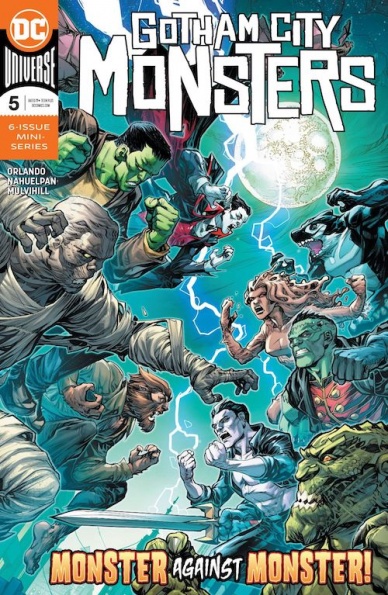
Written by Steve Orlando
Illustrated by Amancay Nahuelpan
Colored by Trish Mulvihill
Continued below
Lettered by Tom Napolitano
Reviewed by Alexander Jones
The Gotham City Monsters are up against the Monster League of Evil in this week’s issue of the title. Writer Steve Orlando layers the development of Batwoman with the “Gotham City Monsters” to take on Melmoth and the team of monster-themed villains. While it is admirable to see DC utilize the publishing history to introduce several teams of monster characters, I’m starting to wonder if Orlando’s focus for the mini-series is starting to spread a little too thin. The Monster League of Evil becomes a derivative group of baddies for the heroes to go up against at the end of the issue.
While there are a couple of excellent moments, ala the Frankenstein on Frankenstein battle that ends in blood, the majority of the brawl between the two teams is underwhelming. The inclusion of Batwoman in the last issue felt a little more natural and in some cases, it almost seems like Orlando’s script is straining to fit all of the monster characters into one mini-series. While it is admirable to see Orlando try and fit the pieces of the greater DC Universe together with references to recent story shifts in “Batman” and “Justice League,” I feel like these moments divert the attention of the story and reveal the scattered focus of the issue. There isn’t enough storytime for Orlando to be able to integrate these comics into the plot of the book naturally.
One of the huge saving graces of the issue is the art from Amancay Nahuelpan. The issue seemingly gets better the deeper readers get into the interior pages. Nahuelpan has a great eye for framing the most interesting compositions and panels readers can think of. This issue is full of beautiful double-page spreads that have great body language and wonderful framing. It’s hard to find a boring page in “Gotham City Monsters” #5 thanks to the pencils from Nahuelpan. Nahuelpan also has a slick visual aesthetic that manages to capture a lot of detail from the characters.
Despite the great interior art “Gotham City Monsters” #5 is struggling to find a narrative focus. The penultimate issue of the series is devoted to resolving new story threads and cliffhangers from the last issue. The silver lining of the book is the solid character moments and slick line art from Amancay Nahuelpan.
Final Verdict: 6.8 – If you can overlook a cluttered script, the art and personality of “Gotham City Monsters” #5 is intriguing.

Written by Jim Zub
Illustrated by Robert Gill
Colored by Andy Troy
Lettered by Joe Caramagna
Reviewed by Gregory Ellner
To call “Marvel’s Avengers: Thor” #1 a one-shot seems disingenuous. It, along with the preceding “Marvel’s Avengers: Iron Man” #1 and likely the ones to come about other members of the team in 2020’s Marvel’s Avengers video game by Square Enix come together, albeit perhaps not directly, to create a backstory framework of hostility for the game’s version of Earth’s Mightiest Heroes.
However, even with the need to keep to a certain type of story, Jim Zub, the writer through the de facto miniseries, manages to create something similar enough to a fun one-and-done story anyway. Using the hostility between Tony Stark, Bruce Banner, and Thor Odinson, along with certain famous elements of Marvel’s take on Norse mythology, Zub helps readers to see into the intricacies of this version of the three heroes, adding in some humor and a lot of conflict that, while seeming classic of Avengers stories in general, is exhilarating and entertaining nonetheless.
Robert Gill’s artwork is very animated, fitting well to a story about conflict between major characters. In action scenes, there is intense detail, with characters’ facial expressions and body language telling volumes about their attitudes and the way in which they fight. On the other hand, there is less focus, and thus less detail, in calmer scenes, with wider angles and thicker linework for all involved, from setting to individual persons. This difference seems a bit odd, but pushes readers to focus in on the battle toward the second half of the story over the more subtle manipulations and actions in the first half.
Continued belowAndy Troy’s colors truly bring the characters of the story to life, especially Thor and the Hulk. While some of the artwork may seem a bit imprecise, the hues and shades help to bring out the intensity of even the calmer scenes, while simultaneously drawing attention to the way in which light plays across the characters. There is particular emphasis on the beauty and various tones of Asgard and its commonly Earthbound hero, enough to allow the story to have quite a lot of fun with the magic and science of its tale.
Final Verdict: 7.5 – Despite a somewhat odd artistic style in calmer moments, this character piece on the Mighty Thor and his place in Marvel’s Avengers is more than worthy of readers’ attention.

Written by Jonathan Hickman
Illustrated by Rod Reis
Lettered by VC’s Travis Lanham
Designed by Tom Muller
Reviewed by Kenneth Laster
“New Mutants” #5 sees the title return to Jonathan Hickman’s writing and following the Original New Mutants in their Shi’ar space adventure. This issue is pretty much standard fare for this series which may or may not be wearing a little thin. The New Mutants stumble their way through space politics but the main draw are the character moments in between. While Illyana has a major moment in terms of implicit subtext for thirty years, many of the women in the Hickman chapters of “New Mutants” are still overshadowed by the focus being on Sunspot and Cannonball.
“New Mutants” #5’s women are in an interesting place in that they have things to do and have an active role but they don’t seem to have the same room to be friendly or funny as many of the men do. Sunspot and Cannonball are definitely the focus of the book, but it objectively feels very odd that Mondo and Chamber get more room for jokes and friendship than Dani Moonstar, Wolfsbane, and Karma who’ve been with this team since day one. This likely isn’t Hickman’s intent to sideline them, but the cast of this book gets larger and larger, with the more galactic political figures added, but the audience can definitely tell his favorites.
The other major moment in “New Mutants” #5 is Illyana Rasputin’s queerness finally getting acknowledged on page. The subtextual romance of Kitty Pryde and Illyana Rasputin has long been the subject of discussion amongst X-fans and with “New Mutants” #5’s “F*** or Fight” page is the most explicit acknowledgement in a Marvel Comic that Illyana is not straight which is incredibly over due and still not necessarily enough. Illyana’s acknowledgement as a woman as a potential sexual partner feels as though it has the potential to be written off as a part of the characters manic energy but it gives a lot of hope after a long time and there’s a lot of responsibility to not fumble this major, and long overdue textual revelation.
With regard to the artwork, Rod Reis is still killing it as the illustrator on the Hickman written portions of “New Mutants”. It goes without saying that Reis’s style is incredibly reminiscent of the original “New Mutants” visionary, Bill Sienkiewicz, but with a more digital flare. Reis’s depiction of the action set piece is incredibly engaging and fun, and there is one panel that is incredibly reminiscent of Sienkiewicz when Karma is telling a Death Commando to punch itself. Reis’s also does just as much work in terms of characterization as Hickman with natural poses and expressions that exudes character and humor which is incredibly important to the core of the book.
“New Mutants” #5 is a fine enough issue for being a middle chapter in a longer story but it does show that some of the charm is wearing off from earlier entries in this series. The glow is starting to fade and some of the cracks are starting to show. However we do get not straight Illyana which is great!
Final Verdict: 7.6 – “New Mutants” #5 returns us back to the Hickman/Reis space adventure which is starting to wear out its welcome with being more of the same from the first few issues.
Continued below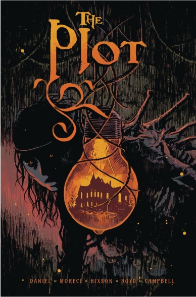
Written by Tim Daniel & Michael Moreci
Illustrated by Joshua Hixson
Colored by Jordan Boyd
Lettered by Jim Campbell
Reviewed by Christa Harader
“The Plot” #4 keeps the mystery and horror moving well enough, but there’s a bit of a disjointed feeling at this point in the book. We’ve listened to tapes, fought with sheriffs, fallen into ponds, remembered some weird stuff and gotten scared, and while there’s not necessarily a need to draw anything together just yet, a few too many entities and twists are present so far to muddy the story. Daniel and Moreci are crafting a book designed to draw tension piano-wire tight, and continuous vignettes and shifting POV between several characters dilutes this escalation just a bit.
Boyd’s art is creative, clean and effective. There are few close-ups of Chase later in the issue with aggressive nose and cheek shadowing, but it’s pretty minor and doesn’t detract from the overall effect. Boyd’s color palette is subtle and minimal, with great sickly greens and interior purples and pinks to get at the emotional depth and weight of the story. Campbell’s lettering is clear and features a font with a good peaky “S” and squat, round-cornered balloons.
Overall, “The Plot” is a good experiment with a style of horror storytelling that features a cast at capacity but enough gooshy jump scares to get us through. There’s still good momentum and mystery here.
Final Verdict: 7.0 – “The Plot” #4 doesn’t rein in its storytelling enough to dazzle, but keeps the pace measured and the craft consistent.

Written by David Hine and Brian Haberlin
Illustrated by Brian Haberlin
Colored by Geirrod Van Dyke
Lettered by Francis Takenaga
Reviewed by Kobi Bordoley
Political drama and dark intrigue abound in the newest issue of “Sonata,” but the story still struggles to balance its disparate themes and styles. We touched on this when we first reviewed “Sonata,” and while it’s too bad that the same problems are lingering this deep into the comic’s run, there are still some flashes of brilliance.
Let’s start with those. The story’s strength has always been its ability to lean into the pulpy, science-fiction fantasy nostalgia it draws upon while adding its own dash of originality. To that end, the friction between the comic’s indigenous populations, interlopers, and the colonizers still feels real in this issue, and the cruelty of excessive force on those otherwise trying to mind their own business is on high display in “Sonata” #7. When those moments hit, they hit.
On the flip side, tedious exposition and rehashings of who is allying and/or betraying whom take up a lot of space here, and we spend a lot of time in closed-off war rooms this issue. Not that getting into the nitty-gritty of interstellar political drama should be avoided, only that it should feel less flat and cramped, which it sometimes does here.
While we still have misgivings about the art style (the mishmash of high definition and more roughly rendered elements are not fully cohesive), the general art direction is still on point. The world of “Sonata #7” threads the needle between Monster Hunter and Mad Max, providing a landscape that’s not quite as bleak and enigmatic as the former, but still not so glitzy and over-the-top as the latter. Hine and Haberline have given us a literal, massive sandbox setting, and imagining the breadth of its horrors and delights still brings joy to the reader.
To conclude, if you’ve been picking up what “Sonata” has been putting down these past few months, there’s nothing here that will deter you from continuing your journey. However, if you’ve been an intermittent reader or were wondering if things change dramatically in the new arc, they do not. There’s plenty to enjoy here, but not enough to keep us compelled, or to put “Sonata “#7” to the top of the to-be-read stack.
Final Verdict: 6.8 – Space tyranny can get tedious, but at least it’s honest work.

Written by Kelly Thompson
Illustrated by Javier Pina with Filipe Andrade
Continued below
Colored by Jesus Aburtov
Lettered by VC’s Clayton Cowles
Reviewed by Luke Cornelius
After escaping the Raft in “Captain Marvel” #11, Ripley Ryan A.K.A Star spins off into her own five part miniseries and now, through a mysterious bond, she’s powered by the Reality Stone. For new readers, this issue gives just about enough of an introduction to Ripley and her situation in the first few pages and quickly gets on with the now: that Infinity Stone. Ripley grapples with the precision required to achieve the result she wants from the Stone over the course of the issue, but comes nowhere close to harnessing its full potential to unstitch reality, although with her dark impulsive habits, you’d imagine that Star’s villainous streak will reach those terrifying new heights sooner rather than later.
Thompson tries to hide that villainous streak in this issue though, and is successful, especially to new readers. She positions Star as the victim of the scenario having been traumatised by Captain Marvel portraying her as a violent and vicious ‘hero’ who punched a hole through her chest. Star is haunted by the attack and stuck in the Pop-Up Bar With No Name feeling sorry for herself, though, arguably, not without reason. Star’s villainous streak is suddenly revealed when a bar fight escalates, with Star only narrowly prevented from setting the bar alight using the Reality Stone. Clearly, for Ripley Ryan, with great power comes no responsibility.
The artwork by the two artists, Pina and Andrade, work well to complement each other despite Andrade only providing the opening dream sequence page. Andrade’s work has an ethereal quality because of its softer lines and liney pencil shading that is juxtaposed with Pina’s work that is marked by thicker lines, giving Star’s panicked awakening a stark contrast. The clarity in Pina’s art continues through the book, with each movement being unobstructed within the panels. Aburtov’s coloring does a great job of breathing life into the book and, although most of the book consists of fairly muted everyday tones, the bright red, blue and pink washes that appear momentarily show that, if the series does start unstitching reality, it sure will be nice to look at. Finally, Cowles’s lettering through the book ensures for an easy and flowing read.
Overall, the creative team of “Star” #1 work together successfully to make a good introduction to Ripley Ryan and her situation, with the infinite potential of the Reality Stone being harnessed by the combustible Star giving enough reason to see what happens next.
Final Verdict: 7.0 – “Star” #1 serves as a good (re)introduction to Ripley Ryan and sets up the miniseries with potentially reality breaking consequences.

Written by Caitlin Kittredge
Illustrated by Roberta Ingranata
Colored by Bryan Valenza and Beyond Colorlab
Lettered by Troy Peteri
Reviewed by Matthew Blair
“Witchblade” #17 finds a group of people who hold a collection of powerful mystical artifacts in the middle of their quest to stop a powerful demon from Hell that threatens to take over the world. Unfortunately, it seems that their biggest obstacle at the moment is the crippling self-doubt of the person who holds a powerful artifact known as the Witchblade, and the fact that the particular artifact doesn’t seem to want to work.
The writing on “Witchblade” #17 is solid with some good character moments and some pretty substantial revelations about the characters involved and why they are where they are in the broader scheme of things. While it would have been nice to have a recap page explaining what is going on, writer Caitlin Kittredge does a great job of crafting dialogue that makes the characters relatable, vulnerable, and allows the reader to kind of figure out what’s going on. The downside to the issue as a whole is that the narrative demands of the larger story kind of require this to be an issue mostly made up of people just sitting around and talking, which can be engaging but it is very easy to slip into being boring.
Speaking of boring, the artwork doesn’t really do a good job of capturing the reader’s interest. Artist Roberta Ingranata does a great job with the quiet emotional moments where the characters are talking. However, while there is one action scene that has some interesting blocking, there is a magically induced flash back that doesn’t make an effort to look weird or special. Instead, the art simply relies on a slightly different color palate and few red lines drawn here and there.
All in all, “Witchblade” #17 is a decent book about an interesting set of characters that does it’s job as the middle issue of a story arc. While there are a few things that could have been done to make the book stand out more, it’s got good writing and the art is good enough to create a safe, unoffensive book.
Final Verdict: 7.4- A decent book that moves the broader story along nicely, but if you’re not already invested in the Witchblade series there’s really no need.


