
There’s a lot to cover on Wednesdays. We should know, as collectively, we read an insane amount of comics. Even with a large review staff, it’s hard to get to everything. With that in mind, we’re back with Wrapping Wednesday, where we look at some of the books we missed in what was another great week of comics.
Let’s get this party started.

Written by Sean Murphy
Illustrated by Sean Murphy
Colored by Matt Hollingsworth
Lettered by AndWorld Design
Reviewed by Kevin M. Gallagher, Jr
Sean Murphy wowed readers in 2017 when “Batman: White Knight” debuted. The core premise, reversing the hero/villain roles of Batman and the Joker, practically sold itself. By the end of that run, the roles return to normal, but the world that Murphy’s story takes place in is changed forever and is explored in this sequel series, “Batman: Curse of the White Knight”. Murphy’s script for this series has been just as strong and compelling as his script for the original “White Knight” series. He’s created a world that’s just as interesting as the main DC continuity and in “Batman: Curse of the White Knight #6” reveals Gotham’s biggest secret.
The issue continues with Azrael’s quest for vengeance as he frees the Joker from new Arkham. Before heading to old Arkham, where the birth of the Joker happened, the villains stop by the GTO and laid it to waste; kidnapping Harley’s twin babies in the process. In a team-up we didn’t know we wanted or needed, Harley and Batman head to old Arkham to take on Joker and Azrael. Harley is able to get through Joker to Jack Napier just enough to save her children, but Jack knows Joker won’t ever leave the twins alone. Meanwhile, Batman and Azrael are trading punches and words about saving Gotham. Harley ends up saving the day, but not before Joker reveals what was written on the wall: “I am Edmond Wayne”.
Sean Murphy pulls double duty on “Batman: Curse of the White Knight” by also providing the art. Between his style and Matt Hollingsworth’s colors, the book evokes a gritty world reminiscent of 1989’s “Batman”. The attention to detail is magnificent and Murphy fully utilizing the rule of “show don’t tell” here—Joker is a Batman fanboy to the point his left purple eye has a bat-shaped pupil.
“Batman: Curse of the White Knight #6” is the best in the series so far. It lives up to the promises made at the start of the series. While the overall premise isn’t as interesting as the original series, the payoff in this issue leaves us anticipating how the final two issues are going wrap up.
Final Verdict: 8.8 – “Batman: Curse of the White Knight #6” is Sean Murphy firing on all cylinders and drops more than one bombshell on readers.
Written by Peter Tomasi
Penciled by Scott Godlewski
Colored by David Baron
Lettered by Rob Leigh
Reviewed by Tanveer Kalo
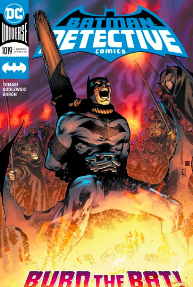
This issue marked the conclusion of the two-part story “Burn the Bat.” Batman battles an ancient Nordic-inspired cult during the holidays without the help of his faithful butler Alfred.
The story is a classic Batman adventure, but what makes it unique is Bruce Wayne attempting to solve the case on his own and reminds readers what Alfred meant to the Dark Knight in his war on crime.
The issue also explored humanity’s pursuit of power through cults/relgion and the consequences of actions. As seen by the fate of the cult leader in this issue, possession without proper understanding can lead to a dangerous path.
Peter Tomasi is an expert in writing containing short self-containing stories in Detective Comics book. He understands the characters well and easily transtioned the post-City of Bane Batman into Detective Comics. Tomasi is right up there with other great Batman writers in recent years like Tom King and James Tynion IV in providing a strong emotional story.
Scott Godlewski, David Baron, and Rob Leigh fully capture the ambiance of the story. Godlewski’s action sequences pack a lot of punch in every panel. David Baron’s colors bring out the emotion Tomasi wants to convey. Rob Leigh’s lettering ties everything together with perfect effect.
Continued belowFinal Verdict: 7.5 – A nice short story of Batman being Batman during the holidays.
Written by Tini Howard
Illustrated by Marcus To
Colored by Erick Arciniega
Lettered by VC’s Cory Petit
Reviewed by Alexander Jones
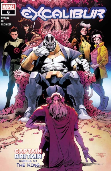
“Excalibur” #6 is the issue that sets itself apart from the other titles in the ‘Dawn of X’ publishing initiative. In just a few short issues writer Tini Howard has changed the physical nature of several cast members. At first, it appeared that Howard was rushing to reach toward these massive mutant status quo changes. Thankfully, Howard has been able to focus and better establish the shifting nature of “Excalibur” during the past few scripts. The newest entry of the series positions Apocalypse in a particularly intriguing nature and foreshadows what promises to be a disturbing next series of revelations for the anti-hero. With so many villains making up the cast of Krakoa’s Quiet Council it is refreshing to see Apocalypse get the spotlight he deserves outside of the main “X-Men” title.
Artist Marcus To is a really strong fit for “Excalibur.” To’s new designs for the cast members in the issue look great on the page together. The vibrant colors from Erick Arciniega are particularly vivid thanks to To’s nimble, precise line. The page composition and framing of panels are also great. To is an excellent artist for a ‘Dawn of X’ comic and would have been a great choice for the main X-Title. Aside from precise lines and solid framing, To is great at finding expressive scenes full of emotion. Howard’s script hops genres of storytelling and even loops back to being a superhero story at certain points. To is able to shift his style as fast Howard’s script changes genres.
“Excalibur” #6 is the single best issue of the series but there are a couple of melodramatic sequences that weigh the title down slightly. Gambit and Rogue’s sequence carries a sense of contrived conflict that undoes some of the goodwill established by other points in the script. Howard’s portrayal of some of the angst from the Braddock family is the only other element detracting from the script. These moments are overshadowed by interesting changes to existing characters and characterization of Apocalypse. Howard’s script for “Excalibur” #6 finally catches up to the craft in To’s pencils. I’m excited to see Howard payoff on the bleak cliffhanger of the issue and new status quo changes in the story.
Final Verdict: 8.5 – “Excalibur” #6 is an evolution of the work that brings significant change to core characters and the overall story for the better.
Written, illustrated, and colored by Maria Llovet
Lettered by Andworld Design
Translated by Andrea Rosenberg
Reviewed by Matthew Blair
Trigger warning: “Heartbeat” #3 contains graphic sex scenes, self-harm, really intense emotional distress, and lots of blood. Also, high school.
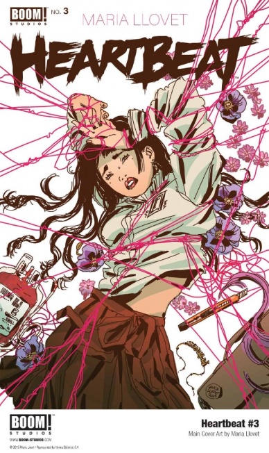
“Heartbeat” #3 is the middle child of a five part series that comes courtesy of writer artist Maria Llovet. It follows the doe eyed protagonist as she is caught between her sympathy for her friend who lost his sister and her desire for a massive creep with a dark secret, who just so happens to be the most popular kid in school. The writing walks a very fine line between well written gothic tragedy and a pretentious story that glorifies self-harm, but it keeps the purple prose to a minimum and does a good job focusing on just how screwed up these students are.
While the writing on “Hearbeat” #3 is decent, Maria Llovet’s artwork is amazing. Llovet seems to blend a high concept European style with Japanese influences that tells the story very well. Everything from the exaggerated facial features to the highly stylized and incredibly detailed architecture each page a treat to look at. It all culminates with a very graphic sex scene that would be incredibly erotic if it wasn’t for the emotional stakes established in the story, along with the very end of the comic where the characters take a sharp turn into some very graphic and intense stuff that some readers may find disagreeable.
“Heartbeat” #3 is a book that deals with abusive relationships, grief, and a lot of nasty emotions that take the characters to some really dark places, and if that’s not your thing that’s totally fine. However, if you’re not too squeamish at the sight of blood, and if you’re feeling particularly brave, you will find a gorgeously drawn and well written drama that isn’t afraid to go down some very dark paths.
Continued belowFinal Verdict: 8.1-A well written story with absolutely gorgeous artwork, but the powers that be felt it was necessary to include the number to the National Suicide Prevention Lifeline for anyone who might be feeling upset or lost, which should tell you what kind of story this is.

Written by Paul Tobin
Illustrated by Arjuna Susini
Colored by Vittorio Astone
Lettered by Saida Temofonte
Reviewed by Jodi Odgers
Glane Breld and his small band of would-be liberators make preparations for the next phase in their plan to, as the subtitle for the series clearly states, steal the planet Heist from the bureaucratic grip of the Dignity Corporation. They are helped by the hilariously ineffectual Conqueror Crows’ use of shoddy doppelgangers of Breld, apparently in an attempt to ruin Breld’s reputation and infiltrate his heist gang. This choice would not be out of place in a Saturday morning cartoon, and leads to some hilarious results that won’t be spoiled here. Breld, Eddy, Celene, and Gaville gather some crucial pieces for their next big move against the Dignity Corporation, and there is even time for a brief glimpse into how and why Gaville turns herself into, well, whoever she wants, whenever she wants.
Arjuna Susini’s art continues to fit well with the grime- and crime-smeared world of Heist. There is still some visual muddiness and inconsistent rendering, particularly of Breld’s faithful hound, Horace. The poor puppy’s mug is never shown the same way twice, and he is even colored incorrectly in one of the panels. Apart from this one strange decision, Astone’s color palette helps to differentiate each of the locations visited in this whirlwind issue. Temofonte’s lettering remains solid, but the issue of readability with the white text in lavender text boxes persists, particularly where those boxes blend from lavender to white. These small hitches serve to disengage the reader just enough to be noticeable.
Final Verdict: 6.8 – The third issue of Heist continues the series’ trend of being an engaging crime caper comic sprinkled with minor issues that slightly dampen its impact.
Written by Skottie Young
Illustrated by Jorge Corona
Colored by Jean-Francois Beaulieu
Lettered by Nate Piekos of Blambot
Reviewed by Luke Cornelius
After fourteen issues of “Middlewest” we’ve certainly come to expect an emotional ride and #14 is no exception.
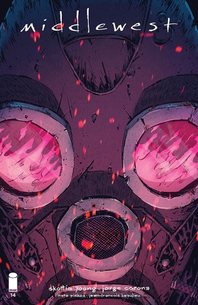
The issue opens up with Abel, Bobby and co. continuing to work in the heat at one of Raider’s Farms before catastrophe strikes; Bobby slips and drops two eyes of Ethol which explode and engulf one of Raider’s staff in searing pink flames. While the series hasn’t shied away from showing us some of the horrors Abel and co. have witnessed on their journey, Piekos’s lettering gives the scene a really haunting quality. The victim expectedly screams in pain and fear and Piekos, rather than lettering the scream entirely within the panel, leaves it to be cut off by the edge of the panel. By doing this, the screaming continues in the reader’s mind through the panels that follow it, without it having to be lettered in each panel and distract from the actions, or rather, inaction, of those who are witnessing the event.
With the man saved by Abel and Bobby, the issue slows down and the workers return for their evening meal. Here, Abel starts to open up to his companions about his father and inspires the rest of the crew to open up about their own traumas. The dialogue here is captivating and you can’t help but sink into the stories that each runaway tells. Corona’s artwork supports the script very well by showing two different traumas in quick succession using different techniques. The first is described with limited background details, forcing us to focus on the character’s empty expression, before isolating them in one panel and casting dark shadows over their face. Corona depicts the second trauma using a flashback sequence of carefully abstracted images, which is equally as effective.
When Young returns to the consequences of the Ethol fire incident, it acts as a big wake up call for both Abel and the reader. Having become so engaged in the unfortunate trauma that led to the children becoming runaways, the horrors of the opening incident are almost forgotten and that’s a testament to the creative team’s efforts. This final scene ends with a much needed glimmer of hope for Abel and the Raider’s farm runaways.
Continued belowOverall, while this issue of “Middlewest” is slower, it gives us great insight into the other runaways at Raider’s Farms and gives us cause for optimism for them.
Final Verdict: 7.5 – “Middlewest” #14 delivers yet another emotional entry in the series with its great artwork.

Written by Ryan Parrott
Illustrated by Daniele Di Nicuolo
Lettered by Ed Dukeshire
Colored by Walter Baiamonte
Reviewed by Michael Govan
“Mighty Morphin Power Rangers” is a consistently good comic. Incredibly so, even. There have been issues that I’ve liked less but I don’t think I’ve disliked any of them. That being said, this latest arc featuring the Omega Rangers really stands out. If you don’t know your Ranger history, when the original Red, Black and Yellow Rangers were written out of the show, they were said to be at a peace conference in Switzerland. Well as it turns out, that was their cover to embark on a secret mission.
It’s a really strong concept and this issue continues to make the most of it. There are plenty of strong character moments. Kiya proves to be an engaging antagonist. Some of the most interesting villains see themselves as heroes. The Omega Ranger truly believes in her cause and that’s terrifying to see. As she grows stronger, our Rangers are a mess. Aisha feels insecure about her place on the team with the return of the originals. Tommy and Kimberly are incredibly angry over the secrets while Billy is hurt. Zordon, on the other hand, sympathizes with the Omega Rangers while Zack and Trini miss their friends.
The artwork accompanying the engaging drama is great too. Di Nicuolo’s work doesn’t strive for realism, instead going for a somewhat exaggerated, anime-esque style. It definitely works when paired with Baiamonte’s bright colors and is true to the spirit of the Power Rangers. When you were a kid, you tuned in to the show for colorful costumes and explosions. Well, it’s all here in spades. Who doesn’t want to see the White Ranger do a flip twenty feet in the air? Who doesn’t want to see Goldar taking out with an epic lightning blast? They’re fighting a monster made out of a school bus, I mean…are you not entertained?!
Final Verdict: 8.0 – I’m so glad it’s Morphin Time and you should be too.
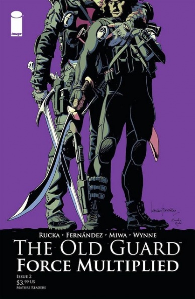
Written by Greg Rucka
Illustrated by Leandro Fernández
Colored by Daniela Miwa
Lettered by Jodi Wynne
Reviewed by Gregory Ellner
Greg Rucka is very good with writing his immortals. Their struggles, though obviously not on the same level as the mortal humans, are still played in a way that is fairly reasonable and understandable. However, even with them being treated as relatable on some level, their personalities are nonetheless warped by their very old age, treating normally aging people as “babies” by comparison.
The problem with “The Old Guard: Force Multiplied” #2 comes when someone is trying to understand the story coming in fresh. While gaining information about the apparent immortality is possible through Rucka’s script, there isn’t much else on to which a new arrival can latch. This story may be made for returning fans, but it nonetheless has problems with drawing in a new audience.
Leandro Fernández provides excellent, dynamic artwork to Rucka’s writing. Anger and ambivalence, among other emotions, are palpable in the interactions between principle characters, even with the detail not being quite as heavy as some other artists may have drawn. The “camera” angles are drawn in ways that seem right out of a live-action film set, from a view of a conversation from the vantage point of a car window to the shock of a gunshot forcing its way into the panel from an unknown source, to more besides, adding emotional depth to scenes without requiring too much detail on the part of the close-ups of many of the participants of the plot.
Daniela Miwa uses a relatively dark color palette, though not so dark as to appear supernatural. Uses of browns, blues, purples, and greens are able to emphasize the nighttime nature of the story, with them all being played in contrast to the orange and yellow of street lights below, or even the shock of a burst of red to showcase extreme violence or emotion.
Continued belowFinal Verdict: 7.0– While the story maintains a high quality in theory and the art more than keeps pace, perhaps the second issue of “Force Multiplied” isn’t the right place to get into “The Old Guard.”

Written by Geoff Johns
Illustrated by Scott Kolins and Dale Eaglesham
Colored by Michael Atiyeh
Lettered by Rob Leigh
Reviewed by Brian Salvatore
It has taken to double digits, but it looks like “Shazam” is starting to fulfill its promise a little bit. While we still have not seen enough character development from the other siblings, the book is finally starting to expand its worldview from out of the Magiclands and into the greater DCU. But more than that, the book is also starting to treat the entire Fawcett world as fodder for the stories, with the Wizard, Tawky Tawny, and the Monster Society all playing major parts in this issue and, hopefully, going forward.
But let’s not bury the lede any further: Superboy Prime shows up! A perfect Shazam villain in so many ways (as well as a Geoff Johns favorite), Superboy Prime will make an ideal foil for Billy Batson for reasons both in story and metatextually. This is one of the more inspired pairings we’ve seen recently, and it portends well for the story now that King Kid is, hopefully, defeated for good.
Kolins and Eaglesham are longtime Johns collaborators, and both do a solid job here, though it’s hard to not wish that Eaglesham was doing more on the title. Kolins, while a great artist, isn’t as natural a fit for these characters as Eaglesham is, and due to whatever scheduling conflicts keep doing in this book, he hasn’t drawn as much of the title as anyone probably would’ve liked.
It is interesting to see the artists playing with the idea first introduced in “Kingdom Come,” where Billy Batson all grown up looks almost exactly like Captain Marvel. While it’s not a straight clone of the Golden Age Cap, it’s close enough, and it helps eliminate the ‘is this really Billy’s dad?’ question that must pop up whenever long lost relative shows up.
Though the end of the issue makes you question if Mr. Batson or the Wizard, or both?, are exactly what they appear. That question, mixed with Superboy Prime and the further incorporation of some of the classic rogues’ gallery, means that this book is finally breaking free from its dragged out first arc. Let’s keep it coming, folks.
Final Verdict: 7.1 – The strongest issue of “Shazam” since its debut.

Written by Brian Michael Bendis
Illustrated by Ivan Reis
Inked by Joe Prado, Danny Miki, Julio Ferreira, & Oclair Albert
Colored by Alex Sinclair
Lettered by Andworld Design
Reviewed by Quinn Tassin
What does the biggest superhero in history do after he reveals his identity to the world? He talks to his Editor-in-Chief. “Superman #19” is a relatively strong issue on the part of scribe Brian Michael Bendis. He makes the smart decision to follow up Superman’s big reveal with a small moment- a meeting between Clark, Lois, and Perry White. It’s a fun scene that helps make these relationships matter and feel really lived in; Perry clearly cares about Clark, firing him for lying then immediately re-hiring him. The post-meeting newsroom moment where everyone in the office wants to hug Clark is also deeply wonderful and honestly should’ve been longer. Classic Bendis-speak becomes an intense strength in the Daily Planet sequence, allowing characters to feel more human in their processing of such a major event.
The issue’s misstep comes in the form of the first meeting of the United Planets. Ambassadors from the first member planets meet with one another, only for Mongul to appear, ready to destroy this utopian organization before it’s even really started. Superman intervenes and chaos ensues, only for the Big Blue Boy Scout to be taken down. While it’s a perfectly fine plot development, it’s a major departure from the first two-thirds of the issue and feels pretty out of place here. Still, though it doesn’t detract from the strength of everything else that’s going on.
Continued belowIvan Reis does his Ivan Reis thing, delivering strong, dynamic artwork that keeps you engaged during slow moments and on the edge of your seat when the action gets dialed up. Particularly effective in “Superman #19” is the spread of Superman flying through Metropolis after leaving the Daily Planet. He flies over a cheering crowd, stops a car crash, then goes to the Hall of Justice. It’s simple, classic Superman stuff but it also has an atmosphere around it that feels pretty wonderful- celebratory and at peace simultaneously. After years of stellar artwork from Reis on major DC books, seeing his lines show up makes you feel at nome in an odd way; it’s hard to imagine an artist better suited for a moment as world-shaking as this one in Superman’s story.
Final Verdict: 7.7 – The Man of Steel takes a second to breathe then takes a hard turn into actionville in “Superman #19.”
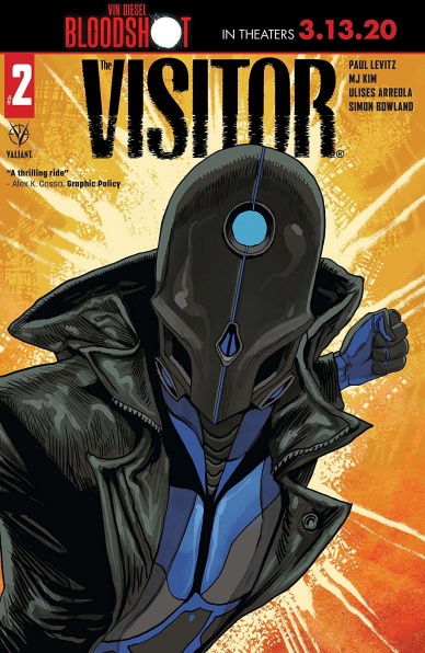
Written by Paul Levitz
Illustrated by M J Kim
Colored by Diego Rodriguez
Lettered by Simon Bowland
Reviewed by Kobi Bordoley
“The Visitor” #2 is certainly ambitious, but unfortunately the pieces just don’t come together in a satisfying, succinct way. Some pages are wonderfully composed, which makes the unevenness even more frustrating — we get the sense that within this story there is a gem of greatness, but it just hasn’t revealed itself yet. Botched beginnings are forgivable, don’t get us wrong. The problem here is that in a five issue mini series like “The Visitor,” every page is precious, and everything has to be more efficient. Let’s take a look under the hood.
“The Visitor” #2 is very top heavy. Exposition starts strong and hard, and the curtains draw at a United Nations security briefing (who would have guessed that an opening scene in one of the most bureaucratic agencies in the world would drag?) full of telling with just enough showing to get a pass, but not enough to pull us in. The next third of the issue, while ostensibly pushing the plot forward, meanders nonetheless as side characters rehash conversations they’ve already had. We don’t get a strong sense of who people are, other than what their job titles are and the fact that they appear very busy. The eponymous Visitor himself, at least, feels unique. He speaks with enough of an esoteric tilt to offset the blandness around him.
Kim’s art and use of space is “The Visitor” #2’s redeeming factor. Her lines are crisp, and in the issue’s definitive action scenes, everything opens up. For all the faults of the comic, when the eponymous visitor is doing his thing, it looks cool as hell. Rodriguez’s colors are bold, and a good mix of negative space and blackout panels cuts through scenes to provide the kind of mystery the story advertises.
So, what’s going on here? Paul Levitz, the writer and former president of DC Comics, knows his way around a story, at least in the most basic sense possible. What’s happening in “The Visitor” #2 feels less like inexperience and more like lack of exciting vision. It feels like the story came together from a thought experiment (“What would a morally grey, cyber terrorist in contemporary New York be like?”) and less from creative inspiration, or a true yearning to tell a story. That thought experiment is fine, but without heart it’s nothing more than a flight of fancy.
Final Verdict: 6.8 – “The Visitor” #2 has Airplane Movie energy — if it’s there and nothing else looks appealing, I’ll take a look and be mildly satisfied. Let’s hope things turn around before this story finishes its flight.

Written by Michael Moreci
Illustrated by Hayden Sherman
Colored by Jason Wordie
Lettered by Jim Campbell
Reviewed by Christa Harader
“Wasted Space” #13 gives us a bit of blowback for Billy (at last) and a new direction for Dust and Molly (thank goodness.)
All that to say, some changes are necessary at this point in the plot and it seems like Moreci and Sherman are willing to give them to us. Incremental progress toward the main objective, teased as it has been for some time now, isn’t bolstering the story tension we need issue to issue. It’s a nice change of pace to see Billy have to dig into his nonsense and learn a bit more about what it means to be good in this universe. Still, there’s a big bad out there and the Creator at large, and the longer we meander the less potent a threat they seem. Sherman plays with some close-up panel stacks for Billy and Fury and goes a bit wider in the battle scenes, and the juxtaposition mostly works. Wordie’s palette is as harmonious as ever, and Campbell’s lettering continues to impress, especially given the amount of dialogue.
Continued belowOverall, “Wasted Space” #13 gazes into the proverbial navel with a bit more interest, and gives us some stakes for Billy again. It’s easy to get lost in his moralizing, and we’re finally turning the lens back on it and not accepting it as the thrust of the story. Perfect timing.
Final Verdict: 7.0 – “Wasted Space” #13 changes the script right when we need a little more depth in the story to keep going.

Written by Zac Thompson
Illustrated by Dio Neves
Inked by Oren Junior
Colored by Rain Beredo
Lettered by VC’s Clayton Cowles
Reviewed by Chris Egan
As Eddie Brock/Venom is on a mission of his own, he leaves his son Dylan under the care of Harry Osborn and Liz Allen. Dylan has a strained friendship with their son Normie. As the boys start the issue with a sleepover and reminiscing over events from past issues, readers get more than their share of exposition drops in the attempt to catch up those who may not have read every recent issue pertaining to the various plots involving symbiotes.
We get some backstory on how the boys feel about their fathers once being super-villains who are just pretending to be normal people at this point in their lives. They also point that mirror at themselves, knowing that because they each have their own monster to bear, they could become just as bad as their dads ever were.
The issue is full of tween boy high jinks with a dark spin to it. We learn that Dylan kept a small piece of the Carnage symbiote and is able to control it with his mind, with help from his own symbiote. As the make their way around the city messing with powers truly beyond their control, we get a look at the problems they could cause for the city and the greater world.
The issue as a whole is fine, but nothing that feels greater than just set up for things that may or may not come to pass in the future. The ‘kids playing supervillain’ sleepover tone is one of the better aspects, but doesn’t have the room it needs to to tell a truly engaging or important story. This has a really great creative working on it, but none of it seems worth the time that was put into it. It never gets as interesting or exciting as it could be.
The artwork from Neves is well executed and stands above some of the standard fare we get from Marvel, but still feels safe and more than connected to the last few decades. It is pretty to look at and there is something to be said for honoring the past. Beredo’s colors are beautiful and flesh out the world as we move through a few environments and emotional settings throughout the issue. The detailing is excellent and nothing to balk at.
This is a spinoff issue that is required reading only for those well-versed in all current symbiote stories (and plenty of Goblin mythos), for everyone else it’s either a passable time filler if you regularly pick up various Marvel books or something to skip for casual readers.
Final Verdict: 5.5 – A creepy kid story that just barely touches on nature vs nurture when it comes to these kids of famed baddies.


