
There’s a lot to cover on Wednesdays. We should know, as collectively, we read an insane amount of comics. Even with a large review staff, it’s hard to get to everything. With that in mind, we’re back with Wrapping Wednesday, where we look at some of the books we missed in what was another great week of comics.
Let’s get this party started.
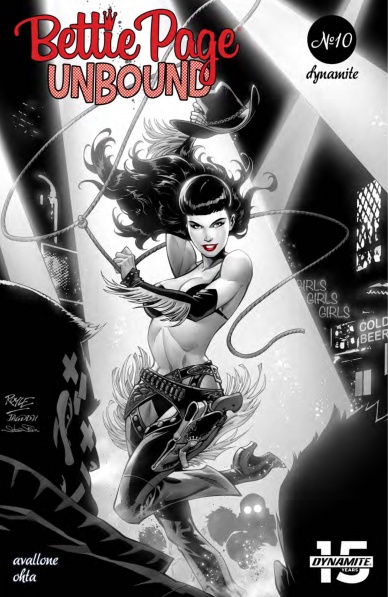
Written by David Avallone
Illustrated by Julius Ohta
Colored by Ellie Wright
Lettered by Taylor Esposito
Reviewed by Christa Harader
“Bettie Page: Unbound” #10 sees our heroine triumphant, our enemies vanquished and the bonds between co-workers, compatriots and spies in arms tighter than ever … not to mention a little reunification of the self.
Bettie blasts her way through Praesepods, rescues her friends and rejects a fraught offer of feminine power in the final issue of this entertaining run. Avallone and Ohta wrap this book in style with some good-guys-win, bad-guys-lose flavor that’s true to the book’s pulp foundations and keeps us entertained. Ohta keeps Bettie powerful and pixie-cute in equal measure with expressive faces and physicality, and Avallone has done a great job all the way of empowering Bettie without giving the male characters short shrift. They’re characters in their own right, and that makes Bettie’s competence and personality all the more believable as she saves them from alien bee doom. Wright’s color palette features lovely acid oranges and more muted blues and browns, and Esposito gets to work his magic on the Queen’s death scene with lovely squiggly balloon tails and effects.
Overall, “Bettie Page: Unbound” has been a wonderful load of fun. From battling Elder Gods to finding herself in a meta-journey across pulp properties to battling bees, Bettie Page is an engaging and dynamic protagonist. The whole team should be proud of their work on this book, and if you haven’t read it yet, now’s the time!
Final Verdict: 8.0 – “Bettie Page: Unbound” #10 wraps this entertaining series with some good action, good vibes and good storytelling.
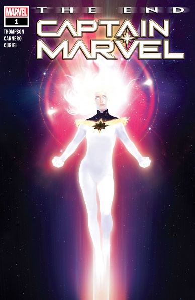
Written by Kelly Thompson
Illustrated by Carmen Carnero
Colored by David Curiel
Lettered by Travis Lanham
Reviewed by Quinn Tassin
One day, the final Captain Marvel story will be written. God willing, it won’t be any time soon, but “Captain Marvel: The End” is a fascinating idea of what that story could look like. Written by current “Captain Marvel” writer Kelly Thompson, the issue takes place in 2051, where Carol Danvers (who glows rainbow now) defends the galaxy from evil aliens. After saving an alien planet, she gets called back to Earth by an Avengers beacon. The thing is everyone on the planet was killed years ago, hence Carol’s cosmic hermitude.
When Carol returns to Earth, things are in dire straits. The planet is in a new ice age and the humans that are around live underground. Worse yet, there’s a giant monster that they just can’t seem to destroy. On the bright side, the legacy of the older Earth 616 lives on; the Avengers of 2051 are the children of a number of the old heroes like Rogue and Gambit (also Emma Frost is there) and Jessica Drew is alive to see her best friend again. Captain Marvel couldn’t have arrived at a better moment. First, she takes the new heroes out to beat the monster by flying into and and popping it open. They celebrate in the underground society with plenty of back slapping and heart to hearts but there’s still the pesky sun problem. Carol solves that too, flying into the sun and releasing all of her energy into it, reigniting it and making Earth viable for life once more. It’s a fitting end for Carol, saving society and then the planet, smiling the whole way through it. There are few writers who capture Carol as well as Thompson and one can only hope that the final Captain Marvel story lives up to her standards.
Carmen Carnero, who illustrated the first couple of arcs of the current run of “Captain Marvel” fills penciling duties on this issue and she does wonderful work with the help of the wickedly talented David Curiel on colors. The pair does stellar work together, delivering absolutely gorgeous moments constantly, from Hazmat’s radiation absorption to Jessica and Carol’s reunion, to Carol’s sacrifice. By far the coolest visual this issue is Carol’s newfound post-Binary aesthetic; it’s stunning to see her new ethereal state, literally becoming a beacon for the Marvel universe. The writing this issue is strong, but the art drives things home in deeply important way.
Continued belowFinal Verdict: 9.0 – Kelly Thompson delivers a deeply satisfying (hypothetical) conclusion to the story of Carol Danvers in “Captain Marvel: The End”.
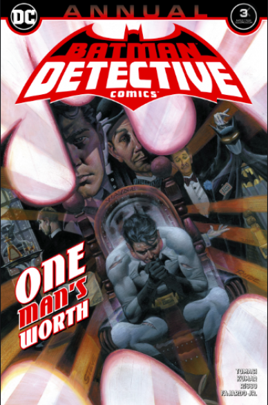
Written by Peter Tomasi
Penciled by Sumit Kumar and Eduardo Risso
Colored by Romulo Fajardo Jr. and Eduardo Risso
Lettered by Tom Napolitano
Reviewed by Tanveer Kalo
Peter Tomasi, Sumit Kumar, Eduardo Risso, Romulo Fajardo Jr., and Tom Napolitano give two of the best Alfred stories to date in this annual. Both stories explore and commemorate a different aspect of the Dark Butler, who recently died at the hands of Bane in the “City of Bane” storyline. The creative team helps readers understand there was more to Alred than just being a servant the day’s Bruce Wayne and the night’s Batman.
Tomasi in “Who Dares Wins”(Also the motto the British SAS), gives readers the MI6 agent Alfred who battled Soviet operatives around the globe and dealt with a betrayal of friendship. He presents Alfred as ever-faithful to duty and those he cared about. Plus Tomasi reminds readers Alfred had skills and training to hold his own against most threats.
In “The Week” Tomasi shifts to Alfred as the butler Bruce and his war on crime. The writer lets Alfred convey his reactions to seeing the child he helped raise become a man on a dangerous mission. Eduardo Risso’s art in “The Week” beautifully captures this sentiment, especially with Alfred’s detailed facial expressions. On every step of Bruce’s journey to Batman during Year Zero, Alfred is always there waiting to stitch him or the Bat-suit right back up.
Romulo Fajardo Jr. and Eduardo Risso’s colors bring out all the emotions in this issue from pain, nostalgia, and celebrating the life of a man who meant so much to Bruce. Readers instantly pick up on the change in the mood or emotion from scene to scene by the two creators. Both are experts in using color to show emotion.
Tom Napolitano’s letters tie everything together in this issue. Readers need to see for themselves with their own eyes to understand how beautiful each lettering is. Napolitano helps emphasize each panel and page with ease. His work in this issue will possibly make readers appreciate letterers more.
This annual also marked the first time Sumit Kumar drew Batman. Kumar penciling Batman is another milestone for Indian contribution at the Big 2 publishers. His pencils in this issue are precise in the finer details of Batman’s costume to the urban environments he creates that add to the character’s best qualities. Kumar’s art completely captured Tomasi’s intentions in telling a story of Alferd’s significance to others.
Final Verdict: 8.5 Detective Comics Annual #3 is an great reflection and commemoration of Alfred Pennyworth’s incredible life.

Written by Matthew Rosenberg
Illustrated by Otto Schmidt
Lettered by VC’s Joe Sabino
Reviewed by Michael Govan
“Hawkeye: Freefall” #2 proves that the first issue wasn’t a fluke and is just as good, if not better. Both the story and art are firing on all cylinders. Otto Schmidt draws a fun, action-packed issue here. It’s great to see the fearsome Ronin taking on random goons and getting into it with Spider-Man. I really enjoyed when Luke Cage shows up, the indestructible hero contrasting with the painfully human Clint. Luke hardly notices the bad guy shooting at them while Hawkeye’s ducking behind cars, trying to avoid stray bullets.
Any issues I have with the art are just small nitpicks. It’s great that Schmidt remembers that Hawkeye wears hearing aids but why does Luke seemingly have his ears pierced? Guy’s got indestructible skin, if you recall. Again though, not a big deal.
There’s a lot of comedy in this comic and the jokes are definitely helped by the humor and personality that Scmidt injects into this issue. Just look at the titular character for example. At a charity event, Clint is stuffing his bruised and bandaged face with hors-d’oeuvres, shirt collar completely askew. Look at the smug look on his face when they call him on stage and when he literally drops the mic on stage. The guy may be an idiot but he’s a lovable idiot.
Continued belowWriter Matthew Rosenberg really understands that about the character, has a strong handle on Clint’s personality. He bounces him off of other characters and every interaction is hilarious. Hawkeye fights a random villain and gets into a petty argument about him not being the ‘worst Avenger’ at the same time. He actually starts listing Avengers he thinks are worse. He manages to get under Tony Stark’s skin, calling the guy old when he’s really just two years younger.
If that wasn’t good enough, the comic finishes with a twist ending that I definitely didn’t see coming. I won’t spoil it here but it’s really great. It raises a lot of questions and already has me ready for the next issue.
Final Verdict: 8.0 – Even if Hawkeye’s the worst Avenger, his comic sure is great.

Written by W. Maxwell Prince
Illustrated by Martín Morazzo
Colored by Chris O’Halloran
Lettered by Good Old Neon
Reviewed by Joe Skonce
Satirizing and subverting superhero comics isn’t a new idea. We’ve all seen a meme or two about how “Bruce Wayne could help Gotham more with his wealth than his suit,” or “Mr. Fantastic could solve major world problems if he wasn’t too busy building gadgets.” At this point, it almost seems too easy. Superheroes are brash and colorful, representing values that can seem quaint, prime material for parody. To be fair, there are some comics that have successfully pulled this idea off, superheroes are not above critical analysis just because they are pulpy. There just has to be something more there. “Ice Cream Man” #17 doesn’t really put anything into its take on the genre and that’s its major problem.
“Ice Cream Man” #17 specifically is parodying the mythology of “Superman,” the major difference being that the hero has gone insane, viewing the galaxy and its inhabitants as insects. The majority of the issue takes place in Rick Sweet’s Isolation Palace, complete with trophies of his exploits and an array of alien creatures that we later discover are being kept as prisoners. To W. Maxwell Prince’s credit, the issue is smart to make the focus Parker Page, a serious reporter who doesn’t trust Ice Cream Man. Watching her draw the conclusions about Sweet’s true nature is interesting, but the issue also spells it out for you when a Figglybump (thought to be genetically bred for culinary use) tells Page that they are sentient and they are being destroyed. It’s possible that the issue works better with the buildup, but as a standalone, it falls flat as a superhero subversion.
That being said, the art is good. Martín Morazzo captures the feel of a classic superhero comic. The buildings and settings are stylized in a way that’s reminiscent of comics of the 1960s. Where Morazzo differs is his drawing of the characters. All of the faces in “Ice Cream Man” #17 are intense. They are long and angular, which only makes the character’s expressions stand out more. It even signals Ice Cream Man’s true nature, his smile looking manic rather than charming. The art feels like it’s letting you in on the joke, which does make the reveal less of a twist and more of an inevitability. It assists the storytelling, but it’s in the service of a take that feels more tired than anything else.
Final Verdict: 3.9 – “Ice Cream Man” #17 is a familiar type of superhero satire, one that over the years has become boring.

Written by Scott Snyder
Illustrated by Jorge Jiménez, Daniel Sampere, and Juan Albarran
Colored by Alejandro Sanchez and Hi-Fi
Lettered by Tom Napolitano
Reviewed by Gregory Ellner
And so ends Scott Snyder’s “Justice League” epic. With the Martian Manhunter reaching out to not just the Earth, not just the universe, but to the reader, Snyder is able to explain a viewpoint on heroes, of the everyday heroism of non-superhero beings, one that can inspire readers to be more, to love the Justice League all the more for their efforts, be they in vain or not.
However, while the storytelling of “Justice League” #39 is well done on Snyder’s part, it is not without a major flaw. If there is any real fault to the story, it is that the writing does not just trust other stories to finish what it started, using them as a way of showing the realism of how the ripple effects of the ‘Year of the Villain’ impact the populace, but seemingly forcing the onus of actually completing the arc that has been going since at least “Dark Nights: Metal” on to other writers or otherwise outside of the book itself to stories like “Year of the Villain: Hell Arisen,” rendering them de facto required reading for a tale readers may have hoped would be completed at least to some level of satisfaction within the pages of “Justice League” itself.
Continued belowFor the artwork and colors, there are two select teams at work. For the first half, we have Jorge Jiménez on the artwork, with Alejandro Sanchez on colors. Together, they craft a marvelous portrayal of epic-scale heroism, with brilliantly bright colors, highly dynamic action, and intense emotional responses on the part of everyone involved. Everything moves so fast that it can feel similar to a blockbuster film.
On the second half, we have Daniel Sampere and Juan Albarran as the illustrators, with the colors provided by Hi-Fi, creating a slower, more detailed, differently intense scenario. While the first half of the story is one of very fast and overwhelming action that can bring readers to cheer or despair, the intensity of the second half is far more somber, with the three on those images doing a very good job of eliciting feelings of a faint ray of hope in the darkest of days.
Final Verdict: 7.5 – Though flawed in how it perhaps puts too much of the onus on other books for a final issue, the finale of this truly epic (in every sense of the term) saga is constructed very well overall, albeit with a lot of that carried by the first half.
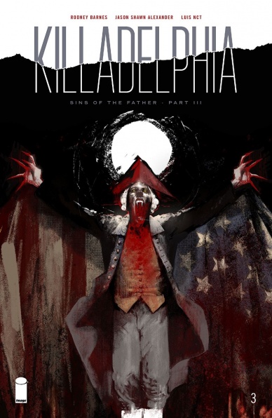
Written by Rodney Barnes
Illustrated by Jason Shawn Alexander
Colored by Luis NCT
Lettered by Marshall Dillion
Reviewed by Kevin M. Gallagher, Jr
“Killadelphia #3” opens with President John Adams standing in front of the Liberty Bell recounting when he and the rest of the founding fathers created a new system that broke away from their British tyrants. About half this issue follows Adams’s story, from what it meant to become President to his post-political life.
While we see how truly long his post-political life has become—a man who wants to use his power to create a new dominant society that is balanced between the elite and underprivileged; we see how it changed his wife’s life. From the first lady to Vampire queen.
Most of the rest of “Killadelphia #3” is spent the recently turned vampire father, James Sangster Sr, his son, Jim Jr, and Philadelphia Chief Medical Examiner, Jose Padilla. Having proved that vampires are really in Philadelphia in the previous issue, this issue sees Jose and the Sangster family fight their way through a morgue full of vampires.
The best parts of Rodney Barnes’s writing shines through when we see James Sangster Sr come to terms with being a monster. He doesn’t want this life and is nearly ready to let it go, but thinks of his son and what John Adams has in store for the city. Just as strong is Barnes’s writing with Jimmy, a son who feels as if his father didn’t love him.
For those that are familiar with Jason Shawn Alexander’s work on “Spawn”, you will see a familiar, yet gritter, look in his art for “Killadelphia #3”. While not traditional art that you’d see from one of the big two publishers, Alexander’s art is beautiful; in a dark kind of way. His characters look real here, even the monstrous vampires. While I’ve never viewed the city of Philadelphia through a dark and gritty lense, I love the darker tones Luis NCT brings to “Killadelphia”—it feels like I’m watching a horror movie.
“Killadelphia #3” is the best issue in the series yet, giving much-needed background information, while still leaving a bit of a mystery and setting up what will be some scary, if not emotional, scenes in future issues.
Final Verdict: 8.0 – Rodney Barnes and Jason Shawn Alexander don’t pull any punches in “Killadelphia #3”, an issue that answers questions about the origin of vampires in Philadelphia and sets up an emotional team up with father and son James and Jim Sangster.

Written by Marjorie Liu
Illustrated by Sana Takeda
Colored by Sana Takeda
Lettered by Rus Wooten
Reviewed by Jodi Odgers
If you are invested enough in comics that you are here, reading micro reviews of some of this week’s comics, you’ve probably already heard of “Monstress”. You may have already read some of it. If you haven’t, you should – it truly is a modern classic comic in every sense. The latest issue, which is the beginning of the fifth arc of the story, continues the series’s trend of being one of the most breath-taking and immersive comics out there.
Continued belowAfter a welcome recap of the key events of the story thus far, “Monstress” #25 begins in a place that has been the source of most of the turmoil in the series – the past. A flashback to the horror that Maika had to live through as a child in the war-torn Constantine. After this glimpse into the hardship of the past, the reader is guided back to the present, where the characters are reeling from the fallout of the end-of-arc bombshell from issue #24. Most of the issue is spent in small character moments – negotiations, discussions, lessons, and the like – but the tendrils grasping from previous issues are ever-present. If the beginning of the issue showed us horrors of the past, the final pages suggest what horrors may lie ahead.
“Monstress” #25 shows that Liu and Takeda have not lost any creative momentum. Liu’s writing is as tight as ever. The dialogue never feels stale or false, even though there is an abundance of it in this issue. Whether it’s Maika’s rough, maternal relationship with the ever-hopeful Kippa, high politics between opposing generals, or even Maika reckoning with an old master, each interaction captures the reader’s imagination. This is made all the easier by Takeda’s rich art style. Every expression is rendered carefully, perfectly capturing the feelings in each moment. When the action picks up towards the end of the issue, the creative team is ready to deliver a hook that will tempt even the most ambivalent reader into picking up issue #26.
“Monstress” continues to tell a harrowing story in one of the most fully-realized worlds in comics. This issue heralds the next chapter in Maika’s tale, and it looks to be as fascinating as all of those that came before it.
Final Verdict: 9.0 – “Monstress” #25 establishes its new arc by reminding the reader why the series has been so celebrated up until now.

Written by Tony Pires & Curt Pires
Illustrated by Jason Copland
Colored by Dee Cunniffe
Lettered by Micah Myers
Reviewed by Matthew Blair
“Olympia” #3 comes courtesy of father and son duo Tony and Curt Pires. It’s a story about comic book creators, and if the fact that there is a character in the book who looks exactly like Jack Kirby doesn’t clue you in to what the issue is trying to say, the fact that the main character’s name is Kirby Spiegelman should be a massive clue.
The narrative of this particular issue should be familiar to anyone who has even a passing knowledge of early modern comic books and creators rights and it’s a compelling narrative of a man who is watching his life implode in slow motion and is ready to end it all. It isn’t until the very end that “Olympia” #3 brings the issue into the broader narrative of the series, revealing that its job was to establish the character of the writer before bringing him into the larger story.
The story of “Olympia” #3 focuses on the emotional tribulations of an ordinary person living an ordinary life, so the artwork has to find different ways to be compelling. Thankfully, artist Jason Copeland manages to pull it off, and it even has it’s own little call backs to comic book history. The challenge for the artwork is making a person’s ordinary life look compelling, so most of the pages are done in a familiar nine panel grid and there are even some flashback panels that use old school benday dots for color.
“Olympia” #3 is a great little character study that could easily stand on its own as a one shot. However, instead of settling on being a well thought out and tragic tale of a man who’s life is ruined, it’s simply laying the foundation of a character who is about to go on a massive adventure.
Final Verdict: 8.5 – A familiar, yet compelling, narrative about the life of a comic creator filled with so much meta that even Deadpool would be impressed.

Written by Tom Taylor
Illustrated by Bruno Redondo
Colored by Adriano Lucas
Continued below
Lettered by Wes Abbott
Reviewed by Alexander Jones
Tom Taylor and Bruno Redondo continue a new era of “Suicide Squad” in the second issue of the series. Taylor’s script balances brutal action with heartful characterization and intrigue. Redondo crafts clear but experimental artwork that makes the most out of Taylor’s script to capitalize on some of the big action scenes in the story. Taylor scripts a fight between Fin and King Shark that is both slightly silly and incredibly tragic. Taylor juggles a lot of different tones in the title and after all the deaths from the last issue, the story has a really somber tone. Lok’s cool and uncaring tone is another example of how much personality “Suicide Squad” #2 carries.
Redondo’s art picks up on visual cues from Talyor’s script to craft intriguing visuals. The first page in the issue is both absurd and melodramatic. Redondo’s characters express huge reactions to a gunshot that is completely out of context. The page is presented without explanation and features backgrounds with different characters hinting at what could have happened. Redondo is experimenting with his pages to match the energetic script from Taylor. The issue presents backgrounds from previous pages later on in the issue to match the wild plot. Redondo’s line is incredibly confident, picking up on little details from the story that other artists may have omitted.
“Suicide Squad” #2 even introduces the direction for the overall title and premise of the series narrated by Lok. In other titles, the sequence might have come off as cheesy but Taylor’s dynamic and genre-bending story is the perfect vehicle for the sequence. Redondo’s expressive figures give these odd moments lots of big emotion. The last couple of panels also tease a few interesting plot directions for the next chapter. The last sequence in the script is a little vaguer than I would have liked from both a script and penciling standpoint. It is difficult to determine from the visuals exactly what is taking place in this scene. Despite an odd final sequence, “Suicide Squad” #2 is an impressive follow-up to a solid debut. Taylor and Redondo have a really unique tone for the new “Suicide Squad” volume.
Final Verdict: 8.5 – “Suicide Squad” #2 is a personal and wacky exploration of DC Universe criminals in a covert setting.
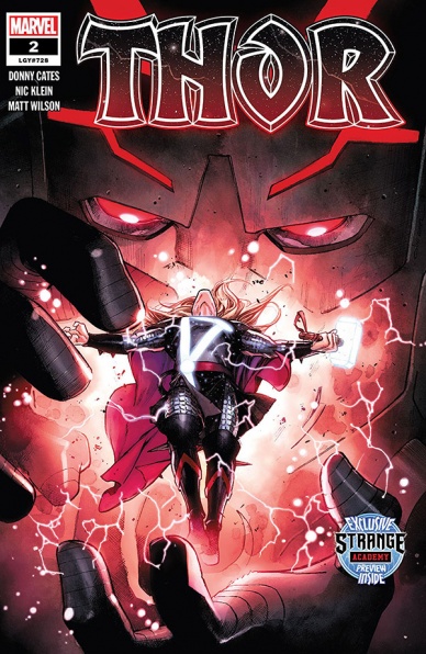
Written by Donny Cates
Illustrated by Nic Klein
Colored by Matt Wilson
Lettered by VC’s Joe Sabino
Reviewed by Luke Cornelius
After an establishing first issue, “Thor” #2 sees the Thunder King’s Black Reign begin in earnest.
One of the strengths of “Thor” #1 was that Cates, Klein, Wilson and Sabino worked together to bring a sense of darkness. Their Thor is struggling with the burden of the crown, possibly losing his worthiness and faced with ultimate destruction by the Black Winter and issue #2 allows you to forget about this bleak future, but not for long.
All of Klein’s artwork in the book presents the far reaches of the universe as beautifully dark. There’s a mythic quality to Thor as he looms in the glow of the planet Clypse with Klein determined not to let us forget his status as a god, but the vast space that surrounds him looks dark, cold and yet, fantastical. This is reversed on the surface of Clypse, where the Herald of Thunder casts a dark figure against the bright and innocent landscape. Here, on Clypse, Thor is not a god worthy of worship, but truly one of Galactus’s heralds; a harbinger of inadvertent destruction. Wilson’s colorwork in the book keeps all the tones muted too, holding back the saturation to limit the wonder that we see in the book. One sequence towards the end of the book sees Klein and Wilson combine negative space and red/pinkish tones to create an overwhelming sense of devastation which is the standout moment in the book.
Donny Cates’s script manages to successfully navigate between the mythical epic and the bleakness of Thor’s current predicament well for much of the book. Where “Thor” #1 had our protagonist entrenched in his role as King, unable to venture beyond Asgard to smite a frost-giant, here, Thor can assert his authority through more warrior-like means and it’s great to see. Likewise, the sense of impending doom is forgotten with the humor in Volstagg’s scene, although the bleakness is never far away as immediately after it, we’re presented with the aforementioned devastating sequence. The weakest moment of the book comes in its opening pages referencing the Distinguished Competition that only feel included in order to generate headlines.
Overall, “Thor” #2 has some great visuals supplied by Nic Klein and Matt Wilson, with Donny Cates’s script showing that he can navigate the mythical epic of Asgard and the impending doom of the Black Winter with ease.
Final Verdict: 7.5 – “Thor” #2 sees Thor un-tethered from his monarchical responsibilities which makes for an entertaining read that is supported by some epic visuals.


