
There is a lot to cover on Wednesdays. We should know, as collectively, we read an insane amount of comics. Even with a large review staff, it’s hard to get to everything. With that in mind, we’re back with Wrapping Wednesday, where we look at some of the books we missed in what was another great week of comics.
Let’s get this party started.
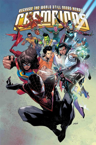
Written by Jim Zub
Illustrated by Steve Cummings
Colored by Marcio Menyz and Erick Arciniega
Lettered by Clayton Cowles
Reviewed by Ken Godberson III
With a new relaunch comes an opportunity to refresh, reassemble and re… something that’s associated with new beginnings (shut up). With a brand new #1, “Champions” has an opportunity to provide a great hook for not only people wanting to jump but also people that have waned.
It’s a shame that it kinda doesn’t do that.
“Champions #1” is a very broad issue of introducing the more expanded team and their missions around the world led by Ms. Marvel. It shows off some of the new members like Qureshi and Amka and establishes what they can do. It also brings people up to speed on lingering plot threads such as the tensions between Ironheart and Viv after the latter kissed the former as well as Sam Alexander losing his Nova powers. Unfortunately we reach a problem that has plagued Marvel over and over and over again: these new #1’s are not new reader-friendly when a load of Ms. Marvel’s exposition and multiple editor’s boxes telling us to go read different box for context. The hooks left for us, including a potential fallout between Kamala, Miles Morales and Sam don’t feel much impact unless you have been reading from the beginning.
Steve Cummings’s pencils alongside Menyz and Arciniega’s colors are serviceable, if indistinct. They do the job they are supposed to do in providing scenes of action for the multiple missions going on (even if missions in Mexico and Japan are drawn as ruins that wouldn’t look distinct anywhere). Perhaps the most distinct image is the final reveal of what will be the central villain of this arc, the coloring in particular doing well in selling the hellish foe to be fought.
All in all, if you were reading “Champions” prior to this, than this will probably feel like a decent continuation of the threads Jim Zub et. al have been working on. If you were hoping to come on with a #1, then I’m afraid to say it doesn’t hit the mark without feeling a bit overstuffed and lifeless.
Final Verdict: 5.0 – Perfectly fine if you were already reading the series, but very little feels like a hook for newcomers.
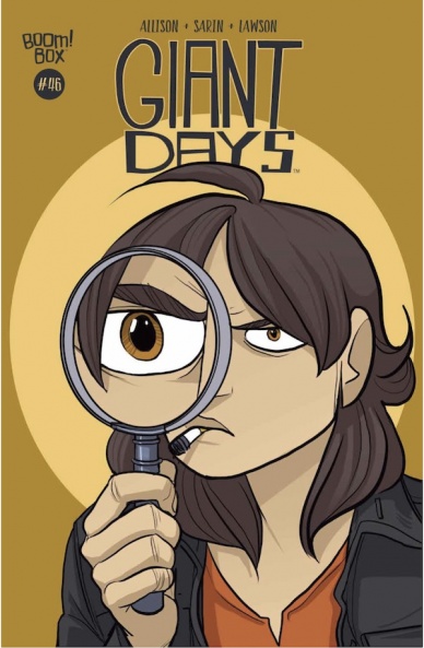
Written by John Allison
Illustrated by Max Sarin
Colored by Jeremy Lawson
Lettered by Jim Campbell
Reviewed by Christa Harader
Allison always managed to strike the right balance with storytelling in “Giant Days”, and there’s not been a bad issue in the entire book. In issue #46, As Susan hires herself on to Esther’s boss to investigate a rash of shoplifting, Allison leads us through an amusing and typical one-shot adventure that’s very worthy of praise. Susan’s stint as Philip Marlowe is delightful. Callum, the culprit, is both endearing and problematic, and his behavior’s neither excused because of his youth or vilified into brittle storytelling territory. Esther, Daisy and McGraw all land perfectly, as usual, and the end sets up a very interesting issue #47: Daisy driving.
Terrifying!
Sarin’s style supports Allison’s consistent wit and sitcom-esque storytelling, because without the exceptional cartoon quality, “Giant Days” couldn’t hang together. It’d be overbearing, and removing it just a touch from reality while staying grounded in character-building and emotional development means all the humor is earned. Lawson’s colors never disappoint, with gradient backgrounds and just enough contrast to highlight Sarin’s incredible character detail in each panel. Campbell’s lettering is always great, and the book’s typeface helps fill space without dominating any of the pages. “Giant Days” relies heavily on the quality of its dialogue, and the readability of this book is down to Campbell’s pro craft.
Continued belowOf special note in issue #46 is the black and white crime comic style for the climax of Susan’s investigations is charming, and executed very well. Sarin’s line is very clean, meaning that while Lawson works magic everywhere else, high-contrast shadows can also do very well in the short term. I wouldn’t want the entire comic to be done in this style, and I’m pleased Allison and Sarin use it in a few places for a pop rather than an issue-long conceit.
“Giant Days” is one of the best books being published and it’s remained so, which is quite a feat. As we wind our way through the back half of the crew’s uni days, issue #46 is another light-hearted tale that’ll delight long-time fans and first-time readers alike.
Final Verdict: 8.5 – “Giant Days” #46 demonstrates that noir storytelling can have a sense of humor, and doesn’t break from the comic’s high standard of substance and craft.
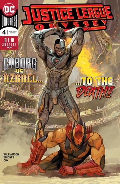
Written by Joshua Williamson
Illustrated by Philippe Briones
Lettered by Deron Bennett
Colored by Jeromy Cox
Reviewed by Greg Lincoln
This interesting mix of heroes including Cyborg, Starfire, Green Lantern Jessica Cruz, Azrael and, um, Darkseid explore the mysteries of the Ghost Sector. Joshua Williamson scrimped nothing on the number of elements and plot threads packed into this issue. He gave us the obligatory hero vs hero fight as advertised on the cover and bookended that fight with cryptic partial mystery reveals and a big foreshadowing moment building tension. Williamson storytelling is clever, recalling Victor Stones athletic past, clearly referencing it as well as reminding us of his tragic past. Cyborg’s discomfort with the god and worship aspect of the story played very well but it’s odd he didn’t question how that “Machine” religion came about let along the massive state dedicated to him. Calling him “The Machine” discounts so much of who he is, it was the first aspect in the issue that knocked me out of the story. I found it strange he does nor react more directly to that. Williamson managed to gave Cyborg’s fellow heroes a moment to shine in this very busy issue. Somehow though despite all that occurred in it the story ended up feeling like little actually happened. It may suffer from being the middle chapter as the storytelling is mainly getting us from A to B. The only moment of real excitement came with the extended cameo foreshadowing appearance of BlackFire, Kormamd’r, who was previously sadly absent from the DC ‘Rebirth’ Universe. I very much wanted to love this book for its cast but sadly it doesn’t all quite click.
Philippe Briones and Jeromy Cox created very pleasant art of this story. It’s never easy to create whole-cloth an alien setting and race. Though a bit DC house style looking the “Machine World” works pretty well visually. What they excelled at were the emotions their faces carried. Victor, Jess and Kory all communicated very expressively even if their actual dialogue fell a bit flat. Were this a movie I’d gave to day though that they broke continuity from scene to scene with Azreal’s helmet, he would be wearing it one moment and it would be gone inexplicably in the next, then back again in the one following.
The overall issue left me with one big question. Given the sequestering of the Ghost Sector where did that society’s connection to Cyborg come from. I’m sure that will be explained, but this issue taken on its own leaves too many questions glaringly unasked by it’s protagonists.
Final Verdict: 6.5 – So many questions about the Ghost Sector that no one appears to be asking

Written by Rick Remender
Illustrated by Greg Tocchini
Colored by Dave McCaig
Lettered by Rus Wooton
Reviewed by Elias Rosner
A year and a half is a long time to be away from a story. Details get fuzzy, actions fail to connect and the narrative can grind to a halt as you try to reorient yourself within the confines of this next chapter. This, combined with the intent of “Low” #20 to disorient, means that the issue suffers upon its return. Putting that aside, however, the disorientation was also due to how the creative team chose to portray the surreality that Stella is experiencing.
Continued belowWhile there should be obvious clues at the onset that something is not right, the aesthetic of “Low” has always been surreal enough that any confusion can be chalked up to Tocchini’s rendering of geography and McCaig’s deep and dark coloring, which has given the underwater cities their unique and breathtaking construction. It isn’t helped by the distortion that happens to many of Tocchini’s faces, which makes it hard to tell, at a glance, who any one character is, especially those who have been dead or missing for many issues. Although, once it does become apparent that the lack of coherence is intentional, the narrative is able to run much more smoothly.
“Low” has always put Stella right into the crosshairs of suffering, so to watch her fears, and the horrors of her past, be made manifest before her one after the other is thematically appropriate. It makes for a good tonal reintroduction, and the revelations at the end about the helm-suit wearer from issue #19 and the reasons for Stella’s current sufferings, makes for a solid start to this final act. Going forwards, there is much to be excited for but the wait between issues, coupled with three quarters of the comic being dedicated to a series of scenes that, ultimately, leave the reader more lost than before means that, instead of hitting the ground running, “Low” #20 stumbles into its final arc, as confused as its protagonist.
Final Verdict: 6.4 – Tocchini’s stylizations, and the long break between issues, hurts “Low’s” return to shelves as it spends too much time on the tonal returns.

Written by Kelly Thompson
Illustrated by Oscar Bazaldua
Lettered by VC’s Joe Sabino
Colored by Frank D’Armata
Reviewed by Michael Govan
It’s good that Rogue and Gambit tied the knot. Marvel’s mutants have had it rough and probably always will, so they need all the little victories they can get. I do appreciate that “Mr. and Mrs. X” has followed the lovebirds through fun adventures like their romp through space and kept the tone fairly lighthearted. However, this issue didn’t do much for me. Enemies like Mojo are comedic in nature, but “Mr. and Mrs. X” #7 never really gives him space to be funny. He puts the couple in a noir setting but the comic pretty much drops that after the first page. It quickly goes from ‘noir’ Remy and Rogue to the two flirting and fighting generic bad guys. Indistinguishable from their usual adventures.
This comic might go a bit overboard with the flirting too. It’s cute at first but after a while it’s too much. #7 attempts to have a more emotional moment with Remy’s ‘death’ but is the audience really expecting to believe he won’t be back the very next issue? Gambit’s life force being drained is the standout moment of the issue, at least as far as the goes. Bazaldua’s art through the rest of the issue is alright but there are some spots it just seems…off. There were two or three spots where I thought that Rogue’s head seemed a bit too big for her body or the proportions were off in some other way. Overall, a pretty neutral experience. Next issue teases Longshot and a more unique fairy tale setting so maybe the Mojo magic will work better then.
Final Verdict: 5.5 – Mojo’s latest show is just so-so.
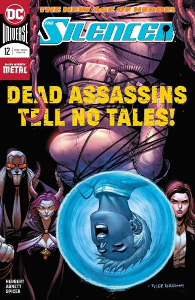
Written by Dan Abnett
Breakdowns by Tom Derenick
Illustrated by Jack Herbert
Colored by Mike Spicer
Lettered by Tom Napolitano
Reviewed by Tom Shapira
A culmination of a year’s worth of stories as Silencer realizes she can’t escape her past, and must make a choice between revenge and the safety of her family. The emotional stakes are there but something here rings hollow to me; possibly because these game of family vs. professional life has been played in this title since the word ‘go’ and possibly because this arc uses the trick of everything-you’ve-seen-had-been-part-of-a-grand-plan which rather takes the element of moral choice from the story so far.
Still, this is a comics co-written by Dan Abnett which means it can’t be all bad, he’s got too much of skill as a craftsman to fail, and there’s some nice action set pieces featuring dozens of the ridiculous post-1990’s Leviathan henchmen. Tom Derenick (breakdowns) and Jack Herbert (pencils and inks) aren’t quite up to the high standard set by John Romita Junior. I know his designs aren’t to everyone’s tastes, and faces can certainly be very same-y, but he knows how to draw out and choreograph an action scene; the beat’em up parts in this issue are decent but they rely too much use of montage – I don’t really get the sense how Silencer can wade through all these super-powered people in the beginning, there’s little idea of geography or cerography in that fight. Things get a little better during the one on one battle later, but for a series that runs on a sense of adrenaline it’s still not enough.
Continued belowFinal verdict : 6.5 – there’s fun to be had, but the action needs to rise above itself.
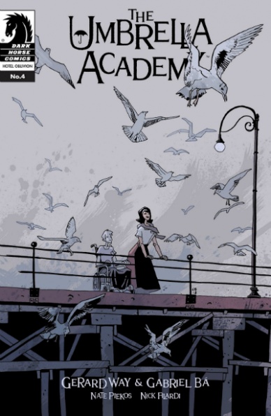
Written by Gerard Way
Illustrated by Gabriel Bá
Colored by Nick Filardi
Lettered by Nate Piekos for BLAMBOT
Reviewed by Chris Egan
The fourth part of this seven part arc continues to be a hodge-podge of ideas and sequences. They’re all wonderful in their own way, and that is what keeps this series from hovering in mediocrity. Great golden-age sci-fi action, nuanced character moments, gritty crime drama, and so-on, but the main thread attaching them all is the characters’s familial connection. Knowing that the end is rapidly approaching, this issue should have really landed on something more significant for the story its telling, but we haven’t gotten there yet. With the two previous “The Umbrella Academy” arcs things got crazy, but there was clear defining plot threads. Things moved forward. This arc is a little too all-over-the-place. It doesn’t feel rushed, but it does feel disorganized in places. Maybe I’m wrong, not seeing the greater picture yet, or maybe a little naive asking, what has always been a heady and multi-layered surrealist adventure, to be a bit clearer about what it is trying to say.
Its biggest strengths are still there. Way’s clever and finely executed dialogue paired with Gabriel Bá’s fluid and twitchy illustrations are a huge selling point; and Filardi’s colors truly give this universe some its finest details. This book would not work as well without his touch. The pairing of these two artists are one of the main reasons I love this series.
This issue is the best one since ‘Hotel Oblivion’s’ stellar premiere in October. It moves at warp speed and is a fun read and we do get some, not answers, but steps to answers here. Less style over substance is necessary as the series moves forward. As a fan of the previous arcs, this one has been a little bit of a letdown overall.
Final Verdict 7.2 – The series’s boldness, and the talent behind it, continue to shine. However, grander steps in plot need to be taken as we approach the finale.

Written by Kyle Higgins
Illustrated by Rod Reis
Lettered by VC’s Clayton Cowles
Reviewed by Alexander Jones
The idea of giving a Bucky Barnes a sidekick is as absurd as author Ed Brubaker and artist Steve Epting bringing the hero back from the dead in the first place. However, “Winter Soldier” #2 introduces a brand new sidekick for Barnes and still manages to fight off cliches. Higgins dives deep into the psyche of someone corrupted by Hydra and explores why an agent of the terrorist organization would resort to violence.
The backstory of RJ is shockingly effective despite the number of cliches in the storyline. Thanks to the more cerebral tone the issue evokes, the writing and art for the familiar story never feels too familiar. There are traditional action scenes bringing themes and storylines together at the end of the issue that speeds up the pacing of mini-series as a whole. Higgins wisely builds up to these moments with quick flashback scenes that have interesting things to say but don’t overstay their welcome.
Rod Reis immediately sets the tone for the issue with his unique approach to comic book art. Reis uses a painterly aesthetic making the absurd backdrop of the issue feel grounded. The last action sequence is one of the most well-executed from the series to-date. There is a fast-paced motorcycle crash followed by a martial arts-inspired brawl which carries a fluid sense of motion. Reis crafts insane pages and panels for this blowout sequence ensuring the issue never looks dull or static. Reis even pulls off moments of absurd comedy and confusion with grace.
As far as comics go, “Winter Soldier” is about as bleak as Marvel titles get. Thankfully, the issue undercuts a truly harrowing story with a really wonderful personality and outlook on the world. The last page illustrates to readers that the series is more than a traditional crime thriller. In “Winter Soldier” #2, Higgins and Reis go beyond cliches to explore the growth of Bucky Barnes over the past few years.
Continued belowFinal Verdict: 8.0 – “Winter Soldier” #2’s grounded and violent narrative shows the progression of Bucky’s character in The Marvel Universe.
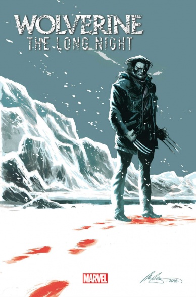
Written by Benjamin Percy
Illustrated by Marcio Takara
Colored by Matt Mila
Lettered by VC’s Joe Caramagna
Reviewed by Gustavo S. Lodi
Based on the podcast story of the same name, “Wolverine: The Long Night” is an excellent story that utilises some of Logan’s strengths as a character: the mystery and suspense around him, the effects he has on people, and the dire situations he gets involved with.
Free of any tie to continuity or, the story plays out in a scenario seemingly unfamiliar with Wolverine and his fame. He is as much of a stranger on these pages as he was when he first appeared in comics, his abilities just loosely defined and explained.
Takara was a very good fit for this series. His line work can be detailed when needed – which lent itself like a glove for the more dialogue-intensive, character moments of this issue – but also expansive, as can be seen on some vistas of the Alaskan landscape “It’s beautiful here. Don’t you think it’s beautiful here?” That balance can be seen throughout the entire “Wolverine: The Long Night” #1 and it keeps the narrative fresh and flowing at all times.
A lot of credit needs to go to Percy for adapting this script. A podcast, by definition, is devoid of visual representation. It relies on heavy dialogues and narrations, so the conversion to a visual medium could be jarring. Not so here. While certainly leaning on the wordy side of the balance, there is not a hint of exposition, of unnecessary dialogue. Rather, the story unravels as characters discuss, investigate, and explore the mystery afoot.
Main characters of the piece, agents Pierce and Marshall, avoid the tropes of the “almighty bureau agents,” coming across as likeable individuals with a mission on their hands. Without the weirdness, they behave more like an agent Cooper of Twin Peaks fame, rather than the gritty, gruntled portrayal they usually receive in similar stories.
With some beautiful art and even stronger dialogue and pacing, “Wolverine: The Long Night” #1 reads as a suspense and terror story, and less like a superhero tale focused on Logan’s healing abilities. It works remarkably well because of that.
Final Verdict: 8.3 – Compelling, instigating, complex. The sharp dialogue and versatile art on “Wolverine: The Long Night” #1 makes it a very strong debut issue.

Written by G. Willow Wilson
Illustrated by Xermanico
Colored by Romulo Fajardo Jr.
Lettered by Pat Brosseau
Reviewed by Gregory Ellner
As two disparate elements of ‘The Just War’ come together, G. Willow Wilson continues her process of redefining the Greek pantheon. Do the gods need to be defined by their concepts, or do they have the capacity to develop those concepts on their own, to define them in turn? Do they need to even be defined in respect to those specific concepts, or can they choose new domains for which to be responsible? From Aphrodite to Ares to Wonder Woman herself, these questions are at the forefront of this slaughter of a war.
Xermanico’s artwork definitely helps to do justice to the various characters at play, from the beauty of Aphrodite to the awe-inspiring presence of Wonder Woman to the menace of Ares, not to mention the relative fragility of the mortals present or the chaos of the war-torn cityscape. The soft touches on facial structures and the intricate facial expressions, especially with regard to Aphrodite and Diana, show an awareness of how to show the very human emotions at play in spite of the divine elements in conflict.
Romulo Fajardo Jr. makes good use of color throughout “Wonder Woman” #61, making the heat of the flames of the city palpable in its harshness, in deliberate contrast to the softer glow of divine power at work.
Final Verdict: 7.0 – While G. Willow Wilson’s script is as intriguing as ever, the artwork and colors of Xermanico and Fajardo truly shine in this installment to “Wonder Woman.”


