
There is a lot to cover on Wednesdays. We should know, as collectively, we read an insane amount of comics. Even with a large review staff, it’s hard to get to everything. With that in mind, we’re back with Wrapping Wednesday, where we look at some of the books we missed in what was another great week of comics.
Let’s get this party started.

Batman #38
Written by Tom King
Illustrated by Travis Moore
Colored by Giulia Brusco
Lettered by Clayton Cowles
Reviewed by Gregory Ellner
Tom King’s writing is, as ever, exceptional, and his use of parallelism is similar to that in ‘I Am Suicide’ and ‘I Am Bane.’ In the very first page, there are deliberate parallels between a new orphan, Matthew, and Bruce Wayne himself, with the dialogue shifting between the two depending on the panel. Over the course of the story, which plays out in a way that fits well with the “World’s Greatest Detective,” the pace is fit in such a way that a variety of perpetrators seem possible, up until the last few pages’ revelations. The return to parallel structure is inherent in the last page, which shows a disquieting full circle as the text is not constrained to one panel each, showcasing an argument as it shows two broken people in very different situations, contrasted against the similarities in the opening.
Travis Moore’s artistry is relatively realistic, focused on close-ups to give reactions of characters or give an intentionally imprecise view of what is happening. This distinction is important, as it makes scenes like a double homicide in an apartment, which shows no close ups, all the most worrisome.
Giulia Brusco uses colors to help set a tone through which individual is the core focus of a scene. Warmer colors are used for the outdoors and for Batman, in both of his identities, including his talks with Jim Gordon on a rooftop or with Matthew in his manor. The scenes focused on the perpetrator of the crimes are shown in a cooler color palette, giving an added tension to scenes where the warmer ones help to calm readers. Together, these color schemes help to set the tone in a way many others do not.
Overall, this deconstruction of Bruce Wayne is not too unique, but the manner in which it is handled, from the writing to the pencils to the colors, make it all feel intriguing nonetheless.
Final Verdict: 8.5- Although the idea of a dark take on Bruce Wayne is not entirely unique, ‘The Origin of Bruce Wayne’ manages to put a warped, dark spin on the tale through a clever writer and well handled color palettes.

Batman: White Knight #4
Written and Illustrated by Sean Murphy
Colored by Matt Hollingsworth
Lettered by Todd Klein
Reviewed by Matt Sadowski
We’re halfway through Sean Murphy’s experimental Batman and Joker story, and it continues to make more of a case for its strange existence. Amidst the deluge of “Batman” titles currently on the shelves, this curious switcheroo of hero and villain is unexpectedly impactful. Batman couldn’t make it in 2018’s fractious social and political climate—but what if a savvy, intelligent man (don’t mind his supervillainous history) ran for office with the support of Gotham’s minority community?
Joker, or Jack Napier as he likes to be called these days, pulls a reverse Harvey Dent by running for councilman. Duke (not to be confused with Batman’s newest sidekick) speaks at a Backport rally/protest in support of Napier. And then Batman commits his worst gaff yet. He violently stops a peaceful march by kicking Duke, an unarmed African-American man, in the face. Ouch. This is potentially out of character, but then again no one is acting quite like themselves in “White Knight.” This isn’t exactly a criticism. I’m even less sold on Joker’s transformation into a super-genius politician, but that’s almost beside the point considering how well the story functions otherwise. The series works if you view at as an “Elseworlds” tale, an alternate take on the Batman universe. This Gotham is slightly off-kilter from the one we know, a place out of time where the Batman Devastation Fund dishes out three billion dollars annually for Bat’s collateral damage, Jason Todd’s grave is empty, Alfred is gone, and the Waynes possibly share a sordid history with the Nazi-affiliated Fries family.
Continued belowAlthough Murphy is telling a fairly nuanced story, he doesn’t waste the chance to play in the vast toy box of Batman’s rogues gallery. When the villains attack the GCPD on a splash page, it’s classic villain mayhem: Penguin floats through the air with his umbrella, Bane and Croc charge through the streets, and Neo Joker leads the charge. Many villains and the overall atmosphere pays a loving tribute to the noir stylings of Batman: The Animated Series. Even Hollingsworth’s use of red echoes the 90s series. In Gotham, nights are always red. Murphy’s pencil packs detail in every panel, leaving little negative space. His Gotham is vibrant with roiling protestors on the streets and reformed villains between the sheets. A compelling night of romance unfolds between Jack and Harley, and it somehow feels normal, endearing even. The lovers’ expressions—ones that are completely new to Joker’s face—make this date night and love scene work better than it ought to. Here’s hoping Murphy’s tenure on “Batman” will continue beyond “White Knight.”
Final Verdict: 8.0 – Jack Napier’s plans for Gotham’s reformation further calls Batman’s crusade into question in this middle chapter of Murphy’s politically-charged and exquisitely-drawn Batman tale.

Captain America #697
Written by Mark Waid
Illustrated by Chris Samnee
Colored by Matthew Wilson
Lettered by VC’s Joe Caramagna
Reviewed by Alexander Jones
“Captain America” #697 has the jovial attitude of a standard installment of previous chapters, but like some of Mark Waid and Chris Samnee’s previous “Daredevil” issues, the title carries a direct physical threat making this particular issue the best from the creative team this far. Mixing together some of the more primal Marvel Universe villains and grounding the comic with a simpler narrative taps into exactly what readers want to see from The Big Two. With its bright colors and Patriotic attitude, “Captain America” #697 channels the energy and art style of DC’s Rebirth recalling books like “Superman” with Steve Rogers’ incredible warmth.
Chris Samnee’s storytelling in the interiors continues to shine through the comic. Samnee draws Kraven the Hunter in a menacing, but playful manner adding a casual nature to the issue that is filled with twisting plot threads. The artwork in the beginning of the issue depicting Steve relaxing in the bar is full of little details with pool cues at the side of the bar and a unique panel layout mixed with a memory which is easy to delineate from the present time period. Samnee even experiments with the page itself, lending an overhead view and smaller panels lending to the illusion of motion. The fight scene towards the end of the title carries excellent choreography as well.
The survival aspect which calls upon Steve to help someone is what I will remember this particular issue for. Watching Captain America struggle to survive and protect a bystander carried such a strong emotional response from me as I compulsively turned the page to get to the final confrontation with Rogers and Kraven. The structure of the comic is also beautiful with Waid telling a briskly composed story with a beginning, middle and end here including a massive cliffhanger encouraging readers to come back to the next issue. Surprisingly, even the after-credits scene with Wolverine kept the tone of the title intact and brought more warmth to the narrative.
The only part of the script which proves to be slightly troubling is Waid’s reliance on a plot twist towards the finale does not feel fully developed and serves to add forced additional conflict to the plot. Watching Rogers get out of the situation and finish battling Kraven draws the leads the book towards a thrilling conclusion. This narrative feels like the next step in Samnee and Waid’s take on the hero, with a stronger scope for the more threatening cliffhanger that could tease a slightly different tone going forward.
Final Verdict: 8.2 – “Captain America” #697 slightly mixes up the tone and pace of the book for a more immediate story filled with danger and fantastic artwork!

The Jetsons #3
Written by Jimmy Palmiotti
Illustrated by Pier Brito
Colored by Alex Sinclair
Continued below
Lettered by Dave Sharpe
Reviewed by Gustavo S. Lodi
“The Jetsons” #3 is a prime example of an ensemble cast book done right. While readers clearly see who the main protagonist for this arc is (George, in this case), Jimmy Palmiotti doesn’t forget to touch upon the entire cast, moving each of their stories along, even if they are more peripheral to the main plot line.
Talking about plot line, this issue does something that I truly appreciate when reading comics: I am as much in the dark as the characters I am rooting for. Don’t get me wrong, I do appreciate the occasional tale when the reader has a deeper knowledge on what is going on, but to discover a book’s secrets as the main characters do? That to me is far more enjoyable. As George stumbles and realizes he might be over his head – but always keeping his cool – so do we as grasping that “The Jetsons” will go into some really interesting science-fiction holes for the ride.
The art by Pier Brito does something that is truly required for a series such as this. While it retains some of the more cartoony elements of this world, it does so in a more grounded way than the TV show it is based on. That makes the art aligned with the slightly more mature narrative Palmiotti is going for, without alienating fans of the show or making characters and their world lose their signature elements.
Final Verdict: 8.0. “The Jetsons”#3 continues to build around these very well-known characters and world, expanding narrative choices. The art style helps push the book along, without losing what fans love about them.

Nightwing #36
Written by Sam Humphries
Illustrated by Bernard Chang
Colored by Marcelo Maiolo
Lettered by Carlos M. Mangual
Reviewed by Reed Hinckley-Barnes
With “Nightwing” #36, the new creative team starts into the meat of what their arc is going to be going forward. While many details about the arc’s villain, The Judge, are still being kept under wraps, in this issue he is established as a more tangible threat, using his power of suggestion to bloodily cover his tracks.
There are some problems with this, though, as the connection between Nightwing and The Judge is still unclear. Humphries has Nightwing spend a decent amount of his internal monologue in the issue saying he can’t let The Judge keep getting away with what he’s done. Unfortunately, since we still don’t have the full backstory on who The Judge is and what Nightwing’s previous experiences with him are, a lot of this monologuing falls flat.
One of the best parts of this run so far has been seeing the team take the time to turn Blüdhaven into a place populated by its own cast of characters. The highlight of the run so far has been the scenes with Guppy, the shark-headed, mediocre criminal trying to take care of his bedridden, super villain father. The characters, and even the way that Blüdhaven is depicted, give it a sense of place that is distinct from other cities in the DC universe.
For the art, the cityscape of Blüdhaven is colored in mostly neon, allowing Nightwing’s mostly black costume to stand out from the background. As a whole, the facial work in the issue is very good, especially when it comes to rendering Guppy’s expressions. Chang is able to give him distinct, facial expressions, without his shark head coming off as too cartoony.
The solicits for the next issue promise a flashback to Dick Grayson’s first encounter with The Judge, back when he was Robin. Hopefully, with some of that backstory a bit more fleshed out, the stakes for his character will become a little clearer. Until then, though, the history between Nightwing and The Judge is a bit too vague to be completely compelling.
Final Verdict: 7.9 – While the new cast of characters is interesting, “Nightwing” #36 still leaves a few too many questions.
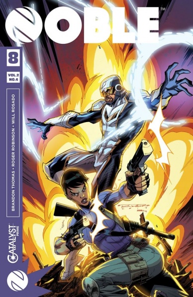
Noble #8
Written by Brandon Thomas
Illustrated by Roger Robinson and Will Rosado
Colored by Sotoocolor, Paul Mounts, Juan Fernandez and Snakebite Cortez
Continued below
Lettered by Saida Temofonte
Reviewed by Michael Mazzacane
Reading “Noble,” and to a degree the Catalyst Prime books in general, is an interesting collision between high and low. There are some high-minded ideas at play in this sci-fi-superhero title and then someone gets their leg punched off like it’s some 80s anime or other such hyperviolent offering. The art team, including illustrators Roger Robinson and Will Rosado along with a litany of colorist, come together to make an aesthetic that feels aggressively comic book-esque with its use of onomatopoeia, screentoning, and action lines. The character designs are a bit too flat and cartooned for it to be 90s inspired, but much like how the hypergendered figures of decades gone by these are meant to communicate clear intent. There is a brutish functionality to this issue, where other books in this general thematic aesthetic are all about clean design this one goes for a melodramatic presentation. And yet, when it comes to the action all that basic functionality fails to elicit much of a reaction. Even when the book hits a clearly well timed shocking moment with striking imagery it never really landed with me. While all of this is clearly done to evoke a style, the action in this book lacks ‘styyyle.’ People shooting guns, laser beams, and the like, at one another doesn’t pop on its own when you have other artist taking these tried and true action beats into something more artistic.
Thankfully “Noble” isn’t about the action, it’s a sneaky family drama between David Powell and his wife Astrid. Writer Brandon Thomas and the art team get the dynamic between them across quite well. Even if there are a couple of moments between them that go a panel too long. “I love you.”/ “I, know” is all that’s said in Empire because that’s all that was needed, it didn’t need further discussion.
Also on that familial drama note, this book has been about David Powell rediscovering his old life. That and the relationship and his wife are the emotional core of this book. The issues base action functionality wasn’t the right presentation for a key moment of recollection. It functionally happens off screen, so readers can instead see his victims. It’s an odd presentation choice given the lack of melodrama in the panels we are shown compared to what is potentially happening off panel.
Final Verdict: 6.5 – “Noble” isn’t a bad comic, in that it is carelessly put together. There is clear thought behind it on a thematic and presentation level. That presentation is, however, detrimental to emotional core of the book.


