
There’s a lot to cover on Wednesdays. We should know, as collectively, we read an insane amount of comics. Even with a large review staff, it’s hard to get to everything. With that in mind, we’re back with Wrapping Wednesday, where we look at some of the books we missed in what was another great week of comics.
Let’s get this party started.
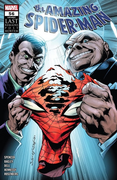
Amazing Spider-Man #56
Written by Nick Spencer
Penciled by Mark Bagley
Inked by Andrew Hennessy & John Dell
Colored by Rachelle Rosenberg & Edgar Delgado
Lettered by Joe Caramagna
Reviewed by Elias Rosner
“Amazing Spider-Man” #56 is a mess and there’s no other way to put it. There are parts that are absolutely excellent in practice, some that are excellent in theory but OK in execution, and others that are poorly executed and stupid in theory. Bagley turns in decent work – with the exception of that six panel grid of Norman reacting, what a fantastic page that Spencer has totally not earned – but when coming off of Gleason’s issues, the contrast is stark and when the same scenes are rendered, it’s hard not to feel like something is lost.
This is also true of the story. “Amazing Spider-Man” #56 is full of “reveals” and twists and clarifications of events that happened one issue ago but none of these reveals, from Osborn actually being cured to letting MJ in on the plan to his deal with Fisk resonate because they carry no emotional weight. The secrets weren’t interesting in the first place and the interesting secrets, like how the fuck Harry became Kindred, and how the fuck ‘One More Day’ caused it, as has been implied with the subtlety of a shovel to the head, are going to get the Kindred treatment of 50 issues of teasing until we get a convoluted and dragged out reveal that doesn’t even answer anything.
The biggest problem of “Amazing Spider-Man” #56 isn’t the component parts but instead the way Spencer tries to fit them together. It wants to be both an arc finale, a post-mortem, and the first half of the closing of an act all at once and can’t decide how to tell any of these parts effectively. Hell, it spends way more pages than necessary in flashback in order to recontextualize OVER HALF THE BIG CLIFFHANGER, cheapening the previous issue and only serving to bore the readership rather than excite. We didn’t need the Osborn fake-out to be a surprise, it’s far more interesting to know about it beforehand, and we especially didn’t need it presented in the most piecemeal, “fuck showing, I’m telling” manner possible.
It’s especially frustrating not only because Spencer seems to really want to reckon with the last 20 years (or more) of Spidey comics but because the underlying ideas are exciting. The family drama of Norman and Harry, the friendship souring between Harry & Pete, Peter’s mistakes coming back to haunt him, these are classic Spider-Man problems and Spencer has shown a willingness to take novel approaches to them. It’s just a shame these novel approaches are nothing more than skin deep.
Final Verdict: 4.0 – “Amazing Spider-Man” #56 tries to do too much, narrating all of it and rarely trusts it’s audience, squandering the interesting ideas it has in favor of cheap “gotcha” moments.
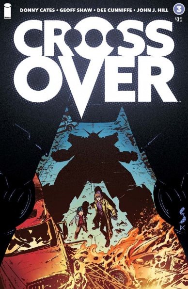
Crossover #3
Written by Donny Cates
Illustrated by Geoff Shaw
Colored by Dee Cunniffe
Lettered by John J. Hill
Reviewed by Jim Malakwen
“Crossover” #2 concluded with the stunning revelation that Ava possesses latent and lethal powers. This plot point creates a sense of dramatic irony for the reader as Ellie and Otto remain oblivious to the potential danger posed by this seemingly innocent little girl.
Donny Cates wisely chooses to explore this story element in a future installment of the series. Instead, “Crossover” #3 opens with a thrilling flashback sequence that provides much needed insight on what happened to Ellie and her parents on the day of the great invasion.
It turns out that Ellie’s origin story has a lot in common with that of a certain big boy scout from the Distinguished Competition. After a jaw-dropping opening splash page that vividly depicts the Denver-based battle between humans and the recently emerged comics characters, the reasons why the dome was created are immediately made clear. In addition, Ellie’s motivation for finding her parents become established in a very moving sequence as they get separated.
Continued belowBack in the present, Ava takes a liking to Ellie and Otto. As the three begin their perilous journey to the dome, they encounter some likable new characters including a team of obscure superheroes from a canceled Dark Horse comic. The most memorable cameo appearance occurs at the very end when a well known IDW character shows up.
The storytelling in this issue was very good. Cates uses narrator blocks sparingly without overwhelming the artwork. And speaking of artwork, Geoff Shaw delivers his finest work on the title thus far. His three splash pages in particular present a masterclass in composition, camera angles and inking. Also worth a mention is the coloring by Dee Cunniffe. The decision to use the Ben Day process to distinguish the comic book world from the real one was an inspired one and helps give the book a unique look.
Final Verdict: 8.2 – a fun comic that develops the characters, advances the narrative and ends with a surprise cameo appearance from a fan-favorite IDW character.

Dark Nights Death Metal #7
Written by Scott Snyder
Penciled by Greg Capullo, Bryan Hitch, and Yanick Paquette
Inked by Johnathan Glapion, Bryan Hitch, and Yanick Paquette
Colored by FCO Plascenia
Lettered by Tom Napolitano
Reviewed by Ryan Fitzmartin
Scott Snyder and Greg Capullo end their hard-rocking saga with a lot of sound and fury, signifying not much. “Dark Knights: Metal” was a high-spectacle, low logic comic, and the conclusion to ‘Death Metal’ is no different. There are epic fights, huge battles, and mighty struggles in these pages of this comic, but the meaning is hard to follow. Heroes and villains clash across space and time, with a rather vague objective and goal. At one point, the Darkest Knight punches the The Teen Titans back to the dawn of humanity. Wonder Woman retaliates by punching him into the heat death of the universe. Then the fight continues. Material like this is meant to be epic, but verges on the absurd. Snyder and Capullo attempt to ratchet the stakes up, but only succeed in removing them. There is such a thing as simply trying too hard.
The overcooked nature of the action is unfortunate, because the art is terrific. Capullo and Glapion draw the massive fights clearly, and with excellent composition. Epic battles in comics can become messy or muddy, but the art in “Dark Knights: Death Metal #7” is coherent. Individual characters can be picked out in large battle scenes, which convey a strong sense of scale. Plascenia’s strong and distinct coloring is striking without being overpowering. The artwork strongly succeeds where the writing does not, in creating a truly epic scale and feeling.
“Dark Night: Death Metal #7” isn’t a complete loss, but readers may find themselves scratching their heads in mild confusion and disappointment.
Final Verdict: 5.7 – Strong visuals aren’t enough to hold together a messy finale.

Future State: Swamp Thing #1
Written by Ram V
Illustrated by Mike Perkins
Colored by June Chung
Lettered by Aditya Bidikar
Reviewed by Jodi Odgers
Seeing into a potential future is an intoxicating prospect, even if one is only peeking down the timeline of a fictional universe. DC’s ‘Future State’ offers readers a host of opportunities to do this, spanning many of their major characters, including a personal favorite of mine, Swamp Thing.
The grim reality of “Future State: Swamp Thing” #1 is delivered carefully by one of the most enticing teams I’ve seen on a DC book. Ram V digs into the roots of what makes a satisfying Swamp Thing story by showing readers a world where humanity has been mostly lost, leaving Swampy and his companions to thrive in their absence. Mike Perkins depicts the inhabitants of this desolated world admirably, making each character distinct yet part of a clear whole, aided by Chungs clever use of color. Perkins’ art is at its most captivating in panels interspersed throughout the issue where Swamp Thing explains how he constructed humanoid forms out of vegetation. Bidikar uses his lettering talents to give Swamp Thing the gravitas necessary, using differentiations in color and linework to add even more personality to Green and his companions.
Continued belowIf you have ever been remotely interested in reading about Swamp Thing, “Future State: Swamp Thing” #1 brings across the core of the character remarkably well. The creative team have given readers a picture of what might happen to one of DC’s Earths, if humanity were ever to almost entirely destroy themselves.
Final Verdict: 8.8 – A captivating Swamp Thing tale from a creative team that clearly knows that Swamp Thing’s tenderness is at the core of the best stories about the character.

Future State: Wonder Woman #1
Written and illustrated by Jöelle Jones
Colored by Jordie Bellaire
Lettered by Clayton Cowles
Reviewed by Quinn Tassin
“Future State: Wonder Woman #1” is one of those first issues that makes you feel like you’re getting in at the ground floor of something special. It’s not that the quality of a book with a team as great as Jöelle Jones, Jordie Bellaire, and Clayton Cowles comes as a big surprise, but it’s a real delight nonetheless. With the introduction of Yara Flor this comic introduces us to an incredibly human Wonder Woman. Where Diana is ethereal and overflowing with grace, Yara is more headstrong and scrappy. There’s a risk inherent to making a Wonder Woman that you can relate to as opposed to aspire to become but Yara’s charm and confidence make her an undeniable star.
As for the story itself, this is a lighthearted, playful comic. “Future State: Wonder Woman #1” feels a bit like a superhero story by way of Disney’s Hercules. It’s a grounded epic where making your way through Hades is about as interesting as going to Newark airport. In great action sequences, Yara fights a hydra, a demigod, and an assortment of underworld ghouls. She steals a coin so she can ride the River Styx. She has a pegasus that doesn’t respond at first when she calls it. In short, it’s really really fun.
To talk about the quality of this comic without bowing down to Jones and Bellaire’s artwork would be a dereliction of duty. Together, the pair makes for one of the best teams in comics. With remarkable consistency, they bring a bold, bright, beautiful comic practically overflowing with life and joy. From little details like a mosquito landing on a pegasus’s muzzle to the twist of Wonder Woman’s bolas, all of the small details make the world of this comic feel full. Then there are the big moments: the aforementioned hydra slaying, the rumble at the River Styx, the arrival of Cerberus. This is one of the best looking comics you’ll find on shelves.
Yara Flor is poised to take on the mantle of Wonder Girl in a post-Future State book (and a CW series) so this is a book that has some real stakes. Luckily, it does more than succeed. It’s not particularly meaty but that works to the comic’s advantage. It gives a great character plenty of space to shine in her debut and makes you long for more to read immediately.
Final Verdict: 8.8- “Future State: Wonder Woman #1” is a gorgeous, fun, imaginative start to the story of Yara Flor

Getting it Together #4
Written by Sina Grace & Omar Spahi
Illustrated by Jenny D. Fine & Sina Grace
Lettered by Sean Konot
Colored by Mx. Struble
Reviewed by Kobi Bordoley
“Getting it Together” #4 is a satisfying, if not pitch perfect conclusion to the four part series from Image about modern love, unconventional relationships, and growing up. “Getting it Together” #4 mostly follows Lauren as she sets out for L.A., forging her own path as a solo musician. While this final chapter feels a little twee at times, it’s certainly relatable with great characterization and wonderful art.
Jenna D. Fine does the art for “Getting it Together” #4, at least for the first six pages, which are spectacular. These pages follow a trippy party sequence, and they’re replete with oozing, thick pastel colors. Dark yellows, pinks, and purples populate the page. It’s a totally heady art style. The colors are bold, but the images are still easily legible. It’s all stylistically a little different, but still familiar enough to feel cozy and lived-in.
Continued belowSina Grace’s art, which covers the rest of “Getting it Together” #4, is more traditional but no less effective. Lauren’s facial expressions are a high point, and while the writing sometimes feels a little stilted, character emotions never feel poorly drawn or executed. Additionally, “Getting it Together” #4 does a good job of incorporating text message conversations and video calls into the panel structure and art style of the story. This is no simple feat, as oftentimes modern communication methods–which are so commonplace for us–are difficult to render effectively in writing, comic or otherwise. But in “Getting it Together” #4, it works.
The last few pages of “Getting it Together” #4 feel a little too hasty in their pacing, but that’s to be expected; there are a lot of threads to tie together. Regardless, Laruen’s closing scenes feel earned, and “Getting it Together” #4 manages to combine modern love and relationships with a kind of wholesomeness not often afforded to stories that cover such messy topics.
Final Verdict: 8.0. A slice of life story for the lost hipster millennial, “Getting it Together” #4 feels relatable and satisfyingly wholesome.

Juggernaut #5
Written by Fabian Nicieza
Illustrated by Ron Garney
Colored by Matt Milla
Lettered by VC’s Joe Sabino
Reviewed by Matthew Blair
So Juggernaut’s sort of a good guy in “Juggernaut” #5, which is a bit of an adjustment for me, mostly because I remember the time he destroyed the World Trade Center in “X-Force” #4 in 1991 (funnily enough, that issue was written by the same author as today’s issue). This time around, Cain Marko is tasked with bringing a new mutant back to the island sanctuary of Krakoa, but a superhuman prison stands in the way. Something is going to get squashed.
The script for “Juggernaut” #5 comes from industry veteran Fabian Nicieza, and it’s very clear that he has not lost his touch. Nicieza is a writer who understands the X-Men very well, mostly because he helped create quite a few of them, and “Juggernaut” #5 is filled with all the familiar tension between mutants and humans, secret government organizations messing with mutants, and all the emotional baggage that have made the X-Men so popular over the decades. Nicieza deftly blends action with a touching emotional relationship between Cain Marko and a new mutant named Miranda. It’s well paced, well plotted, and manages to be a great standalone comic in the middle of the series.
The artwork is equally fantastic and comes from another industry veteran: Ron Garney. Garney’s style is well suited for superhero books by being realistic enough to allow for dynamic action and emotion, but has just enough style to be a very modern comic with hints of David Aja and even some Romita Jr. in there. All the tech and weapons on display look great, and the art combines with Matt Milla’s rich and intense colors to create a gorgeous book that is a treat to look at.
“Juggernaut” #5 is a beautiful book that was put together by a creative team that have been doing this for years and are very good at their jobs. It’s a great X-Men story and well worth a read.
Final Verdict: 9.6- It’s fair to say that a lot of thought, care, and love went into this book and the end results are fantastic.

King in Black: Return of the Valkyries #1
Written by Jason Aaron and Torunn Grønbekk
Illustrated by Nina Vakueva
Colored by Tamra Bonvillain
Lettered by Joe Sabino
Reviewed by Gregory Ellner
Jason Aaron is no stranger to the presentation of Norse mythology in Marvel Comics, considering his 2012 to 2019 run on various “Thor” comic books through to the “War of the Realms” event, and his exploration into various afterlives continues the trend of, to quote one of Thor and his family’s most famous titles, a journey into mystery. Joined by the cultural knowledge of his co-writer Torunn Grønbekk, the two have been crafting new stories with the last three issues of “Valkyrie: Jane Foster,” and despite the problems with release, ‘King in Black’ seems to work as a continuation of their story in a sense.
Continued belowYes, ‘Return of the Valkyries’ is a tie-in comic to an ongoing event, but barring some elements, it can easily be read as separate and more of a continuation of the other series (albeit not a direct one by any means). The majority of the story follows the Valkyries themselves, from their history and place in Marvel’s Æsir-Vanir mythology to the modern incarnation after the War of the Realms itself. The cast is relatively small, but each character has their place, from Jane to the ‘King in Black’ casualty she is guiding to an apparently new shieldmaiden of Norse myth, and the story is quick and easy to follow, exciting as it is short to introduce this miniseries.
Nina Vakueva is new to the Marvel Norse myths, but her illustrations show that she is in no way new to action, mixing the high-flying adventurous ways of prior “Valkyrie” arcs, though it also brings with it a unique sense of otherworldly perspective both within and without a void. Death is at the forefront, but blood and gore are not, with more focus on what comes after and the horrid creatures that lurk in the dark. Facial expressions help to show grief and joy both, alongside anger or fear. Vakueva may be new to the mythos, but she takes to it like a duck to water.
Tamra Bonvillain might not have direct experience with Thor comics, but she is still no stranger to myth, having been the colorist on the ongoing “Once & Future.” She does a beautiful job coloring a variety of people and situations, from the darkness of eldritch horror to the wonder of bright, golden lights, along with a variety of other things in between. Bonvillain may not have been on the same story as Vakueva in 2019’s “Fearless” #1, but with how seamlessly the two work together in “King in Black: Return of the Valkyries” #1, one would be hard pressed to believe they had anything but synergy between them.
Final Verdict: 7.0– Even aside from being a crossover tie-in, the Valkyries ride again in a fun return to form through the afterlives in the midst of a horrific storyline on Earth.

The Resistance: Reborns #1
Written by J. Michael Straczynski
Illustrated by C.P. Smith
Colored by Snakebite Cortez
Reviewed by Christa Harader
“The Resistance: Reborns” #1 takes a look at the origins of some of the villains and heroes from “The Resistance,” including the Dangerous, the Mad, the Hidden, The Transcendent and the Lost. Each gets a mini one-shot look at how they came into their powers, and the connections they made and lost along the way.
Straczynski definitely has an ear for dialogue, and while his other work can be talky there’s a necessary amount of quick character development for those new to “The Resistance.” Straczynski shorthands well without plot dumping, and the book ticks along. Smith does interesting stuff with newsprint and texture overlays to make a realistic line seem less so, and amps up the collage effect with the virus threaded throughout the issue. Cortez makes those nasty little globes pop with heat vision-esque colors, and finds a way to make the blood seem matte against Smith’s intricate panels. Each page has a unified palette, and there are single panels in which Cortez really goes to town with some color washes and psychedelic effects.
Overall, the total visual experience in “The Resistance: Reborns” #1 is what makes this comic. Bonus: we get to enjoy a quick dip into trippy and terrifying storytelling with Straczynski’s honed wit and pacing.
Final Verdict: 8.0 – “The Resistance: Reborns” #1 rounds out some quick character building with good craft and a tight finished product.

Thor #11
Written by Donny Cates
Illustrated by Nic Klein
Colored by Matt Wilson
Lettered by VC’s Joe Sabino
Reviewed by Luke Cornelius
As we cross the halfway mark in the ‘Prey’ arc, “Thor” #11 slows things down to emphasise the dire situation that our heroes are in. Thor is trapped in Donald Blake’s hellscape while Lady Sif and Beta Ray Bill are stuck in Dimension Blood, leaving the insane Donald Blake to roam freely on Earth. He chooses to reacquaint himself with Jane Foster and what follows is tense. Initially Blake can’t help but sound menacing, which raises Jane’s concerns, but Blake then manipulates her sympathy. Nic Klein’s use of close-ups on the opening page gives the book an instantly claustrophobic feel and he portrays Blake’s slipping disguise well, with Blake’s friendly and open demeanour quickly shifting to angry and intense.
Continued belowFor an issue so heavily focused on characters and their dialogue, one persistent flaw with Donny Cates’ script is the extremely high number of ellipses throughout almost every character’s dialogue. They succeed in giving Blake a calculating, manipulating, and sometimes even confused voice, but for the rest of the cast it often only serves to slow down their speech, rather than articulate their emotions.
Visually, “Thor” #11 is solid. Klein’s panelwork gives each scene a strong sense of movement. He portrays Dimension Blood imposingly, with huge skeletal remains forming the boundary of the dining hall, while its Vampa-Cabras are juxtaposed against it, each one kindly holding offerings to the Asgardians. Klein does a fantastic job of tricking the reader for one imagined sequence too, with one panel seemingly only depicting Blake’s reaction, but, when visited retrospectively, it indicates the shift to his perspective. Colorist Matt Wilson furthers the visual storytelling too. Wilson colors the restaurant scenes using a warm orange hue, casting the unpredictability of Blake amongst a facade of normality. This background shifts to a burning angry red for the imagined sequence, adding another subtle clue to the shift in the perspective. The mixture of strange yellows, light greens, and blue/purple in Dimension Blood give the scenes a dramatically otherworldly atmosphere to the rest of the book too.
Finally, VC’s Joe Sabino does a great job of lettering the book, often having to house large word balloons into limited panel space. In addition, his inclusion of the title card for the issue in its first splash page gave the opening a suitably cinematic quality.
Final Verdict: 7.1 – “Thor” #11 is an entertaining read despite it being paced slower than the rest of the arc thus far.


