
There is a lot to cover on Wednesdays. We should know, as collectively, we read an insane amount of comics. Even with a large review staff, it’s hard to get to everything. With that in mind, we’re back with Wrapping Wednesday, where we look at some of the books we missed in what was another great week of comics.
Let’s get this party started.
Written by Jason Aaron
Penciled by Ed McGuiness & Cory Smith
Inked by Mark Morales, Karl Kesel & Scott Hanna
Colored by Erick Arciniega
Lettered by VC’s Cory Petit
Reviewed by Gustavo S. Lodi
“And there came a day, unlike any other.” There are some comic tropes that have been used ad-nauseum, repeated so many time that they lose any sense of their original meaning and purpose. And yet, when used correctly and in the right context, they can reignite some of those original passions of comic book reading.
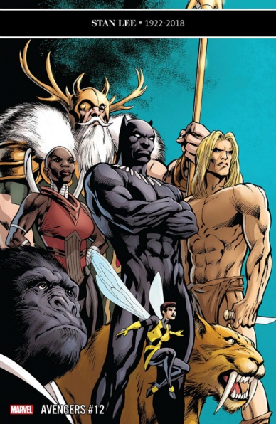
Case in point, the roster assembly that Black Panther executes on “Avengers” #12, as he forms his Agents of Wakanda. Under the pretext of putting together a support team capable to manage the new Celestial headquarter of the main team, T’Challa makes a truly unique, layered, and often unexpected group.
McGuiness and Smith take turns, depending on which member of the Agents of Wakanda is being drawn to the team. While their styles can be immediately told apart, since those transitions are aligned with the story beats, it becomes far less jarring. Further supporting that balance is a more subdued McGuiness, with his traditional anatomic liberties under control, with a deeper focus on character expression and interaction. Smith, on the other hand, is right at home with the more verbose scrip and light on action: the banter between Okoye and T’Challa are filled with nuance and the spirit seen on some of the surprise agents tells a lot about their personalities.
It is with Aaron’s script that “Avengers” #12 shines the most. Free from the requirement of making something bombastic like the new volume’s original arc, the writer takes his time on introducing characters properly, identifying their main expected contribution to the team, and expanding on his world building. There is a lot of promise on this group, the way the issue is told is filled with possibilities and, most certain than not, T’Challa’s plan will soon find a wall – to the enjoyment of readers.
Perhaps the strongest issue of this new volume, “Avengers” #12 relies on the traditional team assembling routine, but it makes it its own by the sheer diversity of the cast. With a balanced art on talented artists, this one has a bit of everything.
Final Verdict: 8.2 – Exciting, surprising, beautifully told and paced; “Avengers” #12 is a series highlight.

Written by John Alison
Illustrated by Christine Larsen
Colored by Sarah Stern
Lettered by Jim Campbell
Reviewed by Tom Shapira
Seven issues in and I think my failure to connect with the series thus far has been due to mistaken expectations: I kept on looking for a slice-of-life-meets-the-bizarre which has long been series creator John Alison’s bread and butter while “By Night” is, in actuality, a horror story. Horror with comedic touches, for sure, but horror none the less. This is made plain in this issue not only with an all-out monster attack, including the expected promise for to come, but also with the all-around atmosphere: the small town America is dying and decrypted, even character we thought positive are in too deep for the mob, for reasons that are both tragic and familiar. It’s a pretty sad series that I’ve foolishly mistaken for lighter than it is because of the rather cartoony art style.
Speaking of which, Christine Larsen’s designs turn out to be more at home with the scary stuff than with the character comedy: she draws decent shadows, ably helped by Sarah Stern on the spot coloring (keeping things dark without losing a sense of place and character), and a rather well-choreographed fight scene. Something in the faces doesn’t quite click for me – too much squinting going around.
Continued belowBut the main problem is that seven issues in, out of planned twelve, I am still not quite certain what this series is all about – is about the two former friends at the center? Is it about the mystery of the other universe? Is it about the terrible conditions in a dying town? It seems to try to be all of them together and as result had spread itself a bit too thin.
Final verdict : 7.0 – good writing and fun art, but the story as a whole seems to lack focus.

Written by Emma Vieceli
Illustrated by Claudia Leonardi
Colored by Andrea Izzo
Lettered by Richard Starkings & Comicraft’s Jimmy Betancourt
Reviewed by Chris Egan
“Life is Strange” #2 continues to be an excellent continuation of Max and Chloe’s post-storm life. Emma Vieceli writes these characters as if she created them, capturing their voices and souls completely. Moving seamlessly back and forth between conversation dialogue and Max’s narration, every bit of emotion and change in inflection is present on every page. At no point is there a question as to how the script should be read because you can hear their voices as clearly as ever. The ingenious story allows fans to enjoy this sequel fully, no matter which ending they received upon completing the video game. As Max and Chloe experience two different universes/timelines it is terribly sad for both the characters and us. The beauty and the pain are evident throughout. Just as the first issue did, this too pulls readers right back into this world.
Claudia Leonardi brilliantly recreates the world of Life is Strange in stunning clarity. Her line work carries on the more cartoon-ish style lifted from the game while still giving enough detail to make the people and locations fully realized entities. Andrea Izzo’s colors take the palette fans know. It’s a stunning blend of full, bright colors that with just slight changes can represent a full, lively world or a muted alternate reality. Their work doesn’t just evoke the world of Arcadia Bay in style, it acts as a partner in a perfect dance with Vieceli’s script. Each panel carries a real weight that also takes on the supernatural, shaky-cam style from the game. The stark, black line that separates the artwork from the clean white margins brings about the Polaroid aesthetic, completing the design.
Readers that didn’t play the game will not be able to appreciate all of the franchise-centric details and perfect character writing in this series, and typically something like that might earn a comic a demerit for being less than broadly marketable, but this is a sequel to a game that deserves to be played and praised. And just like the game, this comic book somehow manages to be an extremely enjoyable read, layered with powerful circumstances, character development, and a full range of emotions. Few comics have the power to put a faint smile on your face and a twinge in your gut as you wait for the other heartbreaking shoe to drop. If you ever had any doubts about the story making the jump from console to comic, put them to rest. Not only is this a fantastic mini-series, but it is also shaping up to be one of the best video game related comics ever made.
Final Verdict: 9.0 – Built up by an incredible creative team, “Life is Strange” #2 is an outstanding sequel and a must-read for fans.

Written by Steve Orlando
Illustrated by Riley Rossmo
Colored by Ivan Plascencia
Lettered by Deron Bennett
Reviewed by Christa Harader
“Martian Manhunter” #2 starts with J’onn on fire and a lot at stake, with mixed results. I appreciate the care Orlando’s taking in fleshing out Mars culture, but both issue #1 and #2 feel like an info dump. There’s too much jargon-packed into the dialogue to let the art breathe or for me to really appreciate J’onn’s familial relationships, and that’s a shame. Earth-side, there’s not enough of an externalized threat to justify such immediate drama or explain why J’onn can’t control his emotions at all. What’s after J’onn? An echo from his past, obviously, but that’s where my comprehension ends.
Continued belowRossmo’s art is technically proficient but doesn’t fit the tone of this book. It’s rare that I find something too cartoony, but Rossmo’s style is immediately at odds with the melodrama Orlando packs into each page. It feels like an intentional contrast gone wrong, and while there are some weird Cronenberg-ian moments as well as some tender details in J’onn and K’hym’s visit to the museum, it’s very hard to take any of the dirty cop/traumatized survivor material seriously with the bubbly style. Earth-side, Diane and J’onn’s faces occasionally appear dead-eyed, which creates an emotional distance that’s not entirely effective.
Plascencia’s colors are cheerful on Mars and suitably grim in J’onn’s Earth life. The pinks contrast nicely with all the green flesh on Mars, and the hard-boiled blues and shadows on Earth fit J’onn’s detective persona. There’s also a nice echo of J’onn’s true form in Diane’s jacket and slacks for a bit of visual continuity. Bennett’s lettering is competent, as always, and I appreciate the balloon styling to help me differentiate who’s talking. The “thought” tails are charming, if a little goofy, and the typeface is decent. However, the italics in the Mars flashbacks are a little tedious and strain my eyes, especially given the massive plot lift Bennett’s work shoulders in those scenes.
Overall, “Martian Manhunter” hit the ground running with a grittier, emotional reboot that’s lacking narrative and artistic harmony. I’ll keep reading, but I’m not entirely on board from the outset.
Final Verdict: 6.5 – “Martian Manhunter” #2 aims for shock value and tenderness and only partially gets there thanks to dissonant art and overwrought storytelling.

Written by Matthew Rosenberg
Illustrated by Szymon Kudranski
Lettered by VC’s Cory Petit
Colored by Antonia Fabela
Reviewed by Michael Govan
Usually, I like the Punisher best in small doses. I mean, I like him guest-starring in another title but don’t care for his solo stuff. Again, usually. To my surprise, I’ve really enjoyed Rosenberg’s run on the Punisher. I can’t quite put my finger on why. Maybe it’s Szymon Kudranksi’s artwork. I like his style, somewhat photo-realistic and perfectly at home in a gritty, mature title such as this one. The panel of Frank bashing in a Hydra henchman’s teeth is gruesome in the best way.
Maybe it’s Frank’s enemy during this first arc. Bagalia, an entire country for supervillains ran by supervillains, is an interesting concept. Helmut Zemo is an underrated Marvel villain, one of my favorites since I lost myself in Kurt Busiek and Fabian Nicieza’s respective runs on “Thunderbolts”. Maybe I’m just warming up to the protagonist and actually find him funny in a morbid sort of way. He’s so cavalier about his brutal actions in this book. Frank kills a Hydra goon while joking about his mother not getting an open casket funeral. Savage, just savage.
This issue furthers the plot a bit but dials back on the momentum of the previous ones. Frank isn’t letting loose and going on a rampage like before. He’s locked up for the whole issue and the one being punished for a change. No villains of note are killed, there are no big superhero guest spots. It is a quieter, slower affair but is not boring or bad. Whatever the reason, I am invested in the Punisher’s war on Hydra and eager to see what comes next for Frank.
Final Verdict: 6.5 – Things slow down when the Punisher gets punished.

Written by Jody Houser
Illustrated by Luke Ross
Colored by Java Tartaglia
Lettered by Travis Lanham
Reviewed by Ken Godberson III
Marvel’s stewardship of the Star Wars comics franchise has been a bit sporadic, even within this year-long “Age of Republic” series. With that said, Houser, Ross, Tartaglia, and Lanham have brought us a one-shot on Jango Fett, a simple man trying to make his way in the universe (his words. Not ours). While on the surface we follow Jango and his son, Boba, on a job, there is a deal of subtlety that the creative team adds to the work that does its best to expand on the relationship from the Attack of the Clones film.
Continued belowJango has an odd relationship not with just his son but with the rest of the clone army that he was commissioned to provide his DNA for. We see in flashback Jango being offered this by Count Dooku/Darth Tyranus and Jango’s own observations on Kamino of the clones. He comes off as very cold, seeing the clones as livestock. With Boba, it’s a bit more complicated. Jango does have affection for his son, but it comes off as clinical; keeping him at arm’s reach while showing him the tricks to his trade. Boba also reciprocates this kind of affection, even if at this point in his life we are seeing the violent and ruthless efficiency that would serve him in later years.
Luke Ross and java Tartaglia provide a dingy palate, but it works for this story. This isn’t the high octane action of a space chase through an asteroid field or the weird mysticism of a force vision. This is the rough underside of the Star Wars galaxy and the rough landscapes and the mean looks and violence that bounty hunters do help counterbalance that occasional… “heartwarming”… moments of Jango showing subtle pride in his son.
At the end of it, “Star Wars: Age of Republic: Jango Fett #1” isn’t anything that’s essential, but it is interesting. Perhaps if this story was expanded a bit to a three-parter as opposed to being a one-off in a giant maxi-series we could’ve been afforded to really dig into these characters. But for what it is, it certainly isn’t a bad bit of storytelling for Star Wars fans.
Final Verdict: 6.3- Space Opera Action takes a backseat to a decent -if brief- examination of the relationship between Bounty Hunter Dad and Bounty Hunter Son.
Written by Ryan Stegman
Illustrated by Kyle Hotz and Juan Gedeon
Colored by Dan Brown, Matt Yackey, Andrew Crossley, and Carlos Cabrera
Lettered by Clayton Cowles
Reviewed by Gregory Ellner
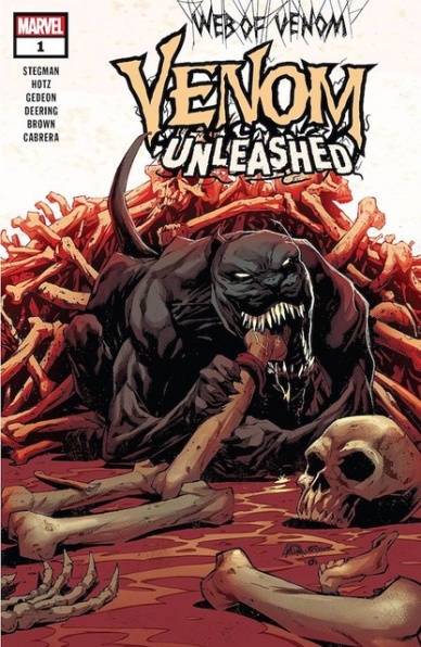
More than previous “Web of Venom” issues, “Web of Venom: Venom Unleashed” seems to serve as a true interlude, a side story that, while advancing the plot of the main “Venom” series, serves more openly to merely explore the world around the symbiote. With Ryan Stegman allowing the canid symbiote itself to take the spotlight, the adventures around San Francisco giving some focus on the less recent developments of Venom’s history and that of other symbiotes. Venom may not be sapient, may not have a clear idea on much of anything at the moment, but its heroic deeds speak to its kinder core, even if it is still very much a wild beast.
Given that Stegman, the artist of the main series, is the writer, it should be no surprise that he allows the artistry of Kyle Hotz and Juan Gedeon to take the spotlight. The linework is dark, with a special emphasis on the amorphous physiology of Venom itself and the gruesome manner by which it deals with threats, especially those corrupted by Knull-related forces. In all, the overall effect seems similar to a horror story where the reader is following a lesser monster, an animalistic, eldritch force that runs in contrast to the more stable appearance of others like robots or human beings.
Dan Brown, Matt Yackey, Andrew Crossley, and Carlos Cabrera work together to create a color palette that merges that of the previous two arcs of the main “Venom” series, merging the pitch black and the bloody red with more natural colors like yellows, greens, oranges, and more. The overall effect seems to be an attempt to merge the Knull storyline with the more down-to-earth “Abyss” story, one that by and large succeeds and helps pave the way for events going forward.
Final Verdict: 7.0- While there isn’t much in the way of further development and the story is not especially newcomer friendly, the creative team on “Web of Venom: Venom Unleashed” provides readers with a good interlude to bridge the two ongoing story arcs of the primary “Venom” series.
Written by Mariko Tamaki
Penciled by Diego Olortegui
Inked by Walden Wong
Continued below
Colored by Chris O’Halloran
Lettered by VC’s Cory Petit
Reviewed by Alexander Jones
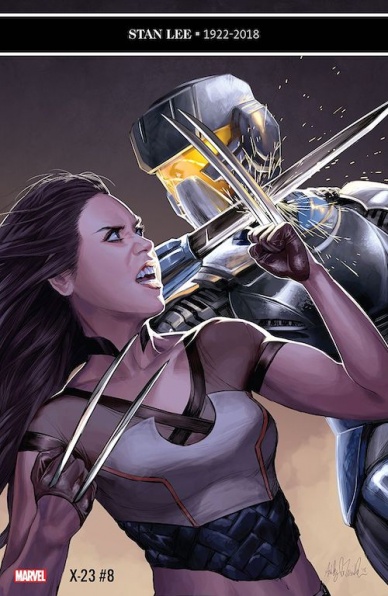
“X-23” #8 is another solid installment of the series, melding a hardboiled, noir story with the bright outlook and sunny disposition of Gabby. Author Mariko Tamaki weaves a fascinating subtext about the fractured nature of family in the series. Gabby has a much different outlook on the situation than Laura and the conversation and direction of the issue between the duo is beautifully complex. The latest arc of the series entitled ‘X-Assasin’ has been more simplistic and bare-bones compared to the last couple stories. Laura and Gabby are chasing a killer that has ties to the X-Men which gets increasingly more complicated as the plot progresses.
Tamaki uses this chapter of the series to make the plot considerably more personal and important to the issue. The best part of the story is the really personal reaction that Gabby has with the remainder of the cast in the series. Writer Tom Taylor and artist David Lopez laid an excellent foundation for this character that Tamaki has picked up on without skipping a beat. While the relationship and subtext surrounding Gabby are executed incredibly well, the break-in and first half of the issue is minimalistic and lacking a certain level of intrigue the rest of the issue and series generally maintains.
Artist Diego Olortegui does a particularly great job conveying the complicated emotions from Gabby in this chapter. His more expressive style gives her a really great attitude and presence. The last couple scenes in the issue are carried by the visual storytelling from Olortegui. While the backgrounds in the issue can be minimalistic and faces can be less expressive than they should be, the issue carries really expressive visuals from start-to-finish. There are a couple pages where Olortegui experiments with page composition and every time he gets more ambitious with the design, the storytelling became more immersive. As Olortegui gets more comfortable with the page design, it is going to be interesting to see him take more chances as an artist.
Tamaki and Olortegui tell a familiar story in “X-23” #8 that has a lot more context beneath the surface that reveals itself as the issue progresses. While this isn’t the greatest chapter of the series so far, it is a formidable addition that brings “X-23” towards an interesting new direction.
Final Verdict: 7.0 – Despite a simplistic plot, “X-23” #8 enriches a complicated family dynamic.


