
There is a lot to cover on Wednesdays. We should know, as collectively, we read an insane amount of comics. Even with a large review staff, it’s hard to get to everything. With that in mind, we’re back with Wrapping Wednesday, where we look at some of the books we missed in what was another great week of comics.
Let’s get this party started.

All-New Wolverine #16
Written by Tom Taylor
Illustrated by Nik Virella
Reviewed by Jake Hill
With “All-New Wolverine,” Tom Taylor has turned everyone’s favorite murderous mutant into something of a rarity at Marvel — a legacy book! Like Wally West’s tenure as the Flash or Dick Grayson’s as Batman, Laura has to contend with all the dangers of being Wolverine, plus all the baggage her clone father has left behind. The title of this arc, ‘Enemy of the State II’ really tries to hit you over the head with that idea of superhero legacy.
As with the original “Wolverine: Enemy of the State,” a sinister organization is trying to turn the heroes claws against innocent people. Laura Kinney has her own long-established Kryptonite, the trigger scent that drives her into a mindless, berserker rage. That’s at the core of the conflict here as Laura is used as a pawn in a war to control the streets of Madripoor. Classic Wolverine stuff, right?
Having Laura off the table (in a characteristically gruesome fashion) puts the focus on her clone sister, Gabby. The creation of Gabby not only strikes that theme of legacy again, but strengthens the connection between Laura and Logan. Despite frequent claims to being a loner, when has Wolverine not had a teenage girl as a sidekick? Gabby hasn’t yet proven herself to be the new Kitty Pryde or Jubilee, but this issue continues her forward momentum into becoming her own stabby superhero.
Nik Virella’s artwork is clean and easy to follow. She leans pretty heavily on six panel grids, both for dialogue scenes and for feral mutant mayhem. The simplicity is not a knock against the art; this is a Wolverine book after all. More importantly, Virella manages to draw Laura Kinney, who spends most of the issue getting tortured in a skintight two-piece, looking like Wolverine and not cheesecake. She’s always a dangerous animal, not a pinup model, and even when she’s down, she’s not out. Virella draws expressive characters that keep you on edge. Even when they smile, everyone looks coiled, ready to strike, until they do. When Wolverine is unleashed, the straightforward style makes the action easy to follow, as she kicks off of walls and sinks her claws into heads. Overall, Virella is an almost seamless fill in for series regular artist David Lopez.
Tom Taylor and company are weaving a mythology for the new Wolverine that draws from the past while feeling completely new. Laura Kinney is probably one of the coolest heroes Marvel currently has in their roster.
Final Verdict: 8.2 – Our heroes are in trouble, but the quality of this book is not!
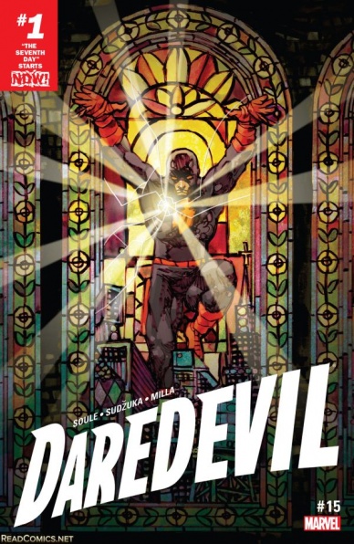
Daredevil #15
Written by Charles Soule
Illustrated by Goran Sudzuka
Reviewed by Alexander Jones
The brand new volume of “Daredevil” started quietly, giving the series a new back-to-basics approach. While the first few issues of author Charles Soule’s run were strong, this latest story titled “The Seventh Day” could be where this comic hits a creative high point, if “Daredevil” #15 is indicative of the quality in the rest of the story. This accessible first chapter of the story is a great place to start the run, slowly introducing the background of past stories to new and old readers while creatively pushing the narrative forward.
With so many plates to juggle, a typical writer might drop a few in service of the actual story, yet Soule excels with a new stripped-back storyline that so wonderfully taps into the paranoia of The Man Without Fear. Goran Sudzuka’s pencils add a refreshing burst of energy to this current storyline taking so many chances with the approach to narrative. Soule and Sudzuka introduce a non-linear storytelling device and characters never-before-seen in the current series.
Continued belowThe entire issue culminates with more firsts for the current volume of “Daredevil” than a single issue has introduced since the series’ debut while still leaving me hungry for more content. I never expected some of Soule’s previous storylines to carry such a pronounced weight on the current continuity of the book, silly me. Long-time readers of the current book get an opportunity to see a radical shift with a certain supporting cast member as a major consequence of what happened in the previous story.
Sudzuka’s initial sequences bring a new element to the series with an excellent opening page that will leave readers wondering if they cracked the pages of the right series. While the opening sequence shows a more playful side to the series, Sudzuka immediately changes the tone with the help of color artist Matt Milla also muting the color palette to establish the dire stakes of the current situation. These shifts in tone and coloring help this issue become more comprehensive with the narrative flipping so often between timelines. Both the writer and art team of this series feel like they are working together in perfect harmony in these pages. When Sudzuka and Milla change up the panel layout in the comic, their experimentation with the form yields excellent, mind-blowing results.
Soule seems to be playing the long game with this series as 15 issues in, the writer has finally started to acknowledge some of the questions readers have had since the debut of the series. This chapter also manages to be accessible as the series introduces everything readers to know about past issues seamlessly in early sequence within the book. It sounds like a lot to juggle while still trying to tell a good story, but the full team somehow makes the narrative flow seamlessly while revealing a year-long mystery to patient readers.
Final Verdict: 8.0 – The debut of the ‘The Seventh Day’ lives up to the epic title as Charles Soule finally plays some of his best hidden cards.
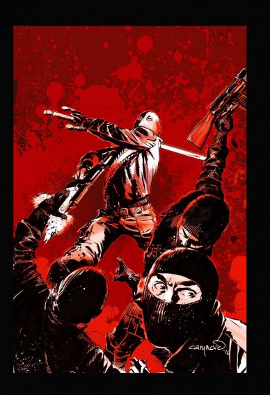
Deathstroke #10
Written by Christopher Priest
Illustrated by Cary Nord
Review by Ken Godberson III
Let me get this out of the way first: one really should read this issue right after “Deathstroke” #9. These two issues are incredibly dense, with multiple storylines in multiple time periods happening at the same time, all focused around the Wilson family. Priest is not one to slow down and explain, and I kind of like that, even if it does make me feel a bit dumb at times. The work challenges you to meet it head on, even if it requires multiple re-reads.
That said, perhaps the most straight-forward story here is the one with Rose, wanting to learn more about her mother’s family. And I’ve said it before: it has been a long time since I’ve read a Rose Wilson that I generally liked. Ever since Geoff Johns got his hands on her in “Teen Titans” once upon a time she’s been a great big blah. This Rose wanting to get in touch with her roots feels so much more intelligent and mature, without ever losing that she’s a badass.
As for the artwork, I have to say, while Cary Nord still does a good job here and Jeromy Cox’s colors continue to wow, I feel like this issue may have been a victim of this twice-a-month shipping. Nord’s more fluid pencils help enhance some of the more visceral actions here, such as someone being sniped in the head. However, I feel in some parts, especially the fight scene involving Rose, the art was a bit rushed and the fight choreography ill-conceived. It isn’t bad, just not up to the usual standards set by this series.
Final Verdict: 7.3- Given a couple of rereads, this is a book that rewards the patient, even if the art had some stumbling blocks.

Detective Comics #948
Written by Marguerite Bennett and James Tynion IV
Illustrated by Ben Oliver
Reviewed by Brian Salvatore
Ahead of the new “Batwoman” ongoing series launching next month, “Detective Comics” focuses on Kate Kane, her relationship with her father, and how she fits into the overall Bat-mythos. This question asks a great question that needs to, but still hasn’t really been answered yet: what can Batwoman do that Batman can’t?
Continued belowEven if the question doesn’t get answered in this arc, the asking of it shows that Bennett and Tynion know that Kane, despite the amazing design, interesting supporting cast, and paramilitary background, is still a bit of an embryonic character. The bits of her history that we do know about – her romantic past, her fractured relationship with her father – get a bit of a backseat here, and instead, the story deals with her actual training; specifically, her trying to trail Batman. Kate is a quiet character – perhaps the most quiet non-Wayne in the Bat books – and the issue reflects that. It’s a terse, quiet issue that nonetheless seeks to break through the gruff, sometimes prickly exterior and to delve into some of the underlying qualities of her character.
It doesn’t hurt that Ben Oliver, one of the most underrated artists working in comics, handles this issue, and – stylistically – acts as the perfect bridge to Steve Epting on “Batwoman” #1. Oliver’s style is somehow both bold and soft, with an impeccable eye for enhancing design. Look no further than the struggles of anyone after Oliver to properly draw the David Zavimbe BAtwing costume, and you’ll see what I mean. The Batwoman costume, as I’ll point out to anyone who will listen, is the best costume that DC has produced in the past 15 years, and Oliver absolutely nails it, letting her hair and the cape co-mingle to create a movement and a flow that is unlike any other Bat costume.
Oliver’s Batman has a bit of a Michael Keaton jawline, which I will never be mad at, but also skulks around more than most artist’s and appears always on the verge of disappearing from the frame. He manages to mix horror and capes in such a seamless way. He would’ve been great on an issue of “Gotham By Midnight.”
Tynion and Bennett use this issue to both resolve some of the lingering threads left over by the first few arcs, while clearly giving Kate the focus, even though she’s been consistently the secondary lead in the book thus far, even surpassing Batman in a few issues. While it is pretty clear that this is a backdoor pilot, it is handled so masterfully that no one will care.
Final Verdict: 8.2 – This team delivers.
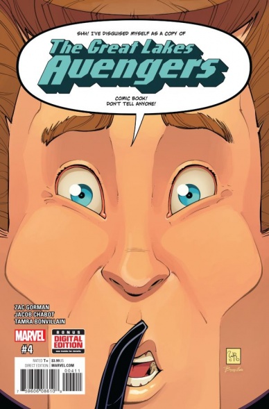
Great Lakes Avengers #4
Written by Zac Gorman
Illustrated by Jacob Chabot
Reviewed by Robbie Pleasant
The GLA’s story continues to progress, with an almost-twist and plenty of comedic mayhem. It often juggles comedy, deconstruction, and actual story and character development, to some degree of success with each, depending on how serious you want to take it.
Perhaps the most compelling part of the issue was the backstory of Nain Rouge, AKA Councilman Dick Snerd. Seeing his failed attempts at heroism leading to a transformation into a cynical politician and an “ends justify the means” outlook is surprisingly good character work for what could otherwise be a forgettable villain, while the comic cleverly switches its art style during the flashbacks to appear like a comic from the 80’s.
Outside of the flashbacks, the artwork becomes somewhat more cartoony, but the illustrations are solid and the detailing is strong. It matches the goofy tone, which works very well for most of the issue. At the same time, it becomes somewhat jarring given the dark note it takes later down the line, but perhaps that juxtaposition of style and substance is intentional. If so, well-played, GLA.
In-between the flashbacks and darker turns, we get some character work, not exactly in development so much as revelations. It gives us more information on Bertha and Mr. Immortal’s breakup, which is set aside for a little more wacky mayhem, but there’s definitely a lot of issues to touch on there, and it’ll be nice to see where it leads. Still, trying to fit everything into the issue as it does can sometimes make things feel rushed and interrupted, but that’s a minor setback overall.
Final Verdict: 6.7 – Good character work and nice artwork, albeit somewhat hectic.
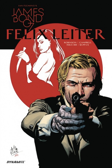
James Bond: Felix Leiter #1
Continued below
Written by James Robinson
Illustrated by Aaron Campbell and Salvatore Aiala
Reviewed by Jess Camacho
Felix Leiter is often called “the American Bond” but really, he’s far more tragic. In both the movies and novels he was horribly injured (lost limbs) and this new series picks up sometime after that. Out of the C.I.A. but in Japan, Felix is dealing with learning to use his prosthetic limbs and tracking down a former girlfriend turned enemy agent. One of the things about James Bond is that the more you dive into his personal life, the tougher it gets to make the story work. With Bond, I like the mystery that surrounds him. I don’t want to know how broken his heart is or how much he misses his parents (looking at you SPECTRE and Skyfall). He’s pure fantasy and escapism and that’s part of what works with him. That’s not entirely true about Felix because he’s always been there to act as a counterpart of Bond. He’s different and in this first issue, James Robinson proves just how by humanizing him much more. This is heavy on Felix’ personal troubles and the shadow of his former self he has become. It isn’t an issue light on action but it doesn’t do a ton to show us the bigger picture but Robinson’s writing of Felix is just so strong that it’s tough to be mad about this. Where the main Bond series will be high octane action, Robinson’s Leiter will be more like a hard boiled detective saga and that’s going to work in its favor.
Aaron Campbell’s art bounces off of that same tone and is drawn a bit grittier than the Bond miniseries have been. There’s far more sadness within these pages than in Bond’s stories and it really clicks. Campbell’s action sequences have a lot of movement in them but some of the quieter scenes involving the mysterious Alena can feel a little static. Japan has a very distinct feel compared to Leiter’s former home in Florida. Campbells makes great use of closeups to kind of deliver this cinematic quality to the conversation between James and Felix and the dark inking works to add boldness and depth to the pencils. Aiala’s colors are solid and there’s a tiny bit of Blade Runner visible in the Japan sequences. The color work could stand to be a little more in line with the writing but it’s good work either way.
Final Verdict: 7.6 – A really solid first issue that any Bond fan will enjoy.
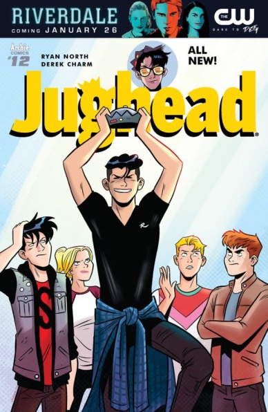
Jughead #12
Written by Ryan North
Illustrated by Derek Charm
Reviewed by Nicholas Palmieri
The Archie universe has always been the perfect distillation of teen comedy-dramas. Ryan North has become known lately for writing comics that are hyper-aware of their genre and the tropes and trappings associated with them. “Jughead” has been combining the two to great effect.
This issue starts off with an eight-page sequence where the teens play a kart-racing video game. Despite its length, the sequence never feels too long, as it allows for dynamic panel arrangements and stylized color work from Charm. In the more grounded back half of the comic, he sticks to grid-like rectangular panels with more natural colors, straight-forward framing, and white borders, focusing on the characters’ body movements and expressions to sell the sitcom elements. In the front half, however, we see neon-lit diagonal panels on top of full-bleed art, with small circular panels embedded into the frame to highlight minute details. It all works together to sell the action-packed game world, which Charm completely fleshes out through the customization of each character’s in-game avatar and vehicle.
As for the writing, North never misses an opportunity for a joke. Further, many jokes also work as characterization. Within a single page, Betty points out an oddly gender-specific plot detail, Veronica explains capitalism using broken logic, and Reggie gets a “spidey-sense,” colored to look like a comic from the 60s, when he feels someone taking a picture of him. Each of these is intimately tied to the character saying it, and each uses a slightly different style of humor so the rapidly-paced jokes never feel like too much. North even writes jokes in small print at the bottom of some pages — and while these can usually be hit-or-miss for me, the reduced number in this issue meant every one landed.
Continued belowThe best part of the comic, though, is its portrayal of the superfluous nature of the teen characters’ lives. This isn’t a world where every character gets pregnant and wants to murder the others. It’s a world where a group of friends hang around, play video games, and make meaningless bets. The point ends up being that there often isn’t a point: when it’s suggested that social media can lead to harm and regret, we are instead treated to a page full of a proud Jughead’s hamburger pictures. That’s real life. And that’s funny.
Final Verdict: 8.3 – North and Charm start a new arc with a bounty of jokes and creativity, all covered in self-awareness. The perfect book to read when you want something that actively pushes against taking itself seriously.

Justice League of America: Vixen Rebirth #1
Written by Steve Orlando and Jody Houser
Illustrated by Jamal Campbell
Reviewed by Michael Mazzacane
The ‘Vixen’ special, is in line with the best of previous Rebirth specials and prior “JLA” specials. It gives an abbreviated history of the character, expositing their basic power functions, while also getting at the big question going into the next series: why say “yes” to Batman when he comes knocking?
For model, businesswoman, animal rights activist, and reality TV star, Mari McCabe’s decision is born from the realization that she can and should do more. All the capital and charity means little if people fall through the cracks and you have the power and ability to help them. That thematic motif of power and its ethical usage is nicely woven in to the book on multiple levels, it is clearly discussed in the dialogue and demonstrated in the art work from character reactions to color schemes. This is the kind of clear, functional, comic book production one should hope for in any book. It is also the kind of thematic material at the heart of the superheroic fantasy. Everything about this book is meant to inspire and create new readers, from lapsed ones or those familiar with the character through adjacent properties. The book left me wanting more of this version of the character.
Mari’s awakening comes from the tears of Charlotte Frank, a girl supposedly being helped by Mari’s various charitable activities, who is still in need of help in finding her kidnapped Mother. This dredges up old memories and new considerations while reinforcing the motif of the usage of power. Artist Jamal Campbell contrasts past and present primarily with color. The present is depicted with a vibrant, wide pallet, while the past is reduced to a trio of earth tones. His line work is clear and nicely formatted but it is his smooth textured colors that give the pages a sense of life as Mari flies or kicks with the power of the animal kingdom.
My core comics knowledge of the character isn’t the best, but this one-shot appears to borrow from the DC-verse and transform the character into a legacy one as seen on TV. This helps to further cement Mari as the hero, coming from a family line of village protectors who realized that protecting the whole was also protecting themselves. This collectivist attitude is realized in a bit of Geoff Johns literalism spiraling out of the Tantu Totem. With it, Mari is directly connected to all animal life on the planet. Campbell depicts this as an interconnected circulatory-esque system with red and blue phase shifting as Mari activates her powers. It was a bit odd reading Mari call out the base animal she wished to draw upon, past representations haven’t done that and this is a visual medium, so it’s clear she’s using an elephant or dolphin. It was a little repetitive and distracting from Campbell’s vibrant artwork.
Final Verdict: 7.5 – “Justice League of America: Vixen Rebirth” accomplishes what these kinds of books are meant to do in a fun engaging read.
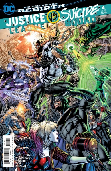
Justice League vs. Suicide Squad #4
Written by Joshua Williamson
Illustrated by Fernando Pasarin
Reviewed by Gregory Ellner
This issue is a classic example of “the enemy of my enemy,” pitting both of the eponymous teams against a greater threat than either of them alone, for a far different reason. The extreme power of that greater threat, the Maxwell Lord-led “original” Suicide Squad, demonstrates their threat level on par with both teams.
Continued belowBanter between certain members of the teams is pretty funny, especially those who have a preexisting rapport. Specifically, the Flash and Captain Boomerang have a relationship that is colored by the Rogues’ code of honor, especially about who is or is not a valid target. As a result, when the Flash saves Captain Boomerang’s life, they make a playful “pact” never to speak of the incident again to the other Rogues.
That said, some of the other interactions leave something to be desired, or even seem to cheapen certain conflicts. Doctor Polaris’ involvement is extremely minimal, with him being relatively easily disposed of; on the other hand, Johnny Sorrow’s signature fatal countenance is almost completely ignored. His one attempt to use it on someone else, Harley Quinn, fails completely, with the reasoning being her insanity renders her immune. This usage of Sorrow is pretty disappointing, given how dangerous he is said to be, and we don’t see even a small example of his power aside from his own disposal.
Fernando Pasarin’s artwork is excellent, though less detailed than Jason Fabok’s work in the first issue of the series. I was highly amused by the almost bored, disappointed expression on Superman’s face while trying to get Lobo to stand down and stop working for Max Lord. The army of the King of Tears, brought forth by Johnny Sorrow, is horrific, featuring creatures straight out of the imagination of H.P. Lovecraft himself.
Pasarin’s way of showing Maxwell Lord’s bloody nose is at once relatively understated and very noticeable, to the point of being very creepy. Scenes such as a certain sword fight are action-packed in a way that much of the rest may not be, showing the agility and speed of both combatants very well. The final image of the issue is extremely similar to the cover of another issue of “Justice League of America,” released back in 2011, giving a foreboding consideration of what is yet to come.
Final Verdict: 7.0 – Highly entertaining with brain over brawn, though some conflicts are problematic.

The Mighty Thor #15
Written by Jason Aaron
Illustrated by Russell Dauterman
Reviewed by Benjamin Birdie
Jason Aaron has been telling his Thor story for several years now over many different titles. Even as it involved his own event book Original Sin, it has managed to exist in its own bubble in the Marvel Universe, free from the distractions of the events at large, even as Jane Foster’s Thor only grows her presence there. For the most part it has focused on the traditional threats Asgard has always faced; Asgardian infighting, Loki plots, elf bad guys, the usual. Even Thor’s scraps with Roxxon on Earth always circled back to some kind of strange mythological element, like pacts with Frost Giants.
In this issue, however, things take a drastic left turn. As Jane continues her struggles against the cancer destroying her human form, Asgard is suddenly invaded by, of all things, the Shi’ar. Don’t get me wrong, Gladiator versus Heimdall is a rad fight to see and, holy cow “Wolverine and the X-Men” fans, is that the triumphant return of Kid Gladiator and Warbird?? But it is a strong divergence from what has been a relatively airtight, what, 40 issues of story? To their credit, Thor and the rest of Asgard are just as confused as the reader on this one, and since this is merely Part 1, answers are sure to come. The final page, while answering little, does raise a few more compelling questions. When looking at the totality of the series, it’s clear that Aaron is simply bringing everything into play he may be interested in, whether its flying S.H.I.E.L.D. cars, The Collector (in “The Unworthy Thor”) or the Imperial Guard characters we all fell in love with in “New X-Men” and his own X-Men run.
It’s also nice to see Dauterman flexing his muscles in the classic Cosmic Marvel sandbox, relishing in, among other things, that awesome Shi’ar hair. He’s just as adept at capturing the bombast of Heimdall and Gladiator throwing each other across the entirety of Asgard as he is at capturing the small bravery of the slight, human Jane Foster standing up to an imposing Cul almost twice her size to argue for her continuing service in the Congress of Worlds.
Continued belowIn a Marvel Universe where events seems to have a puzzlingly omnipotent reach, it’s always nice to return to the safe haven of Aaron’s long and captivating story of Asgard. Trying to figure out exactly where it’s headed is part of the fun, isn’t it?
Final Verdict: 7.8 – A gorgeous and action packed issue but, like, what??
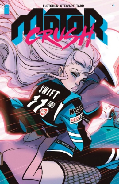
Motor Crush #2
Written by Brenden Fletcher, Cameron Stewart, & Babs Tarr
Illustrated by Babs Tarr & Cameron Stewart
Reviewed by Matt Lune
“Motor Crush” is achingly cool. For some comics, that’s enough. Hell, if a lot of other comics looked as good as Motor Crush, nothing more would be needed from them. But this isn’t any other comic.
This second issue is devoted to exploring the relationship between our main character Domino and her ex, Lola Del Carmen. It’s a great decision, giving the creators chance to examine what Domino is really made of, as well as moving the plot of the series forward in a meaningful way that enriches the characters. Stepping outside the fiction, it’s wonderfully refreshing to find such a complex and messy relationship between two LGBTQ characters, especially when one is the POC lead. More exciting is how natural it feels, almost as if it’s not as woefully rare in this (or any) medium. The creative team has shown a concerted effort to not shy away from these issues in their previous work on Batgirl, but here they’ve got the freedom to really let loose and bring us something much needed in comics.
The pacing hurtles along at breakneck speed, and rightly so: not only is there a lot of action to fit into 24 pages, but the whole deal of “Motor Crush” is about living life at a blisteringly fast pace. There’s a chase scene in the middle of this issue which is superbly done, it gets the heart racing as good as any in the movies and is a perfect example of the art, coloring, and lettering coming together to draw you into the action. Tarr and Stewart’s work shines most during this sequence, which includes a gorgeous double page spread, excellently choreographed panel work and a deceptively complex fluidity to the movement on the page, using color to great effect.
There are quieter moments in here too, and Tarr’s character work, while always strong, has rarely looked better. Through their body language you can feel the tension between Domino and Lola, and during a conversation with her father Sully, you can really sense Domino’s need to understand her past and his reluctance to open up just by reading their facial expressions. The script is excellently controlled during these moments too, but it’s the art that tells the story.
At its core, “Motor Crush” is a visual tour de force dripping with neon 80’s cool, like you’ve just put a quarter into the fastest racing arcade game in San Junipero, or stepped into the VIP area of the hottest club in Vice City. It’s a gorgeous looking, neon-soaked ride with a pace to make The Flash feel woefully inadequate, and while all of that is on display here too, this second issue fleshes out the world with a depth of character and a hefty dose of both drama and charm. Don’t wait for the trade, race out and pick up this book.
Final Verdict: 8.9 – In the race for both style and substance, “Motor Crush” is taking first place.

“Occupy Avengers” #3
Written by David Walker
Illustrated by Carlos Pacheco
Reviewed by Kent Falkenberg
Clint Barton getting smacked around in comics is almost as familiar a trope as two heroes whaling on each other before their inevitable team up. David Walker and Carlos Pacheco serve up both in “Occupy Avengers” #3, as Hawkeye travels to Chicago to get battered by Nighthawk before enlisting him in the ranks of Marvel’s new social justice avengers.
Pacheco captures the brawl’s intensity with intimate, tightly-packed panels, before sprawling out across an imposing splash of Nighthawk finally levelling Clint. It’s a thrill to see Nighthawk join this title. Walker’s familiarity (from the cancelled-way-too-soon solo book) and the fun he has playing with these sorts of machinations keep the setup from feeling trite.
Continued belowOf course, Red Wolf jumps in before Nighthawk inflicts lasting damage. Of course, they’re really in Chicago for Tilda (“Nighthawk’s…. Sidekick? I guess that’s what you’d call her”). And of course her expertise in robotic engineering leads them all to a coal mine acting as a front for black market epidurium (the key element in creating Life Model Decoys) and a backdrop for the third act melee. Of course.
Pacheco’s fluid lines are highly-rendered. The art looks sleek, but it borders on sterile precision through the middle third. Luckily, small flourishes in the final fight work well to capture the frantic pace and to emphasize subtle difference between the fighters. Panels tilt slightly off angle to match the flight path of Hawkeye’s arrow as he looses it deep into an enemy’s forearm, while Nighthawk’s acrobatics let him break free of panel barriers entirely.
Bookended by the frenetic brawl and team up, I was able to breeze through this issue. It’s entertaining, yes, but outside of its introductions (Nighthawk and Tilda) and transitions (chasing the epidurium to its supplier), it doesn’t really feel substantial. Sure, Clint’s narration is always good for a laugh. And there’s room for some great interplay between his frivolous demeanor and Nighthawk’s more severe temperament (“Yes!I love a good team-up. High-five!”…. “I don’t like you”). But Tilda’s constant advances toward Red Wolf feel forced rather than flirtatious. It’s a shame that more of Walker’s character beats don’t hit as hard as Pacheco’s well-pencilled fists. All that aside, the last-page splash is a devilish cliffhanger sure to keep you guessing what state these hard traveling heroes will occupy next.
Final Verdict:6.5 – This issue goes down like sorbet: Looks smooth. Tastes smooth. But you can’t shake the feeling that something a little more satisfying is right on its way.
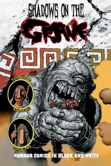
Shadows on the Grave #2
Written and illustrated by Richard Corben
Reviewed by Brian Salvatore
Richard Corben’s new horror anthology continues his amazing run of work in his 70s. Corben’s work has always had one foot in underground comix and the other firmly in the EC/horror work, and this issue, in particular, flexes those muscles at the same time. While this issue didn’t grab me the way the first did, it is still one of the most impressively illustrated issues of the month.
The first story, “A Muddy Plot,” has the most composed and photo-realistic work of the issue, with Amos and Bertella looking as normal as a Corben creation can, but Aunt Deanne being a full on monster before we even hear her say anything.”The Thing in the Swamp,” on the other hand, is a deranged and claustrophobic story, with Corben distorting and exaggerating all features to create a harrowing, trippy experience.
“Don’t Steal From the Dead” is, perhaps, the most predictable of the stories, with a ‘punchline’ that was pretty clearly telegraphed, but still packs a punch. The serialized story of Denaeus, which will appear throughout the whole miniseries, is by far the least interesting part of both of the first two issues. The story is still beautifully rendered – this month, we get a Harryhausen-esque cyclops – but the Ancient Greek timeperiod sticks out like a sore thumb from the rootsy American stories that fill the rest of the issue.
Final Verdict: 7.4 Though not as strong as the first issue, this anthology gives some incredible bang for its buck.

Shipwreck #3
Written by Warren Ellis
Illustrated by Phil Hester
Reviewed by Rowan Grover
Despite the short delay, “Shipwreck” still proves to be worthy of the Warren Ellis name, and one of the leading titles of the Aftershock library. The plot’s conspiracies begin to unfold in this issue with Ellis tackling multi-dimensional themes in a more modest way than he has in previous works. Light is shed on protagonist Dr. Shipwright’s past, revealing that he led a group of scientists to finding a solution to a familiar global warming crisis. The juxtaposition between the confident, cool scientist Shipwright was and the fractured, nomadic man he is now shows some strong character development, keeping the narrative engaging.
Yet Ellis still keeps the overall pace slow, making it hard to tell if he’s playing the long game here or not. Details of Shipwright’s being ‘shipwrecked’ on an alternate earth are still kept deliberately vague, as well as major differences between this and his home world. Ellis uses a separate character, the enigmatic Inspector, to lead the readers and Shipwright to new plot developments in an almost antagonistic way. For readers familiar with Ellis’ work, these are all exciting prospects that hark back to his “Planetary” days, yet it might come off as confusing to newer readers.
Continued belowThe writing often takes a backseat to let the artistic talent drive the plot, and industry veteran Phil Hester doesn’t disappoint. It’s impressive to see an artist be able to tell the story so well without any use of dialogue, which is how the opening pages occur. Hester has expert control of his camera usage, jumping from zooms to bird’s eye view and close ups all in the space of a few panels. While it may sound jarring, It’s a great way to establish the tone and cleverly shows the reader what’s going on without any exposition.
I was a big fan of his work on Mark Millar’s “Swamp Thing” run, and the same jagged, haunting tone is a big draw here. The world Hester renders feels very desolate, almost to the point of being post-apocalyptic. His art works especially well in Ellis’ big reveals, where I lost myself taking in the intricate detailing of the skeleton in the cairn reveal. Similarly, the recurring motif of crows acts as a reminder of the grim reality Shipwright is in, and without question makes for an awesome aesthetic.
Mark Englert’s coloring is a huge part of what makes this books so good. He uses a restricted palette of muted colors which is effective in setting tone and making Hester’s art pop. Each scene setting has a distinctive and memorable feel conveyed by the palette. A scene depicting Shipwright looking out a motel window is a subtle but really effective example – the interior is negative in color creating a rich contrast between the inner and outer world.
If the all-star firing squad of Ellis and Hester didn’t grab you from the get-go, I recommend you jump aboard the “Shipwright” train as soon as possible. The pace might be slow and the premise is still unfolding, but the plot shows promise to be a game changer down the track. Plus, Hester’s art is looking better than ever supported by Englert’s coloring, which should be more than enough reason for you to buy this book.
Final Verdict: 7.8 – An engaging chapter in a series that looks to be another win for Aftershock Comics.

Spider-Man #12
Written by Brian Michael Bendis
Illustrated by Sara Pichelli
Reviewed by Tyler J. Brown
Twelve issues in and things haven’t gotten any easier for Miles Morales in the main Marvel universe. Although some have complained about how conversation-driven Bendis’ books can be, this issue sets up a story that could have some interesting ramifications on Miles’ love life.
Bendis’ snappy dialogue frames the issue with Miles beginning to tell his roommates about his adventure to Earth-65 to look for his father. It’s a simple storytelling tool, but it’s one that got me hooked and curious as to how this crossover with with Latour and Rodriguez’ “Spider-Gwen,” appropriately titled ‘Sitting In A Tree,’ will resolve. Although it may seem like not a lot happens in this book to some, it’s setting up a crossover. With that, I could see how some readers may not be completely satisfied when they reach the final page.
Although Nico Leon’s work on previous issues has more than proven that he can stand side-by-side with Sara Pichelli, I couldn’t help but smile when I saw the Italian artist’s name on the cover of this issue. After all, Pichelli is the artist that helped launch Miles Morales into stardom originally. As expected, her lines convey all of the emotion of a son looking for his father that the reader could want. Of particular note is how beautiful Pichelli makes Earth-65 look. Her lines with Justin Ponsor’s colors make this alternate version of New York City a haunting neon landscape – which helps to convey just how out of depth Miles may be. One surprise that had me smiling was when Miles was attacked by Earth-65’s copy of The Ringer, who just so happens to be a larger, older woman.
It’s good to know that this crossover will be more than a couple of parts. Both teams on their respective books have shown that they know how to handle their characters, and one can’t help but wonder how the story will evolve as it bounces back and forth from book to book.
Continued belowFinal Verdict: 7.0 – Although Bendis’s writing isn’t for everyone, he shines on his solo books. Reteaming with Pichelli brought back an emotional brightness to the art and she hasn’t missed a beat.

Star Wars: Poe Dameron #10
Written by Charles Soule
Illustrated by Phil Noto
Reviewed by Alice W. Castle
The idea of a Poe Dameron-focused comic series was, initially, something that confused me. The ending of The Force Awakens basically forbade any kind of continuation that wasn’t Episode VIII meaning the timeline of the comic series had to fit snug in the weeks and months prior to The Force Awakens. I was largely skeptical of how much story Charles Soule and Phil Noto could milk out of a series with that kind of limitation.
With the tenth issue, this third arc of “Poe Dameron” is shaping up to not only prove me wrong, but cement its place as one of the most interesting Star Wars comics in the new canon. Despite its title, this arc isn’t really about Poe. It’s more about Agent Terex and fleshing out his backstory after the end of the Empire and before joining the First Order and this issue solidifies him as one of the more interesting villains in Star Wars. The twists Soule and Noto have taken with the character have made him a much more fascinating, well rounded and immediate threat without falling into the trap of trying to make him seem sympathetic to the audience.
As you might expect, Phil Noto’s artwork is a sight for sore eyes. Seeing Noto on interiors is always something that warms my heart and he proved on “Chewbacca” that he knows this galaxy. If there’s one downside to the issue, it’s the lack of any kind of action beat that allows Noto to really cut loose. The majority of this issue is dialogue scenes, either in the present or in flashback, which, while it allows Noto to showcase his sense of storytelling and framing, gives the issue a slower pace than had been set in prior issues.
Still, the issue is gorgeous and every panel brings some new flavour of the Star Wars galaxy to the page. From the dingy slums of Kaddak to the technicolour droid operatives to the deep black and red interior of the First Order ships to sepia-toned flashbacks, Noto fills this issue with visuals that keep the different settings and perspectives unique and distinct in a really pleasing way. Plus, there’s a page in here that might be my favourite page of any Marvel Star Wars comic. You’ll know the one. It’s the one that feels like a page from a lost “Crimson Empire” sequel.
Final Verdict: 7.8 – The art is customarily fantastic and the fleshing out of the series’ central antagonist is fascinating, even if the main thrust of this issue’s plot seems to stall in order to make way for it.

Toys for Tyrants: Customer Service Issue
Written and Illustrated by E. D. Bass
Reviewed by Matthew Garcia
E. D. Bass’s “Toys for Tyrants: Customer Service Issue” is a collection of gag strips about the customer service representatives at an ACME-like corporation called Skelnick Industries. They sell rocket powered flight suits, big space guns, all manners of toxic gasses, henchmen, weird machinery, and anything else an evil super villain might be after. “Our customers are eventually going to self-expire,” the big suit says to the incoming crew. “It is your job to give them the impression that their continued business is our top-priority.”
Most of “Toys for Tyrants” is taken up by various super villains trying to figure out these complicated contraptions; more often than nought, they end up pressing the wrong button. And it’s absolutely hysterical. Bass keeps each vignette close to two or three pages long and plays everything straight. He rarely strays from the rectilinear three panel tiers, and gets a lot of milage out of the blank environment of the customer service representatives and the chaos the villains are dealing with. The jokes and sequences move so quickly that even when he turns in a dud, we’re onto the next scene. Bass favors a brushy line, skitterish and sketchy, and that gives the material an even stronger energy than the phone conversations would suggest.
Continued belowHowever, the book struggles at a more technical/conventional level. Bass just grabbed a font he found on Blambot and threw it on the page without any sense of rhythm or meter. Most of the dialogue takes place in these enormous speech bubbles that probably could have been broken up better. Bass’s artwork is so active and lively that it’s a shame he resorted to these computer generated fonts and rough bubbles for the lettering, because it kind of sterilizes the material. The book is also littered with typos and other conventional errors it’s distracting and immediately removes you from the story.
But Bass does a lot of the book well. His art is perfectly fitted for the material and he has a lot of opportunities to show off what he’s capable of accomplishing.
Final Verdict: 7.0 – A strong voice and dynamic art, unfortunately it’s somewhat hampered by some lazy lettering and conventional errors.


