
There’s a lot to cover on Wednesdays. We should know, as collectively, we read an insane amount of comics. Even with a large review staff, it’s hard to get to everything. With that in mind, we’re back with Wrapping Wednesday, where we look at some of the books we missed in what was another great week of comics.
Let’s get this party started.
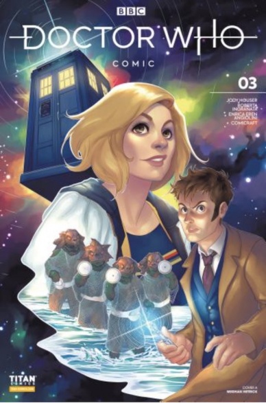
Doctor Who Comic #3
Written by Jody Houser
Illustrated by Roberta Ingranata
Colored by Enrica Eren Angiolini
Lettered by Shari Chankhamma
Reviewed by Ryan Fitzmartin
Jody Houser and Roberta Ingranata’s very simply titled “Doctor Who Comic” #3 is a wild adventure across time and space, true to the TV series’ form. Houser’s tale brings together the Tenth and Thirteenth Doctors, working together to save Nikola Tesla and the world. Doctor team ups are a mainstay of the show, and even more so in the comic books, novels, and audio dramas. Fans may not yet get to see David Tennant and Jodie Whittaker on screen together, so the page will have to suffice.
Indeed suffice it does, as Houser manages to effectively channel the characters mannerism and voices into speech bubbles. The Doctors and their companions read on the page distinctly as themselves; one can practically hear the differences in the accents. Houser has a strong handle not just on how these characters talk, but how they think and act too. The visual likenesses are not quite on the same level, as Ingranta’s faces seem somewhat squished. The characters often appear more like stunt doubles than the recognizable actors themselves. This disappointing effect is mildly lessened by Angiolini’s bright and upbeat coloring. Modern Doctor Who is vivid and lush and Angiolini captures this feeling, bringing the show’s vibes to the page.
The plot and the story may simply be an excuse to bring together two great characters, but that doesn’t matter too much. Yes, there’s aliens and an impending galactic war but it doesn’t have much weight or imperative. The fun here comes from the characters. Fans will come to see the two doctors and their companions interact, and on that front “Doctor Who Comic” #3 does deliver. Reader won’t find anything monumental or perhaps even memorable on display in this issue, but they should be satisfied with what they do get.
Final Verdict: 6.8 – Jody Houser brings together Two Doctors on a routine but still entertaining adventure.

Future State: Dark Detective #1
Written by Mariko Tamaki and Matthew Rosenberg
Illustrated by Dan Mora and Carmine Di Giandomenico
Colored by Jordie Bellaire and Antonio Fabela
Lettered by Aditya Bidikar and Andworld Design
Reviewed by Jim Malakwen
“Future State: Dark Detective” #1 presents an intriguing glimpse at a possible future for the Dark Knight. The Gotham depicted here is hardly the gloomy, gothic, hellscape longtime readers have come to expect. Instead, the city has become a Blade Runner-esqe metropolis under the protection of an enforcer named The Magistrate.
Utilizing a non-linear storytelling structure, writer Mariko Tomaki portrays a defeated Bruce Wayne who seems out of place in a city that has moved on without him. The use of a voiceover narration is effective in creating a sense of empathy with the character in his quest to regain control of Gotham. While eschewing the typical gruff and grim approach most writers use in capturing Batman’s voice, Tamaki succeeds in characterizing a familiar yet different take on the character.
Dan Mora’s artwork is exquisite. He uses about four to five panels per page and utilizes interesting compositions and transitions between timelines to ensure a pleasurable reading experience. Jordi Bellaire’s colors bring the neon-lit Gotham night to vivid life. The saturated hues from the many screens and billboards make this one of the most unique takes on the city yet.
“Future Past: Part 1” is an entertaining back-up story written by Matthew Rosenberg and illustrated by Carmine Di Giandomenico. Grifter is the protagonist of this tale and Rosenberg nails the character’s devil may care attitude. After getting apprehended by the GCPD, Grifter encounters Luke Fox and discovers that The Magistrate is rounding up costumed heroes. Upon escaping from their captors, the mismatched duo make a perilous attempt at leaving Gotham.
Continued belowCarmine Di Giandomenico’s pencils are best showcased in the comic’s many exciting action sequences. He has a knack for selecting dynamic character angles and his use of motion blur during chase scenes is very effective. The issue ends with an exciting cliffhanger that teases the return of a beloved member of the Bat Family.
Final Verdict: 8.3 – A refreshing take on The Caped Crusader that makes him the underdog, updates the setting and introduces a formidable antagonist.

Future State: Teen Titans #1
Written by Tim Sheridan
Illustrated by Rafa Sandoval
Colored by Alejandro Sanchez
Lettered by Rob Leigh
Reviewed by Gregory Ellner
Jumping in on “Teen Titans” comics after a long time can be a bit daunting. There are so many incarnations of the team, though certain characters are more or less fixtures in one sense or another. However, with “Future State: Teen Titans” #1, aside from a relatively new team in some cases, Tim Sheridan not only starts up a new arc while introducing old faces in a new light (perhaps with a bit of oddness of personalities along the way), but also brings to bear elements of the Teen Titans cartoon from the early to mid 2000s. With a darkness to the story and the weight of terrifying flashbacks, even fans of only the cartoon have something to look forward to.
While new to “Teen Titans,” Rafa Sandoval is an excellent artist for “Future State: Teen Titans” #1. He makes the most of the space of each panel, using shadows or perspective shots to hide identities, or otherwise deliberately focusing on terrible actions to make them feel all the more real, all the more “current” as they are in the minds of the people considering them. The mystery around what is going on is already palpable through Sheridan’s writing, but Sandoval’s illustrations make the surprises and mystique more potent.
Alejandro Sanchez does have coloring experience with teenaged superheroes under the “Super Sons,” themselves reprinted in Titans and Teen Titans books. His ability to use color to both enhance a situation’s vibrancy and shroud it in confusion is essential to the way the story plays out, especially when it comes to the core mystery in the light and the dark, and the related sepia-toned flashbacks.
Final Verdict: 7.5– Drawing on a breadth of “Teen Titans” lore within and without the comics, the ‘Future State’ version of the team is definitely interesting for readers of the comics as well as viewers of the 2000s animated series.

King in Black: Gwenom vs. Carnage #1
Written by Seanan McGuire
Illustrated by Flaviano
Colored by Rico Renzi
Lettered by Ariana Maher
Reviewed by Quinn Tassin
Let’s get down to brass tacks: “Gwenom vs. Carnage #1” rules. Every big comic event has a bevy of tie-ins, many (most?) of which are “meh” at best, to be frank. A handful, though, manage to stand out from the pack and the “Ghost-Spider” ‘King in Black’ tie is one of those books. It achieves such status by keeping a decidedly epic, existential event focused and grounded. The stakes are personal- Gwen keeps her roommates safe and has a run-in with the Mary Jane Watson of her home universe- which makes it easy to latch onto as its own story.
The issue is in a near-constant state of action, beautifully rendered by Seaman Flaviano, whose clear, dynamic art is taken to another level by Rico Renzi’s gorgeous colors. There’s a sense of momentum that the pair captures as a symbiote chases Gwen through her apartment building and then above the streets of Manhattan that’s really something to behold. The sequence is made all the better by the little touches like Gwen putting webbing-ballet slippers on just before landing on the symbiote dragon or taking a quick, somber beat before leaping out of her destroyed building.
That this issue is primarily a fight between Gwen and two symbiotes with some real personal consequences for our hero is a massive strength. Once the story does expand its scope a bit, with Knull making plans to absorb Gwen’s own symbiote suit and Alt-MJ appearing, they’re working from a great foundation. I was so absorbed in the book that I genuinely forgot that Carnage was in the title, which made that final page reveal of Mary Jane becoming the titular villain, a genuinely thrilling moment. “Gwenom vs. Carnage #1” is a real delight of a comic; if there’s one King in Black tie-in you’re reading, this should be it.
Continued belowFinal Verdict: 7.9- “King in Black: Gwenom vs. Carnage #1” rises to surprising heights by keeping things grounded
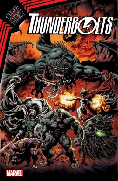
King in Black: Thunderbolts #1
Written by Matthew Rosenberg
Illustrated and colored by Juan Ferreyra
Lettered by VC’s Joe Sabino
Reviewed by Luke Cornelius
A new team of Thunderbolts has been assembled following Knull’s invasion of Earth and the results are… not bad. Rosenberg opens with a flashforward to Kingpin declaring the deceased Thunderbolts heroes for completing their mission and potentially turning the tide in the war against Knull. Six team members are depicted, some of them unrecognizable to the untrained eye as they’re without their masks. It’s an intriguing enough start, with Rosenberg quickly establishing the team and setting them off on their mission. There’s undoubtedly a feeling that this is a ‘King in Black’ tie-in, with Rosenberg’s script transitioning from clashes with Knull’s dragons to standard event comic cameo appearances from Marvel Universe heroes. It never does anything particularly groundbreaking, but it doesn’t have to. It is well paced with a good blend of action and humor. The interactions between the characters, whether it’s momentarily showing an almost heroic side, or murdering a teammate, hold the reader’s attention and are the highlight from a writing perspective.
In terms of the visuals for “King in Black: Thunderbolts” #1, the issue is very strong. Ferreyra’s heavy use of shadow works very well stylistically for a book that is concerned with a team of villains being recruited by a corrupt politician as well as set in an apocalyptic setting. Ferreyra’s facial expressions are strong throughout the issue too, most notably with the rendering of Mister Fear’s sharply angled face, who looks frightening as he leers over jewelry, aided by Ferreyra’s lighting. There’s an energy and dynamism in the action sequences, though some of the angles and compositions of characters feel stilted. Finally, Ferreyra’s colorwork is suitably muted and murky, with the red glow of the sky a constantly oppressive feature in the issue.
By the end of “King in Black: Thunderbolts” #1, many of the team have been killed off, leaving Rosenberg with a smaller cluster of the most interesting villains, now joined by one of Marvel’s biggest. The inclusion of the latter isn’t hugely surprising, though the core “Thunderbolts” team promises to make for an entertaining read as the miniseries continues, even if it is unlikely that it will be anything more.
Final Verdict: 6.9 – “King in Black: Thunderbolts” #1 is a solid and entertaining tie-in, with characters who might just convince you to return for issue #2.

Serial #1
Written, Illustrated & Lettered by Terry Moore
Reviewed by Elias Rosner
New year, new Terry Moore series, and I think this is his strongest debut since “Motor Girl.” While it has the same problem of many of his current series — every issue ends just a little earlier than you think it should — the story is shaping up to be a smaller, more intimate tale, featuring a new, mysterious character (at least I think she’s new) as well as an old favorite: Zoe, from Rachel Rising.
This truly feels like a first issue. No convoluted backstory necessary to understand what’s going on, a great hook, a reason to keep reading, and mysteries that appeal to new readers and old alike. New readers are sure to be wondering why a 10 year old is sleeping in an RV and dreaming about slashing up a bunch of clowns, bigfeet, dragons, and 1-800-perverts with her stuffed monkey. Old readers are sure to be wondering why Zoe, the 10-going-on-60 year old, is living in an RV!
Moore’s art & lettering remains top-tier, shining most during Zoe’s dream sequence where he gets to play with the more cartoony version of Zoe. Spend the time to read all the sound effects and background detail during this. Trust me. It’ll make it that much more fun. But this doesn’t mean the more serious scenes lose their impact; in fact, the contrast is what makes “Serial” work so well.
Because Moore’s work & art is rooted in the characters, the story & tone comes from them. Moore takes the time to let us sit with the characters just being who they are in mundane, albeit sometimes deeply unsettling, ways. This is how we know “Serial” is both comedically violent, due to Zoe’s bouncy, ten-year old joy belying her penchant for stabby violence, and a dark thriller, due to this mysterious new person’s, well, whole deal and because we spend the entirety of issue one on these two characters, we know they are the center of the narrative, narrowing the scope to the inevitable personal conflict between the two.
Continued belowThis change from the more high concept drama of, well, the end of the world from the last two series is what gets me most excited for “Serial” and I think others will find that too.
Final Verdict: 9.0 – “Serial” #1 is another fantastic Moore debut and while it may end a little too early, the journey to that end is lively, twisted, and thrilling. New readers will find something to love and old readers already know they’ll love it. Win-win!
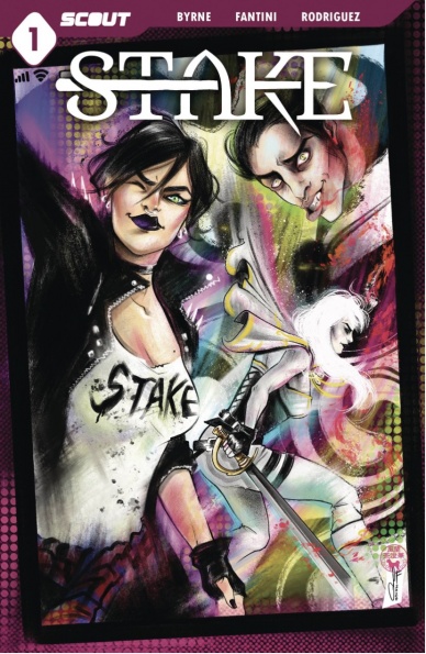
Stake #1
Written by David A. Byrne
Illustrated by Francesca Fantini
Lettered by Joel Rodriguez
Reviewed by Christa Harader
“Stake” #1 introduces us to a social-media savvy woman who’s bent on revenge after a vampire kills her friend. Unfortunately, there’s too much narrative confusion and reliance on quippy humor for this first issue to land or feel cohesive.
Byrne crafts a stereotypical female protagonist whose aughts aesthetic is set dressing in this first issue. “Angel” seeks revenge after an oddly messianic vampire kills one of her friends on film, though it’s not clear who’s filming despite seeing the video twice. Angel’s best friend is also a vampire, and it’s also not clear if she’s the blonde woman who crashes into the ambulance for a bloodbath later. We wrangle too many cast members and too much exposition to ground the story beats.
Fantini’s art is decent, though full color is required for this comic to cohere. As it is, black and white doesn’t add contrast or depth to the page, and the comic feels like a flat plane. Black and white doesn’t support Fantini’s knack for facial details, and also spotlights the moments where the anatomy breaks down in the fight scene to an unfortunate degree. The rare pops of color are not cohesive in either narrative or design. Rodriguez’s lettering is readable, but it blends into the colorless page.
Overall, “Stake” #1 does not deliver on its premise in this first issue. Angel’s too stereotypically snarky and overloaded with third wave punk pastiche, and the vampire lore is too confusing to intrigue beyond a need for basic clarity.
Final Verdict: 5.5 – “Stake” #1 misses the mark with confusing layouts, a disjointed plot and forced humor.


