
There’s a lot to cover on Wednesdays. We should know, as collectively, we read an insane amount of comics. Even with a large review staff, it’s hard to get to everything. With that in mind, we’re back with Wrapping Wednesday, where we look at some of the books we missed in what was another great week of comics.
Let’s get this party started.

Written by Garth Ennis
Illustrated by Goran Sudžuka
Colored by Ive Svorcina
Lettered by Rob Steen
Reviewed by Elias Rosner
“A Walk Through Hell” has been a tough series to wrap my head around. For seven issues, it’s pushed forwards into the darkness, relentless in its despair and uncompromising in traumatizing our main characters. Each issue brings us inches closer to some kind of understanding, only to have that swiftly kicked away from us. It’s a maddening back and forth that effectively creates the atmosphere of unease, distrust, and disorientation that is central to the narrative.
As always, Sudžuka’s artwork transports us to a world that is almost like ours, but infinitely darker – both literally and figuratively. In the darkness of the warehouse, he utilizes tight panels and the phone conversation to draw us in, increasing the claustrophobia and dread until the big reveal of what’s happened to Goss since we saw him last. They even take the time to remind us of that via the disassembled gun, further adding questions and rules to the world of the warehouse.
Svorcina’s coloring accentuates the gruesome moments while the choice to bathe the Notre Dame but in Hell (the Notre Damned, if you will) in a lavender hue softens the scene, despite the implications of the character’s conversations, making the Goss reveal and the final page scene all the more terrifying.
However, not all come together in the ways it should. It’s been a problem for the whole series so far but there are whole conversations that lean too heavily into character knowledge without providing enough context for us to understand it. The narrative captions at the start are a good example of being just a little too vague to be of use, limiting the impact they’re supposed to have. Part of that may be down to an imperfect recollection of prior events but when characters have more knowledge than the audience, it’s important to remember what everyone knows when and how the lack of knowledge can benefit, and harm, any given scene.
It’s not a deal breaker but it is an obstacle to the serialized nature of the series thus far.
Final Verdict: 7.3 – “A Walk Through Hell” continues to low-key terrify as it builds its narrative towards greater reveals and questions. The dialogue and narration don’t always land but the artwork makes sure you’re kept on the seat of your chair.

Written by Donny Cates
Illustrated by Garry Brown
Colored by Mark Englert
Lettered by Taylor Esposito
Reviewed by Christa Harader
Cates & co. have turned up the snark in “Babyteeth” #14, and it’s a good look. The book’s been top-notch so far, but the advent of the Morningstar took a pretty hilarious turn at the end of issue #13, and I’m pleased to see the humor is consistent through this issue as well.
The family’s back together, which means lots of great, craggy faces from Brown and some lovely bright wasteland backgrounds from Englert. Brown has a flair for creature design, and the spi-shark-ion (spider/shark/scorpion hybrid) is goofy and fantastical in the best possible way. Esposito’s work is fabulous, as usual, with balloon styling and sound effects that enhance the reading experience. Plus, with so many characters on the roster in this issue, clarity is key, and Esposito knows how to deliver on that.
Cates’ devil is disarming and exactly as he should be. We’ve had so many examples of Lucifer in popular media, across many mediums, so doing the horned ol’ goat justice isn’t easy. Cates manages to imbue this issue with great casual humor while maintaining Sadie’s intensity and character, and with a full cast on the page to boot. Not an easy feat. “Babyteeth” #14 proves that this book still has surprises up its sleeve, and I’m happy to see the story flourishing.
Continued belowFinal Verdict: 8.0 – “Babyteeth” #14 delights by reminding us that the apocalypse is, above all, weird and that you can’t trust anything when dealing with the Devil.

Written by Joëlle Jones
Illustrated by Elena Casagrande and Fernando Blanco
Colored by John Kalisz
Lettered by Josh Reed
Reviewed by Gregory Ellner
When it comes to the plot of this first part of ‘Something Smells Fishy,’ Joëlle Jones seems content with a rather decompressed narrative, one that tells a small story overall, without much conflict or even many events to deal with. Instead, Jones seems to be gearing the tale of “Catwoman” #7 toward setting up future work, especially when it comes to Selina Kyle and the apparent antagonist of the arc. This distinction is not to say that the storytelling is bad, but merely that there is not much going on to discuss.
The focus of the issue instead is on the way in which it presents itself. Elena Casagrande and Fernando Blanco work together perfectly, with Blanco’s thick, sharp lines smoothly operating alongside Casagrande’s nigh patented “gritty, yet smooth” art style from the background to the slightly rough edges to characters and scenes. Together, along with an interesting use of panels to demonstrate exactly what Catwoman is doing or feeling at any particular moment, these illustrators craft very good imagery to go along with Jones’ dialogue and are able to carry the story perfectly well even without any words at all.
John Kalisz does an excellent job on the colors of “Catwoman” #7. The daylight scenes are calm enough, but his use of a sharp green, coupled with the flashes of color, when showing Selina Kyle’s intense glare definitely helps sell a difference from the rest of the world around it. On the other hand, the nighttime is where Kalisz really shines, using cool colors to demonstrate the quieter time, especially toward the end of the story, along with a different color to show how Catwoman moves in combat where it is necessary to show a kind of “blur” due to the illustrations.
Final Verdict: 7.0- While there isn’t much story to speak of, the artwork definitely carries “Catwoman” #7 to a good place.

Written by Dan Slott
Illustrated by Aaron Kuder
Colored by Marte Gracia & Erick Arciniega
Lettered by VC’s Joe Caramagna
Reviewed by Gustavo S. Lodi
There is a sense of finality on “Fantastic Four” #6. While the previous issues on this series were hard at work to, first, reestablish Marvel’s finest, and, second, to reinforce their family bonds through the Grimm-Masters wedding, this installment focuses on their adventures, possibilities, and foes.
Pitting Doom versus Galactus was an inspired choice by Slott. Not because it is unthinkable or unforeseen, but rather how the Fantastic Four deals with it: like a normal day in their lives. It works remarkably well to define that, truly, anything goes on this series and that it should not get larger anywhere else other than the “Fantastic Four.”
Kuder does a great job on everything he touches on this issue. “Fantastic Four” #6 has a bit of everything, from defining the streets and citizens of Latveria to portraying the incredible scale of Galactus, to showcasing the powers that both Doom and the quarter control. Two particular pages, one of them detailing the ultimate Doom-Galactus confrontation, the other a battle between the four and newcomers Victorious stand out. The level of detail, depth and composition are gorgeous to look at.
Gracia and Arciniega collaborate seemingly effortless on colors: there is no jarring transition. Instead, readers are presented with some of the best energy signatures and lightning effects since “Fantastic Four” relaunched.
Back to Slott’s script, despite the achievements on characters, confrontations and scale, there is still a lacking sense of purpose for this new round of adventures. Perhaps this is intentional, but it does come away a bit like the event or obstacle of the week. Hopefully, that will evolve after this arc, as some of the seeds introduced here, and before, start to bear fruit.
Regardless of this smaller qualm, “Fantastic Four” #6 is a very strong issue that propels Marvel’s first family forward after this return. It is energetic, huge and beautiful: everything the World’s Finest comic should be.
Continued belowFinal Verdict: 7.8 – Larger structure aside, “Fantastic Four” #6 is another great entry on this relaunch. By focusing on adventures only the four can handle, without losing sight of character, this one surely delivers.

Written by Erik Burnham
Illustrated by Dan Schoening & Tim Lattie
Colored by Luis Antonio Delgado
Lettered by Neil Uyetake
Reviewed by Chris Egan
As part of their 20th Anniversary celebration, IDW is producing special “20/20” one-shots from some of their major property on-going series. This week’s special issue is for “Ghostbusters.” Jumping twenty years in the future, this one-shot follows the ghost-busting B team, called the Sanctum of Slime. Unfortunately, this particular spin-off isn’t all that great. It includes two fun, but mediocre stories from writer Erik Burnham. The book itself is unbalanced, attempting to catch up newcomers with the continuity of the hectic main series, appealing to Ghostbusters fans that don’t read the series, and keeping up with the regular readers’ knowledge.
The first story picks up right after the ‘Crossing Over’ event. The crew is exhausted, but when a call comes in that the old guys don’t feel like handling they throw the exhausted S.O.S. at it much to their chagrin. Fans of The Real Ghostbusters will appreciate the ghosts used in this multi-layered case filling out the events of this story, but beyond the fan-service references the story doesn’t work all that well and it feels rushed. This is unfortunate as Burnham actually had to include an additional story to fill out the hefty 30+ page length of this one shot. Rather than cramming everything into the space he did, the story would have worked much better if he had been able to pace it a little differently. Dan Schoening’s illustrations are an interesting blend of the style taken from both the feature films and the animated series. Something that typically works extremely well for the comics and his work continues to reference and pay homage to all things “Ghostbusters.” My only complaint is his version of Peter Venkman…he looks terrible. I know this a version that is 20 years older, but he looks half dead. The same can be said for Delgado’s color work. He perfectly uses a palette that captures the feel of the films and both original animated shows.
The second story has a title, ‘Down the Basement Stairs.’ This story follows team leader Alan of S.O.S. on a call in which he is transported to medieval Carpathia and comes face to face with Vigo himself! This short alludes to Vigo attempting to use Alan in the future to regain power as Janosz from Ghostbusters 2 is Alan’s uncle. Again, it’s filled with fun little references for long-time fans but adds little overall. Tim Lattie’s illustrations will take readers back to the early days of the series and Delgado’s colors, once again are a highlight for this book.
Final Verdict: 5.0, Chock full of fun GB references, but it hardly stands on its own. It’s not great for long-time readers or newcomers as a one-shot. If you regularly collect the series it’s a fine addition to pick up, but it is a bad jumping on point. It will definitely work best collected in a future trade paperback or series omnibus.

Written by Robert Venditti
Penciled by Bryan Hitch
Inked by Andrew Currie and Andy Owens
Colored by Jeremiah Shipper
Lettered by Starkings and Comicraft
Reviewed by Alexander Jones
Telling an origin story and grounding a character as complex as “Hawkman” is absurdly difficult. Writer Robert Venditti and artist Bryan Hitch have done a phenomenal job grounding Carter Hall as a kind-hearted action hero looking to save the world. The personal, grounded approach to “Hawkman” struck a huge shift during the last issue when readers got to see a revised origin for the hero packed with revelations about Hall’s current adventure. This new installment features a conversation between Hall and his Kryptonian ancestor, Catar-Ol.
Up to this point, the “Hawkman” series has carried a bad habit of being slightly formulaic. Thankfully, the new chapter of the title has a different dynamic and structure. Hall and Ol’s conversation plays into the overall story but strikes a dour note making the issue different from the rest. Venditti does a great job parsing out the dialogue carefully, ensuring the issue never comes across as cheesy or simplistic. The Kryptonian easter eggs in the issue are tastefully dispersed throughout the comic. The script also does a great job keeping up the momentum from the previous installments as the story is gearing up for an endgame.
Continued belowBryan Hitch continues depicting a more stripped-back style infusing the issue with a lot of energy. Characters are striking interesting poses and there is always an interesting detail in the background to keep each page interesting. The issue packs an impressively rendered double-page spread full of Kryptonian characters that are some of the best work I have ever seen from Hitch. The script is loaded with talking heads and Hitch always gives the figures an interesting action or emotion to keep the comic engaging at all times.
“Hawkman” #8 keeps the momentum going and does a fantastic job hitting a low point in the story and promising readers that an enticing climax to the story is coming soon. Venditti’s script harnesses the tragedy of Krypton and draws an interesting contrast to Hall’s current predicament. The streamlined and consistent work from Hitch is another great addition to the story. “Hawkman” continues to be impossibly endearing, loaded with all the great trappings of an adventure story.
Final Verdict: 7.8 – “Hawkman” #8 sets the stage for a pulse-pounding finale to the Deathbringer storyline.

Written by Paul Jenkins
Illustrated by Marco Castiello
Co-inked by Vincenzo Acunzo
Colored by Jason Millet
Lettered by Shaw Lee
Reviewed by Tom Shapira
The various Judge Dredd series that has been published by IDW, since they picked-up the North American license, seem to follow a pattern of good ideas (including some that could never be allowed in the regular continuity) meeting mediocre executions. There have been several standouts but the charm of the original seems to be lost when moving across the Atlantic, even if the creator himself is a Brit such as this series’ writer Paul Jenkins.
Toxic seems to be no different. There are some good ideas, the city’s infrastructure is broken and flooding the city with acid while citizens care more about the possibility of illegal aliens (as in, literally from out of space) who only seek to help them, but the execution falters. Dredd has always been a vehicle for unsubtle politics so the problem is not so much with doing a pro-immigration with obvious Trump-figure as a villain but with how boring and expected it all is. The added pages of the American format take what is often noted as one of leanest, meanest strips around and fill it with words that do nothing but fill-up space.
What Jenkins could’ve done with all these pages is probably give some personality to the aliens themselves, this is mainly about them after all, but they remain ciphers. Marco Castiello and Jason Millet do a decent Mega-City One – but the figures are often stiff (sometimes it’s hard to tell the robots from the people) and when the script call for them to dial-up the violence to extra, acid rain, sewers rising up, open warfare on the streets, they remain too subdued.
Final verdict: 5.0 – Good ideas alone do not make for a good story.
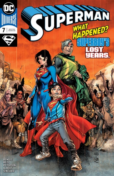
Written by Brian Michael Bendis
Illustrated by Ivan Reis, Brandon Peterson & Jason Fabok
Lettered by Josh Reed & Carlos M. Mangual
Colored by Alex Sinclair
Reviewed by Michael Govan
In “Superman” #7, Jon Kent is finally reunited with his parents. The beginning of this issue is a nice, human moment as Jon reunites with first his father and then mother. Smaller moments like the actual reunion were probably my favorite part of the issue (Superman name-drops the previously unheard of ‘indigo kryptonite’ for anyone keeping track of stuff like that). After the reunion, Jon gets into what he’s been up to and then there’s the last page stinger. I thought there would be more. Moments that I thought would be expanded on like the fight with the Dominators or the alien slave rescue were skimmed over. The comic seemed to end too quickly, but maybe that was just me.
The cover promises Superboy’s ‘lost years’ but we really only get up until Lois left him in space. Not that much time is really covered and much is still a mystery. The whole thing feels like a bit of a tease. If you were expecting all your questions to be answered, it seems like Bendis will be feeding us answers piecemeal.
Ivan Reis handles the artwork on a couple of pages and they reuse some art of Jason Fabok’s, the bulk of the work is done by Brandon Peterson. He does a fine job here, his style similar enough to Reis’s own. Sometimes styles can be pretty different and the transition can be jarring. All in all, while the plot moves forward a bit, it feels like not much happened. Not a bad issue, but not the strongest of Bendis’s run.
Final Verdict: 6.0 – Read all about Superboy’s Lost…Day? Week? (It couldn’t have been longer than a week).


