
There is a lot to cover on Wednesdays. We should know, as collectively, we read an insane amount of comics. Even with a large review staff, it’s hard to get to everything. With that in mind, we’re back with Wrapping Wednesday, where we look at some of the books we missed in what was another great week of comics.
Let’s get this party started.

Aquaman #32
Written by Dan Abnett
Illustrated by Riccardo Federici
Colored by Sunny Gho
Lettered by Steve Wands
Reviewed by Gregory Ellner
Dan Abnett continues his well-structured rebellion storyline, with all sides coming to a head at last. From the use of Dolphin to express parts of the story without any ability to actually speak to Arthur Curry’s use of realpolitik to attempt an alliance with his enemy the crime lord King Shark (who seems similar to an Atlantis version of Killer Croc in how he serves as a champion for the oppressed in his own way), every one of the characters in use has their own intricate motivations, including the newest members of the supporting cast as much as longer standing villains.
However, while Abnett’s writing is good, it is the artwork that really makes “Aquaman” #32 shine. The soft touches of Riccardo Federici’s pencils do a great job with facial expressions, as well as adding to the undersea imagery.
Not to be outdone, Sunny Gho’s colors work masterfully with the aforementioned illustrations, using a varied color palette for different effects. Gho uses muted colors to showcase the underwater experience, only to bring out the brighter ones to emphasize actions of magic or other extreme power, such as lightning crackling along the royal trident or the magical glow in Arthur’s eyes.
Together, these two make for an excellent followup to the earlier, already amazing artwork by Stjepan Šejić in the previous arc. Together, this creative team will make for a beautiful and well-written storyline if they can keep it up.
Final Verdict: 8.5- A well established continuation of the rebellion against King Rath with phenomenal artwork.
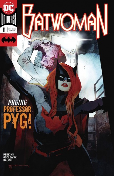
Batwoman #11
Written by K. Perkins
Illustrated by Scott Godlewski
Colored by John Rauch
Lettered by Deron Bennett
Reviewed by Michael Mazzacane
Fill in issues can be tricky. They aren’t allowed to meaningfully change things but are still expected to be fulfilling experiences. For their part, writer K. Perkins, and the art team of Scott Godlewski and John Rauch with Deron Bennett lettering, manage a sound one and done adventure as Batwoman searches for Julia Pennyworth and other recent victims of an international Professor Pyg.
Not being able to break the core aesthetics of the series is perhaps the creative teams greatest strength. Series writer Marguerite Bennett has done a fine job building up operational themes, which Perkins applies to the overall kidnapping plot of the issue. Perkins uses the interiority of the series and Kate’s past traumas towards effective emotional drivers (beyond the obvious primal ones) in the search for Julia, with a twist. There is a more direct emphasis on how Kate’s PTSD can affect her during an investigation. That angle can feel slightly jarring, it’s supposed to be. It’s a moment of utter fallibility that you don’t really expect from a cape comic, even one like this. There is a somewhat rote bat-family emotional sadomasochism to it, but it creates an effective tension between our perspective as omniscient observers and Kate’s own perspective.
Where Perkins maybe oversteps things in a couple of moments is overwriting the issue. With this investigation being a one woman show, there’s a lot of Kate inner monologue. This makes sense for the story being told, it just becomes cumbersome when the dialog re-narrates details that the imagery has already told us.
Overall the art team does fine work in this issue. There isn’t anything as extreme as ‘Fear and Loathing’ but it isn’t meant to be. There is a fair amount of negative space in several pages that are filled by Rauch’s colors that seem out of place. John Rauch pallet overall gives everything whimsically gritty appearance, in particular the decision not to give Kate’s Batwoman wig any definition. It turns it into this fiery red apportion that epitomizes that sense.
Continued belowFinal Verdict: 7.5 – ‘Pygsty’ is the right kind of filler issue. It doesn’t break the mold but shows how that mold still has room for further exploration and can be applied to different formula.

Fence #3
Written by C.S. Pacat
Illustrated by Johanna the Mad
Colored by Joana Lafuente
Lettered by Jim Campbell
Reviewed By Kate Kosturski
En garde! The competition heats up as the men of Kings Row duke it out for the top 3 places on the varsity fencing team. This entire issue is a training montage and a slight lesson in fencing technique for the uninitiated. The good news for Nicholas is, he has several advantages for the sport – he’s left handed (most fencers train against right handed opponents), quick, and very instinctive. The bad news? His sloppy training has led to very poor technique, which means it’s time for a remedial crash course in the basics of fencing. Will Nicholas pick up years of training in a few short weeks – – and adapt to boarding school life and culture – – before the round robin tournament that decides everyone’s fencing fate?
This issue puts aside the main Seiji-Nicholas narrative conflict for most of the issue to focus on the ensemble cast of Kings Row for a moment, and that’s a good thing. We have plenty more time to explore that conflict, now that this has been upgraded to a recurring series – – and we have time to get to know their friends and coaches. In terms of fencing technical accuracy, the side lesson on the types of swords is a good break at the right time. It’s added seamlessly to the story, not thrown in for its own sake, and timed perfect as the fencing side of the plot becomes more prevalent. I do give my kudos to C.S. Pacat for doing her homework on this series – – my boyfriend, a former college fencer, read the first issue and pronounced it quite accurate to the sport’s competitive scene. (Of course, it helps that Pacat is a former fencer!) Praise is also due to Pacat and BOOM! for upholding the latter’s commitment to diversity and tasteful, sensitive, positive LGBTQ storylines. You don’t see much of that here as in the first two issues, but what is touched upon is done respectfully.
Johanna the Mad’s art is pure anime. Think Yuri!!! on Ice with swords instead of ice skates. Pacat is a fan of Japanese sports manga, and it’s not hard to see why – – there’s intense energy and emotion in every line and pencil stroke. Yet, it’s not as intense as traditional manga; Johanna blends both Eastern and Western influences into her art. If you’re looking to ease your way into manga, this may actually be a good start. With that much energy in pencils, and a writer with a novelist background, one might worry that words and art end up competing for attention on the page. Happily, that doesn’t occur here – Pacat knows when to cede her words to Johanna’s art, and vice versa. It’s a perfectly synced ballet – – much like fencing. Joana Lafuente completes this trio with her simple colorwork that also doesn’t overtake each panel. It’s rare to find a comic where all three of these elements work in flawless tandem.
It’s no surprise to me that this is now a recurring series – – it’s a fine introduction to sports manga, and fencing, for the Western world. I’m craving more, and I’m glad we’re going to be getting it.
Final Verdict: 8.0 – Come for the teen drama, stay to learn a little more about a sport many only see once every four years and the genre of sports manga. You won’t be disappointed.

Generation X #86
Written by Christina Strain
Illustrated by Amilcar Pinna
Colored by Felipe Sobreiro
Lettered by VC’s Clayton Cowles
Reviewed by Alexander Jones
“Generation X” is gleefully weird, but if you’ve been following the comic up to this point you probably already knew that. Still, this issue is based around resident X-Weirdo-in-Chief Quentin Quire who is one of the most beloved recent X-Men creations. The character sports obnoxious pink hair and telekinetic powers making him one of the strongest on the roster, unfortunately, he’s selfish, misguided and troubled. Quire is conflicted and has a problem staying on the side of the better angels. Thankfully, the Omega Level Mutant risks it all in this week’s installment to save his fellow teammates in what seems like the most important issue of “Generation X” ever to have been published in this current incarnation of Marvel.
Continued belowAmilcar Pinna’s art is another factor of the interiors driving this storyline in a wild direction. His odd angles and exaggerated anatomy is everything I personally dislike about interior art but assembled in an otherworldly, beautiful fashion. The artist is able to extract the weirdest aspects of the scene and show how novel Quire’s powers are or how tense a regular exchange of dialogue can be. Comics should be weird, over-the-top and dangerous, Pinna tests my limits and assures me whenever I open up “Generation X,” I never know what is going to be on the next page and at the end of the day that’s all I can really ask for in a line crammed with sugar-sweet nostalgia coated X-Men stories that can be sickening.
This comic is about more than just Quire and some weird art as the villains start closing in on the newer mutants. The story has really high stakes, whenever characters like Quire or Jubilee aren’t in the building, readers can get a sense not everyone in the building is going to to make it out alive. This installment also teases some new status quo’s and character dynamics which should take the narrative in a new direction. Unfortunately, this title was cut short and the installment has now become the penultimate chapter of the series which seems fitting with the epic moments changing the leads of the story and the excellent fight scenes.
“Generation X” #86 is a bittersweet story achieving a level of quality that this series was always capable of on the eve of the title’s cancellation. So many plot threads converge here and finally show some of the larger connections and points that writer Christina Strain has tried to convey in this chapter. Fans of X-Men, Quentin Quire and Jubilee must be sure to check in on this issue as well as anyone who likes good comics.
Final Verdict: 8.1 – The penultimate chapter of “Generation X” #86 is also the series’ finest installment yet!
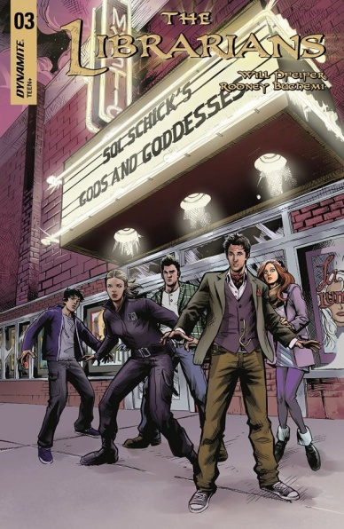
The Librarians #3
Written by Will Pfeiffer
Illustrated by Rodney Buchemi
Colored by Weslei Manuel
Lettered by Troy Peteri
Reviewed by Gustavo S. Lodi
“The Librarians” #3 is a fine example of good ideas trapped within subpar execution. The overall plot revolves around a confrontation between our dimension and another far more magical, with the ‘Librarians’ acting as first line of defense. But the manner that the script and art choose to tell it is frustrating.
The initial problem readers may face – especially new ones – is to track who is who. There are three male characters and two female characters that look and act essentially the same way, save for minor differences in abilities. On most pages, the art doesn’t do a sufficient job to tell them apart, which is particularly bad for the men: it is actually difficult to determine who is doing what in some sequences. The effect for the ladies is minimized by their hair style (long and short), but facial expression and traits are nearly indistinguishable.
Colors and background are also very muted and, while one could claim they are intentional so to provoke certain narrative effects, they do fall flat on some places. For instance, in a couple of sequences, readers must understand that characters are being teleported elsewhere; however, since colors and transparencies fail to properly show that, it becomes harder to understand why the scenarios those characters were in have changed.
The story is the most interesting part of this issue, as Oscar (the book’s antagonist) explains the backstory of the magical dimension and potential future attacks. The problem is that this is done in such an expository manner – he essentially narrates all of it to two other characters – that it dilutes any sense of impact those reveals could have. The issues even goes to the length of recapping the exposition that was just delivered pages before as the issues closes, adding insult to injury.
Final Verdict: 4.9 – Despite an interesting concept of wars among dimensions, with magic thrown in the middle, “The Librarians” #3 suffers from too much exposition on its dialogue and pacing, with an uneven art struggling to show everything that is going on.
Continued below
The Mighty Thor #703
Written by Jason Aaron
Illustrated by Russell Dauterman
Colored by Matthew Wilson
Lettered by VC’s Joe Sabino
Reviewed by Matt Sadowski
The War of the Realms wages on as the Mangog’s path of devastation reaches the gates of Asgardia. ‘The Death of the Mighty Thor’ arc inches closer to concluding, and if these past issues are any indication, fans can be sure Aaron and Dauterman will finish at the top of their game.
Though Malekith and the Mangog are ostensibly the villains, Jane Foster’s struggle with cancer is Thor’s primary antagonist. Doctor Strange’s prognosis is grim, truly signaling the coming of the end for Thor. The background blurs out of focus as we’re pulled closer to Jane from Mjolnir’s perspective, and we see the anguish in her gaunt face. Pulling back from the current cosmic struggle allows Aaron to highlight Foster’s bravery and fortitude against impending death. These hospital scenes also underscore the power of Jane and Roz’s friendship. For however much Odinson needs to protect Jane, Roz understands that only Jane can decide her own fate. It’s powerful stuff.
Dauterman never fails to bring his A-game with each issue of “The Mighty Thor.” Every page turn promises more visual splendor—such as when Jane vanishes in a flashing KRAKOOOM of truly innovative SFX. The letters themselves act as a panel incorporating Roz shielding herself from the blinding light. Innovative paneling also helps communicate the true devastation of the Mangog. It’s as if the comic book itself isn’t enough to contain him. After he blinds Heimdall the All-Seeing, the Mangog obliterates the Rainbow Bridge. The panels first crack and then shatter like mere panes of glass. The Mangog even claws his own panels across the page; blood-red slashes that cut full bleed. Kudos to the coloring work, too, the secret sauce to this run’s overall success. The Mangog’s punches are colored with magmatic intensity and the psychedelic destruction of the Rainbow Bridge is awe-inspiring.
Final Verdict: 8.6 – ‘The Fall of Asgard’ showcases some of the best action and emotional scenes this side of Midgard as Jason Aaron weaves a tale of devastating villainy from within and without.

Peter Parker: The Spectacular Spider-Man #299
Written by Chip Zdarsky
Illustrated by Adam Kubert and Juan Frigeri
Colored by Jason Keith
Lettered by VC’s Travis Lanham
Reviewed by Reed Hinckley-Barnes
With the next issue of “Peter Parker: The Spectacular Spider-Man” being an oversized, anniversary issue #300, that leaves this issue as mostly set up. That doesn’t necessarily mean that it’s bad, just that a lot of the quality of the issue depends on how the story itself plays out.
The issue is mostly action, and Kubert and Frigeri are very well suited to handle it. The structuring of the panels in the issue keep the issue moving at a pretty steady pace. The way that panels overlap, and figures extend out passed their borders make everything feel a bit frantic, drawing the readers eye quickly across the page.
As I said above, the story is mostly set up for issue #300, but it’s good set up. Zdarsky has placed all the pieces on the board in interesting ways, and it will be exciting to see how everything plays together in the next issue. Zdarsky does a good job of making sure that not every reveal is saved for next issue, as this one ends of a cliffhanger that, while not too surprising, is still satisfying in the way it ties plot threads together.
“Peter Parker: The Spectacular Spider-Man” is both a fun book, and one with stakes. The team behind it does a good job of both keeping most of the story light, while still creating moments of drama for the characters involved. And while most of the big payoffs are being saved for next time, personally, I’m excited to see what happens next.
Final Verdict: 7.8 – “Peter Parker: The Spectacular Spider-Man” #299 spends most of its time setting up for the next issue, but is a very good time nonetheless.


