
There’s a lot to cover on Wednesdays. We should know, as collectively, we read an insane amount of comics. Even with a large review staff, it’s hard to get to everything. With that in mind, we’re back with Wrapping Wednesday, where we look at some of the books we missed in what was another great week of comics.
Let’s get this party started.

Barbalien: Red Planet #3
Written by Tate Brombal and Jeff Lemire
Illustrated by Gabriel Hernandez Walta
Colored by Jordie Bellaire
Lettered by Aditya Bidikar
Reviewed by Jim Malakwen
The theme of intolerance permeates the entirety of “Barbalien: Red Planet” #3. All the supporting characters have such depth and grapple with real world issues that it’s often easy to forget that this is essentially a superhero comic book. The comic opens with a heart-breaking scene that vividly depicts the loneliness and despair of a gay man dying of AIDS in the 1980s. Shifting focus to Spiral City’s Gay Village, the previous instalment’s cliffhanger is resolved when Markz gets the upper hand against the Martian Bounty Hunter, Boa Boaz.
Having survived the encounter with Boaz, Markz is left with serious injuries that require immediate medical attention. Upon arrival at St. Jean’s Hospital, he finally meets Dr. Day, a gifted healer who provides much needed counsel to a protagonist still struggling to find his way in a hostile world.
As expected, the writing is excellent. The story’s focus on individual character moments rather than spectacle ensures that while the tale isn’t as action-packed as typical superhero fare, new readers unfamiliar with the “Black Hammer” comics universe will be engaged throughout.
Gabriel Hernandez Walta’s pencils are quite engaging and not ostentatious. In fact, he averages about 5 panels per page and uses a relatively classical technique. His use of gutters is simple and effective. Furthermore, Walta saves the more elaborate stylistic choices for character moments. For instance, a 9 panel grid is used only once during a decisive confrontation between Markz and Cole, his partner in the SCPD. Jordie Bellaire’s subdued colors perfectly complement the artwork and bring the characters and setting to life.
Final Verdict: 8.5 – a moving story about alienation and finding oneself in a world that demands conformity.
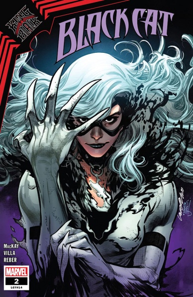
Black Cat #2
Written by Jed MacKay
Illustrated by C.F. Villa
Colored by Brian Reber
Lettered by Ferran Delgado
Reviewed by Luke Cornelius
After a solid debut issue, “Black Cat” #2 dives into the heist genre and delivers an incredible ride. MacKay starts the issue quietly, with Felicia and her team surveying Doctor Strange’s prison of goo. There’s a plan in place to rescue him, but it has a very small chance of success, with Felicia hoping the crucial factor, luck, is with them. Spoilers: It most certainly is.
MacKay ensures that the entirety of “Black Cat” #2 is filled with tension, with the team’s slim chances setting the reader on edge initially, followed by increasing tension through each stage of the heist itself. Villa visualises this with his use of the symbiotes for the framework of the panels when Black Cat is inside the prison. The panels aren’t defined at first, with Black Cat floating amongst the darkness, it closing in around her, then shifting to more typical shapes whilst retaining an inky, gooey, fluidity in their outlines. When it comes to Black Cat’s escape, the issue hits another gear, with her and her crew suddenly hurtling along the sides of buildings in the Spider-Buggy. This sequence sends the reader on a rollercoaster ride, with Villa’s compositions presenting the wildness of their escape in full. You’ll only be allowed your breath back when the issue ends.
MacKay’s script strikes a great balance, with moments of humor punctuating the action and piercing the tension, even if one bit about Boris having a ghost dog falls flat. There’s some nice character work in the narration too, with Felicia delving into her past with the symbiotes and their hosts expanding on her personal connection to the larger ‘King in Black’ story.
Reber’s colorwork throughout “Black Cat” #2 is strong while Delgado’s lettering really aids the dynamism in Villa’s artwork. He controls the pacing of the escape sequence, most notably in one long-shot panel when the Spider-Buggy swings around the corner of a building. Delgado presents the group’s screams increasing in size to show their speed and distance and the reader is forced to come close to a pause.
Continued belowOn the final page, Black Cat takes another risky decision, one that surely won’t pay off like this heist, and it results in a concept that would usually feel gimmicky, but with this creative team showing such good form it only promises even more fun for issue #3.
Final Verdict: 8.2 – “Black Cat” #2 is a roller-coaster heist story from start to finish.
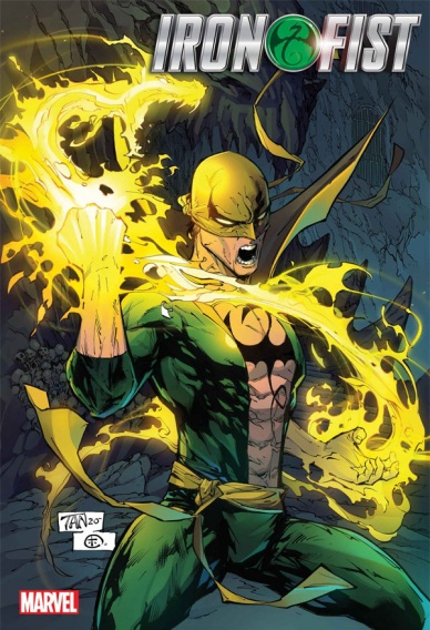
Iron Fist: Heart of the Dragon #1
Written by Larry Hama
Illustrated by David Wachter
Colored by Neeraj Menon
Lettered by Travis Lanham
Reviewed by Quinn Tassin
“Iron Fist: Heart of the Dragon #1” is a testament to the benefits of jumping straight into the action. After a couple of years without an Iron Fist comic, new scribe Larry Hama only gives us 3 pages of table setting before throwing Danny Rand and Fooh into batttle. As we’re whisked from Earth to the Under City and back, it’s easy to get swept up in ceaseless happenings of the issue. It’s a great way to become reacquainted with Marvel’s premier martial artist. The constant momentum does have its downsides- the issue feels a bit unfocused. While the point, of course, is that there are threats coming from all directions, confrontations are so brief that they aren’t very deep, exciting as they might be.
Of course, an Iron Fist comic lives and dies by its art and David Wachter and Neeraj Menon more than deliver. They bring a clean, grounded style to the affair. Two of the best aspects- the way that they make a setting feel alive and the action. Danny’s high rise apartment has the look and feel of a fancy apartment in Manhattan right down to the lighting. The Under City is a bed of grime and violence thanks to its attackers and boy does it feel that way. Wachter and Menon are able to fill the set pieces of the issue with a kineticism that can be tough to find in an art style like Wachter’s. Every punch, kick, leap, and flip can really be felt. The Taskmaster-Iron Fist fight is fun and good but the fight with Lady Bullseye and her minions is the real treat. Power Man, Iron Fist, and Pei all have distinct body language in the fight and while the page is full of subjects, the scene never feels cluttered.
“Iron Fist: Heart of the Dragon #1” It’s a bit scatter-brained but starting a story with such chaos is a genuinely compelling hook and seeing how Danny handles the challenge in front of him is sure to be a good read. For now, we’ve got a good first issue that shows a lot of promise and delivers the feel of a good old fashioned adventure.
Final Verdict: 7.8 – “Iron Fist: Heart of the Dragon” is a promising, if unfocused debut issue
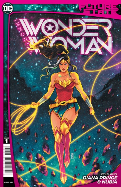
Future State: Immortal Wonder Woman #1
Written by Becky Cloonan, Michael W. Conrad, and L.L. McKinney
Illustrated by Jen Bartel, Alitha Martinez, and Mark Morales
Colored by Jen Bartel and Emilio Lopez
Lettered by Pat Brosseau and Becca Carey
Reviewed by Jodi Odgers
While most of the “Future State” slate focuses on one core character per book, “Future State: Immortal Wonder Woman” #1 spotlights both Diana Prince and Nubia, with the book following a potential future for each of them.
Diana’s story is presented first, jaw-droppingly rendered by Jen Bartel. Bartel’s covers are often exquisite in the bright, neon-coloured style that has become her signature. However, the pages of “Future State: Immortal Wonder Woman” #1 show readers who may only know her from her covers that she excels at the small moments as much as a big, splashy scene that might grace the front of a book. Bartel’s facial expressions are a shining high point in the issue, adding new layers to the touching story that the creative team delivers here. Also of note was the appearance of a certain mathematically-obsessed villain, who is depicted as particularly otherworldly here, aided by stellar lettering choices from Pat Brosseau.
Nubia’s story may take place on less of a grand scale than Diana’s, but it is no less interesting. Nubia following up on a series of items disappearing from museums leads to a surprisingly intricate scheme with personal repercussions for Nubia and her family. The creative team has done a good job of making the setup in this issue spin a tale that feels unique to Nubia. The more gritty, down-to-earth style that the art team brings to Nubia’s story fits nicely as well.
Continued belowWhether you’re looking for a well-spun yarn centred on Diana Prince or Nubia, “Future State: Immortal Wonder Woman” #1 will not disappoint. Even if you’ve never read either character, this issue shines light on what makes them the figures that they are in the DC Comics lineup.
Final Verdict: 8.6 -This issue delivers two strong stories. They may differ in scope and central character, but not in their quality.

King in Black #3
Written by Donny Cates
Penciled by Ryan Stegman
Inked by JP Mayer
Colored by Frank Martin
Lettered by Clayton Cowles
Reviewed by Elias Rosner
“King in Black” #3 suffers from being the middle issue of an event comic. These tend to be the weaker chapters of even an exceptionally strong event, trying to keep up the momentum without relying on gimmicks or sudden twists as the groundwork for the final confrontation is laid. Unfortunately, “KiB” #3 doesn’t have anything to contribute to an event that already feels light on content and motivation and thus feels like a waste of an issue rather than an essential step on the road to what will inevitably be Dylan vs. Knull; the appearance of Thor being the central contributing factor to this feeling of malaise.
It’s an excuse for a punch em up with little to no emotional value behind it, despite the comic insisting there is. Sure, Knull created All Black the Necrosword, but he didn’t have jack to do with it and Thor has moved on. However what’s more damaging to “King in Black” #3 is that it’s wordy with little to say. Take the panel of Knull after he got his hand stigmatized by Thor. He flails about verbally, wondering who could it be and how could this have happened and it’s a waste of space because 1) the audience knows what’s up and 2) it undercuts any drama the scene might have by over-relying on exposition. His reaction could be cut in half and have twice the impact and that’s the problem with all the dialog in the comic.
It’s a shame because Stegman, Mayer, and Martin are once again killing it on the art duties, rendering these fights in all their gooey, goopy, horrific glory. It’s big and bombastic and it should be awesome, but because the underlying emotional ties are weak and the story feels like it’s circling rather than moving, the events of the issue don’t have any resonance nor do they have staying power. It doesn’t help that Knull has been hyped up so much over the last couple years with little to actually justify the hype, and now that he’s here, he’s little more than another ultra powerful baddie that stands around and talks. It’s not a bad issue, per say, but it’s not something I think I would ever find myself craving to return to.
Final Verdict: 5.8 – “King in Black” #3 looks cool and has enough cool to satisfy die hard “Venom” or Cates fans but it’s overwritten and lacks the emotional connections needed to sell the event as a whole.

Miskatonic #3
Written by Mark Sable
Illustrated by Giorgio Pontrelli
Colored by Pippa Bowland
Lettered by Thomas Mauer
Reviewed by Ryan Fitzmartin
Pop culture is currently going through a bit of a lovecraftian resurgence. The bleak state of the world has drawn audiences willing to delve into the darkness of cosmic terrors. Unseens killers, apocalyptic tidings and the fall of humanity seem more relatable these days. Lovecratian horror has often been constrained mostly to novels and old-school RPGs, but has rapidly spread to film, TV, video games and comics in the past few years.
“Miskatonic” #3 by Mark Sable and Giorgio Pontrelli is a mildly engaging comic entry in this burgeoning genre. Miskatonic features many of the tropes found in Lovecraftian horror, from cultists, to monsters and visions of doom. “Miskatonic” #3 follows FBI Agent Keller as she investigates a series of bombings in the town of Arkham in the 1920s. Keller is a woman, and not taken seriously by either the rest of the FBI or local police. She faces not only supernatural horrors but patronizing men.
Continued belowWhat makes “Miskatonic” special is how directly it blends the political history of the 1920s with the characters of Lovecrafts novel. Herbert Hoover and Herbert West appear in this issue, which also references the Palmer Raids and Innsmouth. This cross blending of history and Lovecraft should appeal directly to fans of Matt Ruff’s novel Lovecraft Country and its HBO adaptation.
Pontrelli’s character pencils are a little stiff, especially with faces. They aren’t very expressive, and the panels don’t often flow into each other well, giving the impression of jump cuts in a film. He excels much more at drawing buildings and scenery which are detailed and give an excellent sense of place. His police buildings, manors, and hospitals have a strong Gothic sensibility. The colors by Pippa Bowland are vibrant and rich. Bowland strongly uses different color tones to indicate different feels in an expert way.
“Miskatonic” #3 isn’t a groundbreaking comic, but anyone looking for Lovecraftian terrors will get their money’s worth.
Final Verdict: 7.4 – “Miskatonic” #3 is a worthy new entry in the Lovecraftian Horror resurgence.
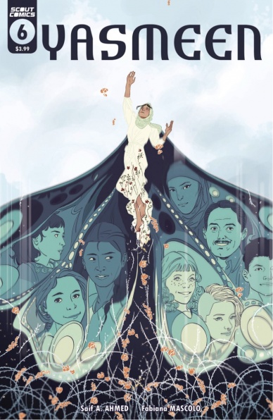
Yasmeen #6
Written by Saif A. Ahmed
Illustrated by Fabiana Mascolo
Lettered by Robin Jones
Reviewed by Christa Harader
“Yasmeen” #6 sees the final piece of Yasmeen’s tumultuous journey back to her family revealed as a police investigation and a high-stakes conversation between Yasmeen’s parents fill in the gaps. Friendships are strengthened, community bonds sown and a touching finale is delivered amidst some fast-paced plotting.
Yasmeen’s story is complex, and taking some time to simplify the plot points would let both the horror of her experience and the bittersweet juxtaposition between her past and present really land. Mascolo does a good job matching panels and experimenting with these time jumps, but they can be abrupt and we have to rely on spoken exposition to get us there. Ahmed’s dialogue isn’t always believable for a teenager, even someone who’s had such a traumatic experience. Still, the lyricism of her and her family settling into their life lands, and the book’s hopeful tone is earnest and welcome. Jones’s lettering is straightforward, with a thicker balloon stroke than we’d expect that nonetheless complements Mascolo’s line.
Overall, “Yasmeen” is a beautiful story of trauma, acceptance and growing up as an outsider in both your own country and in America. It’s a call for love and tolerance, and Ahmed, Mascolo and Jones craft a sympathetic young woman and her family to good effect. The twists and turns of the time jumps could use some work, but it’s still an engaging comic.
Final Verdict: 7/10 – “Yasmeen” #6 balances true emotional growth and hope with a bit of stilted writing in this mini finale.


