
There’s a lot to cover on Wednesdays. We should know, as collectively, we read an insane amount of comics. Even with a large review staff, it’s hard to get to everything. With that in mind, we’re back with Wrapping Wednesday, where we look at some of the books we missed in what was another great week of comics.
Let’s get this party started.

Dune: House of Harkonnen #1
Written by Brian Herbert and Kevin J. Anderson
Illustrated by Michael Shelfer
Colored by Patricio Delpeche
Lettered by Ed Dukeshire
Reviewed by Ryan Fitzmartin
“Dune: House of Harkonnen” #1 gets off to a scattered start. A lot happens in twenty five pages, as the story visits various planets, people, and events. It’s a lot to digest and there’s a boatload of exposition mixed in with action. Writers Herbert and Anderson craft in-depth and intriguing worlds, but it’s challenging at times to comprehend exactly what’s happening. Places, character names, and historical references are tossed willy-nilly, and all but the most dedicated reader will struggle to keep up. At the very least, more than a passing familiarity with the world of Dune is demanded by the authors. The dialogue and characters seem interesting, but the narrative jumps around so much it’s just hard to get grounded.
Thankfully, the art in “Dune: House of Harkonnen” #1 is clear, concise and detailed. Michael Shelfer draws his worlds with great detail, and his faces are strong and expressive. At times when we’re struggling to understand exactly what characters are talking about, at least we always know how they feel. The compositions are strong, and the costume design is especially luscious. Colorist Patricio Delpeche helps out too, by choosing different color schemes for different planets and areas. We know when we’ve moved somewhere new because Delpehce creates such powerful contrasts.
Overall, “Dune: House of Harkonnen” #1 has a lot to offer, even if it may be a challenge to parse. The sci-fi worlds are inviting and interesting, despite the dense plotting.
Final Verdict: 6.1 – A chaotic first issue introduces a rich and well devised world.
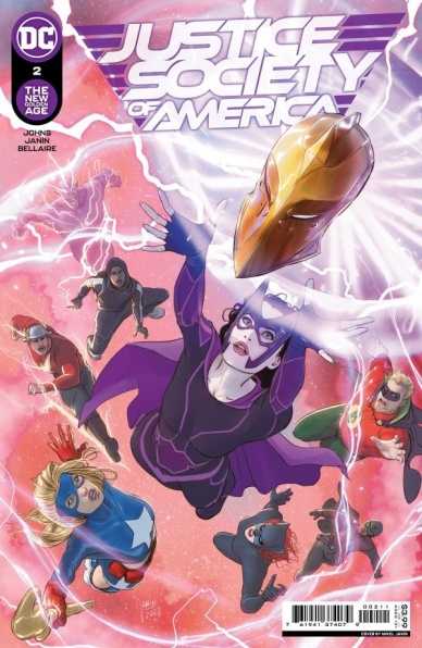
Justice Society of America #2
Written by Geoff Johns
Illustrated by Mikel Janín, Jerry Ordway, and Scott Kolins
Colored by Jordie Bellaire and John Kalisz
Lettered by Rob Leigh
Reviewed by Quinn Tassin
There’s something fatiguing about “Justice Society of America” #2. While the Justice Society’s return to shelves is more than welcome, the story that we’re actually getting is lackluster. The skeleton is fine enough. Helena Wayne is a compelling main character, easy to latch onto with clear motivations. The basic idea that we’re meeting different iterations of the Justice Society throughout time while fighting a villain who can manipulate time is genuinely creative and obviously provides plenty of rich opportunities to explore the DC universe. In execution, though, things just feel messy.
The biggest issue here is pacing. The issue opens in 1940, focusing on Helena finding her bearings in the far past. But we only get a couple of pages with her and the Justice Society before we’re whisked away with Dr. Fate as his consciousness visits his near future. Once we settle back in 1940, Dr. Fate takes a look at Helena’s timeline and then she’s transported to modern day. That’s just far too much to fluidly cram into the second issue of a comic. Sure, it helps communicate the disorientation of the characters that we’re following but at the same time, there’s nothing grounding the story. We see Helena come to terms with the time travel but then lose her perspective. Dr. Fate is a nice window into the mysteries this series has to offer but shifting focus to him doesn’t exactly help with grounding or clarity. The fact that we then hop to Huntress’s childhood and then Catwoman being killed in the future is just excessive. Big stores like this one have the potential to be a blast but they require a stronger core than a main protagonist that’s easy to understand. In “Justice Society of America” #2, setting and perspective are far too fluid for the story to be supported.
Continued belowThe artwork, on the other hand, is absolutely gorgeous. The team makes a deceptively simple choice by combining pulpy coloring and a relatively contemporary mode of storytelling. The circumstances of the issue, a hero from the future dealing with the fact that she’s now in the past provides a great opportunity to build strong visuals like the ones here. The brief jump to 1981, while a bit overwhelming, looks great, more fully leaning into the throwback aesthetic. Grundy showing up fighting Mr. Miracle is a genuine thrill and the character design is spot on. While the even more brief jump to Helena’s childhood doesn’t quite hit the same mark as the rest of the issue visually, it certainly works fine. Ultimately, it’s Janín’s issue to shine and shine he does. Now, if we could just get him some better material to work with, that would be great.
Final Verdict: 5.5 – “Justice Society of America” #2 has great art and a solid foundation but fails to execute on a story level
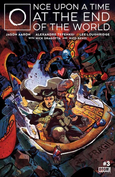
Once Upon A Time At The End of the World #3
Written by Jason Aaron
Illustrated by Alexandre Tefenkgi & Nick Dragotta
Colored by Lee Loughridge & Rico Renzi
Lettered by AndWorld Design
Reviewed by Alexander Manzo
This issue picks up right where it left off, where Maceo and Ezmerelda’s relationship blossoms as Jason Aaron shows the reader the lessons each of them teaches. Ezmerelda is a hunter and more cautious of the world and teaches Maceo some ways to survive while he shows her how to live and enjoy the little things in life. It’s all lining up for some catalyst to change it, mixed with Aaron’s light-hearted narrator comments at the beginning of the issue. The way the two are described walking through the hellish wasteland that is left of the world creates this bubbly-like feeling that goes back to their relationship growing. Yet the rude awakening comes about halfway through when Ezmerelda kills a man while he’s dying from a rat attack and believes it to be a gift of mercy rather than for sport. Maceo’s realization that he may not be helping her grow has him questioning his survival skills, and he tests that theory by venturing out on his own. During the past storyline, Aaron also closes the gap between the antagonists and Maceo. However, when it’s brought back to the current and Maceo has become a grizzled veteran of the apocalypse, it creates more questions to keep the reader coming back.
The artwork by Alexandre Tefenkgi and the colors by Lee Loughridge work well together to create this end-of-the-world desert apocalypse. The beginning of the issue is a reminder of this vast wasteland by using the two protagonists as an almost Where’s Waldo in the big picture of it all. Tefenkgi opens it all up with a shot of a road filled with flies and maggots that could bring goosebumps to the reader. When the story calls for it to be more intimate and zoomed in, Tefenkgi gives honest and realistic emotional responses with nothing being too over the top or dramatic. Loughridge’s colors during those moments are also essential because the scenery is filled with dark grays and purples. Still, when they are in the midst of their relationship being severed, it switches to a dark yellow to wake the reader up and focus. On that same note, Nick Dragotta and Rico Renzi tackle the last pages that feature Maceo in a current timeline where he is a grizzled veteran of this world and being tortured by some animal-like humans. It’s a failed interrogation scene that goes quickly, but its intensity is brought off the page with the solid red sky background and quick fight responses.
Final Verdict: 8.6 – The relationship between Maceo and Ezmerelda may be splitting, but Aaron reminds the reader that there are always bigger things at play.
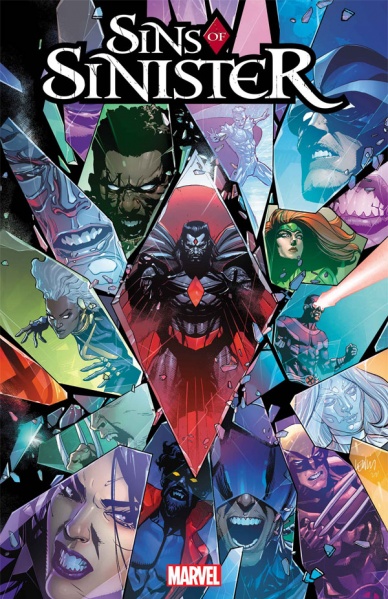
Sins of Sinister #1
Written by Kieron Gillen
Illustrated by Lucas Werneck with Geoffrey Shaw, Marco Chechetto, Juan José Ryp, David Baldeón, Travel Foreman, Carlos Gómez, Federico Vincentini, David Lopez, Joshua Cassara, and Stefano Caselli
Colored by Bryan Valenza
Continued below
Lettered by Clayton CowlesReviewed by Gregory Ellner
With “Sins of Sinister” #1, Kieron Gillen brings in the beginning of the a timeline for the ‘Fall of X’ saga with a bang. Writing from the perspective (or perspectives?) of Nathaniel Essex, a.k.a. Mister Sinister, Gillen crafts a horrifically warped timeline of domination stretching for years on end, one that somehow manages to maintain at least some of Sinister’s comedic antics despite never downplaying his threat level. Yes, Essex is utterly detestable, and the world he hopes to make is terrible. But the personalities at play, through Gillen’s expert script, keep this dystopia from breaking down into unreadability, culminating in a well-deserved cliffhanger that pulls a nigh inevitability on our immoral geneticist.
The artwork on “Sins of Sinister” #1 is listed as having multiple illustrators, with Lucas Werneck as the primary artist and ten special guest artists (Geoffrey Shaw, Marco Chechetto, Juan José Ryp, David Baldeón, Travel Foreman, Carlos Gómez, Federico Vincentini, David Lopez, Joshua Cassara, and Stefano Caselli), but as there is no direct note of which pages each one illustrated, it feels best to address the entire product on that front as one cohesive whole. Werneck et al. craft highly animated, visceral, and overall lively images, be they the montage of how the world changes so drastically or something as simple as a meeting of the Quiet Council.
The colors of Bryan Valenza maintain the level of emotion seen in his other works such as “Witchblade,” with a dark shadow cast over even the brighter scenes. Paranoia runs rampant, and Valenza makes sure the reader never feels completely safe as Sinister times arise.
Final Verdict: 7.0- Horror begins with a smiling face in this opening to an apparent alternate timeline.


