
There’s a lot to cover on Wednesdays. We should know, as collectively, we read an insane amount of comics. Even with a large review staff, it’s hard to get to everything. With that in mind, we’re back with Wrapping Wednesday, where we look at some of the books we missed in what was another great week of comics.
Let’s get this party started.

Written by Carly Usdin
Illustrated by Noah Hayes
Colored by Rebecca Nalty
Lettered by Ed Dukeshire
Reviewed by Chris Egan
Young artist Charlie Bravo transfers to Georgia O’Keefe College of the Arts. Alone and friendless she immediately comes across multiple extremely friendly students looking to pave their own way in life and befriend Charlie. One group she unwittingly stumbles upon are an assorted set of kids looking to start the college’s first sports program, a basketball team called the Avant-Guards. Charlie grew up playing basketball, but there is something about her past that pushes her away from wanting to join the team or open up to anyone right away.
Anyone that majored in the arts will pick up on more than a few little details that will make you smile, but other than that this premiere issue is accessible to anyone, of any age. Everyone has felt out of place in their own skin or lost in a new environment and this story speaks to that feeling. Usdin’s writing carries the plot along with ease and familiarity, and snarky quips make it better than just sugar-coated messages.
Noah Hayes illustrations are a mix between modern Disney and something on Nickelodeon. Solid lines cutting through sparingly detailed panels give it a nice cartoon style. Focusing on characters as well as color design representing emotions is the path taken here and it is definitely the right one. Paired with Rebecca Nalty’s bright pastel color scheme, it makes for a truly inviting look that would feel just as at home as an animated series as it does a comic book. It’s a style that’s catching like wildfire among smaller books aimed at teens and young adults, but when done right, like it is here, it doesn’t feel like they’re playing it safe but rather playing to their strengths.
Great execution of positive messages and likable characters make for an enjoyable read, even if it isn’t an extremely original idea. The use of characters who love both the arts and sports has been done before, but it’s done well enough to make this comic stand out. The mixture of old ideas does make for a decidedly new story. The issue leaves us with a feeling that deeper plot threads to come and hopefully that is the case. Speaking to a wider audience is exactly what this book needs to do and making sure that it is crafted around both accessibility and intelligence is a must, otherwise, it’s just white noise.
Final Verdict: 7.0 – Like the characters that inhabit it, “The Avant-Guards” #1 is a cute and friendly story of acceptance and finding your place in the world.

Written by Justin Jordan
Illustrated by Mike Perkins, Neil Edwards, and Denys Cowan
Colored by Rain Beredo
Lettered by Wes Abbott
Reviewed by Gregory Ellner
Justin Jordan utilizes a collection of tones across the different stories in the “The Curse of Brimstone” annual. The most diverse would be the main story, a collaboration of efforts between the Chamberlain siblings and a certain blue-collar warlock, John Constantine himself. There are moments of humor, depths of despair, and more, along with some further explanation as to exactly what Brimstone and the powers of the Salesman truly happen to be, but none of it seems too out of place, and it all works toward moving the plot along in the process. At the same time, the two backup stories help to explain two supporting characters, each delving into a different mood, from despair to intrigued disgust.
The art styles are, on the whole, rather varied. Mike Perkins recreates the dark, heavily shadowed artwork of Eduardo Pansica rather faithfully to make for a very similar, dark artistic look, delving deep into the horror elements of the “unmagic” of the main set pieces. Meanwhile, Neil Edwards has more detail and fewer shadows in his pencils, befitting the daylight hours shown in the story of Detritus and the different tone of the town itself. Third, we have Denys Cowan, who uses a more stylized, rough look to showcase Wandering Jack’s psychopathic mental state.
Continued belowThroughout it all, Rain Beredo uses a varied color palette, from the dark, visceral colors of Joe and Annie’s journey, to the bright blues of magic around John Constantine, to a nauseating green for Detritus, and more. Jordan may tell a great story, but Beredo’s colors really bring together the whole unit of “The Curse of Brimstone” in a way that is especially true in the annual.
Final Verdict: 8.0 – A variety of moods and interesting stories flow through this interlude of sorts for “The Curse of Brimstone.”

Written by Robert Venditti
Penciled by Eddy Barrows
Inked by Eber Ferreira
Colored by Adriano Lucas
Lettered by Deron Bennett
Reviewed by Gustavo S. Lodi
DC has a revised approach to limited series recently, with “Mister Miracle” perhaps being the precursor of a new age of contained stories, dealing in-continuity with characters unlikely to have the spotlight on an ongoing series. When that angle is combined with the writing of Robert Venditti, himself on an acclaimed revival on the ongoing “Hawkman,” the recipe seems to be successful.
“Freedom Fighters”’s sophomore issue wastes no time in refreshing its debut story, instead simply continuing from the action-package cliffhanger that the team was facing before. Pencils by Barrows do a phenomenal job to keep the characters close and up-front even in the middle of the action. While the entire issues can be summarised as the inaugural battle of this new generation of Fighters against the Reich, thanks to very strong character expression and tight dialogue, readers still get a very strong sense of who these characters are and how they interact with one another.
Inks by Ferreira and colors by Lucas add further layers to the story, particularly on how they work to give Barrows’s pencils a sense of vintage, almost of old paper-stocking. This is more noticeable in quieter moments, where inks and colors have a shaded look to them as if the paint itself has been worn out. For a story so focused on legacy characters and post World War II mentality, this was a remarkable decision by the creative team.
Back to Venditti, it is obvious that the writer has a beginning, middle, and end to the tale at hands, with seeds being planted on this issue and the one that came before it. There is a sense of urgency to the plot, with the heroes intent firmly to reawaken the hope in a despaired America, with the enemy disgruntled and disgusted on this so-called heroic revival.
“Freedom Fighters” #2 certainly keeps the momentum going from its original issue and lays enough plot on the table to sustain it moving forward. With high stakes and beautiful art, this is not one to be missed.
Final Verdict: 7.9 – The adventures on Earth X are consequential, deep and, in a terrifying way, beautiful and vintage. Looking forward to more.
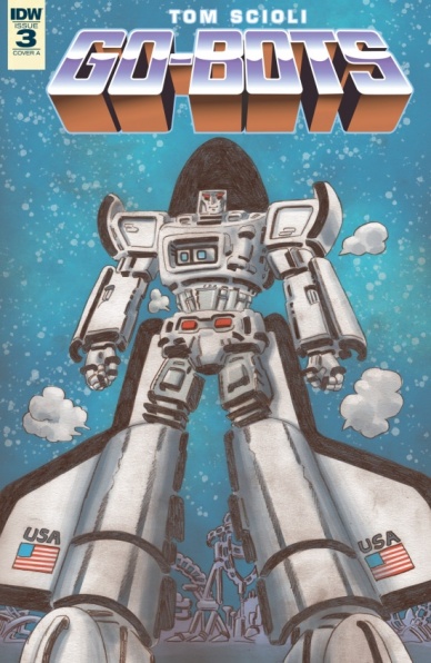
Written and Illustrated by Tom Scioli
Reviewed by Tom Shapira
By the lords of Gobotron – this issue is dense even by the exacting standards of Tom Scioli. This reminds me of the middle stretch of his “Transformers vs. G.I. Joe” run in which every page felt like an event, every panel an attempt at a revelation; it’s exhilarating, but also very tiring. By the end of this issue, I was exhausted with the amount of plot and characters I had to keep in my head. It is still better than the alternative, too many modern comics can be read in five minutes or less – Tom Scioli works hard for your money.
In plot terms a group of astronauts arrives at an alien planet teeming with life, robot life, that somehow speaks English and looks rather familiar; but even if you think you know what to expect this issue plays a far weirder game. I have no idea where the author is going with this series – and I love it!
Art-wise there’s a bit less of the call outs for older comics, or maybe they exist and are too deep of a cut for me to grasp, as Scioli works to turn these hokey toy designs into something that feels truly majestic and larger-than-life. That is, perhaps, his greatest gift as an artist, the ability to evoke wonder, to connect so deeply to the child within. This is a ridiculously ambitious series, attempting to showcase a millennia-worth of story while discussing subjects such as artificial intelligence, the neverending nature of conflicts, and the ennui of leadership, all within five issues and through the framework of children’s toys. Even it falters, it is hard to fault its reach.
Continued belowFinal verdict : 9.0 – Art, thy name is “Go-Bots”
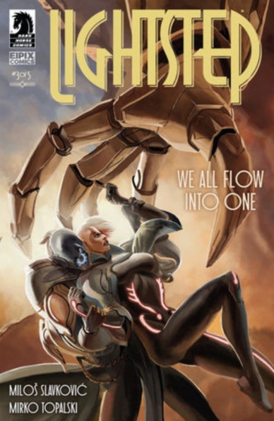
Written by Miloš Slavković & Mirko Topalski
Illustrated by Miloš Slavković
Lettered by Andrej Bunjac
Reviewed by Christa Harader
January Lee’s in the thick of it, and I’m not entirely sure why. “Lightstep” #3 showcases the creators’ great imaginations and gorgeous art, with a plot that doesn’t quite live up to the book’s visual standard.
Slavković’s art is top notch and saves “Lightstep” from really taking a nosedive. You can get away with wooden dialogue and confusing storylines in comics far better if every page is a stunner, and it’s also a great way to work in some cheesecake. I’ve lost count of the butt shots, but they don’t really bother me because every character is depicted with such care and attention to excellent physical form. The alien designs continue to amaze as well, with the lighthouse and the stone creatures and the apocalyptic casket priests all rendered exquisitely on the page.
There are a lot of dreams and portents in this series, and they’re starting to drag a little. At this point, I’m too far removed from the original drama of January’s backstory to be adding in additional mysteries on top of the chaos planet-side as January and Jazzman try to save a civilization … I think? The mysterious stranger trope is very common in genre works, period, but the old man’s appearance clutters an already top-heavy issue #3. Spacing those out a bit more, or maybe ending the issue with the mystery, would give me a chance to absorb what’s going on.
“Lightstep” is a visual feast above all else. Slavković and Topalski are smart because the radio play device is imaginative and gives them license to pump up the melodrama. Put another way, the frame gives them a bit of slack for what feels like loose narrative control. However, it’s the art that elevates this book as a whole, and issue #3 is another strong visual entry in the series.
Final Verdict: 7.0 – “Lightstep” #3 is a bit lopsided in terms of plot, but stunning artwork can really save the day when you’ve got a bit too much narrative to handle.
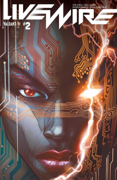
Written by Vita Ayala
Illustrated by Raúl Allén
Lettered by Saida Temofonte
Colored by Patricia Martín
Reviewed by David Craig
As the nature of her superpowers is based around technology, it’s quite fitting that Livewire’s solo series shares the same sleek design you would expect from the latest Apple device. The layout of panels on each page is pleasingly consistent, with clean and precise gutters flowing throughout. Raúl Allén and Patricia Martín work harmoniously to fill these frames with engaging illustrations.
Allén’s detailed character designs stand out on backgrounds that are frequently basic and sometimes comprised entirely of solid color. Far from being a sign of rushed work, this feels very much like a conscious creative decision and one that plays effectively into the overall look of “Livewire.” The abundance of bright red in the second half of the issue is tied directly into the plot, while the stunning use of purple in the opening scene functions as a diverting character motif.
Unfortunately, “Livewire” #2 does suffer from a case of style over substance. After being captured by a group of mercenaries, our lead character is subjected to some horrendous treatment at the hands of their ringleader. Aside from the introduction of the tired genre staple of a power-dampening device, the plot doesn’t seem to move particularly far forward. Breakneck pacing is by no means a necessity, but Vita Ayala’s script can’t find a compelling way to pass the time Livewire spends in captivity. Instead, much of the dialogue is taken up by vague anti-superhuman rhetoric that will be instantly familiar to any fan of the X-Men.
While “Livewire” #2 would have benefited from finding a way to make its throwaway antagonist more interesting, Ayala’s attention is clearly taken with her lead and arguably so it should be. Livewire’s characterization is strong throughout and the use of “We Can Do It!” imagery at a pivotal moment further entrenches her status as an iconic member of Valiant’s expansive cast.
Continued belowWhile the plot is still finding its feet, there is a lot of promise on display in “Livewire” #2. There are more than enough elements in play to suggest that Ayala is building to something big and in the meantime, there’s plenty of beautiful panels to gawp at.
Final Verdict: 7.1 – “Livewire” #2 is a visually striking book, but the narrative leaves something to be desired.

Written by Dan Watters
Illustrated by Sebastian Fiumara & Max Fiumara
Colored by Dave McCraig
Lettered by Dean White
Reviewed by Dr. Chris
The new Lucifer series has focused on two very different protagonists trying to solve their own mysteries. Firstly there’s the titular character Lucifer Morningstar and the question of where he is and why he is trapped there. The second protagonist is John Decker attempting to get to the answers to the questions left in his dead wife’s wake before he succumbs to a brain tumor. Lucifer issue 4 is what avid readers of the series have been waiting for as it finally sheds some light on how these two stories are linked.
Decker’s story is bleak and the reader feels the full force of his doubt and self-obsession. The art style compliments the morbid tone with harsh lines and the deathly skin tones which emphasize Decker’s increasingly harrowing appearance. Dean White’s lettering really helps keep track of who is talking when the narrators overlap. While Lucifer is the core of this series, the Decker sequences captivated me and within this issue especially these sequences are an excellent portrayal of a man fighting his own mind and body in order to find his last answers. Lucifer’s story focuses more on his surroundings, his characterization in this issue is less dry wit and more of a focal point.
In Lucifer #4 we begin to understand why and where Lucifer is trapped and how he was manipulated into this situation. The core of this issue is the crossover between the two narratives and Watters utilizes an interesting style while doing so. He employs two unreliable and dueling narrators. This makes the reader question everything that they have been told, it’s a clever and intelligent storytelling device. The artists produce some of the most creepy and grotesque images in the series so far in the Lucifer narrative and manage to make them eerily beautiful at the same time. Lucifer #4 is a story full of revelations and machinations. The mysteries begin to unravel in an unsure tapestry told from two unreliable perspectives, giving the reader some answers but also deepening the mystery.
Final Verdict: 8.0 – “Lucifer” is evolving into an intelligent and stylishly dark fairytale.

Written by Jed MacKay
Illustrated by Paolo Villanelli
Colored by Andres Mossa
Lettered by VC’s Clayton Cowles
Reviewed by Alexander Jones
At the moment, Marvel is not letting Matthew Murdock stray too far from the series baseline status quo revealed at the end of Charles Soule and Phil Noto’s ‘The Death of Daredevil’ storyline. Getting an entire mini-series based on Murdock’s recovery is becoming tedious, however, there is a certain quaint nature about each script that has allowed the series to retain a pleasant tone at all times.
This entry into “Man Without Fear” particularly enjoyable as the issue centers around Wilson Fisk’s relationship with Murdock. Fisk and Murdock have a dark past and there is a tension surrounding each cast member whenever they are on the same page. Writer Jed MacKay’s captions have a bad habit of coming across as verbose where more restraint in the dialogue and captions could have allowed the story to carry more subtext and quality. The final page of the issue adds a great layer of depth to the overall story, giving readers a silent moment to take in Kingpin’s state of mind would have allowed for a much stronger finale. MacKay’s script suffers from describing actions in Daredevil’s state of mind as opposed to allowing the artist to depict Murdock’s inner turmoil with the ghostly figures surrounding the story. MacKay’s scripts also have a poor tendency of rushing towards certain plot points without featuring enough justification earlier on in the script.
Continued belowArtist Paolo Villanelli does a great job capturing some of the tense scenes and body language between Matthew and Wilson. His pencils are a little too simplistic in some sequences and don’t capture enough detail in others. Wilson Fisk’s body contorts in a strange manner early on in the issue because of the strangely rendered anatomy. The pencils for the issue shine when Villanelli brings some of the horror elements into the comic. From an artistic standpoint, the final page is the best-executed sequence from Villanelli and shows that he has great potential as an artist. The page carries a ghostly figure and evokes Fisk’s troubled state of mind incredibly well.
Having an entire series based around Daredevil’s recovery process can be dull but MacKay has done a great job rotating interesting characters and elements of Matt’s life into the forefront of each issue. Villanelli’s pencils are a little dull throughout the installment but the darker moments of the story shows the great potential in his work. “Man Without Fear” #4 does a tremendous job getting readers primed for the next big moment in Matt Murdock’s life and building excitement gearing up to the new “Daredevil” #1.
Final Verdict: 5.7 – While “Man Without Fear” #4 can be tedious, the issue does a competent job re-establishing the status quo between Matthew Murdock and Wilson Fisk.

Written and Illustrated by Masaaki Nakayama
Translated by Adam Hirsch
Lettered by Darren Smith
Reviewed by Elias Rosner
“PTSD Radio” as a whole is hard to pin down. Its narrative is splintered, fractured, like flipping through radio stations without ever settling on a single song. As you tune in, though, familiar patterns begin to emerge and as the signal cuts in, later on in the song, a picture of the whole emerges. It’s a bold choice, and one that can leave you feeling baffled, but the rhythm of the chapters and the terror of the artwork is more than enough to keep you reading.
Each chapter ranges from 2 to 15 or 20 pages long, with a few recurring but essentially nameless characters, and some form of supernatural goings-on. The set-ups aren’t all that clever — a face in the window, noises at night, the spirit of an ancient, forgotten, scorned god returning to exact its revenge on those who forgot and defiled its throne — but the execution is. Nakayama exploits the page turns to really drive home the horror and his draftsmanship is terrifying.
From the cover to the first page before even the table of contents of Vol. 6, the mood is struck and Nakayama’s particular brand of body horror is on display. The first chapter, which is only two pages long, is the perfect encapsulation of the kinds of short, horror stories Nakayama tells. There is no grand battle, no attack, no blood, and the resolution is open-ended but satisfying. The questions and speculations in the back of your mind that arise from the stories are often scarier than the visuals themselves.
If experimental horror is your jam, “PTSD Radio” is exactly the kind of series for you. It’s unique and is telling a story where every chapter works on its own, as a starting point, while the cumulative reading experience, the grander story, is like piecing together a puzzle. One day I hope I can read it in chapter title order.
This will frustrate some readers, who want answers and a more linear narrative. Additionally, not every story hits home in Vol. 6, either because it is too short or too vague, and the true story at the end will leave anyone who hasn’t read the rest confused.
Final Verdict: 8.0 – “PTSD Radio” Vol. 6 isn’t for everyone but for those who love a good spook as well as wildly creative spirit designs and bite-sized stories, you can’t go wrong with this stressful collection.
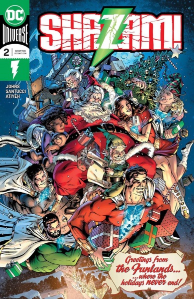
Written by Geoff Johns
Illustrated by Marco Santucci
Colored by Mike Atiyeh
Lettered by Rob Leigh
Reviewed by Ken Godberson III
There are two types of Geoff Johns: “Additive” Geoff, who builds a mythology and adds things that enhance the world of the title he’s on (see: his “Green Lantern” & “Hawkman” runs) and then there’s “Trying to Fix” Geoff, who tries to hammer a mythos into a shape that makes characters feel incredibly off and contradictory to what came before (see: his Barry “Flash” run and a good chunk of his “Teen Titans”). With “Shazam!” #2 (that “!” is actually important), we feel like we are getting that former one as his story with Billy Batson and the rest of the kids begins to unfold further. Threads are beginning to form into a tapestry without anything feeling bloated.
Continued belowWe follow three plots in this issue: the sudden arrival of Billy’s father (?) at the Vasquez house, the kids exploring the Magiclands and following up with Dr. Sivanna and Mister Mind. While the first one may have gotten the short end, all three have provided intriguing stories. The first of the Magiclands the kids visit is Funland, where we see some dichotomy between Mary’s more structured personality and Freddy’s impulsiveness. But it’s in the storyline with Sivanna and Mr. Mind that may have offered one of the more intriguing threads: a magical encyclopedia entry on Mind that hints that there is more to that “!” in the book’s title than meets the eye.
Artistically, Santucci and Atiyeh do a good job, however, it does feel annoying that we already had a new artist on this book an issue in. The team provides a great sense of fun and wonder in the book, the scenes in Funland popping really well. The art shift to the encyclopedia entry is a nice touch, Santucci drawing a very fun and cartoonish, but menacing Mr. Mind. One pet peeve though: the cover, while good, is not really indicative of the inside because Funland isn’t North Pole-themed
The largest weakness in this issue is that, while the world is opening up at a stable pace, sometimes a few characters can be pushed to the back. There’s still some annoying little stereotype-y elements with Pedro and Eugene, nothing that a bit more exploration of the characters couldn’t fix. I can only hope with time that will come. That said, “Shazam!” #2 continues the building of a new mythology for Billy with a vast amount of potential.
Final Verdict: 8.0 – Incredibly paced worldbuilding and fun artwork bring out the best in this budding series.
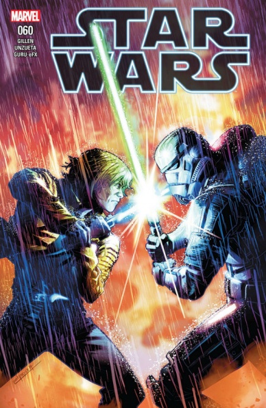
Written by Kieron Gillen
Illustrated by Angel Unzueta
Lettered by VC’s Clayton Cowles
Colored by Guru-eFX
Reviewed by Michael Govan
My heart goes out to Star Wars comic writers. It just seems like a lose-lose situation from the outside looking in. They have to work within the canon and around the events in the movies. Characters can only develop so much without contradicting the films. On top of that, because of the franchise’s popularity, there’s probably a higher level of scrutiny. A bad issue of, say, “Power Pack” would go unnoticed but a bad issue of “Star Wars” might make waves.
I’m pretty indifferent to “Star Wars” #60. I didn’t love or hate it. The Rebels escape the fearsome SCAR Squadron (as you knew they would). They leave Hubin (as you knew they would). They live to fight another day (as you knew they would). All of that has to follow the expected order because Empire Strikes Back is still to come at this point in the timeline. Thane Markona sacrifices himself but he has only really been around for this arc. I need more time with characters to get emotionally invested in their story. For instance, I actually care how Sana Starros story shakes out.
Let’s see, what else? SCAR getting their just desserts, in the end, was good. There’s a kiss between Tula and Luke…but how can the audience care? We’ve seen the movies, we all know it doesn’t really go anywhere. Angel Unzueta handles art for this issue. I’m not familiar with his work outside of the series but I personally don’t care for it here. A priority seemed to have been to make Luke look just like Mark Hamill, Han exactly like Harrison Ford and so on. It seems unnecessary. Leinil Francis Yu drew everything true to his own style and that was perfectly fine. “Star Wars” 60 was an unmoving experience…but we’re all going to see Episode IX when it drops, so there’s that.
Final Verdict: 5.5 – Maybe we don’t need to know everything that happened a long time ago in a galaxy far, far away…
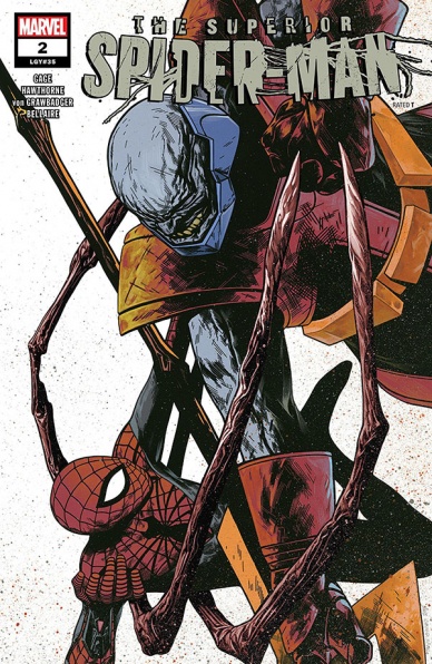
Written by Christos Gage
Penciled by Mike Hawthorne
Inked by Wade von Grawbadger with Victor Olazaba
Colored by Jordie Bellaire
Lettered by VC’s Clayton Cowles
Reviewed by Luke CorneliusContinued below
After comfortably dealing with Stilt-Man in #1, Christos Gage ramps up the stakes in this issue with Superior Spider-Man facing off against Terrax the Tamer. Terrax’s introduction presents Superior/Elliot/Otto with an entirely different scenario. Here, he can’t make a quick “calculation” to defeat Terrax and instead we see Superior try a multitude of different gadgets and methods that all fail miserably. By doing this, Gage digs deeper into Elliot’S character and questions his limits not just mentally, but physically too. While Elliot is able to quickly think of a new plan to defeat Terrax, as we would expect, the physical threat that Terrax poses leaves him to contend with an entirely new “level of pain.” By having to endure this, Elliot presents a heroic resilience to support his claim of superiority.
However, throughout the issue, Gage ensures that Elliot’s current heroics don’t allow for his past as Otto to be forgotten with Anna Maria’s reluctance to help him acting as a reminder of his previous lies and manipulations. These reminders make the final page all the more tantalizing because it leaves Superior in a very exciting position, a position that Anna Maria realizes could be a “colossal mistake.”
With the issue focusing on the battle between Terrax and Superior Spider-Man, the art has to deliver, and deliver it does. Mike Hawthorne keeps the panels large and expansive, allowing us to see everything that is going on, with Wade von Grawbadger and Victor Olazaba’s inkwork making sure the artwork is clear. They fill each panel with a sense of definition by using crisp, thin outlines on Hawthorne’s pencils. However, this clarity doesn’t make the action feel rigid. There’s still lots of movement in the art and Hawthorne’s use of smoke and debris accentuates the motion in each panel too. This is epitomized when Terrax quite literally laughs off one of Superior’s explosives. Fire-y smoke billows out his mouth and, with Superior beginning to run out of options to defeat him, this panel instills Terrax with a sense of invulnerability. This panel also highlights the importance of Jordie Bellaire’s color work in the issue because, while the issue is washed with brown and gray tones due to the dust and smoke, Bellaire infuses the smoke with glowing orange and red hints that bring the scenes to life, as well as giving the Terrax’s cosmic power a piercing, almost-white pink glare.
Final Verdict: 8.0 – After a promising start to the series, “Superior Spider-Man” #2 raises the stakes and delivers an action-packed issue that will leave you desperate for #3.

Written by Alan Martin
Illustrated by Brett Parson
Lettered by Brett Parson
Reviewed by Nina Bailey
Get up and go; Tank Girl’s taking off without us. “Tank Girl Action Alley” #2 jumps straight into, well, the action with Tank Girl on the roof of a speeding vehicle; Barney’s in hot pursuit via motorbike, with the rest of the gang a ways behind tying up loose ends as only they can. Don’t worry, they’ll catch up.
The initial draw of “Tank Girl Action Alley” #2 was the cover: TG staring down the reader, mouth curled in a snarl as she rips an arrow from her shoulder. There is a glorious gush of blood that contrasts nicely with the otherwise gritty coloring. If the cover art doesn’t draw you in, perhaps the kangaroos will. That’s right; kangaroos, as in plural, and they aren’t exactly cute. There’s also a brief boxing match, multiple counts of fleeing, and one delightful arm chop.
“Tank Girl Action Alley” #2 delivers the promise of high-speed, gratuitous-yet-fun violence as it pushes readers along the overarching journey: TG’s quest to get to her adoptive mother. And if high-speed isn’t for you, don’t worry, there are flashbacks. Readers will get a look at TG’s first scalps; credit to artist Brett Parson for making that particular moment somehow both brutal and adorable. The team behind “Tank Girl” certainly does well with that balance between rough and fun. The dire situations feel real without giving up the levity. Sure, TG is balancing precariously on top of a moving vehicle, but she makes it look effortless. And yes, there are terrifying, furry, mutant creatures involved, but it’s still Quip City, and that’s where you want to be.
Continued belowFinal Verdict: 7.7 – Light on plot this go-around, but it’s to make room for the punching, and therefore it’s justified.

Written by Howard Chaykin, Phillip Kennedy Johnson
Illustrated by Howard Chaykin, Alberto Alburquerque
Colored by Edgar Delgado, Andres Moss
Lettered by Ken Bruzenak
Reviewed by Justin Beeson
Marvel is celebrating both its 80th anniversary and their history with “War Comics” with a special “War Is Hell” one-shot. The issue features two stories from different eras of America’s involvement in wars abroad, with uneven results. The first is a WWII-era vignette, written and drawn by Howard Chaykin. It is unsurprisingly beautiful looking, but mostly forgettable. The second story from Phillip Kennedy Johnson and Alberto Albuquerque takes place in modern day Afghanistan. While it offers a much more nuanced look at the effects of war, the art quality dulls the overall effectiveness.
A WWII-era story is perfectly suited for Chaykin’s style, both in art and writing. His square-jawed soldiers and shiny aircraft really personify the setting. The action is cinematic and the characters’ emotions really come through in Chaykin’s artwork. And the way he chose to illustrate the pilot listening to music in the plane gives the story a lightheartedness, and that tonal incongruity is the main issue. It seems like Chaykin is trying to make us feel sympathetic to a Nazi just because he likes jazz music. That jazz music doesn’t stop him from still attempting to gun down allied forces and bragging about his kill count. Because of that, the emotional impact of the last scene just falls flat.
Johnson and Alburquerque’s story really lives up to the “War Is Hell” title, and is a huge shift from the first half of the book. The way the fable is narrated with the parallel depiction of a group of soldiers infiltrating a camp is really effective, and a great meditation on the perpetuation of violence. Unfortunately, the art drags this segment down. The characters are inconsistent and there are some clear anatomical issues with the way some people are drawn. The coloring is a highlight though. Andres Mossa sets the mood with different types of lighting which give the sequence a lot of needed tension. Things like the green tint of night vision and the glow of a TV enhance each scene. Ken Bruzenak’s letters also do some great narrative work. There are a few pages where the panels could have been a little confusing without Bruzenak’s caption boxes leading the eye.
Unfortunately, “War Is Hell” #1 feels like an afterthought. Chaykin’s half has great art and a lackluster story, while Johnson and Albuquerque’s half feels like 75% of a great short story, with the art being a distraction. There isn’t much here for anyone other than people looking to read everything by any of these creators.
Final Verdict: 4.9 – While there are some redeeming parts in each of the two stories, overall it is an unsatisfactory reading experience, and feels inessential.


