
There is a lot to cover on Wednesdays. We should know, as collectively, we read an insane amount of comics. Even with a large review staff, it’s hard to get to everything. With that in mind, we’re back with Wrapping Wednesday, where we look at some of the books we missed in what was another great week of comics.
Let’s get this party started.

30 Days of Night #2
Written by Steve Niles
Illustrated by Piotr Kowalski
Colored by Brad Simpson
Lettered by Tom B. Long
Reviewed by Gregory Ellner
Even for those who know the basic premise of “30 Days of Night” from Steve Niles’ earlier work on this series, the tale of horror in Barrow, Alaska remains very foreboding. Niles crafts his story slowly, only ever showing the supernatural elements just before they lead to brutal violence. With the focus on the bizarre happenings in the town the day before the eponymous month-long night, Niles keeps the reader on the edge of their seat, worried about what is coming next, but unable to look away. Even those who know the reason for some of the strange actions of the townspeople will likely be unable to stop from turning the page, as if looking at a train wreck about to ensue.
Piotr Kowalski is no stranger to horror himself, with multiple unnerving books on his bibliography, and it definitely shows. As if to demonstrate Stella Olemaun’s emotional fragility, he purposefully hides her face from view during her work, only allowing her time to show it when she is able to let her guard down in private. The man at the Ikos Diner is also given a facial focus, but in this case, rather than hide it, the art focuses in on it, showing him to be a rather crazed individual in the very least.
Brad Simpson also is more than up to the challenge of this story, with splashes of red in violent scenes as a color wash to show how horrific the murderous beings really are. The use of shadow, especially in the parts with the creatures, helps to add to their foreboding nature, but the muted colors really showcase how inhuman they really are, as if they do not fit in with the rest of the story, and thus their reality.
Together, the creative team is continuing to craft this horror, but it’s admittedly slow. That said, it definitely works to the narrative’s favor, and is one of its strongest points as of yet.
Final Verdict: 8.0- With a slow buildup, Niles, Kowalski, and Simpson continue to add tension to their horror story before it is ready to go into full swing.
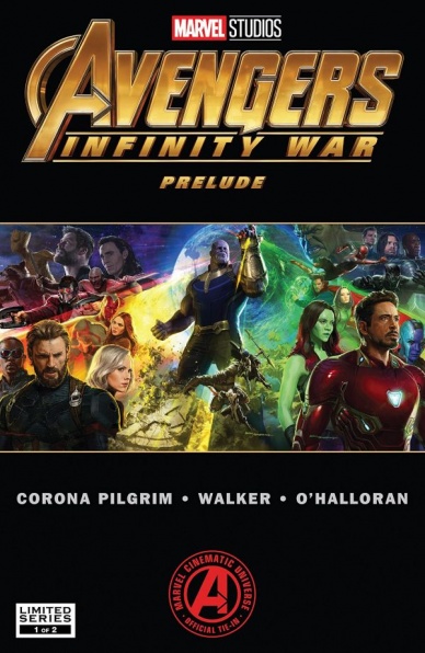
Marvel’s Avengers: Infinity War Prelude #1
Written by Will Corona Pilgrim
Illustrated by Tigh Walker
Colored by Chris O’Halloran
Lettered by VC’s Travis Lanham
Reviewed By Kate Kosturski
Just in time for the May release of Avengers: Infinity War we have “Marvel’s Avengers: Infinity War Prelude” #1. The majority of the story is straight out of the Captain America: Civil War script, particularly the last hour or so of the movie, in which Tony Stark discovers that Winter Soldier (aka Bucky Barnes, Cap’s best friend) killed his parents under the influence of Hydra. Cap and Tony battle it out, Cap rescues the other members of his team from the Raft, and Bucky goes to Wakanda to be put into cryogenic sleep until he can be cured of the Hydra brainwashing. The last few pages do provide some new material in the form of a weapons heist in Syria led by Black Widow, who had been living there in exile after the fight at the airport in Civil War. Meanwhile, Tony’s working on some new tech, but missing his pal.
Plotwise, this is a decent refresher if it’s been a while since you’ve seen Civil War – – but with a book marketed as a “prelude” to the next big Avengers movie, I expected more material that would bridge the two films, not just a few pages at the end. The book does expand on some scenes from the movie, such as the preparations for Bucky’s cryo sleep, and plays up the emotion with reunions for Cap’s team and their loved ones. Tigh Walker does fine work with art, though there is this tendency to add too much detail in faces. (Bucky looks like he could use a dose of Botox or two while he’s in that cryo sleep, if you ask me.) It’s also nice to see some teasers for the film in the form of new suits for Spider-Man and Iron-Man, and a blond Black Widow (something I’m still getting used to seeing). While panel layout is standard throughout the book, the one full page of Shuri looking into Bucky’s memories that centers her with vignettes of his Hydra indoctrination falling around her like playing cards illustrates the breadth and depth of the Winter Solider’s torment beautifully.
Continued belowFor new fans wanting a quick and dirty catchup prior to Infinity War, this will do just nicely. Longtime fans can just get Civil War from Netflix instead.
Final Verdict: 4.8 – The book’s virtual rehashing of Captain America: Civil War doesn’t justify the price point of $3.99. A smarter decision would have been to release it as a free comic, in the style of the “Marvel Legacy” primer pages of last fall.

Monstress #13
Written by Marjorie Liu
Illustrated by Sana Takeda
Lettered by Rus Wooton
Reviewed by Michael Mazzacane
“Monstress” is back! As Marjorie Liu notes in a letter to readers in the back, it’s been a long break. With what transpired at the end of the last arc, it certainly felt too long. Still that break is worth it in the end because that means more beautiful Sana Takeda art. Looking over this issue, it isn’t so much her line work that makes “Monstress” have this air of prestige too it. Takeda’s design work is excellent and expressive but really, it’s her color job that elevates everything. With how smooth but still painterly she blends all the colors together to create a realistic, but still fantastical, texture. Those pallet choices inform the overall soft lighting effect she is going for. The single page spread of Tear Shed, the refugee camp/city, would not have popped as much if it were just the line work. How the lighthouses light shines through and silhouettes the giant tree and the resulting shadows is an immeasurable value.
For all this painterly quality and texture, Takeda and Liu still work in these moments of anime/manga like levity. Kippa and Ren being the vector for this isn’t too surprising but that doesn’t change how pure they make Kippa come off as they eat dumplings. Or how very cat like they manage to render Ren, even as they speak and eat like a person in cat form.
“Monstress” is this interesting balance of high and low. Sana Takeda’s coloring and illustration and Rus Wooton’s lettering, such as when Maika is ‘writing’ to Tuya, create this feeling of prestigious high fantasy. There’s a majestic sea guardian that emerges from the sea like giant whale … and then Marjorie Liu writes it dropping F-bombs as it cites the very specific maritime code. While not always this vulgar, the issue has that kind of sudden smashing of tonality and it is delightful. Sure there is this very serious magical mumbo jumbo going on, which is illustrated beautifully, however, how it is balanced with these lighter moments is what makes everything read as cohesive. That balance shines when considering how Liu structures the issue, it smartly juggles several plot threads each with scenes that are only a couple of pages each but make for enough of the break from the ‘A’ plot that the feeling of time pacing is created. The series returns with an issue that read as fulfilling unto itself, which is no minor feat these days.
Final Verdict: 8.0 – “Monstress” is back, things look as beautiful and enrapturing as ever but Maika’s journey only seems to get more and more perilous.
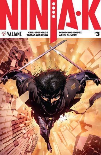
Ninja-K #3
Written by Christos Gage
Illustrated by Tomás Giorello with Roberto de la Torre and Ariel Olivetti
Colored by Diego Rodriguez
Lettered by A Larger World Studios
Reviewed by Gustavo S. Lodi
“Ninja-K” #3 delivers compelling plot evolution as two seasoned warriors discuss the dark implications and underlyings of their covert program. This issue walks that thin line that manages to explain a tremendous amount of back story – both in regards to the titular character and its larger mythology – without feeling forced.
The story zooms on a debate between Ninja-K and D (the older equivalent from the 50s), while they have an intense battle in an old headquarters of their program. Rather than relying on over-exposition, each piece of dialogue feels in place, connected to what both men would like to learn from the other. And since these characters are genuinely interested on that situation, readers are pulled in effortlessly.
Art is shared between Tomás Giorello (present day) and Roberto de la Torre (flashback pages telling Ninja-D’s reasons for hating the MI-6). Roberto’s art is dirtier and edgier, fitting the troubled past and situations Ninja-D is explaining, while Giorello’s more kinetic style suits the intense battle moments. Facial expressions in the present are a strong contribution, especially when Ninja-K feels the personal implications of what his older counterpart reveals him.
Continued belowColors by Diego Rodriguez work best with Giorello. On those pages, colors seemed to have been inserted directly unto pencils, but still having a stronger substance, not feeling like an ethereal shade over pencils. Rodriguez is also the one responsible for setting most of the issue’s atmosphere, from the dusty and old MI-6 base, to the multiple set-pieces shown on Ninja-D narration of the past.
As a bonus, do not forget to read the back-up story (art by Ariel Olivetti), showing one of the first missions Ninja-A (the original MI-6 operative) took during World War I. It is a nice complement to the main story, even if it has little in terms of connective tissue to it.
Final Verdict: 8.0 – “Ninja-K” #3 has a lot going for it, from a compelling story, intriguing debate and art choices that are very fitting to the different moments and styles they are focused on.

Thanos #15
Written by Donny Cates
Illustrated by Geoff Shaw
Colored by Antonio Fabela
Lettered by VC’s Clayton Cowles
Reviewed by Alexander Jones
Some creators can have trouble understanding Thanos or what kinds of different stories can be told using him in an ongoing solo series. Thankfully author Donny Cates seems to have a better handle on what makes the protagonist great in the scope of his own story. The Mad Titan works much better in this context as the creative team exposes him to situations full of both humor and drama. With the light reboot and new supporting cast surrounding the ongoing, I haven’t been this excited to read about The Mad Titan since the original Jim Stalin-penned series a couple of decades ago.
The real shining star of “Thanos” #15 has been the all-new Ghost Rider who proves to be a complex character that keeps evolving. The reveal centered around his identity gives him even more context as a character who opens the script to even more possibilities. Going forward, Cates should continue to explore the character and his complicated dynamic with each Thanos littering the pages. In addition, the other aspects of the series also begin to come to fruition here. It is great to have this story take a more present shape and form and to see the comic develop firm stakes and ambition.
Geoff Shaw’s art is the perfect match for this heavy and humorous storyline. The pages with Ghost Rider are as ambitious and beautiful as some of the insane spreads featuring Thanos. Seeing the comic develop both of these personalities with art this enticing and slick is a sight to behold. Shaw has a fantastic eye for comic book layouts and has devoted an eye towards crafting bombastic comic book layouts and wonderful physicality between the different leads in the title. The book also features highly expressive gestures and faces. Shaw has a great attention to detail and has made incredibly excited to open up the interiors of Thanos every month.
Between the beautiful interiors from Shaw and the wicked sense of humor channeled from Cates, this run on “Thanos” continues to be a winner. Ever since their run took a hard left turn, the book has exuded a strong energy that I’ve been excited to read more of each month. The tone captured here is also something of a rarity right now at Marvel featuring a large-scale serialized storyline with an ample dose of humor and drama.
Final Verdict: 8.8 – “Thanos” #15 has a wicked sense of humor and a bleak outlook on the villain who almost won. Read this book.
Vinegar Teeth #1
Written by Damon Gentry and Troy Nixey
Illustrated by Troy Nixey
Colored by Guy Major
Lettered by Troy Nixey
Reviewed by Reed Hinckley-Barnes
In its solicits, “Vinegar Teeth” #1 pitched itself as “Lovecraft meets Lethal Weapon,” and after reading the first issue, that seems pretty on the money. This issue contains a decent amount of horror and some pretty disgusting images. But at the same time, it’s a buddy cop comedy. An old, washed up drunk has to mentor a fresh, new cop that comes from a very different background. That new cop just happens to be a monster from outer space. It’s a strange blend of influences, but for the most part, it works.
Continued belowTroy Nixey handles both the art, the lettering, and was at least involved in the scripting, and it shows. For the most part lettering is an invisible art. Usually when it’s good, it fades into the background in such a way that compliments the story but is unobtrusive. “Vinegar Teeth” #1 made me notice it’s lettering, but in a good way. The lettering is inseparable from the art itself. From thought bubbles that just portray images, to the numerous onomatopoetic sound effects, the lettering in this issue is something special.
On top of that, the art itself is this odd mix of cartoony and disgusting. The characters look a bit like overly detail caricatures, but in a way that works for the story. It allows everything to be both over the top in a silly kind of way, and repulsive when the story calls for it. The coloring also does a great job selling the tone of the story. Major colors this world in vomit greens and putrid yellows, making even the funny moments a bit off putting.
In the script, not everything completely lands. There are some moments where the dialogue is a bit odd or doesn’t entirely make sense, and a few moments where the jokes just aren’t that funny. But those moments are rare enough not to hurt the issue. For the most part, “Vinegar Teeth” #1 is a bizarre, funny, wild ride, and very exciting debut issue.
Final Verdict: 8.5 – “Vinegar Teeth” #1 is an exciting debut, both funny and disgusting in equal measure.


