
There is a lot to cover on Wednesdays. We should know, as collectively, we read an insane amount of comics. Even with a large review staff, it’s hard to get to everything. With that in mind, we’re back with Wrapping Wednesday, where we look at some of the books we missed in what was another great week of comics.
Let’s get this party started.

Assassin’s Creed: Templars #9
Written and Illustrated by Dennis Calero
Reviewed by Gregory Ellner
Dennis Calero’s writing of the Templar faction, traditionally the antagonists of the series ever since the first game, has been so engrossing that followers of the franchise may be at a loss of which side of the Assassin-Templar War to follow.
The overall development of André “Dre” Bolden’s rise into the role of his ancestors is extremely engrossing for a character who has only even been a part of the franchise for four issues, endearing him to the reader in spite of technically being on the side of the “villains.” His friendship with Juhani Otso Berg is one of the best parts of this arc, helping to humanize the Master Templar agent in a way that the games had thus far not delved deeply. They talk together, and even laugh with one another.
On the whole, the issue seems to have an overall theme of trust. The story of Jan van der Graff cuts off in the Animus right when it seems that he would have been no longer useful to the Templar Order, but his actions are entrusted to Master Templar Juhani Otso Berg, Dre’s one true friend amongst the people at Abstergo. On the other hand, the Assassin Brotherhood seem to have similar problems of trust amongst their own members, as one of them seems to have enough greed to make his intentions to follow the Order be secondary at best to his self-interest. Furthermore, the members of the Brotherhood trust the aforementioned Black Cross in 1808 far too much, resulting in being outplayed by the Templar internal affairs agent.
Dennis Calero’s artwork is far removed from that of Neil Edwards, the artist on the sister series, “Assassin’s Creed: Assassins.” Whereas Edwards relies on clear-cut imagery, with all people involved in a scene being clearly identified and heavy lining, Calero’s focus seems to be on the interrelation of light and shadow, on color over lines. As a result, the art on “Templars” has been very rough, emphasizing the moral ambiguity that is especially present in the cloak-and-dagger operations of the Templar Order, both in the 2010s and in the times of André Bolden’s ancestors. The artwork is extremely useful in determining the black-and-white nature of Templar codes, rather than the interpersonal relationships that have prominence in “Assassins.” For example, during Graff’s training, Calero makes use of silhouettes, with a Templar cross over the body of Olier that both emphasizes which person he is, and demonstrates that his adherence to the Templar Code is inherent in his being to his very core. As a comparison point, a close comparison would be the artwork of Andrea Sorrentino, in how Calero emphasizes the rough-and-tumble nature of the underbelly of the borderline eternal war.
As a finale to both the ‘Cross of War’ arc and the “Assassin’s Creed: Templars” comic as a whole, this issue serves as an adequate ending, while leading into the upcoming “Assassin’s Creed: Uprising” comic.
Final Verdict: 8.0 – Fantastic spy drama comes to its conclusion, leaving wonder of what will come next.

The Backstagers #6
Written by James Tynion IV
Illustrated by Rian Sygh
Reviewed by Nicholas Palmieri
“All the world’s a stage, And all the men and women merely players.” “The Backstagers” #6 deftly explores this concept as Jory must find his way out of a surrealist alternate reality based on theatre. Tynion’s rock-solid plotting skills keep the reader fully engaged as Jory’s journey gradually escalates into increasingly more fantastical situations.
Visually, the whole issue highlights Sygh’s character designs, as each of the characters are pieces of equipment in this new reality. Hunter, for example, is represented as a drill whose front has the same rounded rectangular shape as the outline of his head, and Aziz’s long face is represented as a two-by-four. The designs skillfully call attention to both how radically different each character looks, a surprisingly rare quality, and the simplicity of how that is achieved: through a variety of basic shapes used as the designs’ underlying structures.
Continued belowAlso of note are Walter Baiamonte’s colors. Everything retains a stylized cartoon-ish look, but certain elements shine with a glow that appears equally as bright on a printed page as on a digital screen. The use of darkness and light pushes forward abstract concepts of safety versus danger, and special color effects, like the aforementioned glow, make the fantastical parts of the comic seem even more remarkable.
A central point of the issue revolves around Jory not yet having figured out a preferred duty in the theatre world. It’s a clever metaphor for the coming-of-age topics the series has covered: learning about the world, understanding yourself, exploring the universe of options available to you. It also ultimately suggests that Jory has not yet reached a full understanding of himself, and that that’s okay. Tynion clearly understands the uncertainty high school-aged people feel, especially related to purpose and personal identity, and his expressing it through the subtext of an already well-told story enhances its effectiveness.
As someone who has always immersed myself in different creative groups and taken time to find my role in each of them, this issue — and the series as a whole — hits incredibly close to home. But all people can relate to the more general concept of finding a purpose in life, and with Tynion’s plotting and character strengths combining with Sygh’s strong designs and Baiamonte’s dazzling color work, any reader can be immersed in this world.
Final Verdict: 8.6 – Another great chapter in an expressive, imaginative book, with special resonance for anyone who has ever been involved in a creative group.

Blue Beetle #5
Written by Keith Giffen
Illustrated by Scott Kolins
Reviewed by Robbie Pleasant
The plot thickens, and Jaime’s family is getting caught up in it. This issue graces us with a look at a beetle-esque foe, and it’s an impressive enemy indeed. The design, while a bulky green monstrosity (and I say that in the best way), contains just enough thematic resemblances to the Blue Beetle armor that it works as both a dark reflection and an indication that they’re connected in some way. In both the action and designs, Scott Kolins’ art keeps things active and looking quite cool.
While I do have some reservations about the way the human characters are illustrated (there’s just something about their faces that doesn’t sit right with me), it’s balanced out by the armor, action, and metahuman designs. There are some great shots of Blue Beetle in action, and the way the world seems to crackle around him as he unleashes his anger on this green threat feels intense. Each member of the Posse looks truly unique, with forms and function lending to their personalities.
And after a few issues indicating the mystical roots of Jaime’s scarab, we’re finally seeing more of the forces moving against it. In some ways, it’s similar to when the Reach would try to get at Jaime and the scarab, but with a new mystical twist that’s bringing in the magical members of the DC universe. Whatever dark lord this green foe follows, it’s getting a nice setup with the ominous introduction.
However, the Blue Beetle comics always work best when they’re connecting to both Jaime’s family and the world around him. It’s done well up until now, by having his mother act as the doctor for the Posse, and now everything is getting connected more, with the Posse in action and Ted Kord acting to get Jaime’s family to safety. We’re seeing the Posse as more than just a super-powered gang, and perhaps the first steps of them moving from Chaotic Neutral to Chaotic Good, as Ted alluded to a few issues ago. Character development is always welcome, for central and side characters alike.
Final Verdict: 7.8 – It does well in terms of action, emotion, and character. Things are being set in motion, and I look forward to seeing how it unfolds.

Deathstroke #11
Written by Christopher Priest
Illustrated by Denys Cowan
Review by Ken Godberson III
Before I talk about this issue, let me first talk about something that came out a few weeks ago, the DC-IDW co-published anthology “Love is Love”, which was made in response to the Orlando shootings last year. There was a small anti-gun comic in there featuring Deathstroke. It was one of the dumbest, tone-deaf attempts to be deep or profound within that anthology and just in general. This issue by Priest, Cowan, inker Bill Sienkiewicz, colorist Jeromy Cox and letterer Willie Schubert is the antithesis of that story.
Continued belowWe follow reporter Jack Ryder who is also the supernatural character known as The Creeper as he investigates a series of gang killings in Chicago. And not just one part of Chicago, we are taken on a tour of the many different socio-economical parts of the city and with that comes the variety of perspectives, from detectives to the mothers of innocent children that are shot. It’s a harrowing experience that does not provide any concrete, black-and-white answers that some of us would love to have to stop these horrible things. It’s more than just “let’s take the guns away”. It talks of violence, the systemic causes of it, revenge, the double standards that are created by societal privilege and so much more. Deathstroke himself is more a force of nature in this story, a thread utilized to talk about a lot of things, and it personally left me numb, especially considering the last few months.
Cowan, Sienkiewicz and Cox help create a stark, grim depiction of Chicago that makes one feel claustrophobic. From paneling to the depictions of alleyways to crime scenes, to the city skyscrapers, everything feels tight and cramped, but not out of poor design. This book makes you want to feel just how heavy and deep these issues are visually as well as verbally. Cox’s colors are also kept stark and desaturated, to further emphasize the grounded nature of this issue, even when it is juxtaposed with the more gaudy and animated colors of The Creeper when he comes to play.
I’ve done my best not to spoil things in this review so let me just say: Go read this issue. It is perfectly stand-alone and easily the best issue of the series so far, and that is from a book that is already head-and-shoulder above everything else at DC. Jump on here, then work your way back if you must, but you need to read this.
Final Verdict: 9.6- An early contender for Best Single Issue of 2017.
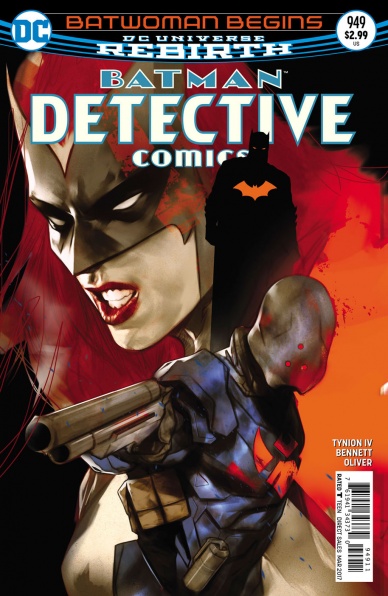
Detective Comics #949
Written by Marguerite Bennett & James Tynion IV
Art by Ben Oliver & Szymon Kudranski
Reviewed by Mike Mazzacane
“Detective Comics” #949 is an effective capper to a two-part story that acts as prologue for writers Marguerite Bennett and James Tynion IV forthcoming “Batwoman” series. It raised the right questions about the nature of Batwoman and began laying the foundation for the spin-off series. It is still however, prologue, which means full meaty conclusions aren’t exactly given. Nor should you really expect those sorts of conclusions, as exploring who Kate Kane is and how she can be differentiated from her Bat-Family appears to be the operational theme for that series.
The line of questioning in ‘Batwoman Begins Finale’ is consistent with motifs Tynion has used previously, the multifaceted inspiration individuals have drawn from the Batman. Once again confronted by the militarized fandom known as the Colony, Kate’s inspiration from her cousin and her prior life as a solider come into relief. Simon Samuels, Colony Prime, becomes a mirror allowing her a peak at what could’ve been had she stuck to the soldier’s life and her father. Mediation between this superhero-solider dichotomy isn’t fully achieved but the quickness this relationship is symbolically setup by the action of the book helps this issue not feel hollow for being largely an action sequence. Throughout the issue, Colony Prime lectures Kate for leaving her father emphasizing the clear mind and pleasure afforded to the solider with their position in a strict hierarchy and need to simply follow orders and complete the mission. This stands in stark contrast to the familial, flattened hierarchy of the team and Bat-Family at large and their amorphous mission to combat crime. This differing perspective is represented in their opposite views of the Belfry. The Colony see it as a superweapon harkening back to Kate’s initial reticence to give up firearms, “I will use whatever tools I need to fight my enemy.” But for the team it is their home, a place for healing not destruction.
These distinctions reveal the ever-present tension between superheroes and the militarization associated with them– from their presentation to the discussion of their extra-legal action as part of a “war”. Often, these tensions and inconsistencies are lessoned by surface level masking such as the use of themed gadgetry. Most contemporary cape characters also aren’t so directly tied to the military establishment, making Kate Kane a unique meeting point between the two. She speaks in military tinged verbiage in both past and present, giving the aura of a special operations soldier in a red cape an cowl. This dissonance and unease between these two aspects hit hard as she performs a leap of faith into Gotham City, a page after reconnecting with her Colonel father and taking up another mission, addressing him like the daughter-soldier she was years ago.
Continued belowIt’s hard not to like Ben Oliver’s art work. The smooth textured colors and light line work from the ink give just the right amount of definition and emphasis without the piece coming off as overdone. That holds true to this issue, it is the presentation that brings pause. Tynion and the various art teams on this book have made beautiful and inventive paneling and spreads a calling card and when everything is working it’s great. In issue #949 everything wasn’t working great and I am left confused by the excess. There are 7 double page spreads in this issue, most in a row in the back half of the issue. Looking at and reading the pages, it is hard to see the necessity for them to be presented in this way with large white gutters separating two normal sets of grid panels. There are a couple of panels that do bleed into that gutter but otherwise the image is tightly contained within the paneling and enveloped in large, noticeable, white gutters. There is nothing impactful or inventive in these spreads. There is a distinct lack of flow in them, as everything is so contained. It makes me think they weren’t supposed to be presented this way with so much unused, precious, space. Comic book storytelling relies on the maximization of this limited space and to have so much of it taken up by borders is puzzling and not enjoyable to read.
Prequel’s often go wrong when they confuse exposition and making connections as storytelling. Prequels go right when they use their position to tell a story about character, that can also connect to a larger web but is not subservient to it. ‘Batwoman Begins’ is the right kind of prequel, efficiently bringing up the tensions in a character like Kate Kane while planting the seeds for a larger web going forward.
Final Verdict 7.0 – ‘Batwoman Begins’ Ends on a promise of an intriguing new series and chapter for its title character, I just wish the art made a bit more sense.
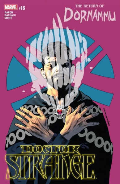
“Doctor Strange” #16
Written by Jason Aaron
Illustrated by Chris Bachalo with Cory Smith
Reviewed by Tyler J. Brown
Magic is dead and Dormammu is the latest enemy to show up and claim to have a right to take Doctor Strange’s life. There’s no way that Aaron is letting Strange take anything like a breather, so besides a flashback, this issue is packed to the brim with some Strange on Dormammu action.
Speaking of the flashback, it takes place during Strange’s training with The Ancient One- particularly, it deals with Strange’s first encounter and exorcism of Dormammu. Aaron and Bachalo have come up with a truly creepy way of Dormammu manifesting himself when possessing others. Namely, their bodies start to burn while his lined face floats in front of their flaming head.
As expected from his previous work, Bachalo’s expressive and cartoonish style brings out all of the frustration on Strange’s face as he tries to take on one of his most powerful foes while having little to no magic left to draw upon. I also loved Bachalo’s new take on Dormammu himself. Gone is the smooth and purple-bodied Lord of the Dark Dimension; in his place stands a sharp and craggly Dread One whose face floats in front a gout of flame. I find what’s most admirable about Bachalo’s work is how he’s fit his style to the normal everyday characters (like Zelma Stanton) while also being able to convey the more “out there” characters like The Orb and Mr. Misery. No character or element of this book feels like it got less attention under Bachalo’s pencil. One character I never get tired of seeing Bachalo draw is Mr. Misery, a floating blob of darkness, mouths, and eyes. This character could easily become bloated and drawn lazily, but the way Bachalo has him manifest on the page always makes him feel like this creepy, roiling presence.
Have I mentioned the layouts in this issue? Because they need to get some attention too. Although characters like Dormammu and Mr. Misery loom large and quite literally take up large amounts of space on the page, Bachalo still manages to have their bodies more frame the page than blot it out. It was a very effective way to have these villains make Strange feel even smaller and less powerful than he already felt.
Continued belowA huge shoutout in this issue belongs to the colorists. Bachalo had help on the colors from Antonio Fabela and Java Tartaglia. It could have been easy for this issue to get confusing with a flashback interspersed, but the consistent coloring and grey tones of the past kept things straight visually. This is even more commendable considering there wasn’t a hiccup in the narrative when Cory Smith helped out with pencils on a few pages. One great example of the effective coloring happens later in the issue when Strange is able to finally conjure up some magic. With some classic phrases like, “By the Seven Rings of Raggador,” and “In the name of the All-Seeing Agamotto,” Doctor Strange is suddenly surrounded by an electrical green energy that jumps off of the page. This was so effective because Strange has been struggling and without magic for the last few issues.
Over sixteen issues, he has crafted a tale that has backed earth’s Sorcerer Supreme into a corner time and time again. With the issue ending on the ominous note of Wong being posessed by Mr. Misery, it looks like times are only going to get tougher and stranger for Stephen Strange.
Final Verdict: 7.9 – A quick-paced installment of the storyline ‘Blood In the Aether’ that mixes the familiar with the new and leaves the reader wanting more.

Future Quest #9
Written by Jeff Parker
Illustrated by Ron Randall
Reviewed by Rowan Grover
Loose plot threads and characters begin to merge as Jeff Parker gives “Future Quest” #9 the drive of a good superhero crossover story. The villainous Omnikron serves as an interesting, almost Lovecraftian foe that brings together the whole Future Quest universe to fight it. There are some genuinely endearing and fun moments to be found in here, from the Buzz’s activation of Frankenstein Jr, to Race Bannon using the Space Ghost armbands for the first time.
The climax of the issue is the strongest part, with Parker scripting a Pacific Rim style mech fight. Big splash pages are effectively used in this scene, right from the get-go with Frankenstein Jr basically curb-stomping Omnikron into the ground. The pacing is well written, with slow, deliberate storytelling used to exaggerate the enormity of the two fighters. However, Parker still struggles to balance with the enormous task of balancing the huge cast of “Future Quest.” We’re getting some good character moments, with the focal point being Buzz and Frankenstein Jr, but a lot of the cast can feel like they’re being pushed aside, which for a book touted as a ‘crossover comic’ is not ideal.
The promise of having Doc Shaner draw an entire issue of “Future Quest” seems like a pipe-dream at this point, but at least we get some consistency in Ron Randall drawing the entire issue here. His style is evocative of Shaner’s, using clean aesthetic and less line work to feel like an update on the classic animation style. One of my favourite scenes in this book is the car chase with the Impossibles and Omnikron. The scene is really well composed and kinetic, lending a strong sense of motion to the book.
The art can look a little stiff at times, however, which jars the flow of the story a little. This happens with the scientists on the opening page, who all look like posed action figures, and later during the Frankie Jr/Omnikron fight, a scene depicts Frankie walking down the beach looking like an old, stiff jointed doll with a camera angle that’s reminiscent of hieroglyphics.
Veronica Gandini’s colors are easily the most redeemable part of this book, thankfully. She has a beautiful, almost rose-tinted tone throughout the entire issue that works as a faithful nod to the warm cartoons of old. However, she uses textured shading on top of to make the art more stylised and energetic, keeping it from looking merely like a screen grab from the TV show (although that wouldn’t look terrible, either).
Final Verdict: 6.9 – “Future Quest #9” might be the best this series has been since the debut, but a few issues prevent this from reclaiming its crown as the best of the Hanna-Barbera books.
Continued below
The Hellblazer #6
Written by Simon Oliver
Art by Pia Guerra
Reviewed by Jake Hill
The ever-fascinating John Constantine spends most of this issue on the sidelines. Since his integration into the wider DC Universe, John has had a lot on his plate, perhaps too much for one simple Hellblazer, and it raises questions about his place in the world. When he’s actually on the page, Simon Oliver writes a pretty good Constantine. His John has a strong voice, and Oliver writes other supporting characters with a sharp wit. The most interesting character in the issue, a Djinn wanting to bring glory back to his ancient race even says, “Humans are one thing, but the English are quite another. On my word… kill them all.” Now that’s pure “Hellblazer.”
Where Oliver stumbles is in the greater plot. The Djinn story, the story of John’s new protege Mercury, the ongoing story of Abigail Arcane, and Swamp Thing, and The Rot, they don’t come together as well as they should. There’s a mess of dangling plot threads that never come together and to make matters less forgivable, they never quite reach John. He spends the entire issue sitting on a train, mostly listening to Mercury recount a dream. That’s about as sidelined as you can get.
That being said, holy crap Pia Guerra. The artist most famous for her work on “Y: the Last Man” is as impressive as ever, and she makes it look easy. The panels in the dream world are crooked while the panels in the real world are geometric boxes. The panels in Mercury’s mind are made up entirely of negative space. Guerra can tell a beautiful story in a trendy haircut or a bloodstain on a shirt. This issue gives her a lot to work with. From the dream world to a fancy ballroom in London, Guerra fills the panel with personality. She gets to show off with googly-eyed dream monsters and she gets to play it subtle with menacing body language at a party.
The coolest flourish Guerra uses is her placement of the word balloons. They don’t always sit in the same panel as the speaker, but drift through the gutters to caption other actions. The balloons are still connected, so it’s clear who’s speaking but the because we’re looking at characters other than the speaker, we get to see reactions or images from elsewhere in the story, strategically juxtaposing the scenes. The way the balloons guide the reader’s eye makes the comic that much more cinematic. It’s a subtle thing, but it helps the pacing of the issue enormously.
Final Verdict: 7.0 – An amusing but forgettable Constantine story elevated by Pia Guerra’s superlative art.

Ladycastle #1
Written by Delilah S. Dawson
Illustrated by Ashley A. Woods
Reviewed by Alice W. Castle
Fantasy is a genre dripping with tropes. Filtering medieval history through the lens of the fantastical, it’s hard not to trip over the same story beats over and over. Even something like Game Of Thrones owes its lot to Lord Of The Rings. It’s a fairly homogeneous genre with many of the works not only drawing inspiration from the same limited wellspring, but from each other. Lord Of The Rings refracted time and again through its successors and imitators. “Ladycastle” #1 is a story that takes these tropes, from fantasy and fairy tale, and not only attempts to turn them on their head, but openly mock them.
“Ladycastle” #1 is a bit of a weird one as Delilah S. Dawson and Ashley A. Woods pay as much homage to animated musicals as they do the fairy tales that inspired them. The main character of “Ladycastle” is ostensibly Princess Aeve who, locked in a tower by her father, sings to herself and writes letters to the townsfolk around her to help solve their problems. It embodies the opening song of a Disney musical that would introduce the cast of the story, but in comic book form. The lettering by Jim Campbell and the design of the panels by Woods, which creates a manic, cartoon-y energy sets the issue off on a really enjoyable foot.
Continued belowHowever, this issue has some strange pacing issue. While it’s certainly enjoyable and its characters fun and likeable, it feels like the issue is on fast forward. It cycles through several plot points in only a handful of pages that I feel would have benefited from lingering on, especially Aeve’s training to be a knight.
Dawson’s script toes the line between having to set up the way the setting of the world operates and its rules in order for the audience to understand the subversions of the new all-women ruling while keeping things interesting for the reader through the characters and their interactions. It does this ably for most of the issue, but with such a rushed pace and a subversion of expectations in the issue’s climax, it ends on a fairly anti-climactic note.
Final Verdict: 6.4 – It’s an enjoyable read and an interesting concept, but the execution is somewhat lacking. I really hope the next issues are bit tighter and focused.

“Loose Ends” #1
Written by Jason Latour
Illustrated by Chris Brunner
Reviewed by Matt Lune
“Loose Ends” #1 is an issue that relies heavily on two things; firstly the visual storytelling prowess of artist Chris Brunner and colorist Rico Renzi; and secondly it relies on you, the reader, working to get the most out of every panel. Jason Latour’s script is tight and minimalist, which isn’t a bad thing, as it leaves most of the heavy lifting in the more than capable hands of the art team. What it also does is set a definite tone for the book that’s hard to place at first.
Centred around an army vet returning from a drugs run, stopping off in a Southern honky tonk bar, Latour does nothing to set up the plot, merely leaves the characters to do all the talking and Brunner to deliver a world around them that tells the story as much as (if not more than) the words on the page. It took a second read-through of the issue to really get to grips with the flow of some of the panels but that was only in one or two places, and whether it’s due to the stoic nature of the shady characters or the way the main protagonist is always slightly obscured, you really have to work for information. All of this isn’t a bad thing per se, as every part of “Loose Ends” feels deliberate and skilfully planned, like any good crime comic.
First released in 2011, “Loose Ends” didn’t manage to release all four issues, so it’s interesting to read this now that we’ve seen Latour’s later work on books like “Southern Bastards” and how that was clearly a successor to this. Here though, Brunner’s art style is super detailed where it needs to be, with a superb way of working the lettering into the art itself; in one panel the background becomes a violent flurry of expletives and sound effects floating around the character. While at first glance some of the panels may seem busy, a closer look shows a strong linework and a keen eye for subtle facial expressions. All of this is captured in a very visceral, exaggerated style of movement that perfectly suits the characters and the plot.
The star of the show is colorist Rico Renzi, who makes this book explode off the page. Latour’s scripting gives this book a slow burn for the first half, but that doesn’t stop Renzi from bringing a neon vibrancy to almost every panel. A highlight is seeing two characters in separate scenes play arcade games in the dive bar. Both times the subjects are cast in a completely different palette to the rest of the panel: deep, violent reds, yellows and pinks that scream off the page. Likewise when the action kicks in during the second half, it’s Renzi’s colors that make every panel scream. Deeply atmospheric, drenched in vibrancy but pulled back to grim sombre tones near the end, this is an issue defined by color.
By the end of the issue the tone of “Loose Ends” becomes clear; this is a visceral, stylish Southern crime story that’s simultaneously a quiet slow burn and a visual blast to the senses.
Continued belowFinal Verdict: 7.5 – A great start that draws you into its seedy, vibrant, violent world, “Loose Ends” #1 is soaked with as much neon as it is blood.
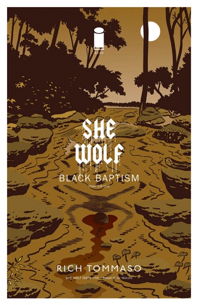
”She Wolf” #5
Written by Rich Tommaso
Illustrated by Rich Tommaso
Reviewed by Kent Falkenberg
I can see another world where Rich Tommaso picked up his itch for cartooning from a drugstore spinner rack, where he snagged a dog-eared “Betty and Veronica Double Digest,” penned by a rather twisted Daniel Clowes who dropped the pair in a D&D manual and sent them to the woods for murder, mayhem and a meeting with Old Scratch himself. This is that kind of book.
Or rather, half of it is.
This issue is cut into two parts. And it’s a hard cut between Part 1 and Part 2. It’s jarring, as the story jumps from a pair of teenage outcasts searching creek beds for salamanders and shoplifting porno to a band of warriors storming a skeleton-lined temple on a rocky, storm-beaten atoll. But Tommaso deftly closes out both parts with the reveal of a titular lycanthrope, so there’s a bit of a thematic parallel even if it’s not really clear how the two halves line up.
He does heavy lifting all over this book: story, pencils, colors, letters. His wheelhouse is an impeccably framed, cartoony style. For the first half, it’s all clean lines, bold colors and wide-eyed, emotive faces. He stretches panels and action portrait-style across two-page spreads to create a classic, comic strip rhythm. But this rhythm is all a feint. It belies the darkness underneath. This isn’t an idiosyncratic, slice-of-life; this is witchcraft and bestial transformations.
The art change in the second half works – it keeps a sliver of that classic tone, but filters it mainly through the lens of high fantasy. The character designs are hulking and varied enough in costume and body type to play against your expectation of who embarks on this type of quest. But the art plays it too straight, comparatively. It misses the juxtaposition of form and content, that really made the first part sing. On the other hand Tommaso’s dialog for the warriors feels completely natural for the atmosphere of eldritch barbarics – even if the words themselves are completely ridiculous (“I could care less who your lord is. We hold the power of Xaxion… He is the one true lord”). His words for the teenage Lizzie, however, feel much less true to form.
So this issue has some hiccups in the writing. It may take a couple read-throughs for what it’s trying to do to really coalesce – as best it can, there’s a definite element of this book that’s purposefully obtuse. But it sure does look good.
Final Verdict: 6.5 – You don’t need all the pieces to fit together when you start a puzzle, right?
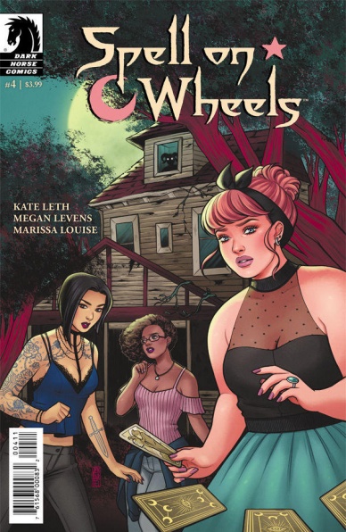
Spell On Wheels #4
Written by Kate Leth
Illustrated by Megan Levens and Marissa Louise
Reviewed by Jess Camacho
“Spell On Wheels” has been, so far, a safe but enjoyable story and with its fourth issue, things move much faster to the ultimate final issue conclusion. The witches, in their travels, come across a legend that they didn’t know was real. What follows is the kind of issue that I wish the entire series had been. “Spell On Wheels” #4 perfectly balances the bigger picture with a short, one off tale. Leth’s sense of humor comes right through this script but each of her main characters have a distinct voice and none come off as abrasive as the previous issue. The flirtations between Claire and the goat man are hilarious but also heartfelt and the cliffhanger ending is also a perfect way to leave things before the conclusion.
Levens continues to do great work with her characters. She’s great at creating the kind of scenery that feels receptive instead of posed. You could open this and instantly see that these characters are close and I love what she does with styling. Each issue has featured something different in terms of styling but the identity each of the witches has hasn’t changed. There are some great early panels of the witches in their convertible that kind of feel like Thelma & Louise in that it’s airy and kind of feels like a fantasy. Louise’s colors, especially the way she creates magic, is well, magical. Her bright palette really works for this story and makes “Spell On Wheels” feel inviting.
Continued belowFinal Verdict: 7.2 – Still a cute and fun miniseries that’ll find a bigger audience when collected.

Spider-Woman #15
Written by Dennis Hopeless
Drawn by Veronica Fish
Review by Alexander Jones
“Spider-Woman” has always been about subverting expectations ever since the relaunch of the series following “Secret Wars.” This new installment carries that tradition, but continues to evoke a darker tone teased in the most recent issues of the series. This story feels personal as protagonist Jessica Drew, a new mother, must learn to suppress her emotions and protect her family.
Dennis Hopeless continues his exploration into Drew’s guilt-ridden headspace beautifully in this issue with art from Veronica Fish. Fish’s page layouts and panel framing continue to toy with the medium of comics with panels naturally bleeding and flowing into each other. Fish’s layouts also continue the series’ tradition of being concise and creative with Hopeless wisely giving his artist room to breathe throughout the series.
Unfortunately, this issue does take a bit of a misstep in cheapening a core plot element introduced a few issues ago. The sudden return of a major player in Drew’s life doesn’t feel earned here. Hopeless is going to have tread carefully in these next few issues of the series or else the book could prove to be slightly offensive with a strange new romantic connection introduced late into the issue. With a cover like “Spider-Woman” #1, this creative team seems wholly unafraid of poking and prodding readers. The comic also shows a noir-influenced flashback sequence that stretches the suspension of disbelief too close for comfort. Despite all the crazy super powers, this comic is a grounded, relatable series that can’t mix in too much mysticism or weird plot holes.
This comic continues to reach deep back into the Spider-Man rogues gallery with villains The Tinkerer, Hobgoblin and more with a unique spin from Fish. She draws no two characters alike and introduces vivid facial expressions on every panel, and VC’s Travis Lanham fills this comic with great lettering. Giving a past “Archie” artist a Spider-Woman comic may not seem like an obvious choice at first, but Fish’s work is wonderfully suited to the subdued tone of this series.
Final Verdict: 7.0 – Spider-Woman’s immediate charm is infectious, even if this issue does a cheepen past plot points.


