
There’s a lot to cover on Wednesdays. We should know, as collectively, we read an insane amount of comics. Even with a large review staff, it’s hard to get to everything. With that in mind, we’re back with Wrapping Wednesday, where we look at some of the books we missed in what was another great week of comics.
Let’s get this party started.

Written by Zac Thompson & Lonnie Nadler
Illustrated by Ramon Rosanas
Colored by Triona Farrell
Lettered by VC’s Clayton Cowles
Reviewed by Matt Ligeti
In the mid-‘90s, the X-Line took a sharp left turn with the ‘Age of Apocalypse.’ There were no more “modern day” X-Titles – everything took place in this alternate dystopian reality.
Over 20 years later, we’re seeing something similar: a new reality, with all the X-Titles spinning out of it. Except here, in the “Age of X-Man,” things finally seem like they’ve worked out for mutants.
…or maybe not. After all, what’s a good story without conflict? We all know how elusive happiness is when you’re in the X-Men.
Thompson and Nadler’s vision for this world is immense and enchanting, with a baked-in edge. While I’m sure they also had input from editors Jordan D. White and Annalise Bissa, their world-building and big-picture thinking are awe-inspiring, and their attention to detail and characterization don’t get lost in the shuffle.
Ramon Rosanas’s “Age of X-Man” designs harken back to that mid-century era that Americans have been obsessed with since roughly around the time Mad Men debuted. This showcasing of “a simpler time” in America mirrors the “Age of X-Man: Alpha” #1’s relation to how many X-Fans talk about the X-Line in the ‘90s – the era when the ‘Age of Apocalypse’ reigned.
Rosanas’s line art is simple and elegant, working well to bring that mid-century theme to life. But his cinematic eye and attention to framing are the less obvious treasure, here. Rosanas gives special attention to his the 9-panel grid design and divides panels with art rather than separating into separate panels to show the shifting interpersonal relationships between characters in ways not made obvious by dialogue alone.
Triona Farrell’s use of a limited palette for this brave new world reinforces the idea of harmony in the comic. The palette also feels inspired by vintage America from roughly around the era Rosanas’s designs seem influenced by. Her thoughtfulness around lighting and shading, to muting colors and breaking the harmonic palette with the X-Men’s entrance (and for plot-related reasons), it all shows she is clearly a top-tier talent.
Clayton Cowles’s lettering work is always exemplary, and that practice continues here. However, he does feel underutilized in “Age of X-Man: Alpha,” where most of the creative needs are in relation to the sound effects.
Long-time X-Men fans talk about the ‘90s and the ‘Age of Apocalypse’ with nostalgic fervor. In 20 years, they’ll be doing the same about “Age of X-Man.”
Final Verdict: 8.0 – “Age of X-Man: Alpha” #1 is a memorable, finely crafted comic even notoriously picky X-Men fans will like.
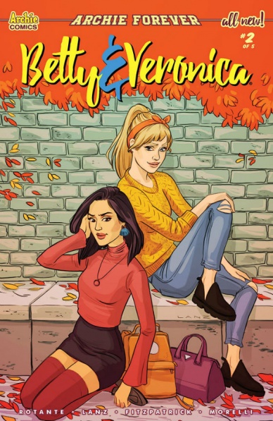
Written by Jamie Lee Rotante
Illustrated by Sandra Lanz
Lettered by Jack Morelli
Colored by Kelly Fitzpatrick
Reviewed by Michael Govan
The senior year of high school is so stressful. It’s a busy time, there’s always something to deal with. On top of schoolwork, students have scholarship essays, campus tours, college applications…did you know there was an application fee? Seriously. My parents (bless their hearts) paid James Madison University about seventy bucks on my behalf just for JMU to respond with a resounding ‘no thanks’.
Maybe it’s my vivid memory of this time that has me invested in “Betty & Veronica”. As they enter their senior year, both ladies are excelling. Veronica is doing great at her internship and Betty is navigating her many extracurricular activities. Senior year has no mercy though and the water’s getting deeper. Betty is losing sleep and overworking herself. Veronica has already secretly been rejected from the university her parents are pressuring her to apply to. Betty’s dad has lost his job which may lead to some economic issues for her. Hiram Lodge is offering to pull strings to get Veronica ahead. The ladies want to rely on one another but are so busy they hardly have time.
Continued belowAll of that fascinates me. The boy drama on the other hand? Not so much. It’s sprinkled throughout but I could do without it entirely. I understand that it’s always going to be a thing for “Betty & Veronica” and the two will be in a love triangle for eternity. Sometimes it’s bearable but I can’t get around it here. Midge is pissed because of her issues with Moose and takes it out on Betty, which isn’t cool. Reggie was involved with Betty despite him being a complete jerk. He may have a heart of gold deep down but ‘deep down’ isn’t good enough.
As always, both blonde and brunette pine after the ginger Archie. They love Archie Andrews because he’s so…charming? Handsome? Maybe on the CW show Riverdale, I can see it. Maybe. Here, I find the attraction funnier than anything else. There’s a panel with a shirtless Archie and flustered girls that Sandra Lanz probably didn’t mean to be so hilarious. Unfortunately, Riverdale’s romantic entanglements hurt this particular issue more than help.
Final Verdict: 6.0 – “Betty & Veronica” shouldn’t get hung up on Archiekins…

Written by Bryan Hill and Matt Hawkins
Illustrated and Colored by Atilio Rojo
Lettered by Troy Peteri
Reviewed by Gregory Ellner
In “Cyber Force” #8, Bryan Hill and Matt Hawkins examine some of the moral quandaries revolving around whether or not it is right to convert someone else into a cybernetically enhanced organism to save their life without their consent. This type of behavior was first seen with Stryker, and to a degree with Aphrodite herself, but looking at it from the perspective of a civilian in its entirety is another thing altogether. Aside from including a fight on the other end of the story, the majority of the plot seems to revolve around Aphrodite and Velocity’s work with Dominique and is all the stronger for it. Rather than being just a mindless romp around combat, this look into the morality of their position helps to keep a higher level of maturity overall without just being a general “fighting a warlord” situation.
Atilio Rojo’s artwork, from pencils to colors, is amazing. Every curve of a form, every bloody slash or shadowed look, all of the glow or shine of machinery, be it electronic signals or metal, plays across beautifully, emphasized by the darkness of the setting itself. Even the relatively emotionless Aphrodite’s emerging rage is shown, as is agony or otherwise anguish from others.
Final Verdict: 7.5- With a mature look into the amorality of life-saving surgery without consent, “Cyber Force” #8 shows the series’ strengths well.

Written by Mark Waid
Penciled by Jesus Saiz, Kevin Nowlan, Butch Guice, Tom Palmer, and Daniel Acuna
Inked by Jim Campbell and Carlos Lopez
Lettered by VC’s Cory Petit
Reviewed by Alexander Jones
“Doctor Strange” #10 is a curiously structured issue that works incredibly well. The title is a special anniversary issue for the good doctor, doubling as the 400th regular installment of the series when counted together with previous Doctor Strange titles. Current series writer Mark Waid is responsible for the scripts of each portion of the issue and the entire issue has a great flow and pace. The main feature brings the events of a series towards a dramatic key moment that previous installments have been teasing.
Waid’s script does a great job capturing so many interesting aspects about the character and grounding the big story into the overall nature of his run. Waid follows up on the intergalactic elements of the series by showing where some of the aliens from previous issues came from. Waid starts to reveal his hand and pieces the threads of the series together. When the script stitches a thread from the first couple chapters, Waid’s explanation is cohesive and fascinating. “Doctor Strange” #10 takes a big risk that could have stained previous entries of the series if it was not executed properly.
The entire issue looks beautiful. Jesus Saiz’s pencil style is a great fit for “Doctor Strange,” capturing the kinetic and fast-moving action of his world. Saiz’s regal approach to the pencils and tone of the series excellently captures the emotion of the series. Saiz is in his prime and deserves a spot among some of the best creators currently drawing Marvel comics. Saiz takes really fantastic risks with page layout and design. Despite mixing so many genres together in the script, Saiz’s slick pencils carry a cerebral nature grounding the script in reality.
Continued belowThe supplemental stories in the book retain an impressive level of quality and add to the nature of the series. Waid writes all the scripts and features a fascinating retelling of Strange’s origin with excellent pencils from Kevin Nowlan. Tom Palmer draws a shockingly beautiful double-page spread referencing key Doctor Strange moments. Waid also tells a charming story with noir artist Butch Guice that carries a sweet ending. Daniel Acuna’s pencils on the last entry are really imaginative and stretch his talents with great page layouts and a mind-bending script.
Final Verdict: 8.4 – “Doctor Strange” #10 is a wonderful celebration of the hero worthy of the milestone numbering placed on the cover.

Written by Bryce Ingman, Hunt Emerson, Kek-w, Mark Rahner, Carol Lay.
Illustrated by Alan Robinson, Hunt Emerson, Lee Carter, Greg Scott
Colored by Felipe Sobriero, Michael Garland
Lettered by Rob Steen
Reviewed by Tom Shapira
I am probably the right audience for this book seeing as I like Edgar Allan Poe, I enjoy a dose of terror every once in a while and I have no formal objection to snifters. And in terms of packaging one cannot complain – this book certainly strives to give you your money’s worth, with two stand-alone stories, the first chapter in a new serial and two short text pieces. In an age of comics issues feeling like snacks, this felt like a three-course meal.
Yet the actual stories themselves are not without their faults: the problem with Edgar Allan Poe is that he has been adapted so many times, in so many formats that it is hard to bring anything new or interesting to his work. This is the case in a particularly rushed adaptation of “The Murders in the Rue Morgue” that runs through all the familiar beats in order to reach a rather adolescent punchline. not helped by uninspired artwork from Alan Robinson.
“Some Words with a Mummy,” the other major story in this issue, does a little better with its modernized version of the comical original – dragging the poor mummy into 21st century America. It’s rather broad in its satirical approach, taking a shotgun to evangelical pastors, corporate culture, gun culture, the current president and every other obvious target; but I got to admit it got a chuckle out of me with the line “I was beginning to suspect that this mummy might be liberal.” Greg Scott certainly rises to the occasion better, selling the exaggerated character reactions.
Lee Carter’s lively art, all shining colors and odd reactions, is the one of the best in the issue. The story it is presented in, part one of “Le Duc De L’Omlette,” is rather oblique; but there are few better than Carter in working with oblique – his red poodle of terror straddles the line between funny and genuinely weird. But the artistic star is Hunt Emerson who gets two pages to turn Poe into a Loony Tunes cartoon and does a damn fine job of it; we just don’t get enough decent slapstick in American comics nowadays.
Final verdict : 7.0 – There are ups and downs but overall it is more fun than not.

Written by Ryan Cady
Illustrated by Andrea Mutti
Colored by K. Michael Russell
Lettered by Troy Peteri of A Larger World
Reviewed by Elias Rosner
The first arc of “Infinite Dark” comes to a close, cementing what was real and what was induced in the minds of the characters, and providing what could have been the end to a mini-series instead of just the first arc of an ongoing story. The tight resolution to the narrative arc begun in issue 1, as well as the thematic and character arcs, is refreshing, as volume one can operate on its own or as a part of a larger whole, which is ideal for a serialized story. However, the effectiveness of this resolution is up for debate.
The final pages of issue #4 leave a lingering sense of emptiness, despite the intriguing hook for issue #5, which is appropriate for the story being told, but the emotional impact of confronting the horrors of the creature from the outside should have hit harder. Perhaps it doesn’t hit as hard as it should because of the shortness of the arc, or perhaps it is because so much of the previous three issues were building up the claustrophobic tension, the final confrontation between the creature and Deva was bound to fall a little flat. It is there more as a manifestation of Deva’s own fears than as any true “big bad.”
Continued belowThat said, the design of the creature and the way it moves is haunting. Mutti & Russell imbue it with an oppressive presence, with red eyes, a lamprey mouth, and an ever-shifting form with tendril-like fingers, truly making it appear otherworldly and yet familiar enough that the in-universe explanation of its appearance holds water. This design stands in stark contrast to the people, however.
Mutti’s strong suit has always been environments and not people, who always appear to be more plastic and disinterested than they should. However, the coloring helps to compensate for this and Mutti seems to be aware of these shortcomings, utilizing the darkness and harsh, varied lighting to obscure faces in clever ways or position them so they are able to emote more than they otherwise would.
This contributes to that sense of emptiness, as connecting emotionally to these characters has been difficult, but the terror and stress they have felt has always been palpable and thanks to that, the relief felt at the end allows for a release that offers a satisfying conclusion before the story takes its inevitable U-turn back into the nameless, terrible emptiness.
Final Verdict: 7.0 – Despite some artistic hangups, “Infinite Dark” #4 wraps up everything it needed to in a satisfying manner while providing enough of a hook that the next installment can’t come soon enough.

Created by Jhonen Vasquez
Written by Sam Logan
Illustrated by Kate Sherron
Colored by Fred Stresing
Lettered by Warren Wucinick
Reviewed by Ken Godberson III
A great injustice has been committed and either Dib or Zim are responsible. But not to worry, no truth can escape the watchful eye of INQUISITOUS THE OBSERVER!
“Invader Zim” #39 is a one-shot story that is a parody of those cosmic “Watcher” characters in superhero comics like Uatu and the Monitors, just with a nice coating of Zim weirdness over it. After the destruction of his SON (Sentient Observation eNvoy), Inquisitous uses his super advanced, goo-based technology to read the minds of Dib, Zim, Gaz, and Gir to find out the truth. The recollections are what you’d expect, Dib’s being the closest to normal, Zim skewering the event into making himself the good guy, Gaz… not caring one bit about any of this and Gir… well…
The strength of this book comes from Kate Sherron and Fred Stresing capturing the likeness of the Jhonen Vasquez’s cartoon so well. The sharpness to the character designs and character motion. The visual over-the-topness of it all. And while there aren’t any horrifying things in the book, it is the double-page spread look into Gir’s mind that gets everything to go absolutely weird. It’s an absolutely stuffed with every bit of madness that makes Gir the weird bot that it is and it’s a plethora of easter eggs. That brief glance into his mind helped elevate the issue while also allowing the art team to show off.
In the end, this one-shot is a bit of a breeze. It does a fair job parodying the Cosmic Observer trope, even if the script perhaps isn’t as strong as its artwork. It’s also not some grand work; it knows exactly what it wants to be. And Invader Zim was never shy about being what it wanted to be, and neither should the comic.
Final Verdict: 6.0 – A decent parody of cosmic watchers elevated by some really good artwork.

Written by: Cullen Bunn, Clay Mcleod Chapman
Illustrated by: Guillermo Sanna, Francesco Manna
Colored by: Lee Loughridge
Lettered by: VC’s Travis Lanham
Reviewed by: Kelly Gaines
“Journey into Unknown Worlds” is a Sci-Fi anthology title rooted in the 1950s. Classic issues boasted the talents of comic juggernauts like Steve Ditko and Joe Kubert who gave life to some of Marvel’s zaniest and most imaginative creatures. “Journey into Unknown Worlds” #1 carries on the grand tradition ambitiously. Ambitious, yes, but also regrettably flawed. The issue includes two separate sci-fi tales depicting terrifying creatures and helpless victims, not unlike its 1950s counterpart. The trouble arises in what stories were paired for this first issue.
Continued belowThe first story, ‘Bones of the Earth,’ follows desperate humans risking everything to fend off an alien invasion in the Ozark Mountains. The second, ‘Chrysalis,’ introduces an awkward boy scout determined to flee from his bullies while on a camping trip to the Blue Ridge Mountains. He soon finds that aggressive middle-schoolers are not the scariest thing in the mountains when he discovers a recently landed alien. Both stories, alone, are artistically and narratively sound. When presented as a unit, their similarities make them difficult to differentiate between.
Both are alien invasion tales set in mountain regions. Both sets of victims are subjected to horrific body-altering attacks. Frustratingly, they also utilize similar color schemes of black, dark blue, and purple. The color scheme is not a deal-breaker and the art-styles are both visually satisfying, but the nearly identical elements make the stories feel as though they bleed into one another and take away from the individual merit they deserve. In fact, more than two pages into ‘Chrysalis’ it was not clear that the story was not a continuation of ‘Bones of the Earth.’ There is a clearly captioned “End.” in the last panel of ‘Bones of the Earth’ but ‘Chrysalis’ starts with such a similar feel, “End.” has questionable finality.
It is certainly possible that Journey books are meant to include aesthetically and thematically similar stories. Many great anthologies have bold variety connected by common themes, genres, or purposes. ‘Bones of the Earth’ and ‘Chrysalis’ can easily be mistaken for parts of the same story. Even so, the creative teams should be proud of their work. Short anthology issues are always a pleasure, even if the pairing was a little too complimentary to give the individual stories the attention they deserve.
Final verdict: 6.0 – The crazy Sci-fi vibe is definitely worth the journey, but mind the gap between the first and second story.
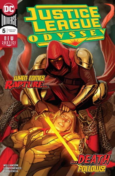
Written by Joshua Williamson
Illustrated by Carmine Di Giandomenico
Colored by Ivan Plascencia
Lettered by Deron Bennett
Reviewed by Gustavo S. Lodi
“Justice League Odyssey” is a series not without its production challenges. Part of the ‘New Justice’ banner, the original plot had to be adjusted given storylines happening elsewhere on the line, which ultimately led to the exit of the original artist, Stjepan Sejic, from the book. If all of that is prologue by now, issue #5 seems to finally catch up with the original mission statement for these heroes in space.
The art by Giandomenico (pencils and inks) and Plascencia (colors) work so well together than one might mistake it being done by a single artist. If Giandomenico is an expert at pulling the camera way out and show the scope of what is happening, Plascencia then adds further layers to reveal how outlandish all of it really is.
The same partnership is effective on the quieter moment of “Justice League Odyssey” #5, especially towards the beginning when Azrael is reminiscing of his past in Gotham City. Facial expressions and softer nightly touches work as beautifully as the outer space sequences later on in the issue.
Back to the plot, Williamson seems to really have hit his stride on how this series connects with the broader DC canvas. “Justice League Odyssey” #5 is a book better appreciated for readers who also got “Justice League Annual” #1, especially on how the big payoff and ultimate reveal occurs within. It can be appreciated on its stand-alone basis, but it looses power without full context.
Also, for all the good Williamson does with some characters on the series, especially Azrael and Starfire, others seem either delegated to a second fiddle role (Jessica Cruz), or outright acting in ways that require a bit too much in terms of suspension of disbelief from its audience (Cyborg).
All in all, this issue is the best of the series so far, apparently moving past the shackles of the course-correction that seemed obvious up until issue #4. If a bit more development and layers to some characters are added, this could be just as strong as it sister titles on the ‘New Justice’ line.
Final Verdict: 7.2 – While not without its flaws, “Justice League Odyssey” #5 amps up its game and sets the board from some unique events going forward.
Continued below
Written by Donny Cates
Penciled by Kim Jacinto and Travel Foreman
Inked by Kim Jacinto and Richard Friend
Colored by Matt Milla
Lettered by VC’s Cory Petit
Reviewed by David Craig
After five issues of intrigue and mystery, it’s time for Donny Cates to deliver the goods in the final installment of this commemorative miniseries. If comprehensive answers were what you were looking for here then you may well be slightly disappointed, but “Marvel Knights 20th” #6 is nonetheless a joyous celebration of a revolutionary line of comic books.
The issue opens with a stunning page from penciler Kim Jacinto, depicting our street-level heroes in peril as a band of nefarious villains close in around them. Everything from the desperate facial expressions to the superb use of shadow creates a real sense of danger, which continues across the next ten or so pages as the monstrous Kingpin prepares to make his move. Unfortunately, this build-up of tension is so well done that the ensuing battle feels somewhat anticlimactic by comparison. The action is fluid from panel to panel and there are a couple of nice moments, but ultimately the tension dissipates all too quickly.
Cates’s narrative shifts in focus about halfway through, marked by the passing of pencil duties from Jacinto to Travel Foreman. While the pair certainly has distinctive styles, the rapid plot developments help to make this transition relatively seamless. Cates provides the same brisk pace and punchy dialogue that characterizes much of his Marvel work, but as previously mentioned the ending to “Marvel Knights 20th” disappoints slightly in how it withholds some of the answers the series had been teasing.
That said, those who have fond memories of the original Marvel Knights line-up will probably find plenty to enjoy here regardless. The touching depiction of Karen Page should be pleasing to Daredevil fans, while the inclusion of The Sentry is a respectful nod to one of the imprint’s more divisive creations.
While it could easily be argued that the central mystery of this series feels somewhat unresolved by this final issue, “Marvel Knights 20th” succeeds at marking the anniversary of a daring run of comics that are still held dear by many readers. More stories in this continuity would be welcome, but if that doesn’t happen then this miniseries can very much stand on its own, encapsulating the spirit of these characters and the Marvel Universe as a whole.
Final Verdict: 8.2 – “Marvel Knights 20th” #6 may not be a tidy conclusion to this mystery, but it’s an entertaining ride and a charming salute to a part of the publisher’s history.

Written by Adam Glass
Illustrated by Ryan Benjamin & Jose Luis
Inked by Richard Friend & Jordi Tarragona
Colored by Hi-Fi
Lettered by Rob Leigh
Reviewed by Chris Egan
“Teen Titans” Annual #1 is told as a two-part story lightly tied to arcs from “Teen Titans” #23-24 and “Heroes in Crisis.” Part One: ‘Robin vs. Robin’ has Damian and Jason meeting in a bar, speaking half-truths and suspecting each other of wrong-doing against both the Bat-family and the Teen Titans. Glass’s dialogue is taut and full of venom as both heroes are motivated by the right thing, but are poised wrongly against each other as the real villain of the piece – an unseen ‘The Other’ is most likely laughing somewhere in the dark. The trio of Benjamin, Friend, and Hi-Fi make the action brutal, gorgeous, framed and paced like a John Wick-style action flick. It is the best-looking chapter of this issue.
Part Two: ‘Joy to the World’ is set in the same 24 hours as part one, but focuses on the rest of the Titans going against teen villain ‘Joystick’ a video-game obsessed meta-human who can take control of anyone he touches. The team confronts him among the hustle and bustle of holiday shopping and find him to be more of a threat than they expected. Fun action throughout, with Glass’s writing, again being the highlight. Luis and Tarragona’s pairing makes for a nice looking arc that suits the lighter fare, taking on a more cartoonish style. Hi-Fi’s colors elevate the entire style to something better than it might have been, but part one takes the cake in this annual.
This year’s “Teen Titans” annual relies heavily on its dialogue and whip-lash inducing action to effectively raise the tension between Jason Todd and the current Titans roster, as well as setting up future problems for the team. Casual readers can absolutely pick this up for a quick, enjoyable read, but long-time fans will be more in the know when it comes to the greater plot threads at hand.
Final Verdict: 7.5 – “Teen Titans” Annual #1 is full of solid action and stake-raising dialogue with greater darkness just out of sight. Even with ties to recently passed story-lines, it is still an exciting book for readers new and old.


