
There is a lot to cover on Wednesdays. We should know, as collectively, we read an insane amount of comics. Even with a large review staff, it’s hard to get to everything. With that in mind, we’re back with Wrapping Wednesday, where we look at some of the books we missed in what was another great week of comics.
Let’s get this party started.

The After Realm Pages 1-12
Written by Michael Avon Oeming & Taki Soma
Illustrated by Michael Avon Oeming
Colored by Taki Soma
Lettered by Michael Avon Oeming
Reviewed by Michael Mazzacane
“The After Realm” is a new webcomic from Michael Avon Oeming and colorist Taki Soma, set in a post-Ragnarok fantasy realm as the elves begin to venture forth and map the newly reconstructed realms. To support this series, the creative team is funding through Patreon, with backer tiers for notes, sketches and the like. The first goal of upping the page count from 4 pages a month to 6. “After Realm” will be free to read on the website.
To help jump start things, Oeming and Soma have released the first 12 pages (and a nifty animated cover). It does as good a job as one can hope for in setting up the world and the character stakes in that span of pages. They smartly use broad fantasy and sci-fi tropes of a post-apocalyptic landscape which is beautifully represented on the first page as an ouroboros-esque view of the planet. The use of retrospective third person narration from the character of Oona Lightfoot also helps to bluntly set things up. The narration is a little overly ominous right now, but that’s also the point. It quickly develops Oona Lightfoot and her desire to be a ranger and go out into the realms, escaping the isolationist and conformist nature of her society. Comics as a narrative medium don’t get to create nuance and ambiguity quickly, it’s only developed over many, many, pages. “After Realm” isn’t there yet, but I’d rather have something clearly give me the dramatic 5W’s than meander about in a narrative quagmire.
That kind of writing fits with the cartooned style of Oeming. His figures are distorted and dramatic, the trees that litter these early pages are a cartooned expressionism. While I tend to prefer the strip approach to webcomics, Oeming’s page layout is often free flowing or visually tied together with endless not quite Celtic knotting that give help support the dramatic character design and coloring. The use of heavy black gives characters as much form as their line work. That black is an interesting base layer to contrast and amplify Soma’s colors pallet with. Oeming and Soma are taking the aesthetic and pallet of “Murder Inc.” and applying it to fantasy in some interesting ways. Sure, there are some traditional high fantasy tones, but these are often used on the scenery. The pallet for the figures is non-traditional. The elves are blue, purple and red depending on the scenes. Oona has this bright red hair which contrasts with her cool skin tones and purple boots. All together the creative team makes for a novel appearance for some standard genre tropes.
Final Verdict: – 7.5 – Webcomics are about slowly building momentum as pages are added over time. “After Realm” is off to about as good a start as one could hope for in only 12 pages.

Avengers #678
Written by Mark Waid, Al Ewing & Jim Zub
Illustrated by Pepe Larraz
Colored by David Curiel
Lettered by VC’s Cory Petit
Reviewed by Matt Lune
There’s nothing especially wrong with this latest chapter of “Avengers No Surrender,” the big Marvel “not an event” event series, and it’s always a good week when we’re treated to new Pepe Larraz art, but following on from the first three chapters, this issue is a little underwhelming.
The teams have split up and going struggling to keep up with the various battles between the Lethal Legion and the Black Order, and while the generic MacGuffins get revealed in this issue, there’s still no real explanation as to how and why this is all happening. That’s not quite as frustrating, however, as one of the bad guys literally explaining that this is all a game, and not one person thinking to go “oh, so it’s the Grandmaster then?” This is exactly his M.O, and quite why no one has figured that out yet is anyone’s guess.
Continued belowThe issue is pretty much one big fight sequence, with Falcon figuring out that it’s probably best to let the bad guys sort it out amongst themselves (the smartest thing anyone does all issue,) but there are a few tantalising moments that tease what’s to come, mainly the moment where Vision is very briefly unfrozen and has no idea who Voyager is. The issue ends on a similar cliffhanger to last week’s issue, except there’s less chance of the character involved being killed because they are a prominent player in another book.
Larraz is pitch perfect for this series. His classic superhero stances and dynamic expressions make for a thrilling issue, and even though there’s a lot going on there’s a clarity to the action thanks to clean linework and a well-defined inking style. Panels explode outwards on almost every page, and the composition is designed to lead you elegantly through even the densest of character-filled scenes. Similarly, Curiel’s colors are bold and fill the page with a vibrant energy that such an epic knock-down drag-out superhero brawl requires. The close-up shots of – for example – Rogue, or Scarlet Witch are colored beautifully too, giving them an almost classic Hollywood lighting that adds depth to the emotional beats.
This is shaping up to be one of the more enjoyable mini-events in Marvel’s recent history, and how memorable it will depend on the weight of the story beats along the way. This is sort of a chapter between chapters, which is probably going to be more enjoyable when the series is collected rather than as a standalone unit, but there’s nevertheless a lot going on in a gorgeous looking issue.
Final Verdict:7.0 – This is a whole mess of characters in what’s essentially one big clumsy battle for the whole issue, but it’s still a fun chapter.
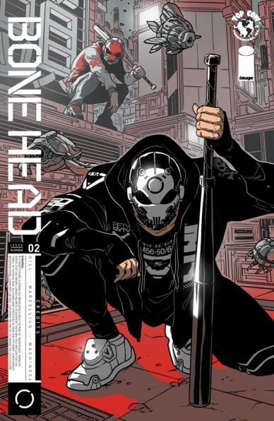
Bonehead #2
Written by Bryan Edward Hill
Illustrated by Rhoald Marcellius
Colored by Sakti Yuwono
Lettered by Jaka Ady
Reviewed by Reed Hinckley-Barnes
While the first issue of “Bonehead” dropped the reader straight into the action, this takes a little time to slow down and explain the world. Though that doesn’t mean the issue is exposition heavy. Really, anything other than another issue that went from front to back with faced paced parkour action would be a slow down from “Bonehead” #1.
The story details given in this issue do help to flesh out the world a little bit. We get a bit of backstory on the scientist that is working with 56, the silent protagonist of the story. With that backstory we also learn a little bit about the world around them, the police system, and the layout of the city. While the first issue kind of lacked a through line to propel the story forward, and make it seem like more than a series of cool parkour stunts, “Bonehead” #2 lays the ground work for future stories, introducing a dangerous drug on the streets and gangs that 56 will have to face.
While this issue does take a little bit more time to explain it’s world, the issue still spends a good number of its pages with the 56 and running and jumping across the futuristic cityscape, and the book continues to look really great. The art is both frantic and clean, giving everything all the action a great sense of movement, while still being easy to follow. The way that 56 communicates to the world, through a series of symbols and emojis, are also really fun. Over all, “Bonehead” #2 brings a little bit of context to the world presented in the first issue, and lays out what this series will be going forward.
Final Verdict: 8.0 – “Bonehead” #2 takes the time to explain its world, but not at the expense of it’s fun action sequences.
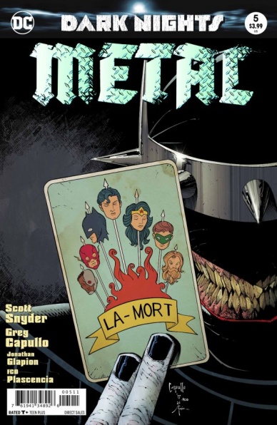
Dark Nights: Metal #5
Written by Scott Snyder
Illustrated by Greg Capullo
Colored by FCO Plascencia
Lettered by Steve Wands
Reviewed by Gregory Ellner
Scott Snyder returns with his patently absurd plotting, and that is meant in the best way possible. From a humorous off-screen encounter with Starro the Conqueror to Wonder Woman wielding the Nth Metal mace of Hawkman, “Dark Nights: Metal” #5 moves very fast to be as flat out fun as possible. That is not to say that it is too rapid, nor that there is actually all that much in the way of forward movement when compared to earlier issues. Events at the Forge of Worlds only progress very slightly, and relatively little happens at the site of the Anti-Monitor’s astral brain either.
Continued belowStill, the focus in on moments rather than grand, sweeping plot lines allows Snyder to delve into some of the mysteries he had been building up, not in the least being what the importance is to the Plastic Egg. Furthermore, the high focus on moments of intensity leads to the sheer horror on display with the Batman Who Laughs having believable potency, rather than being played out, and adds to the tension of the approaching conclusion.
Greg Capullo does a good job with the dynamic action of the issue, as he did with his earlier work on Snyder’s “Batman” run. Readers can almost feel the mace strike its target, can grasp the terror that comes with the arrival of the Dark Knights in various locations. This quality does not lessen in quieter moments, either, such as close-ups of the Batman Who Laughs seeming like something out of a slasher movie. There are some odd expressions, such as Wonder Woman’s bemusement regarding the mace after its use, but on the whole the art does add a lot to the story itself, and FCO Plascencia’s use of a variety of shades and hues in the coloring further demonstrates the dynamism or drama of each scene.
Though not without its flaws, “Dark Nights: Metal” #5 helps to shape what hopes to be a very satisfactory conclusion.
Final Verdict: 7.5- Though there are some oddities in the artwork, “Dark Nights: Metal” #5 does a good job of following up the preceding issue while answering some lingering questions before the coming finale.
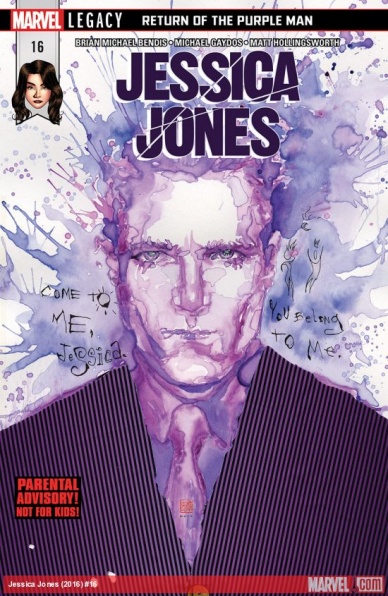
Jessica Jones #16
Written by Brian Michael Bendis
Illustrated by Michael Gaydos
Colored by Matt Hollingsworth
Lettered by VC’s Clayton Cowles
Reviewed By Kate Kosturski
We’re in the homestretch of Brian Michael Bendis’ run on Jessica Jones (his final issue will be #18, due out in March), and we’re certainly going out with a bang. After an attempt to take out the Purple Man fails miserably, he takes control of the Avenger most near and dear to Jess: Captain Marvel. As Carol/Purple Man and Jess attempt to hash out their past, present, and future, Jess is battling out what this relationship means in her own mind – – which leaves her vulnerable to the briefest of takeovers. But this is a changed Purple Man – – and is his offer to “fix the world” with Jessica’s help genuine, or another ploy to control her?
One of the things I have loved about this comic, especially this particular arc, is its distinction from the TV show. It’s more Jess’ mental and emotional torment than superhero stuff, and it provides a nice complement to the Netflix show. Some of the promo images for Season 2 hint at this storyline, and I wonder if it will be explored more in depth on the small screen. Capturing the nuance of mental distress can be difficult in a two dimensional medium; Bendis and Gaydos use words and art to really take the reader inside Jessica’s tortured mind beautifully, with numerous asides and piercing glances that let you know exactly what’s on Jess’ mind, even when a single word hasn’t been said. Matt Hollingworth’s colors are still a highlight of the series; surprisingly, he hasn’t made me tired of purple yet, even when the second half of the book is bathed in it. That’s testament to knowing when and how to use such a bold shade, and in what proportions. In particular, I love the iridescent look of Carol’s eyes while under the Purple Man’s influence; it takes what can be a soothing shade and amps up the sinister to 11. Praise is also due to David Mack’s cover art; issue after issue, he renders watercolor technique so beautifully, a contrast to the darker, gritter art of Gaydos and Hollingsworth within the main page.
I’m hopeful that the new creative team coming in very soon will be able to keep up this high quality in narrative and art; with the second season of Jessica Jones due to drop with the final issue of this current team, all eyes are going to be on Alias Investigations. They have some big shoes to fill.
Continued belowFinal Verdict: 8.0 – I’ll be sad to see Bendis go, but he’s certainly going out with literal and metaphorical guns a’ blazin,.

Moon Knight #191
Written by Max Bemis
Penciled by Jacen Burrows
Inked by Guillermo Ortego
Colored by Mat Lopes
Lettered by VC’s Cory Petit
Reviewed by Matt Sadowski
Contains minor spoilers
Moon Knight has an “off day” as he finally faces off with Sun King and Bushman. #191 picks up immediately after last issue’s revelation that Jake Lockley had a secret daughter with long-time love interest, Marlene. We open on two panels of Diatrice’s crying face and Marc’s shocked expression—the truth is out, and it will change everything moving forward.
Khonshu narrates over the first page’s quiet opening before violence erupts, as Marlene’s home becomes the unfortunate battleground. The fight is decidedly average, but some humorous moments elevate it up a notch. Flaming pants are thrown, Moon Knight fights in his skivvies, and jabs are taken at Marc’s sanity. Bemis’s run on “Moon Knight” may be the funniest yet. Other moments of levity lighten the mood. We learn the cause of Bushman’s overeating and Marc and Diatrice bond over a Dazzler record (and not Katy Perry).
The introduction of Diatrice last issue was a surprising detour for “Moon Knight” to take, but the new father and daughter dynamic works surprisingly well. Marc plays the quasi-avuncular figure to his biological daughter, sidestepping the ludicrous reality of the situation (life is complicated when you have dissociate identities). Their conversation is appropriately cute, as she’s baffled by Marc’s likeness to her “Uncle Jake” and bemused by Moon Knight’s curious status as a superhero.
Meanwhile, inside Marc’s head, Cthulu and “God” make a surprise visit as Khonshu bemoans his iconic daddy issues that recontextualizes the big bad sun god, Ra. Panel borders are warped like Marc’s mind. Green and yellow color schemes give off a sickly tone, separating these dreamlike pages from the rest of the issue. Art on the series remains consistently good, if not great. Some sound effect lettering greatly assists the action sequences such as when Marc’s fiery pants WHUMP upon Sun King’s face, incorporating two tendrils of smoke curling up into its “U.”
The current team’s fourth foray into “Moon Knight” doesn’t capture the same highs as previous issues but its cliffhanger, though downright random, will have fans eager to return for more “Moon Knight” madness.
Final Verdict: 7.0 – “Moon Knight” has an off day, a fan favorite returns, a new dynamic is explored, and a villain becomes generic in a comparatively average issue.

The Silencer #1
Written by Dan Abnett
Penciled by John Romita Jr.
Inked by Sandra Hope
Colored by Dean White
Lettered by Tom Napolitano
Reviewed by Gustavo S. Lodi
“The Silencer,” the second series to launch under DC’s ‘New Age of Heroes,’ narrates the story of Honor Guest, a skilled assassin trying to live the ordinary life. This inaugural issue is effective in setting up her backstory, motivations and skills, even if the story elements have been seen many times in other similar tales.
Before discussing the script, emphasis should be placed on John Romita Jr’s pencils. A big push of the ‘New Age’ publishing line was to have top-tier artists as creators and delivering their A-game. And Romita certainly does so. His action sequences (especially the one in a parking lot) have an intense flow and energy to them, with movement lines that frame Honor’s fighting styles. The quieter moments at home are also very well done, with an attention to details and backgrounds that one might not associate with Romita. Nonetheless, critics of his blocky and angular style will remain offended with this issue, as all characters seem to have been cast from the same forge and Ben (Honor’s young son) changes his head-to-body proportion throughout the issue.
Abnett’s script, while not innovative in terms of origins and reveals, does offer enough interesting concept twists to keep readers interested. Silencer’s power set includes an ability to generate sound-cancellation zones, which are put to good use offensively and defensively. Honor’s banter with her husband Blake was a nice pace changer halfway through the issue, setting up a false sense of normalcy for the character’s life. And a surprise dinner guest – who shall remain unspoiled – introduces a new take on the life insurance business. This issue is, at the same time, amusing on its dialogue and intense on its battles. A special nod to Dean White on colors, who presents a very interesting effect around Honor’s noise-cancelling powers that will likely remain a hallmark of the characters as her story progresses.
Continued belowFinal Verdict: 7.0 – “The Silencer” #1 is a good first issue, providing enough context to keeps readers invested, but without relying on an overabundance of plot elements. John Romita Jr’s art is dynamic as ever, but detractors of his work won’t find much here to change their minds.

Stretch Armstrong and the Flex Fighters #1
Written by Kevin Burke and Chris “Doc” Wyatt
Illustrated by Nikos Koutsis
Colored by Mike Toris
Lettered by Christa Miesner
Reviewed by John Schaidler
Based on the animated series by the same name, “Stretch Armstrong and the Flex Fighters” features three high school pals who became superheroes when they were accidentally exposed to the experimental chemical flexarium. Subsequently, each of them assumed a secret identity and went to work for Rook Unlimited (the world’s biggest tech company) in order to protect their hometown (Charter City) from whatever pose a threat to its peaceful (if bland) existence.
Conveniently, as the story opens the titular narrator (Jake “Stretch” Armstrong) immediately breaks the fourth wall to address the audience directly and relay this crucial backstory. He also tells us about his tightly packed after school schedule that leaves him very little time to himself, much less saving the world. Between track practice, volunteer peer-to-peer tutoring, cello lessons and homework, he can barely keep up with his planned activities, not to mention his top secret side hustle.
Honestly, at times he sounds quite a bit like Archie Andrews, if Archie had come in contact with some mysterious high tech substance that gave him incredible powers and all of his friends were male. I mean, Stretch is certainly friendly and plenty likable, but he’s also exceedingly earnest and a little too lackluster to carry the load by himself. Fortunately, Stretch’s pals Nathan Park (aka Wingspan) and Ricardo Peres (aka Omni-Mass) add a bit of comedic relief and personality to the mix, but they also feel cut from the same cloth as Stretch. It also can’t help but feel like a huge lost opportunity to not put a girl on the crew to add a varied perspective. Instead, we sort of end up with three versions of the same character.
Visually, the story is easy to follow – which can definitely be a big plus for younger readers or people who are new to comics – but it’s also very straightforward. The paneling is well done and the visual flow is effective, but there are also no real surprises or unexpected flourishes. The character designs are decent, but it’s all a bit simplistic, if not downright predictable. Glance at the layouts and pages and you pretty much get the gist. There isn’t a deeper level. What you see is what you get. Even the coloring plays it safe, with three character costumes in a blue, red and green that feel like they came off the rack.
Narratively, the tone of the piece seems to work and hints at untapped potential, but so far that’s all it is. In order to introduce Stretch and get the series going there isn’t a lot of nuance. This miniseries is listed as only three issues, so it doesn’t seem very likely that we’ll do anything but scratch the surface in this run, but maybe somewhere down the line. Certainly, if nothing else, there’s a lot of room to grow.
Final Verdict: 6.4 The mechanics are competent, but pretty uninspired. There’s something in here somewhere, but the creators need to push themselves to figure out what it is.

Tales of Suspense #101
Written by Matthew Rosenberg
Illustrated by Travel Foreman
Colored by Rachelle Rosenberg
Lettered by VC’s Clayton Cowles
Reviewed by Alexander Jones
With the absence of a typical spy-oriented Marvel story, “Tales of Suspense” from rising star Matthew Rosenberg and the unconventional work of Travel Foreman is an incredibly worthy title to fill the gap of books like “Secret Avengers” have left in the publishing roster. Rosenberg injected the title’s irreverent sense of humor combined with the drama and reveals an action-filled story like this needs in order to stay interesting.
Seeing Foreman in the context of a spy comic destroys some of my preconceived notions of him as a horror artist. Foreman has a definitive style which doesn’t hold him back from linear storytelling. Some panels with Foreman’s more exaggerated anatomy lend the title a strong personality. The only trouble the story does carry from an artistic standpoint is a level of inconsistency from the Winter Soldier and Hawkeye’s strange expressions or faces which look like they belong in an entirely different comic at times. These moments don’t happen too often and getting the unconventional work of Foreman more than makes up for the occasional oddities or inconsistent moments. The action scenes littered throughout the tale also retain a strong sense of momentum and tap into the horror elements very nicely.
Continued belowTeaming up Hawkeye and The Winter Soldier together is an idea that shouldn’t be so novel but one Rosenberg really plays up to an interesting degree. The writer shows the differences between the two characters nicely, furthering the idea books about duos of characters can be interesting. While this issue was a joy to read and one that kept my attention with ease, the end of the chapter houses an incredibly convenient reveal which should not have gotten past a couple levels of the editorial. The identity reveal in the issue is easy, cheap and uninteresting to anyone reading this who knows they’re Marvel history–it also makes the some of the characterization built around Clint Barton seem downright absurd.
While it may not be perfect and the final pages left something to be desired, “Tales of Suspense” #101 is a great substitute for some of the dreary, pulpy Marvel Universe spies. The comic looks great thanks to Foreman’s vibrant sense of style and bold storytelling choices. Rosenberg takes the narrative seriously but isn’t afraid to dial up the Hawkeye jokes amid the serious plot and stylish art.
Final Verdict: 8.8 – “Tales of Suspense” #101 is a fantastic second outing for the series only slightly marred by a predictable ending easily forgiven thanks to beautiful artwork and an amusing sense of humor.


