There’s a lot to cover on Wednesdays. We should know, as collectively, we read an insane amount of comics. Even with a large review staff, it’s hard to get to everything. With that in mind, we’re back with Wrapping Wednesday, where we look at some of the books we missed in what was another great week of comics.
Let’s get this party started.
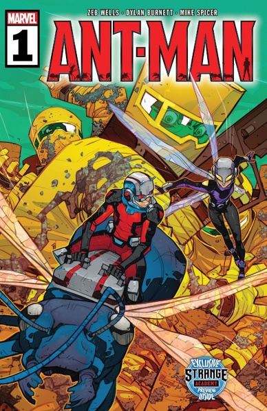
Written by Zeb Wells
Illustrated by Dylan Burnett
Colored by Mike Spicer
Lettered by Corey Petit
Reviewed by Quinn Tassin
After a while without an ongoing book on the Marvel line, Ant-Man is finally back- and this time he’s got a sidekick. With “Ant-Man #1,” Zeb Wells and Dylan Burnett have delivered a fun new status quo for our favorite thief turned hero. The first half of the issue takes us through Scott Lang’s new life- he and his daughter Cassie (AKA Stinger) are working together to thwart evil plots in the great state of Florida but they have a deeply dysfunctional dynamic; he’s also living in an anthill since his security business fell apart and his stint as a Guardian of the Galaxy doesn’t give him any income.
Just as he and Cassie get into a heated debate about his new lifestyle, they’re interrupted by a representative for the beekeepers association. A bunch of bees just went missing and they need his unique skillset (that being talking to insects) to help track them down. In his search, he finds Swarm, a nazi whose consciousness is spread out among a massive number of bees and who can control all bees within a certain radius (welcome to comics). As Scott steals some of the missing bees of Swarm, though, it becomes clear why he was building such a massive body; there are three beings- Vespa (made of hornets), Thread (made of silkworms), and Tusk (made of rhino beetles) that he needs to fight off.
Dylan Burnett and Mike Spicer bring a visual style somewhere between David Aja and a Saturday morning cartoon, matching the energy of the script perfectly. Every piece of the action is dynamic and each character’s physicality feels genuinely distinct and expressive. There are no generic motions or poses here- from Stinger’s stomping through swampland in giant form, to Ant-Man fighting Swarm while wearing bee-armor (this book is awesome, everyone), the art team is constantly delivering.
This whole book is loads of fun and I can’t wait to see where it goes. The character work is stellar, particularly Scott and Cassie’s dynamic. The stakes are fairly small (and I don’t just mean because of the bugs), which is a trait that too many comics are sorely missing today. More than anything, “Ant-Man #1” is a good time. If you’re looking for laughs, compelling characterization, and action you could only find in a comic book, this is the book for you.
Final Verdict: 8.6 – “Ant-Man #1” is a more than welcome (and worthy) return for Scott Lang

Written by James Tynion IV
Illustrated by Guillem March
Colored by Tomeu Morey
Lettered by Clayton Cowles
Reviewed by Alexander Jones
“Batman” is now in a completely different direction thanks to the new creative team. Writer James Tynion IV is crafting a story centered around a mysterious new Batman villain known as The Designer. “Batman” #88 is in the middle of an exciting new story-arc that still has a lot of setups to take care of. Tynion’s script finds a better balance between showing more of the mysteries of the series while keeping The Designer’s identity and master plan illusive. In fact, The Designer does not even appear in this installment but the new Batvillain casts an incredibly large shadow over the pages of “Batman” #88. I’m also incredibly happy to see artist Guillem March returning to the series. March is a much better fit for Tynion’s dark and mysterious Batman arc than the initial series artist Tony Daniels.
“Batman” #88 is attempting to tell a dark and mysterious story and becomes perfect for March’s interior art. March draws shapes and anatomy twisted out of place that causes a sense of tension on the page. March is great at drawing Batman villains which this issue is loaded with. I was thrilled to see how strange March’s depiction The Riddler got in this issue. Eddie is cracking a fierce smile and looks like a guy I would purposefully avoid on the street. The way Batman is depicted in the issue stands in harsh contrast with the villains. Batman looks pristine with his contorted anatomy that is carefully posed. March’s art is incredibly creative and helps Tynion’s scripts achieve a higher level of quality.
Continued below“Batman” #88 teases a slightly tongue-in-cheek but gritty direction for the series. Tynion’s scripts continue to explore the gadgets of Batman and Bruce Wayne as an individual. Tynion also follows-up on some elements from the Tom King run involving Catwoman in a creative scenario. A bulk of the script is devoted to a retcon that is introduced relatively well. “Batman” #88 teases a direction that carries should be generic but March’s art and Tynion’s script finally come together to make a good “Batman” issue. I hope the title will be able to retain this level of quality in subsequent comics.
Final Verdict: 8.0 – “Batman” #88 comes out of the shadow of the previous run and proves that Tynion and March can collaborate exceptionally well on DC’s flagship series.
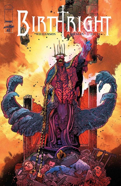
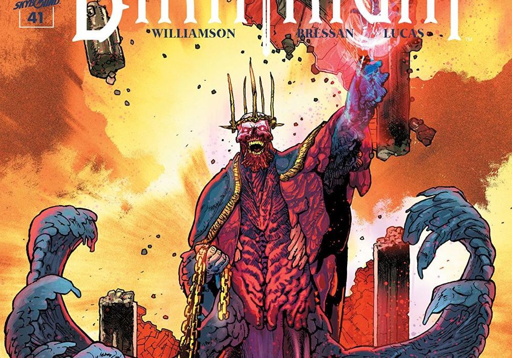
Written by Joshua Williamson
Illustrated by Andrei Bressan
Colored by Adriano Lucas
Lettered by Pat Brosseau
Reviewed by Kobi Bordoley
For the past six years and forty issues, “Birthright” has been grinding us into oblivion with its marquee use of violence, gore, and emotional subterfuge. “Birthright” #41 goes further, and this issue is literally Hell on Earth. No, really: The God King Lore just took the red-eye from Terrenos to Terra, and it’s all business and no pleasure. Someone needs to run the numbers, but it feels like the average decapitations per panel this issue were at an all-time high, across any franchise.
But anyways. This is the penultimate arc of the series, and in a time when books are trending toward thirty total issues, you better have the sauce to justify that extra ten. If “Birthright” #41 is any indication, then let me tell you–it’s got the sauce.
Let’s talk about what sets “Birthright” apart. For most other sword-swinging, a hero is born style stories, the final arcs would be clinical. The protagonist levels up, the villain gets cocky, and after a decisive victory, we get peace, happiness and all that jazz. “Birthright” is different. For the past six years, Williamson has given us the equivalent of Boromir’s betrayal, redemption, and death scene on loop. Basically, a lot happens fast, the stakes are high, and we’re constantly pulled between trust and deceit. We really have no idea how “Birthright” will end, which makes this penultimate arc so compelling. While what goes down in “Birthright” #41 is straightforward, the tables will turn again soon, and that’s exciting.
And then there’s the art. What Bressan and Lucas accomplish in “Birthright” #41 is actually ludicrous. The first half of the comic contains no fewer than seven full-page splashes that are best described as Eye Spy dioramas but for abject, battlefield violence. The colors all skew brown and dark red, but Lucas knows his way around a palette and none of the pictures feel obscured. Every action is readable. These pages breathe, complimenting the direct, upfront story Williamson delivers. Oh, and Brosseau’s grisly lettering is the icing on this murder-cake.
There’s not much else to say. “Birthright” #41 hits, and we’re ready to see how these final chapters play out.
Final Verdict: 9.0 – The doomsday clock struck midnight, then got smashed with a sledgehammer. You need to get in here and read this.

Written, illustrated, and colored by Michael Fiffe
Reviewed by Matthew Blair
“Copra” #5 is a definite labor of love and is part of a creative feat that not a lot of creators have been able to accomplish. Having a single person write, draw, color, and letter a comic can be daunting, but when it works it allows for a substantial amount of valuable creative control. So the question is: is that creative control good for “Copra” #5?
The writing on “Copra” #5 is okay. Since it’s the fifth issue in a series, it is difficult for new readers to get a grasp of what’s going on, but the basic idea is that there’s a group of anti-heroes trying to stop a group of nasty super villains from staging a prison break and summoning something terrible to Earth. The heroes are well humanized, their government overlords are nasty, and the creatures they are trying to stop are imaginative and look brutal and nasty. Basically, if you’re a fan of DC’s “Suicide Squad” you can get the gist of this comic.
Continued belowThe artwork on “Copa” #5 can look confusing to anyone who may not be used to comic books, but once you get the hang of it, it’s a gorgeous comic to look at. The hyper exaggerated, simple line style of the comic makes “Copa” #5 look like a unique, one of a kind story that takes a ton of liberties with anatomy, perspective, and proportions but the whole thing has an incredibly active and raw feeling that makes a lot of sense for the violent, high stakes superhero world that Fiffe has created for himself. The artwork is complemented by a bold color scheme that prefers to keep the color palate sparse, preferring to use massive swaths of color to draw the reader’s eye to certain figures and objects while making sure the story doesn’t devolve into a mess.
“Copra” #5 is a true auteur comic that is part of a series that isn’t afraid to push the boundaries of what a comic should look like and how it should read. It takes the tropes and ideas of a traditional anti-hero comic story and uses it to create twenty-three pages of art that are a joy to view and read.
Final Verdict: 8.5 – While the story and writing may seem traditional, the artwork makes the comic an incredible and unique book to read.

Written by Chip Zdarsky
Art by Jorge Fornés
Colored by Nolan Woodward
Lettered by Clayton Cowles
Reviewed by Tanveer Kalo
Matt Murdock’s still struggling to find his place in the world, especially in Hell’s Kitchen since he hung up the red horns. The issue jam packs Murdock’s Catholic guilt, dirty politics, gangs battling, and a neighborhood caught in the middle.
This issue marked the return of Jorge Fornés on art. Fornés is the artist for urban-based heroes because he beautifully captures every detail of buildings, streets, pedestrians, etc. Fornés makes urban backgrounds into characters rather than just being a backdrop.
Nolan Woodward’s colors and Clayton Cowles’ letters shine through in this issue, especially during the church scene. Both create the emotions laid out by Chip Zdarsky’s writing and build on Fornés’ art.
Chip Zdarsky continues to write some of the best Daredevil stories since Mark Waid and Chris Samnee. He knows how to build dynamic relationships that create strong tensions evident by Matt’s relationship with Mindy in this issue. Zdarsky also knows how to bring out the best of the art team from Fornés’ David Mazzucchelli inspired art on every page to Woodward’s explosive colors during the scenes with Matt’s radar sense. Reflecting on the past issues leading to this issue, Chip Zdarsky has written a layered story that will have a worthwhile climax.
Final Verdict: 7.8 – Tensions rise and the villains close in as Matt Murdock prepares to fight for Hell’s Kitchen.

Written by Larry Hama
Illustrated by Netho Diaz
Colored by J. Brown
Lettered by Neil Uyetake
Reviewed by Joe Skonce
“G.I Joe: A Real American Hero” #270 feels like a cartoon from the ’80s. In fact, despite being such a high number, I never felt like I was missing out on anything by just picking up at #270. While it’s not exactly a self-contained story, it catches you up to speed right away. You got the Joes, a colorful and heightened military unit. They have names like “Wild Bill,” “Psyche-Out,” and “Snake Eyes.” They drive “Joe-mobiles.” They wear colorful garb and seem to fill a large array of military roles ranging from helicopter pilot and paramedic to Ninja. They are fighting Cobra, a terrorist group that wears elaborate costumes and sets up secret bases in community center basements.
The whole issue feels borderline absurd, but it all works. The impressive thing is that Larry Hama is able to juggle different tones effectively. It’s funny throughout, but there are also moments that show the Joes are more than just a military unit, they’re a family. The highlight of the issue is when the unit assigned with Wade decides to carry on with the mission, despite their orders. It’s a moment of bonding, that their bonds with one another are more important than some higher authority.
Continued belowSimilar to the script, the art of “G.I. Joe: A Real American Hero” #270 is a perfect representation of the larger than life world. Scenes inside military bases look like they could be placed in any war movie. But where Netho Diaz’s art shines is in the character designs and vehicles. All of the vehicles are wonderfully absurd, with larger than life guns, vehicle treads, and just the shapes in general. There is one particularly funny scene where Cobra betrays the location of their base by parking their Viper and Hiss tanks outside, betraying the mundane community center they were hiding in. The vehicles look like the toys they were based on and for a comic like this, that’s a good thing. The same goes for character designs. The Joe’s costumes are brightly colored and unique. Diaz also draws dynamic action sequences, which is something you look for in a series as action forward as G.I. Joe. Overall, the art helped to enhance the world of “G.I. Joe: A Real American Hero” #270, which just makes the comic that much more fun.
Final Verdict: 7.0 – “G.I. Joe: A Real American Hero” #270 is a fun romp that feels like watching an episode of the classic cartoon.

Written by Tom Taylor
Illustrated by Jorge Molina
Colored by David Curiel
Lettered by Cory Petit
Reviewed by Gregory Ellner
Tom Taylor excels in the emotional breadth of his storytelling, and “Immortal Hulk: Great Power” #1 is no exception. Rather than try to follow directly in the footsteps of Al Ewing’s “Immortal Hulk,” he creates his own, one-off, very empathetic tale of humor, heroism, and heart that resonates deeply within Bruce Banner, Peter Parker, and a wide range of other supporting characters. Peter Parker being the Hulk is not entirely unique, having been explored at least once before in the alternate universe tale “Bullet Points,” but this usage is very different. Rather than focus on the rage, Taylor instead turns attention toward the various characters’ intelligence and at times laugh-out-loud comedy to give a different kind of shock and tear-jerking moment as the story acts as a kind of breather to separate from the continuing adventures through the Hulk’s nightly escapades.
Jorge Molina’s artwork is very dynamic, with him seemingly effortlessly following along with the varied emotional beats of Taylor’s script. Close-ups and wider shots are used liberally to whatever best suits the emotion of a scene, ranging from a view of eyes to show someone is not alone to a group image for some visual comedy. Together, the effect is very much a classic superhero appearance, helping along Taylor’s take in many ways.
While Molina’s artwork is well-drawn, it would be incomplete without the fantastic colors of David Curiel. Taylor’s writing may give a guide through which to draw, and Molina may shape the story thereafter, but Curiel’s masterful hues and shades truly give life to “Immortal Hulk: Great Power” #1. From the darkest shades of night to the brightest shine of gamma radiation or magic, everything about the colors exudes the sheer empathic intensity brought forth through the combined work on every single panel, every single page. Moments of heroics in the dark seem all the more awe-inspiring thanks to the color choices.
Final Verdict: 8.5 – It may be a one-off, but “Immortal Hulk: Great Power” #1 is still a must-read for fans of Spider-Man and of the Immortal Hulk.

Written by Tim Seeley & Sarah Beattie
Illustrated by Rebekah Isaacs
Colored by Kurt Michael Russell
Lettered by Crank!
Reviewed by Christa Harader
“Money Shot” #4 continues its dialogue-heavy, humorous jaunt through the X-rated cosmos, with mixed results. Quip after quip can bog down the reader in the balloons, and the alien world plot is a bit too complicated to carry off the simultaneous sarcasm and porn jokes. The book shines when it gets to the human relationships and the tenderness underneath, but it’s a bit of a journey to get there.
Isaacs’s art is fun, bubbly and cheerful, and Russell’s colors compliment the line. The world’s a good blend of dusty arena combat and aquatic hues, and Isaacs plays with some fun compositions in certain parts of the book. There are a few pages that boast a bit too much white space – no doubt to try and balance some of the wider shots – but overall, “Money Shot” succeeds because of the visual harmony, creature design and character the art team brings to the page. Crank! uses a font that’s a touch too wide for the amount of padding in the balloons, but it suits the sci-fi vibe pretty well.
Continued belowOverall, “Money Shot” #4 is a touch too complex and weighty to pull off its zany vibe, but the book’s also got heart and that does factor into our overall enjoyment.
Final Verdict: 7.0 – “Money Shot” #4 digs into dialogue but maintains its emotional core.
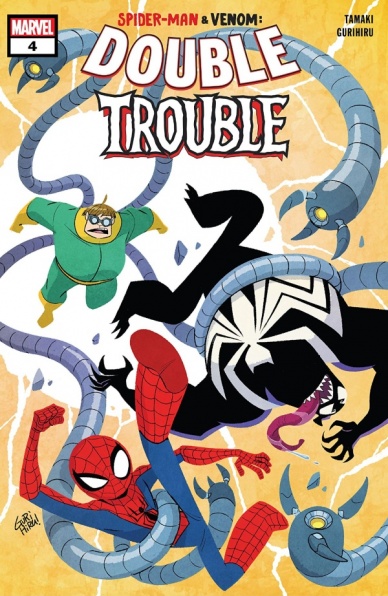
Written by Mariko Tamaki
Illustrated by Gurihiru
Colored by Gurihiru
Lettered by VC’s Travis Lanham
Reviewed by Jodi Odgers
Spider-Man and Venom are in the bodies of a cat and a squirrel respectively. With the help of Ghost-Spider, they have to go to a pizza festival to hunt down their original physical forms. They lost these in an accident when Spider-Man (in Venom’s body at the time) crashed the Green Goblin’s glider into a matter-manipulating weapon that Venom (then inhabiting Spider-Man’s body) won on a television game show.
Tamaki and Gurihiru have created an incredibly charming and wholesome all-ages tale for fans of Spider-Man and Venom. The entire run of ‘Spider-Man and Venom: Double Trouble’ feels like it could have come directly out of a young child’s imagination while they play with their favorite superhero toys. Everything sparkles with excitement, with not a hint of the complicated sentiments that are found in normal superhero fare. Spider-Man and Venom are roomies, they’re in a pickle because Venom did something bad, and now they need to fix the problem.
Sometimes all-ages books suffer from not having enough story in them to warrant repeated reads (or any reads at all if you’re an adult). However, the team behind ‘Spider-Man & Venom: Double Trouble’ have a clear, elegant vision for the tale that they want to tell, and they have executed this admirably. Gurihiru’s art style suits the story perfectly. All of her renderings are exaggerated, and her colors are bright and simple. This results in some eye-catching visuals that add to the sense of fun dripping from each page of the story.
Don’t pick up ‘Spider-Man & Venom: Double Trouble’ #4 expecting a complex narrative filled with graphs and charts. Do pick it (and the rest of the issues in the run) up if you are looking for a breezy, buddy comedy romp that the young people in your life will treasure.
Final Verdict: 7.3 – An all-ages story that will be a highlight of any school library, with enough in it for adults to enjoy too.

Written by Greg Pak
Illustrated by Raffaele Ienco
Colored by Neeraj Menon
Lettered by VC’s Joe Caramagna
Reviewed by Kevin M. Gallagher, Jr
We all love a Star Wars movie—there are three generations of them now—but the franchise may be at its best when telling stories outside of the film. “Star Wars: Darth Vader” #1 sets up the ‘Dark Heart of the Sith’ arc to be no exception to that rule. The issue opens with the classic Star Wars crawl that leads into one of the most known scenes in the history of the franchise.
And while those familiar visuals set the mood, it’s Darth Vader’s thoughts about that moment in Empire Strikes Back that pulls you into “Star Wars: Darth Vader” #1 and keeps you turning the page. Darth Vader is angry at how, from his point of view, weak his son, Luke Skywalker, has become. The moment they had on Bespin together sticks with both father and son.
And “Star Wars: Darth Vader” #1 is about Darth Vader’s journey into finding someone to blame for Luke’s weakness. It’s a journey into Vader’s past, starting with Tatooine. Darth Vader, his Death Troopers, and forensics droid Zed Six Seven head to the home planet of both Luke Skywalker and Anakin Skywalker, Vader’s former self. It’s in the back half of the book that Vader’s past shines the most.
Greg Pak does a wonderful job blending the prequel trilogy and original trilogy in “Star Wars: Darth Vader” #1. The back and forth between Darth Vader’s time exploring the Lars homestead and the flashbacks of Anakin’s time there are moving. At this point in the Vader’s story, he’s the villain; but Pak has me feeling for him. Even when, in the present, Vader and his team are attacked by some of the scum and villainy that the Outer Rim is known for, you find yourself cheering for Vader.
Continued belowBy the issue’s end, Pak has returned to keeping the story moving in the present. Darth Vader’s mission doesn’t end on Tatooine but brings him to Coruscant; specifically Padmé’s home there. Vader has one more stop beyond this in “Star Wars: Darth Vader” #1 and Pak leaves it on a grand cliffhanger.
Raffaele Ienco works his magic with the art. This issue feels like Star Wars in every way. The way he captured scenes we’ve seen in films before, meshed with this new story is great. He saves his best work for when we see glimpses of the prequel era scenes—it’s uncanny how accurate the character depictions are.
Final Verdict: 7.9 – “Star Wars: Darth Vader” #1 is a great first entry into a new chapter of Darth Vader’s story and ends on a cliff hanger so huge, you can’t wait for the next issue.


