
There’s a lot to cover on Wednesdays. We should know, as collectively, we read an insane amount of comics. Even with a large review staff, it’s hard to get to everything. With that in mind, we’re back with Wrapping Wednesday, where we look at some of the books we missed in what was another great week of comics.
Let’s get this party started.
Written by Zac Thompson & Lonnie Nadler
Illustrated by Marco Failla
Colored by Matt Milla
Lettered by VC’s Joe Caramagna
Reviewed by Alexander Jones
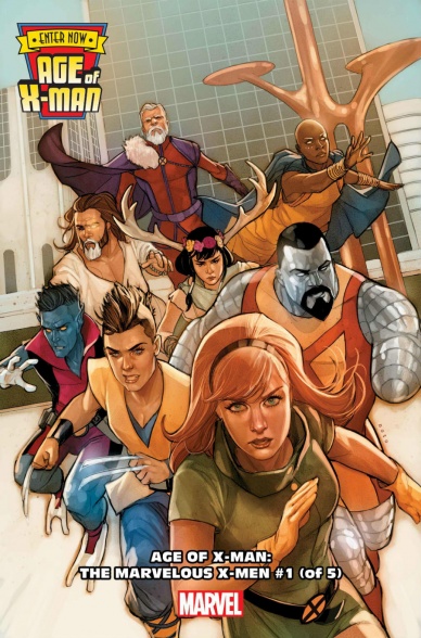
Despite being an entry into the maligned ‘Age of X-Man’ crossover, “Age of X-Man: The Marvelous X-Men” #1 tells a complicated narrative centered around evil psychic ringleader Nate Grey. Grey’s vision of the X-Men and their roles within The Marvel Universe is vividly illustrated by artist Marco Failla and scripted by Zac Thompson & Lonnie Adler. The pencils and visual direction strike a perfect balance thanks to the serene nature of the narrative that is hiding a dark secret. In the core “Uncanny X-Men” title, Grey has a bad habit of being characterized like a generic psychic villain to add to the back catalog of X-Baddies, but thus far ‘Age of X-Man’ has done an excellent job showing readers his vision.
“Age of X-Man: The Marvelous X-Men” #1 is obtuse and dense but in an oddly endearing manner. The script tries to hide the extent of Nate’s vision and the lengths he will go to protect it until the final few pages. The story reads like a ‘What If’ narrative spun in present-day continuity. Nadler and Thompson’s script is interested in the politics of the X-Men world but does a good job not getting too deep into the semantics of their everyday life. The script finds a way for some of the characters to embody their previous selves without being too obvious. The writing has an excellent degree of subtlety while still informing readers of the information they need to know.
Failla’s art direction for “Age of X-Man: The Marvelous X-Men” #1 is a great deal of what sets this apart from your standard event crossover. The issue has a ‘60s-esque style full of bright colors from Matt Milla that sets the tone of the setting exceedingly well. Failla captures some great facial expressions in the smaller moments, showing some of the bad experiences the X-Men are facing. The art has a sleek and clean aesthetic which serves Grey’s distorted, false vision exceedingly well. Failla’s art also has a great level of detail in the background despite the fact that his characters can occasionally be too minimalistic at times.
“Age of X-Man: The Marvelous X-Men” #1 is a great continuation of the overall ‘Age of X-Man’ story. The script does a great job diving headfirst into the politics of ‘Age of X-Man’ and has some interesting things to say about Nate Grey’s boundless ambition.
Final Verdict: 8.4 – “Age of X-Man: The Marvelous X-Men” #1 brings an unsettling level of intrigue and paranoia to the ‘Age of X-Man’ crossover.

Written by Michael Moreci
Illustrated by Breno Tamura
Colored by Dijjo Lima
Lettered by Taylor Esposito
Reviewed by Matt Ligeti
“Battlestar Galactica Twilight Command” #1 is the first issue of a brand new, canonical run by the massively talented science fiction writer, Michael Moreci.
“Battlestar Galactica Twilight Command” takes place at the same time as the events of Season 3 of the hit 2004 show, Battlestar Galactica. Fans of the show may remember this being a huge jump in time, and having a fair amount of mystery surrounding the events. While we get some more insight into that part of the story, along with some familiar faces, it looks like this particular title will focus more on new characters we haven’t met before.
Moreci’s love for the franchise shines through, especially in “Battlestar Galactica Twilight Command’s” tone, both in relation to emotion and in dialogue. This is only elevated by Taylor Esposito’s expert lettering, bringing all those vibrant, sci-fi sound effects to the page.
Breno Tamura nails Battlestar Galactica’s moody lighting, though some characters look more like their on-screen personas than others. Luckily, the dialogue helps lend context when it’s necessary. Dijjo Lima’s colors show skill, but fans of the show might miss the gritty, blue aesthetic of New Caprica’s on-screen representation.
Continued belowAll that being said, if you haven’t seen Battlestar Galactica, you won’t be bothered by what matches up to it and what doesn’t, and you can just sit back and enjoy watching a story of a human rebellion against their captors. For fans of the show, it feels like coming home. Reading “Battlestar Galactica Twilight Command” #1 is like watching a lost season of the show. True fans won’t want to miss it.
Final Verdict: 7.9 – The “Frak” is back! “Battlestar Galactica Twilight Command” #1 is a gift to Battlestar Galactica fans, and a solid sci-fi title in general.
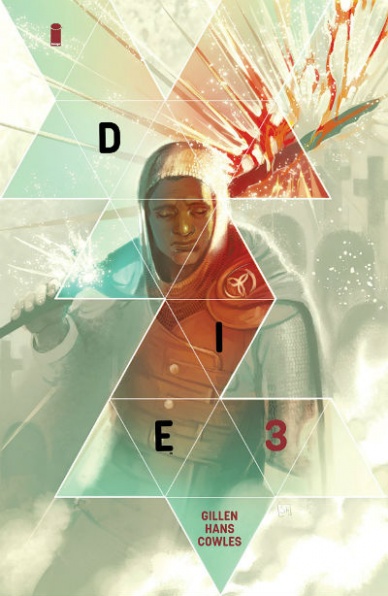
Written by Kieron Gillen
Illustrated by Stephanie Hans
Designed by Rian Hughes
Colored by Stephanie Hans
Lettered by Clayton Cowles
Reviewed by Gustavo S. Lodi
“Die” #3 is interesting to review, as it avoids not only the tropes of traditional fantasy fare but also abandons the traditional narrative styles used to convey it. Behaving as much as an intermission to intense world-building, but also as a robust evolution of the plot, this is one that becomes stronger than the sum of its parts.
“Die” has almost unlimited potential, as there are no known boundaries of how the adventures of the 5 adults dragged back to their Dungeons & Dragons-esque reality can segway into a number of stories and genres. Gillen most certainly takes advantage of that, by portraying clear immediate danger in the shape of a dragon… but one that happens to exist in a dimension similar to World War I, with mechanized beasts rather than magical.
Art by Hans is phenomenal. Note that Rian Hughes collaborated intensively on coming up with the world itself, beasts and characters, but is through her brushes that it comes alive. The aforementioned dragon is a behemoth, taking up a lot of the page and making any other figurine minuscule. The war tranches are dirty and soiled with blood, as much as the faces of injured soldiers. This is very much a lived-in world and one who has seen better days.
In terms of facial expression and character designs, there is a little to much muddiness for its own good, causing some few instances to be confusing. It is not altogether jarring and a second examination, combined with dialogue, is enough to put it back in place, but noticeable nonetheless.
Back to Gillen, this reads clearly like a labor of love. The care for character motivations, their traumas, desires and goals and already a treat, but to have them mixed on such a creative scenario, ripe with potential, really makes it something special.
Like any new series, “Die” #3 is still finding its voice and structure, but the evolution so far is very interesting and worth revisiting. Hoping to see more of the better parts shines the most on future entries.
Final Verdict: 7.5 – Dungeons & Dragons mixed with an unlimited canvas and compelling characters and situations – what more could one ask for?
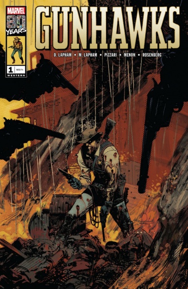
Written by David & Maria Lapham
Illustrated by Luca Pizzari
Lettered by VC’s Travis Lanham
Colored by Neeraj Menon & Rachelle Rosenberg
Reviewed by Michael Govan
I’ve never been the biggest fan of westerns. When I was younger, I sat through many episodes of Gunsmoke and Bonanza with my grandmother or father, bored to tears. However, if you are a fan of westerns, I have to imagine that “Gunhawks” #1 is right up your alley.
This comic has it all. There are Mexican standoffs and intense shoot-outs. There’s the ‘this town ain’t big enough for the two of us’ speech. The cowboy with the dark past that shows up all the time in westerns. Unlike those hour-long westerns that came on TV Land, this issue held my interest the entire time. I thought the overall story was okay but particularly enjoyed the end. It was a bittersweet ending, leaving the western on a fittingly somber note.
Luca Pizzarri’s art is a good fit for “Gunhawks” #1. He doesn’t shy away from blood splatter, which makes sense given the genre. The action sequences are full of energy. One can also appreciate the little details he brings to the comic. For example, the beads of sweat running down Sheriff Donnelly’s face during the opening stand-off, either from the heat, fear or some combination of the two. Another example is the shot of the sweltering sun with a single bird flying across it, which seems to be a recurrence in westerns. The pained expression on the face of Donnelly’s fiancee really helps give the ending that emotional punch.
Continued belowFinal Verdict: 6.5 – They don’t call it the ‘Wild, Wild West’ for nothing…
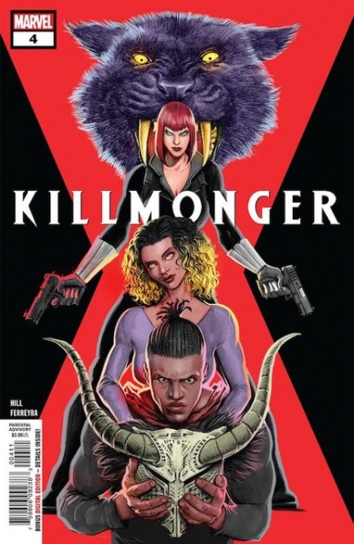
Written by Bryan Hill
Illustrated by Juan Ferreyra
Colored by Eduardo Ferreyra
Lettered by Joe Sabino
Reviewed by Gregory Ellner
As shown in his work on “Romulus” and elsewhere, Bryan Hill is a master both of slow, calm times and of brutal, disturbing action, a combination that plays very well into the rise of N’Jadaka as the eponymous character of this miniseries. Even as he descends into villainy in his pursuit of revenge, Erik Killmonger nevertheless feels sympathetic, though the audience is fully aware that he is going down a path of amorality going forward.
Juan Ferreyra’s artwork, complemented by Eduardo Ferreyra’s color assists, give a smooth feel to the entire enterprise that belies its own horrors, as soft pencils and colors give rise to the savagery of a bloody ax or the softness of the cool snow, both of which clash well against the harsher, more defined speech bubbles provided by Joe Sabino. Killmonger is drawn to resemble Michael B. Jordan’s iconic portrayal in the 2018 Black Panther film, which may go some of the ways toward enhancing the sympathy of the audience, but on the whole the entire thing is drawn in a way that is far lower “power level” than the more common battles against Wakandan foes, with as low a threat as non-powered mercenaries given ample room for shock and awe as they are drawn coming in from almost nowhere. Most notably, Juan Ferreyra is excellent in his use of facial expressions, showing anything from despair to rage to satisfaction and much more in his close-ups and far-off views both.
Final Verdict: 8.5- Bryan Hill’s shift from peaceful times to brutal, horrific action plays perfectly off of Juan and Eduardo Ferreyra’s artwork in this penultimate issue to the story of the rise of Erik Killmonger.
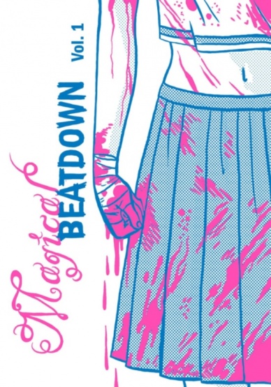
Written, Illustrated, colored and Lettered by Jenn Woodall
Reviewed by Tom Shapira
In terms of stuff like ‘plot’ and ‘dialogue’ the first issue of the mini-comics “Magical Beatdown” is probably a failure. But the simple fact is that this comic book just doesn’t care about such things – it’s a piece of emotions; specifically – a piece of outbursting anger.
Leaving school and hoping to score some time in the arcade our heroine is quickly accosted by a gang of men who grab her and refuse to let go; what follows is one anime-inspired transformation scene and then the titular magical beatdown which takes over most of the (tiny) page count. It’s such a strong scene because it doesn’t pretend to waste time on anything unnecessary to the major emotional beat of the story; Woodall arts treads just the right balance between the comedic (it is a Sailor Moon-esque figure swearing and breaking bones after all) and the serious (you totally get why this character is dishing out extreme violence); the shift in color tone as the magical elements intrude into the real world is also particularly nice touch. “Magical Beatdown” knows exactly what it wants to be – and goes for it!
I am not a woman, I will not pretend to know the feeling of being accosted in the street in such a manner; “Magical Beatdown” did a fine work not just of putting me into this mind space, but also made me sympathizes with the desire to commit such violent retribution.
Final verdict : 8.1 – bloody good, not just bloody.
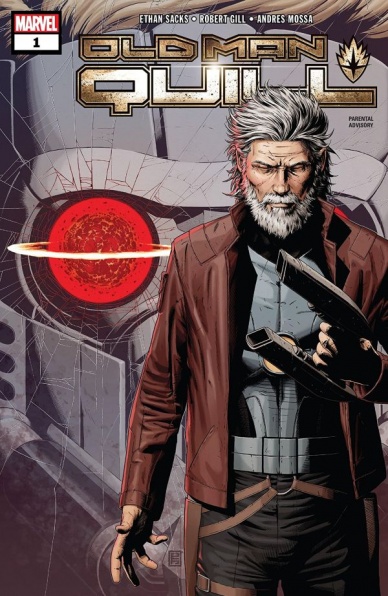
Written by Ethan Sacks
Illustrated by Robert Gill
Colored by Andres Mossa
Lettered by VC’s Joe Caramagna
Reviewed by David Craig
Marvel extends their old man line of comic books into cosmic territory with “Old Man Quill” #1 and the result is a solid but forgettable read. The issue opens with a disaster of cataclysmic proportions that renders the once-chirpy Peter Quill broken and jaded, picking up decades later when his Guardians team is forced to reunite. The major problem with this premise is that while the tragic nature of the inciting incident can be understood on a basic level, ultimately it’s lacking any real emotional punch.
Continued below“Old Man Quill” spends such a short amount of time on Peter’s life before the event, that it’s difficult to care too greatly when its ripped away from him. This lack of set-up proves detrimental to the antagonistic characters as well, as writer Ethan Sacks plucks the Universal Church of Truth from relative obscurity but gives little reason for anybody to care. While the identity of their so-called Dark God is left unrevealed in an attempt at dramatic tension, the absence of an interesting secondary antagonist leaves the evil group feeling faceless and bland.
Fortunately, things do pick up with the introduction of the Guardians, consisting here of Drax, Gamora, Rocket, and Mantis. Sacks taps into the back-and-forth banter that has made the team so popular, providing a number of much-needed lighter moments. Things are weaker in the art department, with Robert Gill’s depiction of these characters failing to convey the emotion in their words. This is most obvious in their facial expressions, which often don’t feel appropriate for what is being said and occasionally just look blank.
But what Gill can’t deliver in the smaller moments, he makes up for in the splashier panels. Vast shots of outer-space look suitably majestic in scale, while he also does justice to the Guardians iconic spaceship: The Milano. The colors by Andres Mossa are at their best in these cosmic vistas, but also standout during a moody Alien-inspired sequence with the ravenous Brood.
“Old Man Quill” #1 is a decent start for this twelve-issue series, delivering on a fun Guardians dynamic and a story that shows potential. That said, the art is somewhat inconsistent and there’s a distinct feeling that the script rushes through what could have been some very powerful moments.
Final Verdict: 6.5 – Die-hard “Guardians” fans will likely get the most out of this issue, which delivers some good moments but falls short of truly compelling.

Written by Pat Shand
Illustrated by Emily Pearson
Lettered by Jim Campbell
Reviewed by Kelly Gaines
“Snap Flash Hustle” #2 dives deeper into the high-risk world of model/ drug trafficker, Haley Mori. Tensions are rising among Coral’s crew, and the ringleader’s version of tying up loose ends means danger for Haley, Drew, and anyone else in Coral’s way. Don’t let the charming pastels fool you, “Snap Flash Hustle” doesn’t hold back in its portrayal of the criminal underbelly. Haley is fully immersed in the underground, and this second issue suggests that she may be way in over her head.
If you’ve just jumped into “Snap Flash Hustle,” the second issue does a good job of painting exactly what Haley and her associates are all about. Starting out in the real world is hard for anyone but Haley’s story makes a solid case against turning to the drug world for financial leeway. A panic-stricken Haley seems to be looking for the door in her new partnership and she is not the only one. There is no trust among drug dealers, a fact that makes the somewhat lengthy dialog pay off as “Snap Flash Hustle”#2 reaches a plot twist of a conclusion.
There is a lot to read in “Snap Flash Hustle” #2. Much of what you learn about the characters comes directly from what is said in the written dialog and captions. The plot does not rely as heavily on visual clues as some other comics do. This can be initially overwhelming to a new reader. The book aligns better after a second read-through. The first read is enjoyable, but there are many more subtle details adding color to the story once you know what all the conversing is building up to. Going back has somewhat of a detective feel. The signals are there, buried beneath other lines of valuable information. That’s not to suggest that the artwork is at all lacking. The choice of using pastel tones to tell a story rooted in violence and crime may be counter-intuitive, but it fits “Snap Flash Hustle” like a glove. This is no crime noir story, at least in the visual sense, and that’s part of what makes it such an interesting read.
Without spoiling the story, it can be said that Haley’s situation has escalated to heights that even she is not yet aware of. Unfortunately, her higher-up, Drew, is painfully aware of just how threatening a small misstep can be. Haley is new to the game and ill-prepared for what’s coming. Coral has made certain of that. This issue is a satisfying read that pulls the attention right into #3. We are excited to see where Haley and her friends end up next.
Continued belowFinal verdict: 7.5 – A well-written comic with uniquely beautiful art and a fun concept. Absolutely worth checking out.
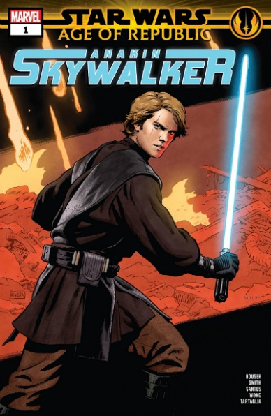
Written by Jody Houser
Illustrated by Cory Smith & Wilton Santos
Inked by Walden Wong
Colored by Java Tartaglia
Lettered by VC’s Travis Lanham
Cover Illustrated by Paolo Rivera
Reviewed by Chris Egan
‘The Sacrifice’ is the story at the center of the latest “Star Wars: Age of the Republic” one-shot. As the Clone Wars rage on Jedi Knight Anakin Skywalker finds himself at odds with the honorable but disagreeing Admiral Yularen of the Republic fleet regarding how to handle a certain battle droid foundry. Anakin believes there to be more to the situation than perceived by most and the Admiral wants to end this problem as quickly as possible so they can move on to the next battlefield.
Jody Houser’s writing competently captures the voices of the characters and feels true to Star Wars, especially from the stories told in The Clone Wars. She understands these characters and really gets into the emotional tug-o-war in Anakin’s mind as he tries to reconcile his duty to the Republic, his allegiance to the Jedi and Obi-Wan, and the connections to his past that truly drive his motivations. We get a solid, quick story that is new but calls back to other Clone Wars-era stories we’ve seen. It’s true to Anakin’s character and continues the cyclical storytelling fans have come to expect from all things “Star Wars.”
The art by Wilton Santos and Cory Smith is decent, but not the greatest illustrations we have gotten in the nearly the long stretch of “Star Wars” comics. Unfortunately, you can see the line separating the two artistic styles and it isn’t used as a function of storytelling. Luckily Java Tartaglia’s color work really pulls the book together to blend some of those lines and raise up the quality overall.
Because the story elements used here have been seen many times before with Anakin, it isn’t necessary to delve too deep. Houser’s writing is a testament to how to keep a familiar story fresh and moving at a good pace. The line work is passable, but at the rate these one-shots are being produced, it seems that most are being rushed to shelves, cutting out the time to craft stunning art.
Final Verdict: 6.0 “Anakin Skywalker #1” is a well-written Clone Wars story that handles some fairly deep ideas and emotional decisions at a quick clip.
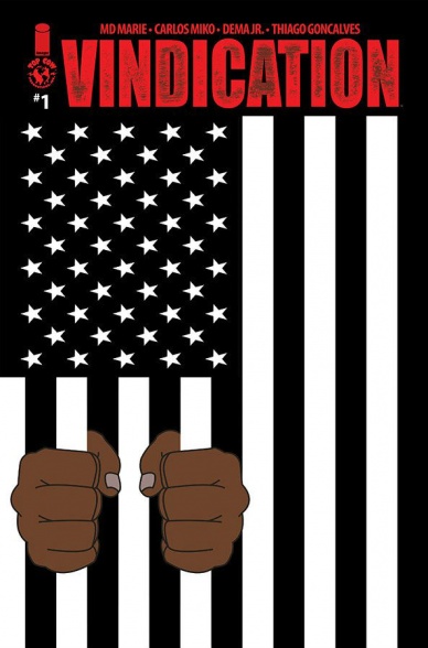
Written by MD Marie
Penciled by Carlos Miko
Inked by Dema Jr.
Colored by Thiago Goncalves
Lettered by Troy Peteri
Reviewed by Christa Harader
Despite an interesting premise, with uneven art, unrealistic dialogue and a flat color palette, “Vindication” #1 misses the mark on what makes a compelling first issue.
Procedurals aren’t my preferred genre but they’ve been done well in myriad ways. “Vindication” #1 does a nice swerve by giving us the story through an angry white detective’s POV, but there’s a distinct lack of subtlety in dialogue that makes for a very hard read. Characters refer to Turn Washington by his full name every time he’s mentioned, often within a single balloon or series. There’s little interiority – everyone seems to say whatever they’re thinking, in full, every time they speak, and exposition’s delivered in the same way. In a superhero book that’s catching us up? Fine. In a contemporary police tale, this device simply does not work, and if everything’s laid out in the text, there’s not much the art has to do.
The art is realistic but panel composition is often awkward, with characters drawn in strange positions to highlight a particular face or physical detail. Realism is unforgiving, and slip-ups create dissonance in a modern comic. The color palette is brutally flat and boasts a lens flare-esque lighting effect that’s completely at odds with the art’s contained line. Grim colors can work for a procedural’s gritty tone, but there are no contrast colors to give the eye a break or add any physical or emotional depth. Everything feels one-dimensional, and that hard visual effect doesn’t do much to lift a story that’s nearly buried by its dialogue.
Continued belowOverall, “Vindication” #1 is born out of a good idea but falls flat in nearly every aspect of its execution, which doesn’t make for an entertaining read. There are lots of ways to snag a reader’s attention in comics, and you don’t have to lighten up your subject matter to get there. “Vindication” doesn’t give you an in with a sympathetic character or present an antagonist with enough skill to spark a reaction, and thus can’t nail its first foray into storytelling.
Final Verdict: 4.5 – “Vindication” #1 has conceptual promise but doesn’t deliver enough skill in its story, artwork or colors to support its procedural realism.
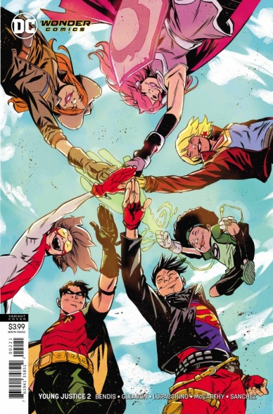
Written by Brian Michael Bendis
Illustrated by Patrick Gleason & Emanuela Lupacchino
Inked by Ray McCarthy
Colored by Alejandro Sanchez
Lettered by Josh Reed
Reviewed by Ken Godberson III
“Young Justice #2” a.k.a. “2 Young 2 Justice” continues to Bendis, Gleason, et. al.’s reformation of the DC’s kinda lost generation of the last couple of years. If I am going to be perfectly honest, there isn’t a super lot about this issue that pushes the plot forward, but it makes up for it so much in character. The focus this issue is on Cassandra Sandsmark, Wonder Girl, and what she’s been up to leading up to this series. It plants seeds for stories down the road but, more importantly, re-establishes Cassie’s character after such a long absence and misuse. She’s a tough girl who’s still trying to find her way, but also fun, not afraid to crack a joke or two or taunt her grandad (you know, almighty Zeus). Bendis gets flack for overextending and single issues not moving a story forward, but it’s only a bad thing if the character and humor don’t work, but so far he’s two-for-two.
With that said, Gleason, Lupacchino, McCarthy, and Sanchez are the stars of the issue. Even in the darkness of a Gemworld under siege, the art is big and bold. Gleason has evolved so much over the last few years and his visions of Gemworld have a bit of sinisterness to them, but it’s contrasted by images such as the awesome double-page spread of Robin and Amethyst charging into battle, the former on a pegasus. On the other hand, Luppacchino and McCarthy’s flashback scene with Cassie are more grounded in a smoother, but equally as dynamic, style. Finally, Sanchez’s colors are the secret ingredient that ties it all together, showing a variety of tone and excelling at it all.
The biggest flaws still remain though: the plot is still going at a slow pace. Furthermore, Jinny Hex and Teen Lantern get some moments but they need real establishing, in particular, the latter. It’s really dodgy the only non-white character still hasn’t shown her face (and it’s not like it’s a secret! She’s been on all the covers so far!). Having said that, this book doesn’t hide it wants to be fun and does so in a way that doesn’t make it feel cringey. If it can iron out the pacing issues, we could be seeing the start of one of the best books on the shelf.
Final Verdict: 7.8- A slow plot development if made up for in fun character moments and fantastic artwork.


