There’s a lot to cover on Wednesdays. We should know, as collectively, we read an insane amount of comics. Even with a large review staff, it’s hard to get to everything. With that in mind, we’re back with Wrapping Wednesday, where we look at some of the books we missed in what was another great week of comics.
Let’s get this party started.

Written by Mark Waid
Illustrated by Kev Walker
Colored by Java Tartaglia
Lettered by VC’s Cory Petit
Reviewed by Luke Cornelius
After its opening two issues dealt with magical threats in the heart of New York City, “Dr. Strange” #3 takes a deep dive into an entirely different realm.
The issue opens with Toby Gould, a tattooed man who appears to be ninety-years old and rapidly growing older still, but is in fact nineteen. As something clearly more magical is at play here, Dr. Strange is assigned to the patient to investigate in the capacity of his “other half” rather than his medical profession. With Waid’s script swiftly establishing its set up, it’s not long before we are on the trail of Toby’s last tattoo artist and into the Realm of Living Ink.
When Dr. Strange arrives in the Realm, we’re presented with a myriad of tattoos that combine to form a strange world. Lots of the designs that Walker includes in the initial view of the Realm, such as a huge eye flanked by two wings, evoke a feeling of the uncanny in the Realm. We’ve seen these sorts of tattoos before, but not altogether like this. The Realm feels at home within a Dr. Strange book too and the composition of Dr. Strange’s arrival echoes the famous Ditko panel of Strange arriving in the dimension of Eternity. Tartaglia’s colorwork on the Realm is imperative in the delivery of the Realm with all the tattoos initially appearing slightly faded in the distance, giving them a sense of scale against the small and vibrant Sorcerer Supreme. It also presents them as flat and harmless, as they appear on Gould’s skin, which gives credibility to Dr. Strange’s naivety prior to their first attack.
Waid’s script is devoted to the exploration of the Realm allowing for the artwork to drive the story, which is fitting for a story with a heavy focus on imagery and its power. There’s little dialogue for large parts of the issue, but Waid manages to control the pace of the story through Dr. Strange’s thoughts instead. Finally, Petit’s lettering serves the book well, aiding the book’s fluidity.
Overall, “Dr. Strange” #3 gives us an almost entirely standalone story exploring the Realm of Living Ink that is entertaining and illustrated with some clever designs.
Final Verdict: 7.0 – “Dr. Strange” #3 dives into the weird side of Strange’s magical adventures and delivers it with some suitably surreal designs and colorwork.

Written by Matthew Rosenberg
Illustrated by Otto Schmidt
Lettered by Joe Sabino
Reviewed by Quinn Tassin
Clint Barton’s Bed-Stuy brownstone has come quite a long way since the days of mafia bros in tracksuits were storming the place. Nowadays, Hawkguy is dealing with naked LMDs, 17-year-old sidekicks, and supernatural crime lords- a far cry from the broken DVD players of old. Matthew Rosenberg’s “Hawkeye: Freefall” has been great, in part because even in the brave new world of time traveling so your friends don’t know that you’ve become a brutal vigilante, the spirit of the book is still as grounded as ever. Issue 3 of Rosenberg’s run keeps the strong, fast-paced story strong and fast-paced
After the reveal that Clint is, in fact, Ronan, “Hawkeye: Freefall #3” is able to get us into the headspace of Marvel’s greatest marksmen without any false pretenses and he definitely delivers. Rosenberg does strong work putting Clint at a strong midpoint of relentless and recognizable. The work he’s doing as Ronan is intense and vicious and it’s making him push some of his oldest friends away. Those darker elements are tempered by the fact that Clint is still a schmuck at the end of the day- a guy who gets dumped because he stole a naked LMD of himself and his girlfriend found it in a closet with Bryce, the 17-year-old tech support guy for the Hood who’s helping Hawkeye/Ronin out now.
Continued belowOtto Schmidt’s artwork is absolutely stellar here. He finds a consistent visual language for the book while still making the zany and violent moments feel distinct from one another. When Clint works his way through an apartment building of goons, he’s going to do it with brutal efficiency and it carries quite a bit of emotional weight; there’s no Deadpool-esque wackiness to the action and Schmidt understands that. At the same time, the hilarious moments feel light and easy.
At the end of the issue, Clint goes to find some of the Hood’s men, only to come across a room full of dead mafia guys instead. Clint takes off his mask in horror and walks into the hallway, only to find Daredevil sitting in the stairwell. It’s an exciting development to say the least- putting a hero with one of the strictest moral codes in Marvel toe-to-toe with someone lying to every hero he comes across. We should all be excited to see where things go from here.
Final Verdict: 8.0 – “Hawkeye: Freefall #3” is yet another great installment in Matthew Rosenberg’s take on Marvel’s Mauve Marksmen.

Written by Vita Ayala & Danny Lore
Illustrated by Erica D’Urso with Marco Renna
Colored by Roshan Kurichiyanil
Lettered by Ariana Maher
Reviewed by Christa Harader
“James Bond” #3 gets us blessedly deeper into the action and eschews some of the intense dialogue that bogged down the two previous issues.
Bond is at his best when he’s quipping and karate chopping and D’Urso and Renna do a decent job switching between fight scenes. There’s a flatness or odd skewing to some of the close-up panels of character faces, as well. Kurichiyanil’s colors add some flavor and washy drama to the action. The flashback doesn’t entirely work, as we’re mid-conflict, but it does add depth to Brandy’s character. A page shorter would keep everything focused and smooth that transition back to the present. Maher picks a trim font that works, though the styling on the narrative boxes lends some confusion when the perspective shifts and a character’s still talking. It’s meant to indicate that exact situation, but for some reason, it hasn’t been tracking well over previous issues. It works better here, but there’s still a bit of a pause before James takes out the smooth talker.
Overall, “James Bond” #3 clears up some of the frankly bewildering back and forth that slowed the pace of the previous two issues and complicated what should’ve been a slicker set-up. We’ve got some stakes now, and Brandy is in way over her head.
Final Verdict: 6.5 – “James Bond” #3 clears up some of the hubbub of previous issues but stumbles a bit in its execution.

Written by Alex Ross & Jim Krueger
Illustrated by Well-Bee
Lettered by VC’s Cory Petit
Reviewed by Kevin M. Gallagher, Jr
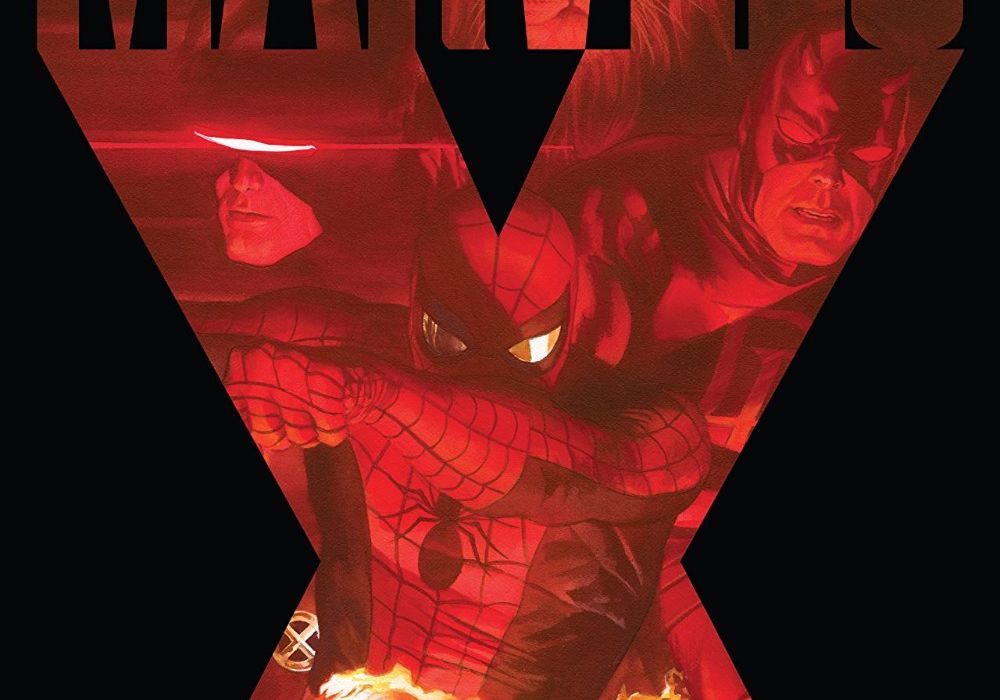
“Marvels X” #2 opens with David and his trucker friend just outside of New York City. The travel companions are discussing what’s happened to the city before trying to enter the Lincoln Tunnel discreetly. It’s not long before it’s revealed that the trucker is none other than Johnny Blaze, the Ghost Rider.
Unfortunately, David doesn’t realize that and thinks he’s some sort of demon that’s actually after him—he’s now in a New York City full of unfriendly “mutants”… on his own. He manages to keep himself safe until nightfall when he chooses a rooftop water tower as his hiding spot. It’s not long before he finds himself in trouble—twice—and is rescued—twice.
“Marvels X” #2 is one of the best-paced books that I’ve seen in quite some time. Just when there’s been enough downtime, Alex Ross & Jim Krueger hit you with action. The heroes make a big splash, for the first time in the series, halfway through this issue—Ross & Krueger could have waited for another issue if they wanted to.
Beyond the pacing, Krueger’s (who took official scripting duties on “Marvels X” #2) script is impressive. Spider-Man/Peter Parker can’t find the lighter side of things and seems like he’s lost hope, but more than, you feel every emotion presented. Most of those emotions are coming from David, but you can feel Peter’s sadness and Dare Devil’s hope.
Continued belowThe art in “Marvels X” #2 is something to behold. Well-Bee evokes Steve Ditko and Jack Kirby, which is especially evident in the scenes with Spider-Man and Dare Devil. This story looks and feels like a classic story—it’s rare to see something like this in modern-day comics; newer stories trend towards a brighter palette. Well-Bee goes a step further and adds some black to really make you feel the grittiness of this world. And when those characters are against a brighter background, they really pop.
Final Verdict: 8.8 – “Marvels X” #2 sets up a world we’ve already seen Jim Krueger create and it doesn’t feel cheap. Writers, artists, the whole team is giving 150% and producing one of the best limited series in recent history.

Written by Ron Marz & David Rodriguez
Illustrated by Martin Coccolo
Colored by Katrina Mae Hao
Lettered by Deron Bennett
Reviewed by Jodi Odgers
Set in Japan in the twelfth century, “Rising Sun” follows a band of warriors from six fictional clans on a quest to discover why their kami have disappeared. Their sudden abandonment has left Japan defenseless against evil spirits, and the clans on the brink of war. Each clan has chosen one champion to aid in discovering why the kami left, and the comic follows this group on their journey.
Each of the six members of the party is visually unique. Chiyoko, the leader of the band, is particularly striking and is the most well-characterized as well. She is given the most space to grow throughout “Rising Sun” #2 and has her motives and demeanor are well-established. The other characters can feel like little more than tropes at times – the gruff, defiant bruiser and the polite, soft-spoken monk are particularly guilty of this. There is also some inconsistent behavior from the characters, most notably when one of the party accuses another of treachery, and then treats them as a friend two pages later. Future issues can potentially give time for all of the characters to be more fleshed out.
The yurei, the enemies faced in the issue, could also have used some more individual touches. The first page presents a grim close-up on one of their faces, blood spilling through its gritted teeth. And yet, this harrowing visual is accompanied by a definition of the ‘yurei’ lifted word-for-word from Wikipedia, and all yurei in the issue are nearly shown as being nearly identical. While they do attack in a horde, sometimes taken to make them more distinct from one another would have aided immersion into the still-developing world of “Rising Sun”.
“Rising Sun” #2 certainly has a lot going on in it. There is a battle between the heroes and the yurei. There are consequences that need to be dealt with. The champions continue on their quest, with suspicion and dissent beginning to brew. There is even bonus content for the board game of the same name that serves as a loose inspiration for the comic! Some of the characters and the overall setting can feel like bog-standard medieval Japanese fare, but there are eye-catching moments and tantalizing plot threads that fans of the genre will want to pick up “Rising Sun” #2 in order to experience.
Final Verdict: 6.2 – “Rising Sun” #2 offers some unique takes on medieval Japan but relies too much on genre conventions to truly stand out.
Written by Ed Brisson
Illustrated by Roland Boschi
Colored by Dan Brown
Lettered by Joe Caramagna
Reviewed by Gregory Ellner
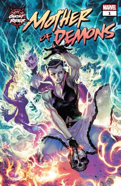
To call “Spirits of Ghost Rider: Mother of Demons” #1 a one-shot is disingenuous. If anything, it serves more as an issue 4.5 of the ongoing ninth “Ghost Rider” volume. The origin story proposed by the name is extremely short, with Ed Brisson instead concentrating most of his efforts on moving forward through the ongoing tale. While some scenarios, such as the temporary return of a villain, are rather amusing or interesting, the story as a whole is written in such a way that it can be renamed as an actual “Ghost Rider” #5 and there would be little if any difference.
Continued belowRoland Boschi does his best to salvage the story, and with his dynamic, hellish style, it’s hard to say he doesn’t succeed. Not for nothing is Boschi considered a very good Ghost Rider artist, given how he weaves violence and emotion in with near-biblical imagery. His focuses on the inner workings of various Hells and the scenes therein are especially well-constructed, emphasizing the hopelessness and corruption alongside the fantastical scenery.
Dan Brown’s colors maintain a dark, dour point-of-view, from the blazing warmth of hellfire to the encroaching shadows of the mortal world. At times, when combined with Boschi’s artwork, Brown even seems to take up truly antediluvian imagery instead of a more modern era, merging the two into a disorienting combination.
Final Verdict: 6.0– Despite being billed as an origin story one-shot, “Spirits of Ghost Rider: Mother of Demons” #1 spends far too much time on continuing the “Ghost Rider” ongoing story and not enough time on establishing a unique history for the eponymous “mother,” only saved by its artwork and colors.

Written by Paul Cornell
Illustrated by Christopher Jones
Colored by Charlie Kirchoff
Lettered by Neil Uyetake
Reviewed by Joe Skonce
If you were to ask someone who isn’t familiar with Star Trek to tell you some facts about the show, chances are that at least one person will bring up Captain Kirk’s prowess with the ladies. It’s a reputation that has been somewhat heightened through years of cultural osmosis and parody, but the fact remains, Kirk gets around. It would make sense that this would be the major joke of a Valentine’s Day special taking place on the bridge of the U.S.S. Enterprise, but Paul Cornell decides to take a different approach. “Star Trek: Year Five: Valentine’s Day Special,” #1 tells a love story of two equals that is fun and charming.
“Star Trek: Year Five: Valentine’s Day Special” #1 is a series of vignettes about the relationship between Captain Kirk and Captain Laura Rhone of the U.S.S. Drake. Laura is, in many ways, Kirk’s equal. She is intelligent, a good leader, and is always ready to jump into action. It’s delightful to watch as their relationship blossoms over the course of the issue, you really feel that they have both found someone to make them happy. But there is one major problem, they are both far too married to their jobs. One of the best scenes in the issue is when we see Kirk, Bones, and Spock discussing Rhone’s marriage proposal. It’s fun to see them having a seemingly normal conversation, but still filling the roles used when discussing universe ending scenarios. You also have to imagine that there were similar conversations being had on the Drake. The story also spans 15 years, showing the sacrifices they made for their work.
The art of “Star Trek: Year Five: Valentine’s Day Special” #1 not only captures the look of classic Star Trek, but shows the evolution of Starfleet’s uniforms and technology over the 15 years. Christopher Jones is able to capture the designs of the bridges of the various ships and creates planet surfaces that would work in The Original Series. Charlie Kirchoff’s coloring also helps with the classic Star Trek design, using colors that match the pallet of the original series.
Final Verdict: 7.9 – “Star Trek: Year Five: Valentine’s Day Special” #1 is a fun love story that shows the benefits (and struggles) of falling in love with someone as ambitious as you are.

Written by Donny Cates
Illustrated by Nic Klein
Colored by Matt Wilson
Lettered by VC’s Joe Sabino
Reviewed by Alexander Jones
Author Donny Cates and artist Nic Klein have already defined their “Thor” run outside of the context of Jason Aaron and his collaborators. “Thor” is in a wildly different place just three issues into the new story. The script for issue #3 of the series focuses on Thor’s new status quo and even shows a classic brawl between two heroes. Thor has an epic brawl with longtime ally Beta Ray Bill in this story that evokes some serious nostalgia while paving the way for what is next for the title. Cates continually adds story elements that make this issue-spanning fight epic all the way through.
Continued belowI hardly think enough can be said regarding Nic Klein’s artistic contributions to the series. Klein is far from a traditional comic book artist and brings an element of personality to Thor that past comics were lacking. Klein is a versatile storyteller who frames scenes incredibly well. Thor and Beta Ray Bill’s new designs capture lots of detail and expression from Klein’s pencils. I really enjoy the sense of physicality that Klein is able to give Thor in particular here. The Odinson’s battle against Beta Ray Bill makes Thor’s ally seem hopeless against Thor’s immense power. This information is communicated really well from the interior art alone and it is nice to see that the script isn’t overwritten.
Cates spends a bulk of the script introducing familiar elements of the Thor mythology back into the series. The aspect of Thor’s mythology feels remarkably different due to Thor being named as the Herald of Galactus. Cates does a great job keeping the stakes of the issue high throughout the long fight scene. The resolution of the fight even has a surprising twist ending that should be enough for readers to return for next month’s issue. Cates does a great job introducing elements of this status quo at a relatively fast pace that still keeps a sense of logic. For instance, readers are given a good grasp of the characterization of Beta Ray Bill towards the end of the script. Before readers get bored with Bill, there’s something new to grasp onto by the end of the story. Klein’s art on the issue is nothing less than impressive making it a perfect match for the excellent script.
Final Verdict: 8.0 – “Thor” #3 is another solid chapter for the new direction in the Odinson’s continuing adventures.
Written by Patrick Ehlers & Sara Pitre-Durocher
Illustrated by Jack Lawrence & Sara Pitre-Durocher
Colored by Josh Burcham & Sara Pitre-Durocher
Lettered by Jake M. Wood
Reviewed by Kobi Bordoley
I mean, why wouldn’t we review the robot love story? The Transformers franchise is no stranger to crossovers and speculative conjecture. If robots can romp in Equestria and go toe to toe with the Terminator, why can’t they have a little romance (as a treat)? Truth be told, Ehlers and Pitre-Durocher deliver a passable story: nerdy Glyph and hunky Tap-Out go on a xenolinguistic expedition, but in the end, realize that learning to communicate with each other was what they’d lost in translation. Fun as it may be, this rose has more thorns than its worth.
To start, Pitre-Durocher’s art is more driven than inspired. The pictures are clear, and the alien world has a semblance of exoticism. The problem is there’s not much contrast in images or panel design, and while there’s certainly action, it’s not very dynamic. Maybe it’s too much to ask from a shticky Valentine’s Day special, but bolder art that leaned into the camp of the concept would have gone a long way.
At least the script is clever. There are some chuckles in “Transformers: Valentine’s Day Special” #1, and a few moments of sincerity as well. Regardless, there’s the overwhelming feeling here that nothing really matters. It’s a light story, so that’s okay–except that the “nothing really matters” feels less like frivolity and more like boredom. Quips abound but the drama comes and goes, and the rekindled love at the end of the story hardly feels earned. It’s entirely possible I’m a heartless buzzkill (I probably am), but at the same time, why can’t we expect the best from our cyborg romances? Someone call us when the Transformers x Call Me By Your Name crossover drops.
Final Verdict: 6.0. A Valentine’s Day gimmick could be a lot worse than this, but also a lot better.
Written by Lonnie Nadler and Zac Thompson
Illustrated by Sami Kivela
Colored by Jason Wordie
Reviewed by Matthew Blair
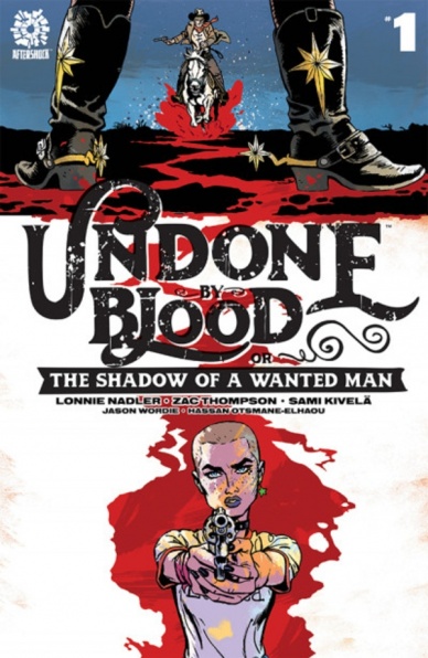
“Undone by Blood or the Shadow of a Wanted Man” #1 is a Western set in 1970’s Arizona that follows a young girl named Ethel Grady Lane, who is hunting down the people that destroyed her family. The comic has a B story that follows…a slightly older man in 1870’s Arizona hunting down the people who ruined his family.
Continued belowThe problem with Westerns is that they are so popular and have been around for so long that it’s difficult to come up with something to make it fresh. Writers Lonnie Nadler and Zach Thompson understand this, so the hook is that “Undone by Blood or the Shadow of the Wanted Man” #1 is actually telling two stories and having them play off each other. The historical Western is presented as a cheap dime-store book that the protagonist is reading as she investigates her old hometown in the middle of nowhere, and it works incredibly well. The writers also demonstrate a keen grasp of what makes Westerns so enduring, showing the lone figure traveling into town, ready to take on an army of evildoers with nothing but their guts and a gun. The writing succeeds as a Western and it will be fascinating to see what happens next.
Meanwhile, artist Sami Kivela and colorist Jason Wordie appear to be having a lot of fun with the Western theme as well. Both stories are set against some incredibly gorgeous desert backdrops that give the setting a desolate feel that makes the book look like it’s in perpetual twilight. The good guys look gruff and heroic, the bad guys look mean and despicable with some very nice facial hair, and every great Western trope is there from riding into town on horseback to walking into the saloon looking for trouble. Granted, Ethel is riding into two on a bicycle and is turned away from the saloon because she doesn’t have her ID, but it’s still fresh without being too different.
“Undone by Blood or the Shadow of a Wanted Man” #1 is a great first issue and a love letter to everything that has made the Western so popular over the decades, all while being different enough and unique enough to be fresh and interesting.
Final Verdict: 9.4 – A satisfying gritty neo-Western that sets the lawless, brutal, and nasty human condition against the backdrop of a hauntingly desolate and beautiful desert town.

Written by Jonathan Hickman
Illustrated by Matteo Buffagni
Lettered by VC’s Clayton Cowles
Colored by Sunny Gho
Reviewed by Michael Govan
Hickman’s definitely juggling a lot of balls in the air with “X-Men”. Each (more or less) standalone issue so far has started an absolutely fascinating plotline and the following issue sets it aside just as fast. You would think “X-Men” #6 might revisit the fact that the mutants are next-door neighbors to some sort of demon island…nope. Or they’d follow up on the evil gardening grannies that can access the gateways? Nope. Okay, okay…what about the plotline in the very last issue?! Darwin, Synch, and Wolverine have been M.I.A. for centuries! Certainly, Hickman will follow up on that!
Nope.
It can be frustrating if you err on the impatient side (like me) but at the same time, you just know that Hickman’s going to deliver. The writer is basically the Lebron James of comic book writing right now, we can all agree he can do whatever he wants. You’ve just got to trust the process.
In this issue, we circle all the way back to the “House Of X/ Powers Of X” event that kicked this whole new era off. Sequences that we thought were complete there, get the ‘extended cut’ treatment here and we see a lot of the events through Mystique’s perspective…
This comic is amazing if, for no other reason, it made me care about Mystique. It is no secret that Mystique is a snake. The movies gave her scales for crying out loud, they’re not trying to be subtle about it. She will betray and backstab her own people, again and again, it’s common knowledge. I don’t even like her…but I feel for her here. It’s abundantly clear that Raven loved Destiny with all her heart and Charles and Erik playing keep away would make me lose my mind too. They’re not even trying to be nice about it, both of them smug as ever.
We can’t give Hickman all the credit though, artist Matteo Buffagni does a stellar job communicating her emotion and genuine pain. That page where she screams at the top of her lungs for them to bring her wife back? It definitely hurts…and the following panel where a condescending Professor X tells Mystique to ‘earn’ it is equally infuriating.
In the end, it looks like Mystique very well might burn everything over Destiny. The dream of Krakoa might die because of the hubris of Magneto and Charles. The end of this issue is incredibly intense and had me on the edge of my seat. I can’t wait to see where this particular story goes…in another couple of issues or so.
Final Verdict: 8.0 – PAY WHAT YOU OWE!


