There’s a lot to cover on Wednesdays. We should know, as collectively, we read an insane amount of comics. Even with a large review staff, it’s hard to get to everything. With that in mind, we’re back with Wrapping Wednesday, where we look at some of the books we missed in what was another great week of comics.
Let’s get this party started.

Written by Scott Duvall
Illustrated by Vincenzo Federici
Colored by Michele Monte
Lettered by Taylor Esposito
Reviewed by Chris Egan
Like Boom Studios’s “Escape From New York/Big Trouble in Little China” series that featured two main characters played by Kurt Russell in the 80s, Dynamite Comics is bringing Bruce Campbell fans a double dose of B-horror saviors. Picking up soon after the events of Bubba Ho-Tep, the deadite slaying Ash hears rumors of Elvis Presley being alive and battling an evil mummy. Hitting the road to see if the rumors are true, or if it’s an imposter claiming to be Elvis, he soon discovers that it’s all true.
Writer Scott Duvall is having fun with this book and it shows. Faithfully getting the voices of both Campbell characters down pat. Fans of both the Evil Dead and Bubba Ho-Tep will get a kick out of this opening issue. Filled with action and fun quips and references, there is no time for dullness. Between Ash and the caricature version of Elvis, the amount of cockiness on the page is astounding and hilarious. As both have a reputation for monster hunting that precedes them, they are both respectful and wary of each other. It’s a fun dynamic to see on the page and comes across just as good as if we were seeing Campbell acting against himself on screen.
Vincenzo Federici’s artwork colored by Michele Monte is like an exploitation acid trip. It’s beautifully bonkers and is the perfect look for this franchise mash-up. Federici’s illustrations are quick and full of movement. Every person and set piece feels malleable and wild. An absolute highlight of this issue.
Final Verdict: 7.5 – Quick action and dialogue make for an extremely fun team-up that will have Bruce Campbell and B-Horror fans screaming with delight.

Written by Mark Waid, Al Ewing & Jim Zub
Penciled by Paco Medina
Inked by Juan Vlasco
Colored by Jesus Aburtov
Lettered by VC’s Cory Petit
Reviewed by Gustavo S. Lodi
Weekly series are a challenging beast to tackle. Present it with too much content and it can become unwieldy, include too little and it feels like a drag to its audience. For this main reason, when “Avengers: No Road Home” was announced relatively soon after its predecessor (and by the same team of writers) “No Surrender,” the question if whether there was really more story to tell became a valid one.
From this first issue, though, there is not enough ground to claim if the creative team succeeded or not on their overall concept. There are definitely worthwhile moments in the plot – which needs to remain unspoiled on this review – especially to the apparent revelation of how the series’s title connects with one character and key twist. Also, the character portrayal of some players – predominantly Hulk and Hawkeye – benefit from having some of their core writers (for the Hulk’s case, Al Ewing) on board on this tale as well.
Art by Medina, Vlasco, and Aburtov is competent, but it does little to really surprise readers with grand visuals and inventive panel design. If “Avengers: No Surrender” presented the Earth’s disappearance with an incredible display, here the artist team comes a bit short of that. Sure, there are some incredible pages in here, but it does feel like visuals and designs already seen elsewhere.
On the more positive side, it has become clear that the team of Waid, Ewing, and Zub have nailed their dynamics for working together on a weekly basis. While it is hard to determine who is doing what, readers familiar with their work can observe Waid’s hands on the overall plot and general concepts, Ewing knack for dialogue, in particular for some characters, and Zub’s inventiveness on bringing team members together who’ve never interacted before.
Continued belowAll in all, “Avengers: No Road Home” is a good start for another round of weekly adventures for the world’s mightiest heroes… it just is unclear if doubling the dose so soon was really warranted.
Final Verdict: 7.0 – Earning the benefit of the doubt, “Avengers: No Road Home” might lead to greatness; it simply has not shown all of its cards just yet.

Written by Zoe Quinn
Illustrated by Robbi Rodriguez
Colored by Rico Renzi
Lettered by Simon Bowland
Reviewed by Kelly Gaines
“Goddess Mode” #3 dives headfirst into a digital nightmare. Cassandra Price is still figuring out how her abilities work while squaring up with daemons, unlike anything she’s experienced before. Luckily, her new friends are willing to show her the ropes. “Goddess Mode” #3 has all the ingredients of a compelling science fiction story but may leave something to be desired for new readers. The main issue is a disconnect created by overcomplicated caption and dialog boxes.
While it’s clear that color, font, and style, are meant to differentiate between who is speaking and how (I.e through email, face to face, various kinds of digital messenger exct.), remembering what’s what and who’s who can become exhausting. In some panels, the speaker’s identity is communicated through symbols, which makes an already complex narrative more challenging to enjoy. Additionally, the large cast of characters, multiple realities, and parallel storylines require attention of their own. Keeping it all straight while internalizing which colors mean which communications and which symbols mean which characters interrupt the flow of what may be a very good story. The book feels as though it is pulling the reader’s attention in too many directions. It’s enthusiastically designed and has the depth to develop into a long-running fan favorite, but the initial impression is one of intrigued confusion.
Is it worth it to stick around for more “Goddess Mode?” Yes. The art style compliments the futuristic tech of the story wonderfully. Characters are given vivid coloration in contrast with sharp linework and minimalist backgrounds. Everything that needs to pop does so when it has to. Everything that doesn’t need to pull focus stays in the background. The stylistic choices help to clarify when Cassandra and her friends are in the digital world versus the real one. Color is used as a bit of a roadmap in “Goddess Mode.” There is a lot going on, but bursts of color do the legwork to subtly lead the reader’s eyes where they need to go. Anyone who’s dreamed of having a cool costume to hide their mild-mannered daytime persona will appreciate the detail of the leading ladies’ wardrobes and hairstyles, and if you’re a fan of steampunk, this is a radiant techno version that’s especially fun to look at. If you’ve been meaning to check out “Goddess Mode,” the third issue makes a solid case to dive in.
Final verdict: 6.0 – A little complex but worth a look (especially if you love cool costumes).
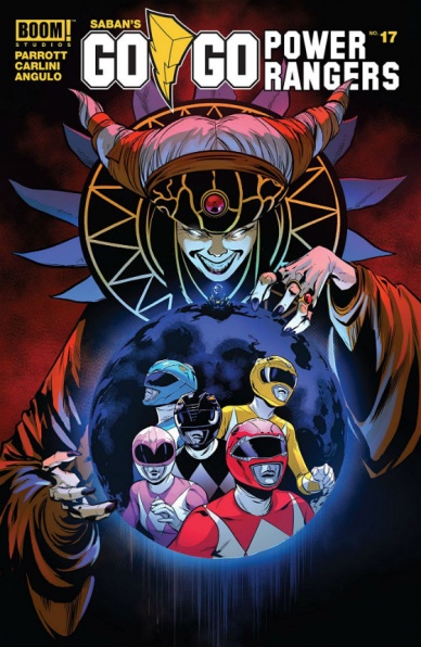
Written by Ryan Parrott
Illustrated by Eleonora Carlini
Lettered by Ed Dukeshire
Colored by Raúl Angulo
Reviewed by Michael Govan
My parents didn’t let me watch Power Rangers when I was little. ‘Too violent.’ I hated that I couldn’t see this awesome-looking show my cousin raved about and didn’t watch the program in earnest until I was in my late teens. The nerd in me loved the zords and suits but by then I was painfully aware of how corny Power Rangers is. Why the heck would you pick teenagers, Zordon? Not to mention they all walk around in the same-colored clothes. Every day. One or two episodes even implies they do it on purpose.
From my perspective, the Boom! Studios comics have improved on the source material. Nowhere near as corny, not dark and gritty either. They have added new and interesting characters, gone in new directions. We see a good deal of new story in “Go Go Power Rangers” #17. There’s a glimpse of a shared history between Zordon and Rita Repulsa, the Power Rangers meet Alpha-1 and Rita conjures up the ghost of her mother. All of this is great, avoiding the formulaic nature that Power Rangers has sometimes.
Continued belowThe characters are interesting too. With Zack, we see that the stress of juggling monster-fighting and homework is having a serious impact (I ask again, why teenagers, Zordon?!). Trini and Jason are now dating in secret while Kimberly is dealing with the divorce of her parents. Rita Repulsa is probably the most interesting of them all. She’s definitely a departure from the over the top villainess she was on Mighty Morphin. Here, there’s a sense of a greater scheme and she’s allowed to be properly menacing.
I can’t really complain about the art either. The action scenes are very kinetic and are just fun to look at. The colors are appropriately bright. I liked the new design of young Zordon too, it really does look great. The page that shows the team’s morphing sequence is especially great and worthy of note. I hope the title continues to be so solid and I’m eager to see where this book goes next.
Final Verdict: 7.5 – It’s Morphin Time!
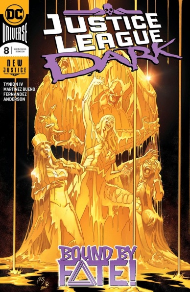
Written by James Tynion IV
Penciled by Alvaro Martínez Bueno
Inked by Raul Fernandez
Colored by Brad Anderson
Lettered by Rob Leigh
Reviewed by David Craig
James Tynion IV continues what has been a stellar run on “Justice League Dark,” with this latest installment providing the same compelling blend of horror, comedy and outright weirdness that has made the series a favorite. As the murderous Otherkind closes in on the magic community of the DC universe, the team desperately scrambles for ways to buy some time. This is a story that has the look and feel of a bona fide epic, but never loses sight of the vibrant personalities at the center of it all.
Themes of loss and guilt recur in the arcs of several team members, with this deep personal connection to the conflict effectively upping the stakes. Impressively, Detective Chimp is the most compelling character in this regard, struggling with the responsibility of both protecting his magical comrades and upholding the legacy of his late friend Nightmaster. If the prominent presence of a talking chimp felt somewhat out of place in the early chapters, Tynion IV has certainly legitimized the character by this point in the story.
The art team on this book consistently knocks it out of the park. The panels of “Justice League Dark” are superbly cinematic and flow beautifully, giving the series an urgent forward momentum that perfectly fits the calamitous events of its plot. Alvaro Martinez Bueno imbues an otherworldly cast with distinctly human characteristics, pulling off the impressive feat of making even the monstrous Man-Bat endearing. Not to mention, his little Swamp-Thing waiters are charmingly absurd (and I suspect would sell like hotcakes in plush form).
The colors and inks, by Brad Anderson and Raul Fernandez respectively, succeed in maintaining an eeriness that lingers even in the book’s lighter moments. The generally dark color palette and shadowy environments serve as a troubling reminder of the danger hiding just around the corner.
“Justice League Dark” feels like a celebration of the mystic side of the DC universe. Long-time readers will appreciate cameos from the likes of Andrew Bennett, Frankenstein and the Agents of S.H.A.D.E, while new readers will simply be drawn in by a rich and dramatic story with a wonderful ensemble cast.
Final Verdict: 8.8 – With its ambitious sweeping story, fantastic characters, and polished art, “Justice League Dark” is quite simply one of the best books DC is publishing right now.

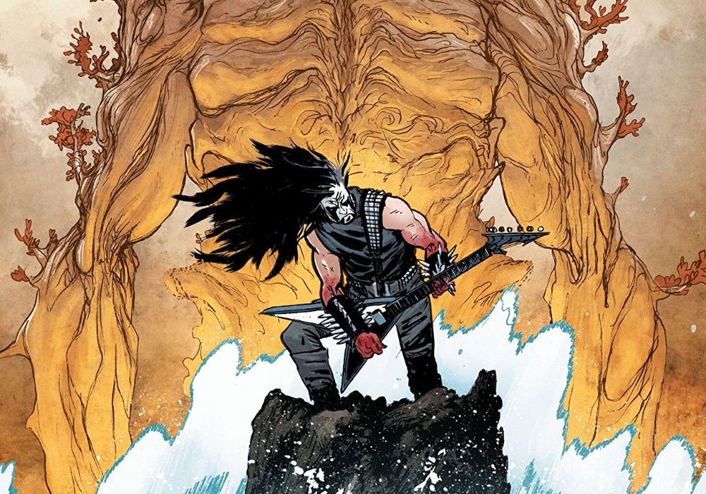
Written and illustrated by Daniel Warren Johnson
Colored by Mike Spicer
Lettered by Rus Wooton
Reviewed by Tom Shapira
Daniel Warren Johnson’s metal meltdown of a comics soldiers on. As with previous issues, the art is the real star here – be it monsters, beasts, leather rebels, guitar shredders, drum pounders or a world torn asunder, his work lends a sharp strong sense of design and movement. It’s obvious he’s having fun drawing it, and it’s hard not get infected by that fun. Mike Spicer and Rus Wooton also seem to have taken up the cause, running wild without losing focus; Wooton, in particular, gets to flex his muscle with some savage SFX. This series seems to go at every issue with all guns blazing and is all the better for it.
Continued belowYet at the same time, something on the emotional spectrum of this story doesn’t quite click with me. Jake’s constant struggle with sorrow and pain feels disentangled from the rest of the comics, like sticking a random panel of “Optic Nerve” in the middle of a “Nextwave” issue. I get that the whiplash is intentional, this is a series about breaking through pain with the power of rock after all, but the emotionally bleak parts threaten to cross the line from fun kitsch into just kitsch. Depression is a heavy subject, and something fitting for a heavy metal comic-book to try and grapple with, but if this series wants to go beyond the realms of death it will have to dig much deeper than it has done so far.
Still, lots to like in this issue: the visit to Murder Falcon’s home-world is a cool visual moment and the possibility of new bands joining in the fray is what the series needs to take it to the next phase. This might not be my exact jam…. But it’s getting awfully close.
Final verdict : 7.8 – This comics is hard as iron!

Written by Jason Aaron
Illustrated by Mike Del Mundo
Colored by Mike Del Mundo and Marco D’Alfonso
Lettered by VC’s Joe Sabino
Reviewed by Alexander Jones
The War of the realms is imminent and there is still turmoil within Asgard. “Thor” #10 directly addresses the bitter mood and dour nature within the realms. Author Jason Aaron has been building up to this point within the narrative since taking on the property over five years ago. Thor has been at a low point after losing access to the hammer and seeing Mjolnir crumble before The Phoenix. However, “Thor” #10 takes the franchise in a different direction and hits a boiling point between the politics of Asgard as they pertain to both Thor and Odin.
The tension between father and son is the crux of the issue and a plot point that escalates incredibly quickly within the narrative. It is jarring to see these characters come to blows so quickly. Aaron struggles to properly convey the tension and conflict that they are feeling with each other in service of a more sensationalized storytelling device. Since the departure of Jane Foster as the Marvel Universe’s Thor, the core title has been missing some of the heart and nuance portrayed in the former series.
Artist Mike Del Mundo’s contributions to the installment are still incredibly vibrant and distinctive. The more action-focused narrative is a great use of his otherworldly, more ethereal pencils. There are moments where the traditional talking head sequences can be difficult to interpret because of the odd angles and movement portrayed on the page. Del Mundo’s art is always exciting to follow thanks to his innovative page layouts and overall art direction no matter what is going on in the script. The downside to his artwork is that it can be difficult to follow because of the bombastic panel composition he lends to his work.
It is hard to track how “Thor” #10 is setting up ‘War of the Realms’ aside from the distrust seeded in the issue between Thor and Odin. While the overall conflict of the issue does feel forced towards a certain set of plot beats, the conflict feels better fleshed out towards the back half of the narrative. With such little time between now and ‘War of the Realms,’ “Thor” has a lot of work to do in order to get this massive storyline underway. While Del Mundo and Aaron make a good fit as a creative team, I hope the series will embrace a tone in future installments better utilizing Del Mundo’s talents as a creator.
Final Verdict: 6.4 – “Thor” #10 establishes an interesting rift between father and son but loses some of the nuance Aaron and Mundo’s past works are known for.

Written by Christofer Emgård
Illustrated by Fernando Baldó
Colored by Michael Atiyeh
Lettered by Richard Starkings and Jimmy Betancourt
Reviewed by Gregory Ellner
Christofer Emgård writes the second issue of his comic tie-in to Tom Clancy’s The Division in such as a way as to make information necessary on the source material minimal for incoming readers. Unfortunately, his writing on “Tom Clancy’s The Division: Extremis Malis” #2 does not seem to leave much else beyond that framework, telling a rather by-the-numbers post-apocalyptic war story. The trials and tribulations of the Division agents and other survivors seem to miss a large part of what made elements of the source interesting. Rather than focusing in on a small group or a select location, there is talk of a vast criminal network between cities, thereby making the events of the issue, while ostensibly meant to mean something more than the more common local narratives, in fact, amounts to far less due to losing its focus on a smaller community.
Continued belowFernando Baldó’s artwork is well done, with thin pencils allowing for intricate faces and lush backgrounds in spite of the horrors of the world. However, the main problem is with showing emotion. While the audience is told about the emotional reactions of certain people (or lack thereof), there isn’t much to determine the response one way or the other, with the script carrying most of the impact.
Michael Atiyeh is, as ever, very good with his coloring. Much like his work on the various “Tomb Raider” comics, he is a master at choosing just what color is good for each situation, bringing to life the hunt for a turkey or the release of an explosive from a launcher, among other lights. The most important color used is the orange on the Division watches, which shines brightly to denote their affiliation much like in the source material.
Final Verdict: 6.5 – Not a bad effort, but perhaps the wrong scope and emotional feel for a The Division tie-in, “Extremis Malis” is carried primarily by its colors where it does work well.

Written by Magdalene Visaggio
Illustrated by Jason Smith
Colored by Harry Saxon
Lettered by Zakk Saam
Reviewed by Matt Ligeti
Elida Al-Feyr is a queen in exile, and she could care less.
Over the past 15 years, she’s flitted about the galaxy, taking on odd jobs to support herself. But when she runs into an old “friend” (he shot her once, she took his ship, it’s complicated), our “Vagrant Queen” takes on a new quest: to find the mother she was separated from all those years ago.
Magdalene Visaggio is a versatile writer, and she’s written one hell of a fun space adventure. “Vagrant Queen” Volume 1 checks all the boxes of the “adventure” genre: a roguish protagonist who’s secretly a good person, an old friend who may not be trustworthy, an impossible mission, an old enemy, and more recognizable plot points.
The one variable is our protagonist, Elida, our titular “Vagrant Queen.” She’s a strong, nuanced woman of color, and her romantic life isn’t brought up even once in the entire volume. The well-fitted leather jacket worn by every cool-guy, loner protagonist is still there, but it’s no longer worn by a white dude with a windswept bowl cut. I, for one, would call that “progress.”
Jason Smith’s panel layout works well for the story’s flow, eschewing the 9-panel-grid style for panels with varying placement and size. It’s a good choice and lends “Vagrant Queen” its chaotic, dynamic style and amps up the action sequences.
Harry Saxon’s ever-shifting coloring work elevates Smith’s art further. Depending on the scene’s tone and venue, you may get dark and moody shading and earth tones with pops of red, or Moebius-inspired pastels, or warm and cool colors juxtaposed for effect. There’s less of an overall palette for “Vagrant Queen” and more a changing theme to match the narrative’s mercurial moods.
Zakk Saam’s sound-effect work is downplayed and often hand-drawn, a choice you don’t often see in sci-fi comics. But “Vagrant Queen” feels much more grounded in reality than most sci-fi comics. While Saam’s more organic effects are part of that, the characters also feel like real people. They talk colloquially. They’re flawed, nuanced, three-dimensional.
“Vagrant Queen” is a solid, straightforward sci-fi action story fans of the genre won’t want to miss.
Final Verdict: 7.8 – Action-packed fun for sci-fi adventure fans of every shape and size. “Vagrant Queen” doesn’t necessarily break new ground for the genre, but does it really need to?


