
There’s a lot to cover on Wednesdays. We should know, as collectively, we read an insane amount of comics. Even with a large review staff, it’s hard to get to everything. With that in mind, we’re back with Wrapping Wednesday, where we look at some of the books we missed in what was another great week of comics.
Let’s get this party started.

Written by Greg Pak
Illustrated by Ario Anindito & Robert Gill
Lettered by VC’s Joe Sabino
Colored by Rachelle Rosenberg
Reviewed by Michael Govan
I love the new Agents of Atlas. It’s such an interesting mix of characters and Greg Pak keeps taking their story further and further. Some of them unofficially came together as the ‘Protectors’ in “Totally Awesome Hulk”. The team grew during the War of the Realms, then there was the “Agents of Atlas” mini and now we’re here at “Atlantis Attacks”. It’s a nice change of pace to see heroes protecting the Pacific instead of New York (you can’t go two blocks without hitting a superhero in Marvel’s NY) and the team has a strong sense of community and teamwork, working quite well together, time and time again.
Maybe you’re not sold on these new Agents of Atlas though. Maybe you prefer the originals…well they’re here too! Jimmy Woo has been M.I.A. only to show up again with his original posse. Writer Greg Pak avoids the initial fight that’s featured in a lot of these team-ups, but trouble is clearly brewing in paradise. This is a tense issue, with a sort of cold war between the new generation and the old, Amadeus Cho and Jimmy Woo. Then there’s the cold war between all of them and Atlantis. You can almost feel a timer ticking down to when everything explodes…and when it does explode, it’s absolutely epic. In the end, cities are being destroyed, armies are invading and the plot is heating up even more.
The art team deserves credit too. Pak’s script demands epic and Anindito and Gill deliver on that front. Those final pages are definitely worth a revisit. A majestic dragon crashing violently from the sky, an invading army rising from the deep, a furious Namor is going on a rampage…can’t wait to see what comes next for this series.
Final Verdict: 8.0 – It’s awesome to see Atlantis attack in…well, “Atlantis Attacks”.

Written By David F. Walker & Chuck Brown
Illustrated by Sanford Greene
Colored by Sofie Dodgson
Lettered by Clayton Cowles
Reviewed by Joe Skonce
The Harlem Renaissance is an interesting period in American history. It’s a period of great artistic achievement centered around the African American artists living in Harlem, but it’s also a period that discusses the struggles of their community and history. The art and literature is a joyful celebration of culture, without forgetting the sometimes difficult reality. “Bitter Root” #6 is a comic that feels in a very similar vein, celebrating the success of the Sangerye family of monster hunters, but showing the problems that the family faces.
The thing is, the comic is a fun rip-roaring adventure, full of witty dialogue and fun characters. Each member of the Sangerye family is a unique and vibrant personality. “Bitter Root” #6 blends together different archetypes of classic adventure stories, and it works. But it’s also a comic that acknowledges pain, why a person like Walter Sylvester might embrace the demonic Ardo. To keep your others safe, sometimes a deal with the devil feels like the only logical way. Chuck Brown and David Walker balance these two stories perfectly, writing a complex adventure.
The art of “Bitter Root” #6 also helps to set the tone and place of the comic. Sanford Greene’s art evokes the look of artists from the Harlem Renaissance, specifically Aaron Douglas or Jacob Lawrence. When characters are drawn from a distance they are elongated, almost impressionistic, which models the work of Douglas. The same is true with the coloring. Many of the backgrounds are vibrant and slightly unnatural colors contrasted by occasional ink splatters. The art takes the excellent story and elevates it. The art makes the comic feel like a story of the period, a legend lost to time that is immortalized by the famous artists of the day. That’s the way to make a comic memorable.
Continued belowFinal Verdict: 8.5 – “Bitter Roots” #6 is a complex adventure that still manages to have a lot of fun, with art that pays homage to the period in which the adventure is set.

Written by Kelly Thompson
Illustrated by Chris Bachalo
Inked by Wayne Faucher, Livesay, Al Vey, Jamie Mendoza, and Victor Olazaba
Colored by David Curiel
Reviewed by Matthew Blair
So Staten Island was overrun by monsters and for some reason, Deadpool was hired to take out the King of Monsters. Unfortunately, by killing the King of Monsters the Merc with a Mouth became the new King of Monsters and has drawn the attention of Kraven the Hunter.
Yikes.
One of the reasons why Deadpool has been so successful as a comic book character over the years is because his stories have a very specific and familiar set of rules to them, and it’s a set of rules that writer Kelly Thompson understands very well. “Deadpool” #3 has a very familiar combination of ridiculous scenarios, deadpan supporting characters, and a hero that combines snark and overly sarcastic dialogue with a surprising amount of heart. Just because Deadpool is a silly character doesn’t mean he cares. It’s a script that is very on-brand for a character that has been following the same formula for decades, and it works.
On the other hand, the artwork of “Deadpool” #3 is kind of a mess and can be difficult to follow. Admittedly, a huge reason why the artwork is difficult to follow is that the comic makes heavy use of double-page spreads and I can only access one page at a time, but there are some deeper issues with the art and the way each panel is presented. However, the real blame for the failure of the art can be spread around to everyone involved. From penciler Chris Bachalo’s strange art style to the multiple inkers on the book, to colorist David Curiel’s inclusion of a weird lens flare effect that washes out a lot of detail, the whole book looks mushy and confusing.
“Deadpool” #3 has solid and familiar writing and artwork that tries to be different and compelling but winds up being something of a mess, and while it’s a decent book, it’s not an absolute must-read.
Final Verdict: 6.9 – It’s a Deadpool story, which means you can expect a certain level of quality when it comes to the writing. Unfortunately, the artwork makes it kind of difficult to follow.

Written by Ryan Parrott
Illustrated by Jacob Edgar
Colored by Kike J. Diaz
Lettered by Hassan Otsmane-Elhaou
Reviewed by Kevin M. Gallagher, Jr
The charm of Ash Williams and the Evil Dead franchise is something special. When a story set in that universe can capture the magic of the character and the universe, it usually can win fans over. When it comes to “Death to the Army of Darkness” #1, it fully succeeds in embodying what it means to be part of this cult franchise.
“Death to the Army of Darkness” #1 is great for existing and new fans of the franchise alike. It touches on enough of the past to catch you hop on where Ash Williams is in his life and how he got there. While most of the story, until it’s final pages, is Evil Dead/Army of Darkness business as usual, it’s not boring. The witty dialogue is so true to Bruce Campbell, you hear his voice as you read it. Ash is flirty—with what ends up being the most accurate looking deadite in the book—and cocky; just the way he’s meant to be.
The story avoids treading on familiar ground by the final pages, where we’re introduced to, as the “Death to the Army of Darkness” #1 cover promises, Team Ash. It also avoids the popular trend of introducing a multiverse—these other team members are created from Ash himself. What does that mean? We don’t know yet, but a good guess is that each member of the team is a different part of Ash’s emotional or personality spectrum.
“Death to the Army of Darkness” #1’s story is strong and the source of that strength is Ryan Parrott. His script is strong and it’s evident from every aspect of the script. The story feels like Army of Darkness. This Ash Williams feels like Bruce Campbell’s portrayal of the character. The deadites feel like Parrott sucked their personas right out of the films.
Continued belowThe biggest problem with “Death of the Army of Darkness” #1 is in the art of Ash Williams and the deadites. Save for the laundromat deadite, they all seemed very cartoon ghoulish. With Ash, he’s such a recognizable character that at times he seems off—specifically when we see his profile. Other times, he looks just like Ash out of Army of Darkness. While a darker, grittier style was expected, the brighter Scooby Doo style works surprisingly well.
Final Verdict: 8.1 – “Death to the Army of Darkness” #1 is a wonderful entry into the Evil Dead franchise and captures the essence of the movies and characters. The art doesn’t exactly match up with what’s expected, but the future looks bright for this series.

Written by Tom Taylor
Illustrated by Karl Mostert
Colored by Rex Lokus
Lettered by Saida Temofonte
Reviewed by Gregory Ellner
Tom Taylor is a master of emotional whiplash, and “DCeased” showed as much in 2019. With “DCeased: Unkillables” #1, he shows even more of how well he can balance pitch-black comedy with utter horror and inconsolable sadness. Using two completely different scenarios across the DC Earth, readers are introduced to two likely converging paths, each on a relatively mundane level when compared to the more overtly enhanced heroes of the primary “DCeased” miniseries. Of course, there are high flying superpowers, but without needing to really worry about much collateral damage, and without the worry of whether or not certain of the more popular heroes survive, Taylor is able to just run rampant across his own pocket Elseworld, causing destruction not for its own sake, but in order to tell the story allowed by what he had already assembled.
After “DCeased,” it is nigh impossible to avoid comparing Karl Mostert’s artwork to that of Trevor Hairsine of the previous miniseries. While Mostert does have a fair amount of emotional depth, there just isn’t the same level of merger with the script that was present before, leading to situations where faces look a bit too long or are otherwise a little oddly proportioned. However, none of this is to say the art is inherently bad. The style is dynamic and interesting, especially in the areas around the Wilsons, but once attention is drawn to close-ups, some imagery can be a bit disconcerting for the wrong reasons.
Rex Lokus does an excellent job with the colors. Shade and light are both played not in terms of an overarching tone, but for what is realistic to the setting, making the horror feel that much deeper, the faces have that much more depth to them. The world is dour and full of horror, but Lokus shows both the hope and the fear present in such a world during its oncoming end.
Final Verdict: 7.5 – Though the artwork can at times not be quite as stellar as the original “DCeased” miniseries, “DCeased: Unkillables” #1 nonetheless shows itself to be a worthy successor to its writer’s previous foray into such a hellish world.

Written by Mark Sable
Illustrated by Maan House
Colored by Hernan Cabrera
Lettered by Thomas Mauer
Reviewed by Kobi Bordoley
When we first teased Godkillers, we billed it as war meets myth. Now that the first issue has arrived, we can more precisely describe this tough-as-nails tale as Zero Dark Thirty meets H.P. Lovecraft. Yes, there is waterboarding, yes, there are eldritch horrors.
But “Godkillers” #1 is more than that. Sable spins a hefty yarn, and there’s more text than your typical war story, which isn’t a bad thing. Simple spray and pray, kill em’ all shooters get pretty stale pretty fast. Luckily, in “Godkillers” #1 the casualties of war, both physical and psychological (and this case, spiritual too) linger on the page long after the gunpowder fades. Much of that is thanks to protagonist Philip Alhazred’s strong presence. Sable’s central character hovers in the corners of nearly every scene, not center stage — a curious choice but one that makes so much sense for a hero who’s reluctant about pretty much everything, including his purpose in this comic. In other hands, his “woe is me” attitude would come across as tiring, but in “Godkillers” #1 its sympathetic, and deeply introspective.
Continued belowThe Godkillers art team puts in overtime on the first issue. Maan House makes good use of the proverbial fog of war, and uses heavy shadowing throughout, in and out of combat. Cabrera then takes over, filling the shadows with the darkest blacks possible. It’s a clear artistic direction, putting the “black” in Black Ops. Mauer doesn’t hold back either, and the letters in “Godkillers” #1 punch back. The fonts and headers are concise, staccato, and exude a military energy. When reading “Godkillers” #1, you’re equal parts recoiling in fear, equal parts fixing your posture — lest the drill sergeant you’ve imagined is reading over your shoulder tears you apart. Oh, and speaking of rending limb from limb, the final splash is worth the price of the comic alone.
More than anything, “Godkillers” #1 promises a smart story: one that’s obvious in its fantasy but realistic in its stakes and the cost of war. Sable and co are coming for our jugulars with this story; let’s hope they don’t miss.
Final Verdict: 8.5 – Cthulu in fatigues. Godkillers is a precision strike of fantasy horror and military realism.

Written by Al Ewing
Illustrated by Juann Cabal
Colored by Federico Blee
Lettered by VC’s Cory Petit
Reviewed by Luke Cornelius
After an exciting new start for “Guardians of the Galaxy,” Ewing, Cabal, Blee, and Petit continue the momentum from the first issue by getting even bolder.
Ewing left all of our heroes in peril at the end of the first issue but gave us a glimmer of hope with the introduction of Hercules. Instead of Hercules being a deus ex machina, he’s only able to solve some of the team’s problems so there’s still rising tension in the book. There may be a bright and hopeful feel to the book, both visually and in the majority of its script, but Ewing keeps a darkness lurking beneath the surface through the persistent reminders of an imminent and mysterious war. Ewing gives the book a great sense of humor through excellent dialogue, such as the witty exchanges you’d expect between Peter and Rocket, and Marvel Boy’s sarcastic response to the trapped Hercules. He shows a strong understanding of each character and gives them each a clear and distinctive voice which makes the final few pages of the comic all the more devastating to read.
If Ewing’s script sets the standard for the energy that is in “Guardians of the Galaxy” #2, Cabal’s artwork combined with Blee’s colors smash past it. Every panel is filled with expression and movement that tell the story and draw you deeper into the comic. The artwork delights, surprises, and haunts the reader exactly where it should, with two pages, even at this self-set high standard, reaching higher; the first depicting Athena’s prophecy, the second, Moondragon’s telepathic strengthening. The former spotlights Cabal’s design for Athena in its psychedelic glory with a page covered in her deliberately flickery movements. This flickering distinguishes her from the other Olympus gods and hints at something more to her entrapment. Blee’s decision to color each frame of her movement differently furthers this striking design. The latter page uses double exposure to show Phyla’s actions literally within Moondragon’s mind against a cosmic background. It doesn’t feel extraneous to the story, it just further demonstrates Cabal’s ingenuity and dynamism as an artist. Finally, Petit’s lettering never intrudes on the artwork and ensures the comic is appropriately paced.
Overall, “Guardians of the Galaxy” #2 is filled with exciting ideas and solid storytelling, with Cabal and Blee giving the reader multiple visuals that you won’t forget.
Final Verdict: 8.5 – “Guardians of the Galaxy” #2 gives an incredibly exciting ride that builds upon the bold foundations set in the first issue.

Written by Gerry Duggan
Illustrated by Stefano Caselli
Colored by Edgar Delgado
Lettered by VC’s Cory Petit
Reviewed by Alexander Jones
“Marauders” #8 is an exceptional issue of the series that focuses on some of the actions of the series up to this point. Writer Gerry Duggan has set a series of ground rules and precautions in previous entries of the series. The last chapter of “Marauders” showed the team not heading the warnings of past team members. Duggan keeps the stakes of the issue incredibly high all the way through this chapter. The script shows the team recovering from the devastating events of the last issue. Artist Stefano Caselli renders the interiors of the issue and assists Duggan in keeping the tension from the script in force.
Continued belowIn lots of the current X-Men titles, readers don’t have a clear villain to despise which is why I’m happy to report that “Marauders” now has a main antagonist. Watching the series give some screen time to the foreboding rogue late in the issue is absolutely fascinating. Duggan also has some really good voices for anti-heroes like Emma and Christian Frost. This series keeps growing delightfully more complex and the teases from the last couple pages in the story are also intriguing enough to keep readers coming back for more. The dialogue in the issue is incredibly reserved and understated as well.
I enjoy Caselli’s pencils but the loose anatomy on some of his figures is not the best example of his artwork. I have seen Caselli render pencils with much more detail in the past leading me to wonder if this issue could have been rushed. There’s a splash page with Iceman woefully lacking in detail and a slap from Storm that completely blurs out her hand. Caselli is adept at depicting some of the facial expressions and renders face-to-face interactions exceedingly well. I really enjoyed seeing Caselli depict some of the mutant characters like Iceman and Storm in casual conversation.
Final Verdict: 8.0 – “Marauders” #8 tells the worse case scenario of a cautionary tale.
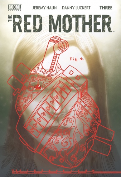
Written by Jeremy Haun
Illustrated by Danny Luckert
Lettered by Ed Dukeshire
Reviewed by Christa Harader
“Red Mother” #3 sees Pari unlock an intricate puzzle box, make some external progress and tumble deeper into her mysterious dreams and visions. Haun and Luckert’s story is largely successful because they rely more on visual cadence, and it’s a blessed break from the sea of talky books on the market right now. Dialogue in “Red Mother” generally functions as an addition or accent, and this helps the mystery and mood in this issue progress at a natural pace. Still, there are a few places where lines are superfluous or obvious, as when Pari states that the box is Victorian and adds “from the 19th century.”
Luckert’s art incorporates more weird detail in the visions, and Pari’s facial expressions still charm in issue #3. We have a bit of a problem with some stilted anatomy and a few curious layout choices (a 9-panel grid doesn’t entirely work) but the book ticks along and maintains its ominous tone. The color palette still tries to balance that particular red against more natural hues, and there’s an odd swirl on the back of Pari’s head on the first page in an attempt to mirror the puzzle box. Dukeshire’s lettering is still good, though there’s a touch too much padding at times. It does work to give the book a bit of alienation, but it could be tightened as well.
Overall, “Red Mother” #3 may not be the horror banger that’s blowing up social media at the moment, but it’s a steady book with surprising depth and restrained tension that’s worthy of every horror fan’s pull list.
Final Verdict: 7.5 – “Red Mother” #3 solves a mysterious puzzle and plunges Pari deeper into her nightmares, to good effect.

Written by Scott Snyder & Charles Soule
Illustrated by Giuseppe Camuncoli, Daniele Orlandini & Leonardo Marcello Grassi
Colored by Matt Wilson
Lettered by Crank!
Reviewed by Jodi Odgers
‘Live free or die.’
These four words are at the heart of “Undiscovered Country” #4. They form the core motivation for multiple characters in the issue. They also serve as the goal for our protagonists, as they seek to escape from the predicament in which they found themselves at the end of the third issue.
“Undiscovered Country” #4 is a slower-paced issue than those immediately preceding it. The issue gives readers insight into the past of journalist Valentina Sandoval. Up until this point, she has seemed to be relatively replaceable on the first group of outsiders allowed to enter the United States in thirty years. “Undiscovered Country” #4 reveals why she, and the team as a whole, were specifically selected, which leads to revelations of further deception about the mission and its true origins.
Continued belowSnyder and Soule’s writing remains as tight as it has been for the entire series so far. They are clearly setting up a long line of dominoes, and that setup continues in “Undiscovered Country” #4. The issue is heavy on exposition but retains the reader’s interest by making that exposition relevant and genuinely fascinating. The art from Camuncoli, Orlandini, and Grassi builds effortlessly on the framework of the story, fleshing out characters’ reactions to the twists and turns of the issue and adding an explosive layer to its final pages.
“Undiscovered Country” aims to have readers walk the spiral with them, following a flawed group through a harsh, untamed land that removed itself from the world. Whether they will live free or die remains to be seen. This fourth issue makes the reader want to find out.
Final Verdict: 8.4 – Deep exploration of characters and upheaval of readers’ expectations continue the creativity of the team behind “Undiscovered Country”‘.


