There’s a lot to cover on Wednesdays. We should know, as collectively, we read an insane amount of comics. Even with a large review staff, it’s hard to get to everything. With that in mind, we’re back with Wrapping Wednesday, where we look at some of the books we missed in what was another great week of comics.
Let’s get this party started.

Written by Nick Spencer
Penciled by Ryan Ottley and Alberto Alburquerque
Inked by Cliff Rathburn and Alberto Alburquerque
Colored by Laura Martin, Brian Reber and Carlos Lopez
Lettered by VC’s Joe Caramagna
Reviewed by Elias Rosner
‘Hunted’ is upon us, welcoming us into what is to be “the biggest Spider-Man event of the year,” a slogan that holds little meaning or excitement. If this prologue is anything to go on, ‘Hunted’ will be another story that has an intriguing premise, a baffling execution, and a whole lot of build-up that confuses the whole message. The issue opens on a retcon and quickly establishes the existence of clone children for Kraven, who all die, save for one. The brisk pace of this intro, for which there has been no hint of these last sixteen issues, detracts and harms the issue, and the arc, as a whole.
It presents the questions of why was this not hinted at or mentioned earlier. It is a recap for events that never occurred as presented, robbing them of their emotional impact, making it superfluous to the narrative. Were these first few pages not to have been there, little would be changed in the story of this issue and the motivations for Kraven. However, the idea that Kraven is pitting poachers and rich “hunters” against animal themed supervillains is new and different, creating stakes that we haven’t seen thus far. Additionally, we have multiple ‘capturees’ to worry about: Rhino, Black Cat, and Billy.
Ottley & Rathburn imbue so much charm and emotion into Kraven’s expressions, doing much of the work to characterize this version of him, while the coloring team bathes it all in the warm, foreboding pinks and oranges of the Savage Lands. The art reminds us that this is not a dark story, only that it occurs as the cusp, where the beauty of the day is appreciated but soon will come the dark.
Stronger, though, is the Lizard-Spidey narrative. This is really where the whole of Spencer’s run shines, with threads tying together and playing out naturally. It is somehow more exaggerated in its art yet understated in its story. If the whole issue had been an extended version of this, with the Kraven party shortened, the mystery could have been sustained and the tension raised. Instead, it is a strong send-off to a weak start.
Final Verdict: 5.9 – ‘Hunted’ starts off on the wrong foot, offering an opening that would have been better off closing, in spite of the always stellar art team.
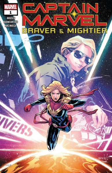
Written by Jody Houser
Illustrated by Simone Buonfantino
Colored by Erick Arciniega
Lettered by VC’s Travis Lanham
Reviewed by Gustavo S. Lodi
“Captain Marvel: Braver & Mightier” is a special one-shot, released just in time for the upcoming movie from Marvel Studios. It stands alone from the storyline in development on Carol Danvers’s regular series, and tells a more intimate story, even if with heavy doses of action.
First of all, the art by Buonfantino and Arciniega is beautiful to look at, especially the sequences set in outer space. Captain Marvel comes across as she should, a larger than life superhero, dealing with impossible threats. The vistas from the atmosphere as Earth looms below, combined with clever designs on alien spacecraft fill up the page. Arciniega’s colors complement that sensation, with an almost photo-realistic approach to some elements, which further enhances the contrasts to the more other-worldly elements of the plot.
Back on the ground, in the confined space of a press junket, the art does take a bit of a hit, with a less-than-inspired page and panel designs, mostly sticking to traditional grids. Sure, it is more demanding of an artist to make such a setting exciting, but more creative narrative choices, like altering points of view and zooms on specific characters could have been used for more diversity.
Continued belowHouser’s plot is a good one if only spread too thin over a page count that exceeds its stay. The story of high-school students getting themselves ready to interview Carol Danvers is interesting, and one that the audience can connect with. And while it does offer insight into Captain’s Marvel personality and drive, it simply is not allowed to evolve all that much. That is a usual problem with specials and one-shots, as any major plot evolution or character development is reserved to the main series.
Regardless, “Captain Marvel: Brave & Mightier” is an effective way to introduce the character to new readers coming in, eager to see or who have watched her new movie. For longtime readers, there is little news introduced here, but beautiful art should be a drawn-in.
Final Verdict: 7.0 – This Captain Marvel special is enticing enough to bring new readers in despite being light on plot, surely supported by the larger-than-life pieces of art.

Written by Alex Paknadel
Illustrated by Diego Galindo
Colored by Adam Guzowski
Lettered by Jim Campbell
Reviewed by Matt Ligeti
“Catalyst Prime Kino” #14 is the final issue of the first arc by the title’s new creative team. If this were an Olympic gymnast’s act, it’d be the kind judges and audience alike would watch in awe, hoping the gymnast in question stuck the landing.
SPOILER ALERT: They did.
Though “KINO” takes place in a world of superheroes, and KINO (AKA Major Alistair Meath) himself is one of the most powerful superheroes, this arc is more a commentary on PTSD, politics and the unfortunate consequences of those who happen to get too close to powered individuals.
Alex Paknadel is a powerhouse and a rising star in the comic book world. He and editor, Jasmine Amiri, work extremely well together, bringing us a world where heroes are broken, dangerous creatures and corrupt politicians rise to power easily. “KINO” may take place in the fictional “Catalyst Prime” universe, but this nuanced and complicated world is closer to our own than other superhero universes.
Similarly, the arc’s art is anchored in Diego Galindo’s more true-to-life style, mirroring the comic’s serious tone. In “Catalyst Prime Kino” #14, however, reality blends with a virtual reality world bathed in an old-school, pulp comic aesthetic. Not only does Galindo’s illustration style change to suit it, but Adam Guzowski’s sedate color palette and Jim Campbell’s grounded word balloons also undergo a shift to accommodate. When these worlds collide, it’s not only the climax of the issue and the arc but also the high point of the entire creative team’s endeavors.
This entire talented team has worked hard to leave its mark with a superhero story that’s about more than fight scenes. “Catalyst Prime Kino” #14 may leave you a little haunted by the arc’s events, lingering awhile after you’ve finished reading it like the afterimage of a flashbulb. It’s a rare feat and a reminder that a “good ending” and a “happy ending” aren’t mutually exclusive.
Final Verdict: 9.0 – The new creative team on “KINO” sticks the landing (and then some) on an arc that challenges the genre and breaks the mold of what a superhero story should be.
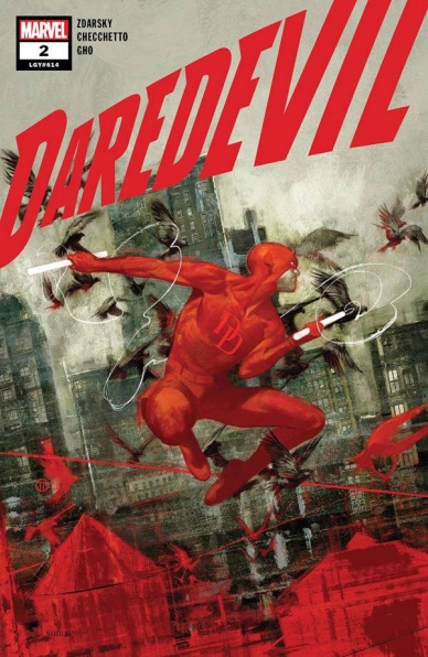
Written by Chip Zdarsky
Illustrated by Marco Checchetto
Colored by Sunny Gho
Lettered by VC’s Clayton Cowles
Reviewed by David Craig
If Matt Murdock is facing an identity crisis following the murder accusations leveled at his costumed alter ego, this series is also having one due to the lack of flair in its execution. “Daredevil” #2 isn’t completely without merit, but it does feel very much like a paint-by-numbers story for the horned hero of Hell’s Kitchen. Being framed for a crime they didn’t commit is well-trodden ground for any vigilante worth their salt, meaning it’s hard to get too excited about this bland mystery which is unlikely to have lasting consequences.
Perhaps if the characters were a bit livelier that would go some way to making this joyless tale stand out, but alas that is not the case. “Daredevil” mainstays Foggy Nelson and Wilson Fisk are present and correct, with their characterization unquestionably the strongest in the book. However, when writer Chip Zdarsky shifts focus to his newly created detectives, Cole North, and Fred Higgins, he falls remarkably flat.
Continued belowThe duo doesn’t have a single interesting trait between them, resulting in North’s internal monologue being a tedious bundle of detective clichés. Ultimately, they feel like a pale imitation of the genuinely fascinating pairing of Walter Bolt and Oscar Clemons from Greg Rucka’s short-lived run on “Punisher.” Admittedly, the presence of artist Marco Checchetto on both books also plays a role in evoking this comparison.
While Zdarsky has his roots in lighter-hearted work, Checchetto is in his element here. His illustrations are perfectly suited to moody street-level crime stories, building a particularly filthy and polluted interpretation of New York City with colorist Sunny Gho. This issue is light on action, but when things speed up in the final panels his framing is spot on and culminates in a stunning full-page splash. Without a doubt, Checchetto is one of the finest artists out there today – it’s just a shame he doesn’t have better material to work with.
Chip Zdarsky is using all the classic ingredients of a “Daredevil” story, but the result is a book so unambitious that its difficult to recommend to anyone. Longtime readers will find nothing they haven’t seen before, while newbies have a plethora of better places to start.
Final Verdict: 5.0 – Close your eyes and imagine a generic “Daredevil” story. You just saved four dollars.

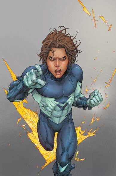
Written by Steve Orlando
Illustrated by Riley Rossmo
Colored by Ivan Plascencia
Lettered by Deron Bennett
Reviewed by Chris Egan
Issue #3 jumps into a back and forth telling of Martian Manhunter’s origin story and how past events link directly to his current predicament and the case he and Diane are working on. “Martian Manhunter” #3 moves between a mystery, an alien sci-fi/horror tale, and superhero origin. It all flows nicely and fans of any or all of those story choices will enjoy this. Orlando’s tight script does a great job molding these elements into a compelling comic that moves at a quick pace.
This re-telling is not rushed or over-stuffed while handling a decent amount of material. It’s great for new fans and those who are well versed in J’onn J’onzz lore. Keeping this as a limited series is a perfect way to keep the plot moving while still telling a compelling and detailed story. With less time to lose their way, we can only hope that the rest of the series keeps the quality as high as these first three issues have been. Rossmo’s pencils capture exactly what the story is trying to tell from panel to panel, whether it’s a stoic cop story, a wild and creepy alien plot, or the tale of a secluded man from another world trying to find his place in this one. Plascencia’s colors are bright and intense. He is perfectly paired with Rossmo and this entire creative team’s take on this character is such a great change of pace for this character. It is refreshing to know that a long-standing character can still be taken in new directions.
Final Verdict: 8.0 – Readers of all kinds will find something to love in this genre-bending mash-up of True Detective, The Thing, and superheroes.
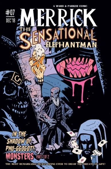
Written by Tom Ward
Illustrated and colored by Luke Parker
Lettered by Micha Meyers
Reviewed by Tom Shapira
I didn’t read the previous issues of this series, which re-imagines real-life person Joseph Merrick as a Victorian-era occult fighter, but this is the first in a new short arc which involves secret societies and Lovecraftian monsters, which is the kind of stuff I like so I decided to give it a try.
There’s very little of real-life here, I guess the disconnect starts at the moment Merrick shows feats of near-superhuman strength and athletic daring do while stopping a robbery at the theater; so by the time another real-life person Frederick Treves starts summoning terrors from beyond it seems less far-fetched. I’m never quite sure what to think about stories that take real people and flatten them into action-adventure protagonists (looking at you H.P. Lovecraft), but that genre is pretty much an established thing now and we need a longer piece to engage with it.
Continued belowTaking it as is “Merrick, the Sensational Elephantman” is a rather fun ride, very much in the Mike Mignola vein (you can certainly see this series as taking place in the backwaters of the Hellboy-verse). Luke Parker is very good at the monster and scenery design; it seems like he’s borrowing a lot from Mignola, dig these silent panels setting up the creepy atmosphere; but the important thing is that he knows how to borrow and to adapt the shadow-heavy style into his own needs. Oddly enough the one element that doesn’t really work for me is Merrick himself – whose lumpy cranium becomes near flat in several panels. The action scenes also lack a certain grace, we cut in and out of them without much rhyme or reason, but the punching is not really the point here so this is forgivable.
As with the art Merrick seems the least interesting part in the writing, played here very much as an exuberant fighter; I’m assuming the creators spent the previous six issues focused solely on him (or so it seems from the recap page), so this doesn’t hurt the issue too much. I rather like the idea that some members of this secret society these members belong to are as shocked at the secret dealings as everyone else – they are, in the end, just people dealing with forces beyond their knowledge.
Final Verdict : 7.0 – The art is the real star here, and it shines rather brightly.

Written by Gerry Duggan
Illustrated by Ron Garney
Colored by Richard Isanove
Lettered by Travis Lanham
Reviewed by Christa Harader
So far, Duggan seems to know the right recipe to make a good Conan story. This arc sees Conan at his most violent, monosyllabic and brutal, with just enough dark humor to balance out the moodiness. He spent the first issue battling the sea and now he’s battling what all Conan fans know he hates the most: a sorcerer. Koga Thun has all the hallmarks of a classic Howard villain, complete with gaudy and gruesome displays of power. Menes is a nice antidote to the swooning women of other Conan stories, and Duggan balances Suty’s bewilderment and humanity very nicely.
Garney’s art is great, with a sweeping, sketchy style and sharp contrast inks to enhance Conan’s moodiness. A lot of panels feature his face partially or completely obscured and add to his menace, but there’s also humorous contrast between the orderliness of the library and Conan’s girdled, muscular form. And, speaking of muscles, they’re celebrated with clever and careful detail, exactly as Conan’s physical prowess should be. Isanove’s colors are suitably muted and washy in their own right when the action starts getting chaotic, and the light sources add a welcome brightness to an otherwise dismal universe. Lanham’s lettering is on point, with some nice creature styling and just the right note of the fantastic on the font without sacrificing readability.
Overall, “Savage Sword” is a good package, with enough gore to justify the Mature rating and enough imagination to secure this run’s place in Conan’s history. Duggan and the team are creating a solid and entertaining product, and I can’t wait to read more.
Final Verdict: 7.5 – “The Savage Sword of Conan” #2 delights with good art, pacing, colors, and lettering in a fine sword and sorcery package.
Written by Dan Didio
Illustrated by Kenneth Rocafort
Colored by Dan Brown
Lettered by Travis Lanham
Reviewed by Alexander Jones
Despite the fact that “Sideways” has been canceled along with nearly the rest of the New Age of Heroes titles, I would argue that the comic never ran out of a story to tell. The final issue of the title finds protagonist Derek James investigating the death of his mother through supernatural means. While the storyline has been extended over the past couple issues and “Sideways” never truly draws a conclusion to the narrative, the final moments of the finale strike an incredibly emotional final note. The last moment proves DC has more story tell with James.
Continued belowFew artists drawing New Age of Heroes titles are going to draw the final issues of their respective series that they launched. However, Kenneth Rocafort is back for the “Sideways” finale. His expressive, always-tired looking facial expressions still suit the comic incredibly well. Rocafort’s incredibly busy and expressive layouts are a joy to look at and continue to evoke the imagination of the reader. The supernatural sequence in the Dark Multiverse at the beginning of the issue has some of the wildest, most kinetic work in the issue.
“Sideways” continues to blend lots of “Spider-Man” influenced slice-of-life elements peppered in with the superheroes. Didio crafts a narrative that has some grounded twists and turns giving the series a sense of stakes and supplanting Derek’s world outside of the aforementioned Dark Multiverse. Getting a comic that can balance so many touching genre elements that even manages to add a love story and mystical elements should make a comic uneven. Didio’s script is jammed full of interesting new developments that develop slowly over the course of the story.
A couple of issues ago, “Sideways” finally managed to break free from a heavy “Spider-Man” influence and tell it’s own story. Unfortunately, the unique tone Didio and Rocafort lent to the second half of the series struggled to find an audience leading towards a premature finale. “Sideways” #13 is a really great showcase for the full tone and scope of the comic. Readers see pieces of Derek’s personal life, his adventures in the Dark Multiverse and the latest developments in his romantic life. Plus, Didio and Rocafort tell a haunting, hopeful twist in the final page that has me eagerly anticipating the next stories for James and his supporting cast.
Final Verdict: 8.0 – “Sideways” #13 is a well-paced, emotional finale that finally delivers on the full potential of the series.

Written by Kelly Thompson
Illustrated by Gang Hyuk Lim
Lettered by VC’s Joe Caramagna
Reviewed by Michael Govan
The best part of “West Coast Avengers” is the characters. Weird concepts like land sharks are a plus but the motley crew that Kate Bishop has assembled really takes the cake. It’s a weird mix of characters but it works in spite (or maybe because) of it. I wasn’t even familiar with Gwenpool or Fuse going into this title but they’ve proven themselves to be as intriguing as the rest of the team. It’s been fun watching these underdogs struggle to find their footing and you can’t help but root for them.
It is a bit harder to root for them in “West Coast Avengers” #8 though. That’s probably because their enemies fall a bit flat. The whole issue revolves around them infiltrating the Temple of the Shifting Sun, a Hollywood cult. That’s an interesting concept that goes unexplored for the most part. The stakes just seem low. The cult’s hooded members aren’t all that menacing and neither are Madame Masque’s goons. At one point, Gwenpool calls them ‘redshirts’ (the more ‘expendable’ Star Trek crew members) and it’s an apt description. The big twist reveals that the cult is made up of vampires instead of Skrulls doesn’t make them any more interesting. At least not this issue. Next issue could be a completely different story.
The art is strong in “West Coast Avengers” #8. Gang Hyuk Lim’s work is a good fit for a lighthearted, humorous title like “West Coast Avengers”. The panel of a groggy Kate Bishop waking up was hilarious, as were the crazed expressions on Noh-Varr’s face when talking about his Skrull conspiracy. The fight scenes were all dynamic and full of energy, especially Gwenpool carving up Madame Masque’s henchmen. All in all, it was an alright issue of a so-far strong series.
Final Verdict: 6.5 – Watch out for vampires on Venice Beach…


