There is a lot to cover on Wednesdays. We should know, as collectively, we read an insane amount of comics. Even with a large review staff, it’s hard to get to everything. With that in mind, we’re back with Wrapping Wednesday, where we look at some of the books we missed in what was another great week of comics.
Let’s get this party started.

Armstrong and the Vault of Spirits
Written by Fred Van Lente
Illustrated by Cafu with Darick Robertson
Colored by Andrew Dalhouse with Diego Rodriguez
Lettered by Dave Sharpe
Reviewed by Elias Rosner
I know very little about the Valliant universe, let alone Armstrong, but when I saw that there was a one-shot for an “unconnected” story, I was sold. I wanted to know if this was a good entry point into his world and I got exactly what I looked for. Van Lente, along with Cafu and Robertson, craft a story that is easily accessible for a relative newcomer like me and also one that satisfies long-time fans of the Anni-Padi brothers.
I said I was new to Armstrong, not his brother Ivar.
Tonally, Van Lente does a fantastic job balancing between the comedy of Armstrong’s antics, the pathos of Archer and Ivar’s relationship with him, and bombastic superheroics that are a staple of the genre. On the story side, there is also a mysterious group of villains who all want Armstrong’s wine because old wine is quite valuable, for many different reasons in addition to a retelling of the story of Noah from Armstrong’s perspective.
That is a lot of story to juggle and tie together. While the issue does feel a little bloated and rushed due to this, on the whole, Van Lente is able to make it work. Most of that comes down to Cafu and Robertson’s art as well as Armstrong just being so damn charming. He has a large heart and even when he’s acting callous, it’s obvious that he cares.
A lot of that charm is due to Cafu’s art. His facial expressions are restrained but very realistic, making each close-up meaningful and important. One of the best sequences of Cafu’s art in the comic is when he shows Armstrong meditating on the final bottle of Noah’s wine. His face is somber and contemplative when looking at the bottle but when he turns to look up at his brother, his face is filled with sadness and regret. We then get a shot of Ivar, entirely in shadow, looking down into the vault, imposing and distant.
It’s these little moments that make this issue as good as it is. Where the issue falls a bit flat is in the bombast and superheroics/super villain antics. It feels very paint by the numbers: shadowy figure, villain attack, superhero battle, punch, kick, repeat. While it leads to a good conversation between Armstrong and the villain leader, which ends in an unsatisfying joke, the strongest parts of this issue are the quiet moments between the heroes…sans Faith, Pink Mambo, Quantum and Woody.
The Noah stuff is just ok. It gives context and contrast for modern day Armstrong and fills in a bit of his life but it, again, feels rushed. I kept thinking this was the first issue in a mini-series and that’s how it’s paced out. I actually wish there had been one more issue, or even a few more pages, to flesh this out and to let the pathos sit for longer but as it stands, I’m glad I read this.
Final Verdict: 7.9. A solid one-shot that gives some insight into Armstrong & his corner of the Valiant Universe.
Iceman #10
Written by Sina Grace
Penciled by Robert Gill
Inked by Robert Gill and Ed Tadeo
Colored by Rachelle Rosenberg
Lettered by VC’s Joe Sabino
Reviewed by Reed Hinckley-Barnes
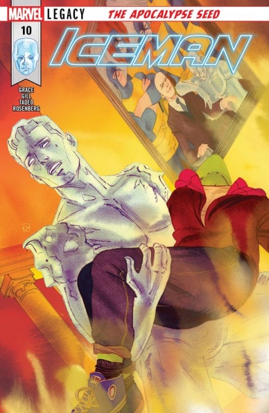
“Iceman” #10 is the penultimate issue of the series, brings many of the narrative threads in Sina Grace’s run to a close. This issue wraps up the Daken storyline, with a decent amount of action. One of the best parts of this series that hasn’t been related to Bobby’s coming out story, is seeing Bobby start to actually use his powers to their full potential. It’s been something that X-Men comics have toyed with for some time, saying that Bobby has the power of an omega level mutant. But this series has worked to actually show him using it.
Continued belowThe art in this issue is serviceable, and the team does a good job of portraying the fight between Bobby and Daken. There is a double page spread about halfway through the issue with Daken slicing through different ice clones, where the art does a good job of making each of the blows land.
The story is obviously moving toward a close with this issue. After the fight, there is a difficult conversation between Bobby and his boyfriend. This small moment between the two of them is probably the part of the issue that works best, as a very human conversation between adults. Overall, “Iceman” has been an interesting series, and a cool exploration of a Bobby’s life after the revelation that he was gay. It’s too bad that it is going to be over so soon.
Final Verdict: 7.0 – This issue does a good job of wrapping up story lines, and starting to bring this too short series to a close.
Infinity Countdown Adam Warlock #1
Written by Gerry Duggan
Illustrated by Michael Allred
Colored by Laura Allred
Lettered by VC’s Cory Petit
Reviewed by Gustavo S. Lodi
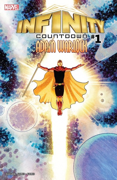
“Infinity Countdown Adam Warlock” #1 marks the beginning of Marvel’s expansive story around the rediscovery of the Infinity Stones. However, for a saga potentially so vast, this issue is very personal as it focuses on the return of Adam Warlock. This is a wise decision that delivers an excellent kick-off for this event as it frames the story around a worthy hero with a deep connection to these items of power.
Before dwelling into the script, it would be a disservice not to comment on Michael and Laura Allred’s art: it is nothing short of stunning. The entire issue is filled with gorgeous moments, but some stand out. Readers will observe how the Allreds use three splash pages to retell Warlock’s story: those pages combined unusual panel choices, an attention to detail and are so well-complemented by Laura’s Allred coloring that they are a sight to behold. In another instance, the artists use transparencies and layers to showcase Warlock’s costume through the ages, almost as if past versions of Him are all contributing to his current iteration. And, finally, one particular piece reveals what is to come after “Infinity Countdown”: Michael’s Allred razor-thin pencils are so suited for that “Where’s Waldo?” type of page that readers will search for hidden secrets for a good while.
That great art would mean little if not for a compelling story, and Gerry Duggan delivers. He has been laying the pieces of this saga on his “Guardians of the Galaxy” and it certainly is exciting to see the curtains drawn. Duggan chose to use this issue to do essentially two things: to reintroduce Adam Warlock with a sense of gravitas that this hero rightfully deserve. Long-time readers of Jim Starlin’s tales will automatically understand some references. Second, Duggan succeeds in generating a looming dread and emergency that draws the audience in: on a story so vested in time-travel, to have a sense of urgency is a hard feat to pull of… but pull it of he does.
Final Verdict: 8.2 – A personal and respectful story focused on one of Marvel’s great cosmic heroes prepares the canvas for a high-stakes event, while wrapped in some truly mesmerizing art.
Mother Panic/Batman Special #1
Written by Jody Houser
Illustrated by Ty Templeton
Colored by Keiren Smith
Lettered by John Workman
Reviewed by Michael Mazzacane
When ‘Milk Wars’ was announced the idea of Violet Paige getting involved may have been a bit of a stretch, even without her being a classic vigilante loner type. While her more direct involvement will come later, writer Jody Houser uses this segment of the ‘Milk Wars’ arc to tell what is both a solid introduction to Violet Paige and style of “Mother Panic,” and one that also reads, emotionally, as a continuation of the main “Mother Panic” series. Which is about the best I could hope for out of a crossover like this.
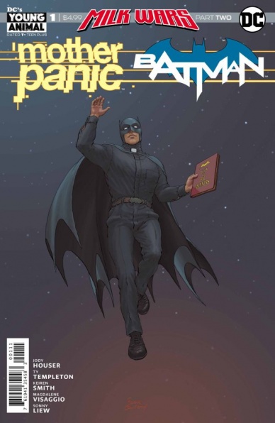
With all the RetConn homogenization business going on, things are getting a little screwy in the DCU. They’ve somehow resurrected Gather House and placed Batman under their frothy thrall. In a bid to make Batman more palatable they’ve twisted Batman into an incongruent vision of the ’66 Batman, which informs the aesthetic of the book created by Ty Templeton (who worked on the “Batman ‘66” comic) and Keiren Smith. That version of Batman was presented as an alternative authority figure. Now he has become Father Bruce with his shotgun wielding Holy Sidekick Choir of Merciful Justice, removing the counter culture influence and fusing it with the idolatry of “Returns” era Batman.
Continued belowTy Templeton and Keiren Smith do a great job of using the aesthetic of the “Batman ‘66” comics without using it to punch down at it. It operates as a reference point to reveal the absurdity that is going on in the story. Outside of it as reference, it becomes an interesting example of less is more design. The costuming isn’t overly elaborate, Violet’s outfit stands out because of how comparatively overwrought it is to the simple choir costumes and priestly cape and cowl. The designs may appear simple but what it allows Templeton to do is get to the core emotional beat of an image like good cartooning should. Keiren Smith’s pallet goes a long way in selling the “66” aesthetic with everything being saturated with bold solid colors.
While this issue aesthetically cribs from others, it functionally still reads like a “Mother Panic” issue. You have the insertion of symbolic surrealist imagery during action beats and pages that cycle through containment and freer flowing panels. With the various artists that have rotated through “Mother Panic” it’s been interesting to see how core aesthetic motifs to the series are represented by different teams. With Templeton and Smith, they’ve created for a more graphic look compared to the dark whimsy or impressionist takes of artist Shawn Crystal and Tommy Lee Edwards.
Final Verdict: – 7.5 – “Mother Panic” returned for ‘Milk Wars’ in an issue that might entice new readers but doesn’t discount current ones.
Rise of the Black Panther #2
Written by Evan Narcisse with Consultation by Ta-Nehisi Coates
Illustrated by Javier Pina
Colored by Stephane Paitreau
Lettered by VC’s Joe Sabino
Reviewed by Alexander Jones
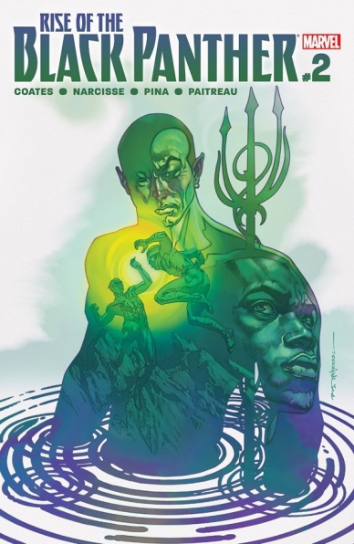
Lots of readers likely don’t have the backstory around T’Challa as presented in the original comic book form. Part of the reason for this is how the character’s origins stem from “Avengers” and “Fantastic Four” stories. Even the most well-read Marvel readers likely don’t understand some of the nuances of T’Challa’s origin, which is why “Rise of the Black Panther” #2 feels almost like new material to me and lots of other astute readers. Since the issue is laced with endearing bouts of action and genre elements, the comic doesn’t read like your average origin story either.
The follow-up chapter takes a huge departure in storytelling tone and only focuses on a compressed amount of time with the characters. This installment is centered around Black Panther’s team-up with Namor. The comic carries a strong amount of intrigue carrying the book along as the people of Wakanda are struggling to reveal themselves to the rest of the world. The issue does try to awkwardly retrofit the ‘60s continuity with the present day aspects of the Panther’s life.
I have seen Javier Pina’s work look lush, focused and beautiful, but “Rise of the Black Panther” #2 looks rushed. Some pages, like the opening action scene between T’Challa and his competitor, looks fantastic from a composition standpoint and from the line work gracing the page. Some of Pina’s work on the issue is gorgeous while the final couple pages have sloppy line work that detracts from his stronger pages earlier on. The second-to-last page, in particular, has a couple panels with Namor which are hard to take in–Namor makes the strangest facial expression that is drawn in a relatively amateur manner.
Even though the art can be inconsistent and leave something to be desired, “Rise of the Black Panther” #2 is a solid comic book with an exceptional script. Writer Evan Narcisse has a fantastic grasp on the Black Panther, but he often falls into the trap of smothering the page words that don’t add anything to the narrative. Black Panther writers have a long history of being verbose, but with a little more polish and less dialogue, the situation could have been changed. While this is another strong chapter featuring a solid script, I hope the subsequent installments of the title smooth out the rough edges of Pina’s artwork and pair down the dialogue in Narcisse’s script.
Final Verdict: 7.5 – “Rise of the Black Panther” #2 is a great retelling of Black Panther’s origin story with a solid foundation and inconsistent artwork.
Continued below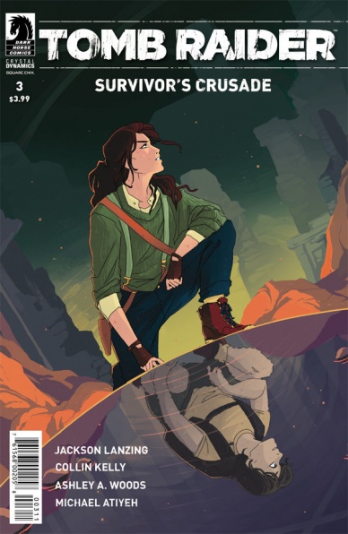
Tomb Raider: Survivor’s Crusade #3
Written by Jackson Lanzing and Collin Kelly
Illustrated by Ashley A. Woods
Colored by Michael Atiyeh
Lettered by Michael Heisler
Reviewed by Gregory Ellner
After the heart-wrenching argument between Lara Croft and Jonah Maiava in the previous issue, Jackson Lanzing and Collin Kelly continue their analysis of a major flaw within the rising heroine: her obsession with the past. Even when she spends an entire year trying to stay away from her hunt for Trinity, Lanzing and Kelly show that her father’s assassination is still on her mind. However, rather than show it through repetitive dialogue or an outright retread of the preceding argument, the writers instead showcase what exactly she does with her time, gradually moving away from the relatively mundane shipwrecks of a day job and toward first a brutal, self-enforced physical training regimen, then a hunt for a “special place” she had with her father Lord Richard Croft. Therefore, even when she is not actively hunting for her father’s killers, the archaeologist is still demonstrably trapped in her own past.
Ashley A. Woods is very good at showing the variety of emotions that cross our heroine. From her intense loneliness as she remembers her times with her deceased father, to her determination to keep herself occupied (at the potential risk of her own safety), to her happiness as a young child, Woods is very good at explaining what is going on in Lara’s head without actually needing to say a word, due in no small part to the relative lack of dialogue in the present day.
Michael Atiyeh’s coloring is very good at setting a mood. From the bright past and outdoors to the dark, sullen present day, the colors immediately pull readers into Lara’s attitude. Of special note is the final page, with its use of multiple different color schemes for different visual styles. Coming as a shock, this sudden break helps to pull readers back into the reality of Lara’s situation.
The writing and artwork make clear that even if Lara Croft tries to escape her own obsession, it is going to keep pulling her back in, whether she and Jonah like it or not.
Final Verdict: 8.5- After a heartbreaking previous issue, “Tomb Raider: Survivor’s Crusade” #3 is a very well-done character study of Lara Croft herself.


