
There is a lot to cover on Wednesdays. We should know, as collectively, we read an insane amount of comics. Even with a large review staff, it’s hard to get to everything. With that in mind, we’re back with Wrapping Wednesday, where we look at some of the books we missed in what was another great week of comics.
Let’s get this party started.

”Deathstroke” #12
Written by Christopher Priest
Illustrated by Larry Hama and Joe Bennett
Reviewed by Kent Falkenberg
There’s no real shame when a book dips after a landmark issue. And, make no mistake, that’s what Priest gifted us two weeks ago – ‘Chicago’ had weight enough to resonate well beyond the cape and costume stratosphere. So, it’s kind of expected that any follow-up will fall back to earth. Unfortunately, this one falls further than that. It hurts to say, but “Deathstroke” #12 is a bit of a mess.
Joe Bennett bats cleanup over Larry Hama’s breakdowns, so there’s an undeniably ‘90s element to the smoothly executed action scenes and Deathstroke’s hyper-stylized in-costume posing. These parts are fun in the same way we all enjoyed knocking two actions figures together when we were six (or sixteen). But there’s a tendency for backgrounds to disappear behind talking heads. And there’s a lot of talk in this issue.
‘Twilight’ continues spinning out the tapestry of compromised morality that Slade Wilson has smothered his family under. Priest plots a fairly dense issue, weaving about five different threads together, all while introducing Raptor to the title. He does navigate smoothly from one to another, but there seems to be something missing in his dialog – and not in a subtextual, words-left-unsaid kind of way, either.
Conversations are confusing and awkwardly phrased, to the point that I found myself re-reading pages. Not so much to understand how these scenes ended – the plotting is clear enough – but more to understand how the characters themselves came to certain conclusions. In a book this deliberately paced, I understand Priest needs to leave people in specific situations before moving to the next thread. But there are too many scenes (Rose and Hosun, Etienne and Joseph, even Slade and Dex) where Priest seems too concerned with moving the chess pieces forward than in making the words flow naturally.
Final Verdict: 6.0 – After a very special episode, it’s a rocky return to the regularly scheduled “Deathstroke.”

Divinity III: Shadowman and the Battle of New Stalingrad #1
Written by Scott Bryan Wilson and Matt Kindt
Drawn by Robert Gill and Juan Jose Ryp
Reviewed by Alexander Jones
The allure of the Stalinverse is clear. Now that the Valiant Universe has been re-written, the publisher’s icons can be reinterpreted in new ways. Jack Boniface, someone who has had a hard time establishing himself within the Universe gets his due in “Divinity III: Shadowman and the Battle of New Stalingrad #1.” The hero’s role as the leader of a revolution finally gives him a unique role to play in the Valiant Universe.
With so many things about the Universe up in the air during this event, watching a more traditional Shadowman battle against against a corrupt regime is thrilling and straightforward. The story written by Scott Bryan Wilson and illustrated by Robert Gill is littered with violence. Gill’s gritty style meshes well with the tone of the writing, equating to a poignant fight sequence towards the end of the issue. The battle is arguably the highlight of the issue even if the sequence ends too abruptly. The idea of resistance amidst the Stalinverse is a captivating idea and one that isn’t explored with quite enough depth in these pages. Shadowman’s forces are never properly fleshed out in the issue.
If you have been curious at all about the state of the Stalinverse in general, this issue is a great place to jump in with straightforward action and characters. The issue is paced very fast, but pays off a key plot point in the story very early on. Shadowman has always been a character with incredible potential and has abilities are introduced in a strong, innovative manner in this issue. The introduction to the Deadside brings a much-needed twist to the story.
Continued belowThe issue is at its best when the fight scene wrapping up the story pulls the narrative together. Gill’s work is strongest when superheroes are fighting each other and buildings are toppling. Some of Gill’s pencils with more regular people falls short towards the beginning with lackluster figure work and needless, gross-out violence. Thankfully, the artist pulls all the disparate threads of his work together towards the end with a brutal final conflict topped with an emotional splash page to leave readers hanging.
Matt Kindt’s story in this comic introduces a character who is just creepy enough to elicit some nasty nightmares. Juan Jose Ryp finally gets the chance to add his pencils to the horror style best suited to his work. Even though the story is short in page count, the strange, twisting tale of an oppressed Stalinverse local is enough to leave a lasting impression. The character work comes full circle at the end with a nice, more direct tie to this crossover that I’ve seen previously. The story will also give readers a nice taste of what could be next for the Valiant Universe.
“Divinity III: Shadowman and the Battle of New Stalingrad #1” is a complete package with a really nice introduction to a character who has stumbled to find a unique voice in his ongoing series. Wilson finds a great entry point to the character with Gill’s brutal pencils and Kindt and Ryp’s introduction to Baba Yaga is every bit as unsettling as I wanted it to be.
Final Verdict: 8.0 – Wilson and Gill find a new way to establish Shadowman in the Valiant Universe as Kindt and Ryp get the chance to haunt your dreams.
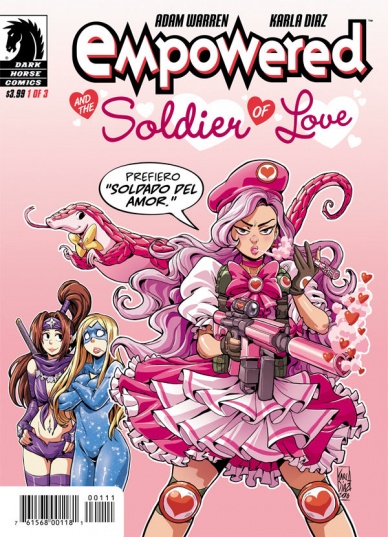
Empowered and the Soldier of Love #1
Written by Adam Warren
Art by Karla Diaz
Reviewed by Jake Hill
“Empowered” is back in an all-new format! Usually published in manga-style digest volumes written and drawn by series creator Adam Warren, “Empowered” is now breaking out into a three part miniseries, with art by series newcomer Karla Diaz. As such “Empowered and the Soldier of Love” #1 (excusa me, Soldado del Amor) is a relatively self-contained adventure for Emp, Ninjette, the Superhomeys, and a new villain, the titular Soldier of Love.
After a quick recap page, drawn by Warren in the regular series style we move immediately into the adventure. The mostly Spanish-speaking Soldier of Love is in town and she’s causing superheroes to feel… uncontrollably amorous feelings for each other. Things start out subtle (as subtle as they ever are in “Empowered”) with a simple slash-fiction-turned-real scenario, when Smokeshow cheats on Night Giant with his best friend (and Alcoholics Anonymous sponsor) Freedom Rocket. From there things escalate when living slime puddle Protean has a bathroom threesome with Fairy Dustdevil and the ice-powered Special Snowflake. In fact, every superhero in the City seems to be uncontrollably sexting and/or doing the nasty. Everyone except for Emp and Ninjette.
An “Empowered” story lives and dies with its humor and even though Warren isn’t drawing the issue, he and Diaz don’t miss a beat. Diaz nails the improbable outfits and pouty lips that are at the core of “Empowered” but adds a Saturday morning cartoon feeling. This really works; “Empowered” is usually completely over-the-top, so adding another dimension of energetic zaniness really serves the issue. Pink hearts fly out of Emp’s head as she sees the hyper-masculine Solar Flexus make out with the equally testosterone-charged Cosmos Def. “I would totally ship this, if it weren’t actually f**cking happening!” Emp yells before letting out a “Squeeeee!” The whole sequence is hilarious and adorable.
Hilarious and adorable are really the operative words here. Getting a female artist on “Empowered” was a great decision, as it removes an icky dimension that may have been a barrier for readers in the past. Warren has always used the comic to criticize the sexualizing nature of superhero comics, but having an actual female perspective on the art not only makes the commentary more biting, it makes the ridiculous costumes funnier. Plus it gives Warren more time to focus on coming up with brilliantly inspired names for the supporting characters. I’m personally a fan of Mechzacoatl, though Shock King is also pretty great.
Continued belowFinal Verdict: 7.8 – If a girl in a buffalo mask making out with a puppy would offend you, maybe this is not for you. Otherwise, a hilarious first issue in an exciting new miniseries!

Justice League of America: Rebirth #1
Written by Steve Orlando
Illustrated by Ivan Reis
Reviewed by Tyler J Brown
Although I was initially excited to hear that Steve Orlando would be taking over “Justice League of America,” I have to admit that I didn’t read any of the four one-shot issues starring Killer Frost, The Atom, Vixen, or The Ray. Needless to say, I was a bit hesitant coming into the “Justice League of America: Rebirth” one-shot, afraid that there would be no time spent introducing those four characters. I’m more than thankful to say that readers coming into this issue cold won’t feel lost.
The idea Batman has for this team is that they’re all mortals, heroes that the communities they serve can look up to instead of the god-like beings that pepper the DC universe. It’s an interesting idea; mortals saving mortals and wanting to inspire they people they save, etc. My only gripe with this idea is the inclusion of Lobo. Is he really considered mortal? The dude is a nearly indestructible alien. The cynical comics fan in me is yelling that they only included Lobo on the team because he’s either incredibly popular or they aren’t sure exactly what to do with him yet…or both? Anyway, besides that minor question, his inclusion didn’t hinder my enjoyment.
Although I’ve confessed to disliking the fact that DC Comics has a “house style,” I have to admit that when it works, it works. That is to say that Ivan Reis is one of those less-stylized artists DC employs, whose art I never mind seeing. His work isn’t overly detailed, so it doesn’t get bogged down in a need to make sure every inch of every surface is rendered. Instead, Reis employs a style that gives just enough substance to every character and background. His pencils really make this book stand out from the rest as a more down-to-earth approach to a Justice League book. Of course, he wasn’t alone in this effort. Joe Prado and Oclair Albert give every panel depth with their inks while Marcelo Maidlo’s colors bring a warmth to the pages that I wasn’t expecting.
Batman leading a rag-tag group of superheroes that aren’t sure if they even want/deserve to be there? Although similar formulas have been tried (and succeeded) in the past, Orlando’s “Justice League of America” is already looking to be something different. I know I wasn’t the only reader excited to hear that Orlando would be taking over JLA, and that excitement has been proven to not be misplaced. This book is something to be excited about.
Final Verdict: 8.0 – Deserving of the hype, this book provides an exciting new direction for one of DC’s flagship teams.

Kingpin #1
Written by Matthew Rosenberg
Illustrated by Ben Torres
Reviewed by Gregory Ellner
‘Born Against,’ the title of this issue, is the perfect summary of Rosenberg’s latest approach to Wilson Fisk, the eponymous, notorious Kingpin. As he enters the Daredevil-based ‘Running with the Devil’ plot line, Fisk has been let out of jail, and seems to be trying to have a fresh start with a cleaner record while being honest about his past crimes. This approach is seen through the eyes of poor journalist Sarah Dewey as she encounters him and decides on whether or not to write his biography. As far as Kingpin stories go, the focus on his quasi-nice side puts readers on edge, wondering what his angle is, how he is planning on spinning his latest attempt to curry public favor.
Journalist Sarah Dewey makes an excellent counterpoint from which to examine Fisk anew. She is aware of his criminal past, as would be most of the world, but is desperate enough monetarily and has little enough direct interaction with him thus far to be a fresh face.
Ben Torres’ artwork is exceptional. At some points in the tale, the art of the scenery becomes darker, with the people involved becoming white silhouettes, emphasizing the darkness of a noir drama. Wesley’s scenes are almost always cloaked in shadow, with his cheekbones clearly visible, in contrast to the far more bulky Fisk. This appearance, coupled with the approximation of a widow’s peak in his hair, makes him look far more dangerous, simultaneously emphasizing Fisk’s own darkness in spite of his public turn toward legal operations. When Torres wants Fisk to appear somewhat benevolent, he gives him a small smile and kind eyes, unlike his usual menace as a crime lord when facing the likes of Daredevil or Spider-Man. On the subject of Daredevil, we see a far more menacing view of his civilian identity as Matt Murdock when at one of Fisk’s public events. As soon as Fisk’s name is brought up in a conversation between him and Ms. Dewey, his face becomes cloaked in shadow, with the artwork depicting his shadow behind him in the shape of his vigilante alter ego, including red lines in the outfit as if to emphasize it rising up behind him, looming over her. As another very interesting point, toward the end of the scene, his silhouette is shown with a walking stick in one hand and a glass of his drink in the other, with the composition of his appearance implying his trademark Billy club.
Continued belowFinal Verdict: 8.0– Interesting jumping-on point for those wishing to see into the complexities of a criminal boss in the Marvel universe.

Motor Crush #3
Written by Brendan Fletcher and Cameron Stewart
Illustrated by Babs Tarr
Reviewed by Rowan Grover
Fletcher and Tarr give us a deeper insight into the character relationships here, especially with Lola, Dom, and her father. Lola and Dom reunite early on in the issue, however only as a cycling team, which is realistically written and doesn’t feel forced. The scene is bookended by a cute appearance from Dom’s father to help coerce Lola into coming back, which helps to keep the drama grounded and relatable. Plot-wise, we’re being introduced to more and more racers, which is both interesting yet hard to follow at times. When the large face on the comic’s cover, Decimus Wexler shows up, it feels a little shallow. We do get a panel of Decimus and Dom locking eyes, seemingly hinting at some connection to reappear later at the series. However, we don’t get any dialogue or further interaction with him, making the appearance a little underwhelming.
Luckily, we’re introduced to my personal favourite character as of yet, Queen Christine, who feels more fleshed out than other underground racers. Almost immediately, she commands the attention of the reader with her brusque speech patterns and incredible visual design. Fletcher and Stewart cap off the issue with an alluringly mysterious character that seems to know a deeper secret about Dom. It’s a well written sequence that takes itself seriously enough to avoid falling into stereotype traps, and ensures that readers will return next issue to find out what happens.
Babs Tarr really has a style set in stone for this series that works so well, and seems to improve with every panel. Right from the start of the issue, Tarr ensures we’re thrust right into the thick of things, with a dynamic sequence of Dom practicing during night hours. Tarr uses great panelling and camera work to convey Dom’s racetrack frustrations, with the last panel of the sequence displaying her bike skidding and falling from her, almost escaping from the panels of the page to ensure complete immersion for the reader.
However, Tarr has a great hand at quieter scenes, too. Dom and Lola’s meeting is set in Lola’s house, starting with each character on either side of the front door conversing. Again, it’s a scene that could easily feel corny and cliché, but is humble enough in execution that it comes across as very human. Additionally, we get to see Tarr’s great facial work on Dom and Lola, with sequences that go through longing, comfortability and a touch of humour just through close up shots. Another great example of this occurs on the following page, in which we see Dom’s face darkened as her mind is elsewhere. She’s pulled back to the crowded city the next panel, in a way that expresses her worry and loneliness better than any exposition could.
Colorist Heather Danforth is a big part of the iconic, pink cyberpunk aesthetic of the book, and provides some great work in this issue. Her night-setting work is especially notable, giving her ample opportunity to fill scenes with neon glows and a softer palette. Early on, a scene depicts Dom finding her dad during the middle of the night, and embraces him in a panel with no background detailing but a soft blue light illuminating both characters. It’s a subtle touch, but it works to make the book more engaging.
Final Verdict: 7.8 – Motor Crush continues its vibrant first arc with solid character debuts, immersive bike action and moving quieter scenes.
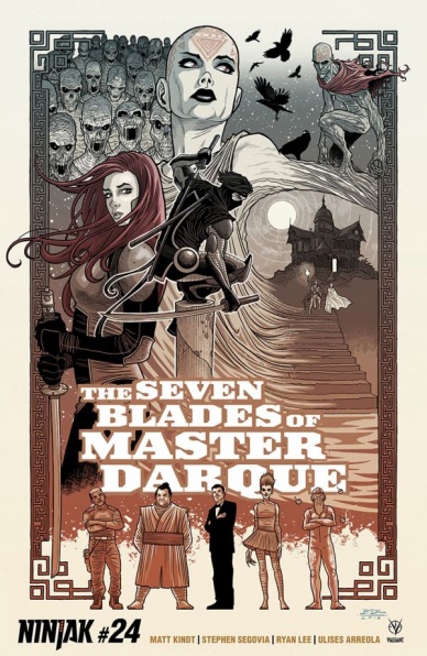
Ninjak #24
Written by Matt Kindt
Illustrated by Marc Laming
Reviewed by Mike Mazzacane
Generally, the twenty-fourth issue, and second issue in the current arc, wouldn’t make for a good jumping on point to a series, but this issue manages to be perhaps the best jumping on point in the series. It is exposition heavy, as the Shadow Seven meet their new benefactor, Sandria Darque, and mission details are spooled out. At the same time, Matt Kindt and artist Marc Laming quickly retell the history of Ninjak and the series overall.
Continued belowThe exposition heavy nature and diversions this issue takes is a change of pace; yes, #22 was the ‘silent’ issue, but it still spoke in the action heavy language of the series overall. Fighting does not dominate this issue, conversation does. To have Sandria clearly state “this is what I want done” runs counter to the action oriented stance of the book. However, even as she orders the Shadow Seven to kill her brother, her representation in the book leaves plenty of room for doubt. Sandria is rendered a femme fatale, introduced in a skin tight red dress. Laming draws her from angles that emphasize her sexual allure and mystique as she tugs Ninjak along. With panels floating around the page, focusing on subtle changes of expression, or quickly moving to the next moment, it creates a sense of shifting motivation and priority.
For all the present day briefings, it is how effectively and quickly Kindt and Laming re-illustrate Ninjak’s history that makes the book a place to jump on. The past is reimagined in the form of ‘Ninja Tracks,’ thirteen 4 panel comic Chibi-inspired strips. Their brevity and simplicity render Ninjak down to pure intent and desire. Kindt’s reworking of the “pure of heart trope” as more a matter of intent fits it into the relativist view of the series. Intent only speaks towards action not judgement. It recalls the sad commentary by filmmaker Jean Renoir, “the truly terrible thing is that everybody has their reasons.” Everything is justifiable and up for debate.
Final Score: 7.5 – “Ninjak” is clearly headed towards something big as it builds and builds towards taking on one of Valiant’s most powerful villains.
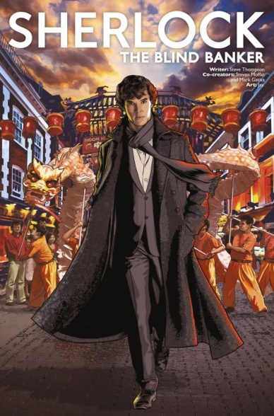
Sherlock: The Blind Banker #2
Written by Steve Thompson
Illustrated by Jay
Reviewed by Nicholas Palmieri
This issue adapts approximately ten minutes of a ninety-minute episode of BBC’s show Sherlock. About 95% of the panels are copied directly from the camera shots in the episode, and closer to 99% of the dialogue is word-for-word. The TV series is certainly quality, and this adaptation keeps the story exactly as-is. But given that there are almost no artistic liberties taken, I can’t help but wonder: What’s the point?
Jay does a great job capturing the likenesses of the actors. His character designs do have slightly exaggerated noses and eyes, but that and the choice of which lines to use in stylizing the faces shows his personal style. His choice of which shots or parts of shots to use is also interesting. Most panels focus on the blocking of the characters’ bodies in relation to each other and their environments, for more direct storytelling. Occasionally, though, he will focus on a smaller detail instead of drawing the main focus of a shot, like one panel where a character washes his hands and which focuses on the sink instead of the characters. There are also a few panels throughout the book where Jay frames his panels from above, which is completely new — one the only truly new things in the whole issue. Even so, his choice in what to repurpose here has the cumulative effect of a slightly more Japanese pacing and tone than the show has.
The focus on environments in particular made this issue feel much more Japanese. The first (and sometimes last) panel in most scenes exclusively highlights either the overall scene or a small detail from within the scene, whereas the show often skips such establishing shots. Jay’s detail and framing of these moments adds to the more grounded and slightly more relaxed tone compared to the show, which is nice.
There is absolutely nothing technically wrong with the comic. Still, though, there is the price tag. $5 for a word-for-word adaptation of ten minutes of something that’s easily accessible? For only $3 more, you can subscribe to Netflix for a month and watch all 900 minutes of the show that are currently available.
I’m sure there’s some Sherlock super-fan out there who is glad this got an official North American release, but the steep price tag and overwhelming lack of new creative touches keep me from recommending this to anyone else.
Continued belowFinal Verdict: 4.5 – An adaptation so absolutely faithful that there is very little reason to read it. Watch the show instead.

“Southern Cross” #11
Written by Becky Cloonan
Illustrated by Andy Belanger
Reviewed by Matt Lune
This issue is the penultimate chapter in the second arc of the series, and “Southern Cross” is ramping up the speed. For a book that already feels like it’s permanently in high gear, that’s saying something.
There was always a lot going on in this series, but in this issue it’s clear that Cloonan is at her best when spinning as many plates in the air as possible. Multiple factions; numerous characters, most of which have more than a couple different motives and ties to the titular missing ship; throw in reanimated corpses and a set of all-powerful alien artefacts and it’s sort of an understatement to say that the plot here is busy. Yet it’s a rewarding kind of busy, the kind that deserves a second read and validates you for doing so, especially here where the action is so fast and so clearly building towards an explosive finale (pun sort of intended.)
Likewise, Belanger’s detailed, often graphic art works overtime to provide as much plot as the words on the page, rewarding the reader for examining every panel. The grimy, industrial sci-fi setting is presented with an almost James Stoke-esque level of detail, and Cloonan’s dependence on that pays off when intricate details in a panel from pages earlier pay off later in the narrative. The pacing of the issue is really well constructed, pulling you along through multiple plot threads at a speed that is almost dizzying but never leaves you behind, a testament to the panel work. The intentionally, uncomfortably ugly characters, the disgustingly detailed violence and the unsettlingly atmospheric locations – all crafted by Belanger – will, to be honest, make you’re glad you’re not living in the world of “Southern Cross,” but more than that it’ll draw you into this unique universe and keep you coming back for more.
After an arc that has been dealing mostly with the grounded realism of a mining rig and the political and personal battles therein, this issue drags us back into the other-worldly psychedelia of the first volume in a major way, allowing Belanger and Loughridge a chance to truly flex their muscles. The final scene is especially noteworthy for its trippy backgrounds, and panels that expand outward engulfing the page until a graphic final reveal that allows Belanger’s character work to take the spotlight.
It’s here in the final few moments that this complex rollercoaster of an issue lays its cards right on the table. The tangled web of plot-lines all get simultaneously drawn together and swept aside as we hurtle headlong to a conclusion that is almost impossible to predict at this point. In a book that delights in throwing curve balls at the reader, this issue is a statement that maybe the craziest moments are yet to come.
Final Verdict: 7.0 – It’s full steam ahead to the conclusion of volume 2, and with everything coming together there’s no sign of easing up on the action or plot twists.


