
There’s a lot to cover on Wednesdays. We should know, as collectively, we read an insane amount of comics. Even with a large review staff, it’s hard to get to everything. With that in mind, we’re back with Wrapping Wednesday, where we look at some of the books we missed in what was another great week of comics.
Let’s get this party started.
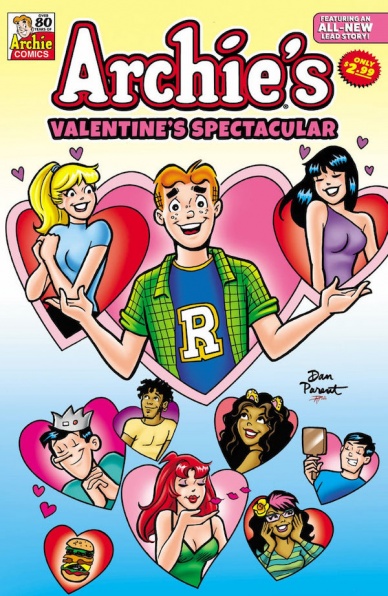
Archie’s Valentine’s Spectacular #1
Written by Jamie Lee Rotante, Kathleen Webb, George Gladir, & Dan Parent
Penciled by Bill Galvan, Jeff Shultz, & Dan Parent
Inked by Ben Galvan, Henry Scarpelli, Jon D’Agostino, & Jim Amash
Colored by Glenn Whitmore and Barry Grossman
Lettered by Jack Morelli and Bill Yoshida
Reviewed by Henry Finn
“Archie’s Valentine’s Spectacular” #1 continues the high-school hijinx of our iconic characters Archie, Betty, Veronica, and our ever-sardonic Jughead. While on the surface the issues seem as topical and mundane as ever, there is an attempt to bring Archie and gang into the modern day zeitgeist, which have mixed results.
In the first story titled ‘A not-so-sweet romance’, we find Archie curiously aggravated at how much his friends love the latest hit song by Taylor Swift lookalike. I mean in case you weren’t sure, her name is Taylor and her nickname is TaySway. She is singing about her ex the ginger-bread boy and much to everyone’s chagrin we find out she’s talking about Archie! It’s their attempt to stay relevant in today’s society. I find this an obvious play and am truly unsure if it works or not.
One thing that is funny about the book is early in it Veronica chides Betty for being ‘so 2018’. Which is hilarious because they still look like they’re stuck in the 50s with their clothing. Sure, Betty has a hoodie on but the primary colors and simplistic character designs makes it hard to tell the difference. This is the challenge of being an illustrator tasked with modernizing characters invented in 1939. The problem with sticking to the simplified primary colors and art style limits the visual presentation.
The rest of the art follows the template set forth for the past 80 years as well, and it is more of the diversity in characters in the world that surround the gang that subtly reveal we are in a different era.
Final Verdict: 5.0 – Another adventure in the saga of Archie and the gang that should please readers of their age group.

Devil’s Reign #4
Written by Chip Zdarksy
Illustrated by Marco Checcetto
Colored by Marcio Menyz
Lettered by Clayon Cowles
Reviewed by Ryan Fitzmartin
“Devil’s Reign” #4 features the good guys on the run and the bad guys in control. The ‘Devil’s Reign’ crossover event is Zdarsky’s NYC focused version of Bendis’ ‘Dark Reign’ event from 2008. Daredevil, aided by the Champions and the Avengers, wages a resistance against the fascistic rule of mayor Wilson Fisk and his ally Doctor Octopus. Zdarsky mixes strong character pathos with social commentary to create a story that’s easy to get invested in. Putting the good guys on the wrong side of the law is a reliable plot, which has worked for Marvel in the past and works here. In that same lane, Zdarsky’s criticism of policing and power doesn’t exactly feel new, but it does feel still relevant. His character scripting rises above his rehashing of an old story, and Daredevil and Kingpin are particularly well written.
Checchetto’s art is competent and he conveys emotion well. There’s a lot of speechifying and exposition and Checchetto does nice work with the faces during it all. His costume work is particularly strong, with the detail on Rhino and Moon Knight’s outfits being a highlight of the issue. The costumes pop off the page and feel as if they have real texture. The only minor flaw is some of the action panels are a little too cluttered. Once or twice, having too many characters in a frame made it hard to tell exactly what was happening. On the flip side, the coloring is flashy. Marcio Menyz makes things pop, and he does an especially great job of making each environment in “Devil’s Reign” #4 feel distinct, whether it’s a prison, hospital, or luxury apartment.
Continued below“Devil’s Reign” #4 feels a bit like Zdarsky doing a cover version of Bendis for better or worse. This isn’t the first time Marvel’s done a “heroes on the run” story and it surely won’t be the last. The execution is strong enough that it’s still worth reading, especially for fans who enjoy it when a band plays the hits instead of trying something new.
Final Verdict: 7.7 – A solid modern riff on a classic Marvel story.

Norse Mythology III #1
Written by Neil Gaiman and P. Craig Russell
Illustrated by David Rubín
Colored by Xulia Pisón
Lettered by Galen Showman
Reviewed by Gregory Ellner
Comic books portraying Norse myths are far from a new concept, and readers need only to look at the take on Thor in Marvel Comics to see as much. However, with “Norse Mythology III” #1, Dark Horse Comics takes a look at the original myths, rather than modifying them to a superhero setting.
P. Craig Russell works alongside Neil Gaiman, author of the anthology book Norse Mythology that this series and it’s two six-issue predecessors adapt, and in so doing presents a highly educational approach to the Scandinavian legends. Merging an olden storyteller take on narration with highly amusing dialogue, the misadventures of Asgardians and giants come to the fore.
David Rubín’s artwork is rough yet expressive, giving the feel of a story that is not at all refined and features many imperfect people. The style is highly expressive, especially when it comes to Tyr’s giant father. Monsters such as Jormungandr are drawn in detail as well, giving a real feel for the monstrous nature of elements to this world.
Xulia Pisón’s colors are vivid as they are dark, adding significantly to the grit and grime of the Norse mythological world. It all feels all the more violent and somewhat crass due to the darker coloration, which makes the characters, be they gods or giants, feel all the more human.
Final Verdict: 7.0– Educational and amusing, an interesting story straight from the eponymous legends greets readers for this first installment to the third volume of ‘Norse Mythology’.

Secret X-Men #1
Written by Tini Howard
Illustrated by Francesco Mobili
Colored by Jesus Aburtov
Lettered by Clayton Cowles
Reviewed by Quinn Tassin
On it’s face, “Secret X-Men” #1 doesn’t seem to be about much more than having a good time with an interesting, fleeting roster. And to be honest, there’s probably not that much more than face here. This is an issue that focuses on Sunspot getting together the other would be X-Men who weren’t elected during the Hellfire Gala and going on a space mission while very hung over. There really isn’t much more to it than that, which is honestly welcome. We get the breezy but brave fun of a Roberto-led mission and nice little glimpses of characters who deserve some time in the sun. Character-wise, Sunspot and Cannonball get the most to do by a fair margin. There isn’t quite enough time to give all of the characters real moments which is a bit of a shame given how great so many of them are.
The artwork in this issue is strong. The action isn’t particularly inventive but it is always exciting and with a group of characters with this wide spread of power sets it’s nice to see them illustrated well. The colors are solid if a bit muted which doesn’t quite fit be fly by the seat of your pants tone of the issue. The visual high Point definitely comes when the team is attacked mid-flight. We get a beautiful, exciting look at Armor, Strong Guy, Banshee, and Cannonball working together in a scene that makes me long for an ongoing series with this group.
This story doesn’t seem to be totally superfluous given the strange kidnapping of Deathbird and wiping of the X-Men’s memories. It’s a strangely executed plot point- it’s sudden, frantic, and understated all at once- but one that also signals toward some future purpose. Other than that, this isn’t an issue that sets up or pays off all that much. Which is fine! There should be more comic book issues like this; issues that understand that having a good time in space is just as important as intricate, constant stake-raising.
Continued belowFinal Verdict: 7.6- Simple fun. No more, no less.

X Deaths of Wolverine #2
Written by Benjamin Percy
Illustrated by Frederico Vicentini
Colored by Dijjo Lima
Lettered by VC’s Cory Petit
Reviewed by Alexander Manzo
Benjamin Percy continues his cat-and-mouse storyline between Moira MacTaggert and Mystique in this issue. Although the overall story still feels very fast-paced by nearly forcing Moira into a corner, the reader gets to see how desperate and willing she is to try and break free. Percy gets his chance to shine with how brutal he can go by slowing it down to see the courage needed for Moira not only to cut off her metal arm but cauterize the wound on the same page. Percy also does an excellent job of switching the perspectives with Mystique and a Phalanx in the form of Wolverine. In the final pages of the issue, Percy does a great job of leaving a hook for the reader by asking what Moira saw in the future and what could be coming for more than just her.
Frederico Vicentini does a solid job with the art in this story by having crisp, clear lines yet giving every page and panel some grittiness. Throughout the story, there’s this vibe of never feeling safe and looking around every corner to make sure the characters are safe. Especially given that Mystique is the hunter in this scenario, Vicentini gets to have some fun by splitting her transformations when she transforms, and her brutality with her kills. There is also this perspective shift that Vicentini does where he can make quick movements to show the reflexes of the characters, such as when “Wolverine” gets shocked by a taser then immediately flips it on the cop.
The colors by Dijo Lima are bright and distinctive, so there’s no shying away from the brutality of this issue. The story is centered around the chase, and it’s a treat for the reader to not just have the characters hide in the shadows and hold their breath. Lima’s color palettes showcase blood, gore, and explosions.
Final Verdict: 8.5 – The creative teams work well to create this mutant version of a Bourne Identity-like issue of cat and mouse where there’s still plenty of secrets and twists to be revealed.


