
There’s a lot to cover on Wednesdays. We should know, as collectively, we read an insane amount of comics. Even with a large review staff, it’s hard to get to everything. With that in mind, we’re back with Wrapping Wednesday, where we look at some of the books we missed in what was another great week of comics.
Let’s get this party started.
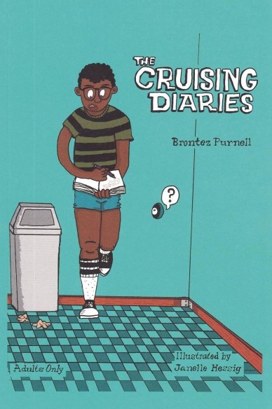
The Cruising Diaries: Expanded Edition
Written by Brontez Purnell
Illustrated, colored, and lettered by Janelle Hessig
Reviewed by Jeremy Estes
After leaving the repressed straight world of Alabama for the queer sexual frontier of Oakland, author, musician, and dancer Brontez Purnell sought out the kinds of sexual escapades that would make half of us blush and the other half green with envy. He chronicled his adventures in 2014’s “The Cruising Diaries.” This expanded edition brings more of the same. Purnell writes about sex in a way that is more than confessional. It’s sensual in the way that it ignites the senses–touch, taste, smell–but it isn’t erotic. In fact, in his introduction Purnell calls these stories “anti-erotica”, which is a perfect encapsulation of the work. These vignettes are written with the frankness of a PornHub description, evoking all the stupid, funny, and gross things which happen in the pursuit of an orgasm.
Each story is accompanied by single-page illustrations from artist Janelle Hessig. It’s a perfect match for Purnell’s unsexy stories. Even the most outrageous images—-a super-powered STD dragon emerging from Purnell’s backside, a crowned penis sitting on a throne–pulse with life, but it’s the people who feel the most real. Hessig’s figures are rubbery and long-limbed, filled with the kind of cartoon energy that’s impossible to convey in perfect proportions or exact anatomy. These characters are covered in hair, veins, fluids, and blemishes that, despite their simple rendering and primary colors, bring the stories to life.
It’s refreshing to see such taboo subject matter treated in such a breezy way. Even the most liberated among us are hampered by our own hang-ups and repressed desires. Straight or gay, promiscuous or chaste, there’s something here for everyone to relate to. Or maybe try at home.
Final Verdict:7.5–This book is best enjoyed in the same casual, no strings-attached manner as the sexual encounters it depicts. You may not form a lasting relationship with it, but you’ll have a good time while it lasts.
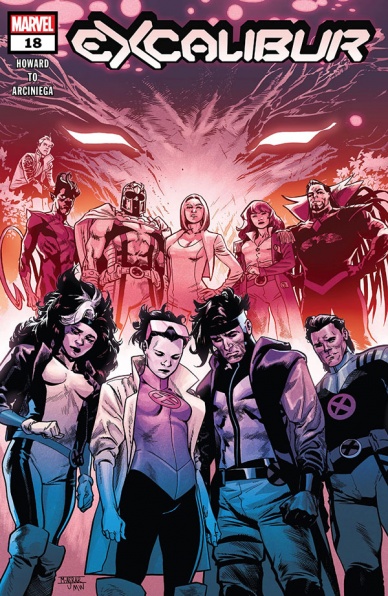
Excalibur #18
Written by Tini Howard
Illustrated by Marcus To
Colored by Erick Arciniega
Lettered by VC’s Ariana Maher
Reviewed by Luke Cornelius
“Excalibur” #18 is one of those strange issues of a series that, whilst reading it, is totally compelling, but after feels a little uneventful, even though it isn’t. It’s a very dense comic that is primarily concerned with the questions surrounding Betsy Braddock, but also explores other consequences from ‘X of Swords’ in the form of Apocalypse’s legacy and Krakoa’s relationship with Otherworld.
Howard’s script ensures “Excalibur” #18 is so compelling by weaving a tight narrative that glides from scene to scene, exploring the intriguing subject matter, but never loses sight of the characters and their emotions. When Emma Frost arrives, she is sympathetic with Betsy’s resignation to silence, despite her being required to try to mend the relationship between Krakoa and Otherworld. Likewise, we understand Rictor’s admiration for Apocalypse and empathise with Rogue’s dislike for him. Howard ensures that each character feels alive on the page and isn’t going to be overruled by the machinations of mutantkind at large, which actually makes those larger plot points even more exciting.
The biggest question of “Excalibur” #18 is about Betsy, though: Is it her, or is it not? Howard does a great job of keeping readers uncertain through the first half of the issue, with evidence to suggest it is, but with characters voicing doubts, we can never be certain. By the end of the issue, we’re still not entirely sure what is happening with her, and, while it might be easy to start feeling tired of Betsy’s return(?), this reviewer feels that it does a great job of giving greater emphasis to the events of ‘X of Swords,’ as well as setting up a potential end point for Betsy and Kwannon’s body-swapping saga.
Continued belowDespite “Excalibur” #18 being focused on conversations between characters, To’s artwork is incredibly dynamic, with a variety of differently shaped panels being used to heighten the drama. The energy never feels overwhelming for the subject matter, instead, it does a great job of keeping the visuals as compelling as the characters inhabiting them. To’s facial expressions throughout are great, with Saturnyne portrayed as definitively childish on the opening page. Arciniega’s colorwork gives the book a vibrant aesthetic that always feels warm and inviting, which suits a book filled with characters who act like, or in many cases, are, family.
Final Verdict: 8.0 – “Excalibur” #18 is a dense but compelling exploration of the ‘X of Swords’ fallout.

Future State: Kara Zor-El, Superwoman #2
Written by Marguerite Bennett
Illustrated by Marguerite Sauvage
Lettered by Wes Abbott
Reviewed by Alexander Jones
Not every Future State is as radical as the other titles in the publishing slate. Thankfully the first issue of “Future State: Kara Zor-El, Superwoman” took enough chances to avoid the level of fatigue other Future State titles suffer from. This issue focuses on Supergirl Kara Zor-El finding her place in the DC Universe that already has a Superman. Kara Zor-El struggles to keep the peace on the moon colony near Superwoman’s Fortress of Solitude. Marguerite Bennett’s script has a clever title and a clear ending that pays off the first issue. Bennett’s story structure is one of the most impressive aspects of the title. When I returned to the “Future State: Kara Zor-El, Superwoman” #2 after a first read-through I was able to appreciate some of the mechanics behind the plotting.
While Bennett’s writing is solid, artist Marguerite Sauvage’s art style is the highlight of the issue. Sauvage has an incredibly distinctive art style. Due to the nature of the brighter colors and intricate page layouts, I’m happy to see Sauvage’s work utilized for an issue not set on Earth. The details of the layouts and odd setting give Sauvage a platform to show off her skills. A page featuring a stained glass window easily makes this one of the classiest “Future State” comic books. I’m impressed to see the symbolism from later moments in the story foreshadowed by minor details in the layouts. Sauvage has great storytelling ability on top of a defined art style. Bennett’s script captures a level of authenticity due to the emotion Sauvage is able to render from each cast member.
“Future State: Kara Zor-El, Superwoman” #2 has a solid foundation and structure. It also has a lot of boring plot to recap before getting to the good part of the issue. I wish Bennett was able to adjust the script making less of the backstory required. The last page of the issue recontextualizes the title incredibly well but I still find the additional plotting unnecessary. At times, it almost seems like Bennett assumes readers will have a deeper emotional connection to Lynari that could have been fleshed out better. While the central plot of the story may lack a punch, the connection between these two books and the amount of story told is admirable. The visual aesthetic of the series cultivated by Sauvage is able to capture just the right tone to keep me interested all the way through. The level of detail and composition of these pages capture is enthralling.
Final Verdict: 7.0 – “Future State: Kara Zor-El, Superwoman” #2 contains beautiful art alongside a generic script and strong ending.
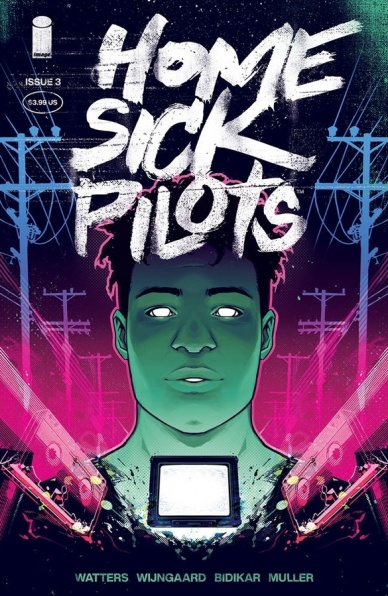
Home Sick Pilots #3
Written by Dan Watters
Illustrated and colored by Caspar Wijngaard
Lettered by Aditya Bidikar
Reviewed by Alexander Manzo
“Home Sick Pilots” #3 is another great chapter in this ghostly supernatural series. The flashback to a gig for the protagonist, Ami, to start is a sad reminder that she is no longer involved in the world of the living. Although Ami is still trapped in the spiritual plane doing the house’s bidding she never loses her ultimate goal of coming back.
One of my favorite things that this creative team did for this issue was show Buzz’ perspective in his continuous journey to try and find Ami. There was a small preview in the first issue of this series about how headstrong Buzz is on finding her. Now this issue brings to light his struggle to even trust the police, going to “dangerous” people to find any clues, and even going back to the haunted house that cause it all multiple times, by himself. I think by doing this it’s not just about building a romantic connection between the two characters but just for her, an orphan, to have someone to look out for her.
Continued belowAmi only shows up at the beginning and end of the story but her presence is heavily felt throughout the issue. The choice to have her narrate the story almost as if her spirit is really with the other characters is done exceptionally. Especially given how she is not shown during the day scenes and yet she can see it all but still not be able to say anything.
The artwork throughout this series is outstanding. From the details in the punk studded jackets to the small details in the haunted house just bring this story to life. No panel is wasted and the color choices really bring this eerie and ghost element to the story that really helps enhance it. There is a moment towards the end of the issue when a haunted TV set changes colors and it just immediately alerts the reader that something big is about to happen and stay locked in.
Final Verdict 8.2 – A much more heartfelt chapter in this ghost story that seems to be leading to something even scarier.
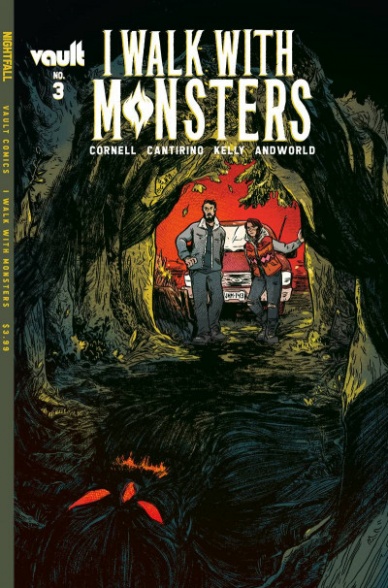
I Walk With Monsters #3
Written by Paul Cornell
Illustrated by Sally Cantirino
Colored by Dearbhla Kelly
Lettered by Andworld Design
Reviewed by Rebis
“I Walk With Monsters” #3 is a confused, and at times heavy handed, attempt to show traumas of the past with little focus on plot. Paul Cornell is trying to convey a lot of ideas about generational trauma, but it doesn’t really land due to the unfocused nature of the book. The characters feel like their only character traits are their trauma; while it’s certainly true that traumatic events shape you and take hold in your life, you’re still a rounded person. At three issues into the series, you still don’t know who Jacey and David really are as characters and why you should be rooting for them, or if you should be at all. Outside of Jacey’s quest for revenge, she doesn’t really have any other stand out qualities. Just when you think you’re going to get something deeper, or more meaningful, Cornell moves on with the scene.
The art is definitely the best part of the book with Cantirino using strong themes that are clear throughout the book, and carry a genuine emotion captured in every touch. The themes of intrusive thought and moments of dissociation are present throughout. Cantirino definitely has a talent for making you feel shocked and uneasy about what you’re seeing in a way that makes you sympathetic to Jacey. You’re shocked seeing it, and one can only imagine how she feels about it. The coloring of the book gives a sort of perpetual mysteriousness that’s hard to shake. The imagery does a good job of making you wonder when the next shoe is gonna drop.
Final Verdict: 6.6 – “I Walk with Monsters” #3 is a book with great visuals and metaphor but lacks with character development and plot structure.

Scarenthood #4
Written and Illustrated by Nick Roche
Colored by Chris O’Halloran
Lettered by Shawn Lee
Reviewed by Quinn Tassin
“Scarenthood” #4 is an excellent conclusion to the first chapter of this series. The grounded folk horror is as scary as it’s ever been, albeit in a fresh way. Past issues have really focused on atmosphere and normal bad things like not picking your kid up for hours happening. Here, it’s full on demons and a faerie world. What’s best here is how clear it is from the moment the demon we meet is defeated that this is a story with a much greater scope than we’ve been seeing thus far. Talk of things that have been unleashed and trying to track down what those are and who knows about them isn’t necessarily classic last issue material but it’s really exciting here. In the midst of table setting, Nick Roche doesn’t lose track of his characters for even a moment. They’re all processing what’s going on in their own
Roche doesn’t just do a great job with his writing, though. His pencils are absolutely gorgeous, bringing a simple, realistic style to things that helps the issue feel easy to connect to. Arguably more vital to the artistic success of the issue are Chris O’Halloran’s colors. They serve to make the more normal aspects of the issue like the drive through Howth feel more real and make the demon and faerie all the more supernatural. The best moment of the issue comes when those collide as Scooper is sucked into a goopy void (to use the scientific term) and Cormac saves her. In those pages, the magical horror feels all too real but it makes the catharsis more rewarding. It’s like being in a nightmare only for it to end in relief somehow.
Continued belowThe most surprising aspect of “Scarenthood” is that it’s a comic that meets this moment extremely well. It’s literally about fighting a demon that feeds off of your fear, anxiety, and feelings of insecurity. In the midst of a pandemic that’s separated many of us for nearly a year, those feelings are more than familiar and the idea of vanquishing that demon is very easy to latch onto. Better yet, when Cormac has to rescue Scooper from the void under the school’s stage, we get a testament to the way that communities can help us with our greatest challenges in the form of the other parents helping him. This is a beautiful comic with real emotional resonance and it’s really exciting to see where it’s going.
Final Verdict: 8.2 – “Scarenthood” #4 serves as both a moving ending a deeply intriguing new beginning to a wonderful (and very Irish) story.

S.W.O.R.D. #3
Written by Al Ewing
Illustrated by Valerio Schiti, Ray-Anthony Height, Bernard Chang & Nico Leon
Lettered by VC’s Ariana Maher
Colored by Marte Gracia
Reviewed by Michael Govan
Knull, the King in Black, has taken over everything. The Earth. The superheroes.
This series.
Both this issue and the previous one are ‘King in Black’ tie-ins. You could view that as a negative. The series JUST got started after all, hasn’t even been given room to breathe before being derailed. You could view that as a positive. The whole point of S.W.O.R.D. is that they ‘speak for Sol’. If some intergalactic kerfuffle is going down, shouldn’t S.W.O.R.D. be right there on the front lines?
Either way you look at it, I think it’s fair to say “S.W.O.R.D.” #3 works. The big bad ‘King in Black’ crossover is our setting but at the same time, the spotlight is squarely on Manifold. From the cover to Eden being the only character listed on the recap page, it’s apparently clear that #3 is a character study.
So what do we learn about Eden? For one thing, he cares about his family. He makes a point to check on them before anything else. Eden’s also dealing with trauma, something I hope Ewing unpacks further. Manifold also has a very strong connection to his Australian homeland. This is interesting for two big reasons. One, Eden’s power enables him to travel just about anywhere in the universe. He’s the ‘Everywhere Man’ but still very much rooted and anchored to his homeland. Two, his homeland is Australia, NOT Krakoa. Eden’s working with Krakoa and respects them but stands apart, a mutant but not Krakoan. It’s a very intriguing perspective.
The highlight though is the new ways he uses his powers. “S.W.O.R.D.” #3 stresses that Eden isn’t a teleporter, he folds and warps space (in visually dazzling ways). Manifold creates a little invisibility pocket by warping light around him and it’s such an amazing, creative use of his power. It’s also hilarious comedy from the artist, seeing him sneakily reach one visible arm outside of that pocket.
Brand’s personnel notes explain the whole thing to us, an impressive framing device and use of data pages. It also makes for an intriguing look at how S.W.O.R.D. functions. We saw Mentallo’s personnel notes last issue so it will be great to see other characters’ fleshed out in a similar manner.
I have one complaint and that is the number of artists on this issue. Four different artists drawing a singular narrative…it feels disjointed and some of the styles don’t seem like a good fit. They are all solid artists but it is definitely distracting and ultimately hurts the reading experience. Still, another great issue of “S.W.O.R.D.”.
Final Verdict: 8.0 – Manifold takes us everywhere in a solid issue of S.W.O.R.D.

White Ash Presents: Glarien #1
Written by Charlie Stickney
Illustrated by Romina Moranelli, Yishan Li, and Conor Hughes
Colored by Romina Moranelli, Yishan Li, and Fin Cramb
Lettered by Conor Hughes
Reviewed by Jodi Odgers
“White Ash Presents: Glarien” #1 is a one-shot with two main goals: bringing the titular Glarien to life in an engaging manner, and showcasing the craft of the three artists that bring her to life in distinct historical periods. It only succeeds at one of these.
Continued belowThe art in “White Ash: Presents Glarien” #1 is, on the whole, the strongest part of the issue, particularly in the second segment from Li, and the third from Hughes and Cramb. There are some stand-out panels that motivate the reader to keep going through the issue to experience.
Unfortunately, the visual appeal of the book is weighed down by its story, particularly in the first segment. What flimsy plot there is exists purely as a means to depict Glarien in either fight scenes, with very few items of clothing, or both. There are a number of panels where a strand of hair or a caption box conveniently obscures a nether region or nipple. These instances feel forced, particularly with the second segment choosing to forgo them entirely and reading as more genuine because of it. The dialogue is mostly run-of-the-mill, with noticeable stodginess at the beginning of the issue. Hughes’ lettering is similarly unremarkable but functional, with a couple of odd placements accentuating the problems with the characters’ speech.
The various covers for “White Ash Presents: Glarien” wear the appeal of the issue on its sleeve – it is a book where a pretty elf kills things, often not wearing many clothes. It is a pity that the most entertaining story is the one that tries to go against this notion, and it is sandwiched between two lesser tales.
Final Verdict: 6.2 – There are comics out there using similar ideas more successfully, but the artists clearly try to elevate the issue.


