
There is a lot to cover on Wednesdays. We should know, as collectively, we read an insane amount of comics. Even with a large review staff, it’s hard to get to everything. With that in mind, we’re back with Wrapping Wednesday, where we look at some of the books we missed in what was another great week of comics.
Let’s get this party started.

Captain America #698
Written by Mark Waid
Illustrated by Chris Samnee
Colored by Matthew Wilson
Lettered by VC’s Joe Caramagna
Reviewed by Alex Curtis
Anybody remotely familiar with Marvel knows that Captain America has gone through some seismic shifts recently. Luckily for of us, Captain America is back to patriotic basics—biking around ’Merica to help the little guys out. But after a fight with Kraven the Hunter, Steve has awoken (in ice of course) to a US dystopia right out of a YA novel.
Whether illustrating San Francisco or a putrid wasteland, Chris Samnee reigns supreme. The best artists and writers are storytellers, and the Mark Waid/Samnee partnership is the modern equivalent of Miller and Mazzucchelli. Samnee’s dynamic poses are begging to be immortalized, and his attention to detail and moody inks builds this dystopian landscape. Samnee evokes textures like nobody’s business, and you can practically feel the rust and crumbling concrete structures.
Waid isn’t afraid to disorient us as he introduces this grim alternative reality. The opening pages are in Cap’s disoriented POV, only to jump to the perspective of the misfits who uncover him. Soon, Liang, the resident boss of the fighters, leads Steve (and us) through the land, accompanied by evocative flashback images. A crushing sense of hopelessness sets in when the crew holds Captain America back from saving a young boy for their collective safety. But this only emboldens our hero to inspire those around him.
We’re also given a glimpse of a new big bad, King Babbington, who’s cloaked in mystery and feared by his underlings. Samnee shrouds the villain’s aesthetic in blood reds and metallic greys that harken back to Supreme Leader Snoke’s throne room from The Last Jedi.
Yes, the story is fairly straightforward. But it’s the subtle touches of characterization that make this issue glow. The bizarre band of misfits is instantly sympathetic and compelling, even alongside Steve Rogers, who’s simply adorable posing for selfies and saluting left and right.
Thematically, this is Waid’s fieriest issue to date. It’s hard not to get swept up in his incendiary (albeit preachy) vision of impending apocalypse. We’ve seen all these tropes before, but Waid digs deeper than most and gets us thinking as he whisks us through this exciting new adventure.
Final Verdict: 8.3 – “Captain America” #698 isn’t very subtle, but with creators this focused and masterful, it’s irresistibly exhilarating.

Charismagic Vol. 3 #1
Written by Vince Hernandez
Illustrated by Joey Vazquez
Colored by Federico Blee
Lettered by Zen
Reviewed By Kate Kosturski
The world of Aspen Comics “Charismagic” returns. After the events of ‘The Golden Realm,’ in which Serke was defeated and Sudana was discovered to know more in her visions than previously stated, Sudana’s out in the world trying to save it, but discovers something more sinster than any dark force they’ve previously encountered hiding in a nondescript lab in Nevada. Meanwhile, Hank’s broke and just a bit bitter in Los Angeles. He gets the idea to start a TV series with Sparkles for some needed cash, but during his premiere party for two, Samsun appears looking for mend fences, but before Samsun has a chance to do so, that dark force that Sudana found earlier breaks out of the lab and finds Hank and Samsun . . . and takes something near and dear to both of them.
Despite marketing that would suggest this is a jump-on friendly issue (and a quick plot recap on the inside front cover), I found that picking up the companion primer (which is only $0.25) helped me to appreciate this third volume even more, as I had more context for these characters and how their previous adventures. Unfortunately, that primer didn’t do that much, and I wonder if reading the previous two volumes would have served better. That aside, Vince Hernandez does craft a good standalone story that new readers will appreciate, even without the extra context. Joey Vazquez and Federico Blee do a fine (although not spectacular) job on art, it’s well done and suitable for the series’ overall themes, but little seized me as groundbreaking or original. The early scenes in the lab did remind me of the alien from the film Arrival (particularly a case of “what if Amy Adams’s attempts to communicate went horribly wrong?”), and there’s a good dose of humor in filming the promo scenes for Hank and Sparkles’ new TV show, but there wasn’t much else that struck me. Even the climatic final pages that set up this series didn’t keep me intrigued; in a way, it was almost predictable what was going to happen at the end of this confrontation.
Continued belowExisting fans of the series will certainly want to pick this up, but if you’re looking at this to be a jump on point as a new fan, be prepared to do some additional reading first.
Final Verdict: 4.9 – Good for those invested in the series already, not recommended as a starting point for new fans. New fans would do well to read the companion primer first at the very least, but even that didn’t fill in all the gaps.

Cold War #1
Written by Christopher Sebela
Illustrated by Hayden Sherman
Reviewed by Matt Lune
With America currently ruled by a political landscape that seems intent on saying one thing and doing another, having a book that examines the extreme effects of something being too good to be true seems entirely relevant. That’s what’s facing the customers of the appropriately named Panacea Cryonics in “Cold War” #1, who’ve awoken from being frozen for hundreds of years to a world at war, and they’re the newest recruits.
Sebela’s narrative style in the first half of the issue swiftly navigates through the biggest revelations of the book as if they’re not as important as what comes after. In a way, this is a little frustrating, as it would have been far more interesting to see more of the natural human response to being thrust into such a nightmarish situation. We get glimpses of that but they’re all too brief. It’s made clear, however, that it’s not relevant, and intentionally so, as we’re seeing this world through the eyes of Tom Rook. Rook is a military vet and war-beaten soldier of 30 years, and to him, nothing is as important as getting out onto the field of battle. The latter half of the issue dives into greater detail because that’s the battlefield and that’s what Rook loves. To him, everything else is just an inconsequential prelude to the fighting itself, and as such, that’s how we experience the issue too.
Similarly, Sherman’s art — pulling illustration, coloring and lettering duties on this issue — sweeps through the earlier scenes with wide shots that echo the narrative by taking in the bigger brush strokes, and sacrificing the smaller human details. The consequence of this is that when the cast expands in the middle of the issue, they get a little muddled when they talk over each other. Again, this could be reflecting Rook’s attitude that they’re unimportant, but by the end of the issue these characters are shouldering a lot more of the narrative weight, but we have less of a connection to them.
Sherman’s colors are superb throughout “Cold War.” Never natural, always emotive and ever-changing, the palette is bold and really sets the tone of the issue. It adds an almost pop art edge to the book, elevating the narrative into something far more strange and unreal. There’s a sickly green tone to the early scenes to match the sickness felt by the characters (both emotionally and physically), and then that shifts into a pervasive red that underscores the dangerous world they’ve been thrust into, and the death that surrounds them.
From a high-concept elevator pitch, “Cold War” has the beginnings of a series that could really develop a rich lore, as it explores the history of this world and the war that these unfortunate time-displaced soldiers find themselves. This first issue makes some interesting narrative decisions and, by the end of the issue, it’s unsure if they will benefit the overall story moving forward, but it’s certainly a start that grabs your attention.
Final Verdict: 7.6 – A bold debut that races along with a grand design, but loses the human touch along the way.

Death of Love #1
Written by Justin Jordan
Illustrated by Donal Delay
Colored by Omar Estévez and Felipe Sobreiro
Lettered by Rachel Deering
Reviewed by Reed Hinckley-Barnes
Out of the slew of love-based comics released on Valentine’s Day this year, “Death of Love” #1 came with an interesting premise. It involves an asshole “nice guy” named Philo who is dealing with the sting of rejection from a local barista and also is fighting an army of cupids with a chainsaw. Or at least, that is where the book promises to end up. For this first issue, we mostly just spend a lot of time getting to know Philo and learning through a number of “nice guy” based jokes, how much of an asshole he is.
Continued belowDelay’s art is a perfect fit for the story. Exaugurated but not too cartoony, there is a lot of energy in every panel. He brings a sense of motion to the characters even when they’re sitting still. The body language, the characters facial expressions, and even the framing in a number of scenes, are all well done and in a lot of cases, pretty interesting. Its unfortunate, then, that while the art does it’s best to sell these characters as people, the script does not do them any favors.
That’s not to say that I disagree with the general message of “Death of Love” #1. My problem with the issue is just how ridiculously on the nose it is. The first words out of Philo’s mouth are “I’m a nice guy,” while he decides to go out for the night wearing a fedora. There is a moment where a character is being redpilled while literally being given a red pill. Philo is a strawman made up of bad “nice guy” clichés, and so far, the book seems content with that being the case.
There is probably an audience that this all really works for. But to me, the jokes ended up being more groan worthy than anything. Too on the nose, too much time spent just pointing out these clichés without actually doing anything with them. There are plenty of way to mock pick up artist culture and guys that feel entitled to sex, and I think these are subjects worth mocking. But in “Death of Love” #1, none of it quite comes together.
Final Verdict: 5.0 – While the artwork is well done, “Death of Love” #1 has far too many its jokes fall flat.
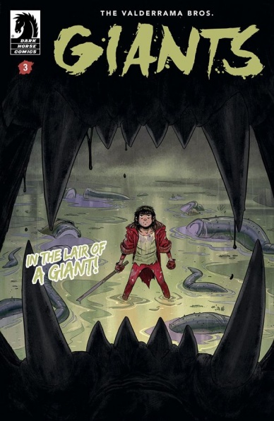
Giants #3
Written, illustrated, colored, and lettered by Carlos and Miguel Valderrama
Reviewed by Elias Rosner
“Giants” is shaping up to be one of the great monster stories of today, complete with equal parts action, sibling drama, and post-apocalypse world building. This continues into issue three and the Valderrama brothers accomplish a lot in the 22 or so pages they give us this month. From complicating the monsters and the world of the surface to redefining the roles of the gangs in the underground, this is the issue that sets Gogi and Zedo onto the paths of their disparate personal journeys.
Carlos and Miguel’s art is just as stellar as ever and I could spend endless amounts of words picking this apart page by page, panel by panel. There is a wealth of details in each panel and while it is not the hyperdetail of, say, someone like Moebius, there is a sense that the panels are as full as they need to be.
One of the best pages in this issue comes after a gang fight over the Ambernoir that Zedo and Gogi found back in issue one. The page is laid out like an inverted pyramid, with the five panels starting with all the gang members lying dead or knocked-out in a pile, with Zedo cowering beneath them and fire all around. Zedo is kept centered throughout the three panels he’s in, giving us a clear line to watch his reactions change as the roof cracks open to reveal a monster. The final panel is a small close-up of Zedo’s face, colored orange by the fire and then, on the next page, we hard cut to Gogi, bathed in blue, in a panel the same size, arms crossed and looking down in melancholic contemplation.
It is cinematic in quality and scope and I got serious “Akira” vibes in all the best ways.
The story this issue moves just a little too fast though and I’m not just saying that because there might be a time skip next issue. OK, maybe it is because of that but this issue still felt like it moved at a very brisk pace. Despite this, I never got the sense that this issue was rushed. It may seem contradictory but they made a creative choice to keep the action fast and intense and it works; I just get the sense that the transition into the next issue would be greatly helped if they had expanded upon or slowed down a couple scenes. I could be wrong. Only time, and the next issue, will tell.
Continued belowFinal Verdict: 8.9 – A fantastic, action packed third issue that leaves me wanting more in all the best ways.

Marvel Two In One #3
Written by Chip Zdarsky
Illustrated by Valerio Schiti
Colored by Frank Martin
Lettered by Vc’s Joe Caramagna
Reviewed by Gustavo S. Lodi
In “Marvel Two In One,” Chip Zdarsky has been playing with readers’ expectations of what a “Fantastic Four” reunion book should be like, with each main character, the Thing and the Human Torch, approaching the situation with different viewpoints and even different pieces of information. And while issue #3 is another good entry to the series, it is a weaker link given a more unbalanced script and not-so-stellar art.
Valerio Schiti had his work cut out for him on covering for Jim Cheung’s absence on this arc. The art on this issue is not bad, but it certainly isn’t stellar, with some pages feeling a bit cluttered and missing opportunities to present reveals on a more grandiose way. But focusing on the positives, Schiti delivers extremely well on character expressions: Ben, Johnny and other surprise guests are portrayed in unique, clear ways, with little need for words or exposition to explain what are they thinking or doing. A battle moment between the heroes and a water-based antagonist flows nicely, with some clever design choices for powers and technology.
Zdarsky is well-known for his comedic vein and the jokes on this issue really work. The banter between Ben, Johnny and other characters joining on their quest land every time, adding to the atmosphere of camaraderie amid the danger. However, they are far too often. In past issues of the series, Zdarsky was able to better balance those funnier bits with dramatic situations, culminating is more rounded stories. Here, the plot feels like it’s chasing the next punchline and it robs some of the more serious reveals of their strength.
Having said that, those reveals show promise. They will remain unspoiled on this review, but the stakes do get raised on this issue, by both aligning the quest for Reed, Sue and the kids to even further consequences, and also by introducing new players to the equation, on the side of good and evil.
Final Verdict: 6.9 – “Marvel Two In One” first two issues have been a balm for fans claiming for more Fantastic Four. Issue #3 keeps the momentum going, but the shift in art and a more uneven script makes it stumble.
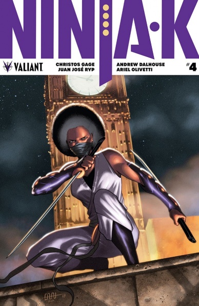
Ninja-K #4
Written by Christos Gage
Illustrated by Juan Jose Ryp
Colored by Andrew Dalhouse
Lettered by A Larger World Studios
Reviewed by Michael Mazzacane
After being if not less than impressed, let down, by Juan Jose Ryp and Andrew Dalhouse’s work in the “Harbinger” franchise it was nice to see the duo come together for an all around excellent issue in “Ninja-K” #4. Funny how good writing makes working in unison with art leads to effective dramatic moments. As the former Ninja-G attacks K, the paneling crescendos to an effective page turn reveal of the contemporary Ninja-G and the giant katana she’s trying and bisect K with. Ryp’s use of foreshortening with the downward striking action and Dalhouse’s pallet giving everything a textured (if not realistic) feel make that page pop.
Gage’s script lets Ryp play to his strengths with strong design work as the middle portion of the issue deals with the life of G in largely montage fashion. The life of G is shown in a mixture of overlapping panels and splash pages that create the feeling of a large action filled life, while still being narratively efficient. Gage also correctly writes narration that isn’t purely repetition of what he’s written for Ryp to draw! These factors allow this section to read like Cinéma du look as time compresses, and everything becomes big symbolic moments interspersed with micro scenes.
And it’s not just that Ryp gets to show off effective design chops that make this issue work, Gage gives him room to also hit the personal as well. The reveal of Devotchka, G’s arch nemesis turned partner in life, is a delightful play on old spy tropes. How Ryp draws their posture during a brief conversation about their old life as K leaves sells a connection between these characters we’ve only seen in splashy montage up to that point.
Continued belowIt’s also worth noting how the deceptive nature of the Acclimation Bureau plays into the lived experience of G as not just the first female ninja but first black female ninja. There are little moments of articulation but overall it brings the metaphors Gage is developing into starker relief and makes me really hope they don’t screw this up when this story concludes next issue.
Final Verdict: 7.5 – “Ninja-K’ exploration of the systems of control, lives, and history of the Ninja Programme, continues to be an effective mirror to reflect back on Collin King as he deals with his current crisis.
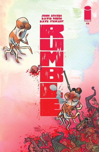
Rumble #3
Written by John Arcudi
Illustrated by David Rubin
Colored by Dave Stewart
Lettered by Joe Sabino
Reviewed by Jonathan O’Neal
The first series of “Rumble” played out like a fantasy version of “Kill Bill” with Rathraq exacting vengeance on those creatures that had caused him a millennia of suffering. The first two issues of the rebooted series from Image Comics seemed to be charting the same course. In issue three, John Arcudi throws readers something a bit off speed, and it’s a welcome development in a story that initially seemed destined to retread similar (albeit very enjoyable) ground.
Midway through this first arc Arcudi appears to be laying foundations for deeper meditations on the nature of modern violence and society’s fear of “the other” while still maintaining a brisk storytelling pace and a comedic tone sharpened by his years spent in the Mignolaverse. Here human frailties are juxtaposed with mythical power beyond understanding, and the prospect of a cataclysmic battle between warriors and monsters for the fate of the world does not put an end to human pettiness. In “Rumble,” the baser, more violent, instincts in modern society seem to be the evolutionary result of even more bitterly-held grudges between its ancient ancestors. Arcudi plants these subversive seeds well. Why else would a monster attend a town hall meeting? And which monster are we talking about?
David Rubin continues to be a worthy successor to James Harren’s work in the previous run of the series. Like Harren, Rubin brings an ebullient and energetic style that, along with Dave Stewart’s high chrome palette of complementary oranges and blues, make the routine displays of viscera easier to take for the squeamish. While Harren’s line was thinner and more precise, Rubin’s bold, thick lines have a feverish and manic quality (perhaps even more than in his previous credits) that effectively serves this more static story but really kicks into gear at the issue’s climax.
While this issues’ slower moments and sucker punch finale muddy the waters for the story protagonists, readers benefit from the layering of story and character nuance on top of the series’ original elevator pitch. Since the requisite reintroductions required by the series’ long hiatus have been completed, it would be surprising if Arcudi didn’t explore the ideas introduced in this issue to create a more narratively complex and satisfying read in the installments to come.
Final Verdict: 8.0 – These guys make good comics look easy, and this is assuredly very good comics, especially as it charts a course for a richer story and a new and more noble crusade for Rathraq and Company.


