
There’s a lot to cover on Wednesdays. We should know, as collectively, we read an insane amount of comics. Even with a large review staff, it’s hard to get to everything. With that in mind, we’re back with Wrapping Wednesday, where we look at some of the books we missed in what was another great week of comics.
Let’s get this party started.

Abbott 1973 #2
Written by Saladin Ahmed
Illustrated by Sami Kivelä
Colored by Mattia Iacono
Lettered by Jim Campbell
Reviewed by Rebis
“Abbott 1973” #2 is a good, albeit transitional, issue, setting up some interesting plot points to touch on while keeping you enthralled in the world. This issue follows Elena on her continued investigation of the racist propaganda flyers and radio ads while setting some ground work for just how powerful a chosen one Ms. Abbott really is. The world feels haunted and dark in the night, while being vibrant and alive in the mornings; this gives he reader a feeling of being in a big city. Ahmed pits Elena against the real world problems of racism and sexism, making the world feel more grounded. He gives the world a bit more of a fantastical feel when you get to watch her banish a demon from her friend or clear a “negative energy node” after you see her editor berating her for just trying to be a good reporter. Ahmed has skillfully crafted a cast of complex characters that bring an attitude and life to the page simply by being on it.
This is all helped by artist Sami Kivelä, who brings a wonderful style to the table. Kivelä helps craft the look and feel of the world, doing a great job of balancing the action and the emotional. Action packed moments like Elena giving a taste of the potent magic she can wield as “the Light Bringer,” transition to more personal ones, like where Elena shares a tender moment with her girlfriend. There, it feels like they’re whispering without anything other than Kivelä’s art to give that quiet feeling. The ghostly apparitions of the Cabal give them a sort of inhuman look and are drawn in a style that’s just slightly different than the rest of the book, landing a little in the uncanny valley at times. Kivelä’s art is only improved upon with the help of Mattia Iacono’s coloring, bringing a beautiful ambiance to a world that is definitely in need of some light. The displays of magic from both Elena and the Cabal are contrasted, both metaphorically as light and dark and in the colors as deep purples against Elenas yellows and oranges.
Final Verdict: 7.6 – “Abbott 1973” #2 is an excellent road map to the rest of the series while keeping the draw from the first issue
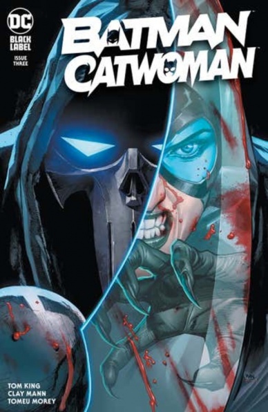
Batman Catwoman #3
Written by Tom King
Illustrated by Clay Mann
Colored by Tomeu Morey
Lettered by Clayton Cowles
Reviewed by Jim Malakwen
“Batman Catwoman” #3 begins in the aftermath of the previous instalment’s jaw dropping cliffhanger. After Selina kills an elderly Joker in the future timeline, GCPD Police Commissioner Dick Grayson summons Helena Wayne to investigate the demise of Batman’s greatest foe.
In the present timeline, The Phantasm’s reign of terror continues as she murders more Joker henchmen in her unrelenting quest for vengeance. Frustrated with his inability to stop the killings, Batman takes out his frustrations on the captive Joker. Unfortunately, due to an implied connection with The Clown Prince of Crime, The Phantasm makes Selina her next target and attacks her at Wayne Manor.
The writing in this chapter is fine. The narrative is advanced a little bit and the juggling of plot developments between timelines is done competently. Furthermore, the appearance of Helena Wayne adds an interesting element to her interactions with Selina. She has inherited her father’s keen sense of deduction and this enhances the dialogue between mother and daughter, filling it with subtext.
“Batman Catwoman” #3 has spectacular artwork. Lee Weeks’s character designs appear to be influenced by Jim Lee’s seminal work on “Batman: Hush” but still bear the artist’s unique take on the world of Gotham. From the very first page, expect to be dazzled by his dynamic layouts involving overlapping panels and minimal gutters. His compositions are striking.
Continued belowThe inking on the pencils is also quite good. Mann uses crosshatching often to suggest texture and to create tonal and shading effects. In addition, the frequent utilization of silhouettes and chiaroscuro lighting makes the art pleasing to the eye.
Tomeu Moreu’s colors are very effective in bringing life to the Gotham setting. A cool blue is the predominant hue and is mostly used in outdoor settings to suggest the gloomy, Gotham night. Interior scenes are mostly rendered in warm brown, red and yellow.
The comic ends on yet another cliffhanger that hints at some sort of past connection between Selina and The Joker as well as the likelihood of a confrontation between Helena and Selena once the truth about Joker’s murder is uncovered.
Final Verdict: 7.8 – While not as action-packed as the previous chapter, this issue adequately sets up the mystery of Selina’s connection with The Joker and creates a sense of dread for her encounter with The Phantasm.

Captain America #27
Written by Ta-Nehisi Coates
Illustrated by Leonard Kirk
Colored by Matt Milla
Lettered by Joe Caramagna
Reviewed by Ryan Fitzmartin
Now this is a “Captain America” comic! Tightly plotted, searingly relevant, and filled with slam-bang action. Ta-Nehisi Coates once again proves to be one of the best comics writers of the modern era. “Captain America” #27 displays his rare ability to combine smart political commentary with engaging plotting and characters. “Captain America” #27 has a lot to say, but it never veers into being a diatribe, as this is first and foremost a superhero comic. Coates leans into Steve Rogers discovering life in 2021, where the fascists might be the ones displaying the red white and blue. As Steve Rogers bemoans that “America has become another country”, Sharon Carter replies “it has always been another country, it’s just that now you can see it”. This is just one of many incisive and brilliant lines in an expertly written, very thoughtful comic.
The pencils by Leonard Kirk don’t hit the heights of the writing. His faces aren’t very expressive, and sometimes feel flat. For a comic reliant on deeply-held opinions and emotions, the character’s holding those emotions are mildly underserved. Rogers looks to have a permanent pout, and villainess Sin seems to be in a state of constant bafflement. Kirk’s compositions and panels are strong, he simply doesn’t provide rich work on the faces. The deficit wouldn’t be so noticable if the script didn’t require such emotional heavy lifting. Mark Milla’s colors are more effective, and lends the characters a little more heft. The coloring of the costumes is especially distinctive, and effectively creates contrast between heroes and villains.
“Captain America” #27 is strong enough to satisfy longtime fans or new readers, who will likely find themselves sucked right into the story. Cap fans who may have lapsed in their reading will want to return, as the story is as strong as it’s been in years. Despite celebrating his 80th anniversary this year, Steve Rogers still feels as relevant and important as he ever has.
Final Verdict: 8.7 – A superb comic filled with exciting action and strong social commentary.

Champions #4
Written by Eve L. Hewing
Illustrated by Bob Quinn
Colored by Federico Blee
Lettered by Clayton Cowles
Reviewed by Quinn Tassin
There’s essentially nothing about “Champions” #4 that doesn’t work. The pacing is solid, moving between confrontations and character moments with relative ease. From Kamala fangirling to Cyclops’s heartwarming connection to the team to Viv’s talk with her adoptive mother, this is an issue that gives plenty to latch onto emotionally. The political moments land, too, and without being so cartoonish or obvious that they feel frivolous. More and more, Kamala’s Law feels like an at least somewhat understandable in-world conflict (though it could be the political science major in me liking polling numbers).
The one snag that it does hit is its portrayal of the X-Men. Now, to be fair, their presence works emotionally and Cyclops’s soft spot for his former team is genuinely touching (especially putting on his old costume) and the characterization is actually very strong. The wrinkle comes in the plausibility of the presence of mutants and especially the diplomatic risks Cyclops is taking on behalf of the mutant nation. It’s far from a dealbreaker given the fact that the whole thing works so well but I couldn’t help but wonder if they would get themselves involved in American political affairs.
Continued belowBob Quinn’s illustrations and Federico Blee’s colors work fine, though they leave a bit to be wanted. The art is clean, easy to follow, and plenty satisfactory. Moments like the final page’s splash or the Atlantean confrontation even look actively good. There’s nothing in “Champions” #4 that pops, though. No small details to appreciate or large spectacles to marvel over. In some moments, like the meeting of the Champions and the Marauders, character proportions look weird and stocky. But again, it’s pretty good artwork on the whole.
“Champions” #4 is the definition of pretty good. Basically any negatives are nitpicks in the grand scheme of the issue but there’s also nothing that sings. The Cyclops beats shine through but mostly it’s just a fun, easy to read comic with some decent social commentary. There are much much worse things to be.
Final Verdict: 7.5 – “Champions” #4 is a fun, easy to read comic and a fairly unremarkable one

Future State: Catwoman #2
Written by Ram V
Illustrated and Colored by Otto Schmidt
Lettered by Tom Napolitano
Reviewed by Elias Rosner
Ram V knows how to make a series fun. Rather than focus on a dour dystopian aesthetic like 90% of the other Future State: Batman titles, V & Schmidt lean into Catwoman’s roots as a heist specialist to provide a fun and surprisingly moving closing to this two-parter. The biggest issue “Future State: Catwoman” has is that, because it’s only two issues, it’s just long enough to stuff with a lot of ideas rather than keeping things lean but just short enough to prevent those ideas from being fully explored and set up.
As a piece of “Future State,” it’s a wonderful side story that gives us some of the most touching Catwoman/Batman moments we’ve seen since the ‘Superfriends’ arc of “Batman.” As a mini on it’s own, it feels like we’re missing crucial context, like this is the cold opening to a longer adventure or an interstitial moment that’s following up on, and setting up, a larger narrative. Still, SChmidt sells the hell out of it, providing all the high octane action and fist pumping moments needed for a story like this. He is perhaps a little too heavy on the reds inside the train, it starts to feel flat and empty after a few pages, but on the whole the coloring works well.
If this is your first introduction to Catwoman, or Ram V’s run on the title, it gives a good overview of the themes he’s hitting on and the kinds of stories you can expect. It’s fun, stands on its own but promises more, and provides all that Bat/Cat action the fanbase is clamoring for. For a mini in a strange status quo like “Future State,” it’s hard to ask for more.
Final Verdict: 7.5 – “Future State: Catwoman” #2 concludes the series just like it began: strangely paced because of its length but very fun.

The Immortal Hulk: Flatline #1
Written, Illustrated, and Colored by Declan Shalvey
Lettered by Cory Petit
Reviewed by Gregory Ellner
Bruce Banner is an interesting character, one who has a wide, sweeping backstory from before he became the Green Goliath known as the Hulk in the first place. However, such a place is not often viewed beyond a small, select number of people. Those involved in his studies of gamma radiation that had led to him getting involved in what would become the disaster that turned him into the Hulk aren’t often delved into, but with “The Immortal Hulk: Flatline” #1, Declan Shalvey does just that, showing someone’s reactions to both Banner and at least one Hulk (and seemingly more than one) despite having only heard of his exploits and problems since decades earlier, and refuses to let him destroy himself over all he has done or will aim to do. The overall effect is one that is rather poignant, dealing with the concept of being alone as contrasted against a need to be with other people. Even with the ending being relatively predictable, ‘Flatline’ is still a very effective one-and-done story examining Banner through an unusual lens of being both an outsider to most comics and an insider to Banner’s early life.
Continued belowAlongside his writing, Shalvey also was in charge of the illustrations and the colors. The artwork is highly detailed in a way similar to his work on “Moon Knight” years ago, with the Hulk looking distinctly different from the rest in more ways than one, particularly his veiny muscles. Close-ups are very well put-together, showing the raw emotion even as Hulk appears to be calm, alongside a variety of well put-together perspective shots such as upside-down panels or the distinct terror of someone being essentially disassembled, not unlike Hulk has been in other parts of the main “Immortal Hulk” run.
In terms of color, Shalvey makes excellent use of greens, in a variety of shades. There is an unearthly glow to gamma, particularly around the main physical conflict of the story, and it contrasts well between the users of the energy, on top of several other varying color schemes, including purples, blues, and browns. In general, while there is definitely something inherently horrific about the run’s version of the Hulk, the overall effect helps to bring him down to Earth, in a sense.
Final Verdict: 7.0– A bit typical, but still interesting, ‘Flatline’ is definitely a worthwhile one-shot.

Teenage Mutant Ninja Turtles: The Last Ronin #2
Plotted by Kevin Eastman, Peter Laird, & Tom Waltz
Scripted by Tom Waltz & Kevin Eastman
Laid out by Kevin Eastman
Illustrated Esau & Isaac Escorza, Ben Bishop, and Kevin Eastman
Colored by Luis Antonio Delgado
Lettered by Shawn Lee
Reviewed by Alexander Manzo
“Teenage Mutant Ninja Tutles: The Last Ronin” #2 is a great follow-up to the first issue because it feels like the heart and the soul of the story. Where the first issue felt like the action parts of John Wick, this felt like more like the beginning when you see him in his day-to-day and what led to those events.
Michelangelo, having recovered from his failed suicide coup of the Foot Clan’s base, is still dealing with the ghosts of his brothers and trying to process what has happened and how to move forward. His mission remains the same, but he realizes there is more left from his previous life than he expected. Finding April and her daughter is a great tool that the creative team uses to not simply have Michelangelo only focus on the mission and willing to kill himself.
Another tool that is beautifully used is the flashbacks, which show the aftermath of an ambush and forcing Raphael to attack the foot clan by himself after his father, Master Splinter, is killed. By showing this, the reader gets the classic act first, think later aspect of Raphael, but realize how separated he is from the Turtles’ beginning, when they needed to stay united.
The artwork is done exceptionally well. The creative team changes tone and style depending on what is happening. The current storyline and flashback art are drawn similar to the original 90’s cartoons, sprinkled with John Wick blood in the fight scenes. The fight scenes were done with enough detail where it wasn’t just punches being thrown with a “whoosh” behind it. The art looked almost like still images of fight choreography.
The panels in which Michelangelo shares his personal journey after the death of his family members are done in black and white with gritty line work, reminiscent of traditional Japanese art. By switching up the art styles completely, this memory grabs the reader’s attention to show how much this means to him.
Final Verdict 8.5. An in-depth chapter at the purpose behind Michelangelo’s journey.

X-Men Legends #1
Written by Fabian Nicieza
Pencilled by Brett Booth
Inked by Adelso Corona
Colored by Guru-eFX
Lettered by VC’s Joe Caramagna
Reviewed by Jeremy Estes
The stated goal of “X-Men Legends” is to tell in-continuity stories from the X-Men’s past, including never completed tales like this one featuring Adam X, a.k.a. X-Treme. There are a lot of narrative dots to connect, so, following the note that this story takes place after the events of 1994’s “X-Men” #39, I dug out my copy to help. That issue, like this one, was written by Fabian Nicieza, and aside from losing the faux-Claremontian text boxes featuring the exact time and location in which a scene takes place, his storytelling remains largely the same. Then, Adam X rescues Cyclops’ grandfather from a plane crash in the Alaskan wilderness. Here, Cyke and Havok enlist Adam X to help them rescue their grandfather from a Shi’ar cult called the Crystal Claws. As much as this story is interwoven with decades-old stories, it’s light and fast and covers a lot of ground. Throw in ads for Sega Genesis and this would feel right at home in 1994.
Continued belowBrett Booth accounts for much of that look and feeling. Booth came to prominence in the 90s as another “not Jim Lee.” He remains not Lee, nor Art Adams, nor even Art Thibert. His work is generally fine, occasionally leveling up to exciting, but it suffers from the same lack of storytelling that plagued many of the proteges of the Image founders. On one page, Booth puts Adam X in a Liefeldesque-pose, his legs alternately bent and kicking out. Other times the characters stand around in cool poses looking intense yet flat. Booth’s best moment comes in a full page spread of Adam X fighting Cyclops, Havok, and members of the Starjammers. Adam X is multiple locations on the page, rendered in faded color to convey his movement, and there are lasers and optic blasts intersecting and exploding off the page. It’s an exciting moment, but most of Booth’s work feels like 1994, but not in a retro way. Like guest star Cable says to Adam X early in the issue, “I thought both of us had gotten over our extreme phase.” Adam X clearly has not. With long hair, a backward cap, and claws, he ticks nearly every box on the Bad 90s Character Design checklist. A big gun and pouches would have put him over the top or, in the parlance of the day, over the edge.
The most striking art of the book is colorist Guru-eFX’s work on a brief flashback sequence. The scene is tinted with a lovely blend of pinks and blues and yellows, the gauzy colors of a dream. Using 1994’s burgeoning computer would have rendered the scene gaudy, but here it’s cool and ethereal.
Final Verdict: 4.5 – The setting of this story isn’t a particularly interesting period of X-Men history, but the nostalgic conceit of this series has the potential to be a lot of fun given the right story and the right creative team. Is Art Thibert busy?


