There is a lot to cover on Wednesdays. We should know, as collectively, we read an insane amount of comics. Even with a large review staff, it’s hard to get to everything. With that in mind, we’re back with Wrapping Wednesday, where we look at some of the books we missed in what was another great week of comics.
Let’s get this party started.

Batman: Sins of the Father #1
Written by Christos Gage
Illustrated by Raffaele Ienco
Colored by Guy Major
Lettered by Josh Reed
Reviewed by Reed Hinckley-Barnes
Taking place in between seasons 1 and 2 of Telltale’s Batman games, “Batman: Sins of the Father” does a great job of faithfully recreating the universe of those games. Raffaele Ienoco recreates the look and feel Telltale world, with every character retaining the look and feel from those games, without just feeling like stiff screen shots of the games. He is able to provide a level of detail to both his characters and environments that really brings the world to life.
With Ienoco’s art to help him, Gage is able to bring the Batman of the Telltale games into this issue almost whole cloth. But the issue does more than just recreate the world of the games. It is also, by its own merits, a pretty good story. The story is much more about Bruce Wayne than it is about Batman, but Gage does a good job of keeping the political maneuvering interesting. By following up on the events of the first game, the series has a lot of interesting ground to work with.
The only real problem with the issue, and the only reason I might not recommend it, is that it is so heavily tied to the games. I can’t be entirely sure what the reading experience is like without knowledge of what happens in Batman: The Telltale Series, but I assume without having played them, a person might be a bit lost. With that being said, for those that are a fan of the games, or those that are willing to deal with being thrown into this other world with a lack of explanation, this is a surprisingly great issue for a tie in.
Final Verdict: 6.5 – “Batman: Sins of the Father” #1 is a good comic with the caveat that you’ll be missing quite a bit without having played the games it’s attached to.

Cave Carson Has a Cybernetic Eye/Swamp Thing Special #1
Written by Jon Rivera & Magdalene Visaggio
Illustrated by Langdon Foss & Sonny Liew
Colored by Nick Filardi & Sonny Liew
Lettered by Clem Robins & Todd Klein
Reviewed by Elias Rosner
“Milk Wars” has been the crossover event I never knew I wanted. It has been a trip from the start and now, in its penultimate chapter, the pieces are making a little more sense and falling into place, although there are a whole host of unanswered questions left.
Even though the story itself is more of what we’ve come to expect from Young Animal, this issue has felt the most grounded of any of the specials and the most logical in its presentation. This has to do a lot with Langdon Foss’s art. He never lets his art spiral out into the psychedelic abstraction that the other titles tended to do yet he preserves the unsettling and wonky tone of the imprint. A maze-like office environment that spreads across two pages, Cave shoveling salad down his throat, Wild Dog chopping off Dave’s head with a CHOP sound effect and milk spurting out of the wound, all of this craziness is still there but Foss’s art and Rivera’s scripting makes it easy and clear to follow.
As a penultimate chapter, this is what we needed. Enough clarity to get our bearings before diving into what will be, I’m sure, a bat-shit insane finale. Another fantastic touch is the way Filardi colors the comic. Without this, I don’t think the issue would have felt as unsettling as it did nor would this have felt as complete. We are seeing the book through Cave’s eye and, as such, the pages replicate his state of mind.
Continued belowOn the first page, everything is out of focus, as if we were looking at one of those old 3D red and blue books. Then, as the milk is brought around, it comes into focus even though everything is still muted and mostly populated with greys and yellows. Then, once Cave vomits up Swamp Thing, the colors change. Swamp Thing is a crisp green while everything else is still muted but the more Swamp Thing interacts, the more the colors come back until Cave himself is freed from the milk.
There is also the “Eternity Girl” back-up by Visaggio, Liew, and Klein which, damn, having all (?) of the parts of this thing now, it feels like it’s going to be special. Be on the lookout for its mini-series.
Final Verdict: 8.5. An action-packed, wild penultimate chapter to an already wild crossover. Bring on the finale!

Damage #2
Written by Robert Venditti
Penciled by Tony S. Daniel
Inked by Danny Miki
Colored by Tomeu Morey
Lettered by Tom Napolitano
Reviewed by Alan Buxbaum
The New Age of DC Heroes is upon us, and front and center is Daniel and Venditti’s “Damage.” This series gives us a fresh take on a character with seemingly unstoppable force and a duel-personality problem (sound familiar?). While I wish there were more qualities that set this comic apart from its predictable nature, the action scenes and world-building were enough to make it worth the read.
Plot-wise we don’t see much deviation from what you’d expect. This issue is essentially here to show us how strong Damage actually is. I also can’t blame Daniel and Venditti for the formulaic nature of this issue, since they’re introducing an entirely new character into an already crowded landscape of DC heroes. Not only do they need to do this, but they need to prove that it’s different enough from characters like The Hulk in order to gain interest. That’s enough of a challenge to start with, so I understand why the chain of events in the story has been so cliche to this point.
One successful endeavor is Colonel Maria Jonas, head of the program responsible for creating Damage. I’m very curious to see where Daniel and Venditti take her character; her nature seems to be cold and calculating, yet it’s very difficult to tell what her true intentions are. I love how the book immediately sets her apart from Amanda Waller in this issue as well, since the two characters are similar enough already in their ability to gain control over powerful beings (although to be fair, the jury’s not out on Jonas’s ability at this yet).
The art in this issue is great; Daniel, Miki, and Morey’s rendition of Parasite is really effective. The battle with the Suicide Squad is equally as awesome; Damage fit in perfectly next to classics like Harley and Grundy. I personally can’t wait to see Damage take on the best of the Amazons.
Final Verdict: 6.0 – “Damage” #2 is a solid start, but it’s just too early to tell. Hopefully Daniel and Venditti will develop it and take it to a place far enough away from its predecessors so as to make a name for itself.

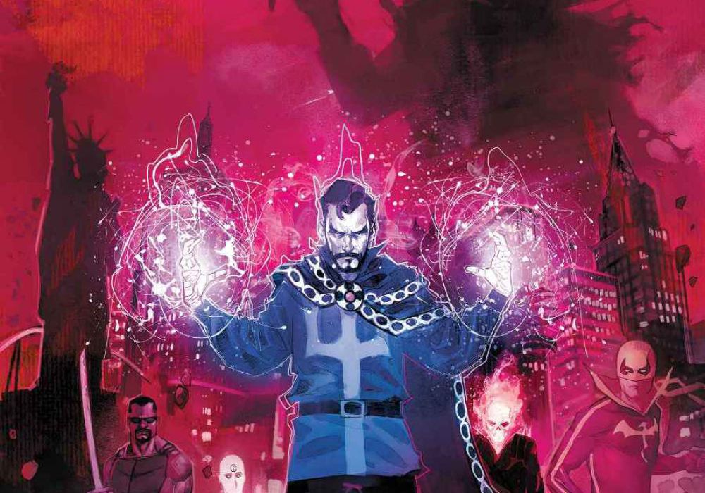
Doctor Strange: Damnation #1
Written by Nick Spencer and Donny Cates
Illustrated by Rod Reis
Lettered by VC’s Travis Lanham
Reviewed by Alex Curtis
Nick Spencer and Donny Cates combine their distinct styles into a darkly delightful cocktail. Each character brims with strong characterization and there’s a fair amount of humor to balance out the misery. Regardless of who did what, this is a wildly imaginative premise with a myriad of amusing details that give “Damnation” a surrealist, fairy-tale vibe.
Rod Reis’s art displays a marvelous balance of water-color and digital aesthetics, which works perfectly for this foreboding, atmospheric tale. He’s an excellent colorist as well, lighting up the pages with glowing hues of blue and swelling reds. Even the panel layouts are inventive, and Reis throws in a gaggle of little design tricks that deliver thrills only comics can give.
Reis is able to capture scale well without overloading pages with unnecessary details. His art has a stunning rough edge to it. Sure, the paints sometimes go outside his sketchy figures, but that’s the charm. It’s like reading storyboards from an incredible (and dark) animation. His faces, although often cartoony, are stunningly emotive, like a more rugged Phil Noto. He’s not trying to capture realism. Instead, Reis’s pages are more akin to mood paintings.
Continued belowWhat sets this event apart from many is the sense of stakes. Spencer and Cates aren’t afraid to shift focus to average citizens to show them falling prey to Mephisto’s wiles. This grounds the issue and overall event so we actually care about the victims; separating this arc from being a post-post modernist punch-up where we don’t even see the collateral casualties.
The plotting is pretty exceptional—albeit a tad rushed in the beginning. There’s barely any breathing room between Strange renovating Las Vegas and Mephisto’s arrival. But I can’t complain too much, because this quick beginning gives the creative team plenty of time to introduce the stakes and plot, which unfold in a satisfying way. We learn plot developments organically as the issue continues, which makes for an exciting, page-turning read.
Final Verdict: 8.5 – “Doctor Strange: Damnation” #1 starts a bit suddenly, but is so well executed, it deserves its place in every pull list. Regardless of your stance on Spencer or Cates, this issue cements them as Marvel’s hottest writers on the scene.

Ice Cream Man #2
Written by W. Maxwell Prince
Illustrated by Martín Morazzo
Colored by Chris O’Halloran
Lettered by Good Old Neon
Reviewed by Gustavo S. Lodi
While the “Ice Cream Man” mission statement was not clear with its first issue, it is with its sophomore entry that enough pieces fall into place. What Prince, Morazzo, and team present in the shape of a contained story about drug addiction and the collateral damage it can cause is a treat.
This book is one of those rare situations where script, drawings and colors come together so efficiently that is seems effortless… but it is anything but. Morazzo’s style provides just enough details not to clutter the pages, packing a lot of information without ever damaging the flow of the narrative. Readers can breeze through or pause and take all the background details if they want to. That layered approach lends itself nicely into this story, with different time periods and state of minds (positive or negative) being mashed together. On less able hands, the story would not have been clear and the main plot beats could have fallen short.
Also supporting that clear delineation of time and mood, O’Haloran colors intentionally change palette every other page to match the tempo. In the sequences set in the past, where readers are introduced to main characters Jim and Karen, colors are bright and cheerful; the same in present-day with Alice and Phil. However, as certain decisions are made and life spirals out of control, purples start to take over, with panels fully in gray when final conclusions are reached. Outstanding work.
Prince’s script is the fundamental cornerstone of the issue, though. He is able to introduce brand new characters, and making the audience care for them, in a very limited time and using precise resources. Diary pages, sharp dialogue and a looming sense of dread compel readers forward. And when the inevitable occurs, and the Ice Cream Man presents himself, readers know what will happen, but that doesn’t steal a bit from the experience.
Final Verdict: 8.2 – The best type of second issues, where a series’ statement is made clear and where script and art are fused to deliver an excellent story. “Ice Cream Man” is one to watch.

Kid Lobotomy #5
Written by Peter Milligan
Illustrated by Tess Fowler
Colored by Lee Loughridge
Lettered by Aditya Bidikar
Reviewed by Matt Lune
“I descend into the deeper, darker areas of the brain. I mean, hotel.” And so we too delve deeper into the Hotel Suites, into the dark madness of “Kid Lobotomy” in the penultimate issue of the arc. While the series has certainly had issues more divorced from coherence than this one, part of the joy of picking up this series every month is the adjustment you have to make in how you normally read and understand comics.
This is not one of those “if you don’t like reading this, then you’re reading it wrong” declarations. There is a certain narrative style to “Kid Lobotomy” however – a style on display prominently in this issue – that requires a relaxing of your hold on sanity much like you relax your eyes with one of those Magic Eye paintings: not everyone can do it, but once you do the experience is rewarding.
Continued belowUnlike previous issues that concentrate the story around a certain character, there’s a sense that the plot is moving all of the pieces around in order to reach its destination on time. Kid returns to the Suites and descends to the depths in order to find his “last exit to sanity,” his sister Rosebud makes a few discoveries of her own, and Adam Mee, frustrated novelist, clears his writer’s block. There’s also mermaids, murderers, living paint, dead uncles and a Bluetooth enabled lobotomising ray gun.
Tess Fowler manages to keep up with Peter Milligan’s madness and surpass it in many cases, effortlessly creating beautiful people in ugly situations. The madness that you read in the words is made tangible on the page, and Lee Loughridge’s evocative colors give a richer sense of unease, with sickening greens and unnatural tones.
Fowler’s art really shines in a few full page spreads in this issue, including one with Rosebud riding a burgundy steed, galloping over traffic on the freeway, and one of Kid falling through an inky blackness, his terrified wide eyes and helpless pose drenched in the dreamlike blue of Loughridge’s palette.
“Kid Lobotomy” isn’t an easy book to read if you want a cohesive, linear narrative in a world of relative realism. It’s easier if you go with the flow, like recalling a half remembered poem or a misremembered dream. Relax your eyes and you’ll find an engaging exploration of the search for sanity, one filled with fun characters and a little skewed meta-insertion on behalf of the author along the way (if the less-than-subtle name for novelist Adam Mee wasn’t enough, the character uses Milligan’s name in his book). This issue in particular gives in to the creeping madness that pervades every chapter, and to fully appreciate it you need to do the same.
Final Verdict: 7.9 – An unforgiving and gleeful glimpse at an unravelling mind.

Mata Hari #1
Written by Emma Beeby
Illustrated by Ariela Kristantina
Colored by Pat Masioni
Lettered by Sal Cipriano
Reviewed by Michael Mazzacane
The first issue of “Mata Hari” is an effective start to this fictional biographic miniseries of Margaretha Geertruida “Margreet” MacLeod. Writer Emma Beeby is up front in a letter in the back this isn’t an entirely accurate account of her life. At the same time, she’s also honest about the various factually agreed upon, but never the less characteristically diverse accounts of the title characters life she’s read. Which is fine by me, looking for truth in historical fiction is always a recipe to pick at nits and miss the forest of points the text is trying to make within this historical aesthetic. From the start this series is clearly inclined towards a feminist examination of society, both todays and a Europe just coming out of the Victorian era, with the historical arc of the Mata Hari.
The design work that artist Ariela Kristantina does in this issue is beautiful, even as it jumps back and forth in time (roughly 1900-1914), it has an incredible flow to it. From an early court sequence highlighted by the intrusion of the title character’s Mata Hari persona, to other sequences that highlight time periods as if they were framed pictures. On the court sequence, these ritual like intrusions are interesting in how soft they are compared to the court room and the fact they are all circular and rounded in shape, contrasting with the strict panel structure of the court. The flow is like a higher quality version of the kind found in graphic memoirs.
The temporal free flow makes for beautiful page designs but also muddles the personal narrative importance of these brief scenes of her early life. In totality this issue via these interludes all point towards highlighting a society that tries to constantly regulate her sexuality and force her to conform before it finally executes her, with the implication that society hasn’t really changed that much sense. The muddiness comes when reading these sequences and trying to get a bead on the title character. Much of this first issue is addressing or using the idea of the Mata Hari persona and not so much the woman who is about to be executed. That lack of a clear read on the character is an effective means to generate if not sympathy, interest. Her trial appears to be a sham and the general public is out to get her for her transgressions. By playing up the mystique of the title character, I’m now very curious to see where things go as they begin to depict her life. Which is what you would want out of a first issue.
Continued belowFinal Verdict: 7.5 – With excellent art and strong premise “Mata Hari” gets off to a strong start as it examines the life of it’s title character.

Redlands #6
Written and colored by Jordie Bellaire
Illustrated by Vanessa Del Ray
Lettered by Clayton Cowles
Backmatter material and design by Becca Carey
Reviewed by Jonathan O’Neal
The final installment of the first arc of “Redlands” the culmination of a Lynchian fever dream that is both hypnotically otherworldly and shatteringly prescient. It is difficult to remove this book from the cultural context in which it exists, and judging by the comments in the back matter of this issue, the creators welcome the parallels. “Redlands” is about the evil that men do and the women who, for all their power, must play by their own set of patriarchal rules, until they resist, until they fight fire with fire. It also reads like a story that the creators had to tell, as something that—for all its darkness—needed to see the light of day. And there is light in this issue, but befitting the series tone, the final pages are not sun-dappled. This is not the Florida from the postcards.
Jordie Bellaire’s writing belies her lack of previous comic scripting credits. The elliptical construction is a nice, if often-used, touch, and the dialog sounds true, even if some monologues lack nuance, or seem almost too ignorant, too racist, or too evil, as if spewed from hell itself. Bellaire’s colors of Vanessa Del Ray’s expressionist, scratchy, and downright creepy linework often register as etchings, flipping the positive and negative spaces. Figures emerge from the blackness, and backgrounds are draped in velvet shadows. There is sometimes the feeling that we are straining to make out the details in many panels, coupled with a secret relief that we have been spared some additional and gruesome secret. (Note: This effect is somewhat mitigated in the digital version.) Overall, these artists seem to be so compatible that it’s often difficult to tell where one’s genius ends and the other begins.
Just as it is difficult to view this issue in a cultural vacuum, it is equally problematic to view it apart from the prior installments. Rereading the entirety of the first arc yields a read that is greater than the sum of its parts, as good as each part may be. Together, these six issues careen through swampy shadows in unexpected ways, and while the story itself is off to a solid start, the dreadful mood that has been established and maintained through this satisfying arc conclusion supersedes it.
Final Verdict: 7.0 – Issue 6 is another hauntingly beautiful but difficult read. It is not for the faint of heart, but if you’re looking for a happy ending, this might be the happiest “Redlands” can or wants to deliver.
Sex Criminals #22
Written by Matt Fraction
Illustrated, Colored, and Lettered by Chip Zdarsky
Reviewed By Kate Kosturski
While the back cover proclaims, “You must be mature and sensual to get on this ride” there isn’t much sensuality still to be had. Suzie’s still getting the creeps from living with Mom, finding her social life thwarted when one of Mom’s post-menopausal Reclaiming Our Bodies, Our Selves nights coincides with Suzie’s night out. The Psychologist and the Former Porn Star have hit their own dry spell, and Jon’s plans to break into Badal Corp. hit a snag. Jon’s the only one looking for some healing with a night out in a sex club, but both he – and Suzie – receive unexpected communications from their own pasts.
After four arcs of the hot and heavy, it’s still somewhat off-putting that there isn’t much sex to be had by anyone, but Fraction still makes things fun, particularly with Suzie’s mom using menopause to reclaim her womanly desires. Things are building to something – especially in that final panel – but no one’s sure what yet. Patience will pay off, for this is going to be a long, slow, burn. Zdarsky’s color palettes continue to work beautifully (and have consistently been one of my favorite things about this comic), from the pinks and purples of Susie’s mom’s Post-Menopausal Barbie gatherings to literal red lights for Jon’s sex club. Zdarksy is also becoming the master of the flashback, keeping those panels hazy, as if they are being viewed through a scrim, a visual metaphor on memory and its lack of persistence over time.
The letters section of this book has always been a fun read, and this issue’s installment is both humorous and heartbreaking (you may want to re-read issue #20 after reading it). It would be really easy to go for the obvious gag (yes, pun intended) with a title like “Sex Criminals” and make every issue a hump fest, but taking a step back allows for Suzie and Jon to start growing and moving forward with their lives. Where it takes them is still anyone’s guess, but you’ll do well to wait out this dry spell.
Final Verdict: 7.7 – even when there’s hardly any sex to be had, there’s still plenty of sexy, witty times.


