
There’s a lot to cover on Wednesdays. We should know, as collectively, we read an insane amount of comics. Even with a large review staff, it’s hard to get to everything. With that in mind, we’re back with Wrapping Wednesday, where we look at some of the books we missed in what was another great week of comics.
Let’s get this party started.

Carnage Forever #1
Written by Phillip Kennedy Johnson, Ram V, and Ty Templeton
Illustrated by Edgar Salazar, Salvador Larroca, and Ty Templeton
Colored by Rachelle Rosenberg, Rain Beredo, and Ty Templeton
Lettered by Joe Sabino and Ty Templeton
Reviewed by Gregory Ellner
“Carnage Forever” #1 is an odd way to delve into the next era of the red symbiote following the ‘Extreme Carnage’ event. A somewhat lopsided anthology that leans heavily on its first story and gives diminishing returns in the length of the subsequent two, it does not seem to easily place within any one time period.
While Phillip Kennedy Johnson’s script on the first story, ‘Breakdown,’ is immensely disturbing, in keeping with his experience with the likes of “The Last God,” his is not the one that is to connect with the upcoming third volume of “Carnage” next month. Instead, it is the far shorter ‘Unmade In His Image’ by Ram V. Both of these stories are horrific, but Ram V’s tale, alleging to be continued in the upcoming ongoing, is rather confusing, with the mechanics behind what is happening not making much sense at all.
Edgar Salazar and Salvador Larroca do a rather good job of emphasizing the horror of the serial killer symbiote, but in different ways. For Salazar, the focus is on the slow changes to a little girl, how her expression goes from innocent to malicious over time, and thus demonstrating Carnage’s corrupting influence even without Cletus Kasady or even appearing much within the tale itself. Larroca instead concentrates on the expressions and liquid movements of the alien itself, as if to make sure of how inhuman it truly is while giving detail to expressions on its own “face,” with less concentration on the primary victim of the plot.
Rachelle Rosenberg and Rain Beredo’s colors help with emphasizing each of those art styles. Rosenberg uses dark hues and heavy shadow to give a sense of an overwhelmingly foreboding atmosphere even with very little direct violence shown on panel. Meanwhile, Beredo’s copious amounts of experience with coloring symbiotes works well toward giving added vibrance and darkness both to the liquid state of both primary characters in the second story.
The last bit, Ty Templeton’s one-page, one-creator comedy piece ‘Carnage the Legitimate Menace,’ does come off as funny, but it unfortunately clashes far too heavily with the mood of the prior pages to the point of being easily ignored of forgotten.
Final Verdict: 6.0 – While disturbing on the surface, what exactly was meant to be achieved in this prelude one-shot to an upcoming series remains unclear by its end.

Distorted #1
Written by Salvatore Vivenzio
Illustrated by Gabriele Falzone
Colored by Gabriele Falzone with assists by Francesco Canneva
Reviewed by Henry Finn
“Distorted” #1 is an interesting first issue mainly because it doesn’t rely on the standard format of introducing the main characters in a series. In fact, after reading the book I’m not quite sure who the main protagonist is if there is one. Writer Salvatore Vivenzio establishes a luxurious pace not normally found in a 22 page comic. This has the effect of creating a sense of mystery that is milked to the last page. He eats up pages with simple direction that focuses on actions with nuanced meanings. This is exemplified in the first four pages when James, a gifted teenager comes home and we see him using his powers to lift up objects and put things in place.
Illustrator Gabriele Falzone does a great job of bringing the script to life, and what stands out about his work in this book is that even when faced with mundane actions within the page, he puts in the work to create a variety of interesting angles and perspectives that help create a cinematic feel. There is a sequence when we see various scenes of super powers going out of control around the world that jumps from wide shots to closeups at low and high angles all within each page. He constantly shifts the perspective and focuses on details that might normally be left out.
Continued belowAlso what I like about the art is that Falzone takes the time to render backgrounds so we are always aware of where we are spatially and also clear that when we are jumping from character to character that we are in a different world. He uses blank panels sparingly which add to the effect of highlighting emotions and tense actions. Overall the book works well together with a marriage of pacing and art.
Final Verdict: 7.5 – An interesting first issue worth checking out.

The Killer: Affairs of the State
Written by Matz
Illustrated & Colored by Luc Jacamon
Lettered by Andworld Design
Reviewed by Alexander Manzo
“The Killer: Affairs of the State” is a story that seems to pick up from a point where Denis, a once badass assassin, is forced into an office position for an undercover assignment, but he doesn’t know when it will end. Instead of seeing gun training or excerpts from previous jobs, the audience is only left with Denis complaining about his everyday nine to five. Even after the job is given to him, the first thing being done is reconnaissance to find an opening the potential moment to kill. This vibe comes from the story that makes it feel like a pilot for the AMC Network. That means that it has a promising premise that won’t be remotely explored until about 3-4 episodes into the series. Matz uses this issue to show a man trapped in a mental prison but instead of coming up with a plan of escape or working out, he is simply lying on his cot staring at the ceiling.
The story does have a slight hook, thanks to the action scene drawn by Luc Jacamon. This scene follows a group of men chasing someone and eventually thrashing his car with baseball bats with fury and anger. It’s unknown who these people are or the full context of the situation but the fear and anxiety of the man being chased is communicated to the reader by the various angles shown of him trying to get away and feel the car struggle to start. Jacamon’s use of greens and yellows for primary colors during the stakeout scenes work well and bring this late 90s movie vibe to the story.
One of the more exciting choices about this story is the character design for Denis. He has these glasses on during the entire story that transition from sun to prescription, rarely showing his actual pupils that give him a bit of a Dilbert vibe to him. The rest of the characters have more details on their faces to show their emotions, while Denis is much more stoic in his mannerisms. Initially, it seemed more simple in design for an unknown reason, but his history of being an assassin worked because he could seemingly blend into any crowd of people.
Final Verdict: 5.7 – It feels like a story about Jason Bourne being dropped into an office job, and the reader gets to see the blander sides of being an assassin.
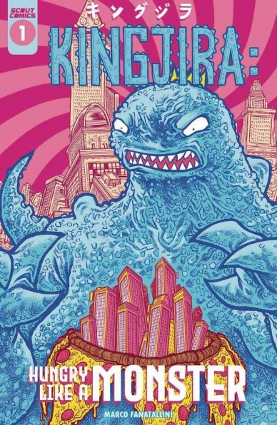
Kingjira: Hungry Like a Monster #1
Written and Illustrated by Marco Fontanili
Reviewed by Quinn Tassin
“Kingjira: Hungry Like a Monster” #1 feels like the perfect comic for a kid who would really like comics but hasn’t read any yet. It’s simple and funny, but deceptively so. For an issue like this to work, there’s a level of talent that a creator has to have and Fontanili certainly has it. While this isn’t a masterpiece by any means, it’s remarkably well-paced, easy to laugh at, and has absolutely gorgeous art.
As far as protagonists go, Kingjira would have to be one of the most compelling of all time. See, he wants pizza and his willing to do whatever it takes to get it. There’s no clear malice toward the city he’s destroying so much as there is rage at the concept of people trying to stop the kaiju from getting a delicious meal. That conflict his staged inventively- there’s no dialogue here, just action and images in text bubbles. It’s a creative way to make interactions genuinely comedic. Where actual words played for comedic effect may feel try-hard, the emoji-like images employed here get the job done.
Continued belowThe artwork is so good in “Kingjira: Hungry Like a Monster” #1 that an actual Godzilla book by Fontanili would be welcome ASAP. The detail in the scenery is awe-inspiring; each rock on the ground, window in a toppled building, and wrinkle on a face is rendered with the utmost care. Shading is used perfectly, communicating the tone of a given panel quickly and effectively. Colors are used sparingly, reserved for screens, explosions, pizza, and especially emotional moments for Kingjira. The colors that are used are bright and interesting, especially during the visual highlight- Kingjira’s energy breath. Every time that he lets loose, everything around him darkens, he shines blue, and the illustration really communicates the might behind his big attack. The way that skeletons crumble and skin melts away is grim but hilarious.
All in all, this is probably the best story ever told about a kaiju wanting pizza real bad. It’s loose and easy to follow and has a few laugh out loud moments (looking at you, Kingjira floating to a giant pizza pie). The art is bonkers good and the resolution- Kingjira going to monster jail but getting all the pizza he wants- is fitting.
Final Verdict: 8.0- A big monster wants pizza- what’s not to love?


