There is a lot to cover on Wednesdays. We should know, as collectively, we read an insane amount of comics. Even with a large review staff, it’s hard to get to everything. With that in mind, we’re back with Wrapping Wednesday, where we look at some of the books we missed in what was another great week of comics.
Let’s get this party started.
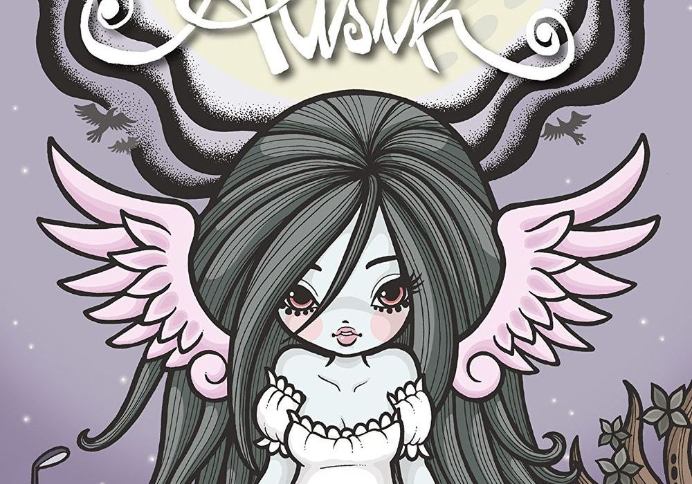
Alisik #1
Written by Hubertus Rufledt and Helge Vogt
Illustrated by Helge Vogt
Colored by Helge Vogt
Lettered by Cat Connery
Reviewed by Alan Buxbaum
Rufledt and Vogt’s “Alisik” #1 is a Tim Burton-inspired tale with an excellent start to the series held up by some absolutely amazing artwork. From a birds-eye-view, the style of the artwork captures the darkness of the story while using porcelain doll-like figures to give the world some light-heartedness. The angles and shots of the opening panels make you feel as if you’re in a movie. Each panel feels as if it organically leads to the next, creating what feel like moving images in your head. Vogt is a master at saving Rufledt from needing to be too wordy throughout the entire comic as well. For example, the reader is fully aware of the anxiety Alisik must be feeling when she’s in the process of finding out she’s indeed dead! Several repeat close-ups of her eyes, which change ever so slightly form panel to panel, culminating in disbelief. Another stunning example is the scene where Alisik’s determination to prove that she isn’t dead to herself brings her to a raucous concert with raging teens. In order to convey this change of environment, Vogt uses giant-sized lyrics that looks as if they’re coming towards and away form the reader, essentially putting a “doppler” effect on them. This makes you feel as if you’re trying to have a conversation with blasting music in the background. This is only the tip of the iceberg when it comes to ways in which Vogt masterfully draws this comic.
The story itself is intriguing, although needs to develop more in order to see where its heading. So far, it does a great job of drawing on Halloween and other undead-lore while clearly carving out its own separate world. The mysteries of how this world of the undead works are certainly luring enough to get you to the next issue. My biggest question is whether or not they will keep ‘Alisik’ a more closed, tightly knit world or if they will develop it into something much bigger and in-depth. For example, why is it that these post mortal beings are sent back to Earth? Is it as simple as them misbehaving during their lives or something more sinister for those pulling the strings? The other big mystery that will be explored is why Alisik is dead in the first place?
Final Verdict: 7 – “Alisik” #1 is a great start to what can potentially be an amazing story. In the meantime, Vogt’s incredible artwork will keep you interested until the end of this first issue.

The Beef #1
Written by Richard Starkings and Tyler Shainlin
Illustrated by Shaky Kane
Lettered by Richard Starkings
Reviewed by Reed Hinckley-Barnes
“The Beef” #1 is a strange book. After this first issue, I have no idea what the rest of the series is going to be like. Though I’m not sure whether to count that as a positive or a negative. The book follows Chuck Carter, a beef factory worker that is in charge of using the bolt gun to kill cows in the factory. But, having spent his entire life eating the beef and other genetically modified food that has come out of this factory, he has turned into some kind of strange, hulk like monster.
The art, from Shaky Kane, is done in a kind of silver age, pop art style. The flat coloring throughout the book makes everything feel very poppy and gives “The Beef” #1 a feeling of lightheartedness. This is contrasted with the moments where cows are being killed, where the art conveys all the gruesome details without being too over the top. This juxtaposition is probably the best part of the issues art. But in the scenes with action, the quality of the art dips a little bit, and there is a lack of momentum in a number of the figures. On top of that, there are some moments where the perspective on characters just feels off. Arms and limbs that are supposed to be pointing out toward or away from the reader but just look flat.
Continued belowThe biggest problem with “The Beef” #1 is that I can’t quite tell what it wants to be. At points it seems like it wants to be a silly satire of the meet industry, at other times, it seems like it wants to be a deep psychological examination of the bland main character, Chuck. The worst part of this jumble is that the villains of the book are two characters that are deeply misogynistic and racist, and when the book spends so much time being lighthearted, it makes the whole thing extremely uncomfortable. As I said in the beginning, I have no idea where the book is going from here. Maybe the introduction of the hulk-like monster Chuck turns into at the end will turn things around, but at this point, I have no idea what the “The Beef” is trying to be.
Final Verdict: 4.8 – “The Beef” #1 is a strange mix of subject matters and tones, and none of it ever quite fits together.
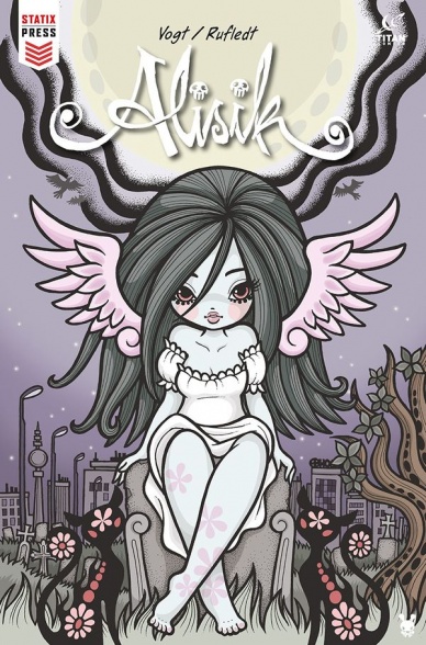
Calexit #2
Written by Matteo Pizzolo
Illustrated by Amancay Nahuelpan
Flatted by Dee Cunniffe
Colored by Tyler Boss
Lettered by Jim Campbell
Reviewed by Jonathan O’Neal
Hitting the stands seven months after the plus-sized premier issue, “Calexit” #2 continues Pizzolo’s ambitious story of a near future where California has seceded from the United States. It is clearly a passion project, a cautionary tale of what could happen in the wake of the tsunami of our real world political climate. It’s truly a staggering and admirable result of a creator’s imagination and detailed planning, and this achievement cannot be stressed enough in light of this issue’s crucial failings.
The most glaring issue is in the story’s protagonists. Pizzolo avoids showing us why Zora McNulty is so important to the resistance and a target of the occupation forces, thereby robbing the reader of a reason to care about her. While her significance will likely be revealed (along with the story behind her prosthetic leg) in future issues, this installment suffers in that lack of detail. It’s ironic in a book so full of information. It is also ironic that Pizzolo would choose to humanize the sadistic Rossie in this issue’s final act before bothering to do so with his heroes. At least Rossie seems to know why Zora is so important. Perhaps he could have given readers a clue before he settled in for a cup of tea in his man cave. At this point, all we really know about our heroes is that Jamil, the self-serving courier who finds himself attempting to deliver Zora to resistance forces in Tijuana, is a bit of a chauvinist jerk. He’s brazen in his dealings and thinks he is principled because he refuses to choose a side. And Zora, the resistance hero, is a badass, especially when doling out tough love to a little kid who just lost her mother due to Zora’s impetuous penchant for violence. In short, Pizzolo seems to be deconstructing his heroes before his story can.
Amancay Nahuelpan’s art is effective even as the style sometimes vacillates between realism and cartoonishness. Many panels are void of backgrounds but the places where we do get them reveal this decision to be one of economy and aesthetic rather than a lack of ability. Mainly, the artwork suffers from the shortcomings of Pizzolo’s script that can’t seem to decide what it wants to be, a gonzo satire or an earnest sociopolitical thriller. Tellingly, the faction flags by Robert Anthony Jr. and Pizzolo presented in the back matter seem to have been given more care than some story elements.
Ultimately, the problem with issue 2 is that the storytelling take a backseat to the impressive world building. The patience of readers may be tested waiting for a emotionally and not just politically resonant story to catch up with the pastiche of this near dystopia, if it ever does.
Final Verdict: 6.0 – There are truly impressive things going on in “Calexit.” Unfortunately, at this point, the story is not one of them.
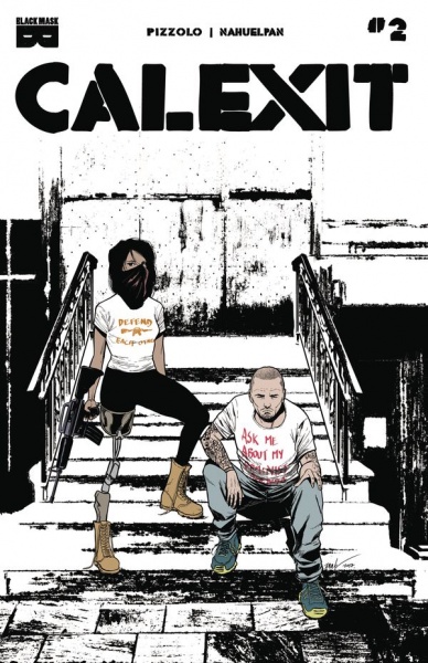
Doctor Strange #386
Written by Donny Cates
Illustrated by Niko Henrichon
Lettered by VC’s Cory Petit
Continued below
Reviewed by Gustavo S. Lodi
“Doctor Strange” 386 is set some moments before the ‘Damnation’ event (first pages) and during the same event for the duration of the issue. And while an understanding of this broader story can certainly give readers a better experience, it also holds up well as a stand-alone, thanks to the sharp script by Cates and art package by Henrichon (drawings and colors).
Artists with a sensibility for the macabre and mystic can have a field day with a book like “Doctor Strange,” especially on an arc addressing what happens when Las Vegas becomes the headquarters of a literal Hotel Inferno. Henrichon certainly seizes the opportunity by offering as much lighting and energy effects as possible, as well as some harrowing images of ghouls and demons that made Inferno their residence. There is a particular clever piece of design around poker playing cards that should get readers craving for more. The artist does crowd the pages quite a bit, though, and it can hurt the narrative at some points, even if marginally: one can only take as much fire, brimstone and creatures without getting lost. One earlier page, with a gorgeous Las Vegas desert vista hints at his ability to deliver open shots quite well. Regardless of this criticism, the issue surely looks beautiful, with the full control of the art in one person certainly being perceptible.
Donny Cates on has been on a roll as of late, with critical acclaim while writing “God County,” “Thanos,” and this very own “Doctor Strange.” This issue is no exception to that trend, as Cates juggles the scale of a demonic invasion with a very personal exploration of Strange’s personality, arrogance and tricks, and how key character choices take him down perverse paths. Highlights include the banter with both his ghost talking dog (yes, that’s right) and Mephisto: it is pretty amazing how much character delineation and plot Cates can convey so effortlessly with sharp dialogue alone.
Final Verdict: 7.5 – “Doctor Strange” 386 focuses on contained settings and sharp character interaction to move the story forward while offering beautiful art, even if somewhat trapped by large panel counts.

Hungry Ghosts #2
Written by Anthony Bourdain and Joel Rose
Illustrated by Leonardo Manco and Mateus Santolouco
Colored by Jose Villarrubia
Lettered by Sal Cipriano
Reviewed By Kate Kosturski
(Warning: this review contains spoilers.)
The previous issue’s game of 100 Candles continues with two stories that take readers to southern Europe. The first, “Salty Horse” is a classic tale of gluttony gone too far. Horsemeat is a delicacy in Europe, and for one man in Spain, it is his favorite above all other meat. After eating through his entire stable, from the racehorses down to the foals, he still craves more. One older war horse is left for consumption, which our protagonist devours with intense gusto. He probably just expected a late night attack of indigestion after such rich food, but instead received something more sinister. The second story, “The Heads” finds a chef’s apprentice out of work in Italy after his master dies, and taken in by a new group of chefs. This new group of chefs are not of this world – – in evenings, their heads leave their bodies looking to feast on human flesh. Our apprentice fights most of them off, but is left with one unwanted souvenir, which he soon finds he can use to his advantage.
Both artists on these stories have similar but still distinct art styles. There’s lush detail and line work throughout each, but more ample use of shadow in Leonardo Manco’s tale. Conversely, Mateus Santolouco has a lighter hand in shadows, but strong line work on motion – – you feel like you are falling yourself as our apprentice tosses headless bodies out the window. These two different approaches add the touch of horror to the story in their own way. Manco’s shadows hint at terror to come, while Santolouco’s lack of shadowing make those moments of terror, when they do come, less expected and more surprising. Jose Villarrubia colors remain consistent and muted throughout, but praise is due the horse spirit in the final panels of “Salty Horse.” With just the right touch of intense light in the eye and no other changes to the color palette, he has helped to create a truly horrifying demon. The artwork definitely elevated “Salty Horse” from its standard trope of a deadly sin (gluttony) gone wrong, and complemented the twists and turns of “The Heads” beautifully. Let’s see what supernatural treats our chefs have in store next.
Continued belowFinal Verdict: 7.8 – Sophisticated art both elevates classic horror tales and provides twists when you least expect them.
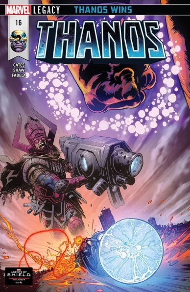
Thanos #16
Written by Donny Cates
Illustrated by Geoff Shaw
Colored by Antonio Fabela
Lettered by VC’s Clayton Cowles
Reviewed by Alex Curtis
Donny Cates has brought a twisted humor and his own brand of apocalyptic intrigue to Thanos for four issues now, and I’ve been mostly enjoying it. But this issue cements my biggest problem with this arc: Cates clutters up the narrative with other characters and world-building details.
Exploring future versions of a universe is a common trope in comics and media in general. Successful dystopian stories don’t forget to develop our lead/s while introducing us to amusing alternative versions of characters. But “Thanos” #16 is too wrapped up in Cate’s funhouse of horrors by delving into the origins (or would it be the future?) of Frank Castle and how he became a Ghost Rider. It strikes me as self-indulgent and takes us away from Thanos’s development.
It’s odd for Cates to leap into this protracted “end of the Marvel universe” fan fiction and stall Thanos’s arc. Yes, it’s plenty fun, as are most futuristic tales, but our main story should come first and foremost. This is an example of a writer getting bogged down in the niceties and not giving apt attention to what matters most: story and narrative thrust. The two Thanos’s quest to please Death is relegated to the back of the book and ends with a cheap cliff-hanger.
I’m also not sold on Cates’s over-dramatic narrating. In some instances, his grandiose, adjective-laced prose sound regal and fit the merciless story. However, most of the time, the narration comes across as overwritten and melodramatic. Quite frankly, it’s distracting.
In the art department, Geoff Shaw’s art couldn’t be better suited for Cate’s exceedingly grim series. Shaw brings a rustic growl to “Thanos” with his shadowy landscapes and expressionistic characters, who simmer with rage and foreboding amusement. Even Thanos, who is usually grim, has his equal share of expressions under Shaw. No matter the problems I have with the plot, Shaw sells the cataclysmic events of this tale with a no-holds-barred, mammoth charisma.
What truly sells Shaw’s portentous panels are Antonia Fabela’s colors, which are wonderfully unfussy and reminiscent of colorists in the 90s who didn’t have access to all the fancy, digital technology we have. Fabela isn’t afraid to paint our favorite heroes in garish, clashing colors against the ruinous, inferno backdrop of Thanos’s rampaging.
Final Verdict: 4.7 – I want to like Donny Cate’s apocalyptic take on the Mad Titan, but the current story is too bogged down in details to be wholly satisfying.
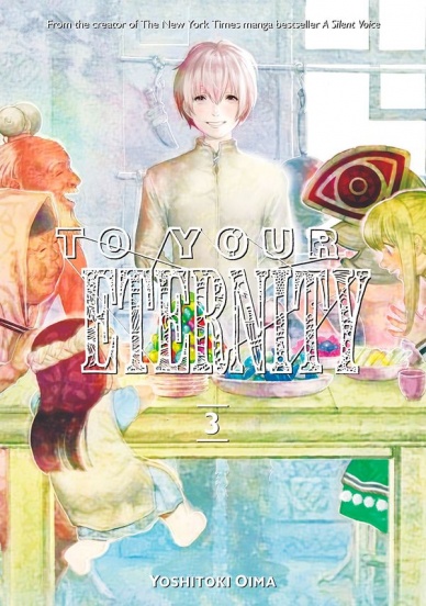
To Your Eternity Vol. 3
Written and Illustrated by Yoshitoki Oima
Reviewed by Elias Rosner
“To Your Eternity” is not a happy series, despite what the covers might have you believe. The first two volumes are defined by death and sadness and they are filled with broken people living in a broken world, much like Oima’s previous series, “A Silent Voice.” Yet in this volume, we have a respite from the sadness, although only partially. This respite was very much needed and through it, Oima shows her command of tone, shifting effortlessly from human drama to humor to action and back to drama.
Oima’s art, once again, is fantastic. The characters are all expressive and visually distinct from one another. Even when Gugu wears his mask, the interplay of words, physicality and framing are able to the exact right amount of emotion and intent. Her backgrounds are also lush and dense, using a high volume of short inking lines to make them feel solid and build the town where Gugu lives.
Doing this as a weekly, I can’t imagine how much work goes into each page, especially with the number of panels per page during the slower moments of which this volume is filled with. We shift focus too, to a new character named Gugu. As is standard at this point, Oima chooses to dive deep into this other character and his broken life as a parallel for Fushi/Immo and as a learning opportunity for him.
Continued belowThis doesn’t mean that it works 100% of the time. There are some suspect philosophical moments that don’t quite mesh with the rest of the story, especially the ones Gugu spouts after being confronted by Rean without his mask on. There is also the feeling that Pioran is being sidelined with the Booze Man but if her actions near the end of the volume are any indication, that was only a temporary measure to give others room to develop.
Speaking of Pioran, the supporting cast, which has shrunk after the events of last volume, has blossomed out again, providing us with a wide variety of people to get attached to and even more stories to learn. While we don’t get many more answers about the stranger in black or the knockers, which are coined in this volume, the danger has never felt more real and the trial of the immortal isn’t over yet.
Final Verdict: 8.7 – Compelling human drama combined with stellar art keeps this series feeling fresh and moving in its third volume.
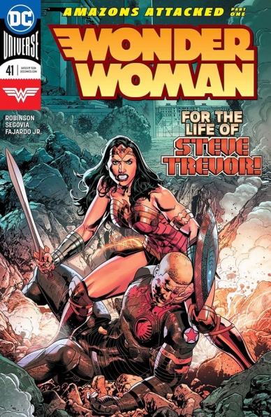
Wonder Woman #41
Written by James Robinson
Illustrated by Stephen Segovia
Colored by Romulo Fajardo Jr.
Lettered by Saida Temofonte
Reviewed by Gregory Ellner
First, let’s just get this out of the way: yes, the new arc ‘Amazons Attacked’ is named after that infamous storyline ‘Amazons Attack!’ from 2007. No, it is nowhere near that… quality, and the connections are thankfully tangential at best.
James Robinson is doing a good job of adapting the legions of Apokolips to be villains of Wonder Woman, integrating further from Grail by having Darkseid’s attention focused on Themyscira. Given the New Gods’ original design as enemies of Marvel Comics’ Thor, it makes sense for the God of Tyranny to instead focus in on the closest mystical equivalent in the DCU, the Olympians.
Wonder Woman and Steve Trevor’s relationship takes center stage in this issue, as they talk through their problems (martially, anyway) while discussing their vulnerability. The spread out focus on the former’s fights helps to give some minor attention to her struggles without focusing much in on them on the whole, instead staying on an emotional level.
The artwork emphasizes the chaos of battle when showing Steve Trevor, but more organized and relatively adept when the organization of fight scenes is brought toward Wonder Woman herself, showing the difference between the mortal and the divine. Still, the overall effect of constant movement helps keep attention on the words themselves, on the dialogue between the two, to paradoxically turn a fight-centric issue into a character-focused one.
Final Verdict: 7.0- Though something of an interlude to lead into the meat of ‘Amazons Attacked,’ “Wonder Woman” #41 nonetheless helps bring out all of the major pieces to move things in a consistent direction.
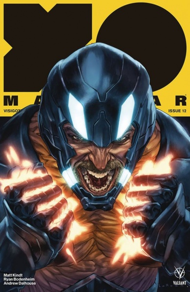
X-O Manowar #12
Written by Matt Kindt
Illustrated by Ryan Bodenheim
Colored by Andrew Dalhouse
Lettered by Dave Sharpe
Reviewed by Michael Mazzacane
Comics can be a tricky balance between whether enough has been dramatized or not. The turn against Aric felt to sudden, but his retribution in this issue feels just right. Artist Ryan Bodenheim brings sound designs and strong line work that make for clear action and some solid humor.
Aric isn’t the most emotive type, he’s very much in the mold of characters slowly learning to express themselves in ways that aren’t violent and wrathful. To that end, Bodenheim gives Aric a pitch perfect incredulous gaze at the beings who consistently discount him even in a weakened state. How could they not think they had the drop on the former emperor, coming across him fully nude? It is for that reason that this stare works so well. Their scuffle isn’t super fancy but Bodenheim lays things out in clear fashion.
A similar bit of well-done physical humor comes as the bounty hunters attempt a consensus on what exactly to do with the armor. Kindt’s script helps setup the cadence and a few one liners, but Bodenheim illustration showing the combination of naïve-glee as Bat tries to put the armor on gives the moment a dark quality. Much like the naked fight, readers know what to expect and things go as expected. Bodenheim slowly shrinking the panels as Bat is ingested(?) by the armor gives that page the right cadence and allow letter Dave Sharpe’s onomatopoeia have the final word.
Continued belowActions get slightly muddy during the council showdown. It’s a mixture of geography being a bit nebulous and paneling. Dedicating a single panel to showing off a blood-soaked knife is an evocative image, that never seems to have a follow through. On reread I get that Aric is supposed to be stabbed, but where exactly isn’t clear. In the clamor it initially seemed like Schon was meeting the blade but that’s also wrong.
Bodenheim is at his best when he is simply illustrating events such as the reunion between Aric and his armor Shanhara, with Kindt’s script it has all the intimacy of a deathbed farewell. It rightly builds to the eventual moment of Aric fully excepting the armor, his partner, back into his life and that’s not a good sign for his enemies.
Final Verdict: 7.0 – “X-O Manowar” marches on with consistent beat as Kindt continues to peal back another layer from Aric of Urth.


