
There’s a lot to cover on Wednesdays. We should know, as collectively, we read an insane amount of comics. Even with a large review staff, it’s hard to get to everything. With that in mind, we’re back with Wrapping Wednesday, where we look at some of the books we missed in what was another great week of comics.
Let’s get this party started.

Written by Joshua Williamson
Illustrated by Andrei Bressan
Colored by Andriano Lucas
Lettered by Pat Brosseau
Reviewed by Joe Skonce
It’s not an easy task to set a fantasy story in the modern world, but when a book is able to find a nice balance of the tones, it can tell a memorable story. “Birthright” #42 does an impressive job of blending the fantastical with the modern. You have trolls, werewolves, eldritch witches with multiple heads, but set in military bases with soldiers, news reporters, and modern-day weaponry. While there are those who seem skeptical of the fantastical world, everyone seems to be on the same page about stopping the threat. But where the issue was really impactful was the story of Rook. I have not read a single issue of Birthright, yet I immediately felt a strong connection between Rook and the Chosen One. Granted, I am an easy mark when it comes to “big scary guy with a gentle soul,” but Rook is written to be incredibly likable. It was the first time I picked up the page, but I felt the very real pain of The Chosen One when he found his friend and mentor dying, telling him that he was his family. Joshua Williamson wisely chooses to frame the issue with a conversation about Rook’s life, his hopes, and his dreams. To give him the victory of escape only to take everything away.
The story is good, but the art is spellbinding. Andrei Bressan and Andriano Lucas are clearly on the same page when it comes to the design of their fantasy world. The designs of the witches are straight out of dark fantasy, full of unnatural angles and fangs. Most of the scenes with the witches have harsh green coloring, which makes the creature seem all the more menacing. In fact, the colors throughout “Birthright” #42 really sell the darker tone of the comic. The colors enhance the darker tone of the book. The world that Lore has created isn’t a pleasant fantasy and the art team’s designs really help to enhance the horror of the comic. The team does a good job of showing what might happen if our world suddenly clashed with a dark fantasy world.
Final Verdict: 7.0 “Birthright” #42 combines effective dark and moody art and a tragic story of found family to create a modern-day fantasy epic worth checking out.

Written by Chip Zdarsky
Illustrated by Marco Checchetto
Lettered by VC’s Clayton Cowles
Colored by Mattia Iacono
Reviewed by Michael Govan
You know what I like about Spider-Man’s movies? They stress how much the wallcrawler means to the community and how he inspires the people of New York. Off the top of my head, I can think of five different moments that go out of their way showcase that. Reading “Daredevil” #19, that’s what I was thinking on in the back of my mind. How much superheroes can mean to ordinary people.
In this issue, appropriately entitled ‘Inferno’, Hell’s Kitchen is in dire straits, under attack by a posse of super-villains. There’s nothing but explosions and gunfire…the atmosphere is extremely tense. It feels like you’ve been dropped into the middle of a warzone and it’s clear that not everybody’s going to make it out in one piece. Artist Marco Checchetto deserves credit for drawing the action in this book. He’s done epic superhero action before but this is a different animal. It’s gritty, street-level action. This is a world where Thor or Iron Man aren’t right around the corner to save everyone. This is hell. The sky’s on fire and people are panicking. I mean…even Stilt-Man is terrifying.
Yet the people of Hell’s Kitchen rally together. Several ordinary people put on Daredevil’s mask and take a stand, refusing to go quietly into the night. Both the script and art come together to make this a pretty emotional issue, bombastic issue. My complaints are relatively minor in the grand scheme of things. This seems like the kind of rampage that Rhino wouldn’t be involved in given his portrayal as a sympathetic villain but I’m no expert on the guy. A character that I don’t care for at all makes their return but it doesn’t take up too much time. All in all, a great issue.
Continued belowFinal Verdict: 8.0 – Daredevil enters the ‘Inferno’…but he’s not alone.
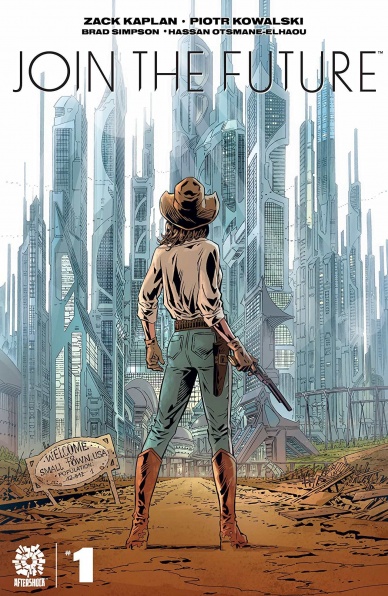
Written by Zack Kaplan
Illustrated by Piotr Kowalski
Colored by Brad Simpson
Lettered by Hassan Otsmane-Elhaou
Reviewed by Kobi Bordoley
“Join the Future” #1 hits all the must-haves of a series premiere: premise, tension, cliff hanger. The premise: socialist, urban “utopia” vs. small town bucolic “freedom.” The tension: salvation through technology vs. tradition and independence. The cliffhanger? You’ll know it when you see it. While Kaplan has planted the seeds for a well designed sci-fi western mashup, does “Join the Future” #1 overcome the tropes of moralist, hand-wringing that can plague such stories? We think so.
The opening pages explore the central set piece of the city, describing its vertical gardens, free healthcare, universal basic income, and more — all with a diverse cast. Really, it looks pretty sweet. There’s no obvious “catch” here. No organ farming a la The Island , no sacrificial lamb a la The Ones Who Walk Away from Omelas , or anything of the sort. The future has never been brighter.
On the other side, there’s Franklin, the small town where protagonist Cam and her family live. It’s quaint but anti-technology, with a sprinkle of patriarchy. If Kaplan’s hope midway through the opening issue of “Join the Future” was to cast the city as bad and the country as good, he did not succeed. However, I don’t think penning a primitivist libertarian screed was Kaplan’s intention, because he’s smarter than that. Once you break away from trying to distill a political ideology from “Join the Future” #1, the real story emerges: and it’s about Cam, a young woman caught between the rigid but safe present, and the curious, alluring possibility of a larger life. It’s a time tested archetype, but Kaplan’s writing keeps things interesting. The disagreements between daughter and father, the small betrayals and reaffirmations of ideology and trust — they’re all well written and genuine.
Of course, this entire world is made possible by the deft hands of Kowalski, Simpson, and Otsmane-Elhaou. They accomplish every comic team’s dream of providing absolutely unforgettable art that at the same time never overtakes the story itself. The vistas in “Join the Future” #1 are as sweeping as character movements are exact. This world feels lived in, breathing, and palpably on edge, despite the utopian gloss of abundance.
While the lid blows off the pot in the final scenes of “Just the Future” #1, it’s still very unclear where exactly this story is going, and who the good guys are. We can say, with full genuineness, that we can’t wait to find out what happens next.
Final Verdict: 9.0. Subtle yet immense, political yet evenhanded, “Join the Future” threads the needle of expectations with a calculated hand.

Written by Greg Rucka
Illustrated by Mike Perkins
Colored by Andy Troy
Lettered by Simon Bowland
Reviewed by Alexander Jones
Author Greg Rucka has used the platform of “Lois Lane” to return to some of his favorite characters in the DC Universe. Rucka’s favorite characters have been working alongside Lois Lane to find the truth behind Lane’s recent assassination attempt. Rucka’s smart dialogue is in force throughout the issue and lends a strong aspect of humor to the issue. There are several scenes in the comic where Rucka allows artist Mike Perkins to carry the story with silent sequences that have beautiful, vivid motion. Also, the way Rucka has structured the plot of “Lois Lane” is absolutely fascinating. The series has had one-off issues and scenes where Lois interacts with Superman and Jon and others that are devoted to completely different topics. You never quite know what Rucka’s scripts are going to offer readers in the pages of “Lois Lane.”
The interior art from illustrator Mike Perkins can be non-descript at times. Perkins omits lots of detail on the page yet aspects like Renee Montoya’s hair are so detailed. Some of the faces in the issue are so poorly defined that it is difficult to discern which character is on-panel. These problems have persisted from the beginning of the series and I would have hoped to see Perkins evolve as an artist with more experience. However, this issue is full of impressive visual sequences. There’s a cameo in the issue where sequences end with fluid motions or punchy jokes timed just right. Perkins is great at illustrating motion on the comic book page. I also would like to see more interesting page compositions from Perkins. The illustrations in the silent sequences take a lot of chances and stretch the comic book medium.
Continued below“Lois Lane” #9 also doesn’t waste time introducing readers to important plot elements. With so many comic books decompressed in storytelling, “Lois Lane” continues to introduce narrative aspects late in the run. I also can’t help but appreciate how Rucka’s scripts attempt to tie-into current continuity. Aside from a few technical aspects lacking from the detail in Perkins pencils, this is a commendable issue of “Lois Lane.”
Final Verdict: 8.0 – “Lois Lane” #9 is packed with clever dialogue and serene silent sequences.

Written by Sarah Beattie and Tim Seeley
Illustrated by Rebekah Isaacs
Colored by Kurt Michael Russel
Lettered by Crank!
Reviewed by Jodi Odgers
“Money Shot” #5 is the climax of the first arc of the series, and it is stuffed full of what has made the series such an enjoyable ride so far.
Beattie and Seeley’s writing is charged with fresh ideas, sex-positive messages, and the end of this first narrative arc leaves the reader as satisfied as the XXX-plorers themselves. Rebekah Isaacs’ art captures the spirit of the comic perfectly, right down to the disproportionate genitalia of the Bokai Elder being used as a bludgeon. Kurt Michael Russel’s coloring continues to elevate “Money Shot” – the lighting is sublime, and the color palette makes every aspect of the comic pop without ever feeling needlessly bright or garish.
This comic was never going to be for everyone – there hasn’t been this many sets of human and alien genitalia in print since “Saga” went on hiatus. However, this never feels forced in simply to sell issues to those looking for a new sexual kick. “Money Shot” has heralded the message that sex is, at its core, about connection. Issue #5 ties a bow around this concept, showing how the XXX-plorers, through sex, form humanity’s connection to the wider universe. It touches the reader, and not in the way that you’d expect. More than that, it gives readers a peek into where the series could go from here, and it’s enough to perk the interest of those that have followed the series to this point.
Final Verdict: 8.6 – The money shot of “Money Shot” certainly did not disappoint.
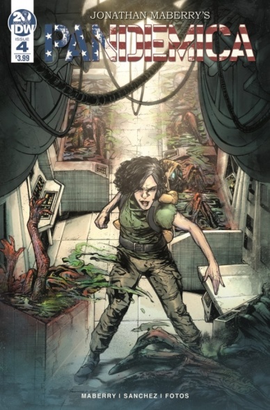
Written by Jonathan Maberry
Illustrated by Alex Sanchez
Colored by Jay Fotos
Lettered by Shawn Lee
Reviewed by Matthew Blair
“Pandemica” #4 is the second to last issue of the series and serves as a sort of origin story for the moment where everything went wrong. A small group of special ops soldiers and scientists are trying to stop a shadow government organization from launching a pandemic that will kill all non-white people and unfortunately, the plague is starting to look like it’s a lot less discerning than previously thought. While it is over exaggerated, it’s definitely a topical plot in today’s social and political age.
The crux of “Pandemica” #4 is the classic needs of the many vs. needs of the few debate as two soldiers sent to infiltrate a bioweapons lab are forced to decide whether or not to kill a child in order to save everyone on Earth. It’s a debate the writer Jonathan Maberry handles well, with two former friends having a falling out over the fate of the child set against the ticking clock of a rapidly spreading plague and an incoming SWAT team. There are times when the comic can be a bit wordy, but the characters all behave in a relatable way and the book doesn’t go completely off the rails.
The art of “Pandemica” #4 is highly detailed and blends realism with just enough cartoon elements to be slightly exaggerated while maintaining a serious tone. This is a story that requires a lot of blood and violence and artist Alex Sanchez delivers on both counts very well. There is a weird thing going on where almost every character looks like they’re gasping for air like a suffocating fish, but given the panicked and high stress nature of the story it makes sense.
“Pandemica” #4 is a book that doesn’t really matter. We know what winds up happening in the end, we know that the moral arguments are all pointless, and we know that the world ends anyway. Still, it’s some pretty compelling stuff and it’s nice to know how things got to be so bad.
Continued belowFinal Verdict: 8.2 – Even though we know what the end result of all of it is, the book still provides some compelling moral drama.
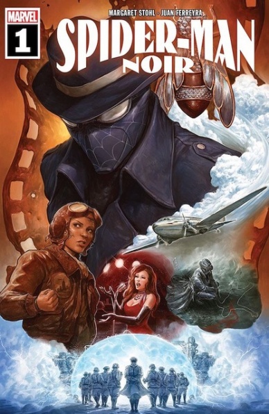
Written by Margaret Stohl
Illustrated and Colored by Juan Ferreyra
Lettered by Travis Lanham
Reviewed by Gregory Ellner
Where this story goes, the wind follows. And the wind… it smells like rain. The rain of a dark and stormy night, of crooked cops and antiquated dialogue cranked up to eleven to near the point of parody. While fun to read, Margaret Stohl’s writing on “Spider-Man Noir” #1 is heavy enough with speech similar to films in the 1930s and 1940s that it appears to be more a caricature of the era than the more serious takes put forth by the original “Spider-Man Noir” or its sequel miniseries “Eyes Without a Face.” Stohl’s style isn’t exactly badly applied, but as a whole seems best read while ignoring those two preceding stories, a focus that doesn’t exactly bode well for it in terms of returning fans. Rather than aiming to draw those fans back, it seems as though Stohl is focused instead on the newer crowd that associates the character with Nicolas Cage’s portrayal in Spider-Man: Into the Spider-Verse. There are obviously differences, and references are made to elements that would only truly work with the context in the previous comics, but the overall feel is still very much present. At its worst, that style still fades away with time in the story itself, but it can leave a negative impression nonetheless.
Where “Spider-Man Noir” #1 really shines is, ironically, in the dark and dour artwork and colors of Juan Ferreyra’s work on the debut. The soft pencils help to draw out the dark color palette, all of the artwork feeling akin to a sepia-toned photograph at times, perhaps with a bit more color such as Mary Jane’s red hair. Piece it together with creative use of panels and perspectives that emphasize the darker nature of this noir-based universe, and “Spider-Man Noir” #1 coalesces into an intentional period piece that draws on both hope and fear, on mystery and determination at the same time, all helping to characterize Peter Parker, Mary Jane Watson, and much more beyond through their facial expressions as much as the way in which they are positioned amidst a near-totally grayscale world.
Final Verdict: 7.0 – While the storytelling, especially the dialogue, is rather cliché for a noir tale, Juan Ferreyra’s artwork and colors lift up and enhance the script of this new debut.

Written by Skottie Young
Illustrated by Humberto Ramos
Colored by Edgar Delgado
Lettered by VC’s Clayton Cowles
Reviewed by Luke Cornelius
With the launch of any new series there’s an inevitable comparison to previous works and with “Strange Academy” #1, the Harry Potter series never feels far away in its opening pages. Young introduces Emily Bright, a teenager trying to determine the limits of her powers. When her attempts go wrong, Zelma Stanton intervenes and informs her of the Strange Academy. After convincing her parents, Emily becomes a member of the school’s first student cohort. Young lampoons the fictional sounding “magic school,” before removing J.K. Rowling’s works from the reader’s mind with Emily’s arrival at the academy. Here, Young’s script comes to life by quickly introducing the other students who are from each corner of the Marvel Universe. Their introduction brings an energy to the book that never lets up until the comic ends. The characters have tensions instantly, mainly caused by the Asgardian twins who brace for attack at the arrival of a frost giant and Dormammu’s son. The variety of characters gives Young a wealth of possibilities to explore in future issues, as well as a diverse range of identities and backgrounds that mirror reality. Dessy (short for Despair), a demon from Limbo burdened with seeing the “desperate side of all things at all times” and can’t help but change the group’s mood, steals the book.
In the visual side of the book there’s no shortage of energy either. Ramos’s character designs make sure each student is unique and identifiable, even in the wide shot when they’ve changed into their uniform. Likewise, Ramos’s range of facial expressions manages to make each student’s face, even when reacting in a similar way to others, different. Delgado’s colorwork in the book presents magic in the book well; as we watch Emily grow, the panels are washed with muted, earthy tones, with Emily’s abilities standing out with an angelic glow. Comparatively, the landscape at the Academy is incredibly vibrant and emphasises the wondrous nature of the setting. Cowles’s lettering presents all the dialogue very comfortably despite its abundance in the issue and never causes any confusion regarding its source.
Continued belowOverall, Young provides “Strange Academy” #1 with a script that dispels the shadow of the Harry Potter series quickly and is filled with potential while Ramos’s artwork is part great character design and part pure energy.
Final Verdict: 7.4 – “Strange Academy” #1 has a strong creative team that deliver an entertaining start, with plenty of potential.
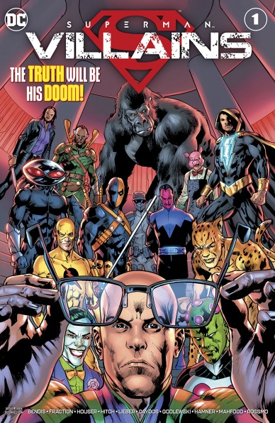
Written by Brian Michael Bendis, Matt Fraction, Jody Houser
Illustrated by Michael Gaydos, Riley Rossmo, Scott Godlewski, Bryan Hitch, Cully Hamner, Steve Lieber, and Jim Mahfood
Colored by Michael Gaydos, Ivan Plascencia, Gabe Eltaeb, Alex Sinclair, Dave McCaig, Nathan Fairbairn, and Jim Mahfood
Lettered by Dave Sharpe, Clayton Cowles, Tom Napolitano Troy Peteri, and Josh Reed
Reviewed by Kevin M. Gallagher, Jr
In the wake of Superman revealing he is Clark Kent, “Superman: Villains” #1 explores how his rogue gallery, from Toyman to Lex Luthor and beyond, reacts. The cover would have you believe that’s what this entire issue would be about, however, we truly only see a handful of villains react. Several writers and artists team up to bring these different stories to life and while they don’t all fully hit it out of the park, there are certainly some highlights.
The bulk of “Superman: Villains” #1 focuses on The Daily Planet’s newest owner having direct ties to the invisible mafia of Metropolis. It’s the story that has a typical arc in comics and doesn’t feel like it’s every abruptly ended unnaturally. The infected Supergirl pages are also very good, though if you’re not following the “Supergirl” series, it’s a confusing section without further investigation.
Many of the highlights in “Superman: Villains” #1 are the short one- or two-page glimpses at reactions to Superman revealing the truth, specifically the pages with Lex Luthor and Bizarro. Both short stories were a fun, quick glimpse of very different parts of Superman lore. Toyman’s story was perhaps the most satisfactory. Surely there will be a lot to come from Superman revealing that he is Clark Kent, but Toyman to surrender, give up a life of crime, and stand trial for his crimes must be rewarding for Superman; it is for the reader.
While some stories do fall flat, or end abruptly, for the most part, they flow from one to the other nicely. However, the art in “Superman: Villains” #1 is so vastly different between the stories, I had to take a break from reading. All of the artists involved did a wonderful job, but my head began to hurt from so many changes.
Ultimately, the idea of seeing a micro slice of characters in an anthology series works—we’ve seen it work with “Superman: Heroes” #1, where the art changes were much more subtle for a majority of the comic. However, “Superman: Villains” # 1 would have been better off slimming down the number of stories and artists; perhaps even creating a limited series run to group different stories/artists across multiple issues.
Final Verdict: 6.9 – “Superman: Villains” #1 is a highlight reel of moments with Superman’s rogue gallery but is ultimately a wonderful idea that fails to fully connect.


