
There’s a lot to cover on Wednesdays. We should know, as collectively, we read an insane amount of comics. Even with a large review staff, it’s hard to get to everything. With that in mind, we’re back with Wrapping Wednesday, where we look at some of the books we missed in what was another great week of comics.
Let’s get this party started.

Age of X-Man: Prisoner X #1
Written by Vita Ayala
Illustrated by Germán Peralta
Lettered by VC’s Joe Sabino
Colored by Mike Spicer
Reviewed by Michael Govan
At this point, I can confidently say that “Age of X-Man” just isn’t my cup of tea. I gave it a shot. I liked “Nextgen” (largely because of my soft spot for the Academy X kids) but beyond that all I can muster is indifference. “Age of X-Man: Prisoner X” #1 is no exception.
It feels like not all that much happens this issue. “Prisoner X” #1 follows Lucas Bishop as he is locked up in the Danger Room Prison Complex. There are multiple charges but he was snatched up back in “Age of X-Man Alpha” #1 for his relationship with Jean Grey. (Side note: Locking up a black man for sleeping with a white woman doesn’t look great no matter the context.) Bishop has trouble adjusting and runs afoul of a prison gang led by Beast. He makes friends with Danielle Moonstar and has visions of his sister and the true reality throughout the comic.
Maybe this issue falls flat for me because the mini-series is in the introductions phase. It sets up a plot that hasn’t really gotten underway yet. I can’t say I care for the versions of characters readers are introduced to here. Making Beast a prison thug is a really bewildering choice. While I like Bishop a lot this isn’t his best showcase. He never uses his powers and probably could be swapped out for another X-Man with minimal changes to the plot. The same is true for the supporting cast but that’s really a problem for the main character.
The plot that is shaping up isn’t terribly interesting either, in my opinion. Bishop remembers bits and pieces of the true reality but that’s happening with a lot of characters across books. Over in “Nextgen,” Glob Herman is the one remembering things.
The highlight of this book is the artwork. The background mutants are all very interesting and the little action readers are treated to is very dynamic. The issue is nice to look at but that doesn’t really make the story, and the crossover event as a whole, any less dull.
Final Verdict: 5.5 – Here’s hoping next month’s ‘War of the Realms’ crossover turns out better.
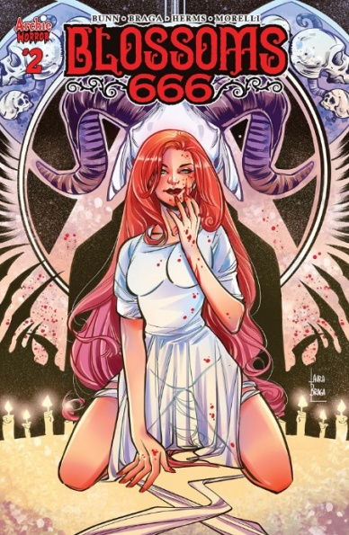
”Blossoms 666” #2
Written by Cullen Bunn
Illustrated by Laura Braga
Colored by Matt Herms
Lettered by Jack Morelli
Reviewed by Matt Ligeti
Jason and Cheryl Blossom are rich, popular, flame-headed twins who just so happen to be heirs to the throne of Lucifer. But like a Ninth-Circle Highlander, there can be only one supreme ruler of Hell. As such, “Blossoms 666” is like Cruel Intentions, but with more human sacrifice: two devilishly attractive teens compete to prove themselves worthy of the keys to the unholy kingdom.
Of course, no one else knows about the Blossoms. But Betty Cooper is beginning to suspect something, and suspicion isn’t safe in Riverdale. One thing’s for certain: “Blossoms 666” is a far cry from the Archie comics you may have seen in the grocery store’s checkout line. This limited series takes place in its own continuity, so all bets are off even for the most beloved “Archie” characters.
No one is better suited for the task of writing “Blossoms 666” than Cullen Bunn, who has years of experience writing mainstream teen angst (and a little ‘Inferno,’) in “X-Men Blue” and horror in just about all of his non-Big Two titles. Bunn builds the tension effortlessly between the charmingly evil Blossoms and the pure, All-American innocence of Betty Cooper and the rest of the Riverdale High gang.
This second issue of “Blossoms 666” is a little slower and quieter than the pentagram-filled first, focusing on building out the greater story now that the book’s tone and plot have been established. Not only does that give readers a chance to catch their breaths, it also gives Laura Braga’s art room to shine, especially in those terror-building, dialogue-light scenes. A shoo-in for the series after writing “Harley & Ivy Meet Betty & Veronica,” Braga blends idyllic Riverdale and cherubic faces with impishly evil grins and horrific, Satanic iconography.
Continued belowMatt Herms easily shifts from the soft, inoffensive “Archie” color palette to dark and bloody horror before readers have even realized the change occurred. And though the occasionally busy panels don’t leave much room for dialogue or exposition, Jack Morelli finds a way to make it work.
“Blossoms 666” #2 is infernally fun and a strong next step in what promises to be a “cult” classic from the Archie Horror imprint.
Final Verdict: 8.0 – Though mostly a quiet issue, it’s clear the entire talented creative team is having a blast creating a horror comic they’re perfectly suited for. “Blossoms 666” is an absolute must-read for fans of “Archie,” horror, and especially “The Chilling Adventures of Sabrina.”

Female Furies #2
Written by Cecil Castellucci
Illustrated by Adriana Melo
Colored by Hi-Fi
Lettered by Carlos M. Mangual
Reviewed by Christa Harader
“Female Furies” posits that the main challenge Granny Goodness and the Furies face to their power, dominance and actualization as key components of Darkseid’s glorious army on Apokolips is sexism. Yes, you read that correctly.
Sarcasm aside, “Female Furies” is another example of the stumbling block creative teams face when they try to sandwich real-world issues into fantastical landscapes without trivializing their content. Re-casting Apokolips as a militarized structure dependent on institutionalized sexism and assault to run properly is a bizarre and, frankly, incorrect choice for the New Gods universe. The book began at a deficit, and issue #2 continues indulging in dull, hyperbolic and stereotype-laden dialogue, down to the issue title delivered in a line by the ridiculously ghoulish Willik. While this kind of writing tries to emulate the Wagnerian drama of New Genesis’ and Apokolips’ endless struggle, it ultimately reads as flat, irritating and, frankly, insulting.
As issue #2 heads for narrative disaster, the book’s visuals can’t pull it back from the brink. Character designs are cheesecake-y, and Aurelie’s dance-style fighting doesn’t work from an anatomical or narrative perspective. Character faces are blurry and over-inked at a distance, and close-up cartooning that’s meant to add depth cheapens the book’s deadly serious tone. Action lines are too fine, and there’s often too much contrast in the shading on the page. The color palette is too broad to be meaningful and too flat to help the book’s mood, and the straight-ahead lettering does the job but offers very little style to enhance the read.
Unfortunately for this book, the Furies are murderous, operatic villains in a cosmic, archetypal space landscape, and reducing their conflict to what all too many people face in the real world is trite and misguided. Aurelie is crushed by the weight of Willik’s actions, which situates him as the center of her character development, so her musing on the brutal nature of the Furies’ purpose barely has time to breathe before she’s gaslit into oblivion. “Female Furies” is trying to tackle sexism as a barrier to empowered femininity by situating it as the sum total of its narrative conflict, and thus the Furies are objects of desire and trauma in a book that’s trying in theory to raise them out of exactly this situation.
Final Verdict: 3.0 – “Female Furies” #2 completely misses the mark with deadly serious storytelling in a fantastical milieu, and lacks the craft to back up its conceit.

From Hell: Master edition #4
Written by Alan Moore
Illustrated, Colored, and Lettered by Eddie Campbell
Reviewed by Tom Shapira
It’s rather odd reviewing an established classic as if it is a newly released comics. Should one refer only to color work, whether or not the recoloring adds or subtracts to the original? Or should time be taken to engage fully with the whole subject?
These are the kind of things I ask myself whenever a new chapter of “From Hell: Master Edition” comes out, having read the original a good half a dozen times, and I have yet to find an answer. There are certainly certain scenes in which the colors add variation in tone that could not be found in the original, the funeral scenes which captures the quiet and cold desperation of certain English days; but most of the time the color is just ‘there.’ Eddie Campbell claimed he’d used the chance to fix past artwork mistakes, but unless you are the obsessive type to notice that someone dressed in the wrong waistcoat fashion for September of 1888 it probably matters little to you. It doesn’t feel gouache, but not does it feel sublime.
Continued belowIn terms of writing what this read-through is teaching me is that Alan Moore’s tendency to tie everything into neat little bows, his interconnectedness of all things theory, can become a bit grating with time. While it’s good that he sets out to engage with so many weighty themes, institutional misogyny, class struggle and even the origin of fake news (this comic-book feels forever topical), it can sometimes have the effect of making the work look like it’s trying to overpower the reader with it’s cleverness. There’s nothing left to hand of chance in Alan Moore’s world, we are all part of this big tableau; it makes the story thrilling, but also exhausting.
Final verdict : 8.6 – is the whole effort worth it? I still don’t know. Is “From Hell” still a grand work from two known master of form? Yes!
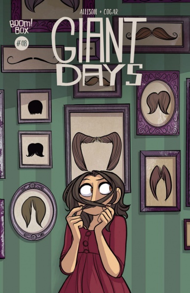
“Giant Days” #48
Written and Illustrated by John Allison
Colored by Whitney Cogar
Lettered by Jim Campbell
Reviewed by Elias Rosner
Another month, another issue of “Giant Days,” another chance to laugh, cry, and spend some time with the Sheffield Three. This month, we get a change of artist, as Allison has come back to draw the entire issue. It’s truly amazing how much Allison has grown as an artist and it’s clear where Sarin’s work has influenced his presentation of these characters and their world. For some, the change in style may be too much of a departure from the usual bright, noticeably less angular, higher energy work of Sarin.
However, all the elements that make “Giant Days” work so well are still present. The situational comedy is spot on, while the characters’ wit and heart are on full display the whole way through. Allison, despite having a flatter, less three dimensional style, still renders facial expressions and posing to perfectly match the tones of the scene and the personalities of the characters. Daisy’s constant worrying, Esther’s complete confidence in herself, and Susan’s barely tempered rage for the Shaws are palpable in every panel.
Cogar’s coloring is noticeably tempered, fitting the light inks of Allison’s art without overpowering it, while Campbell’s always solid lettering merges and blends with the characters, allowing the voices to come out naturally, without odd bolding or italics muddying the meanings. “Giant Days” #48 does have a couple art goofs, such as on the second page when Susan’s hand mysteriously disappears into a non-existent pocket. A minor problem, and quickly overshadowed by the care put into the rest of the comic and its many fantastic jokes and quips.
It’s always hard to say more about this series that has not been said before. Even after 48 issues, the jokes remain fresh and new, and each monthly return is like joining up with good friends for a night hanging out. You might hear stories about their recent bouts with The Horn, of their feuds and frustrations, of strange hotels and stressful family gatherings. You might hear a new joke, or an old one told anew, that gets you simply because of the person telling it. Or you might just sit in silence, allowing the night to go by, happy that you get to spend another day with the people that bring joy to your life.
Final Verdict: 8.9. – “Giant Days” hardly has a bad issue and this one is no different. Pick it up and enjoy your time with Ester, Daisy, and Susan to the fullest.
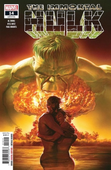
Immortal Hulk #14
Written by Al Ewing
Illustrated by Kyle Hotz
Colored by Paul Mounts
Lettered by Cory Petit
Reviewed by Gregory Ellner
Al Ewing, as ever, writes a good story with “Immortal Hulk” #14. However, the beginning of the current arc seems set to prove that when it comes to events in other comics, the addition of other required reading may make for a story that can have difficulties standing up on its own. By being forced to incorporate Thunderbolt Ross’s death in last December’s ‘Winter in America’ arc for “Captain America,” the story slows significantly, and only really seems to come back to itself in the closing scenes. None of this is to say that the story is bad, but merely that it seems to be lacking something in contrast to previous arcs.
Continued belowKyle Hotz does a good job as a guest artist, but his facial artwork seems a bit too exaggerated on the whole. That kind of exaggeration work well wih the Hulk himself, but with other characters like General Fortean, Betty Ross, and the non-Hulk Bruce Banner among others, it comes across as a bit too cartoonish for the horror nature of the story itself.
Paul Mounts is, as always, doing a very good job on the colors for this issue. The hues are dark and grim when appropriate, and harshly bright in flashbacks to show how much those memories hurt. The use of color with a thermal scope is especially good, as it shows knowledge of thermal signatures of the human body and how it can or cannot be easily seen.
Final Verdict: 7.0- “Immortal Hulk” #14 noticeably struggles with current events in the Marvel Universe, but the pacing keeps up on the whole, leading to an enjoyable, though perhaps slightly less overwhelmingly amazing, start to its latest arc.
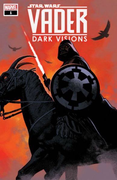
Vader: Dark Visions #1
Written by Dennis “Hopeless” Hallum
Illustrated by Paolo Villanelli
Colored by Arif Prianto
Lettered by VC’s Joe Caramagna
Reviewed by Chris Egan
Hallum’s new Darth Vader series attempts to bring back some mystery to one of pop culture’s most famous and heavily dissected characters by viewing him through the eyes of characters who have very little direct contact with the Sith Lord. In the last 42 years of Star Wars‘s existence we have learned far more about Darth Vader than fans would have ever expected when he first burst onto the screen. In issue #1, as a Galactic Civil War space battle rages over a primitive backwater planet, the story is told through the eyes of a young indigenous kid.
It’s been so long since there has been any sort of mystery or secrecy around Vader as a character and this first issue does exactly what it sets out to do. In the eyes of this child, Vader has become a mythological character again. Hallum’s writing never waivers. He quickly created a character and a society that is nicely realized and clearly understood. Villanelli and Prianto work together to make a big adventure in a relatively small space that matches the fast paced writing. Though most of the illustrations are a fairly straight forward representation of Vader and the greater “Star Wars” universe, there are some cool fantastical moments manifested from the narrator’s memory. It all blends together in a nice way as the story is told. Competent color work brings it all together, but there’s nothing next level on display here.
“Vader: Dark Visions” #1 does an excellent job at playing with points of view. Readers see both the Imperial nightmare that they are used to as he destroys Rebel fighters in a space battle and once on the planet, he is seen by the locals as a savior, a hero of the ages, all through nothing more than happenstance.
Final Verdict: 8.0 – An exciting Vader adventure that sees him in a slightly different light than fans are used to. Solid writing and standard Marvel/Star Wars art fare make for a very enjoyable read.
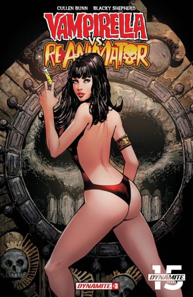
Vampirella vs. Reanimator #3
Written by Cullen Bunn
Illustrated and colored by Blacky Shepherd
Lettered by Taylor Esposito
Reviewed by David Craig
As “Vampirella vs. Reanimator” approaches its final instalment, the stakes (no pun intended) are raised appropriately high. Seduced by the promise of immortality, the naïve Herbert West has helped the goddess of death build a nightmarish portal with little regard for the consequences. Thoughtful horror storytelling this is not, but this series effectively plays into the B-movie charm enjoyed by both of its titular characters.
Cullen Bunn’s take on Vampirella provides a genuinely likeable heroine. While her objectifying costume design endures as a regrettable remnant of her pulpy seventies roots, her personality stands out as remarkably contemporary. There’s a self-awareness to the character which is a long way from parody, but enough fun to keep the ludicrously horrifying story ticking along.
Granted, Reanimator is little more than a plot device by comparison, but this works for the story Bunn is trying to tell. He makes practical use of the character’s single-minded obsession to create a tale that’s epic in scope. Certainly, an attempt to tackle the character in a more nuanced form would be worthy of greater attention, but for the sake of this silly pairing it isn’t really worth dwelling on.
Continued belowIt seems unlikely that H.P. Lovecraft ever imagined one of his creations in a story quite so daft, but visually the book stays true to his phantasmagorical visions thanks to the excellent work of artist Blacky Shepherd. The aforementioned portal of death is gloriously creepy, although arachnophobes may find themselves nervously flicking past the book’s haunting early splash page. The mostly black-and-white panels gives “Vampirella vs. Reanimator” the look of a classic Hammer horror movie, with the occasional flares of color used to great effect.
It’s difficult to criticise “Vampirella vs. Reanimator.” That isn’t to say it’s a perfect book or even that it’s a must-read, but it seemingly achieves everything that it sets out to do. It’s a simple and schlocky story but should be pleasing to fans of both characters, staying true to the gothic and cosmic horror elements that they are so clearly influenced by.
Final Verdict: 7.0 – “Vampirella vs. Reanimator” is a campy horror story with enough heart to make up for its obvious shortcomings.
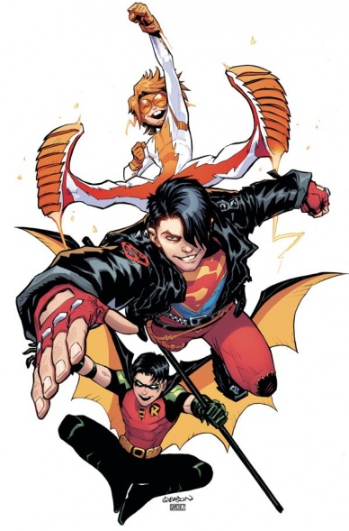
Young Justice #3
Written by Brian Michael Bendis
Penciled by Patrick Gleason and Viktor Bogdanovic
Inked by Jonathan Glapion and Alejandro Sanchez
Colored by Chris Sotomayor and Hi-Fi
Lettered by Carlos M. Mangual and Josh Reed
Reviewed by Alexander Jones
The DC Universe is an ever-changing place and few comics are better examples of the rapid changes within the line as “Young Justice.” The third issue of the series tackles what is arguably the most fascinating plot thread for long-time, continuity-focused readers. Author Brian Michael Bendis and artists Patrick Gleason and Viktor Bogdanovic attempt to make sense of the extremely rapid return of Connor Kent as Superboy. While readers were undoubtedly excited at the prospect of his return to the DC Universe, his return was wildly sudden and needed context to justify the huge plot point.
“Young Justice” #3 is here to address the elephant in the room and explain where Kent was while offering readers touching moments between Impulse and Superboy. While this issue does address the delayed gratification and even give the proper context for just how the heck Kent came back to the DC Universe so suddenly, it is hard to feel that any answer Bendis could have written in the story would have felt truly earned. That being said, the content of the third issue of “Young Justice” is a sheer delight for longtime readers. The series holds a regal and important nature that digs right into the heart of DC. This issue singularly is a great embodiment of what makes DC so special and what the Rebirth initiative stood for in the first place.
While Bogdanovic is a great artist in his own right, the looser aesthetic he brings to the issue clashes with the refined linework from Gleason. Gleason’s pencils are buttery smooth and carry an awesome level of expression. There are some truly beautiful panels with Impulse in the beginning and there is a great sense of movement across the page. Bogdanovic’s pencils carry great layouts and expressive figures, but he is lacking in some of the polished lines making his work jarring transition to Gleason’s output. The bottom line is that no matter who is drawing the page readers are in good hands.
Jamming the “Young Justice” characters into current DC continuity so suddenly was a difficult pill to swallow no matter how excited I am for the characters to return. “Young Justice” #3 finally starts adding the context and explanations Bendis should have doled out from day one. Plus, this story finally bridges the ongoing plot thread with Amethyst and Gemworld into the Young Justice world. The script is also essential to understanding Connor Kent’s sudden DC return.
Final Verdict: 7.5 – “Young Justice” #3 boldly fleshes out the context and narrative behind Kent’s return to the DC Universe.


