
There’s a lot to cover on Wednesdays. We should know, as collectively, we read an insane amount of comics. Even with a large review staff, it’s hard to get to everything. With that in mind, we’re back with Wrapping Wednesday, where we look at some of the books we missed in what was another great week of comics.
Let’s get this party started.

Written by Matthew Rosenberg
Illustrated by Juanan Ramírez & Roberto Di Salvo
Colored by Federico Blee
Lettered by Travis Lanham
Reviewed by Quinn Tassin
“2020 Force Works #2” is an odd entry in the whole machine uprising corner of the Marvel Universe. It’s ostensibly connected to everything else that’s going on, but mostly it feels like a spy story that also involves some robots. That’s not strictly a bad thing! There are lots of cool robots and spy action this issue- it just doesn’t feel that connected to the larger narrative.
As for the actual content of the issue- the Force Works team gets captured by a bunch of Deathloks, then everyone but Rhodey escapes only to find other Deathloks fighting Ultimo. Rhodey gets out of his Deathloks’ clutches with the help of none other than MODOK, and they all reunite. It simultaneously feels a bit overstuffed for one issue and like an exciting, fast-paced story. Part of its bloated feeling comes from the oddly large amount of dialogue that there is. There’s certainly merit to wordiness at times but a lot of the speech bubbles here feel like impediments to the flow of “2020 Force Works #2.”
In the midst of all of this is some pretty great characterization and action. Matthew Rosenberg clearly likes all of these characters and it’s a blast seeing them interact with one another. U.S.Agent is undoubtedly the most fun to read- he’s his usual gross, condescending, hyper-masculine self but Rosenberg puts him in check frequently and adds a self-awareness that makes him a more fun character than usual.
Juanan Ramírez & Roberto Di Salvo absolutely deliver on the art here. They bring dynamic energy to everything going on here and it feels almost cinematic at times. Every time Ultimo is on the page, its presence is absolutely overwhelming in the best way. They also do a great job at giving each character a distinct physicality; it’s a quality that isn’t a given when everyone doesn’t have flashy powers but it’s an absolutely wonderful touch. There’s Best of all, their work flows together so well that “2020 Force Works #2” doesn’t feel anything like a comic with two illustrators.
Final Verdict: 6.7 – “2020 Force Works #2” delivers on fun action and characterization but leaves you wanting for a better story

Written by Matt Kindt
Illustrated by Matt Smith
Colored by Chris O’Halloran
Lettered by Jim Campbell
Reviewed by Kobi Bordoley
“Folklords” #5 answers many of the questions Ansel sought on his quest, but answering questions and resolving stories with a flourish are two different things. While “Folklords” #5 is a palatable ending to the initial arc, it left us wanting just a little bit more.
A lot of this comes down to expectations. When we first reviewed Folklords, everything looked slick: strong premise, good subversion of tropes, well-established character relationships with a lot of room for depth, and all that good stuff. Since then, the story has moved forward at a relatively fine clip, but “Folklords” #5 simply does not deliver on all fronts. For example, you’d expect an arc ending shootout to have high stakes. While this story has never been aggressively dark or gritty, it has certainly been dramatic. Because of this, the aforementioned shootout’s comfortable resolution feels a little disappointing. There are plenty of twists and turns in the final third of “Folklords” #5, but without heightened drama or a sense of danger, they feel more vaudeville-y than mouth open, oh my god moments.
The best sequences in “Folklords” #5 come from the art team. O’Halloran and Campbell keep things fresh. The colors are bright, and the bad guys are florid in the best way possible. Their ostentatious manners match their color palette. The lettering especially brings the drama when the script is lacking. We’ll be the first to say that some well placed and well-designed BANGs go a long way towards cutting through dialogue
Continued below“Folklords” #5 does have its strengths, and further arcs could pick up and dive into the character work that made previous issues so strong. Matt and Matt certainly have the chops to pull it off, so there’s no need to sound the alarms just yet.
Final Verdict: 7.1. An ensemble cast ending to the first arc is not without its faults.

Written & Lettered by Ryan Ferrier
Illustrated by George Kambadais
Reviewed by Christa Harader
“I Can Sell You A Body” #3 features Denny and Henrietta on the run, a priest’s first demon and murder in America and a few cops with no idea they’re in over their heads.
Ferrier and Kambaidais continue their eclectic, spooky and weird mini with style. “I Can Sell You A Body” succeeds because Denny’s the right blend of hopeless conman and squashed romantic. Henrietta’s self-awareness and grounding make her an interesting character in her own right, not just because she’s there to ground Denny. The priest is an endless source of amusement, and Ferrier nails the blend of Italian accent and oddball Catholic humor we need to buy that development.
Kambadais’s art uses a lot of white space and heavy shadowing to produce a pop-art page, with high contrast and a good deal of oppressive, overhead angles to highlight how truly out of control the story is – and can get. It’s a smart tactic and a nice visual break from how most other supernatural books work these days. Ferrier’s lettering remains readable and the balloons are placed well, considering the challenge of borderless panels, gutter breaks, and non-traditional layouts.
Overall, “I Can Sell You A Body” #3 sets us up for a particularly weird and gratifying conclusion if the team can carry it home. So far, so good!
Final Verdict: – “I Can Sell You A Body” #3 continues to entertain with its unique brand of humor, complex storytelling, and poppy art.

Written by Chuck Brown
Illustrated and Colored by Prenzy
Lettered by Clayton Cowles
Reviewed by Joe Skonce
There’s always a certain level of disappointment when a thing that you’re excited about doesn’t quite live up to your expectations. On paper, “On the Stump” seemed like a book made for me, a big ridiculous book about a future where members of Congress are now pro-wrestlers who literally fight for legislation. There are things to like about the book. The characters are larger than life, the action bombastic and wild, and there are certain threads that are revealed in “On the Stump” #2 that are intriguing. But the book has a big problem, “On the Stump” #2 has a lot going on and as a result, feels messy.
There are three major revelations in “On the Stump” #2. The first is that (much life actual professional wrestling) it appears the result of the matches are dictated by major corporations, with the antagonist “Thunder Bear” having a heated conversation with the CEO of the Nixx corporation who wants to move forward with dangerous legislation to increased illegal genetic mutations which endanger people but make for more exciting matches. The second is the protagonist Jack revealing that a group called the Blacksmiths, thought by many to be a myth are not only real but operating under congress. Finally, there are two assassins running around. Of the three, the Blacksmith story is the most interesting and it would have been nice to spend more time on that story. It also would have been more interesting to slowly parse out the reveal of the matches being fixed. The issue felt like it was just doing too much and sacrificing other more interesting threads.
The art also has its fair share of issues. While Prenzy’s character designs work well in the hyper-inflated machismo of the world of “On the Stump” #2, the coloring of the book gives it something of a muddled feel. There are just a lot of dark browns, tan, and beige that are offputting. When the story shifts to the secret base of The Blacksmiths, the pallet changes to include more blues, greens, and reds which gives the book a shot of life. But, much like their role in the story, it’s not enough to make up for the rest of the art in the book. It’s possible that in the weeks to come the book will become more focused. At the moment, it’s not looking likely.
Continued belowFinal Verdict: 4.8 “On the Stump” #2 has some promise, but the story is unfocused and the art leaves something to be desired.

Written by Kieron Gillen
Illustrated by Dan Mora
Colored by Tamra Bonvillain
Lettered by Ed Dukeshire
Reviewed by Luke Cornelius
After a month off, Gillen and Mora’s Arthurian epic, “Once & Future” returns with #7. The issue opens in Camelot now the world has finished shifting with Arthur concerned about an “old rival” returning. In order to prove himself worthy of stopping the old rival for Arthur, Galahad must risk the Siege Perilous. Now, it may be cliche to describe a new story arc as darker than its predecessor, but Mora’s Siege Perilous design suggests just that, with the throne’s metal structure being obscured by the numerous skeletons that have become a part of it. Furthermore, when Galahad begins his transformation, the jagged and violent distortion of his arms coupled with deep red fumes bursting from within plunge the series into gruesome, horrific territory.
The script then checks in with Duncan, who has just finished hunting a pixie. We discover that he’s still in contact with Bridgette, but only to get her advice on the family business. Meanwhile, Rose is tracking travel between our world and Otherworld. From these scenes, Gillen quickly establishes the small-time jump between this issue and the last and the changes in its status quo organically through the dialogue. Dukeshire’s lettering makes it read smoothly.
Rose has found that there is huge Otherworld activity at the British Museum and the sequence that sees Duncan exploring by himself gives the comic a moment of silence. Here, Mora’s increased panel size emphasizes the isolation of Duncan but, rather than induce fear, there’s a sense of wonder and magic. Bonvillain’s colors aid this by using cooler blue hues against the torch-illuminated focal points. This is broken with the arrival of Galahad, now with his horrific redesign.
After opening with Arthur fearing the return of an “old rival,” Gillen closes with a sequence focused on Elaine, who is reading from a manuscript to resurrect them. Here Gillen’s knowledge and understanding of English legend are demonstrated, as it has been in previous issues, with the inclusion of a passage of Old English, which adds an extra layer of authenticity and an extra level of anticipation for those who recognize it. The identity of the “old rival,” which this reviewer refrains from spoiling, marks a big addition to the mythology of the series and leaves readers desperate for the next issue.
Overall, Gillen, Mora, Bonvillain, and Dukeshire combine to make “Once & Future” #7 a bolder and darker beginning to a new arc.
Final Verdict: 8.0 – “Once & Future” #7 sees the creative team continue their form with an addition to the mythology that will change the course of the series.

Written by Christopher Hastings
Illustrated by Ryan Browne
Colored by Ruth Redmond
Lettered by Hassan Ostmane-Elhaou
Reviewed by Matthew Blair
“Quantum and Woody” #3 follow the world’s worst superhero team as they continue to fight the good fight against the oncoming surge of mad scientists that seem to be popping up around the world. This week’s adventure takes them to a pit of despair so deep and terrifying that even they don’t know if they’ll make it out alive: high school.
Writer Christopher Hastings has a keen grasp of what makes Quantum and Woody work as heroes. They definitely don’t trust each other, but they understand and respect each other enough to get the job done. On a more macro level, Hastings does a good job of showcasing the absurdity of two grown superheroes attempting to infiltrate a high school and ties the single issue into the larger story in a way that is brutally direct and kind of hilarious. It’s a good script, the only problem is that sometimes the characters talk too much which might cause some reader’s eyes to glaze over while reading a wall of text.
Artist Ryan Browne provides the artwork for “Quantum and Woody” #3 and proves that his style is perfectly suited for these characters. The comic looks like an old comix book that you would find in a 1970’s San Francisco head shop with thick lines and exaggerated facial proportions that make everyone in the book look mean and ugly. It’s a very good style of art to showcase these long-suffering hero’s plight and the ridiculousness of their present situation. The only problem some readers might have is that most of the pages are crowded with lots of tiny panels that might make the book hard to follow in places.
Continued below“Quantum and Woody” #3 is a book that understands its heroes and has some really good jokes. While the script and page layouts could have been a little less wordy and a little less crowded, it’s still a good book with good jokes and shows why these two morons deserve a spot as one of Valiant’s best titles.
Final Verdict: 7.9- Walls of text and crowded pages prevent the book from being the best it could be, but it’s still a book with plenty of heart and some really good jokes.
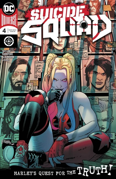
Written by Tom Taylor
Illustrated by Daniel Sampere
Colored by Adriano Lucas
Lettered by Wes Abbott
Reviewed by Gregory Ellner
Tom Taylor is a master of pulling heartstrings. From horror to comedy, from heartwarming to heart-wrenching, he can provoke a wide array of emotions in readers from issue to issue in many different stories. “Suicide Squad” #4 is no different, playing to his strength with a team focus to allow for many characters to stand out. Deadshot and Osito’s relative seriousness play well off of Harley Quinn’s rapid-fire comedy and Captain Boomerang’s utter ridiculousness in this capture job. Even the origin story shown is integrated with enough pathos to make readers feel sorry for such a new addition while never letting the audience forget that the Squad is still, by and large, made up of criminals.
Daniel Sampere is excellent both when it comes to faces, which are used for a wide variety of emotions especially on the ever-amusing Harley Quinn, and the far more varied utilization of scenic angles. The latter comes up in particular focus for a flashback, which makes use of wide views of a post-battle burning virtual hellscape as well as a similarly wide appearance of an ocean shoreline. Both of these expansive viewpoints come in contrast to close-ups of an exploding head (as per Suicide Squad norm) or a more haunting appearance of a body in a morgue seen from behind a mourner’s shoulder. Taylor’s script may set up sad scenes, but it is Sampere’s artwork that really sells them to the audience.
Adriano Lucas further enhances the already well-done artwork of Sampere. A flaring red in a warning situation turns into bloody violence without missing a beat. Cooler colors and shades help to enhance a sense of calm before the storm in lighter scenarios, while the warmth of a sunset further calms the senses with the beauty of the surroundings. In other situations, a similar warmth can be shown as glaring and intense, in accordance with the way the script handles the scene as much as the artwork itself.
Final Verdict: 8.0– Character building works in tandem with humor and excellent artwork in this latest installment to the trials and tribulations of Task Force X.

Written by Jonathan Hickman
Illustrated by Leinil Yu
Colored by Sunny Gho
Lettered by VC’s Clayton Cowles
Reviewed by Alexander Jones
Marvel’s X-Men line is juggling an absurd amount of plot threads thanks to the expansive amount of books being published. Right now the core title sees a ragtag band of X-Men teaming up to take on the Brood’s coveted King Eggs. The egg is an artifact instrumental to Marvel continuity that both the Shi’Ar and Kree are desperately trying to get their hands on. Author Jonathan Hickman creatively structures the script to lend a degree of action, science fiction and heist elements into the narrative for good measure. The opening sequence, in particular, catches readers up to speed to the mythology of the Kree and the egg with minimal exposition.
When the series jumps forward in time 8,000 years into the future and readers catch up with the X-Men they are desperately trying to keep the egg for themselves as well. Taking the X-Men out of Krakoa, mixing up the team members and pairing them off with alien species is the right call for this arc of the story. Hickman’s plotting in this issue is truly remarkable and despite the simplistic heist elements of the story, the issue is loaded with creative plot elements and mythology to keep longtime readers happy. Hickman has been able to add story elements from several decades to pave the way for new stories with older characters. The occasional humorous lines of dialogue are hilarious and showy but not over-the-top here. The issue features a tremendous scene with Kubark as well which shows that the interiors carry dense plot with a touch of strong personality.
I would argue that artist Leinil Yu’s X-Men artwork has never made as much sense as it has in the context of a space-focused Mutant story. Yu is able to draw more machines and alien figures than some of the previous issues. The same flaws in Yu’s storytelling are present here but less pronounced. The issue lacks expression and can make Jonathan Hickman’s scripts seem emotionally cold at times. Huge action sequences and alien brawls look as good as ever here. Yu has different strengths than artists Pepe Larraz and R.B. Silva which are on full display in this issue. It’s also great to see Yu draw Marvel Universe staples like The Supreme Intelligence and other Kree characters here.
Final Verdict: 8.4 – “X-Men” #9 provides a pulse-pounding script with sleek art and a cliffhanger that will leave you counting the days until the release of the next issue.


